• We are STAs
    • Asha Rountree
    • Haley Ma
    • Kate Shih
    • Kyra Lee
    • Nicholas Peasley
    • Sasha Kenney
    • Shanda Horm
    • Shriya Atreya
    • Tomas Marulanda-Mesa
  • We were STAs
  • STA Presentation
    • STA Presentation 2017
    • STA Presentation 2016
  • Testimonials
  • Resources
  • Home

STA Blog

Abriella Corker

Abriella Corker

Working on Some Detail Features

January 5, 2021 By Abriella Corker

Working on Some Detail Features

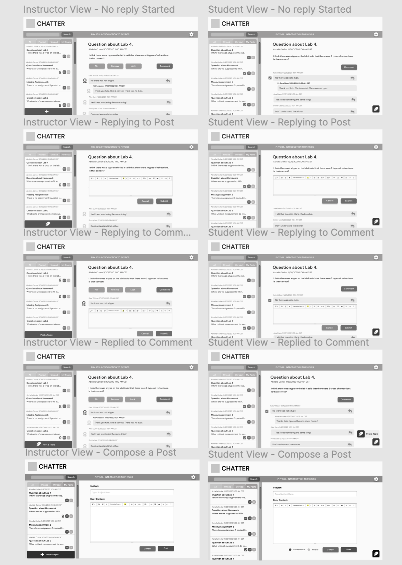
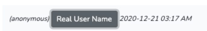
One feature that I worked on redesigning was the reveal function for instructors to see the student’s name on their end. This is the place holder that was made by Chris:

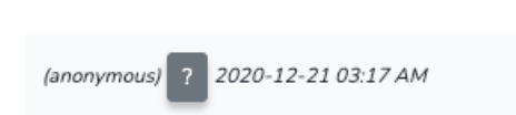
Here is my redesign of this feature:

The instructor will click the arrow and the name will slide out to the right as so.

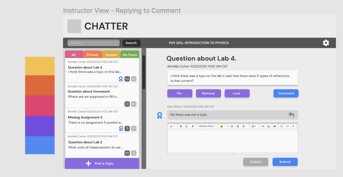
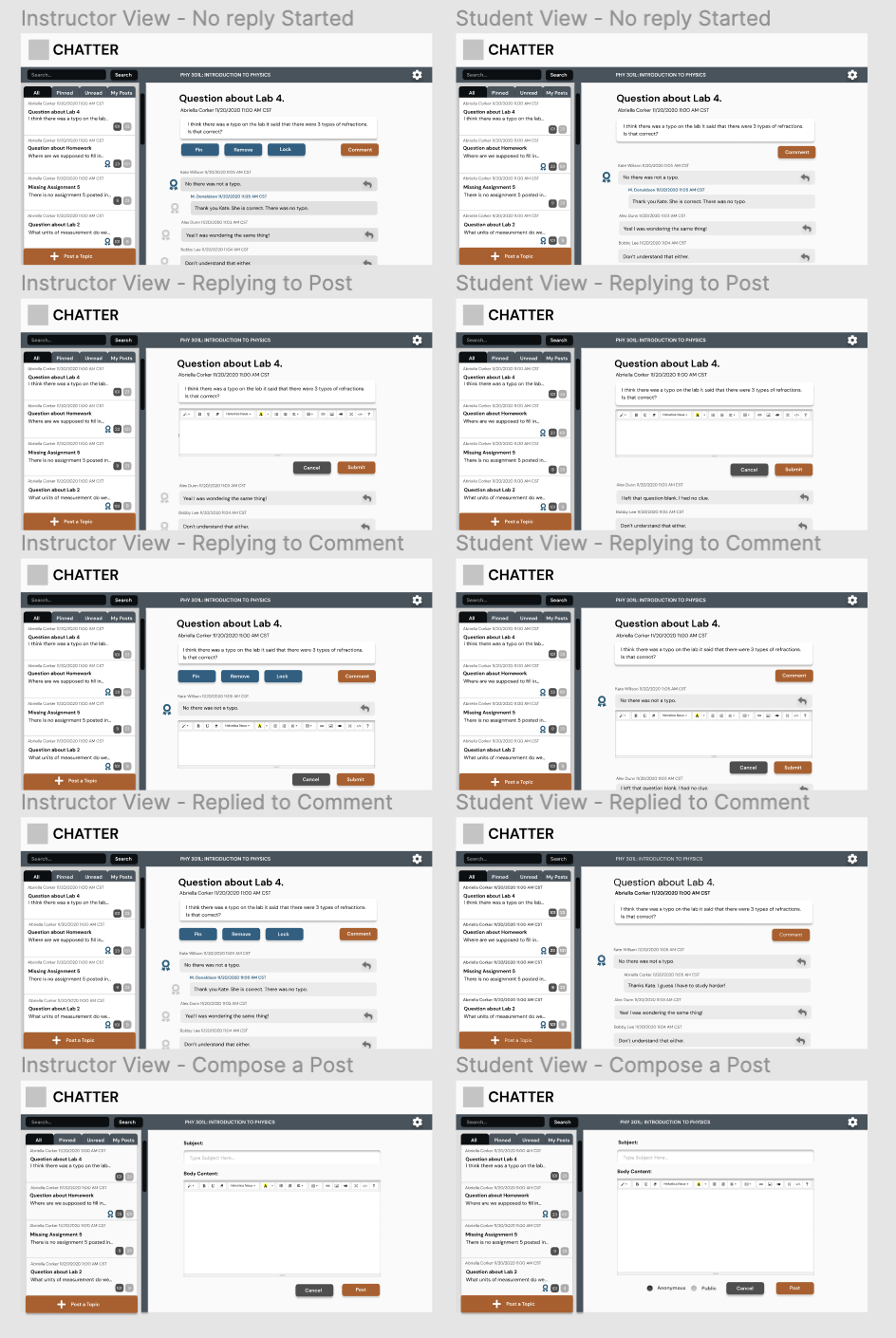
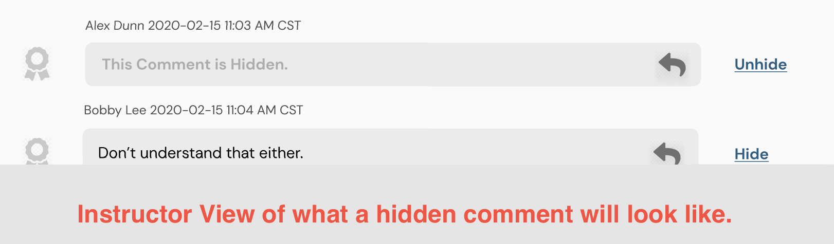
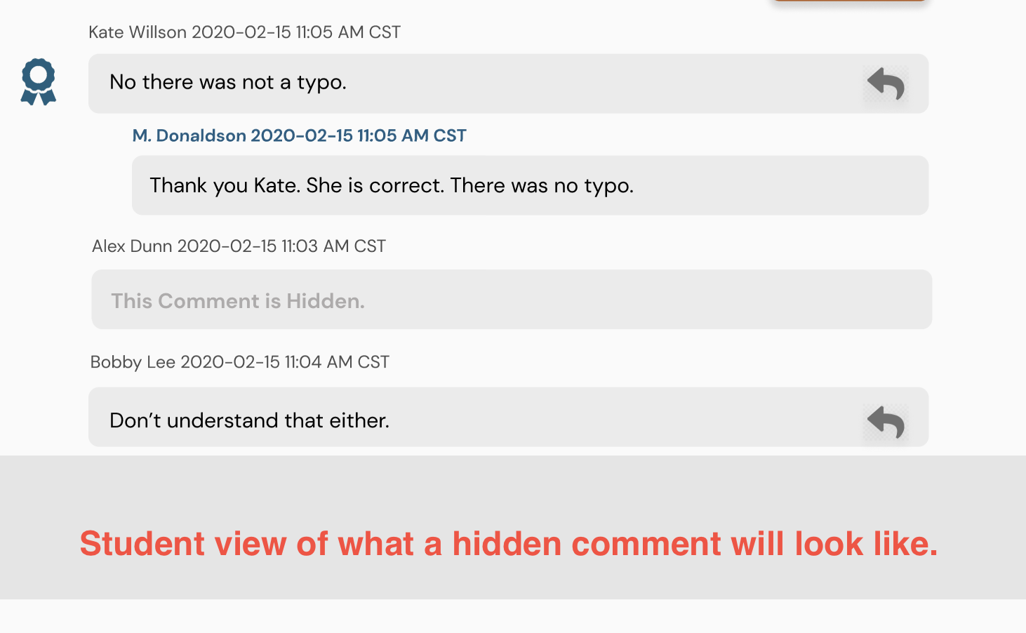
The next feature we were missing was the ability for an instructor to hide a comment. So far we only had a feature to hide a post. Here is what I came up with for the desktop version so far:

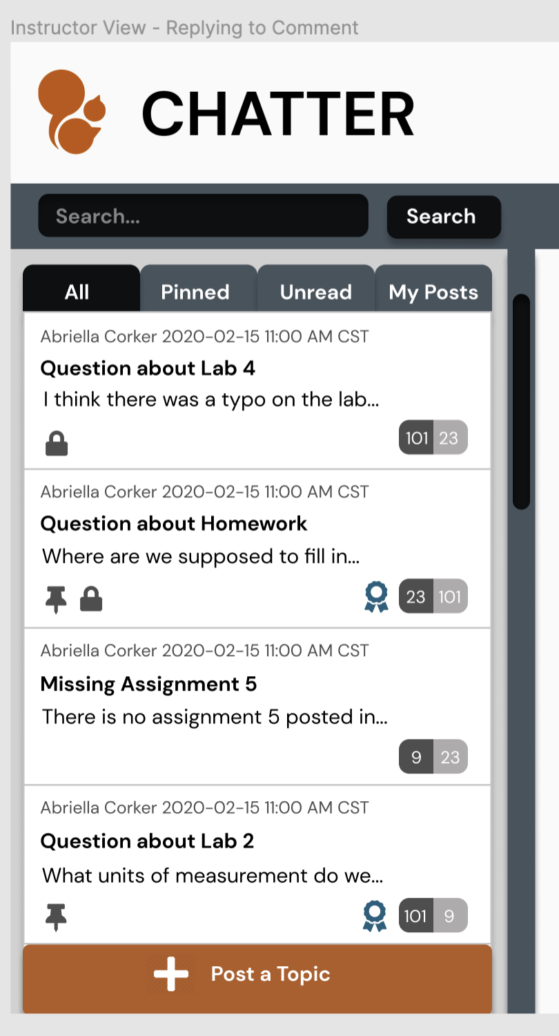
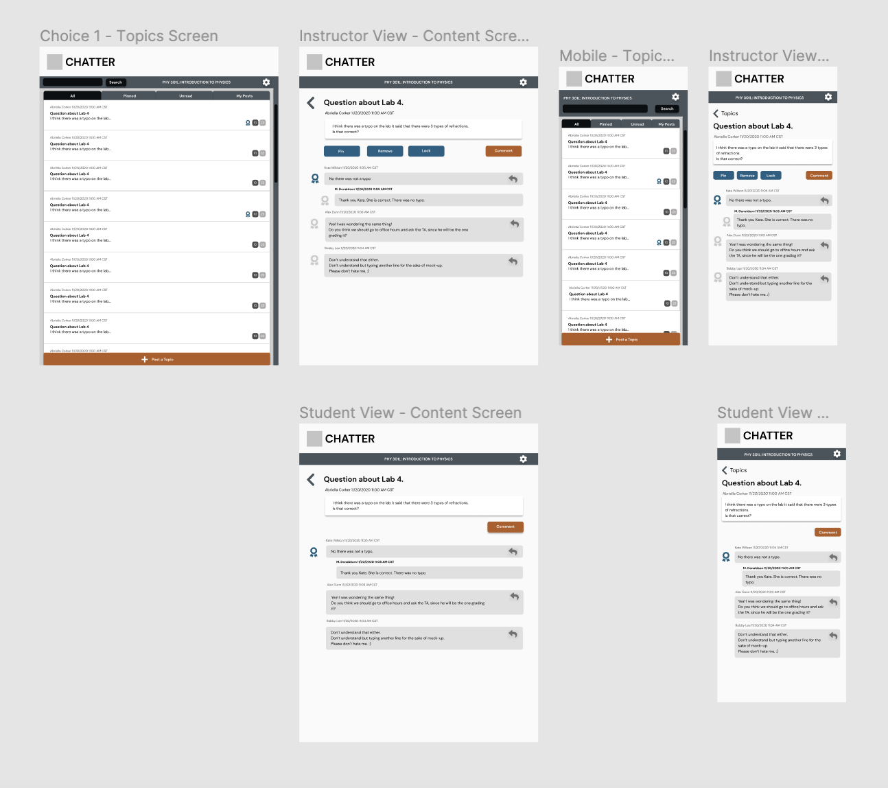
We also wanted to add features within the inbox on the left where we can see that a post was locked or pinned in the ‘all’ tab. I also merged the unread/read boxes in the bottom right corners to be joined together:


Filed Under: 2020 Summer | 2020 Fall

CHATTER

December 22, 2020 By Abriella Corker

CHATTER UI/UX


Project: Chatter, a replacement to Piazza.
Client /Prof: College of Liberal Arts at UT Austin
Completion status: Started December 1, 2020
Staff guidance: Maddy Kaniewski
STA team members: Thuy Nguyen
Description/plans: COLA is looking for an alternative to the messaging application Piazza used on canvas. The LAITS team has been working with Thuy and I to come up with the user experience and interface of the new application.
To be completed: Before Jan 21, 2021


These are the initial sketches of the UI:

I started off by looking at case studies on the redesigning of Piazza and drew from their top tips on the UX to inform how I should wireframe my own replacement version. For the most part, the main layout stayed the same in the final version. Chris also has a one-pager of 10 must-haves for a minimum viable product and I drew form that as well.

This is the high fidelity layout done in Figma. No color yet. Still exploring button appearances and placement:

Here the post a topic button is different on every frame as well as what the endorsed comment symbol was going to look like. We ended up going with a “+” post topic and a badge in the end after talking during our meeting. We were still unsure as to how the reply to a comment button will work in its effective communication to users. That may still need to be resolved after a to b testing.

These are the different color palettes I explored before settling on a UT palette:

Since this messaging system will be its own page I was allowed to play around with some unconventional color palettes. I tried a UT version anyway incase we place that inside the actual canvas page. It ended up being the favorite so from there I messed around with color placements keeping in mind how colors translate importance to primary and secondary buttons. I then placed each color option I did into a colorblindness simulator to make sure that the hierarchy of color still remained across all types of color blindness. https://www.color-blindness.com/coblis-color-blindness-simulator/

Below are images of the final desktop version:

This is how the final look came out. The logo has already been decided but is in the final stages of refinement which is why it isn’t depicted yet.

Below are the final mobile versions for tablets and phones laid out by Thuy and colored by myself:

Thuy went ahead and laid out the mobile version while I worked on coloring. Once her and Chris talked over what they liked best I went in and added coloring to this as well with a few minor spacing adjustments as well.

Filed Under: 2020 Summer | 2020 Fall

Anti-Racism Banner

December 22, 2020 By Abriella Corker

Anti-Racism Banner


Project: Anti-Racism History Department “Overview” Banner
Client /Prof: Tiana Wilson, Graduate Assistant
Completion status: Started December 21, 2020
Staff guidance: Valerie Tran
STA team members: Abriella Corker
Description/plans: This webpage that they’re creating is part of a larger project that focuses on the Anti-Racism Initiative. This initiative was created as a result of this year’s re-rise of the BLM movement. They want the webpages to be a resource for POC grad students. The webpages they need will be created and implemented by their own team, but they are in need of assistance in designing two banners for the tabs for their webpage.

To be completed: January 21, 2020


Above are my first two sketches of the classroom banner that I made off of a reference photo provided. One includes and instructor the other is just the raised hands of students. Then below I picked this warm color palette with two bright accent colors of red and cream.

Here is how the final draft came out. I combined the two sketches to make the banner feel more full and fun to look at.

Filed Under: 2020 Summer | 2020 Fall

MKT 320F Updates

December 8, 2020 By Abriella Corker

MKT 320F Updates

I added a master template to the slides and this is how it turned out for each of them. Then I updated the wardrobe design to be more grayscale rather than neutral tones because those would be too complex for matching to skin tones in the studios.


Filed Under: 2020 Summer | 2020 Fall

MKT 320F

December 7, 2020 By Abriella Corker

MKT 320F Course Designs 2 Versions

The first version I made was based of Sheryl’s and Thuy’s designs that they have been making so far for McCombs. We are trying to keep unity between the courses but with variations in color and images. The second version is a remake of what the professor wanted just recolored to a reference photo that was sent in. I think both of these came out really well and would be fun for the course look either way. I’m excited to see what the professor ends up going with.


Filed Under: We are STAs

Character Design P.2

November 23, 2020 By Abriella Corker

Character Design P.2


This is how the character turn around ended up. I have to say this part was the most difficult. I had to make sure that things were proportional and I was also working on an insect body with a very intense perspective. I’m happy with how it turned out for being my first draft.

Filed Under: 2020 Summer | 2020 Fall

  • « Previous Page
  • 1
  • …
  • 16
  • 17
  • 18
  • 19
  • 20
  • …
  • 50
  • Next Page »

link to LAITS home page

Video STA Home

© 2025 Liberal Arts Instructional Technology Services | Production Credits