CHATTER UI/UX
Project: Chatter, a replacement to Piazza.
Client /Prof: College of Liberal Arts at UT Austin
Completion status: Started December 1, 2020
Staff guidance: Maddy Kaniewski
STA team members: Thuy Nguyen
Description/plans: COLA is looking for an alternative to the messaging application Piazza used on canvas. The LAITS team has been working with Thuy and I to come up with the user experience and interface of the new application.
To be completed: Before Jan 21, 2021
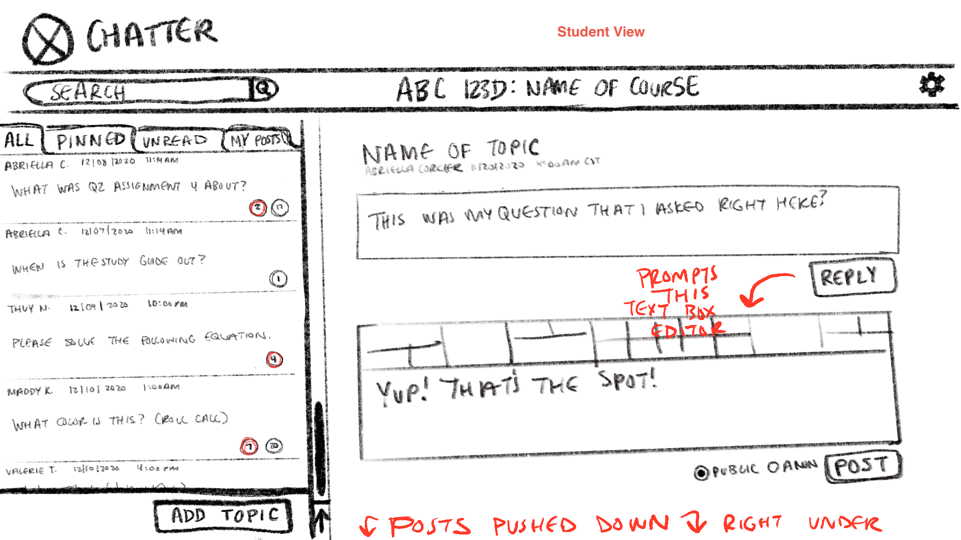
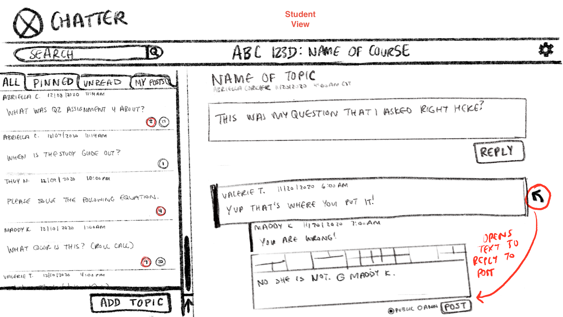
These are the initial sketches of the UI:
I started off by looking at case studies on the redesigning of Piazza and drew from their top tips on the UX to inform how I should wireframe my own replacement version. For the most part, the main layout stayed the same in the final version. Chris also has a one-pager of 10 must-haves for a minimum viable product and I drew form that as well.
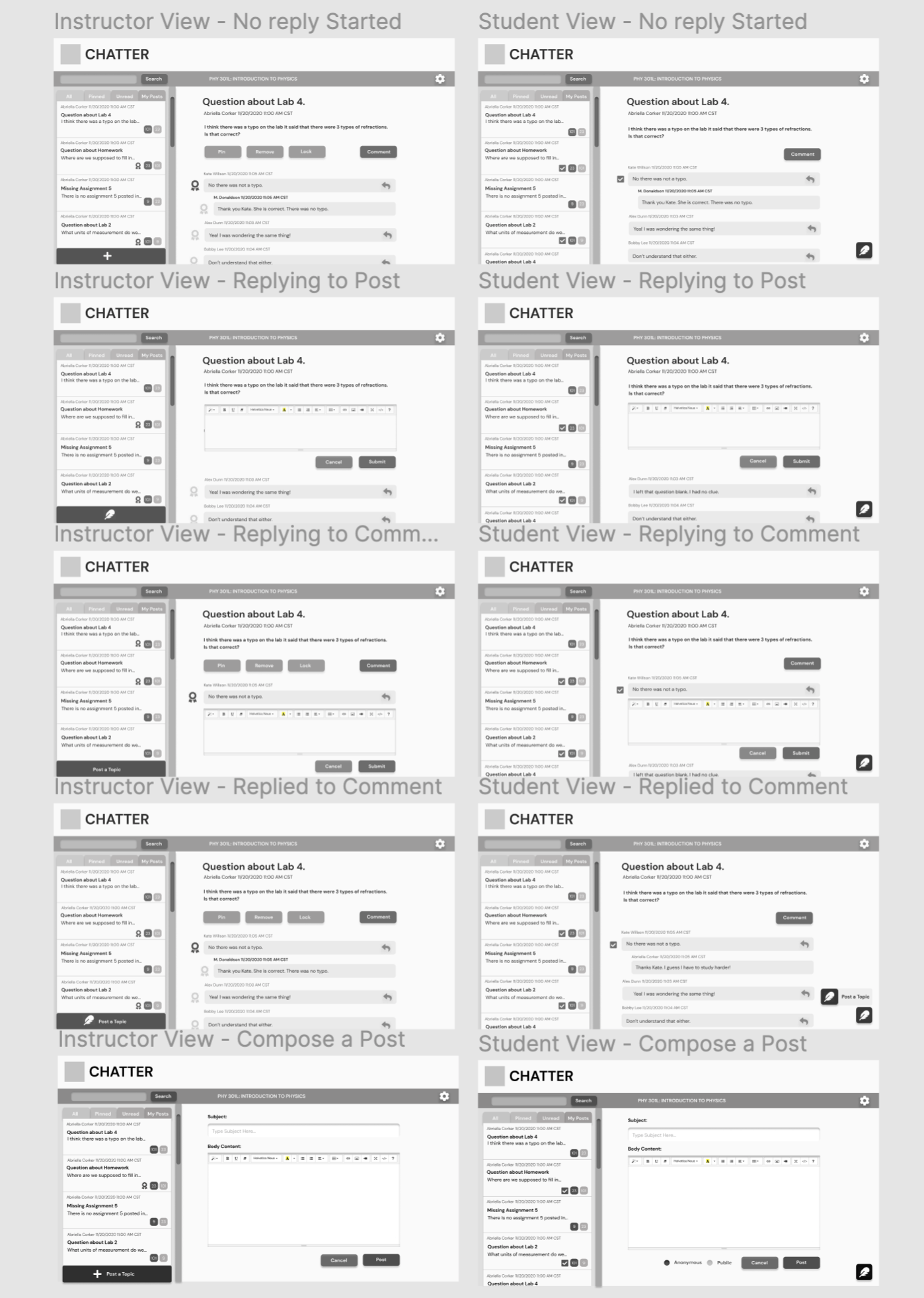
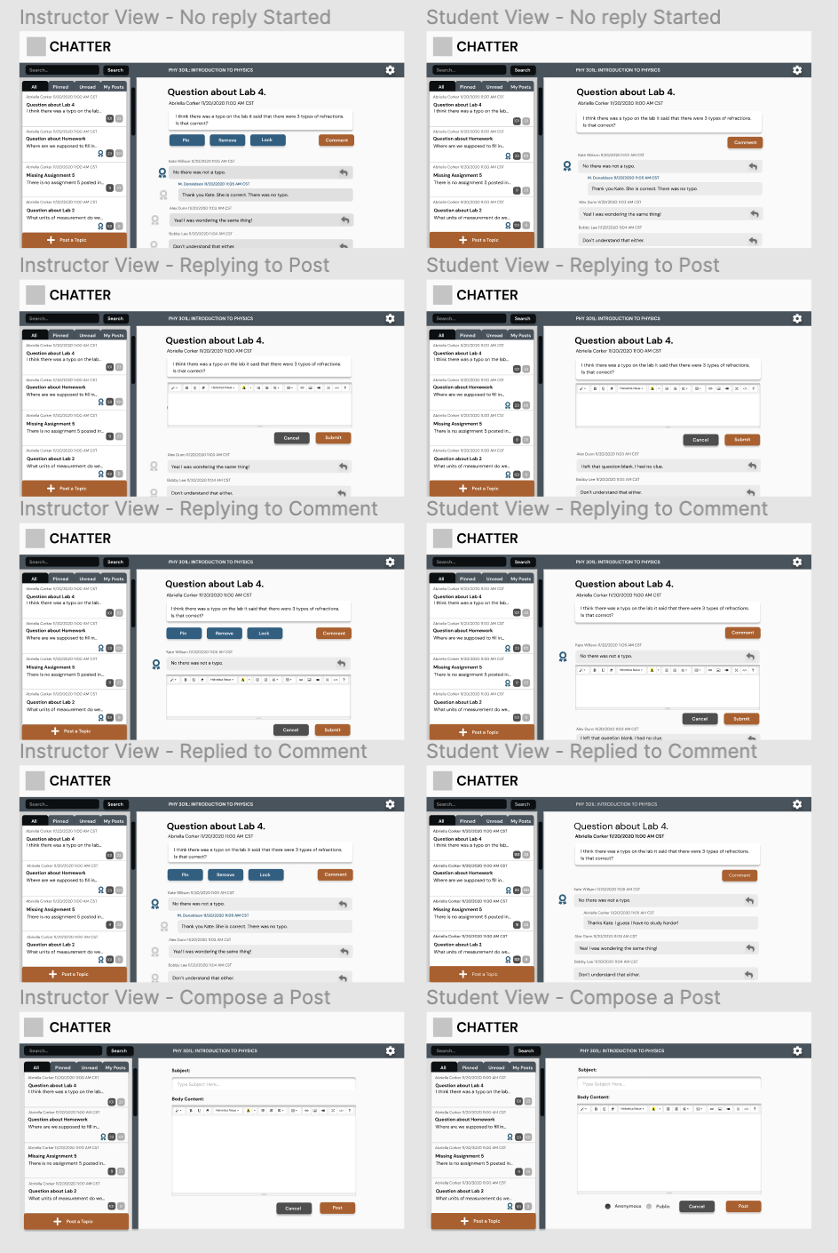
This is the high fidelity layout done in Figma. No color yet. Still exploring button appearances and placement:
Here the post a topic button is different on every frame as well as what the endorsed comment symbol was going to look like. We ended up going with a “+” post topic and a badge in the end after talking during our meeting. We were still unsure as to how the reply to a comment button will work in its effective communication to users. That may still need to be resolved after a to b testing.
These are the different color palettes I explored before settling on a UT palette:
Since this messaging system will be its own page I was allowed to play around with some unconventional color palettes. I tried a UT version anyway incase we place that inside the actual canvas page. It ended up being the favorite so from there I messed around with color placements keeping in mind how colors translate importance to primary and secondary buttons. I then placed each color option I did into a colorblindness simulator to make sure that the hierarchy of color still remained across all types of color blindness. https://www.color-blindness.com/coblis-color-blindness-simulator/
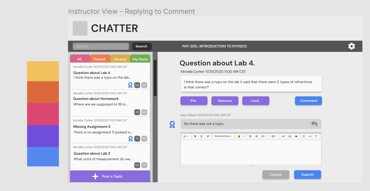
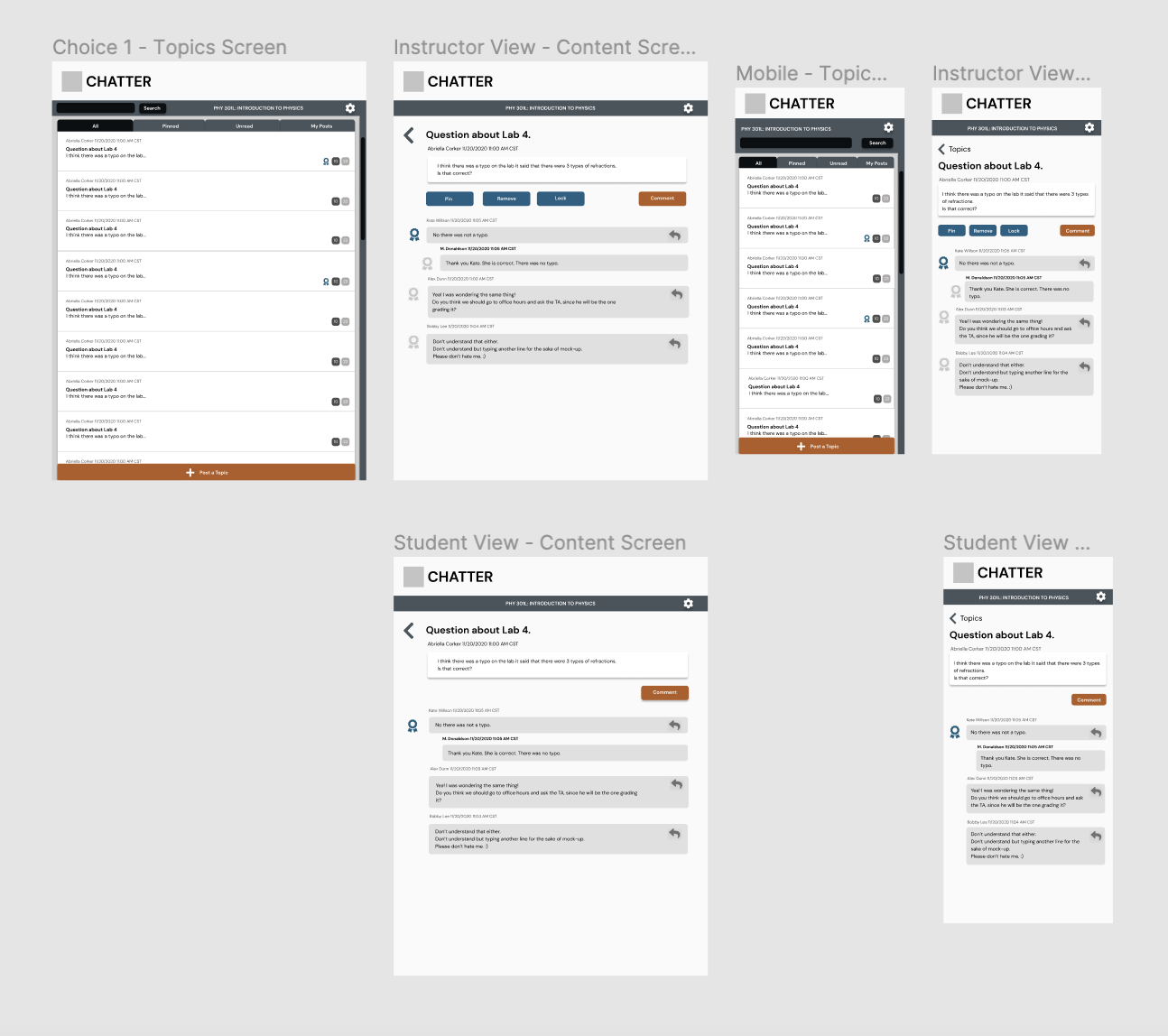
Below are images of the final desktop version:
This is how the final look came out. The logo has already been decided but is in the final stages of refinement which is why it isn’t depicted yet.
Below are the final mobile versions for tablets and phones laid out by Thuy and colored by myself:
Thuy went ahead and laid out the mobile version while I worked on coloring. Once her and Chris talked over what they liked best I went in and added coloring to this as well with a few minor spacing adjustments as well.


