Week 1 & 2 & 3 & 4 Recap:
Week 1&2 of my STA Journey:
- I Became familiar with various tools used in day-to-day work.
- Created a personalized banner for the blog
- Started assigned training modules.
- Completed my Web Accessibility Standards Training
- Discovered the significance of building accessible websites.
- Realized the importance of inclusivity and providing alternate formats of information.
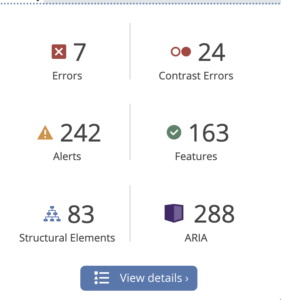
- Learned about Web Accessibility Evaluation Tools, such as Wave, for analyzing websites for compliance with accessibility laws.
- Utilized Figma to correct errors flagged by wave accessibility tools.
Wave Accessibility Tool
Errors detected when I analyzed Byjus.com
In Week 3&4 of my STA Journey:
I built my first website using WordPress. The website taught beginners to use WordPress. Let me walk you through the various phases here!
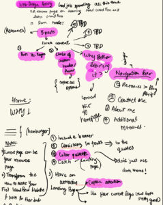
Phase 0) Brainstorming
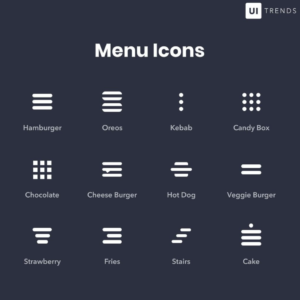
Before building my website, I drew a rough sketch on my notes app. At this point I asked De’sha for feedback regarding my rough plan and learned more about menu icons in the realm of website. As a digital native, I am sure we must have come across the menu bar (three horizontal lines stacked on top of each other). I learned that the menu bar was called a hamburger and there’s a whole suite of names for the different icons used in WebDesign. I found this information really interesting and wanted to share it with the readers of the blog!
Menu Icons
BrainStorm Process
Phase 1) Implementation
While no one likes to face problems, I believe that the best way to learn is through consistently failing. Here, I will list all of my mistakes and what I learned from them.
- Implementation is hard but doable if you persevere. Initially, I had no idea what themes were and I kept switching out themes to build my project. This created a couple issues because I was not able to locally customize certain things as the local customization did’t have precedence over the pre-built theme customization. It was mid-project that I learned from a colleague that Astra is really powerful theme for customization purposes, so I stuck to that. Lesson: Don’t keep changing themes in WordPress
- The global customization theme is your BestFriend! Starting off, I was unsure of utilizing global headers and global footers so I would spend a lot of time, individually customizing my global headers and footer for each page. The main problems with this implementation was 1) The headers and footers were not consistent across the pages and 2) A lot of time had to be spent in making these features consistent across pages. Lesson: Master Global features.
- Another issue I had was implementing the menu bars. Before I built my website, I knew that I needed a navigation bar. So naturally, making that part work was very important to me. However, I was just not able to get the hamburger to show up. It was so frustrating. I watched Youtube Tutorials, spent a lot of time tinkering with WordPress only to conclude that perhaps Astra does not support Menu icons. Lesson: Don’t axe your vision because it does not seem to work at first.
- When in doubt, ask for help. This step is super important. After being frustrated at not being able to implement certain features, I asked for help from my Web-Dev supervisor. So we spent about an hour on a call where he explained how to go about implementing menu bars and sub-menus, thinking about Global features, overwriting of certain features, and increasing responsiveness of the website. Lesson: Try everything before you ask for help. That way you are prepared to learn the most.
Phase 2) Feedback
I asked around for feedback. For me, this is one of the most exciting phases of building anything. I get a sense of what is working and what is not. I am also able to step out of my capacity as a creator of the project and criticize some of my own choices which pushes me to improve what I build.
- Here’s a list some of the feedback I got:
- Improve your about me page.
- Have a banner for your landing page because it is the first thing people see and it is important to make it as catchy as possible.
- Have some sort of color palette.
- Keep your fonts consistent.
- Explore word hierarchy.
- Utilize horizontal scroll.
Phase 3) Repeat implementation
- I incorporated different suggestions to make my website look attractive.
- I decided to distinguish my website from other websites by turning the highlighted portion green.
- I also made a menu with sub-menu and rounded the edges of them to make it more inviting for learners.
- I was not able to explore utilizing horizontal scroll, but I will keep that in mind to implement in future websites.
- I was able to build a uniform header and footer for my website.
- I also implemented features that improved the responsiveness of the website.
Final Product!
& drum-roll! I have been talking about my project through the entire blog without showing you my final product. So, here’s my first ever website! Enjoy 🙂
Link to Website


