STA Training: Logo Design V2
Start: Feb 1st, 2024
To be Completed: N/A
Description: This is a three-part training in branding and the first step is the creation of a logo to represent myself.
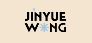
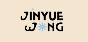
After the winter break, I’m able to obtain a fresh new eye on this project. Therefore, I moved from the chunk logo I created last semester to a more type-based logo, which utilized the elements and color palette from my portfolio website, and designed a new logo that blends in my initials. The color palette I chose for the personal branding is the nude, aerial and black for the primary color.
The base typograph for this logo is called Mendl Sans, one of my favorite font families. I love its boldness as well as the connected joint between each stroke. Beyond the original typeface, I rounded the corner in the joint to match the dynamic vibe of my type design of J and W. I’m still experimenting with the best way to blend the san-serif font into a more art deco style.


