Student Success Tool Logo Update
Welcome back to this journey of designing the logo for the upcoming Student Success Tool that will soon be launched for UT professors to implement in their classes starting this Summer 2021. Last time I posted about this I concluded with a teaser of the theme of this update: shape-based logo drafts. So, after I got that feedback, I started working on the following drafts.
Original Shape-Based Drafts
Note: I started out working with these two because they are the ones with the lower stakes, given that the strongest direction for the logo was decidedly the String Ribbon Reminder route.
Calendar and Target Reminder Drafts
For these I pretty much kept the original idea they were rooted from and got rid of all of the lines. Additionally, I refined the shape of the push pins to be more geometric.
Afterward, Valerie and Bridget (the client) had a chat to settle on one design. Bridget took some of my previous drafts to her project partners to review them. The general consensus pointed towards the finger with the ribbon being the better concept, but that it needs refinements. Furthermore, one concern they had was that though was that if and when the logo got reduced in size it might look like it’s the middle finger, rather than the index. So, to address that, I was tasked to work on the following drafts:
1. A more polished version of the finger logo (and trying to see if tilting it could solve the middle finger issue)
2. A palm-forward version of the finger logo
3. A palm-forward Hook ’em hand with the string
And so, I got to work…
The Failed Shape-Based Batch
I consider these four attempts the failed batch because they steered away from the goal in a major way. But they were born out of a need to try new things. The first two designs with the black background were an attempt at the palm-forward version and the palm-forward Hook ’em hand. I added the black backgrounds to contrast the white hands that would not have been visible with a transparent background over a white page. However, the main problem with those two was that the visual of the hand was not coming through the way it did with the other drafts.
The bottom two drafts were supposed to be a more refined version of the ones above, but they were also not quite as string as they could have been. So, as soon as I came to that conclusion (that Valerie agreed with), I started out on a new batch of drafts.
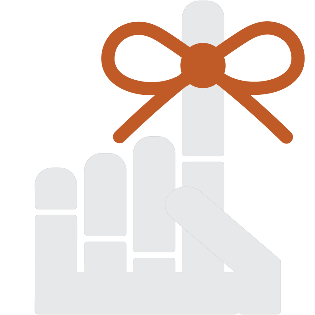
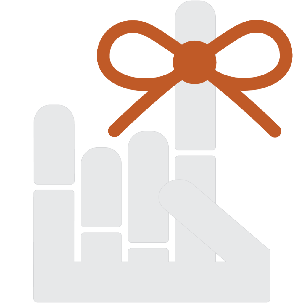
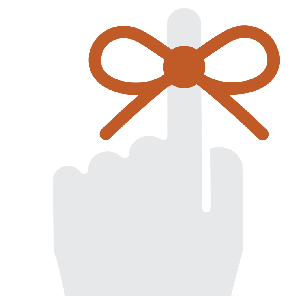
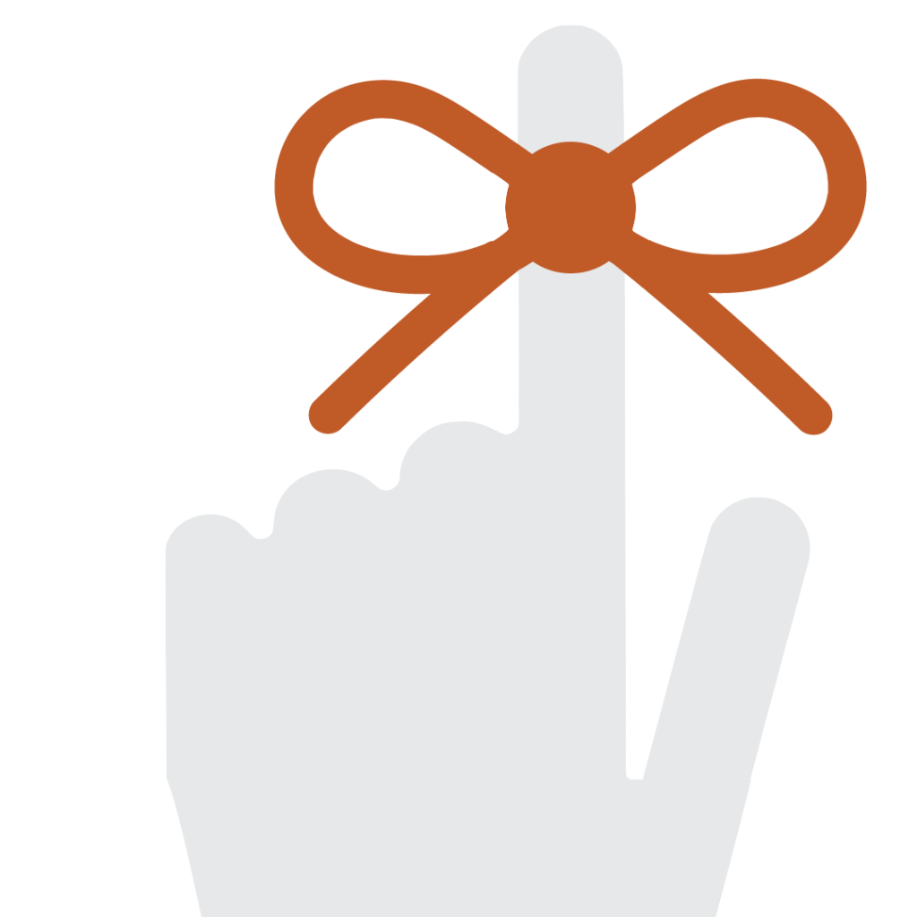
Afterwards, Valerie suggested a more shape-style approach to reimagining this logo, and that’s what I did for the following designs.
Shape-Style Approach Drafts
About an hour after I posted these I got some more feedback, but I haven’t yet have time to work on it. So, more on this on the next update. Stay tuned!


