CHECK LIST DESIGNS
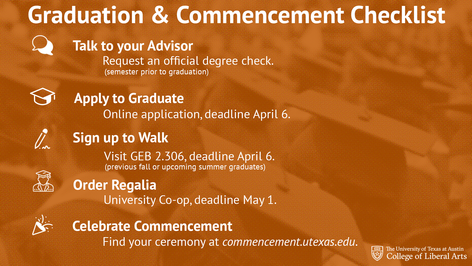
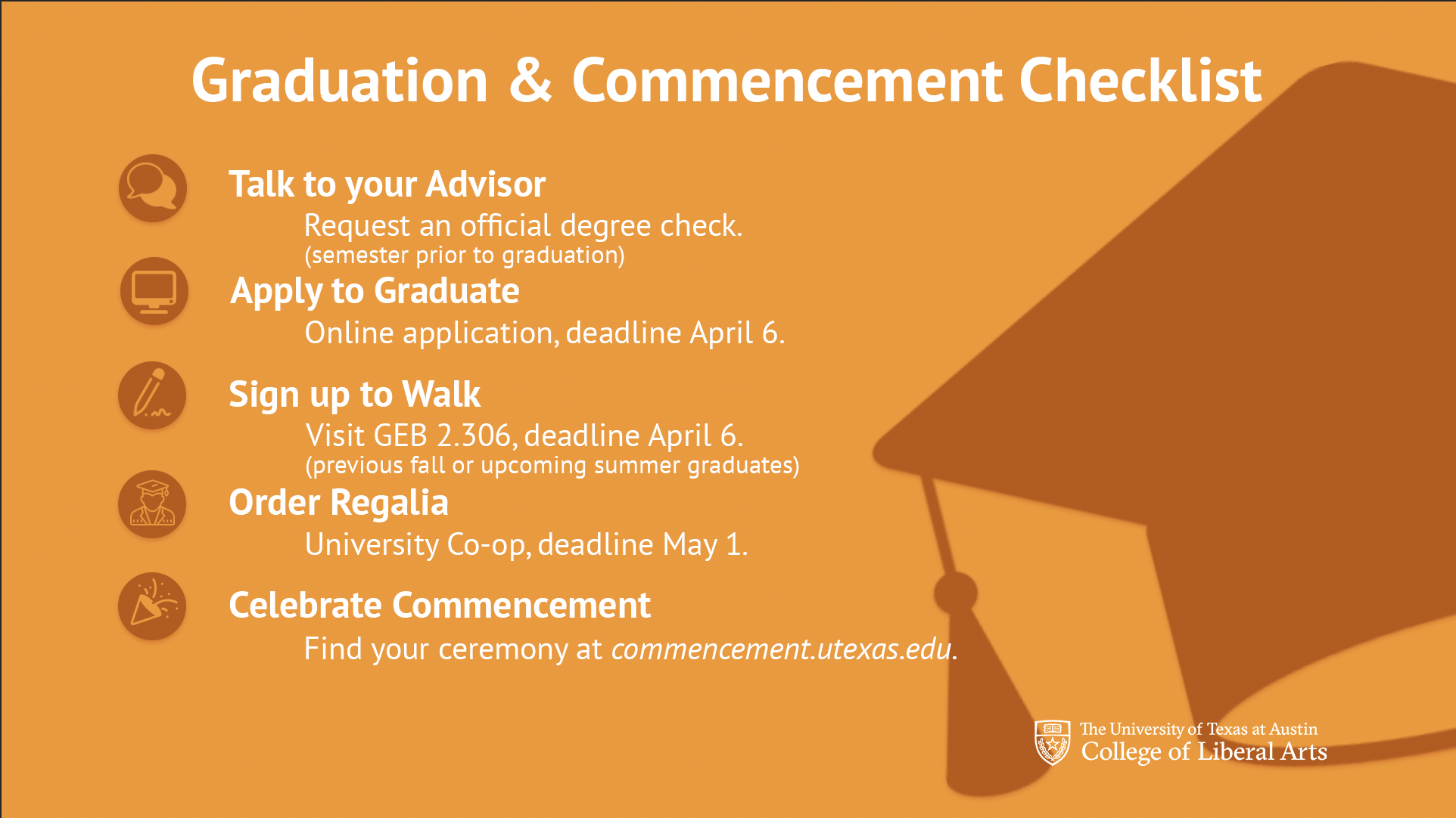
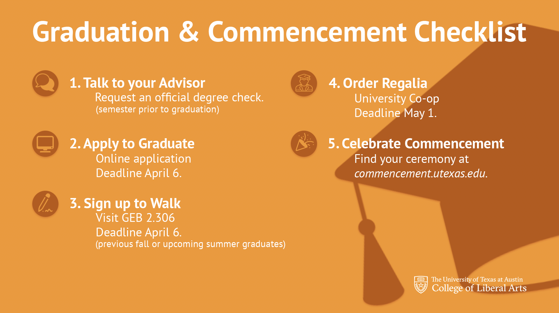
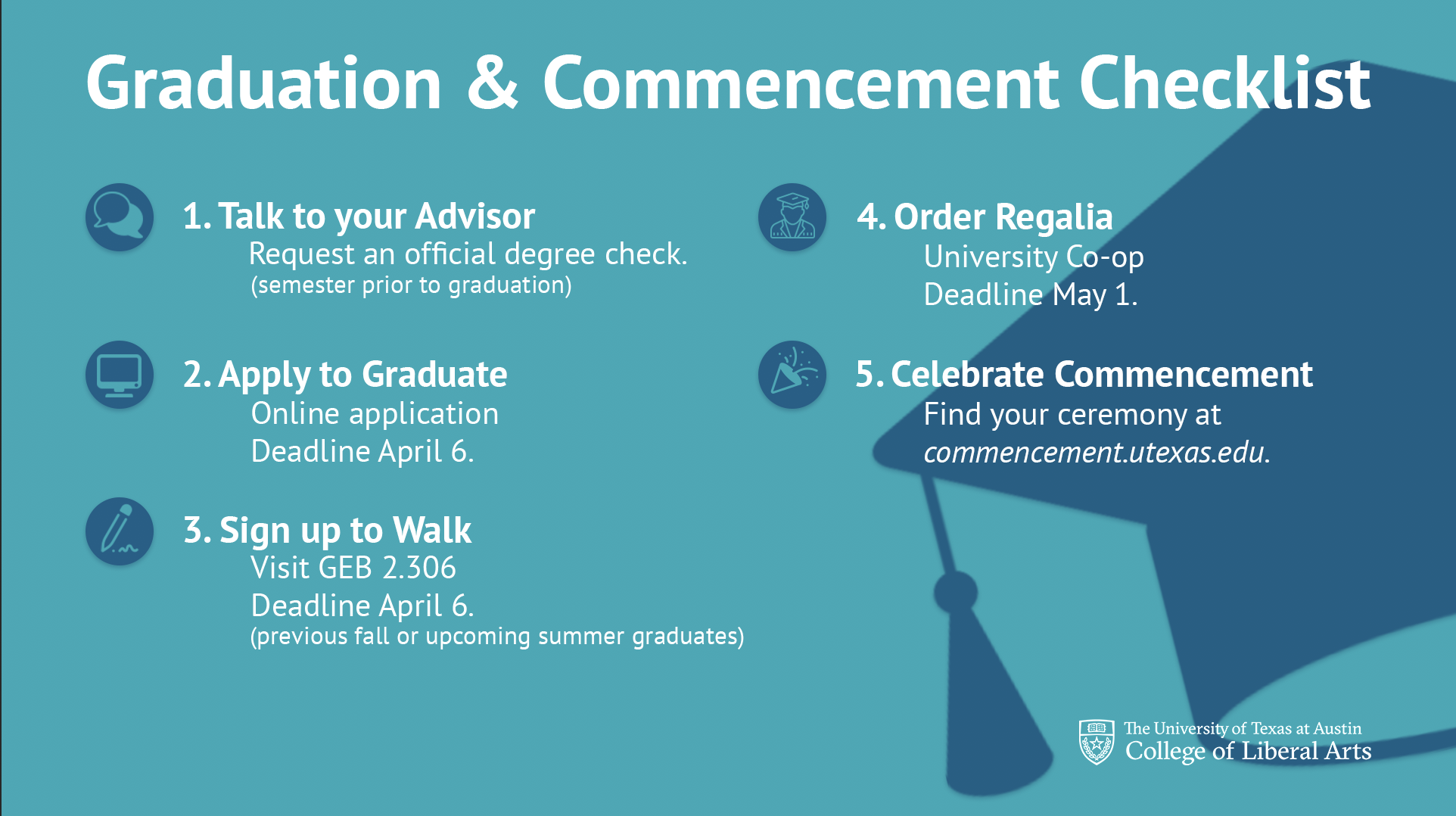
These were the final designs for the checklists that I made. The first one is a design I made before knowing what content would be placed on the image. I did both a serif and sans-serif font and Michelle ended up picking the sans-serif for the design. I met with Suloni to talk about more directions this could take and she made suggests which led to the last 4 images below. A flat bold graphic design with both a double column and single column layout. The colors are of the primary and secondary UT orange and navy blue. I got my icons from a non-copyright source and edited them to be placed within solid circles to balance out the darker colors in the image. The Liberal Arts knock-out image was added at the end which in turn led to a need to re adjust spacing throughout the entire text to accommodate for it. Overall I think the project had a good outcome with the blue single column as the final choice (which was my favorite as well).


