More on HDO 301
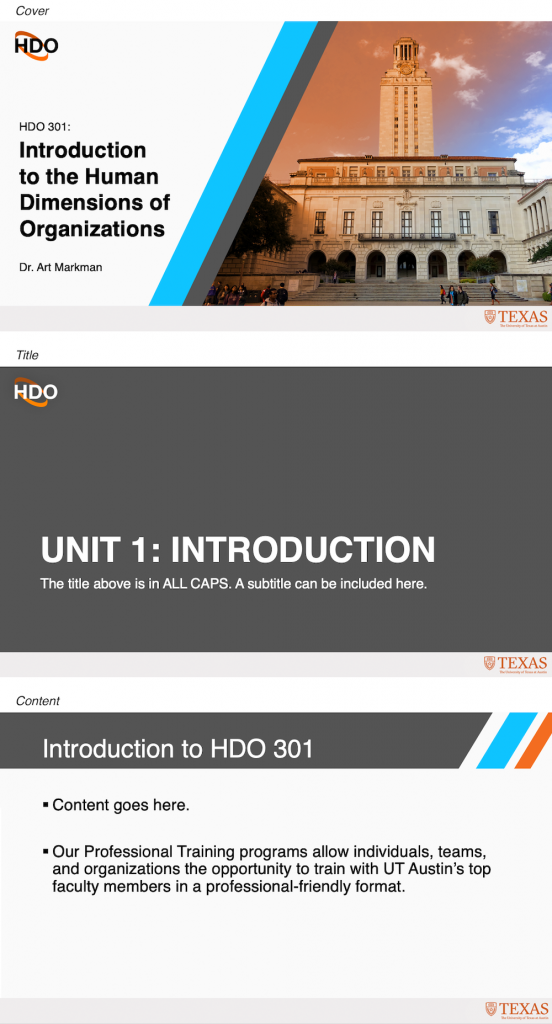
I’ve made a lot of progress since my last post on HDO 301 assets. The design parameters for this project included using the HDO branding, including logo and the orange, blue, and dark gray. It also needed to be clear this is UT affiliated, in case any assets are ever shared out of context. For this type of course, since the content is business-adjacent, I decided a professional and simple design style works best. Overall, I’m happy with the final look.
The Powerpoint slides, which I’ve shared before. The more I look at it, the more I like the image I chose of the tower with people walking under it to represent human dimensions of organizations.
To make it easier on the professor I learned how to create Powerpoint templates so they are able to input their content without worrying about formatting. 
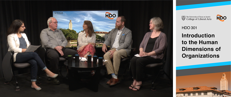
End card to play at the end of class:
Lower third card, I was surprised how well Photoshop got the job done animating this:


