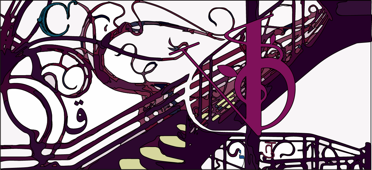
Update for Comparative Literature banner. I wound up using purple as the central color for both of the designs, but I may change the coloring later. I’m still doing some clean up work to make the curves smoother when I end up livetracing them. Most of the clean up needs to happen in the center and with the stairs.
For the first design, there is the problem of making the letters pop out without making them too different from the rest of the design. For both designs, the letter V should be integrated into the staircase but I have not been able to come into the office and work on this since last week. I am still not sure how to incorporate the rest of the letters into the designs.
Both of these are still drafts and require further work. I may wind up discarding both and working more towards incorporating more art nouveau detailing into the design and framing the letters with those details, as Suloni suggested.

