Week XLVIII
UTFC – Green Screen: 5.4B Getting Around Town List
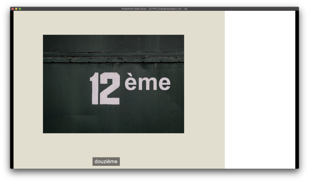
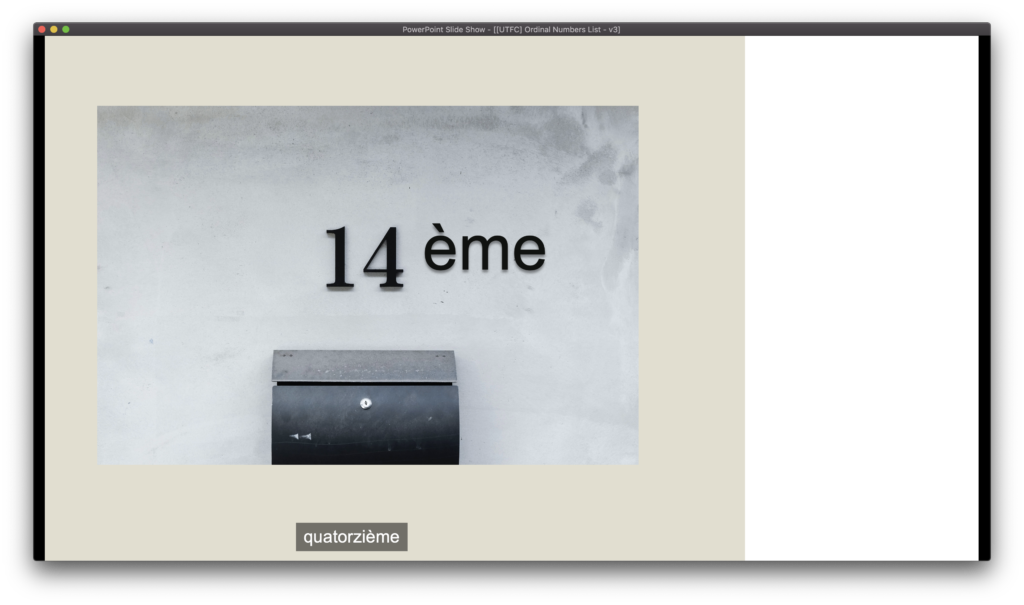
Most of this week was spent on the poster, but I did rework some older slides to have a number graphic and a superscript suffix after them. I tried to find stock photos with the numbers in them, and match the style.
Fall 2022 STA Poster
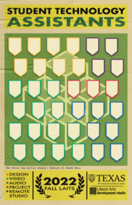
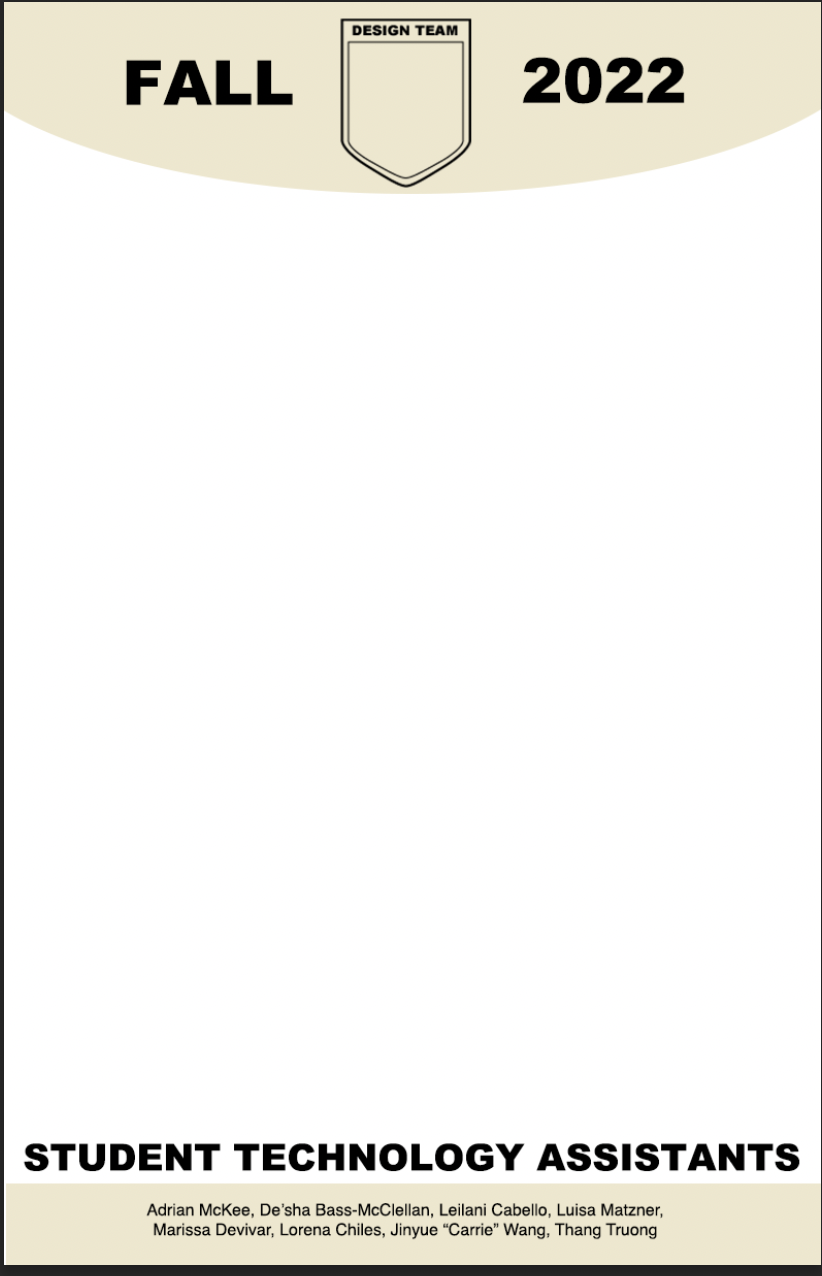
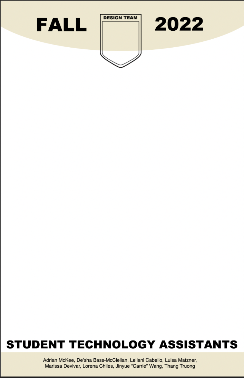
I started this week with a template (the top and bottom bars) and a late-submission photo, bringing the total from 13 to 14 figures to fit into this more limited vertical space somehow. My first thought was: shrink everything and do a simpler 2-legged zig-zag.
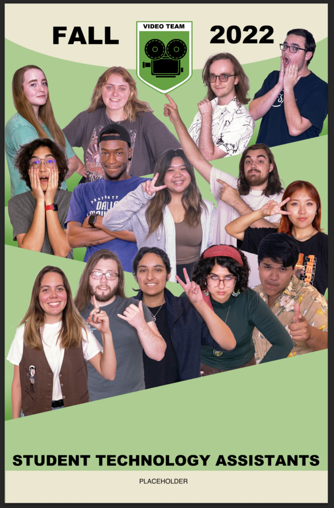
Because of the large amount of empty space, De’sha suggested I try something closer to the older zig-zag with 3 legs.
.Scrunching it up vertically actually made it somewhat more difficult to discern. I decided to try maybe…
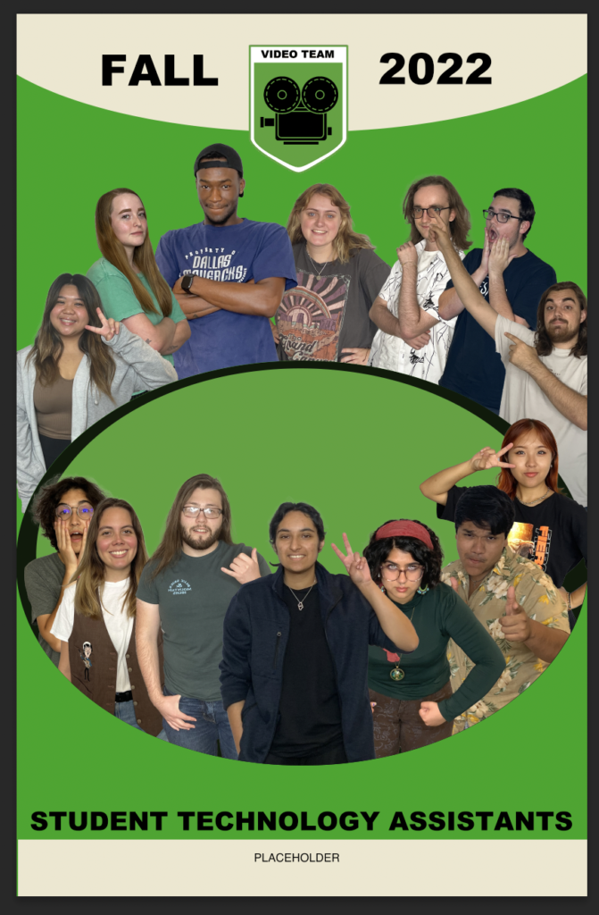
A gradient shadow between the “wedges”? But there’s so little space between the STAs that it’s still barely visible. Then I started getting really crazy. Circular layout?
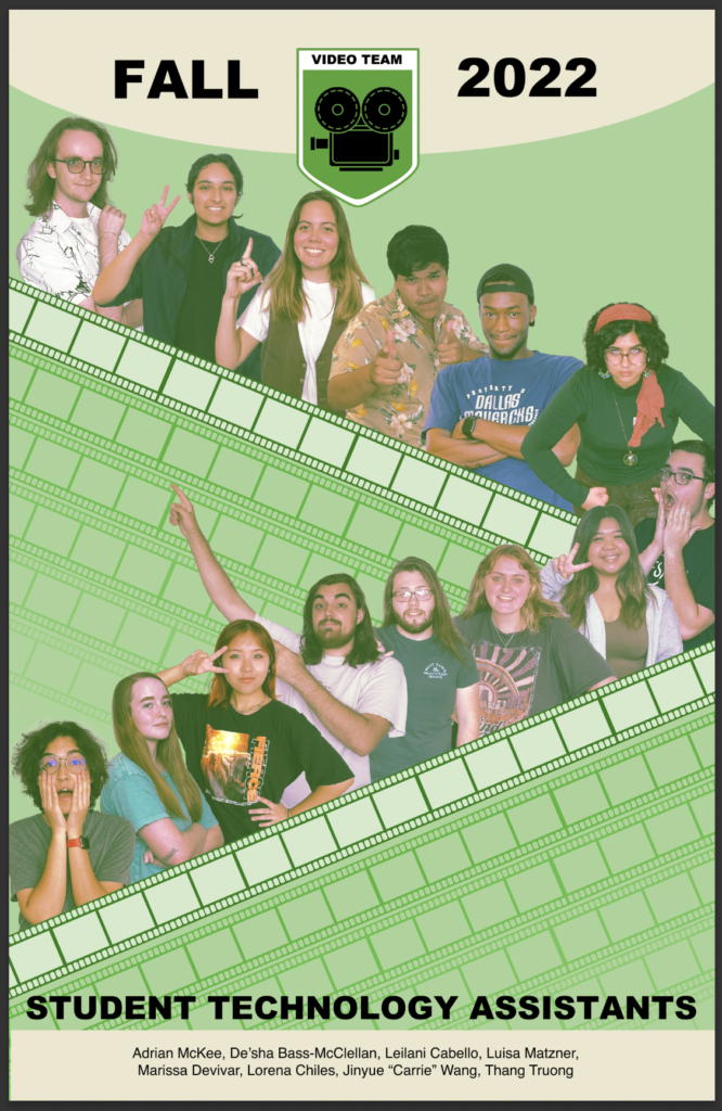
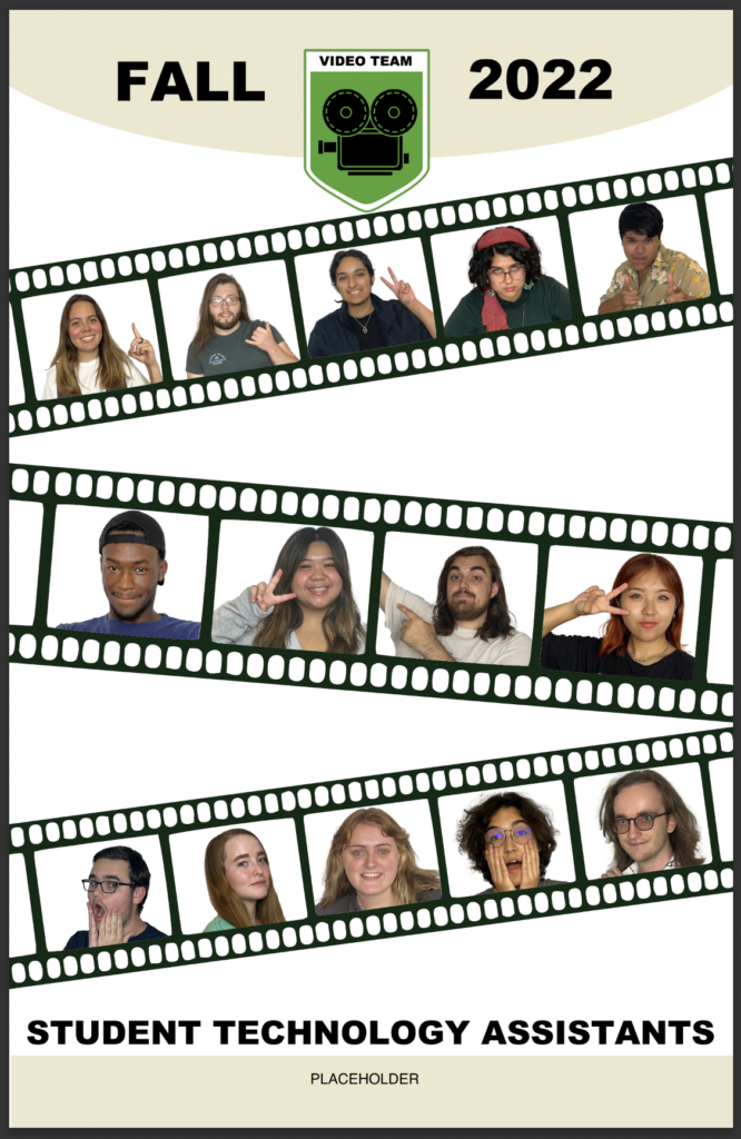
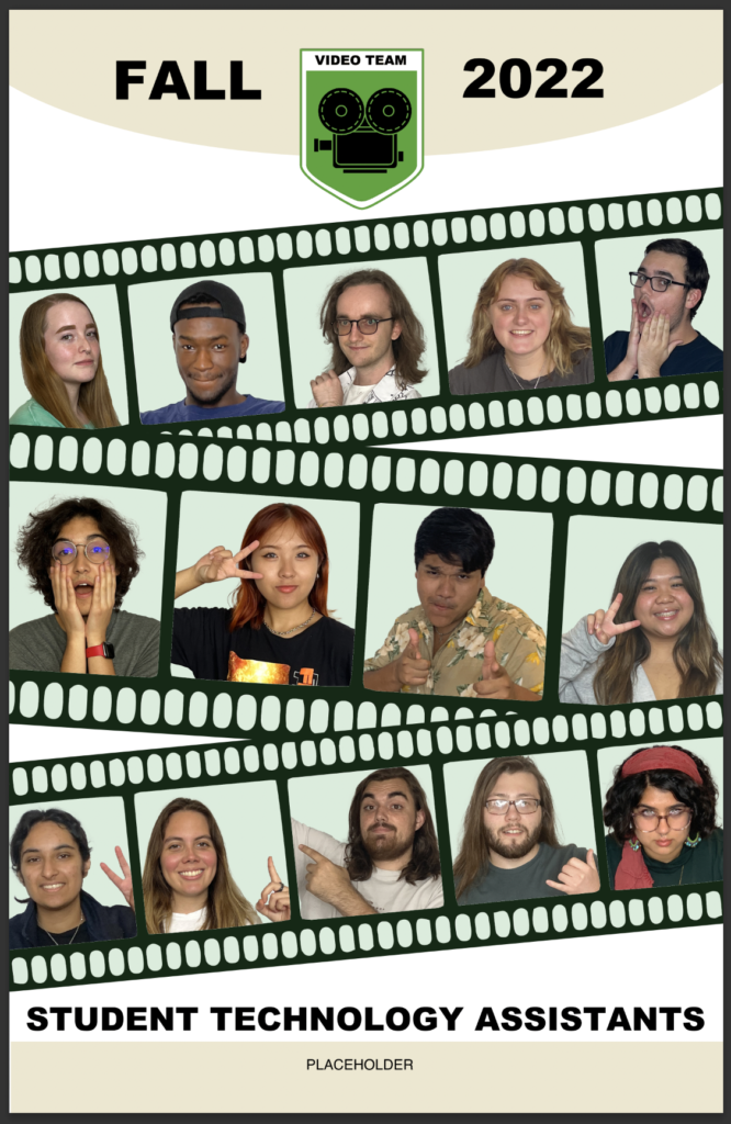
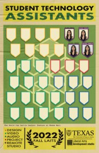
De’sha suggested making larger film strips and putting the photos inside, but my first attempt was too small and inconsistent. This was a bit of a process, with creating a useable vectorized film strip and cutting the photos out individually.
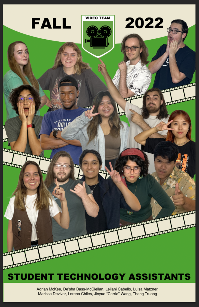
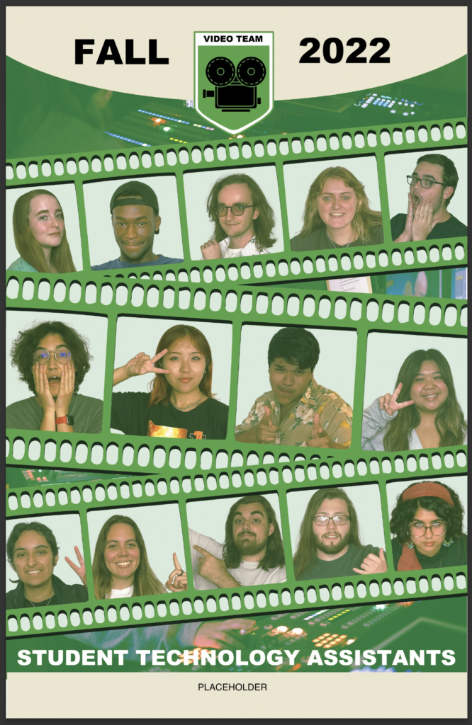
The next one was a little better, at least I think so, because I’m still waiting on feedback for it as of writing.
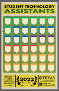
The layout itself has been the most time-consuming thing, so I’ve avoided touching the color scheme too much for most of these drafts, but this one gave me some time to actually test some stuff. I’m trying to keep it limited to the basic colors still, but give it as much flair as I can.
