UTFC 5.1B Pronominal Verbs List
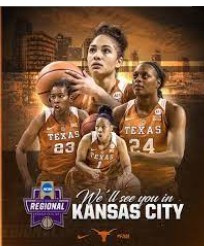
This week I assisted in some edits on a PPT slide deck for the UTFC project. I just had to locate replacement images for certain slides:
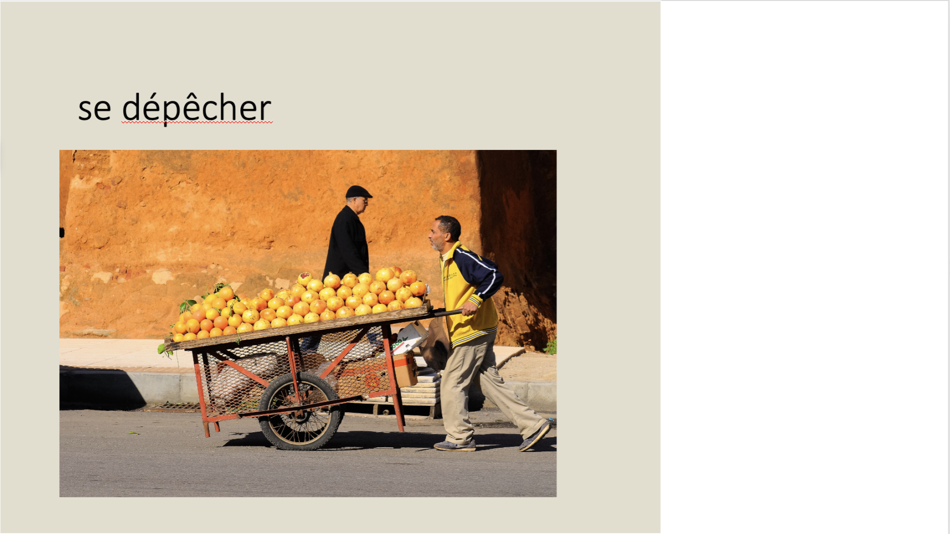
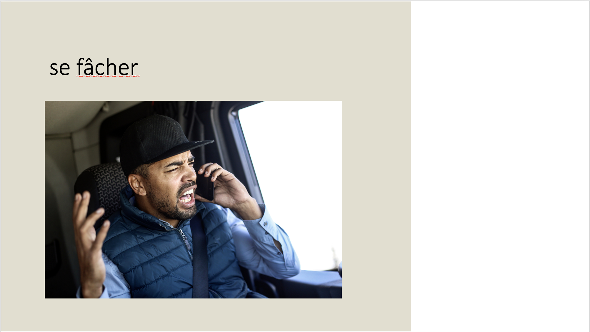
This week I assisted in some edits on a PPT slide deck for the UTFC project. I just had to locate replacement images for certain slides:
Completion status: started on September 20
STA team members: De’Sha and Leilani
To be completed: TBD
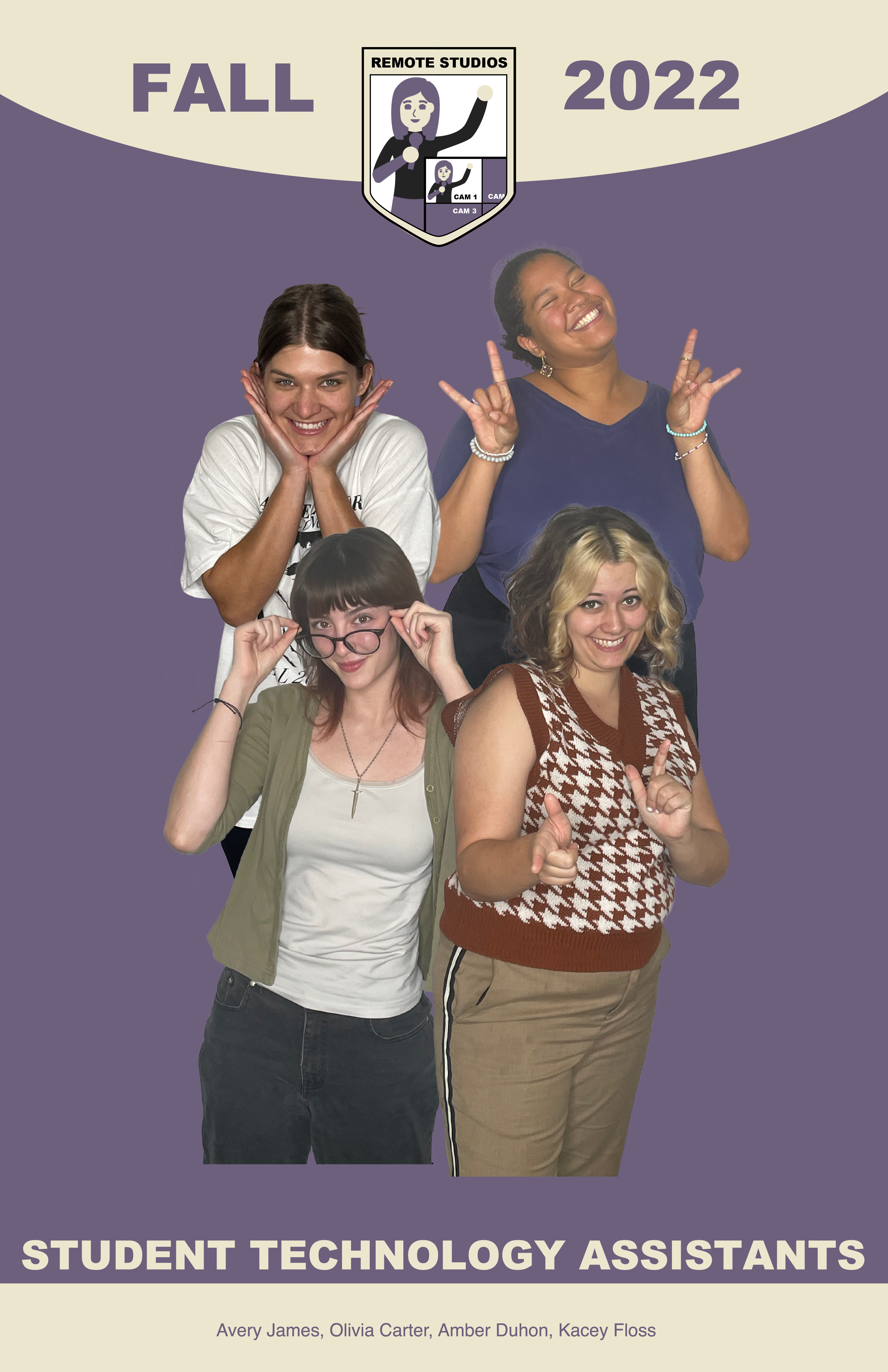
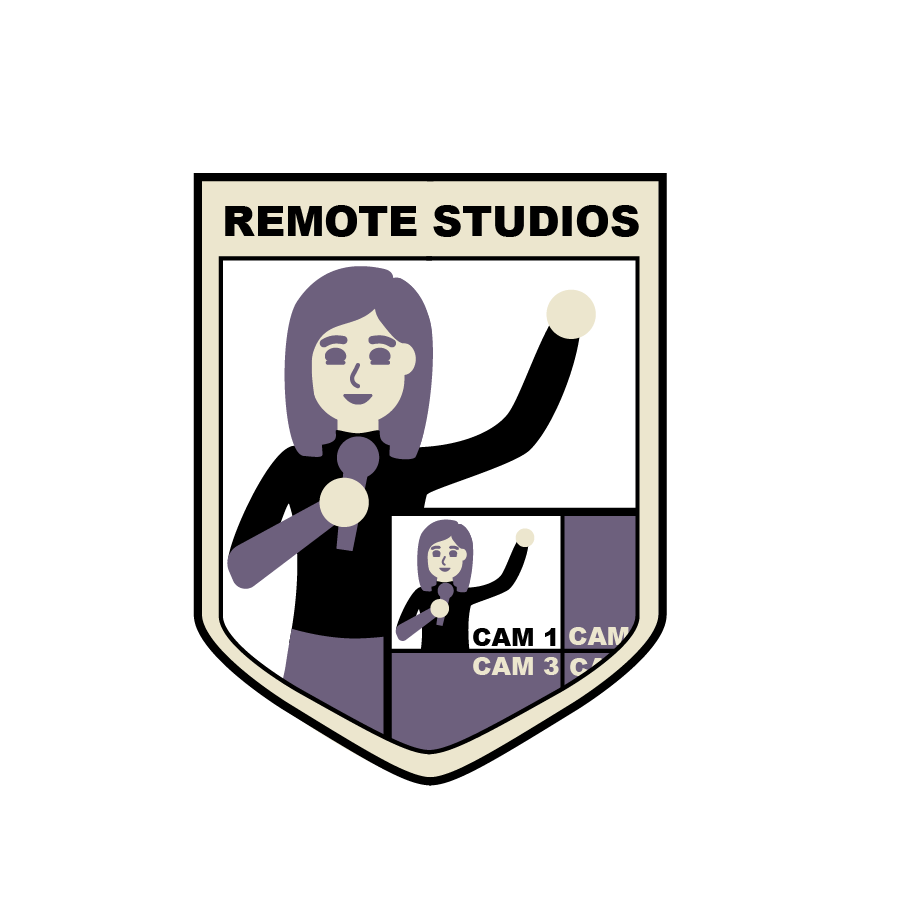
Last week I mainly worked on the Remote Studios poster/logo; I updated formatting to match the other STA poster designs.
Both of the following designs are still very much in progress, will be working on this more soon!
Completion status: started on Sept 29
STA team members: De’Sha and Leilani
To be completed: Finished on Sept 29
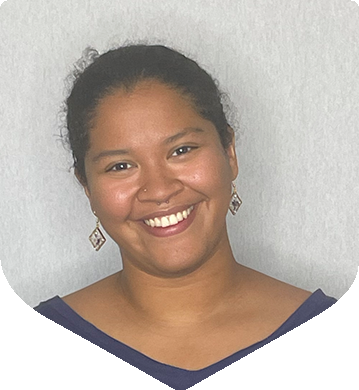
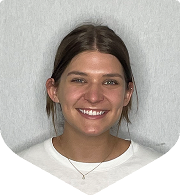
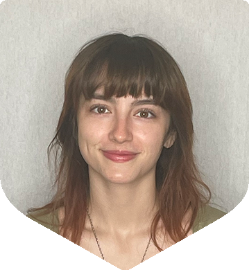
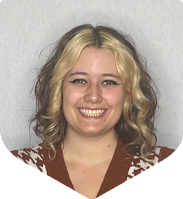
Last week I also helped resize some of the STA portraits in little shield shapes for the main STA poster. Shown below is the Remote Studios team, but I also did part of the Audio team. (note: it seems that these images have harsh lines at the bottom, I think that’s just how they uploaded to WordPress since the original exports were not like that)
Completion Status: Started on September 22
Staff Guidance: Maddy
To Be Completed: September 27
Continuing the project from last week, I converted to the print file types and also made the black and white versions (print and digital) of the stacked and horizontal logos. Here’s the black versions, the white is a very similar.
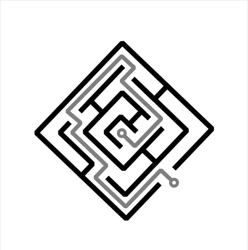
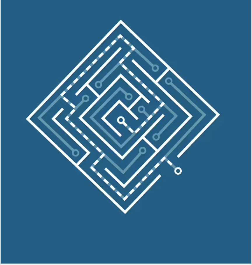
project: Planning, Search, and Reasoning Under Uncertainty
Client /Prof: Joydeep Biswas
completion status: Started September 28th
staff guidance: Maddy
STA team members: N/A
description/plans:
For this part of the project, I was instructed to create the logo for the course that will later be animated.
To be completed: October 21st
Initial Draft:
Next Draft:
Final Feedback:
Next Tasks:
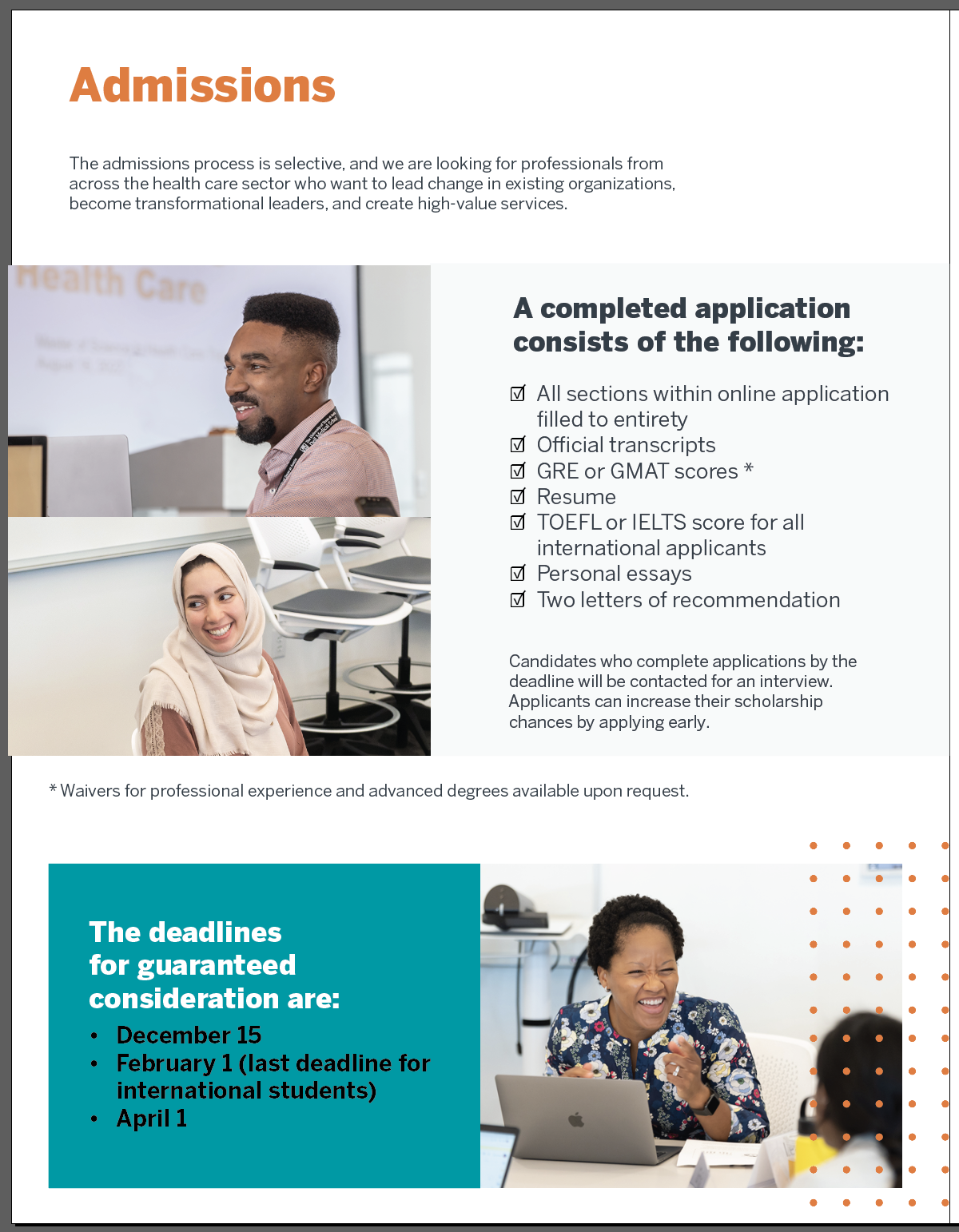
This week, I primarily worked on the Value Institute Brochure. It’s beginning to come together as a print composition, which is exciting. I’ve met with Maddy over the last few days to iron out layout details. It’s been challenging to find ways to improve the existing brochure, since it’s already such a strong piece. I’ve also gotten to think about things I usually don’t think about when designing, such as paying minute attention to the cropping and positioning of photos. It’s definitely been a learning experience.

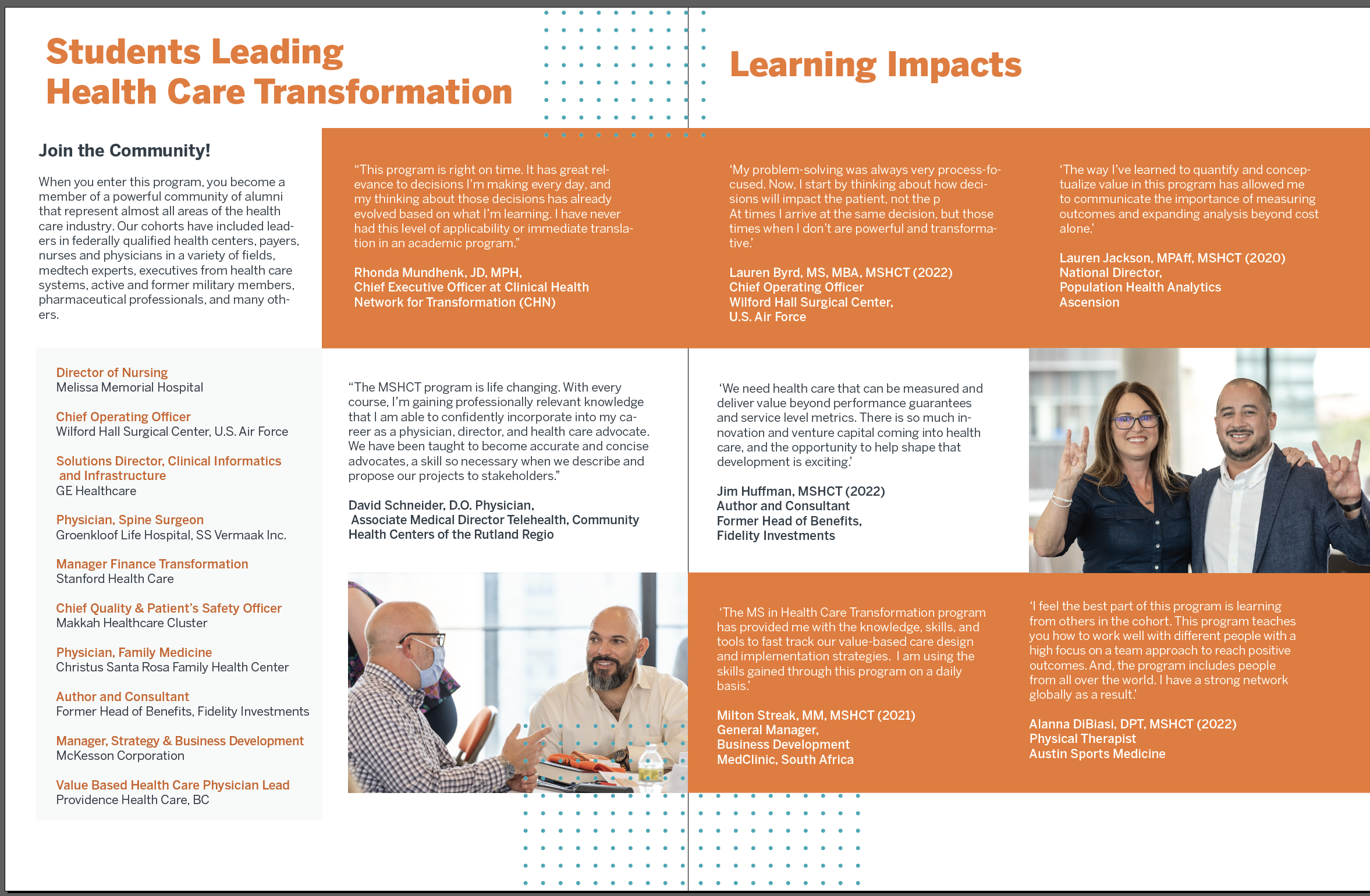
Another aspect of the brochure I’ve been working on is how to incorporate the colors for both Dell Medical School and McCombs School of Business without overcluttering the palette or losing the core UT identity. This has also been a challenge, trying to balance Dell Med blue with McCombs yellow with the quite overpowering burnt orange. Here are some examples of color work on the Admissions page.
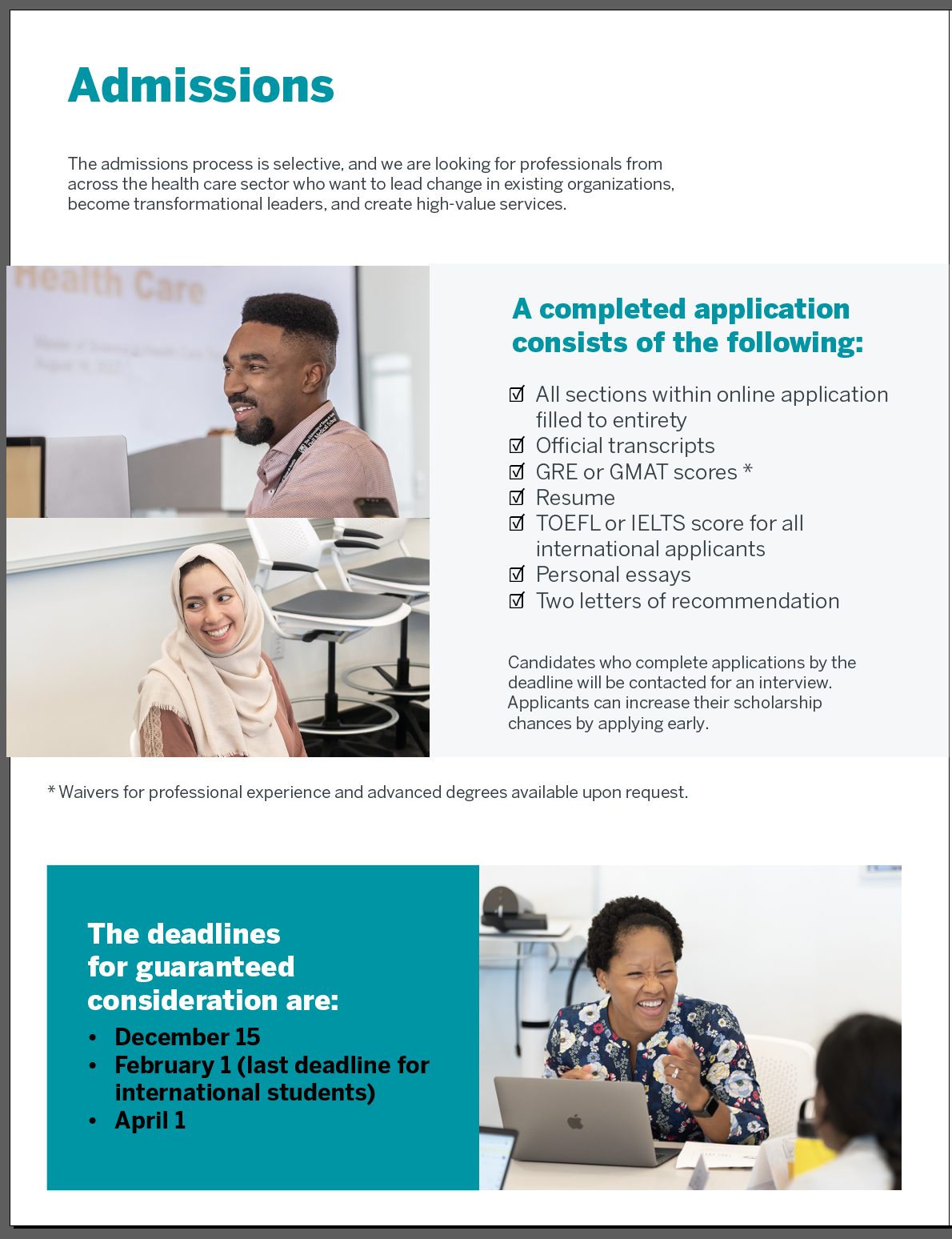
In between working on the brochure, I’ve also made edits to the project team STA crest, going off of De’sha’s amazing feedback! I was doing a bit of research on heraldry for a personal project, so inspiration and visuals from that crept into my design. Now, the design has mostly been finalized, and I’m just working on the finetuning.
Week 4
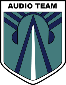
AUDIO TEAM CREST
(9/27 – 10/3)
These past few weeks have mostly been filled with working on the Audio team’s STA poster and crest. In the beginning, I felt a bit lost (and overwhelmed) since there was a lot of creative freedom left up to me. However, after each feedback comment, my designs improved, especially after seeing some of the other STA’s work.
At first, I was more focused on creating a crest that vaguely alluded to the idea of audio but I soon realized the design needed to be more explicit. After we received more information about the color palette, template, font, etc. I made another crest that included feedback from De’sha and more clearly displayed “audio”. After receiving feedback again (VERY HELPFUL) I made a crest that spoke more to the job of an Audio STA (audio engineer).
Now looking back on my first attempt, I am very thankful for the critiques/feedback that I received. Each time I redesigned the crest, it improved very much. I still have to finalize the crest, but hopefully, this design is good to go:)


AUDIO STA POSTER
Although the Audio team doesn’t have a ton of STAs, the fun poses that I wanted to include made the poster seem “crowded”. De’sha gave me some help by suggesting to mirror similar poses and create an overall shape with the pictures. I still need to implement the feedback, but this is the draft I had before receiving it.
Draft:
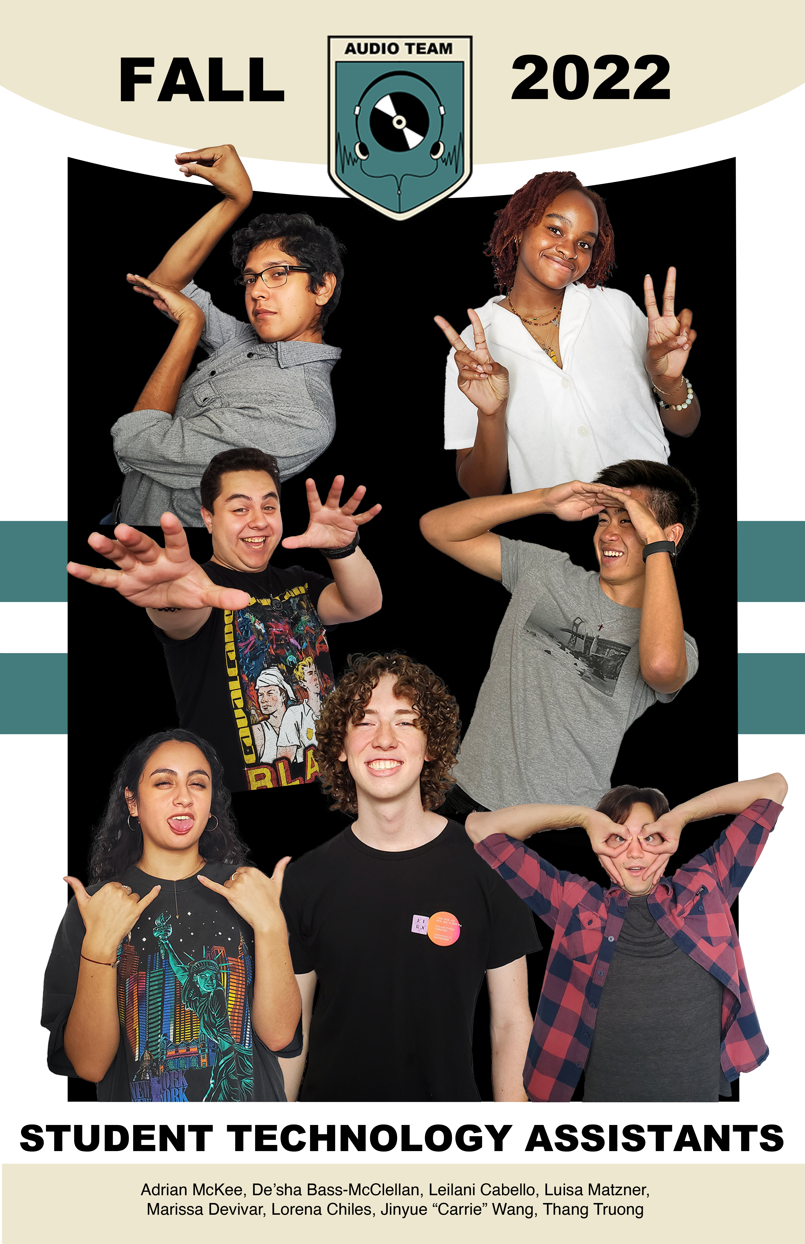
Inspo (for feedback):
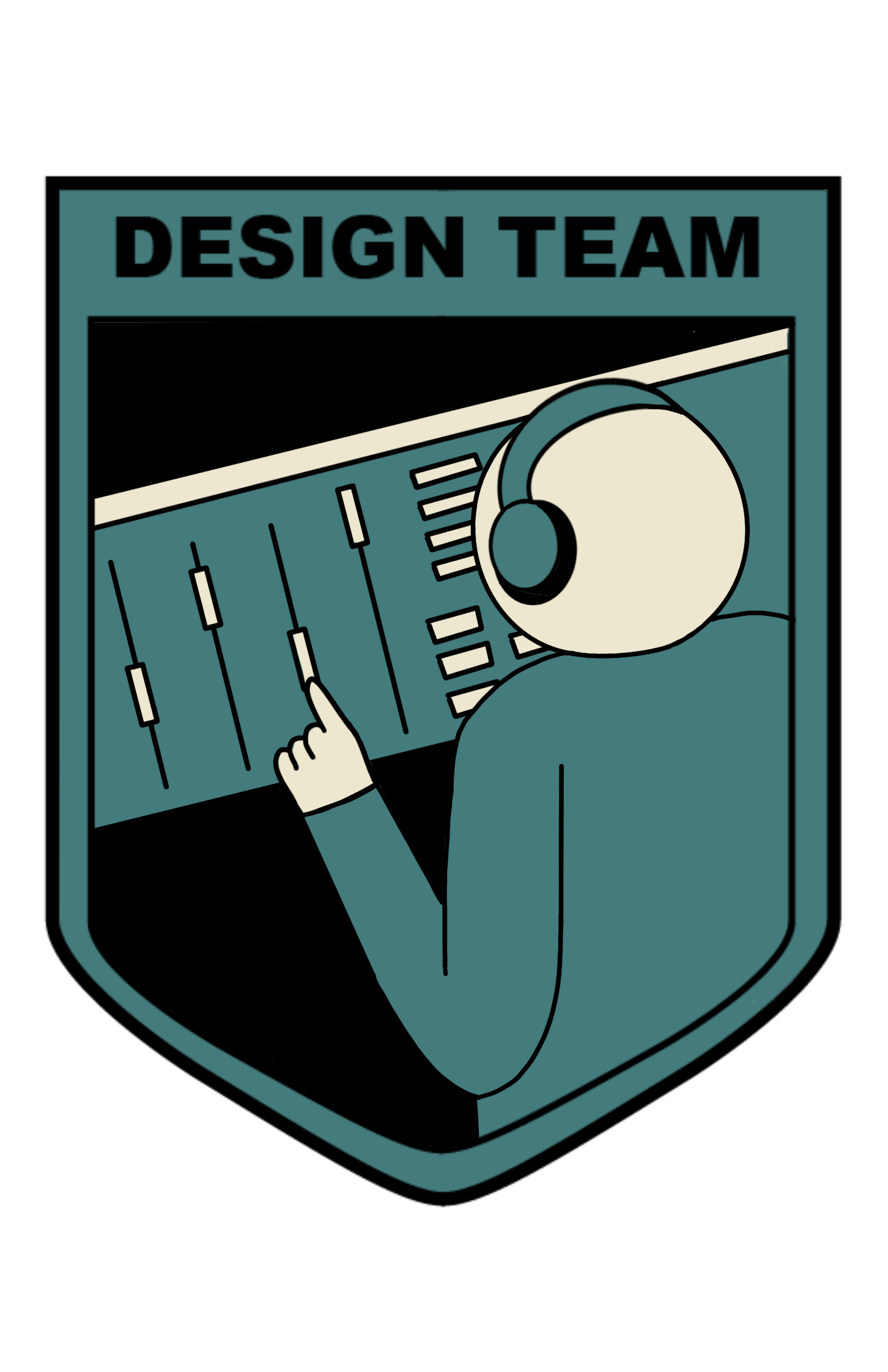
Project: STA Design Team Poster
Start: September 13th 2022
To be Completed: September 29th 2022
Staff Guidance: De’sha and Suloni
This week I worked on the Crest design for the STA design Team. Starting from the previous sketches, I decided to keep the cursor-pen tool elements and add more direct coding and design icons to the crest. In procreate, I created a figurative web character with its pen arm who try to picture the daily tasks of our designing and coding tasks.

Suloni suggests me to add more coding elements such as {</>}, {…}, and {js} so I decided to create a window for typing coding language with the text box from design software.
However, when I put the crest into the poster, the tan shield and broader fade into the poster background and the complicated designs are invisible and messy at the top. So I get rid of the eyes and arm of the global to emphasize the pen-cursor and simplify the overall feeling. Here is the final version:
For the poster, since we are no longer being literal with the soccer world cup theme so the trophy in the middle of the poster was moved. Quote from De’sha: “Even though as designers we work on separate projects, collaboration is key. How can you position the poses where we are connected as a team?” I decided to use the shape of the stroke to connect everyone together. The strokes would start from one STA and lead us to another STA.
I add the spark in the background and typed in several coding languages to make the vibe. Regards to design elements, I placed the brush tool icon and eyedropper icon undernead Fall 2022. After cooperating with the crumbled paper effects, here is the latest version!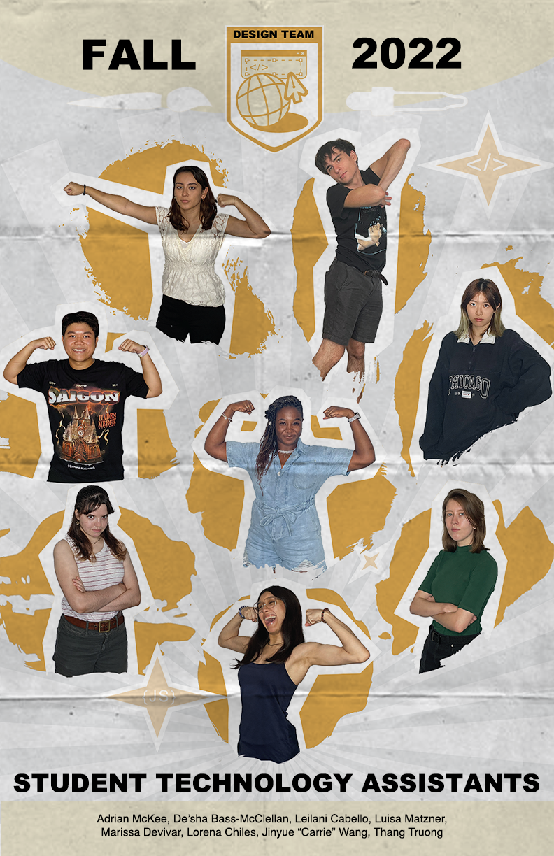
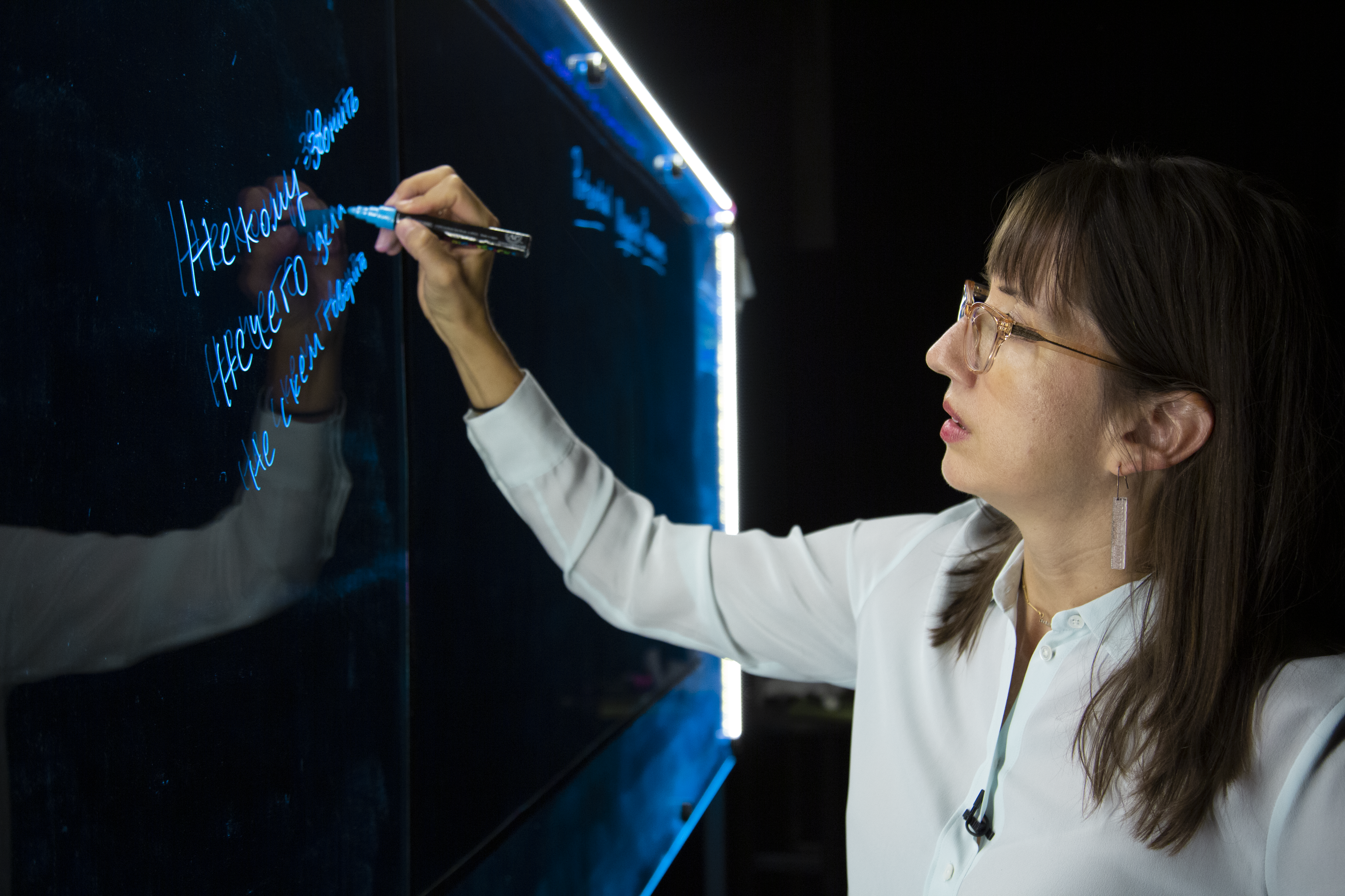
Project: Online Course Photo edit
Start: Oct 3th 2022
Completed: Oct 3th 2022
Staff Guidance: Maddy
Maddy asked me to edit this photo to reduce the yellow tone on Dr. Rice by preserving the blue board and neutralizing the yellow light on her. I adjusted the temperature, tint, and color mixer, as well as little change in vibration and saturation.

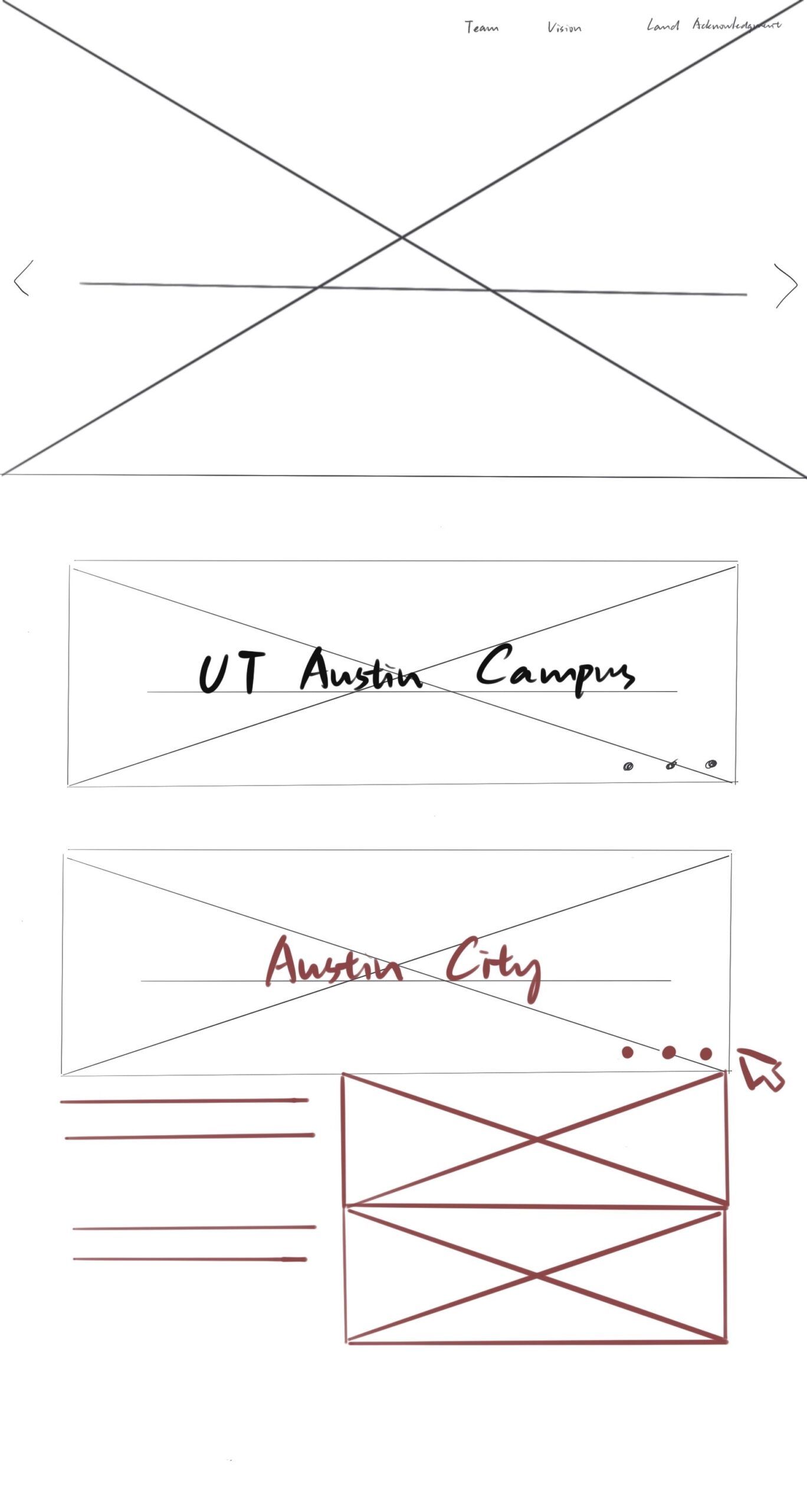
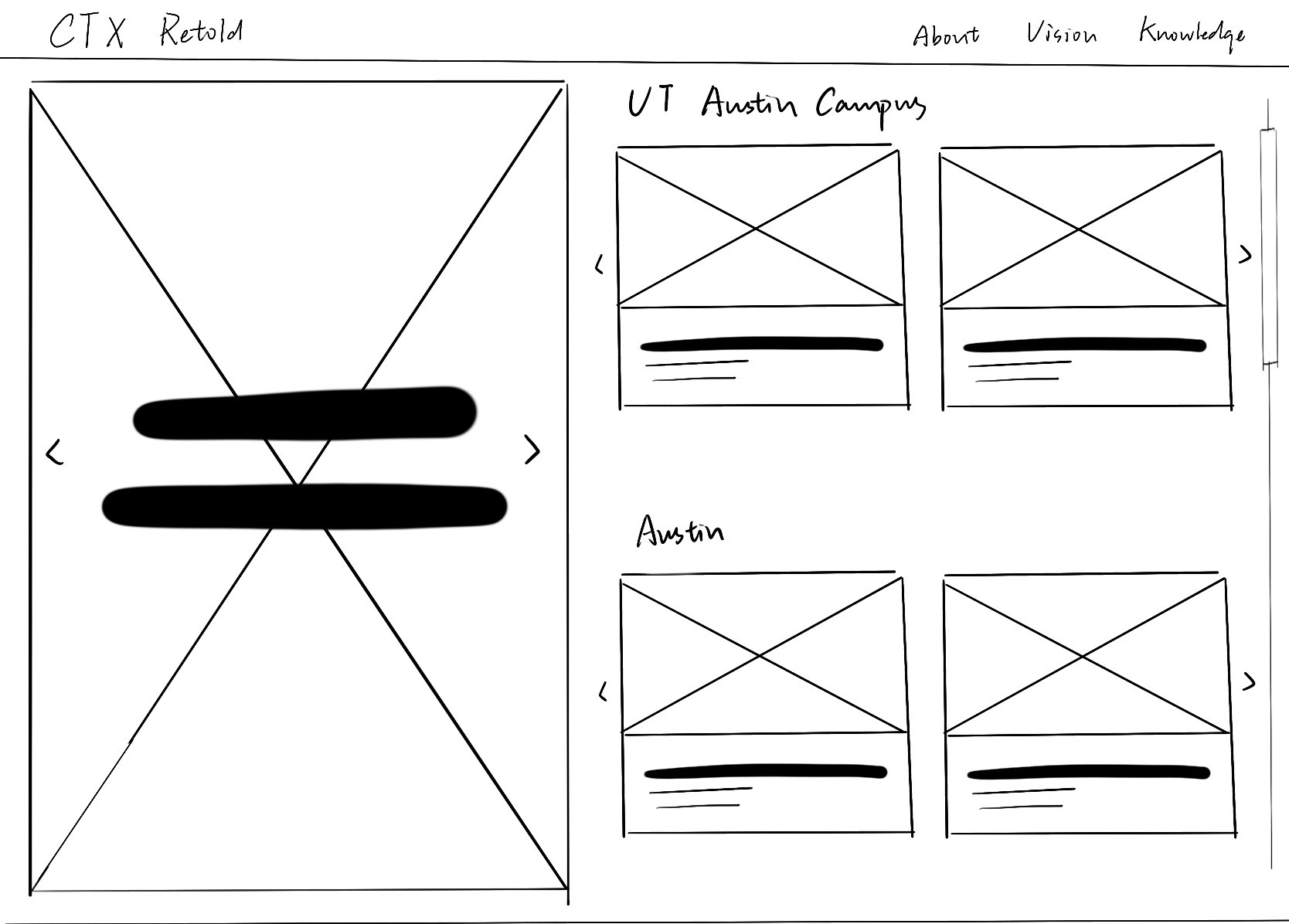
Project: CTX Retold
Start: Sep 27th 2022
To be Completed: Mid Oct 2022
Staff Guidance: Maddy
For the CTX Retold project, we decided to organize the homepage by geography in the categories of Campus, Austin, and Central Texas. We also want to preserve the minimalist and modern aesthetic style of Dr. Gordon. After browsing the current CTX Retold website, I found the efficient way is to only show the geographical locations on the main page and hide the sub-cards after one click so it’s clean overall. The red section represented that stimulation is needed to show part of the content.

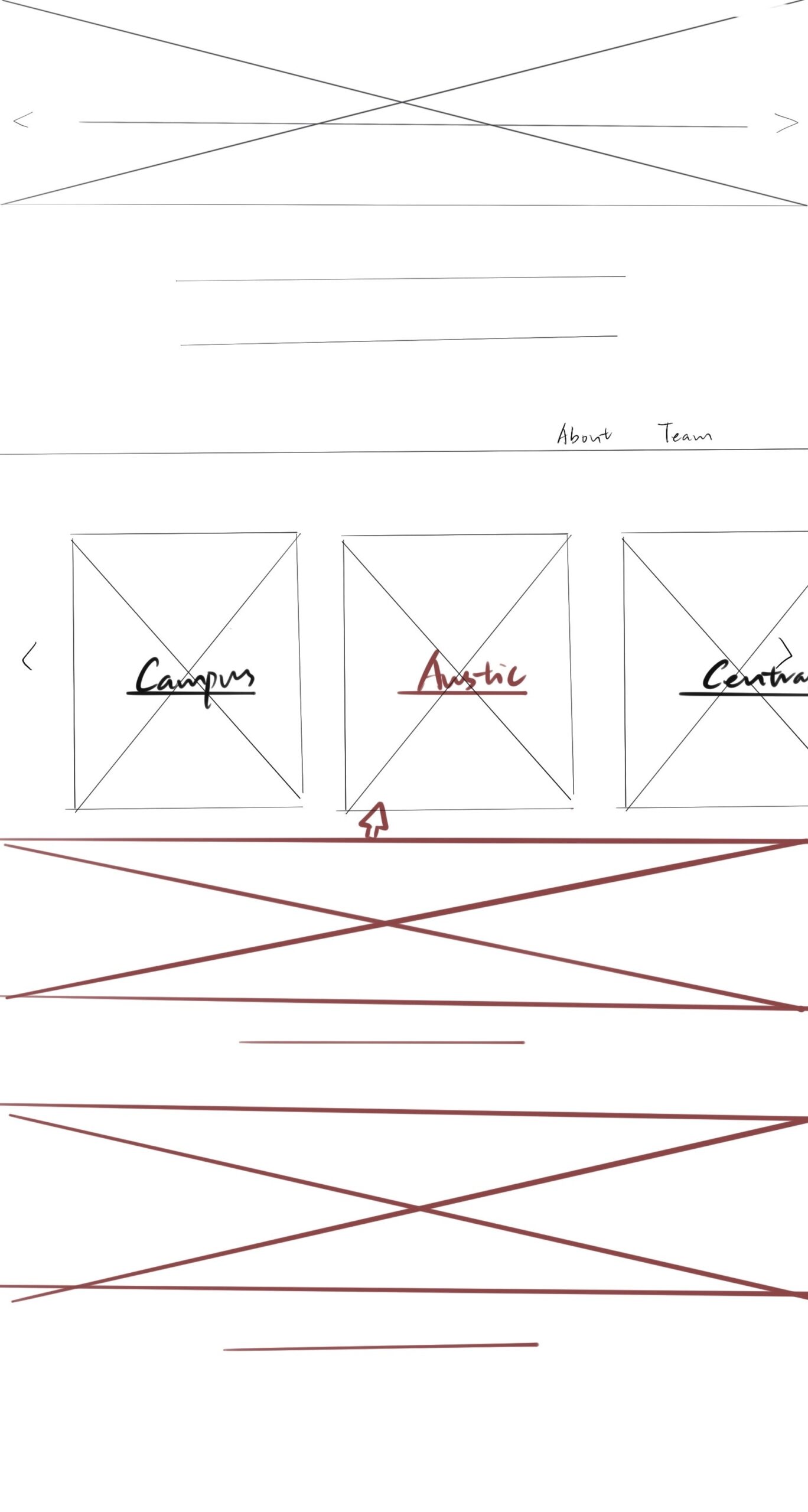
I also try to develop an iteration where the projects are not hidden behind a click. It helps improve discoverability since users may not realize something is clickable, and it is “one less click”. Regards to the possible future cards, I add the slider arrows on the side for enough flexibility. Also, this way I display text underneath instead of color overlay so readability is enhanced.