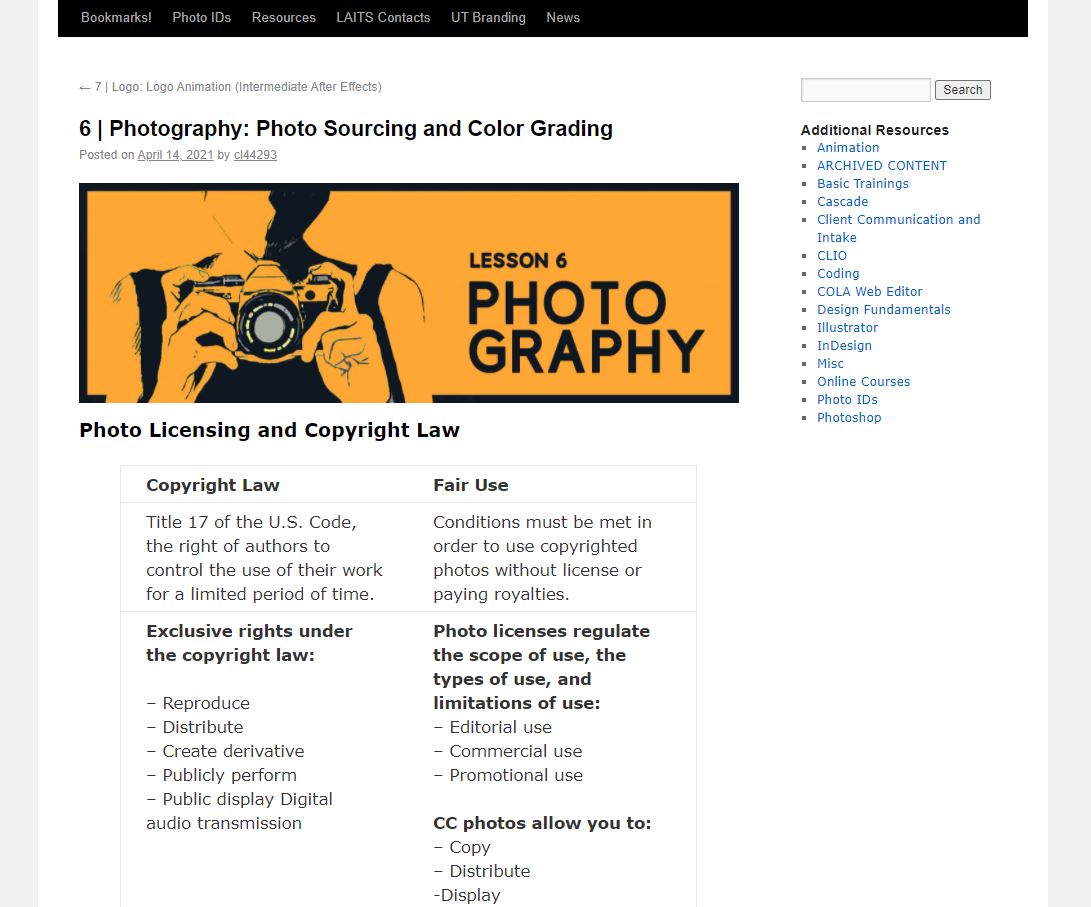
Lesson 6: Photography
Megan and I did some research on photography earlier in the semester for our STA course program, and I finally had time to put those information together into a KB post.
Some of the topics we researched:
- Photo licensing and copy right law
- How to source CC photos
- How to pick dynamic photos
- Resolution and resizing photos
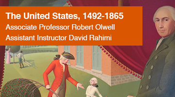
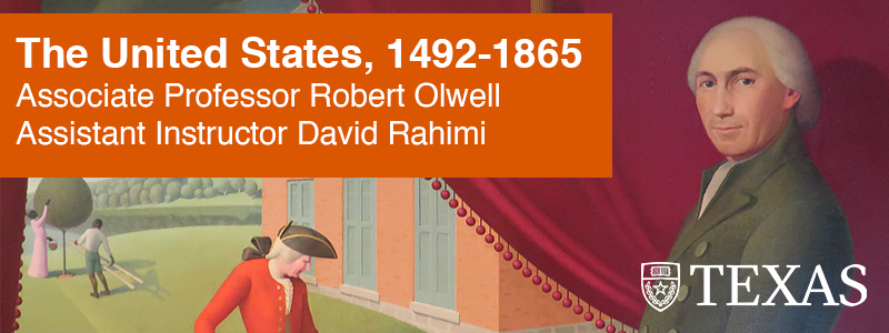
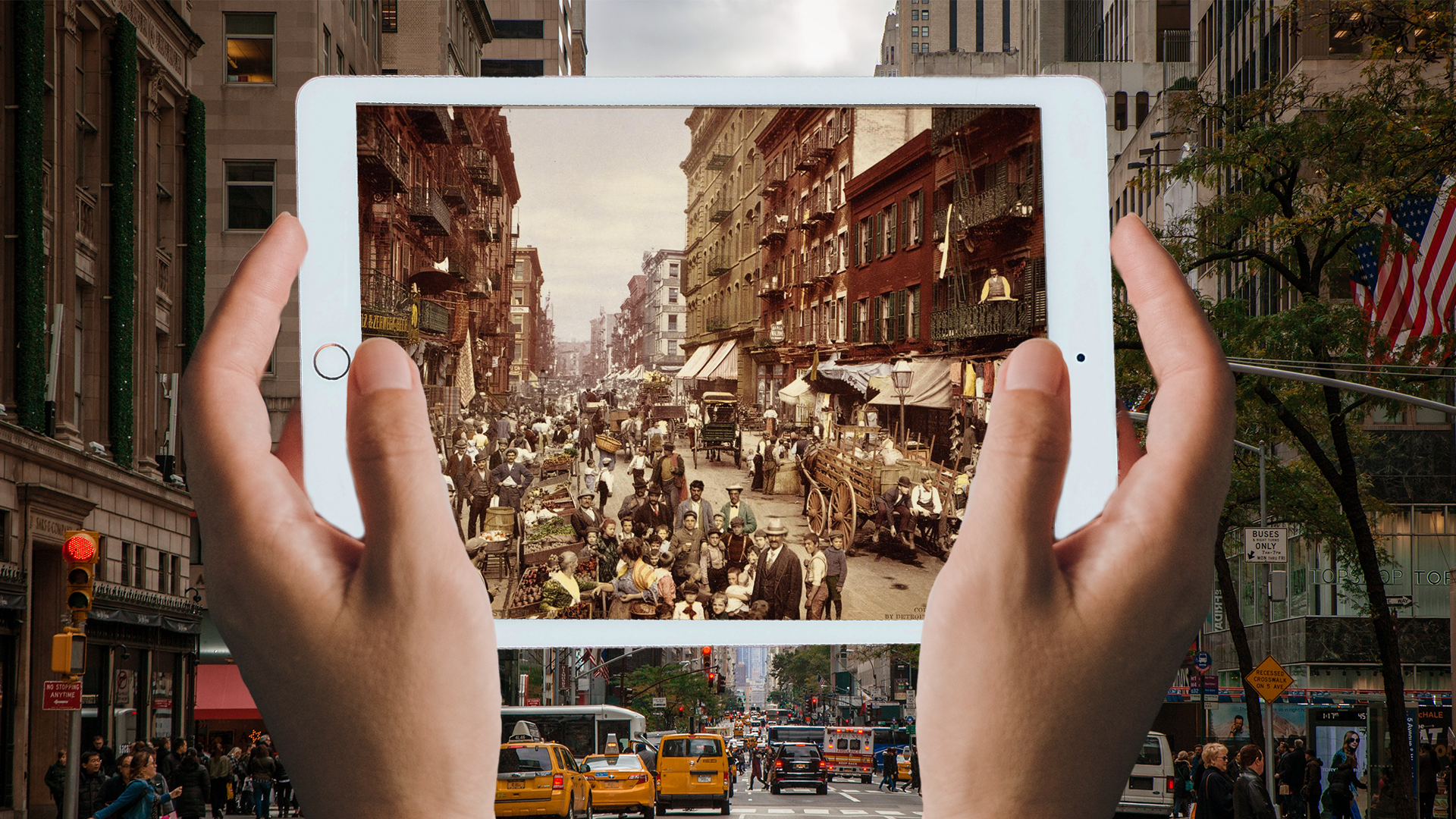
I also created a short color grading activity and a banner for this module. http://sites.la.utexas.edu/kb/2021/04/14/lesson-6-photo-sourcing-and-color-grading/