Not much to talk about this week as this is the only day I’m working this Thanksgiving week :^(
However, I had my eval meeting today, and here’s what I have so far for the InDesign training!
Not much to talk about this week as this is the only day I’m working this Thanksgiving week :^(
However, I had my eval meeting today, and here’s what I have so far for the InDesign training!
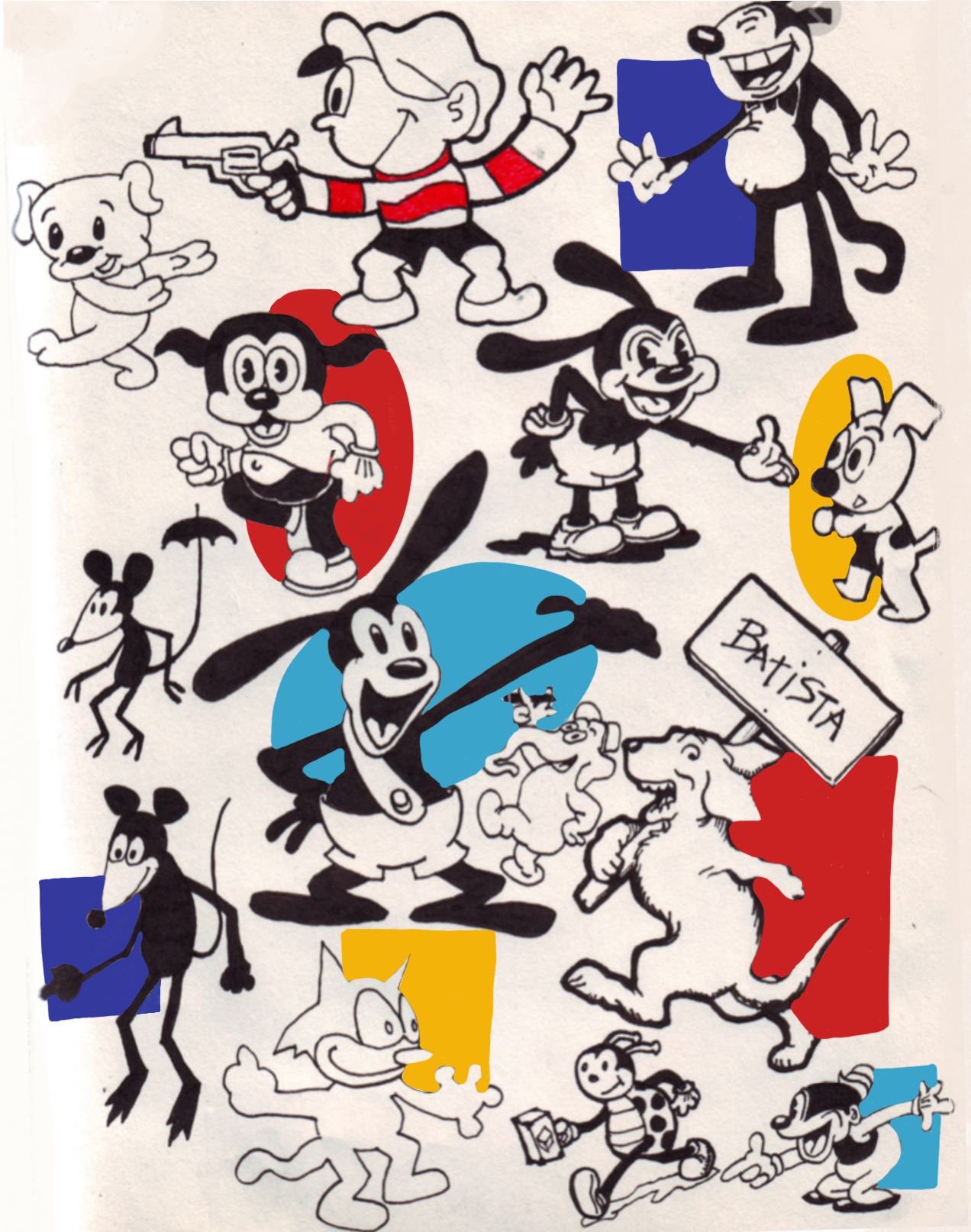
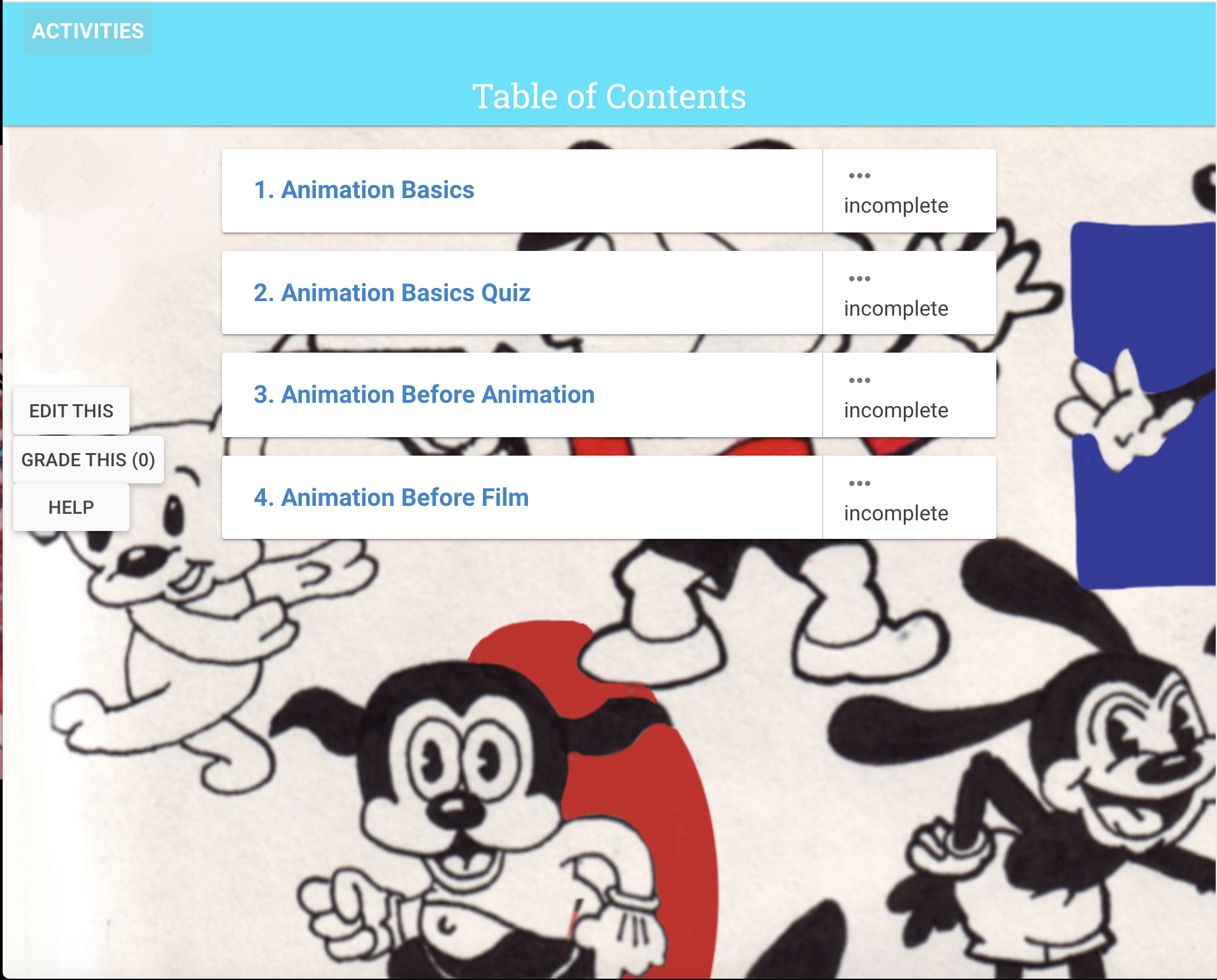
For this week I have been working on the CLIO training. My course will be focused on early beginnings of animation. I have added most of my content to the course and I’m currently adding in the background.
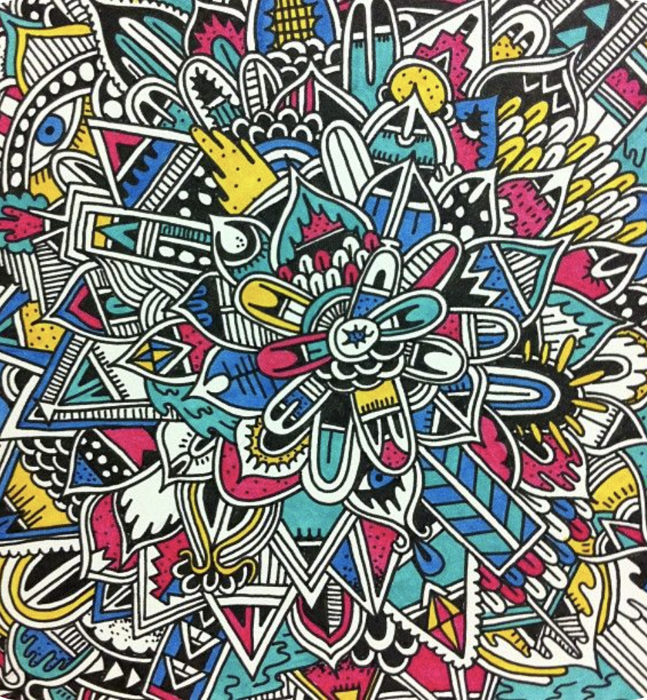
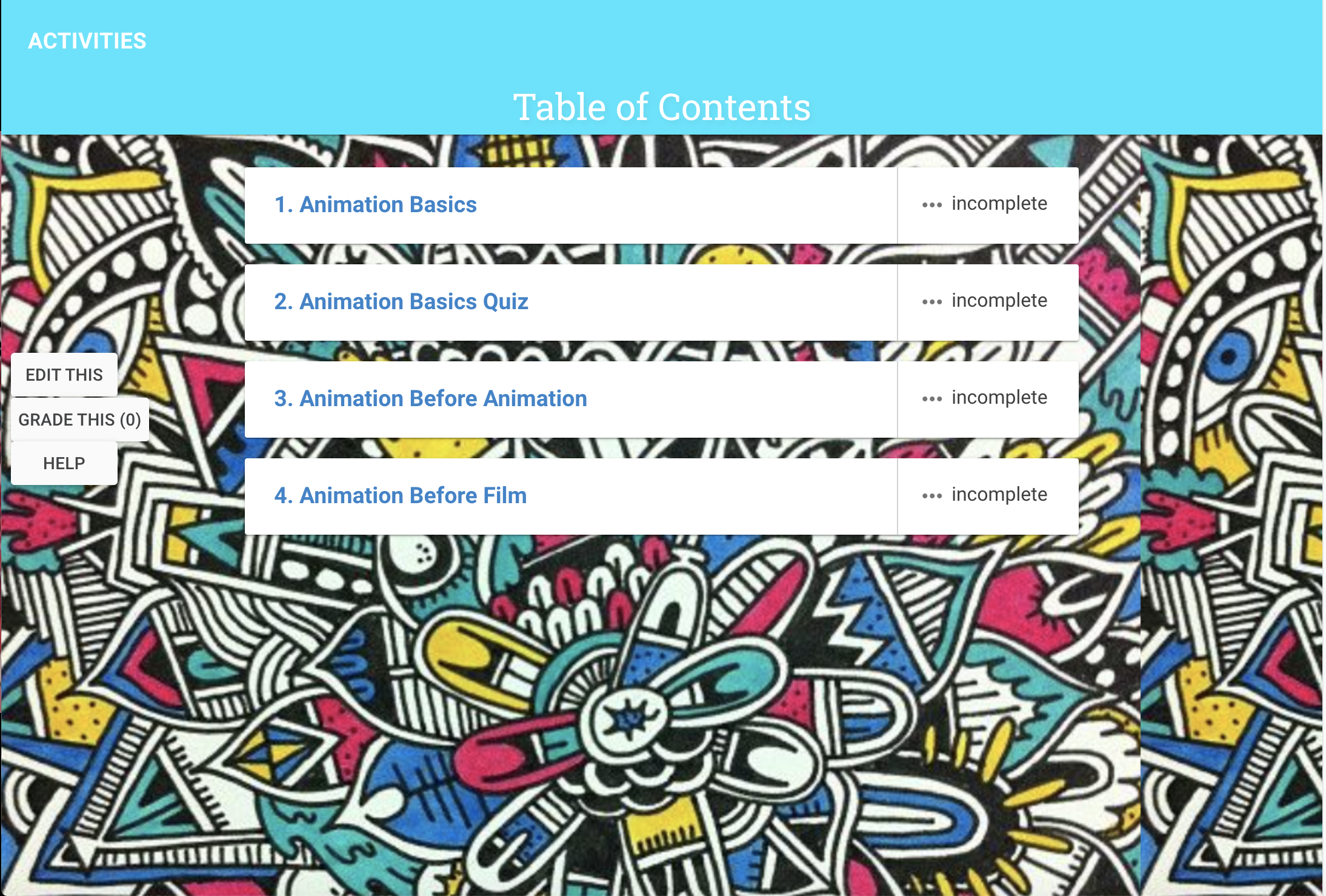
I wanted the background to be whimsical and match well with the color palette chosen for the course. At first, I used characters as the background, but it didn’t look well. So I decided to go in a different direction and I believe it worked a lot better.

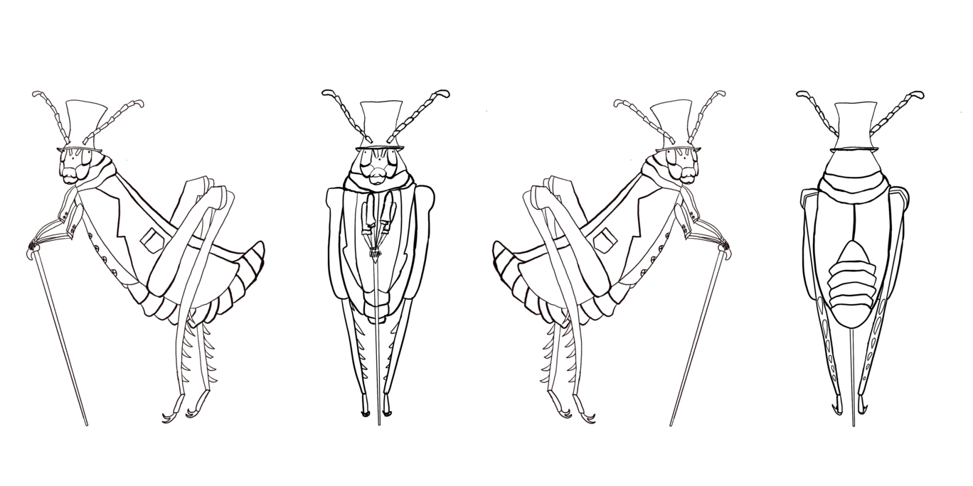
This is how the character turn around ended up. I have to say this part was the most difficult. I had to make sure that things were proportional and I was also working on an insect body with a very intense perspective. I’m happy with how it turned out for being my first draft.


Today, I worked on a Photoshop Color Correction training. The training walked through several different types of photo adjustments, which are used often when editing photo IDs. Here are some of the examples that I worked on that I found the most interesting.
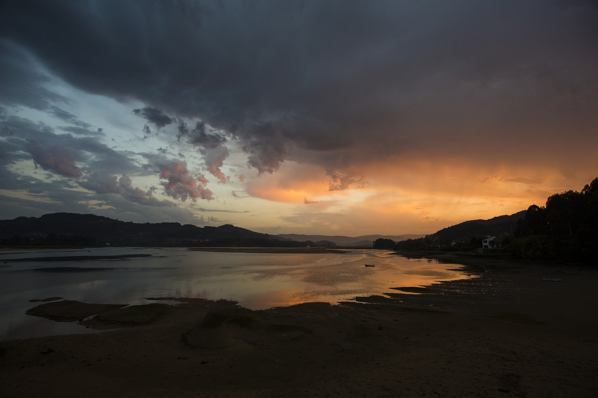
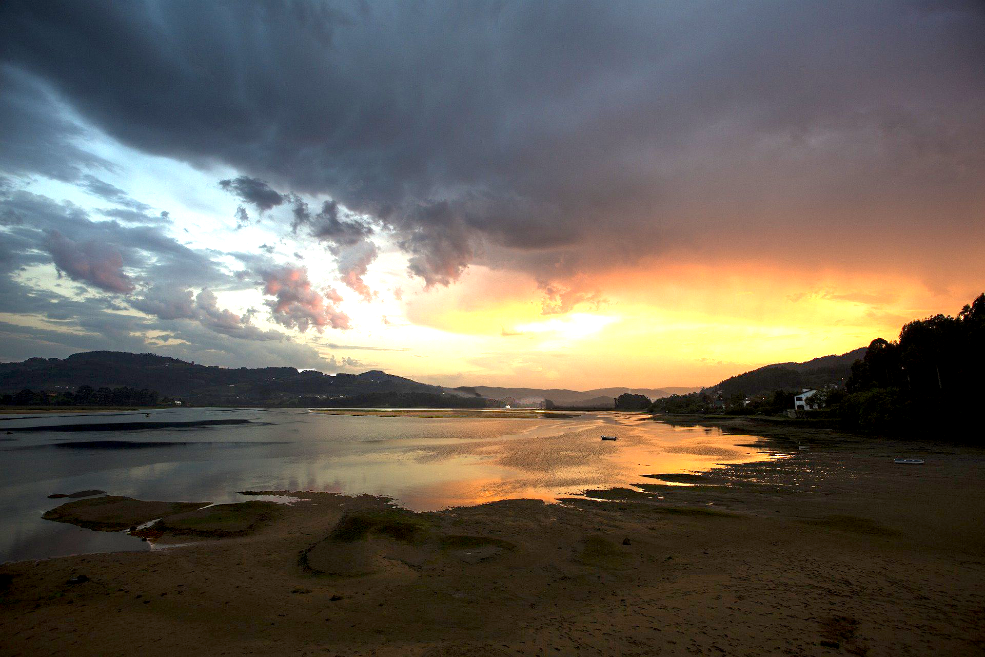
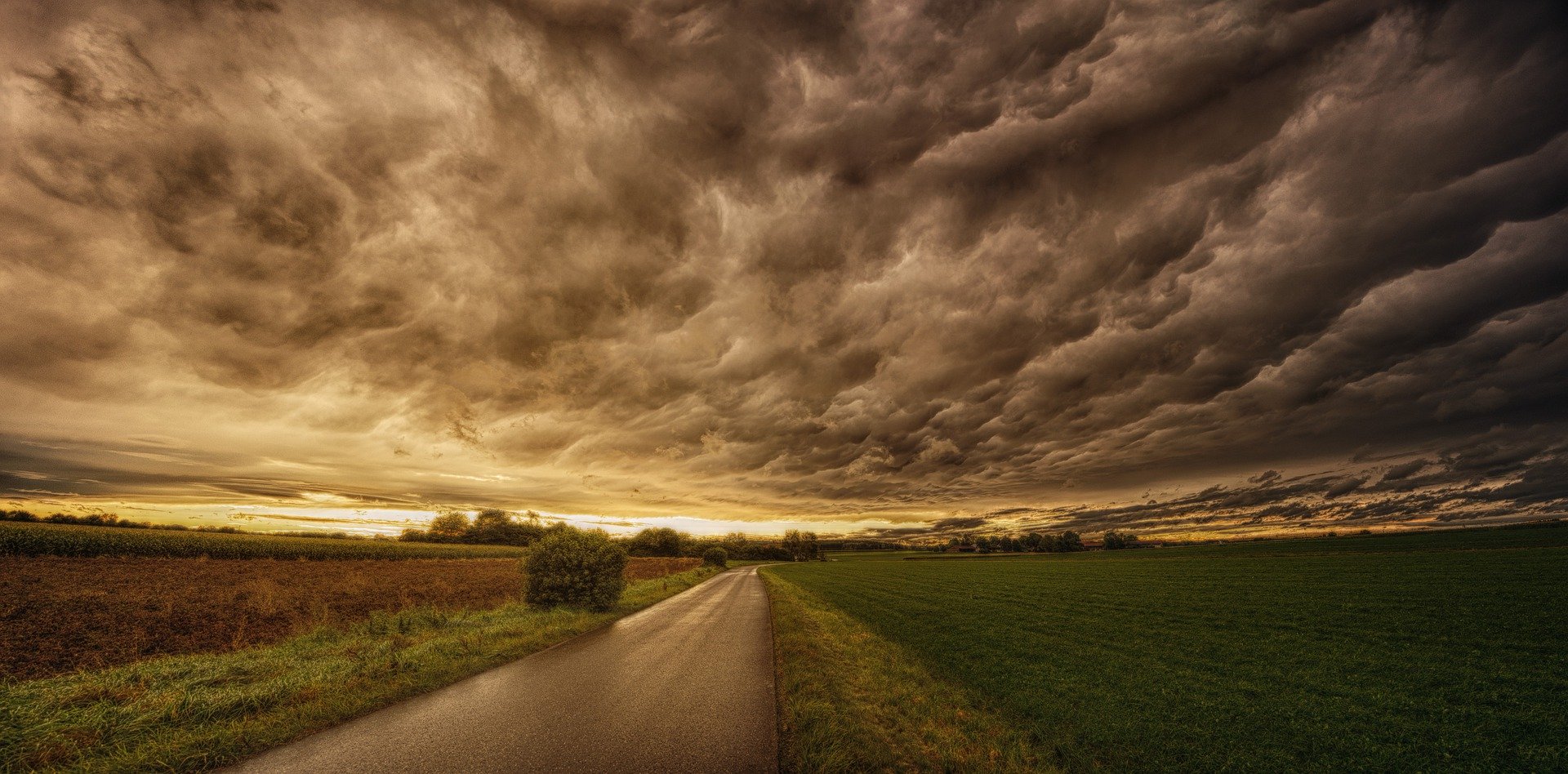
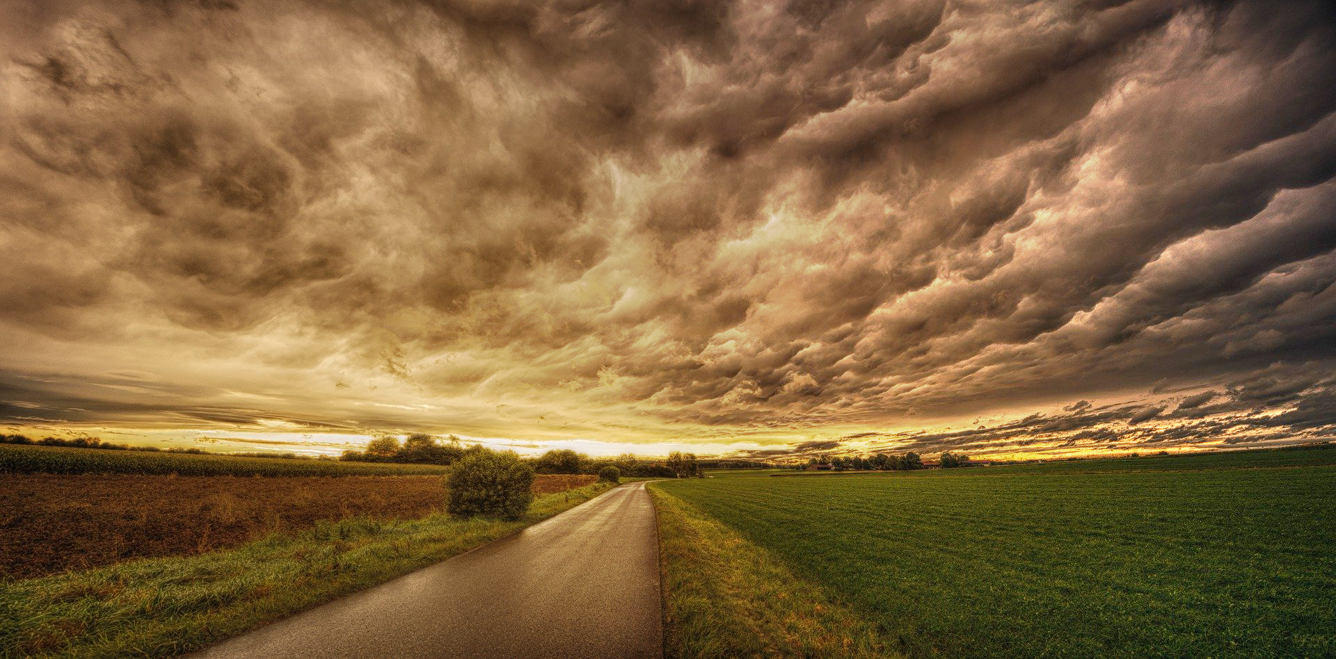
In this exercise, we practiced using the exposure adjustment. Since the land and the surrounding sky and water are lit differently, we used the selection tool to select parts of land then adjust the gamma and offset to make it look natural. Then, we followed the same general process but for the inverse of the first selection such that it would apply to the sky and water.
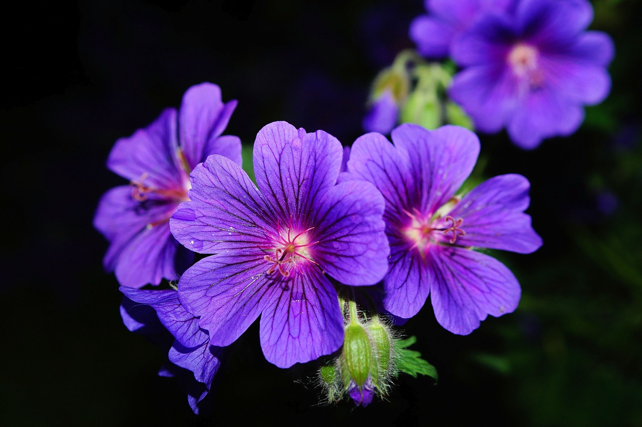
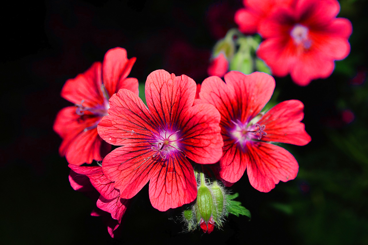
In this exercise, we practiced using the hues adjustment. We were asked to practice changing the color of the flower petals. Since they are purple, I selected “Magentas” in the hue bar under “Master” and adjusted the sliding color scale towards the red hue until it looked red. I was surprised by how realistically this changed the color of the flower petals.
In this exercise, we practiced another method of editing specific parts of a photo as opposed to the whole photo , which an adjustment is usually applied to. I applied a levels adjustment then used a gradient on the the masking layer to specifically brighten the right side of the photo but not the left. The gradient appeared white to black, from the left to the right. Since the right side is darker and underexposed, I shifted the white arrow to the left to bring some more light into the photo. With the masking, it only applied these edits to the black portion of the mask.
This training was super helpful, especially with understanding how to make edits targeted for specific portions of photos.
This week, after a week-long break, I finished my HTML/CSS training — you can see the finished product here. I also completed some options for the ISPRII logo, and did some photo IDs, examples of which can be found tomorrow.

![]()
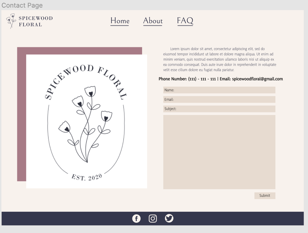
This week I worked on finishing the UI/UX with Figma Training as well as the Pixel Art training. Here are images of the final design of the website. I really liked working on this project. It made me think more about User Interaction and it really helped with the Think Aloud test I did with Thuy to notice some changes that I needed to make. One of them is adding a Shop button on the navigation bar as well as a search bar so that clients could look up specific bouquets they would want. You definitely have to think about things in a different way, and not just what makes something “aesthetic”.


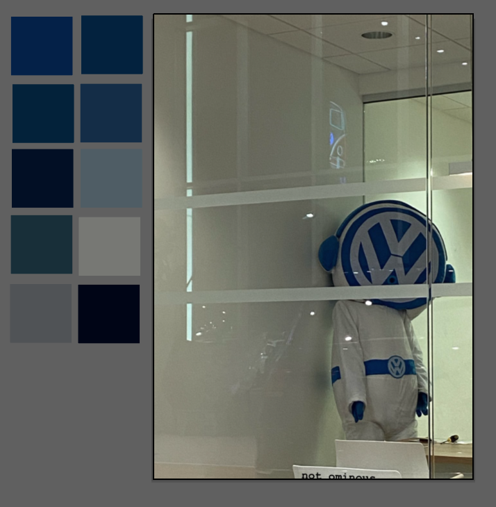
Here are the images for the Pixel Art training. I decided to make my image off of what I am assuming is a Volkswagen character that I saw at a dealership. This was a lot of fun! I definitely will be making more Pixel Art in the future.

![]()
![]()
![]()
![]()
![]()