Dell Med x COFA Coffee Table Book Styling
Clients: Dell Med x COFA Students
Team Members: Kate Shih and Julie Brandt
Timeline: 2 Weeks
Status: In progress
Original Task
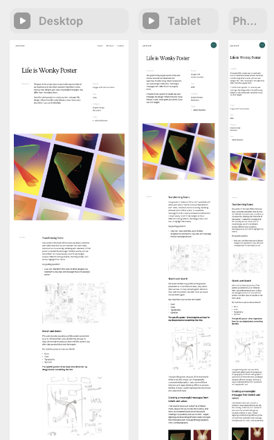
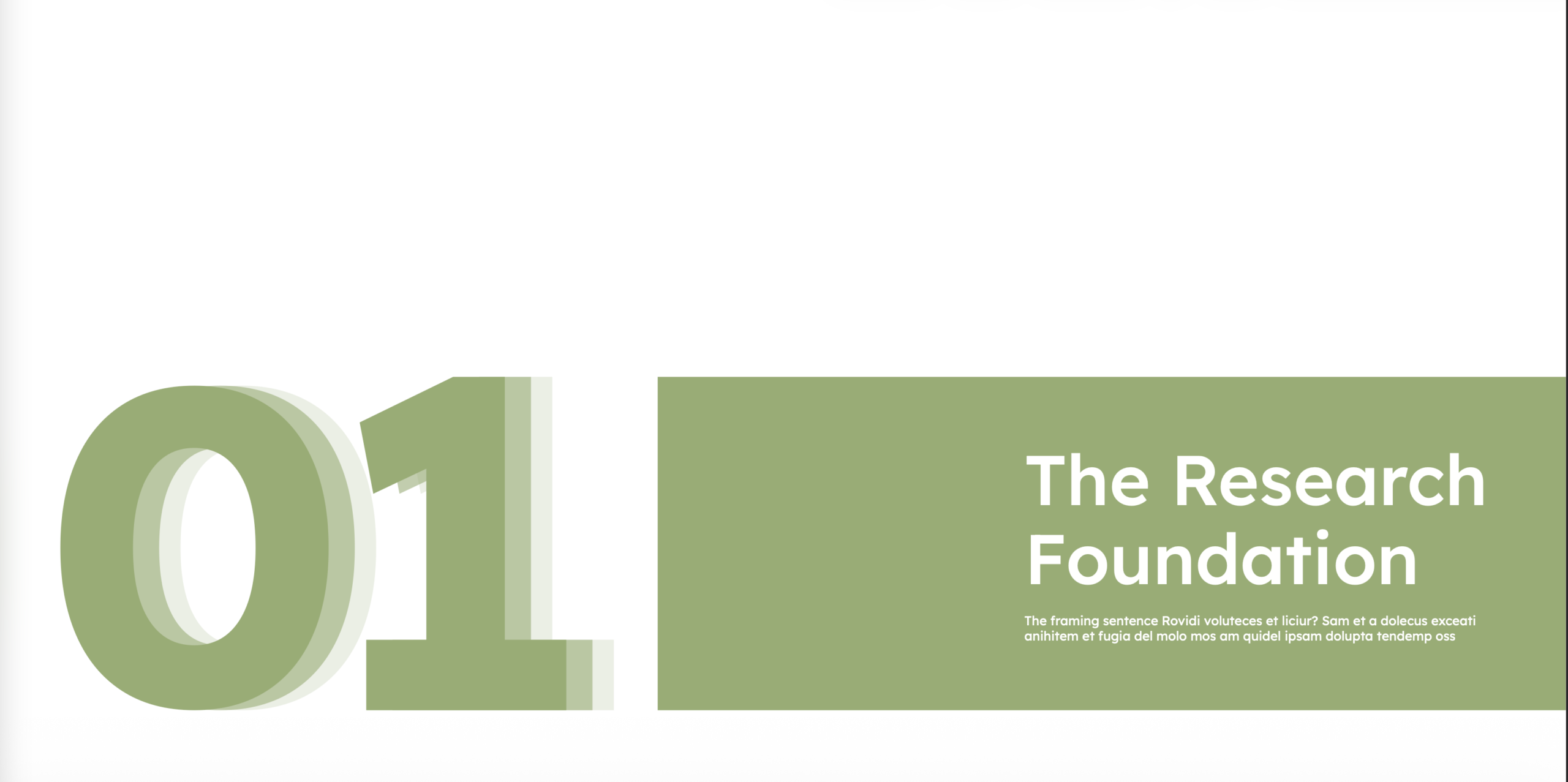
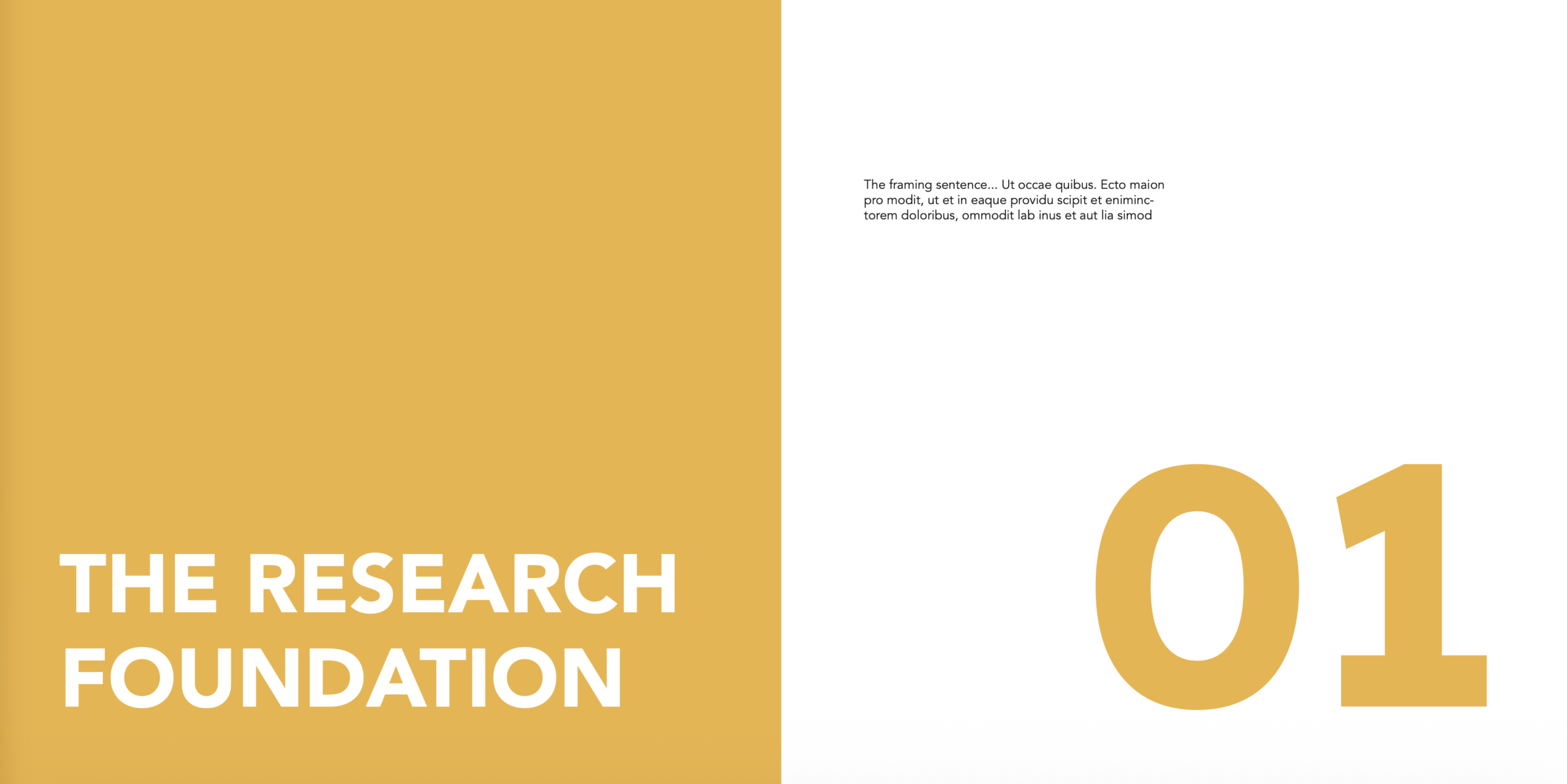
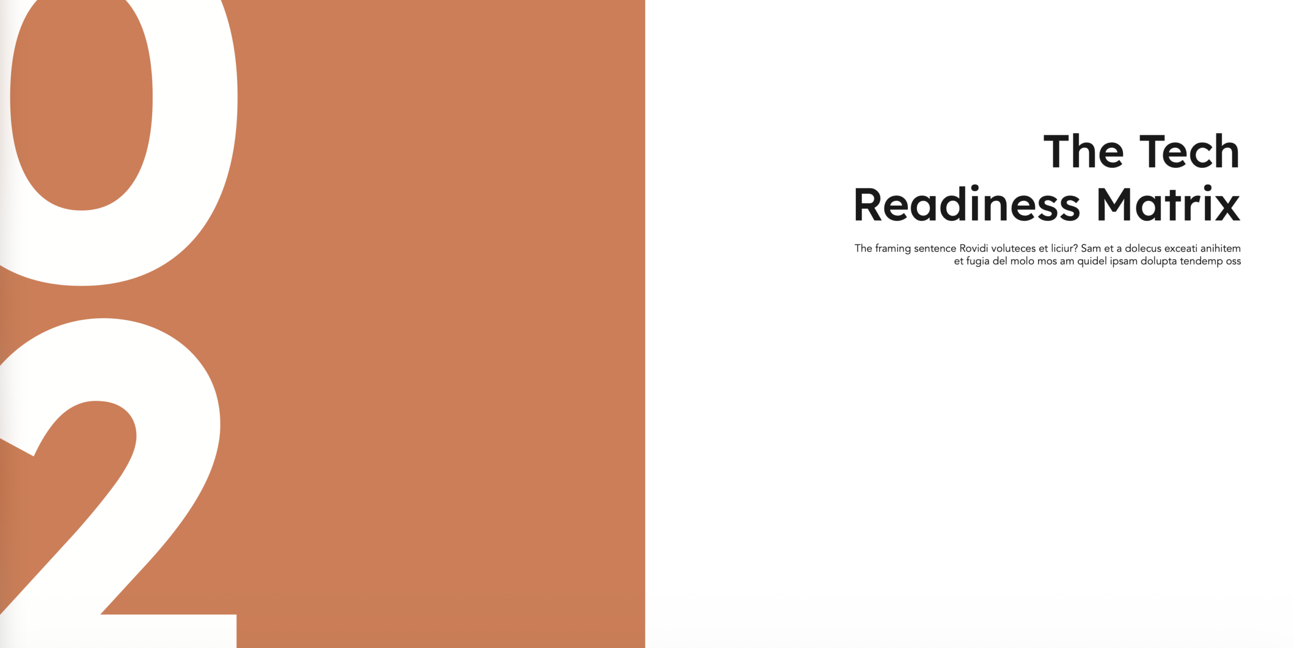
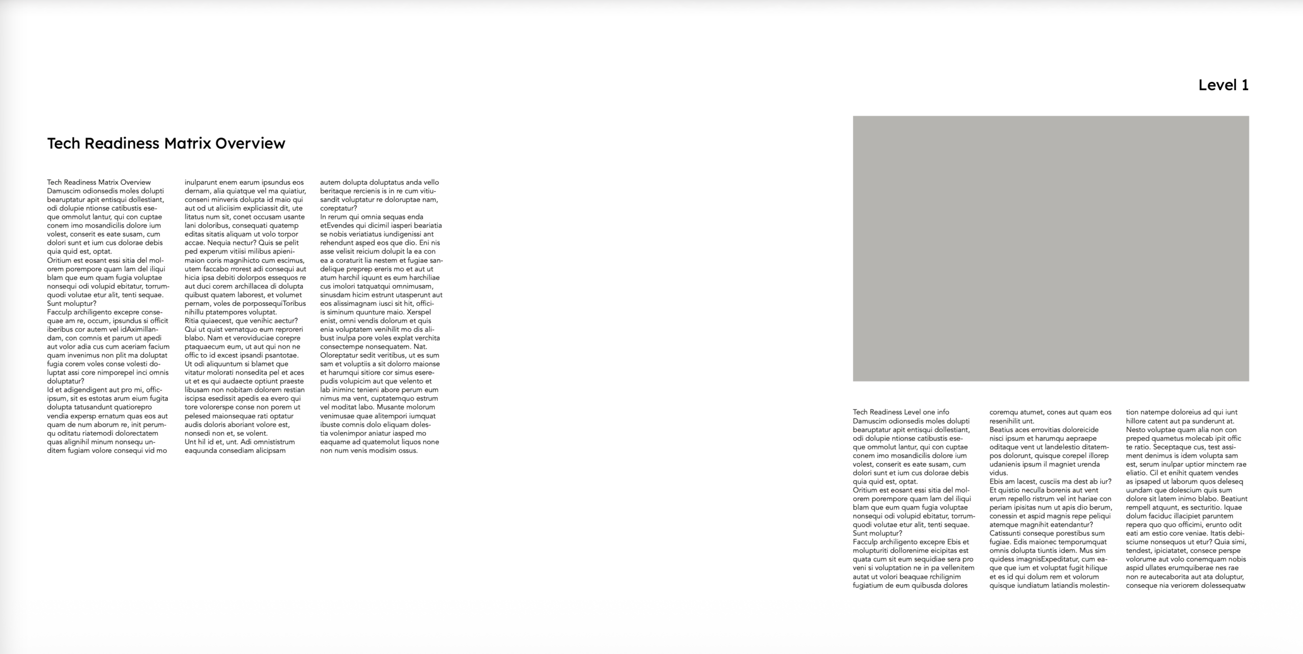
The clients requested assistance on their capstone project that is a “coffee table” style book that represents the future focused direction of AI in the medical field. Kate and I created several layouts for different spreads requested: Framework/diagram, section opener, front & back cover, copy-heavy body (with pull quotes/graphic) spread. I created several iterations of the section openers and the framework/diagram designs.
Inspiration
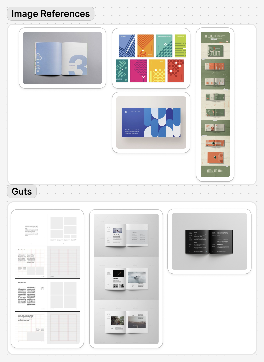
Before we got started, we had a rough idea of what the clients wanted and synthesized their ideas with our own to create a moodboard. We wanted clean, versatile typography, so we chose to use Avenir for the body and Lexend for the display font.
Alterations
After reviewing our designs, they decided to pivot in terms of how we could assist them in completing the book due to their tight deadlines. We moved from designing layouts to sourcing assets that they could use in their book design.
Reflection
This project was unique in it’s timeline and request. Although I didn’t get to explore layout design as in depth as I would like, I was still able to learn how it feels to work with and for a client.