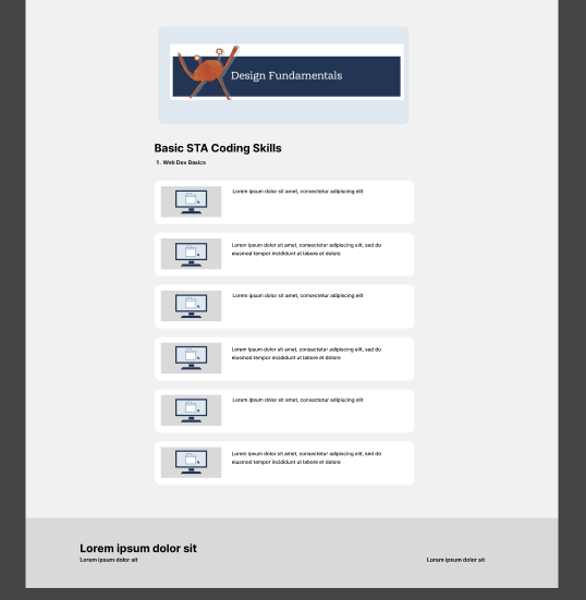
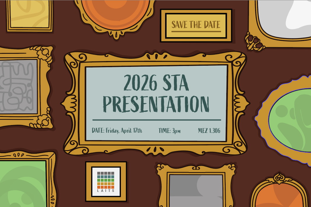
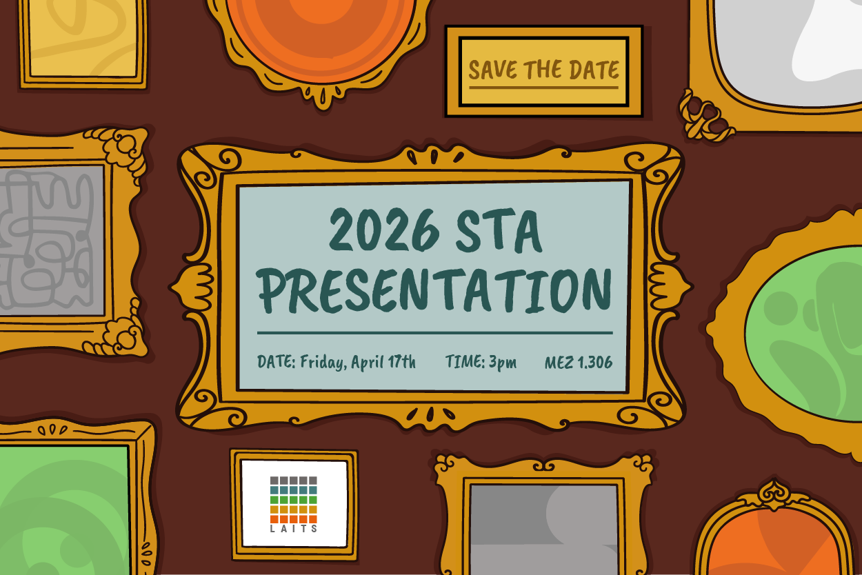
STA 2026 PRESENTATION GRAPHICS
──────────────────────────────────────────────
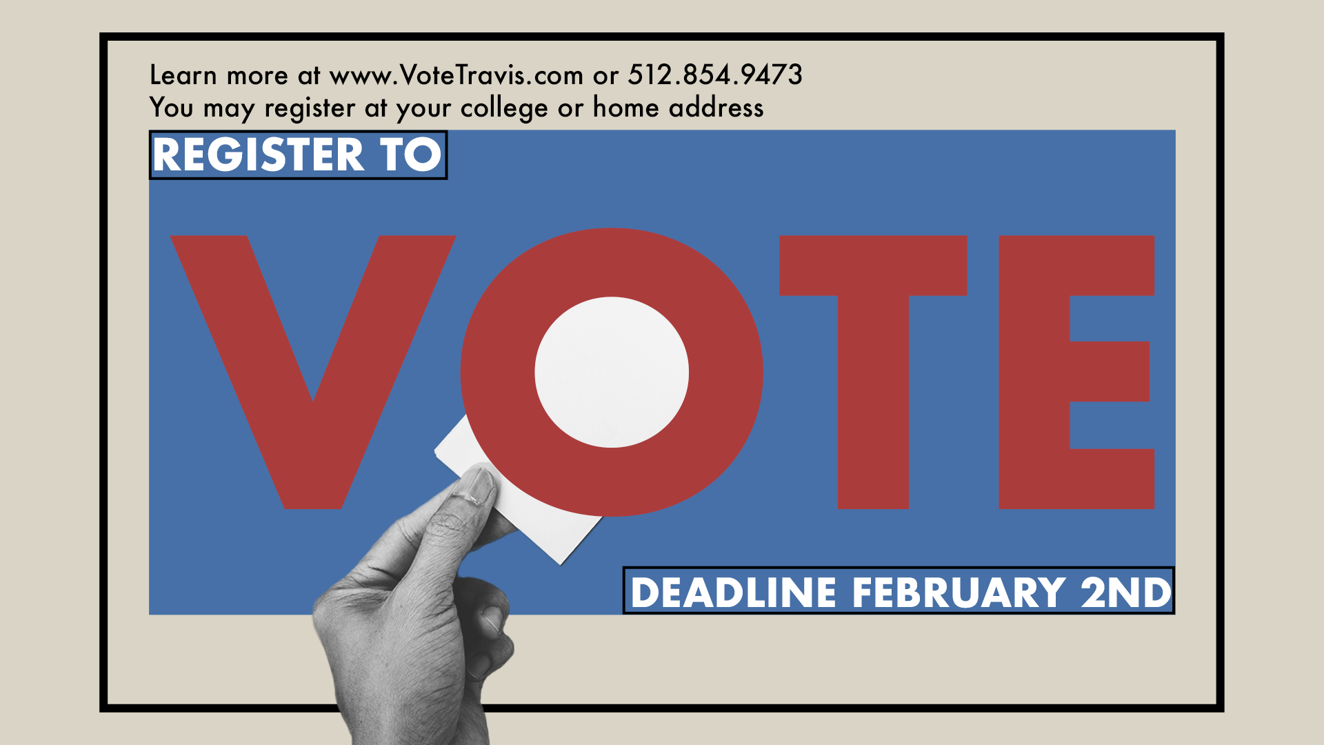
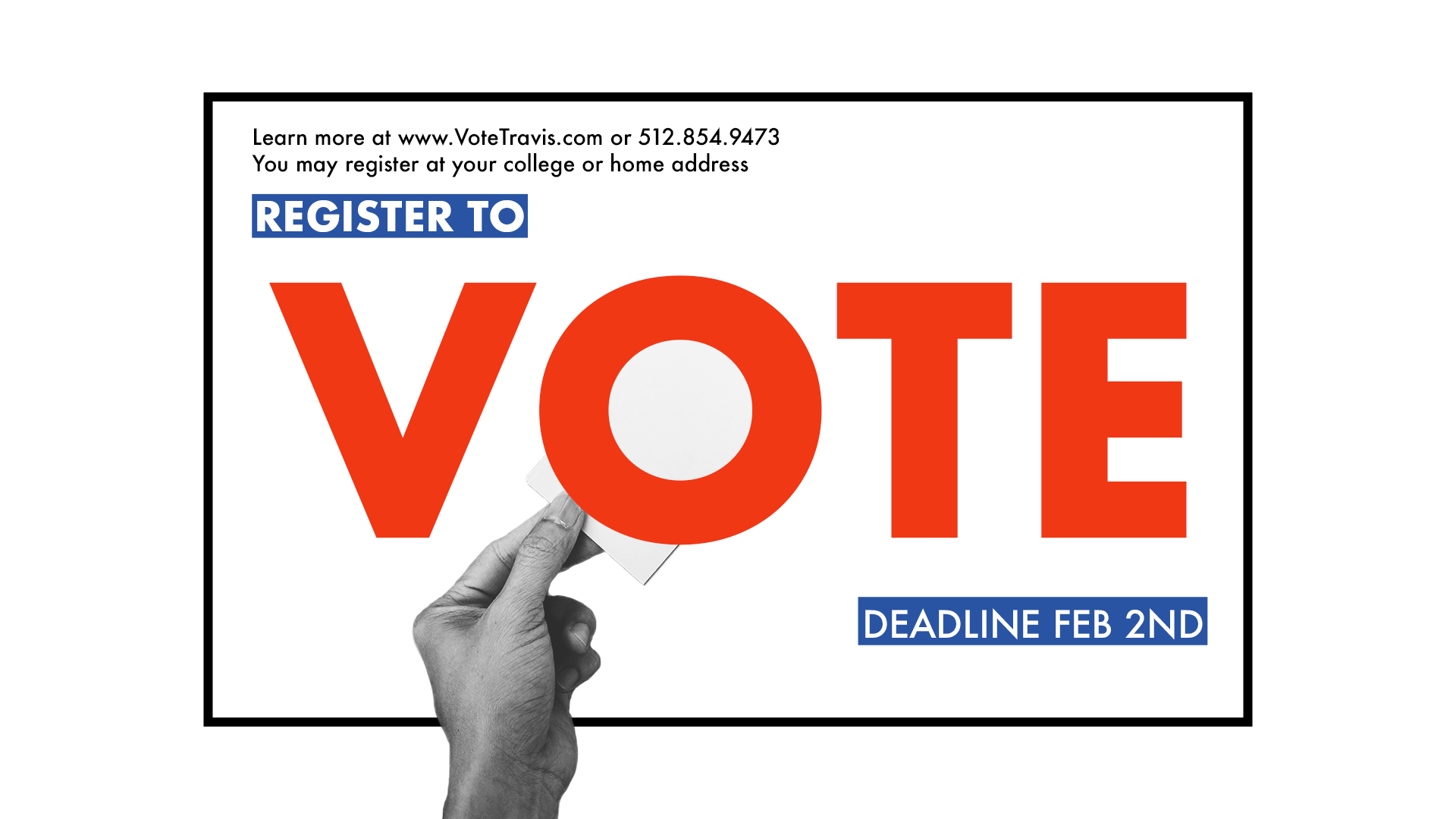
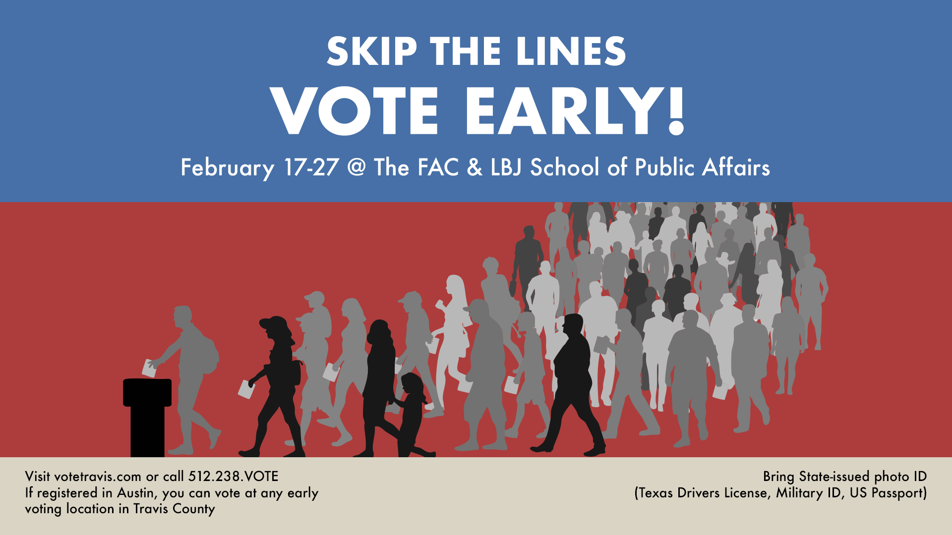
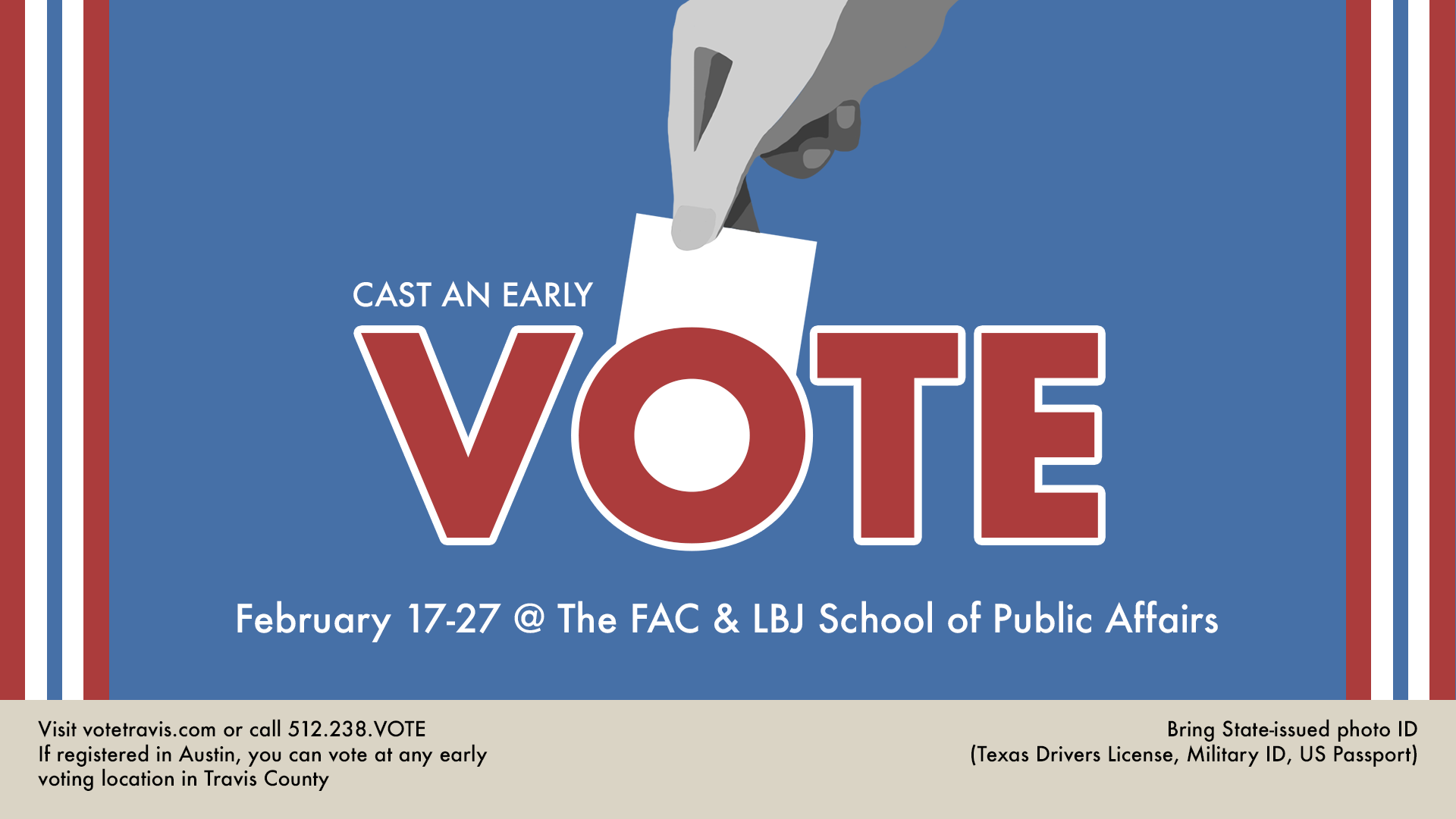
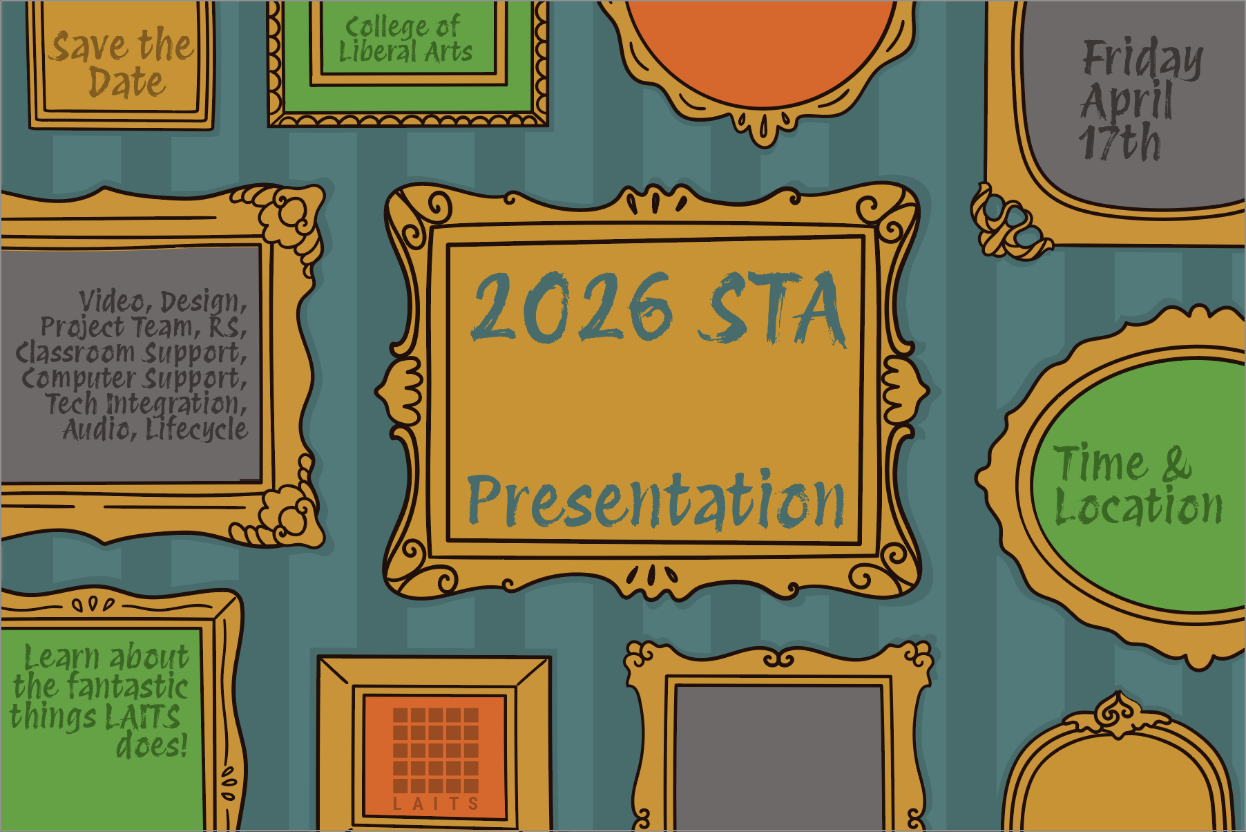
My focus for most of February has been the graphics for the STA 2026 Presentation which I’m overseeing! This is the biggest project I’ve acted as art director for. While I keep track of the assignments I provided to other designers, I have my own task to work on: the walk-in animation.
— Walk-In Animation–
Progress as of 2/18/26
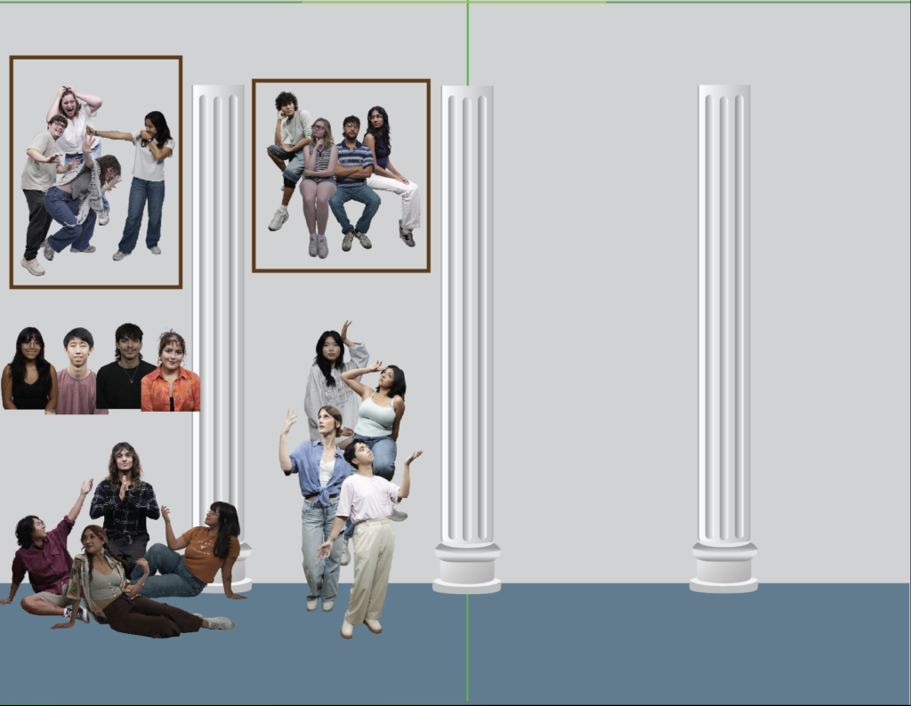
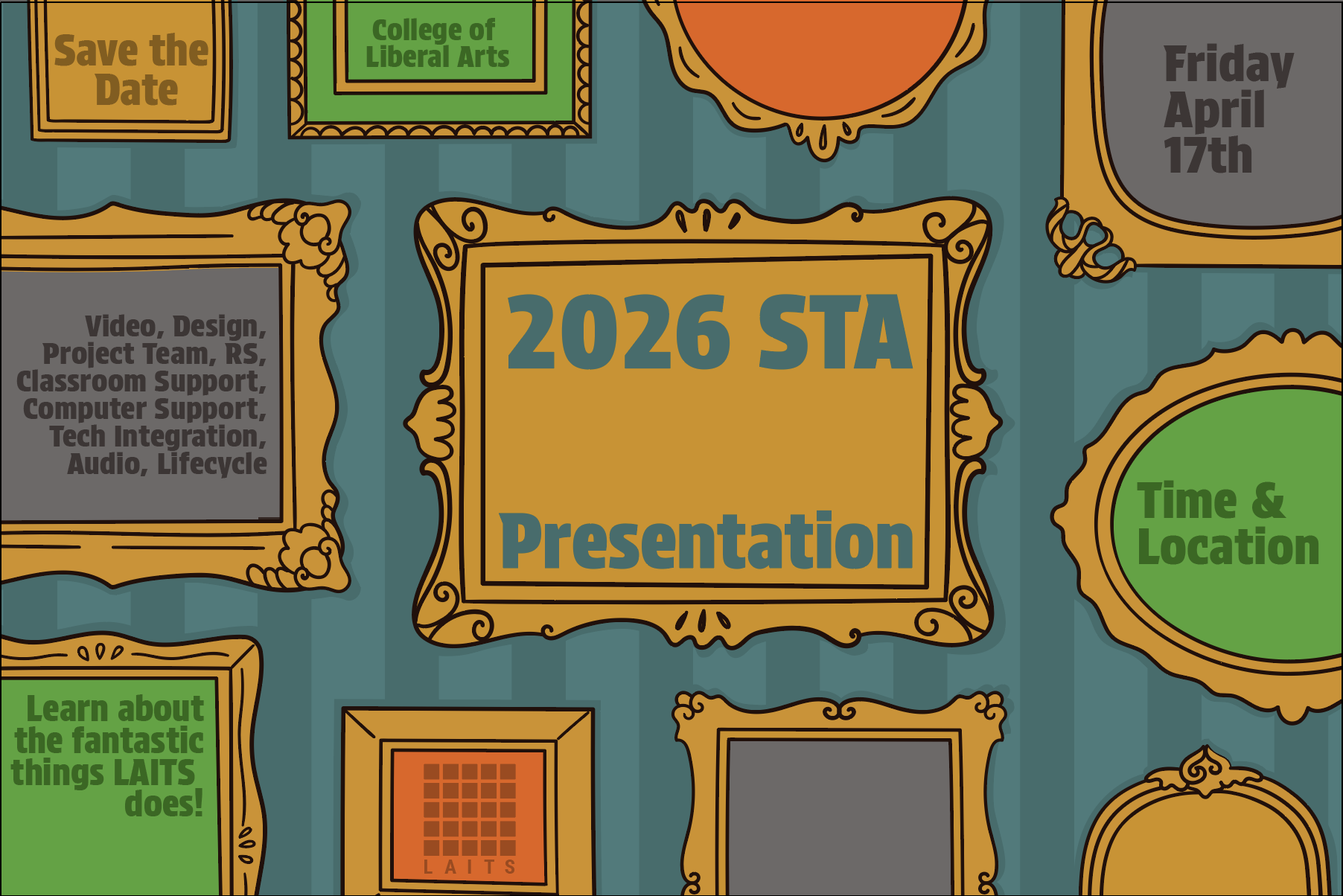
Initial Mood board
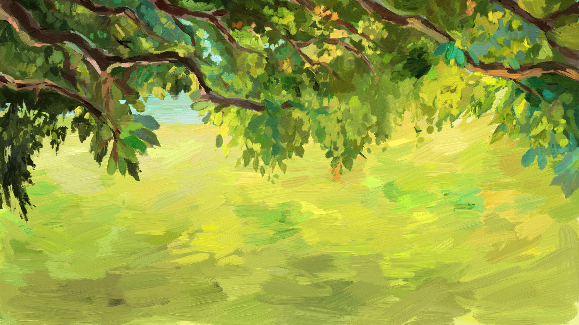
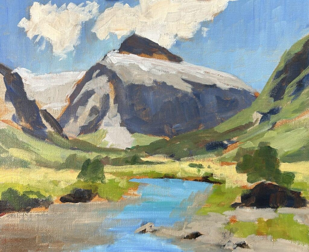
Initial Mock Up
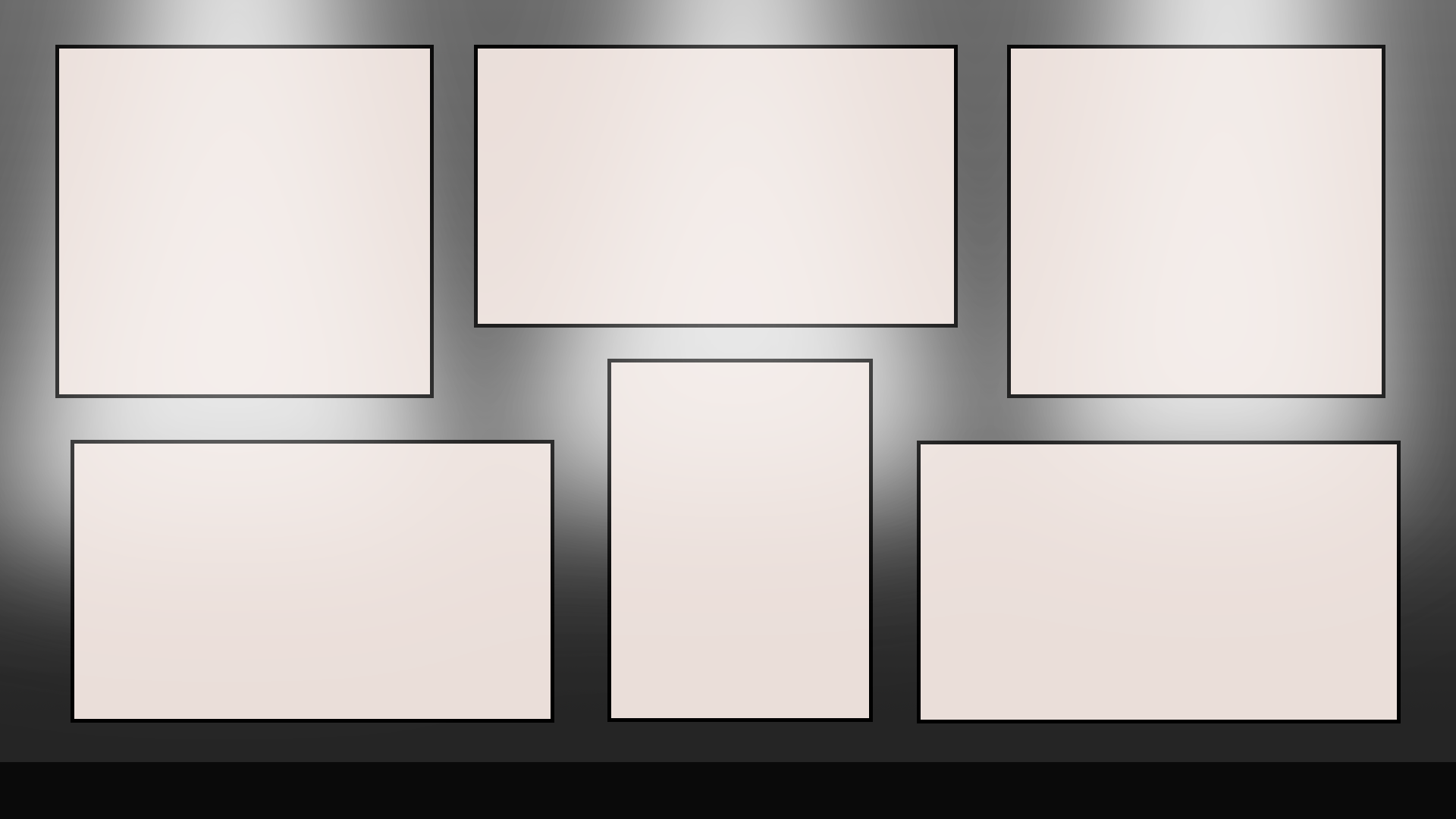
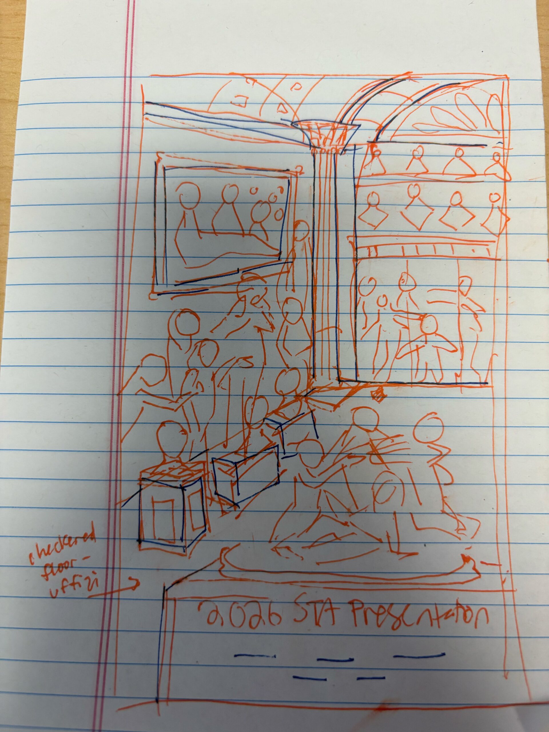
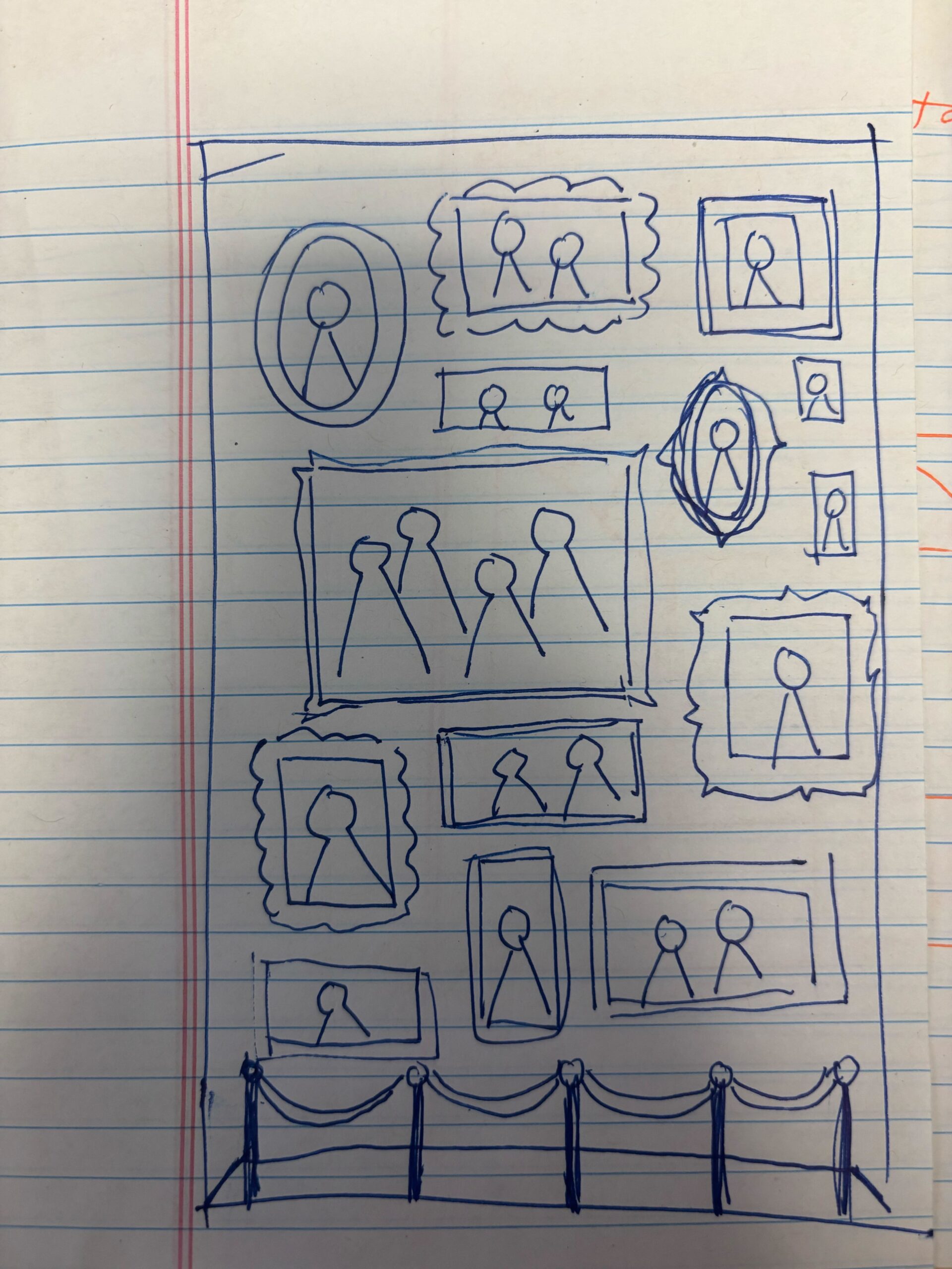
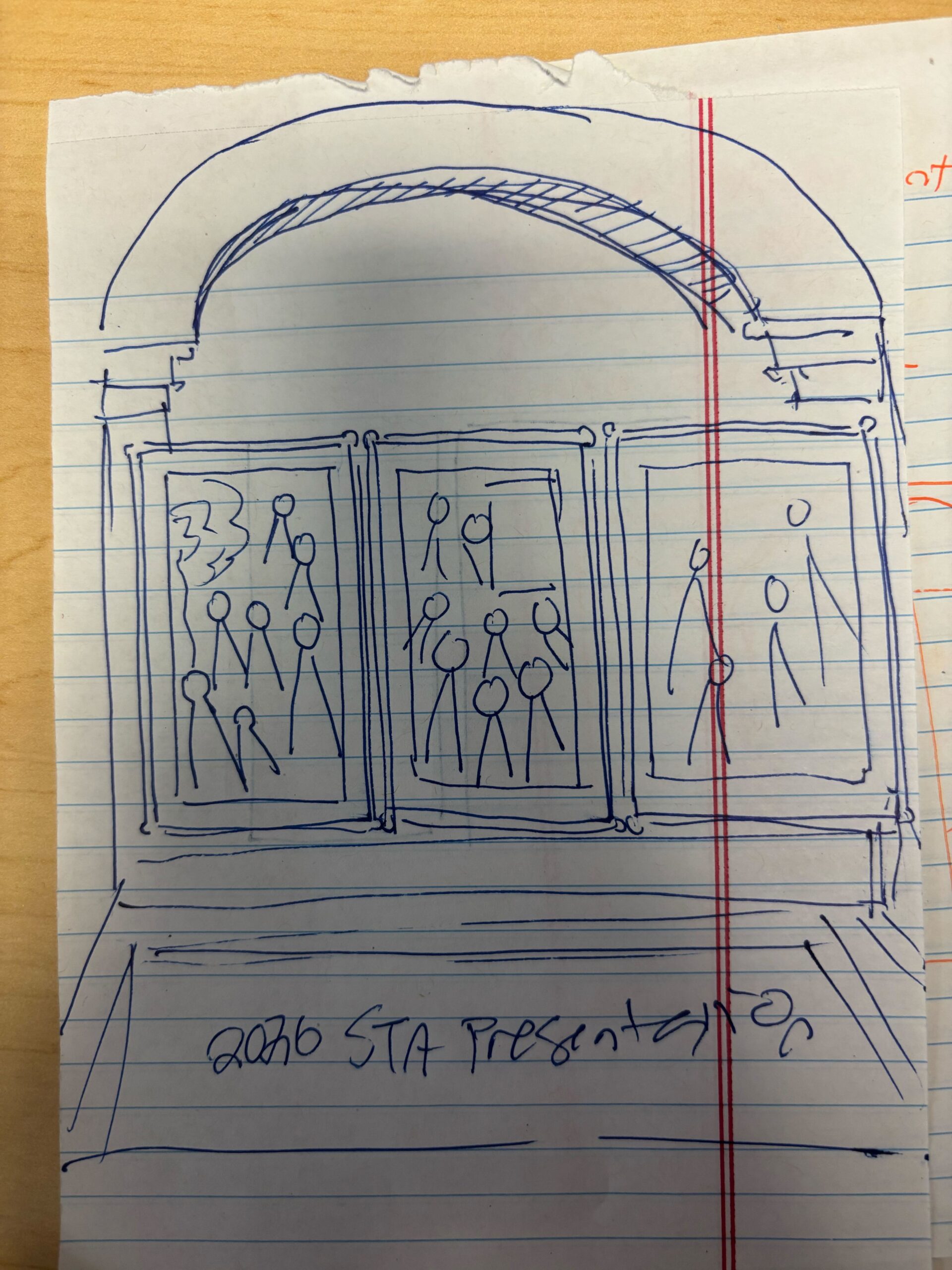
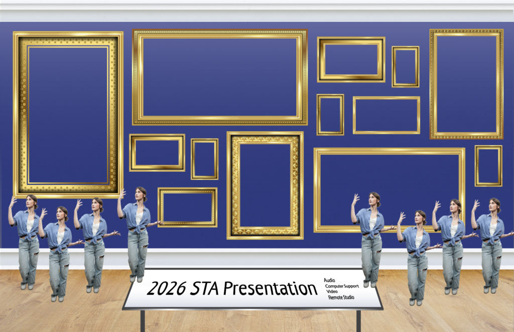
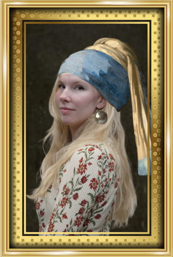
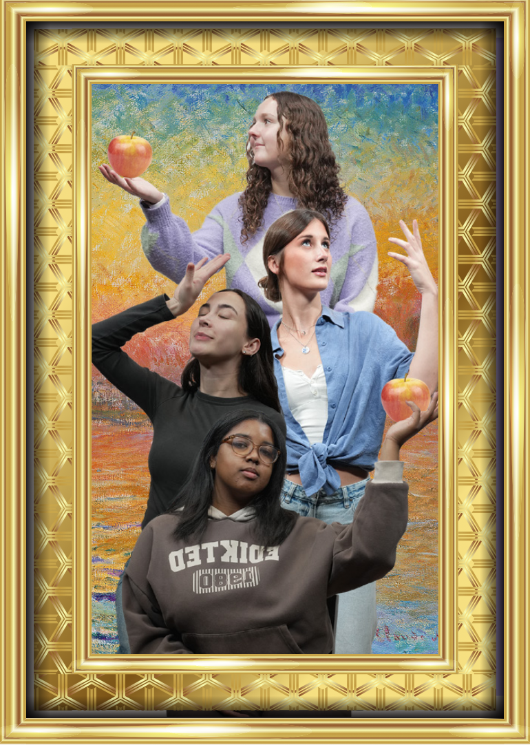
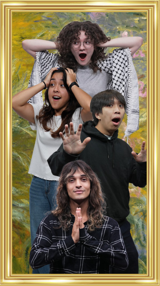
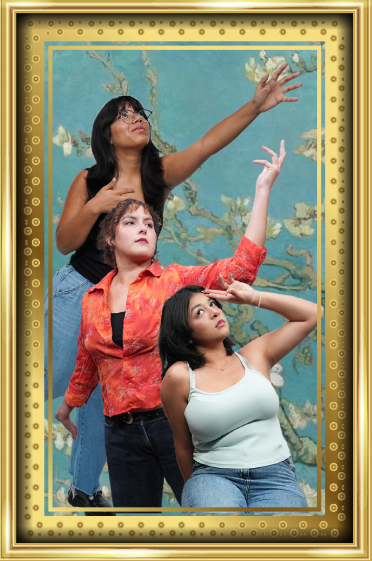
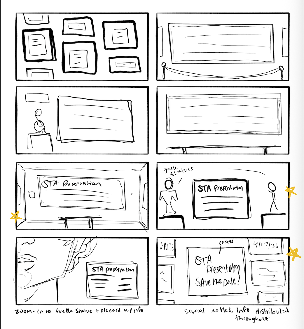
Storyboard
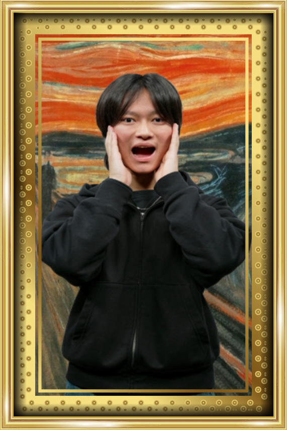
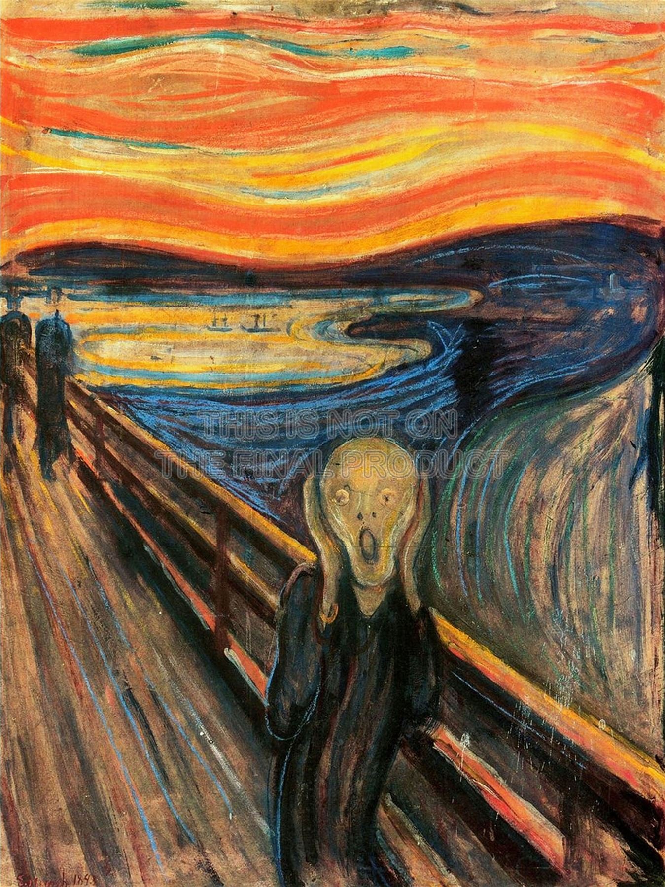
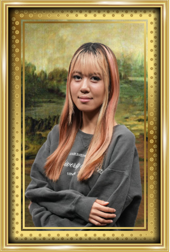
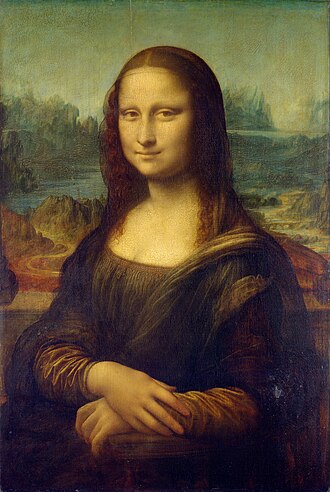
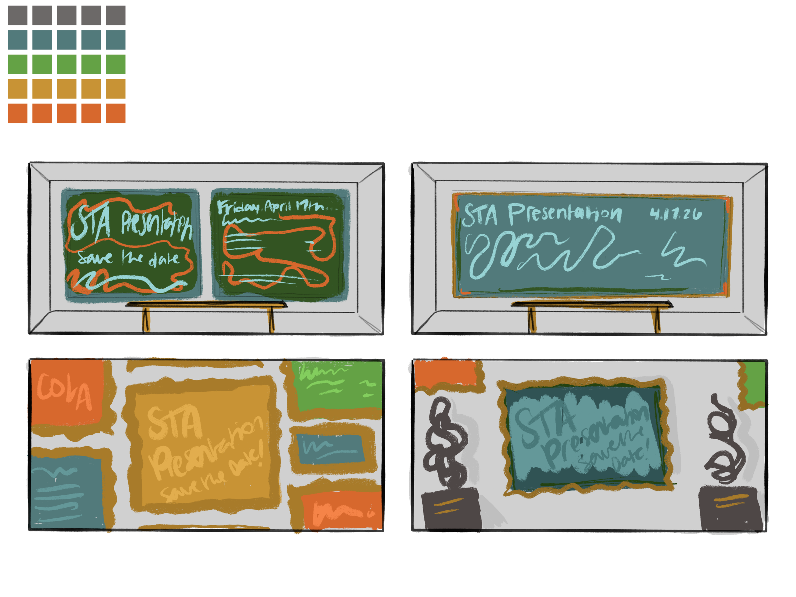
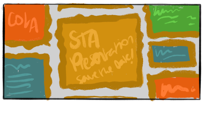
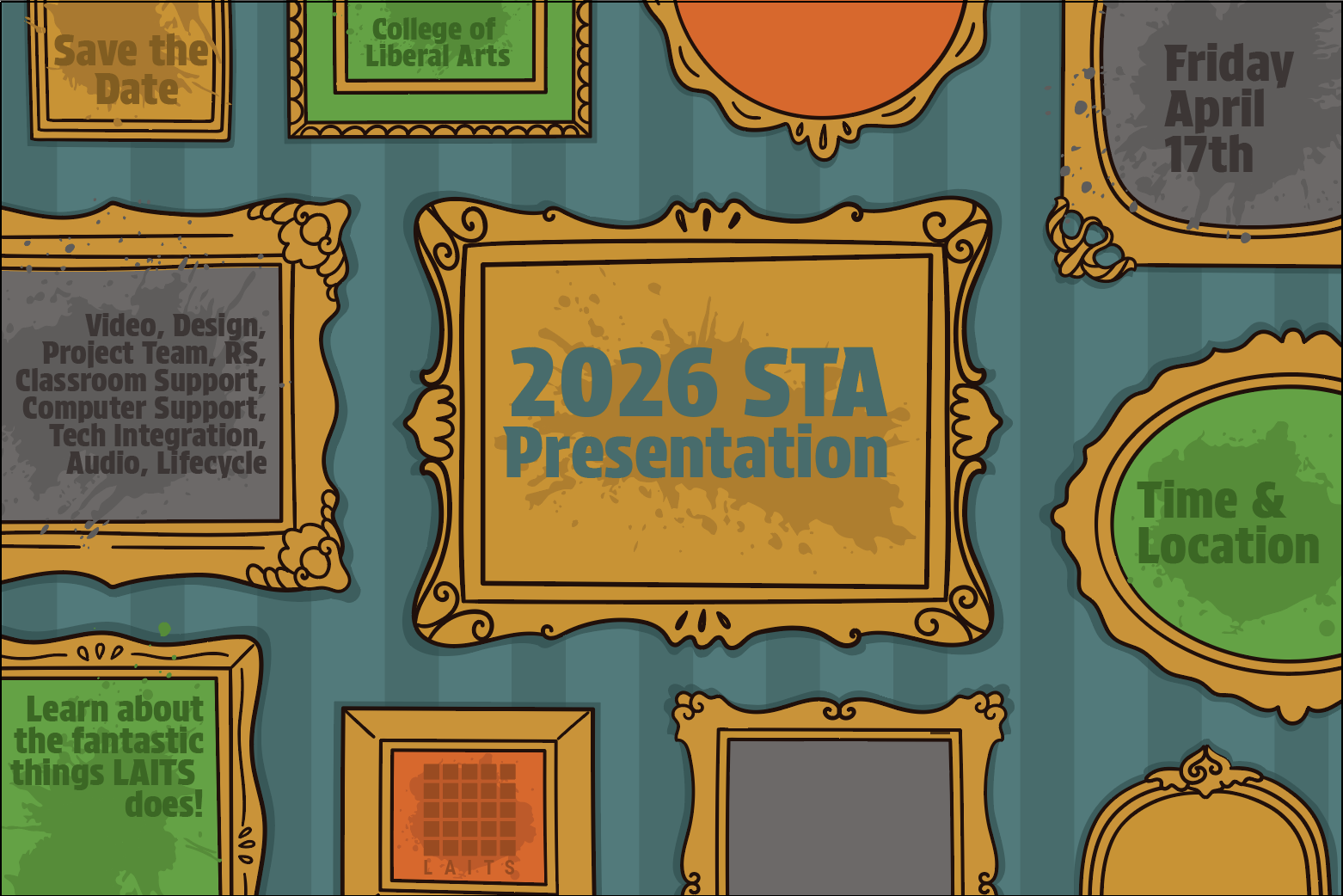
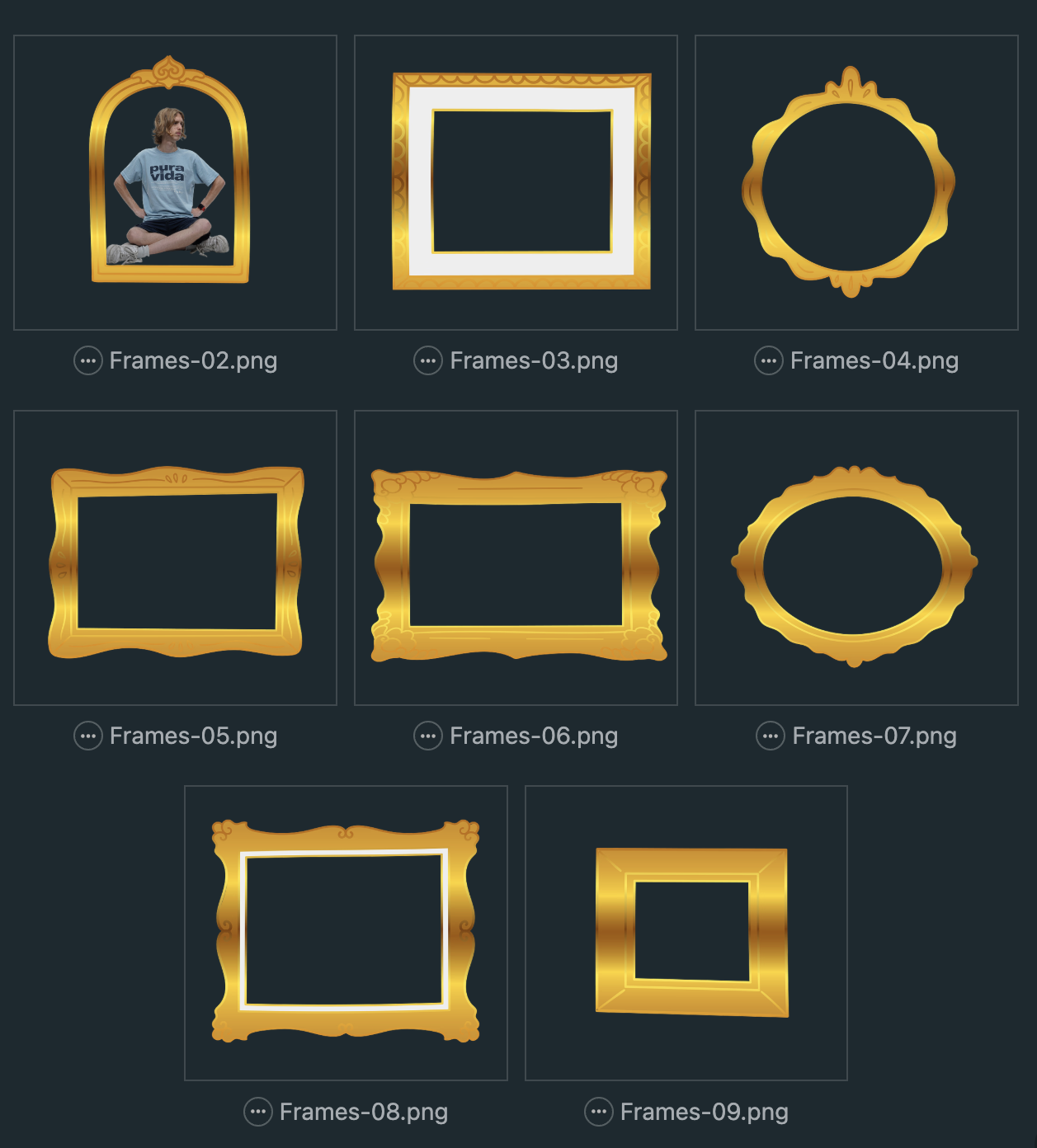
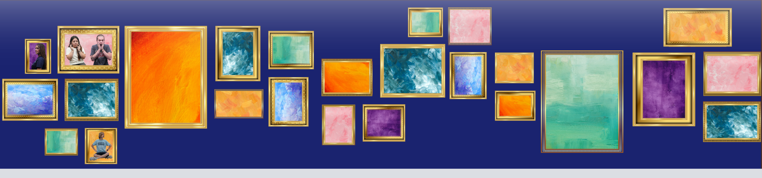
Frames: First Iteration
Feedback: First Round
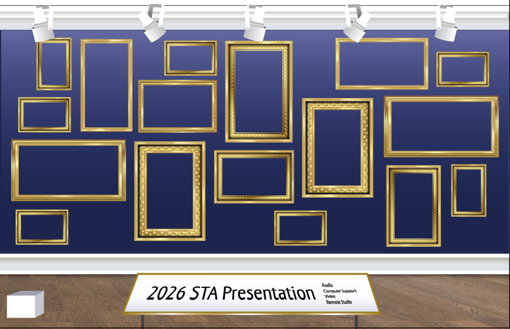
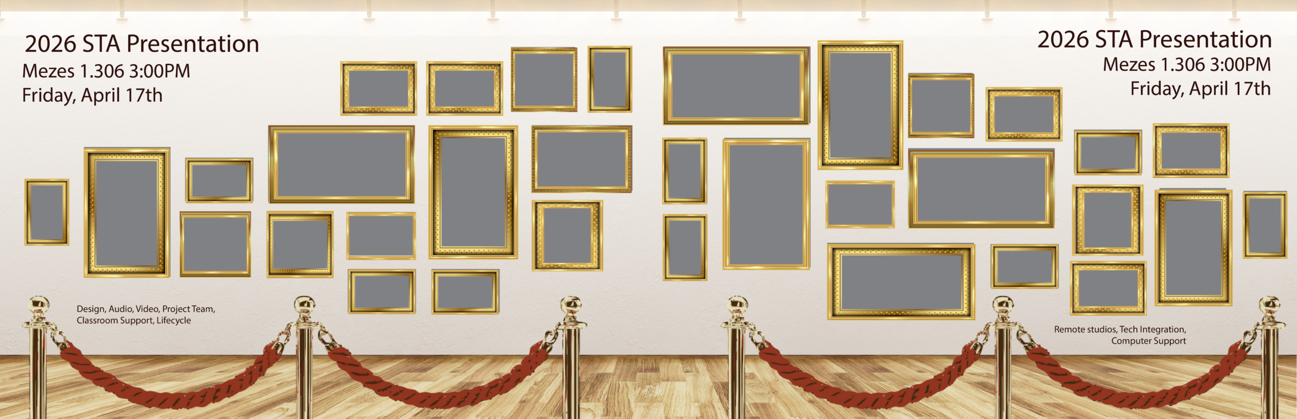
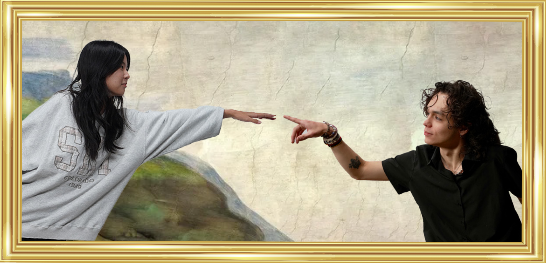
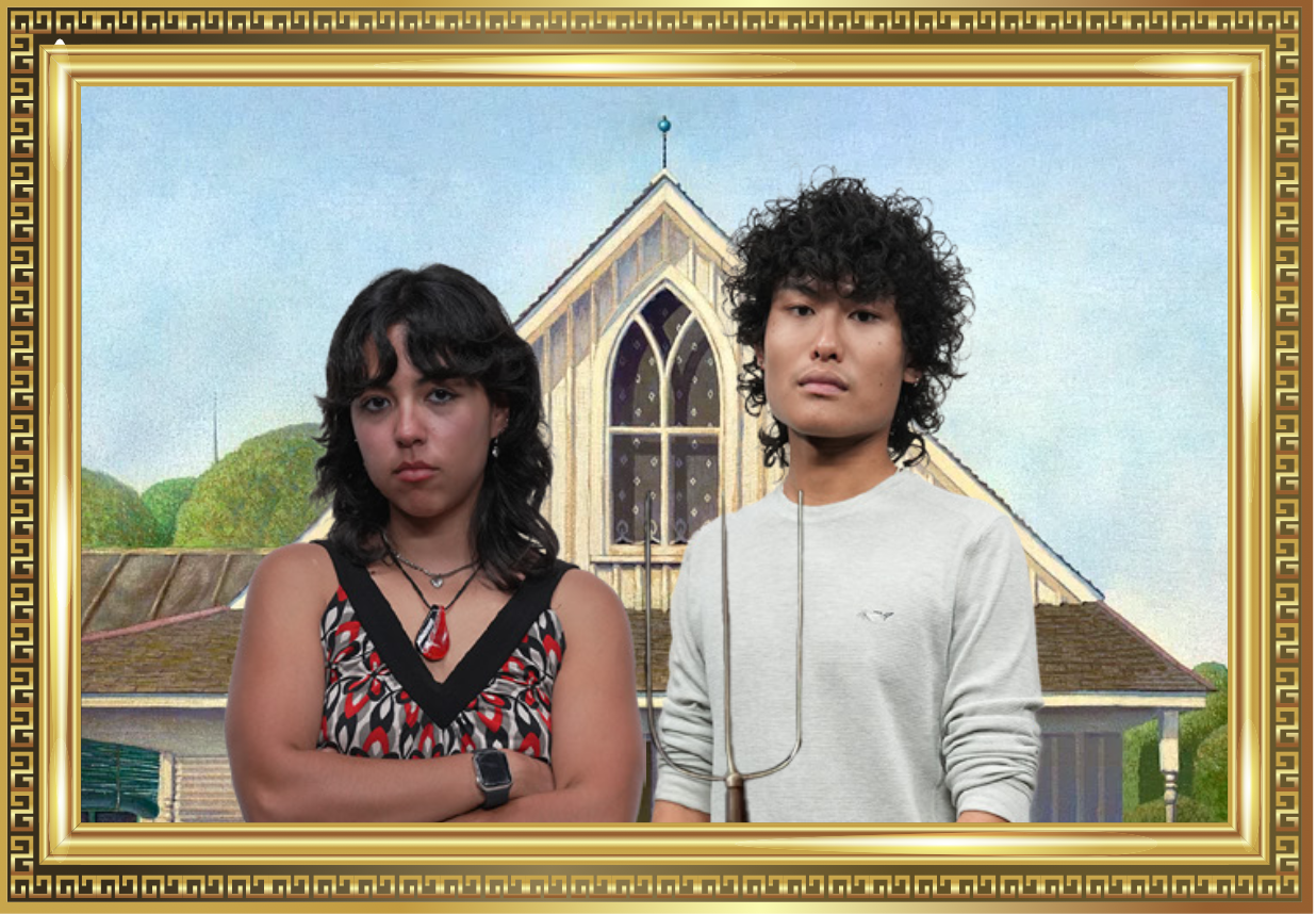
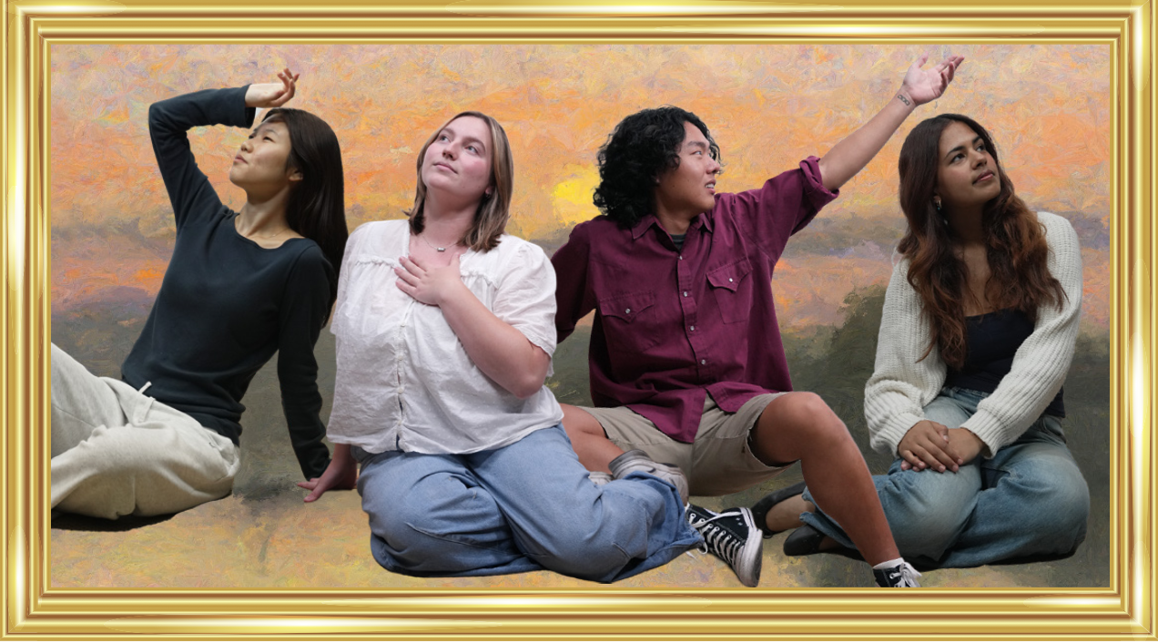
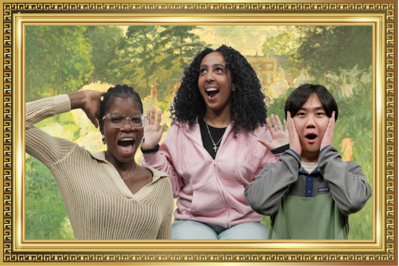
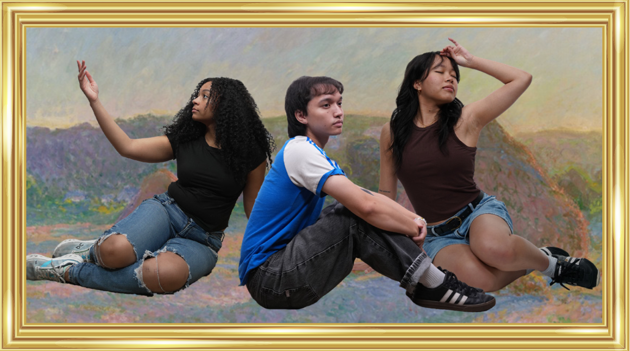
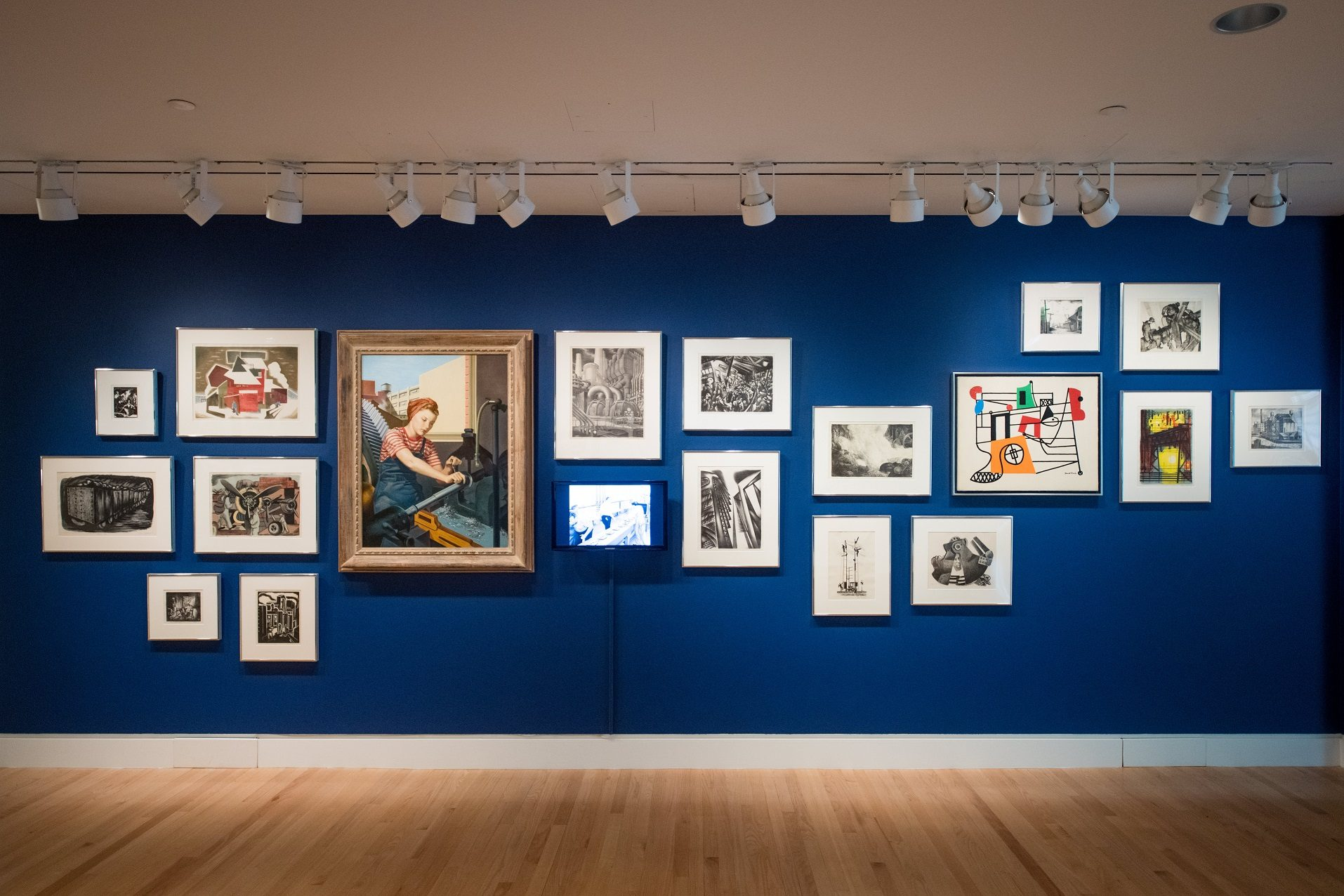
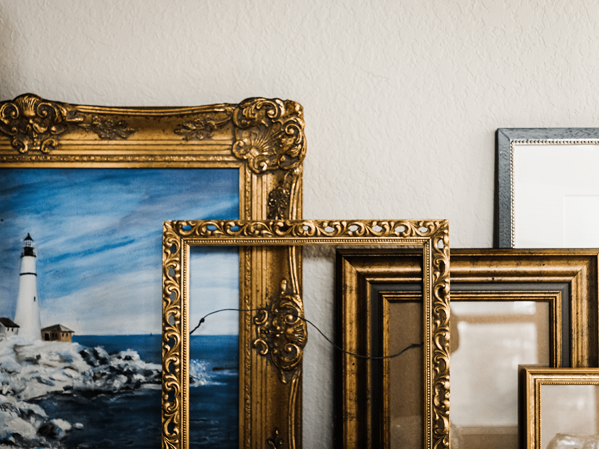
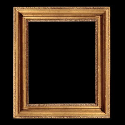
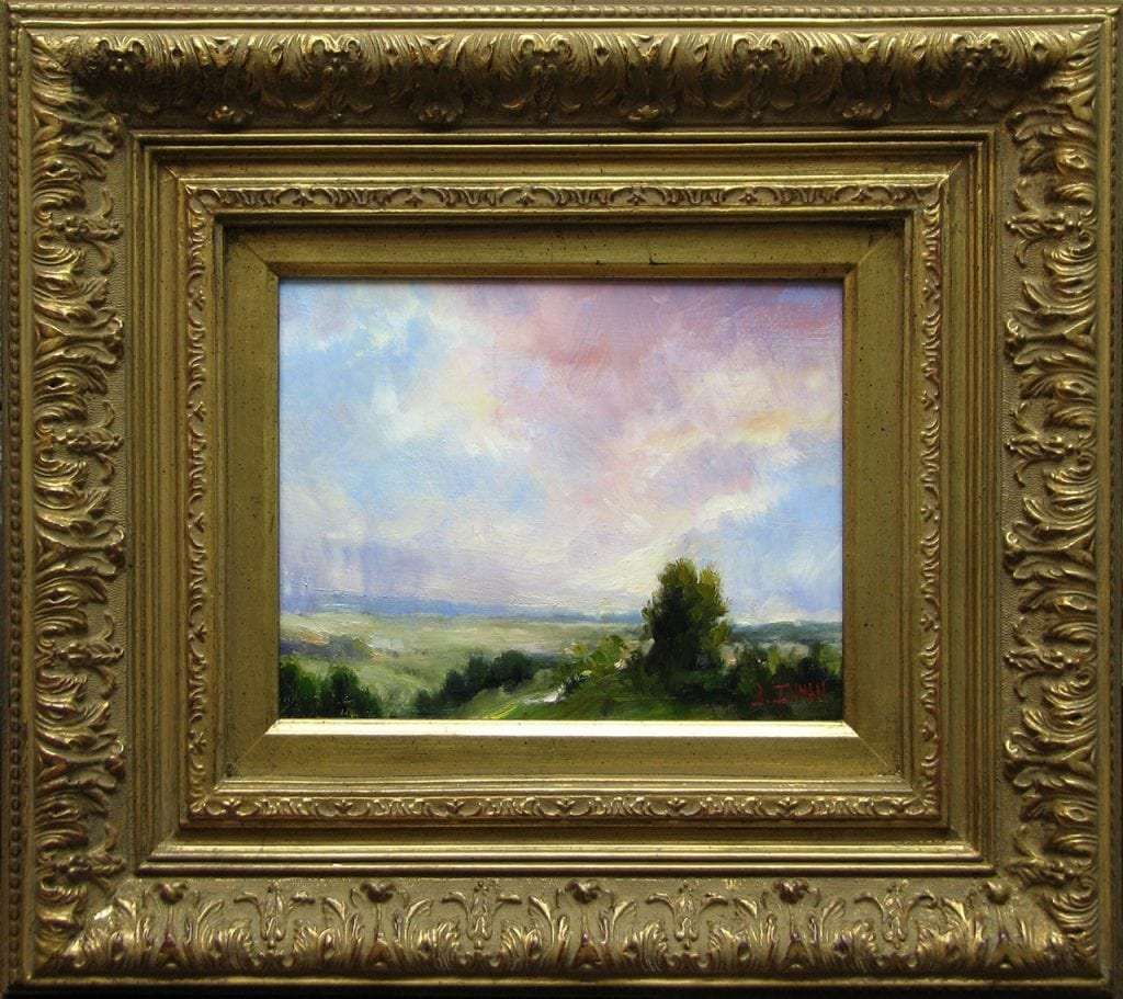
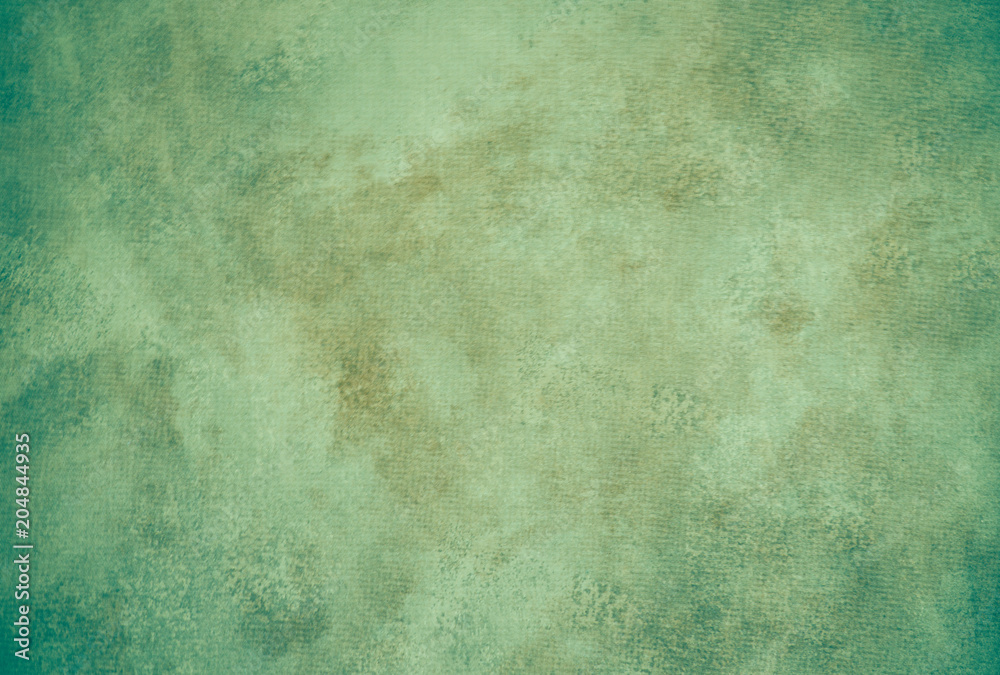
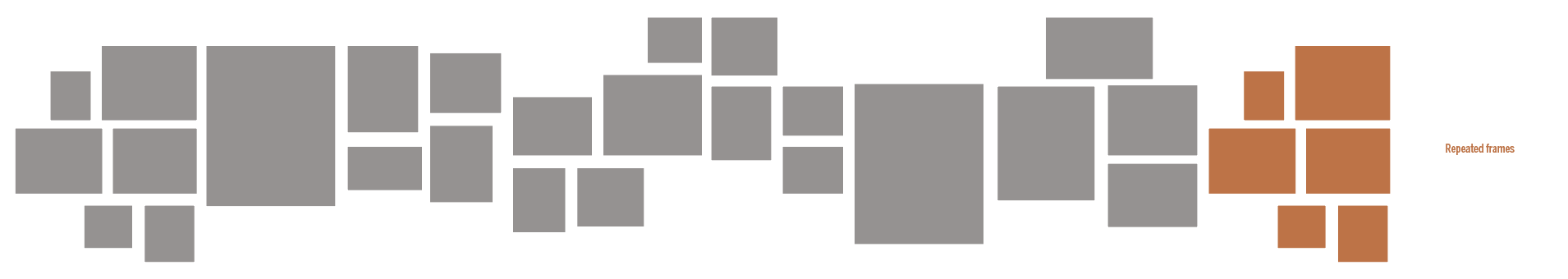
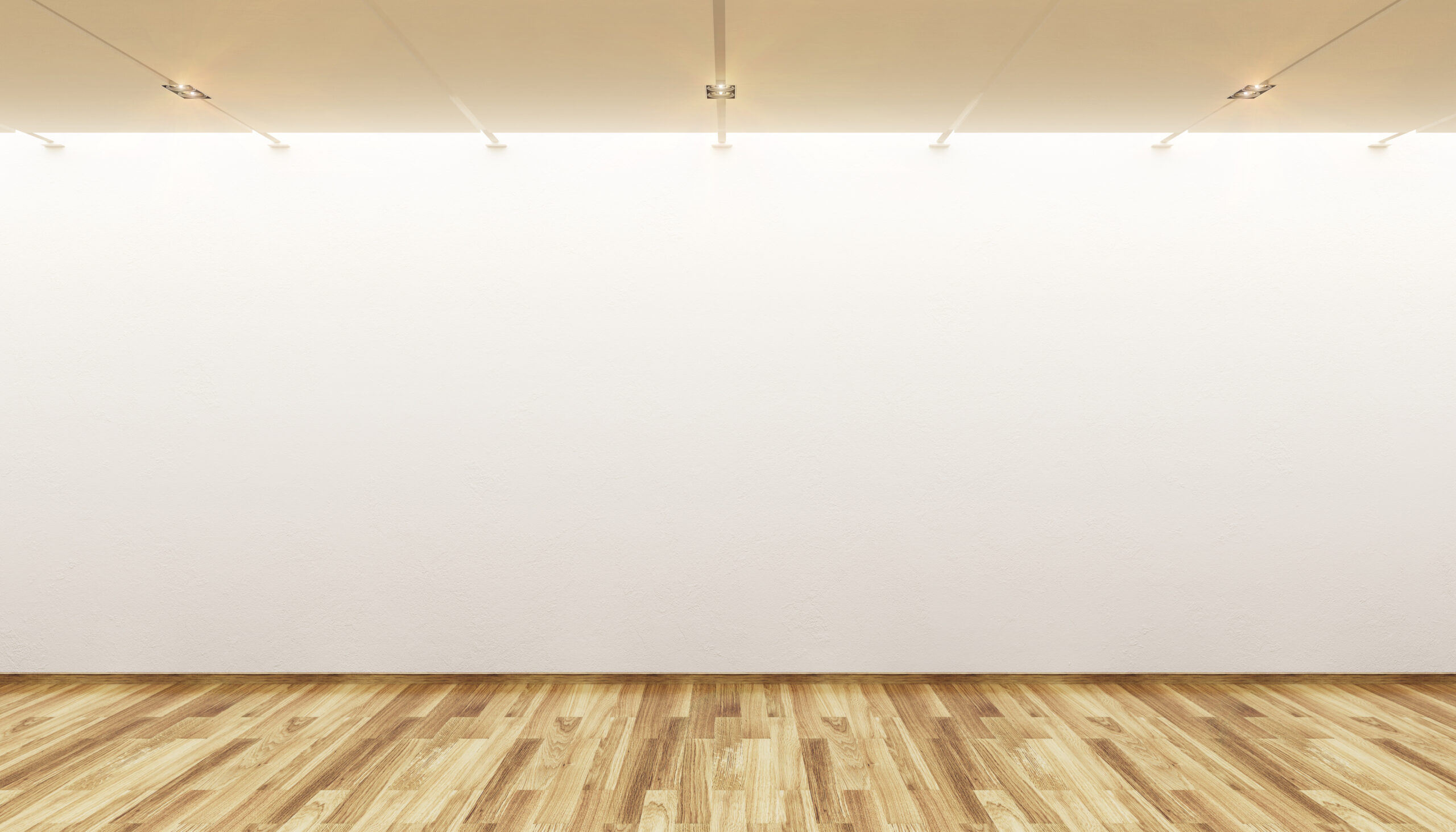
It was decided that the aesthetic for presentation graphics should pivot to a more modern gallery style. Some notes for me to keep in mind were unique frame layouts, warm wood flooring, spotlights, accent walls, and essentially anything that supported the modern gallery aesthetic. I was also suggested a layout that I could follow for the frames.
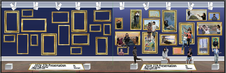
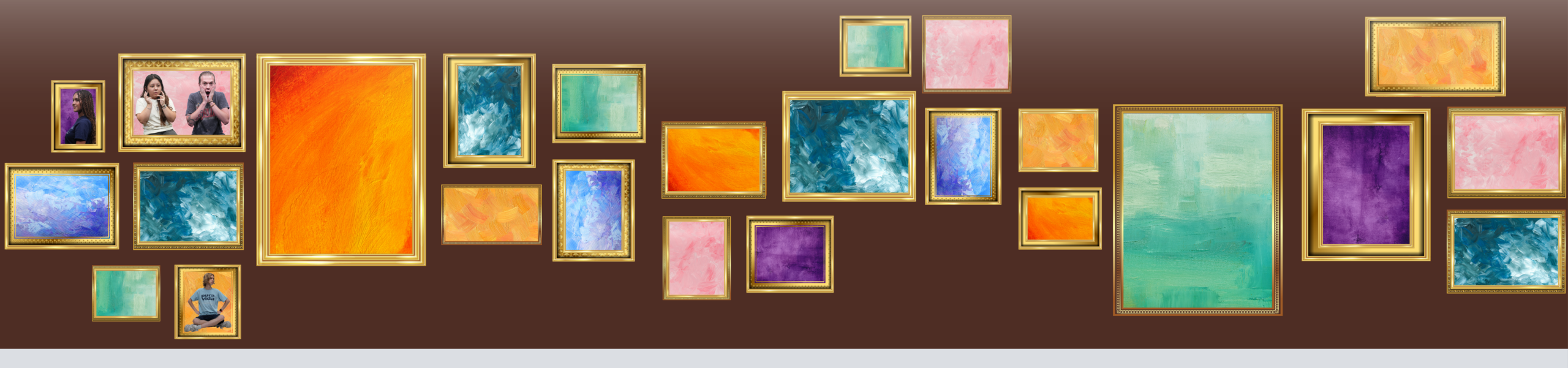
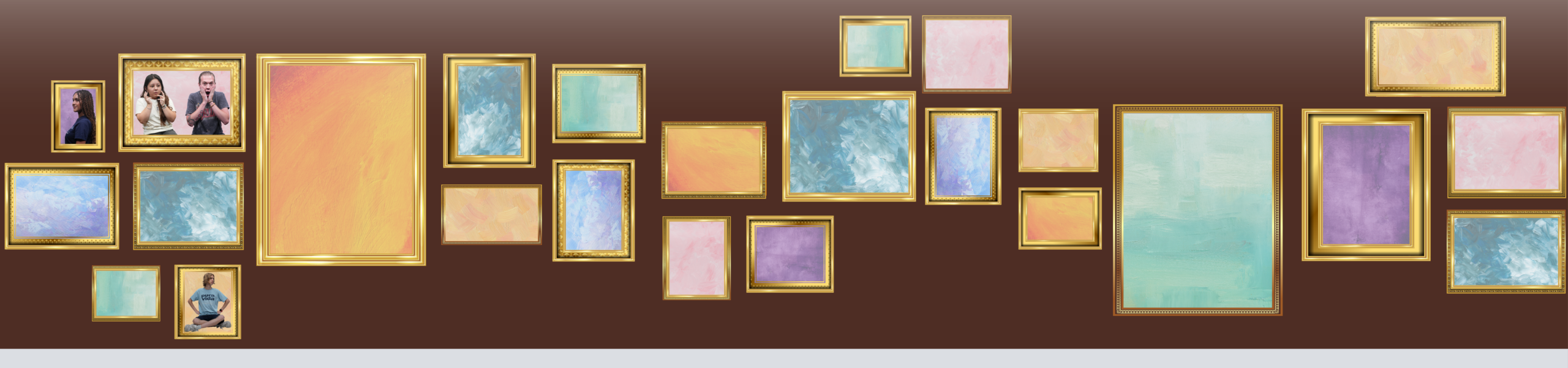
Wall Iteration
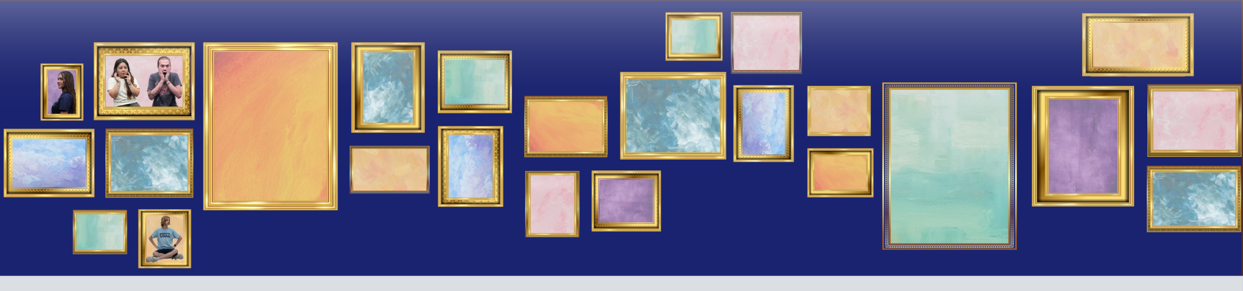
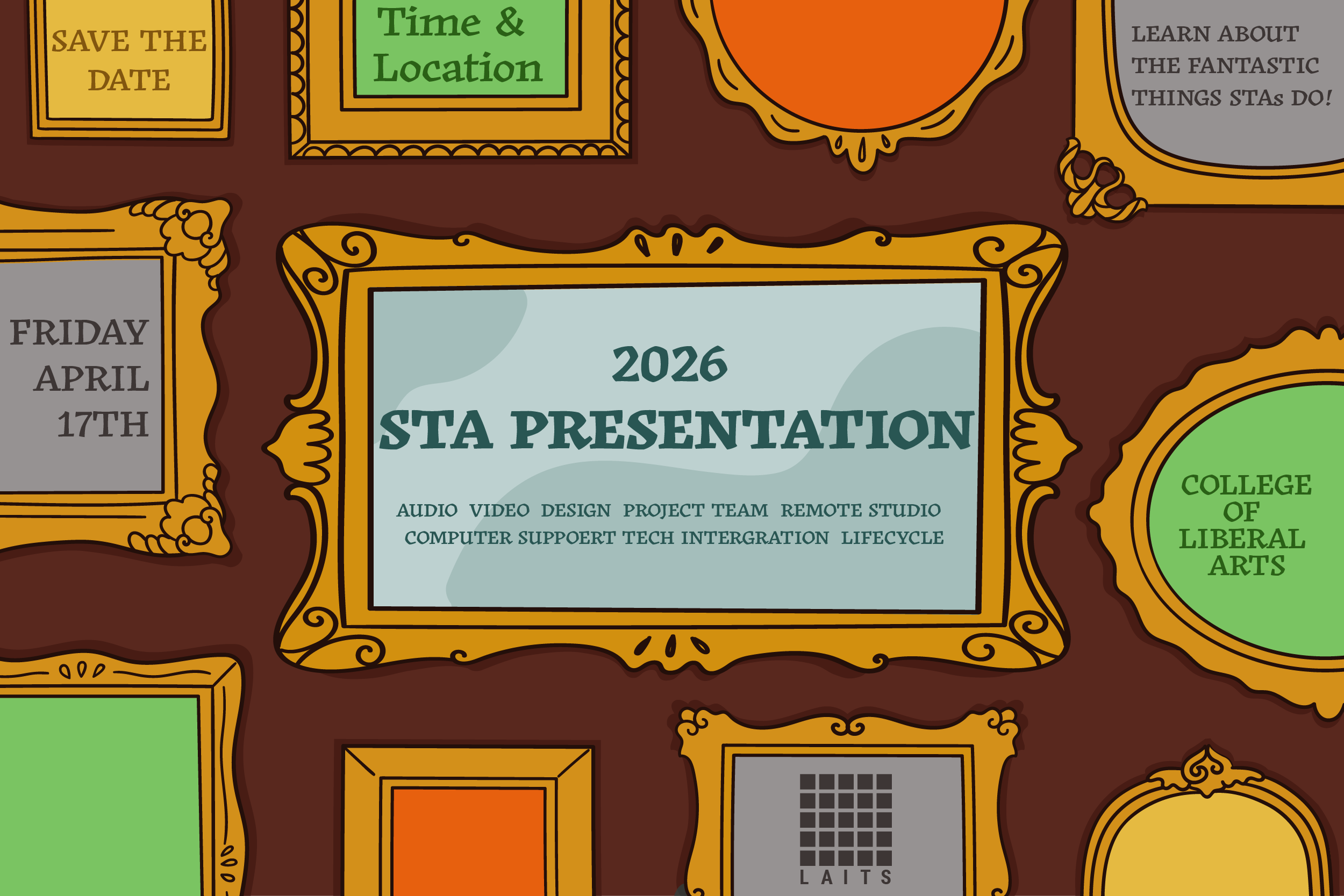
Progress as of 2/24/26
Light Fixtures
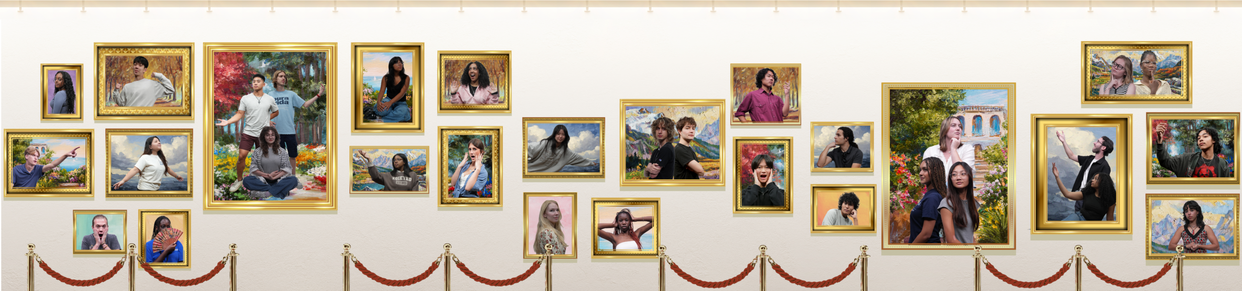
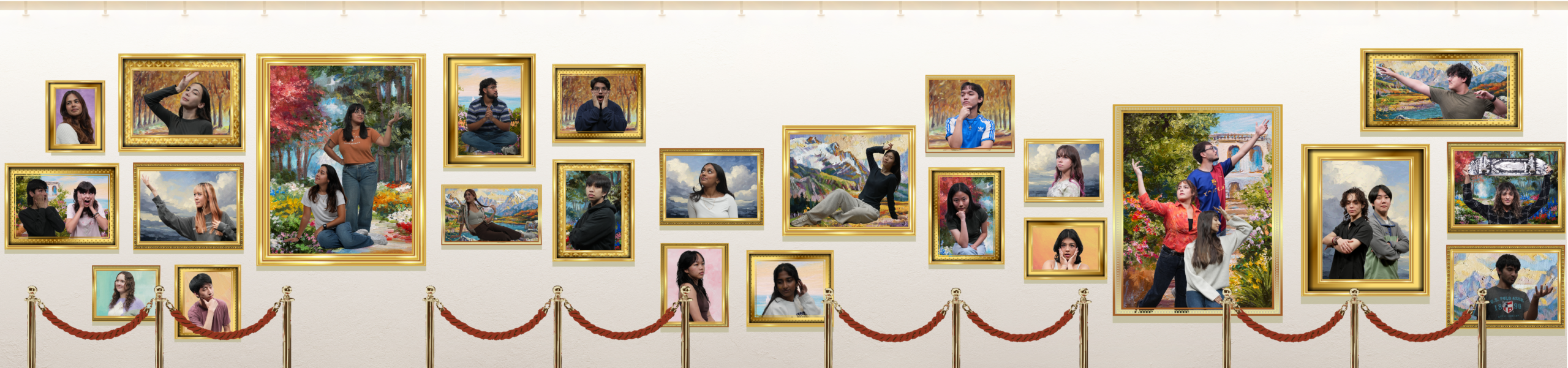
After a bit of back and forth and tweaking, the backgrounds for the paintings were settled! The next thing to add was light fixtures- suggested by De’sha. The first image is my first attempt at them. However, I was requested to see how it would look if the lights were at different angles- similar to one of our main references. So, I utilized the light assets Asha made for the presentation poster!

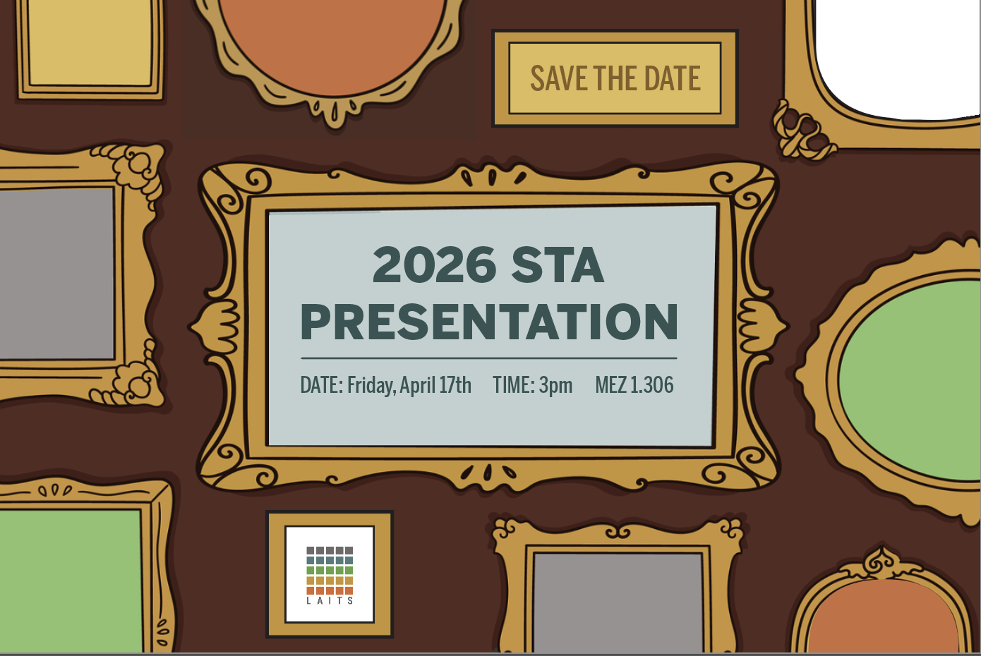
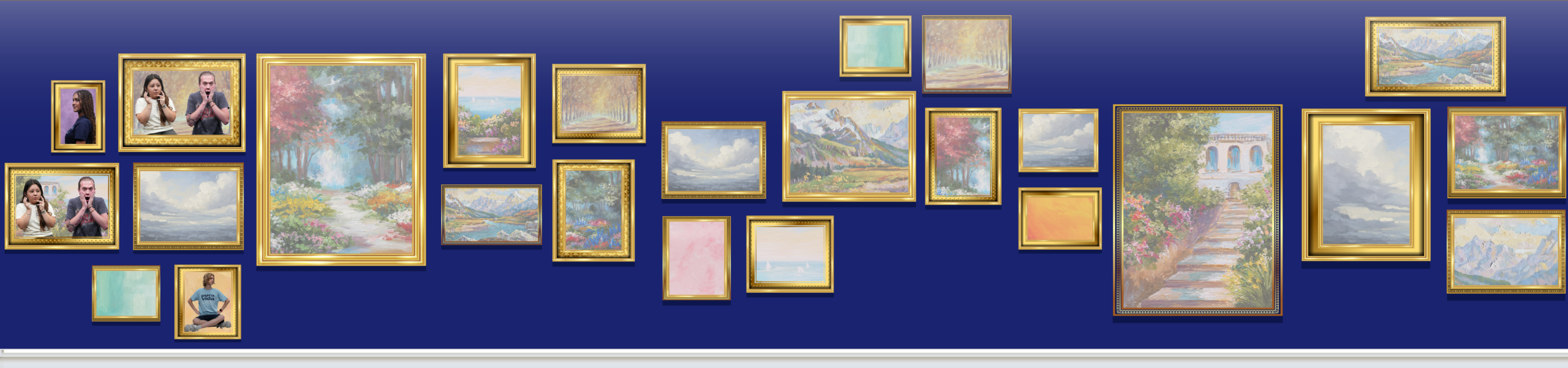
Pivot Pt. 2
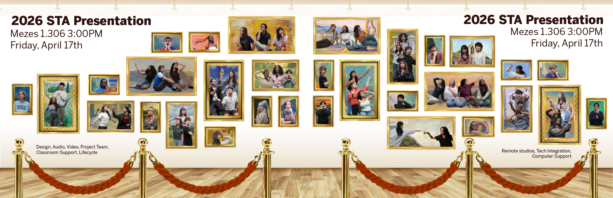
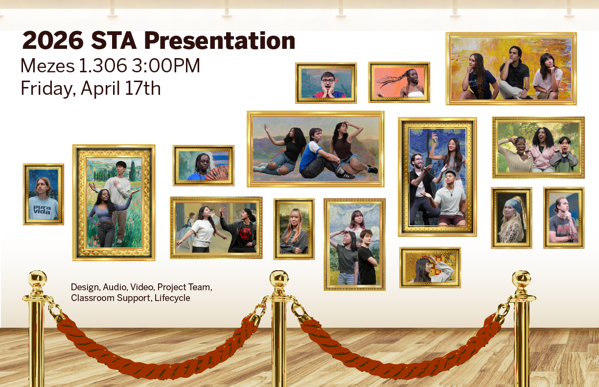
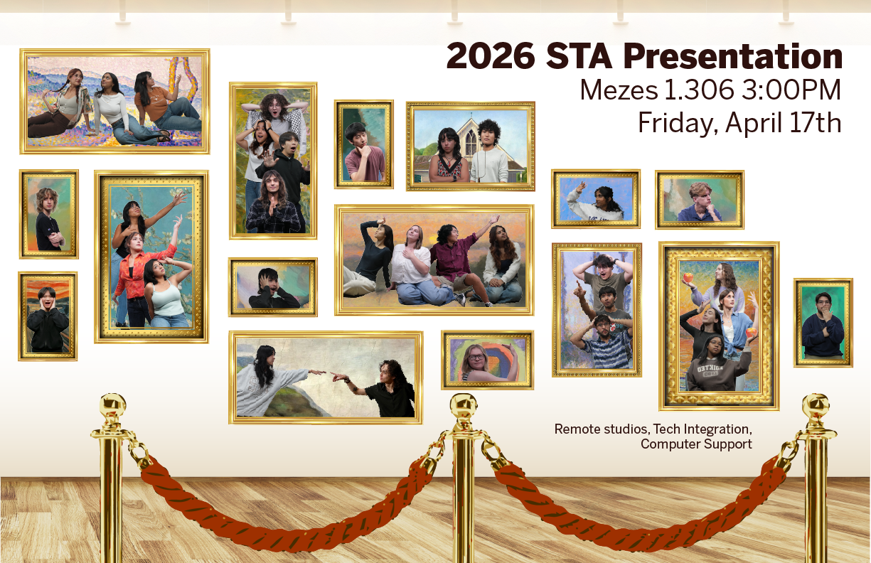
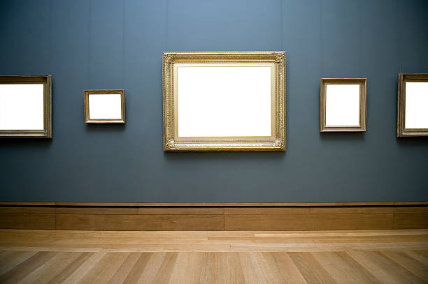
After some discussion with Lila and De’sha, another pivot was decided! To draw more attention to the frames and STAs, there will be a shift to a white background to all assets. Additionally, instead of statues we will do red velvet rope. It was decided that the statues may distract from the STAs in the frames too much. Below is the main reference for the background for future iterations of presentation graphics.
These are the most recent drafts as of 03-03-26. After adjusting the lighting of some of the STAs, it will finally be time to animate!
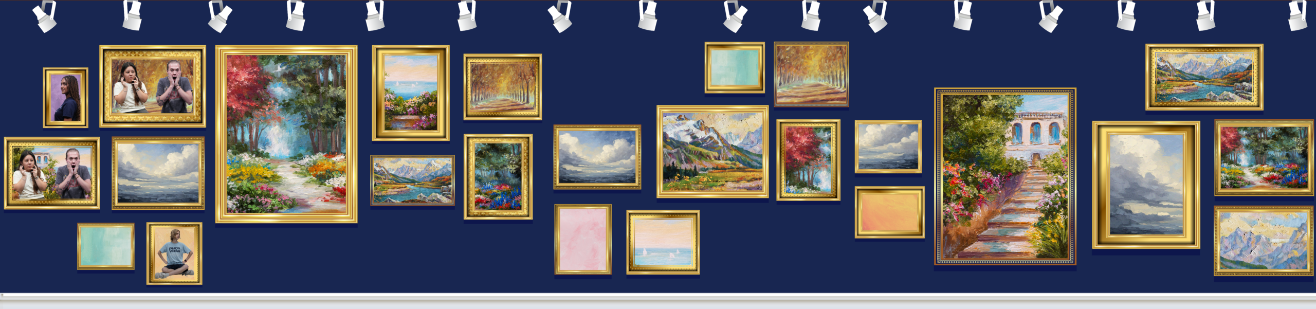
Animation
Doing a seamless scrolling animation was a lot more tedious than I thought! Since the animation had 3 main moving parts (roof detailing, frames, and velvet rope), it was a bit difficult to line up the cut from the end back to the beginning without a weird jump. However, with some help from Lila and adjustments, I was able to achieve a parallax effect with little jitters!