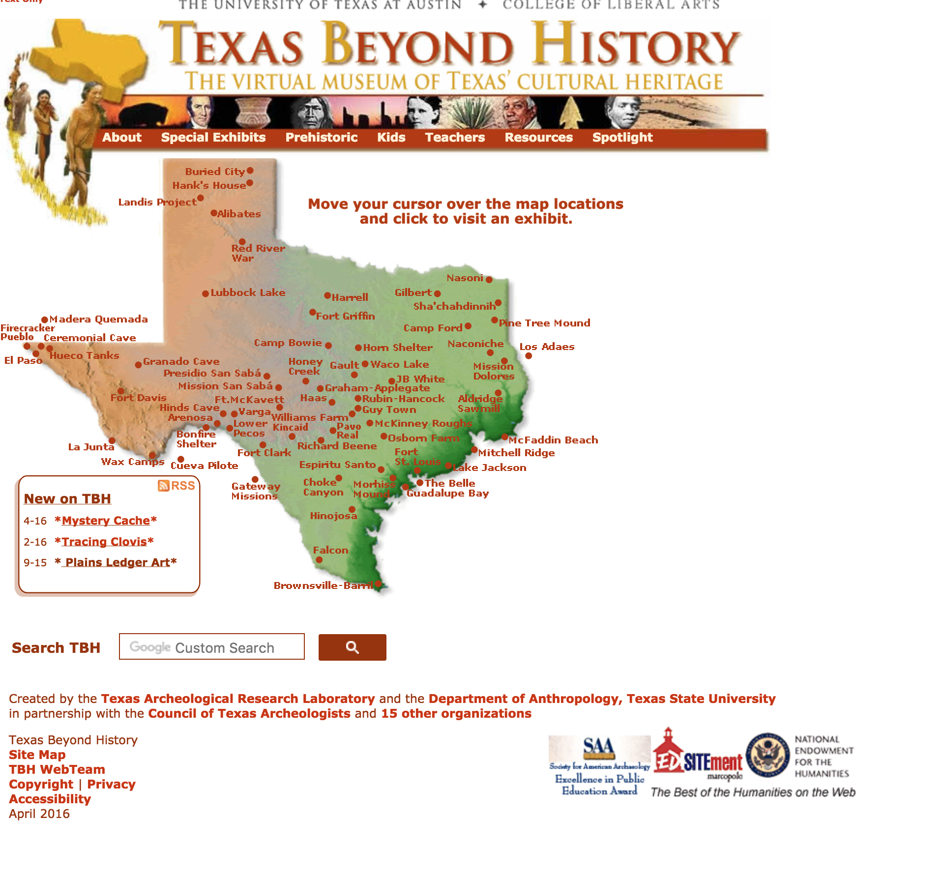
• We are STAs
    • Asha Rountree
    • Haley Ma
    • Kate Shih
    • Kyra Lee
    • Nicholas Peasley
    • Sasha Kenney
    • Shanda Horm
    • Shriya Atreya
    • Tomas Marulanda-Mesa
  • We were STAs
  • STA Presentation
    • STA Presentation 2017
    • STA Presentation 2016
  • Testimonials
  • Resources
  • Home

STA Blog

Current Sta

Coding TBH Site

February 6, 2018 By Nick Lavigne

Coding TBH Site

Over the past few weeks I’ve been coding the new TBH site. I’m starting with the homepage which I modeled in the previous posts. Stacy advised to use CSS grids and gave me this site, which I found extremely helpful: https://gridbyexample.com/examples/ .TTo achieve the grid layout I basically followed the tutorial and implemented my own version. Currently each grid box contains an image of the thumbnail I want but that leads to scaling problems with the text and images being fuzzy so I think I’m going to redo it and make it dynamic.

Heres a code snippet of the html I’m using:

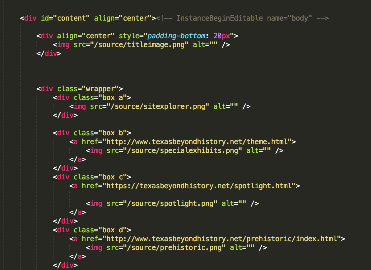
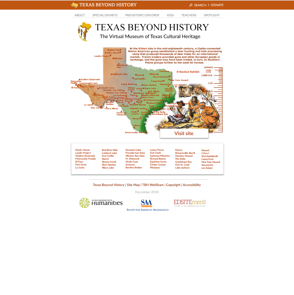
Also here’s the current working prototype:

Filed Under: 2017-2018, We are STAs

TBH Redesign

December 12, 2017 By Nick Lavigne

TBH Landing Page Redesign


I was asked by Suloni to redesign the existing TBH homepage which looks like this:

As you can see the design was really dated and uninspiring, especially since the main audience for this website is kids. We needed to update it to make it more tablet friendly/exicting and also give it a more “modern” feel. The client who oversees Texas beyond history typically does not like changes so Suloni had me create two design mockups. One was pretty close to the old design and the other was very different.

1st Mockup:

I tried to keep the same “feel” as the old website but add modern design elements such as the nav box/ drop shadows. I also reformatted header and footer to look cleaner.


2nd Design option:

This was my preferred design option. It offers a completely different look and feel from the old home page. It is clean and simple. The large icons are easier to press for children, especially since most will be accessing this site with a tablet. The client ended up choosing this version to our surprise! In the next coming weeks I will be working with Stacy, one of the web developers here, to bring this mockup to life in the new site using CSS/HTML.

Filed Under: 2017-2018, We are STAs

U13_5 Illustration

November 29, 2017 By Stephanie Lawrence

Filed Under: 2017-2018, We are STAs

U13_1 Illustration

November 29, 2017 By Stephanie Lawrence

Filed Under: 2017-2018, We are STAs

Texas Beyond History

November 15, 2017 By Nick Lavigne

Interactives

I’ve finished the rebuilds of Talking Hands and Parade animations. The Parade one was relatively simple, but the Talking Hands was probably the hardest interactive I’ve done yet. It involved adding many features to Canvasser which Ruben graciously added. 

The hardest part to redo was this frame which involved a slider which controlled a mini map and the large map. You could then drag the mini map to move around the large map. This involved adding multiple constraints for each elements such as the slider position controlling the scale of the minimap and the large map. If you want to see the final version you can see it here: https://dev.texasbeyondhistory.net/st-plains/kids/talking/index.html

Filed Under: 2017-2018, We are STAs

U12_2 Illustration

November 2, 2017 By Stephanie Lawrence

The U12_2 depicts Oleg and Polina on an ornate staircase, where Polina is at the bottom looking up the stairs with Oleg at the top looking down on her.

I felt the most important part of the scene was the perspective. The stairs are the focal point of the scene, but Polina and Oleg also needed to have the correct perspective to make it seem more realistic and show their position and where they are looking.

The photo I chose reference showed a clear perspective that could easily show the two characters and had good tonal qualities.

I did a rough sketch of the scene.

Once I got approval, I started the final drawing. The perspective of the staircase was easy to capture, but the hardest part was actually drawing the ornate railing, especially since they were all at different distances. I needed to get the right amount of ornate-ness but not detract from the actual stairs and Oleg/Polina (since that was not the focal point).

I added Polina and Oleg in, and while Polina fit in nicely as the perspective was much more straight forward, it was a lot harder to capture Olegs perspective.

I needed to make a sculpture of Oleg out of clay in order to visualize the perspective, because none of the other character sheets showed that perspective from looking down at him. Once I found the right perspective, I pieced together parts of Oleg from multiple character sheets and constructed a new position for him on the stairs.

The tonal renderings were not that difficult, especially since there is a pattern going up the stairs where there is much harsher light and shadows towards the window and softer more dispersed light towards the back.


Filed Under: 2017-2018, We are STAs

  • « Previous Page
  • 1
  • …
  • 126
  • 127
  • 128
  • 129
  • Next Page »

link to LAITS home page

Video STA Home

© 2026 Liberal Arts Instructional Technology Services | Production Credits