Progress
- Completed Tier 2 Studio Graphics
Graphics I made for Tier 2 Studio Graphics
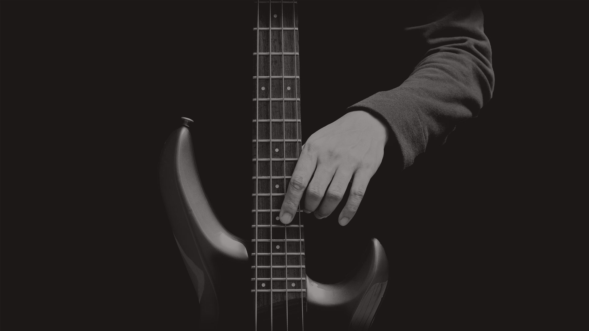
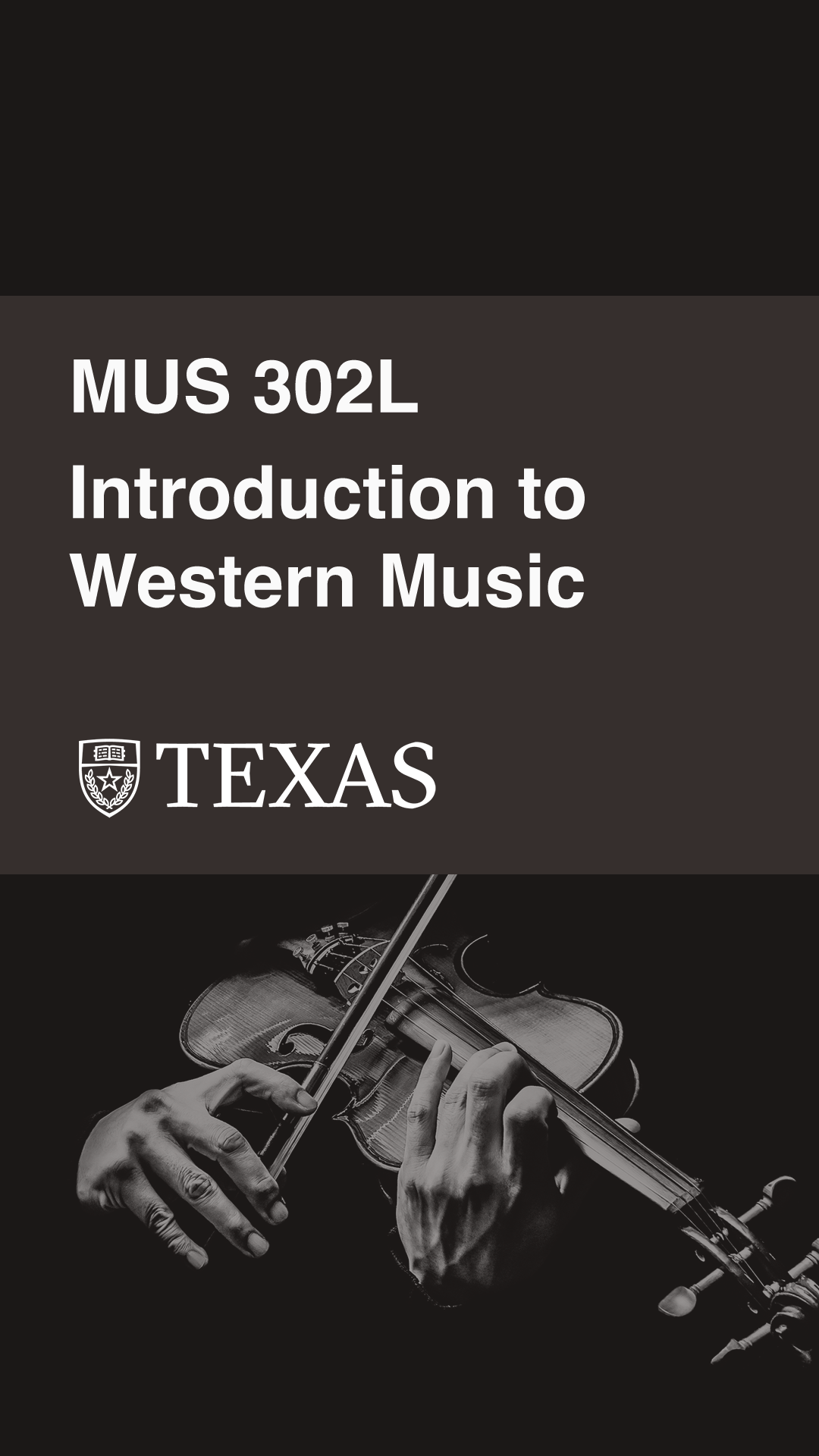
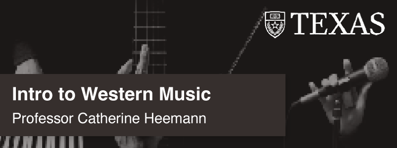
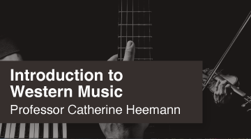
I decided to design graphics for MUS 302L, Intro to Western Music, which is a class I’m in currently. I wanted to focus on a darker mood with a brown theme.

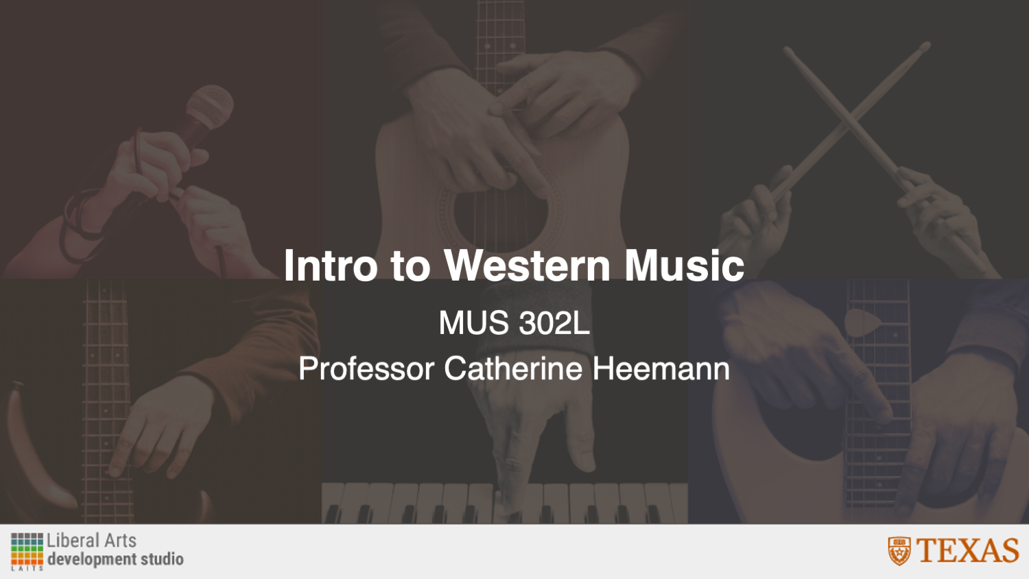
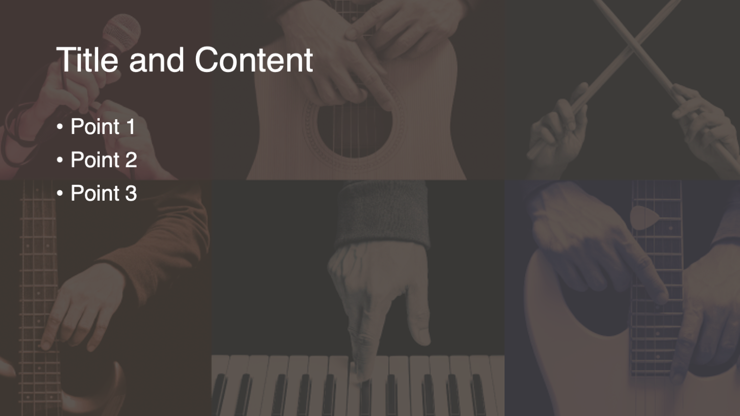


I decided to design graphics for MUS 302L, Intro to Western Music, which is a class I’m in currently. I wanted to focus on a darker mood with a brown theme.
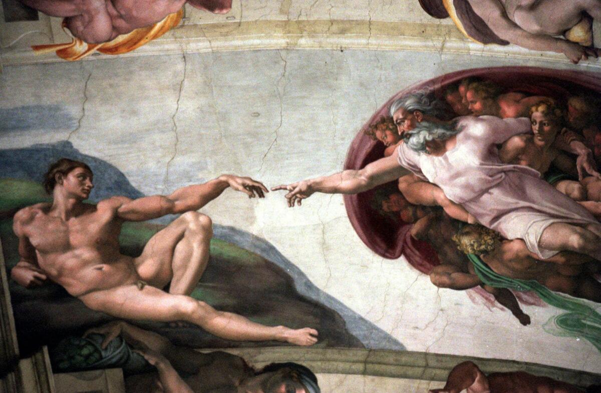
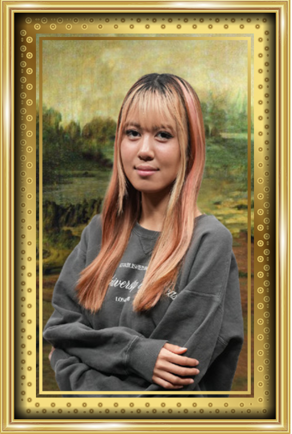
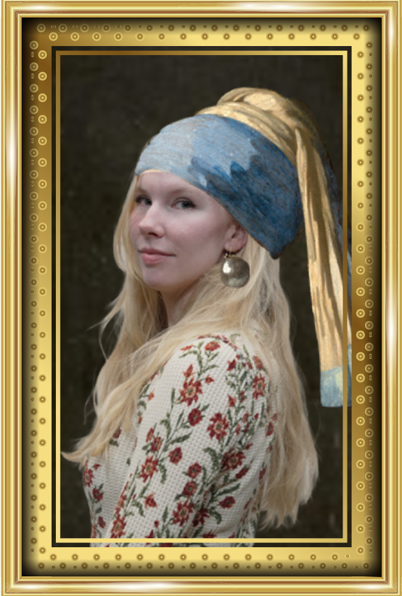
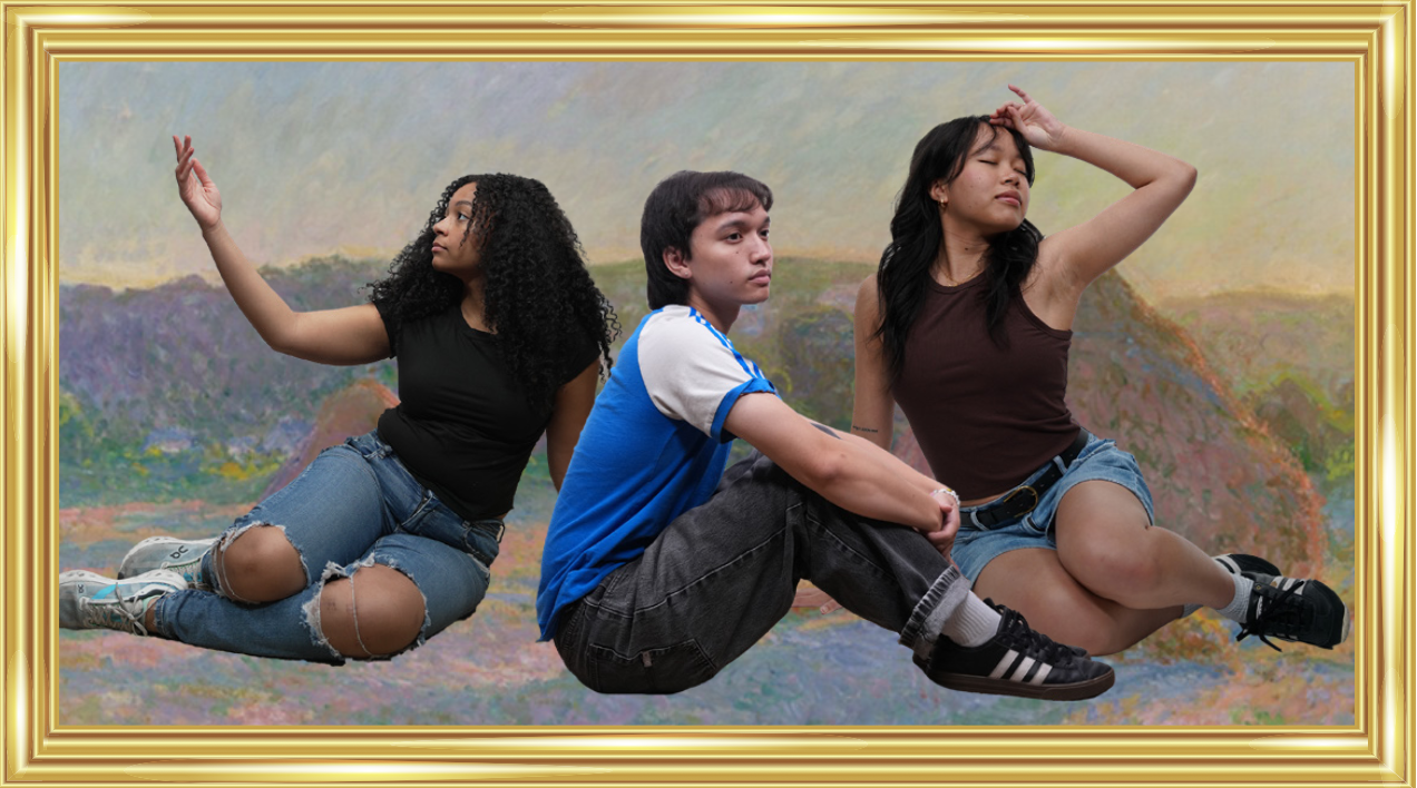
This goal of this project is to create a poster for the 2026 STA Presentation following an “art gallery” theme. In the project specifications, I was instructed to split the STAs into two posters while still thinking about how these posters would fit side-by-side cohesively.
This was a fun assignment, because I got to explore different ways to present the STAs within an art gallery format, emphasizing their unique poses and expressions.
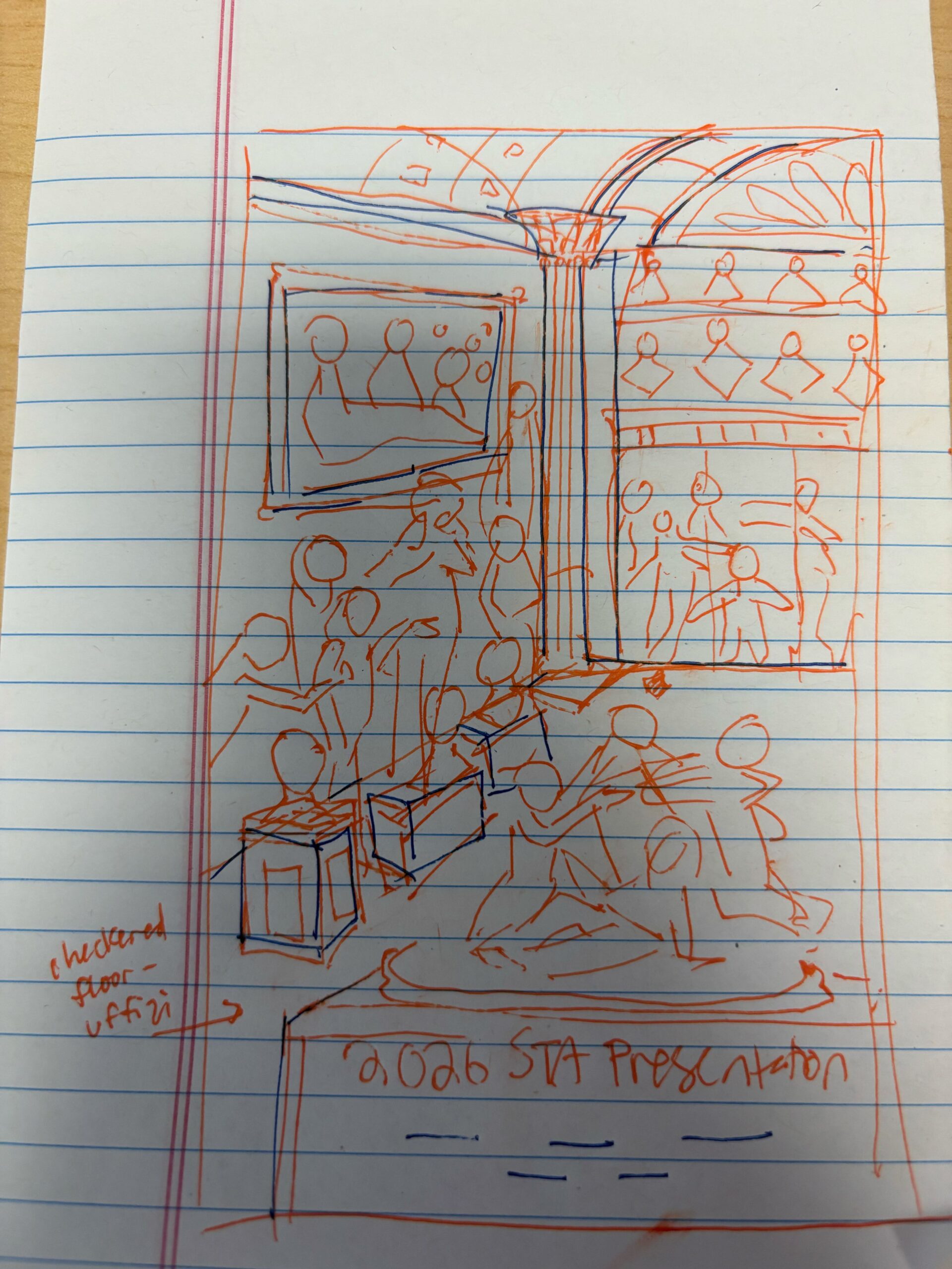
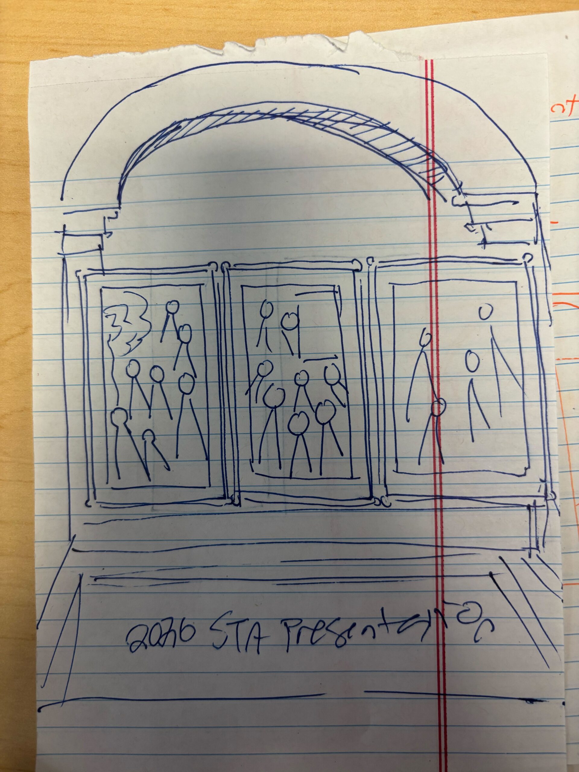
★ Design Drafts: To get an idea of how I could lay out the posters, I created a few rough sketches on paper. The left sketch was more classical inspired (primarily focusing on sculptures), while the right ones have a more modern gallery look.
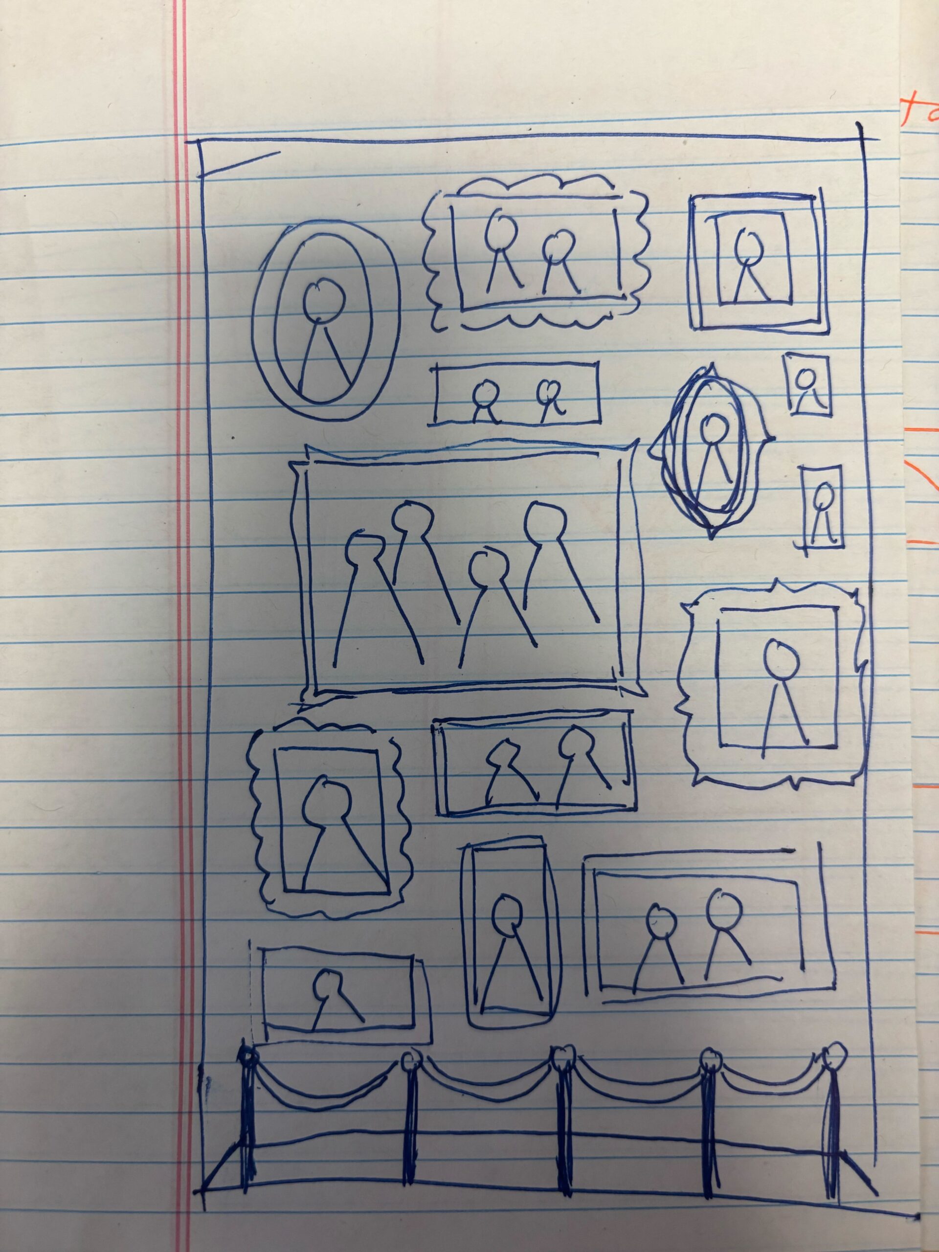
I received feedback to incorporate both sculptures and paintings, and to simplify the layout of sculptures into a 2-D view (my original left sketch used one-point perspective to add depth). Using this feedback, I created the following sketches on Illustrator:
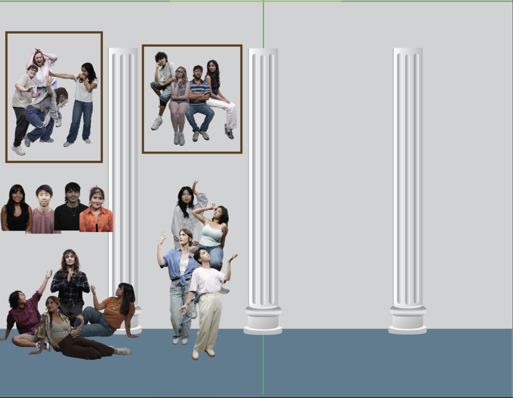
I created drafts of columns to place in the background, and played around with the layout of the photo cutouts. I tried to group interesting poses together in scenes that could be interpreted through sculpture or painting.

On this iteration, I formalized the background a bit more (adding texture, patterns, ect), and made the choice to include the poster title on a plaque to align with the museum theme. I also decided to orient the posters horizontally instead of vertically to leave more room for standing statues.
★ Pivot to Modern Gallery: Next, I received feedback that the current artistic direction leaned a bit too much towards Greek-style architecture, and that LAITS wanted to emphasize a more modern gallery aesthetic. This involved removing the pillars (which left more room for frames), and including more wooden/warm accents.
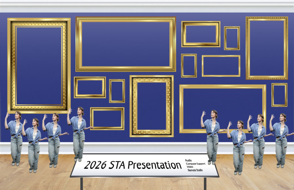
For my first draft of the modern gallery, I experimented with the layout of a few frame assets Shanda provided me, and thought about how statues could be organized.
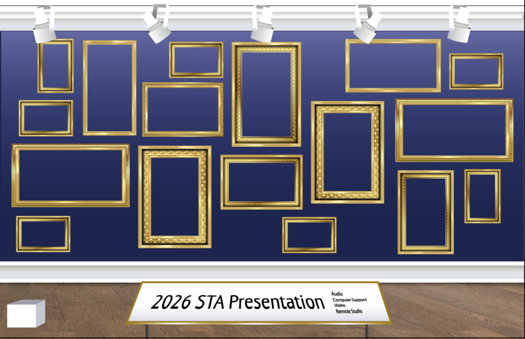
I received some feedback to add light fixtures, and to make the frames more organically structured with breathing room around the sides. I also adjusted the frames so that there are even pockets for statues to be placed. I also made the backgound a little darker to make the paintings/statues stand out more.
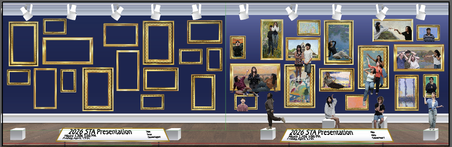
I’ve begun thinking about how the two posters will fit together and what paintings/photo cutouts will be used. I scoured free photo archives online to find fun and recognizable paintings to include, many of them from the impressionist era. Overall, I want the colors of the paintings, the poses, and expressions to feed harmonious. I also adjusted the height of the pedestals to make sure they are visible over the title plaque.
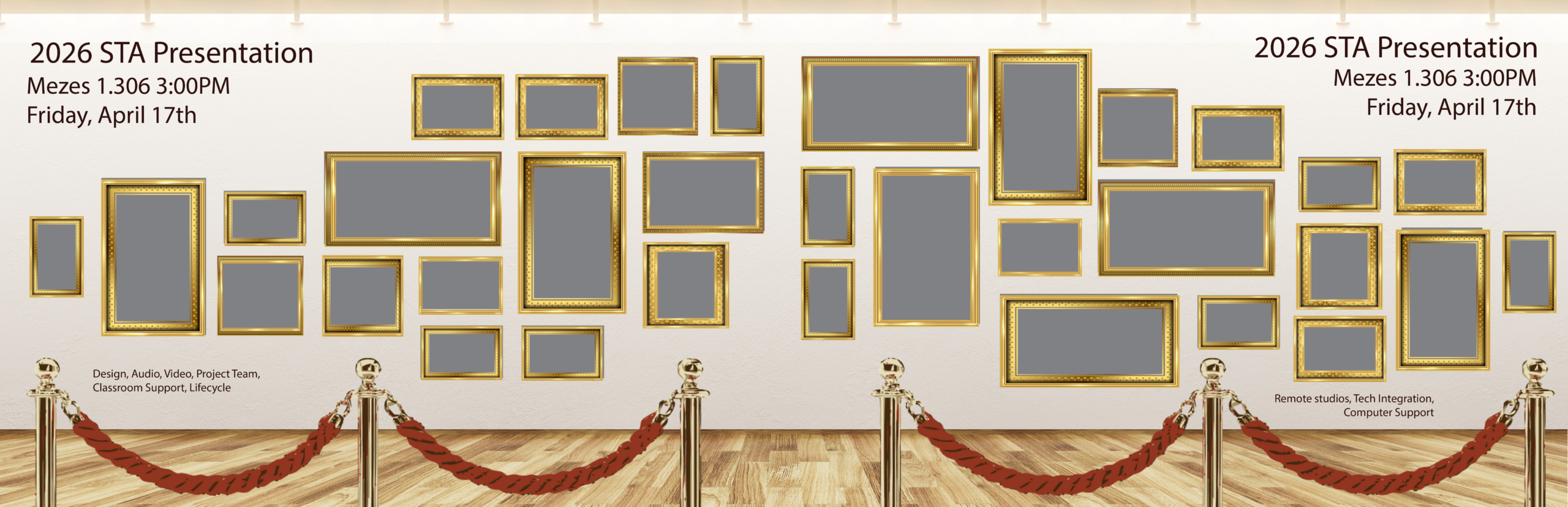
★ Pivot to a new background: I have received feedback that in order to fully bring attention to the paintings, we will remove the statues, change the wall and floor to lighter colored assets, add velvet ropes, and move the text to the wall. This edit in background will be accompanied by a re-ordering of the picture frames to better convey movement. I was given this reference to work off of:
My objective after this pivot was introduced was to finalize the poses and paintings I would use for each STA. This required a lot of iteration, as I wanted the STAs in group settings to seem dynamic and engaged with each other, so it seemed they all actually belonged in a painting together. It was also a challenge to fit the required number of STAs into the frames.
★ Coordination with other STAs:
With the addition of the new Spring 2026 STAs, I became a little confused with which STAs had photo cutouts I could use and how many STAs total were expected to be on each poster. It was also difficult for me to track which STAs I had already placed on the posters/which ones I still needed. Thankfully, Lila came in clutch by creating this handy Photo Tracking Spreadsheet:
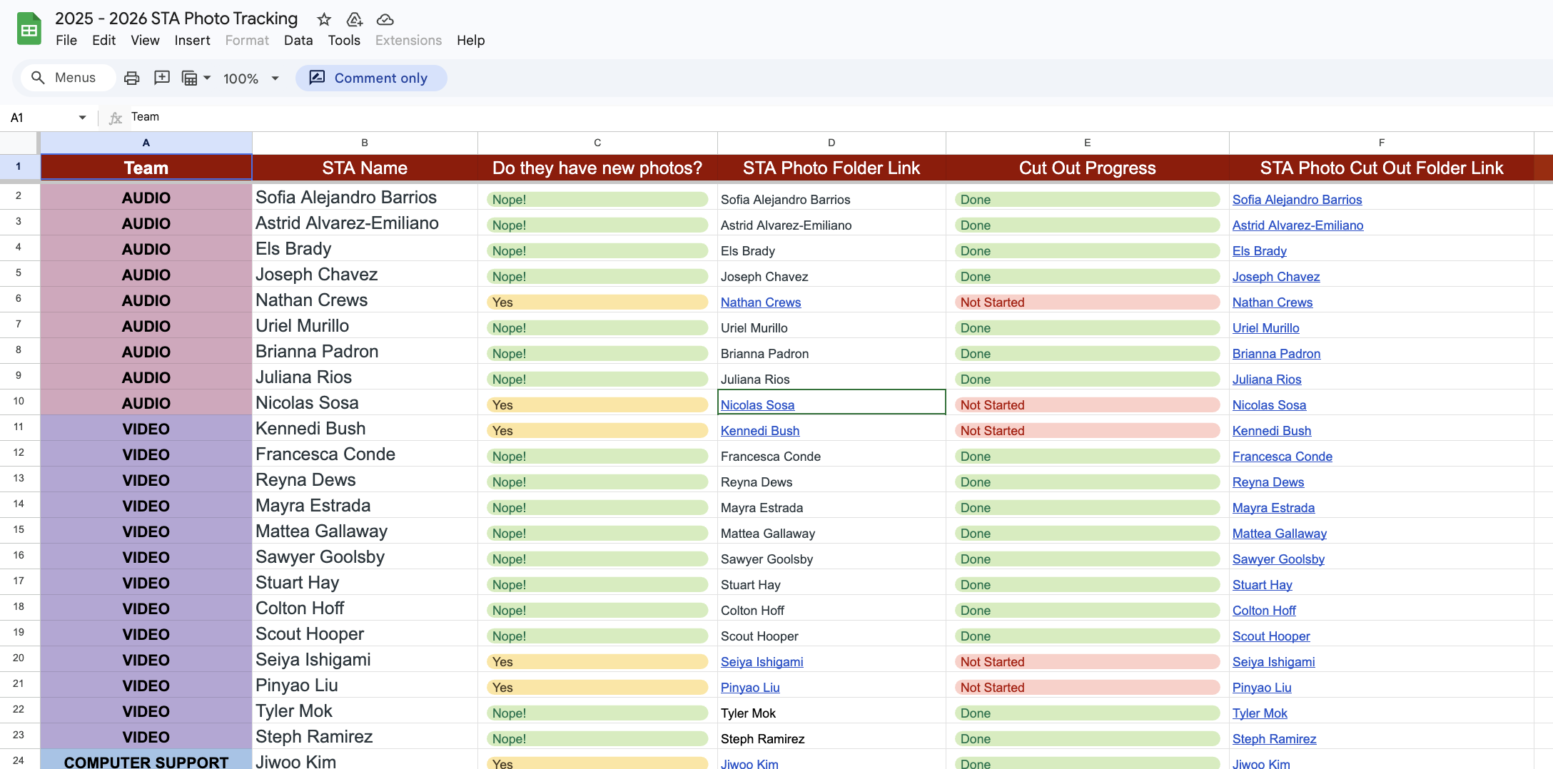
This spreadsheet helped organize and track the cutout statuses of the STA photos. It also made it easy for other STAs, like Thomas, to help out with cutting out the STA photos. Not only was this spreadsheet useful for my poster, but for all graphics being created using the STA cutout photos.
This illustrates the importance of communicating with the art directors and managers of a project to come up with tools and systems to organize a project.
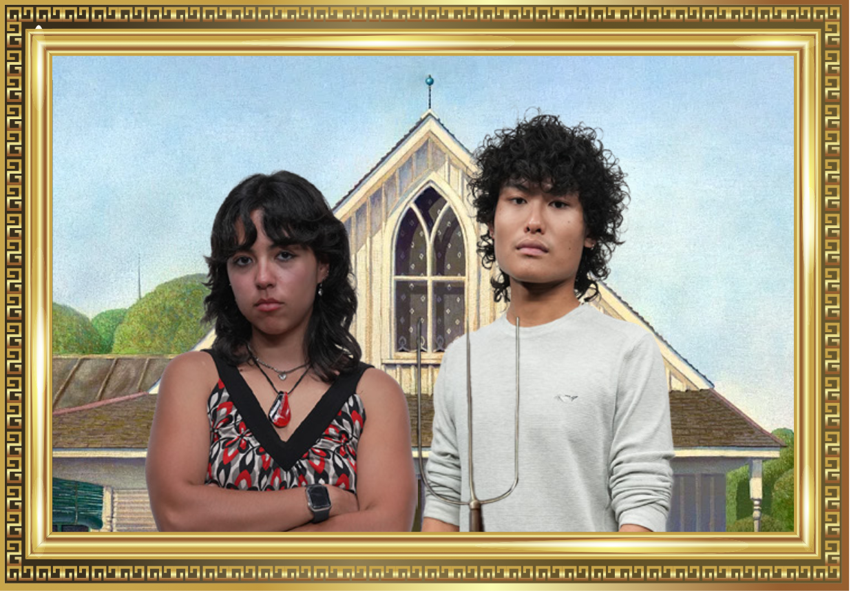
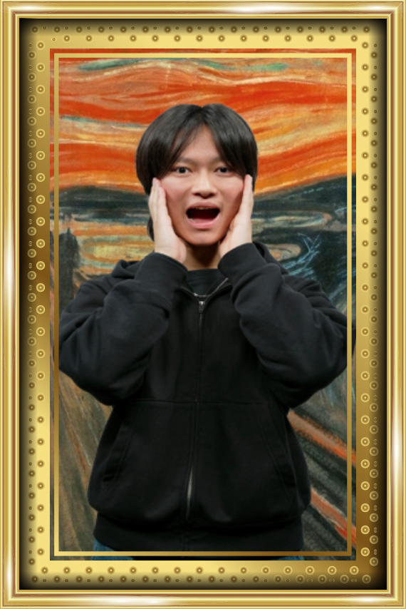
★ Final Poster:
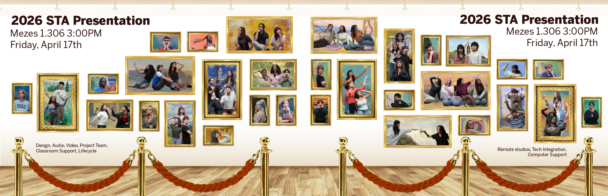
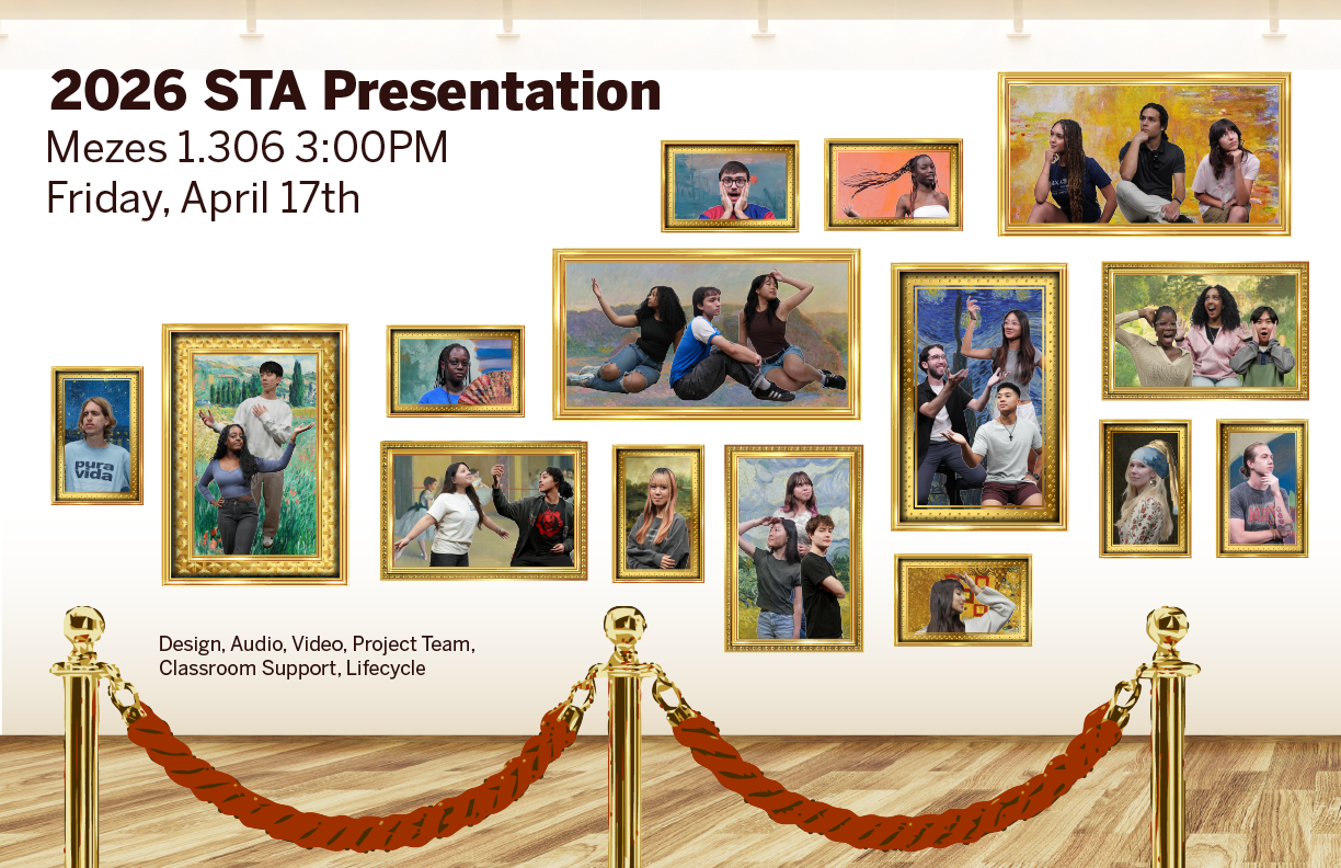
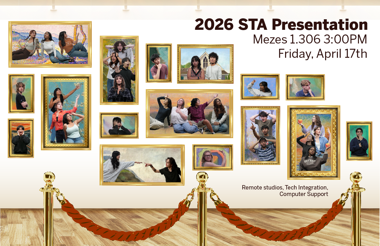
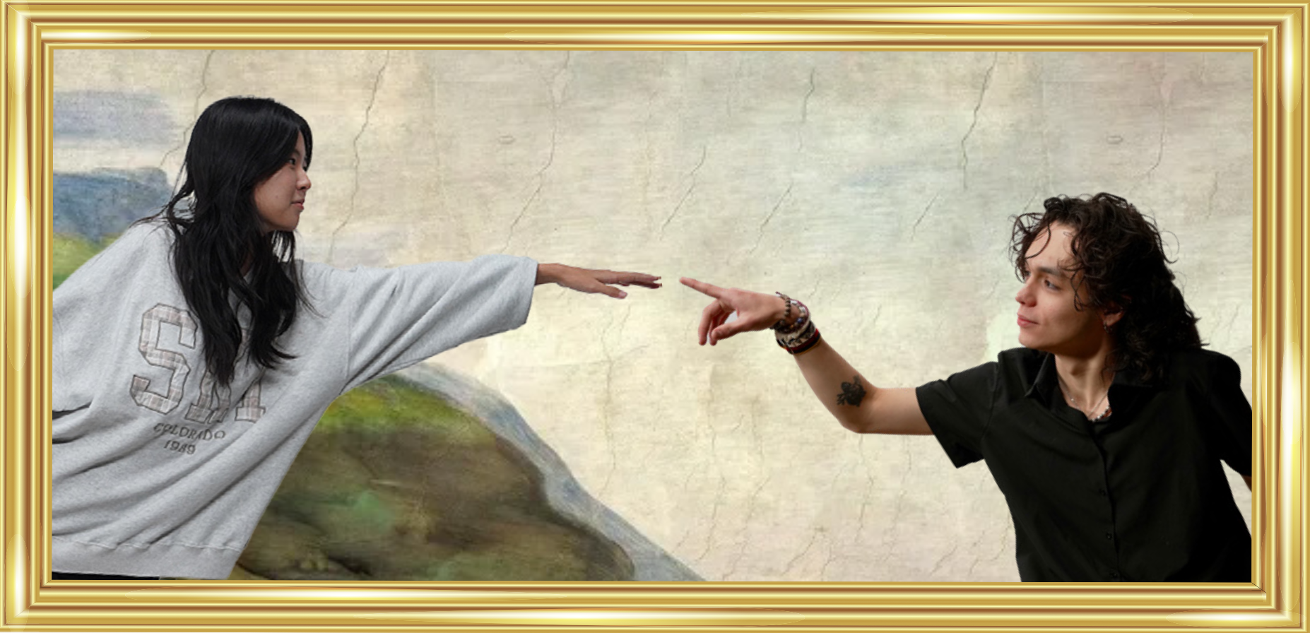
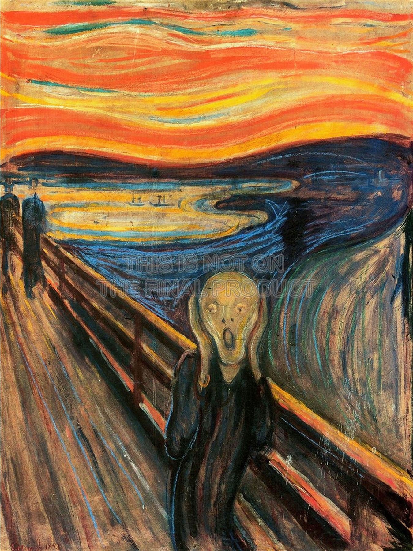
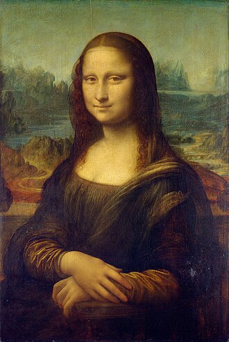
★ Side-by-side comparisons of famous painting recreations on the poster:


★ Some of the group painting clusters:
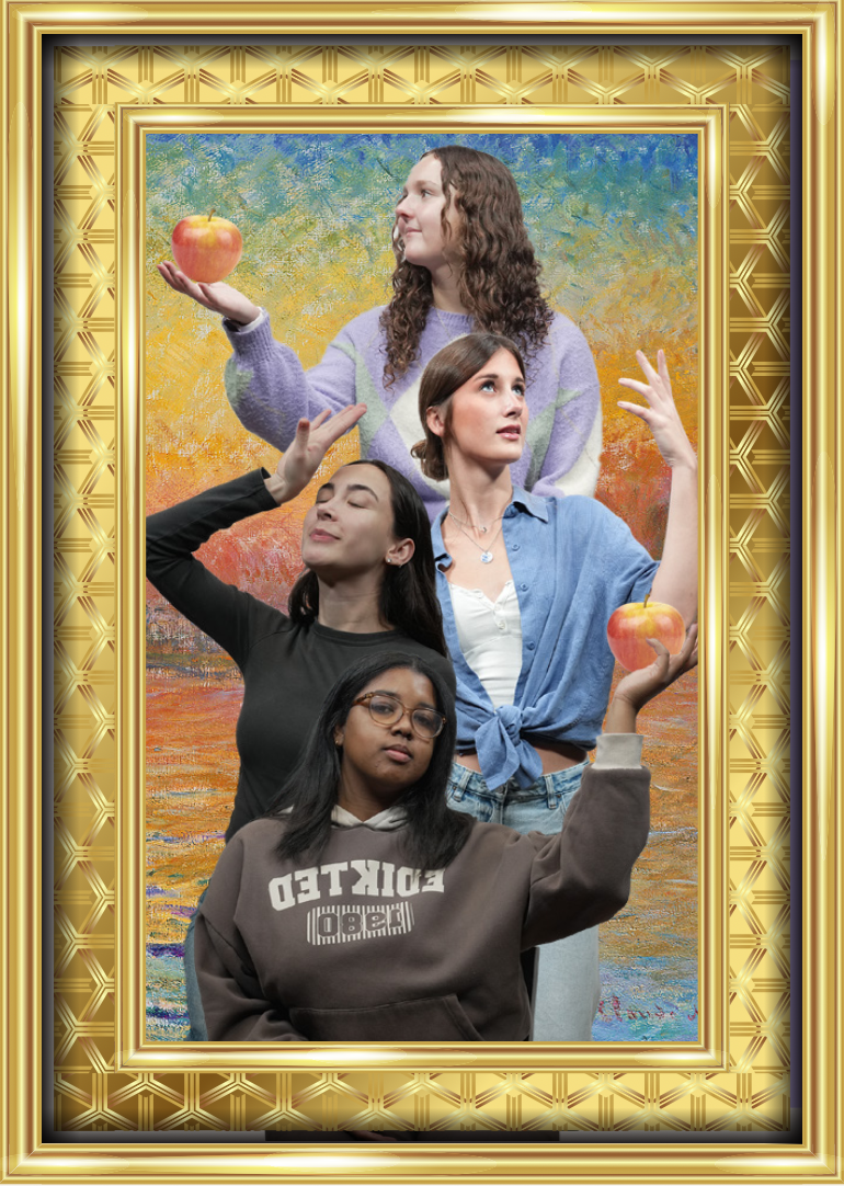
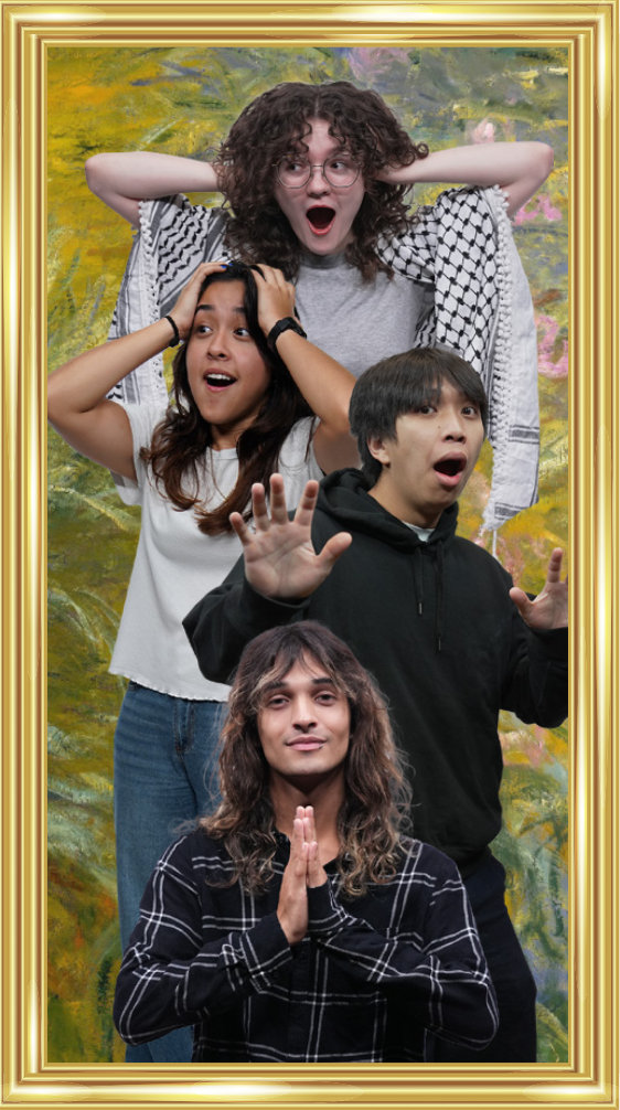
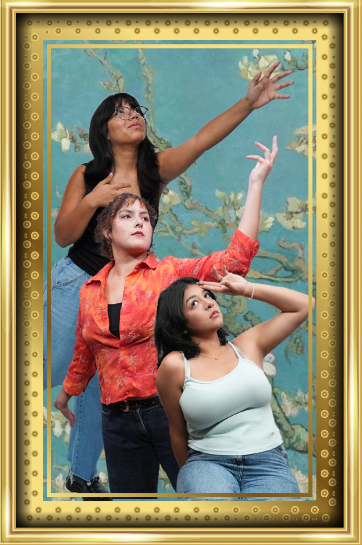
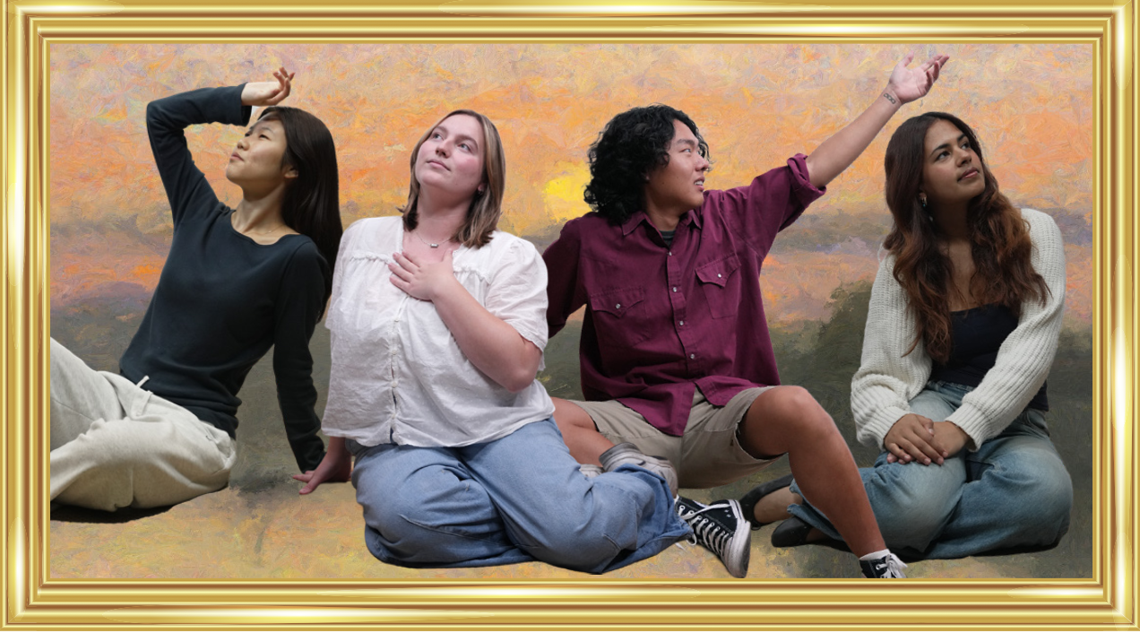
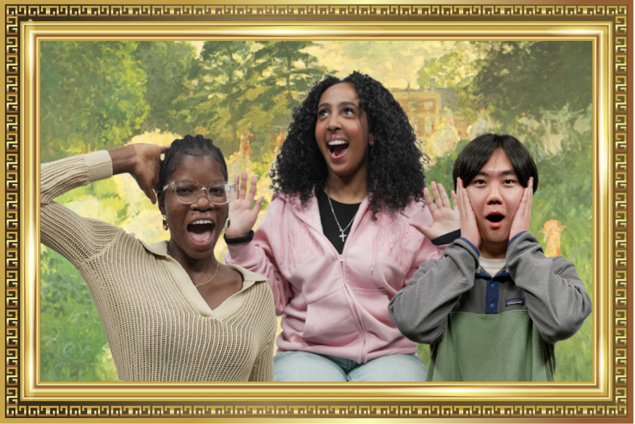
For all of the paintings, I made sure to choose backgrounds that were colorful and engaging, but not too distracting, as the STAs are the center of attention. I ended up adjusting the lighting of some of the STAs with photoshop to ensure consistency across photos.
★ Reflection: Working on a poster with so many assets was definitely a challenge. Although I had creative liberty in my designs, there were specific criteria to adhere to, so it was important to strike a balance. The following are a few lessons I learned:
1) Project scope flexibility: When I first started drafting the poster, I wanted to include grand archways and columns, reminiscent of an ancient art display. However, when the project scope changed to focus more on a modern gallery look, I realized I would have to pivot my creative direction. Later on, the art direction pivoted once more to further highlight the STAs. I learned that even if I’ve started fleshing out one idea, the outcome of the project ultimately depends on the client’s needs and scope, and it’s important to be able to adjust accordingly.
2) Consistency is key: I learned that In a poster with so many different paintings, poses, and people, It was important to retain an element of consistency. I ensured the sizing of the photos, sizing of frames, and the lighting on the photos remained consistent. I also replicated a few group poses across both posters so that the posters felt connected and cohesive.
3) Organizational tools make life easier: Lila’s spreadsheet really helped me track and choose STA photo cutouts for my poster. It shows how much of a difference something simple like a spreadsheet can make in the efficiency and clarity of a project (especially one handling lots of assets).
Client: Jonathan Cortez
Task: The Frontera Scholars Collective (FSC) would like a logo that will be the branding mark for their organization. They want something clean and polished, while also providing an exciting feel to the design.
Status: Design proposal sent
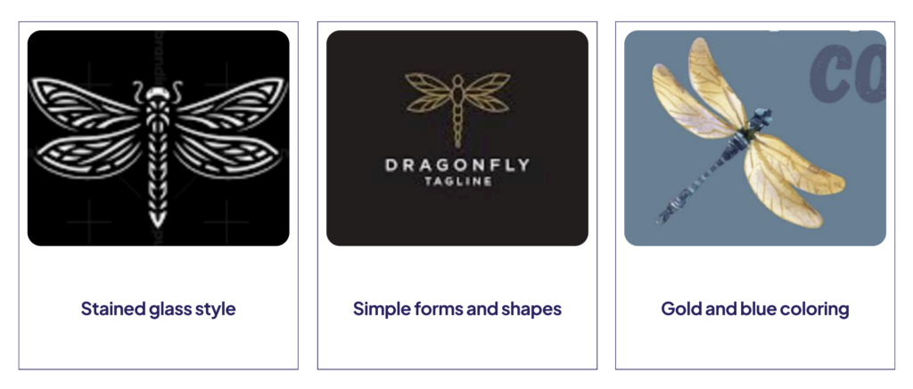
I started by looking at inspiration based off of want the client wanted the logo to look like. He wanted the logo to be a dragonfly with stained glass style wings. Additionally, the colors had to be blue and gold.
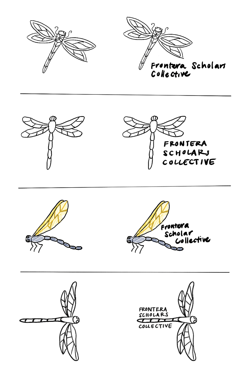
I then made a couple options, creating different dragonflies and trying out different text placements.
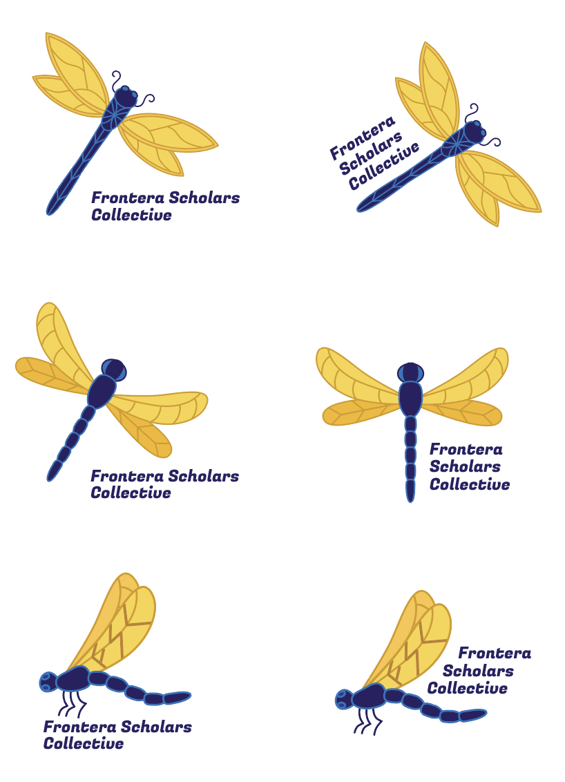
After receiving some feedback, I fleshed out and colorized some of the options from my sketches.
We then chose 3 logos from my 6 and made some mock-ups for the client.
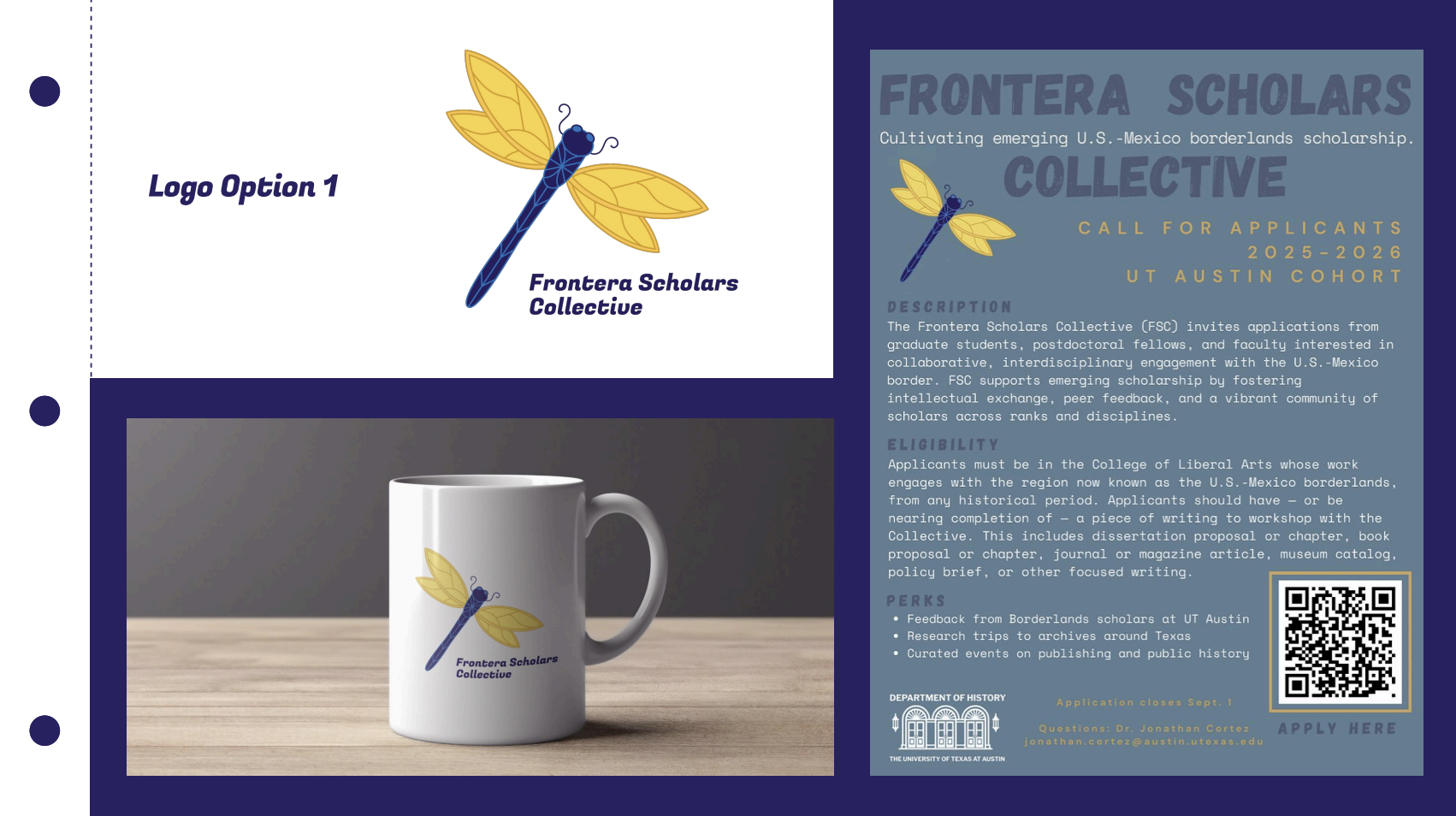
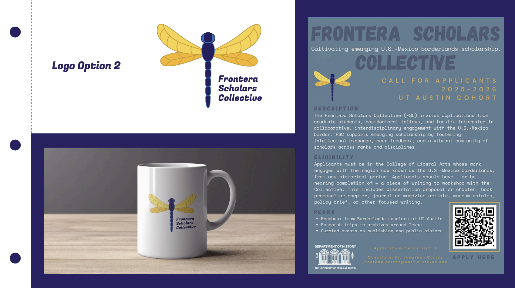
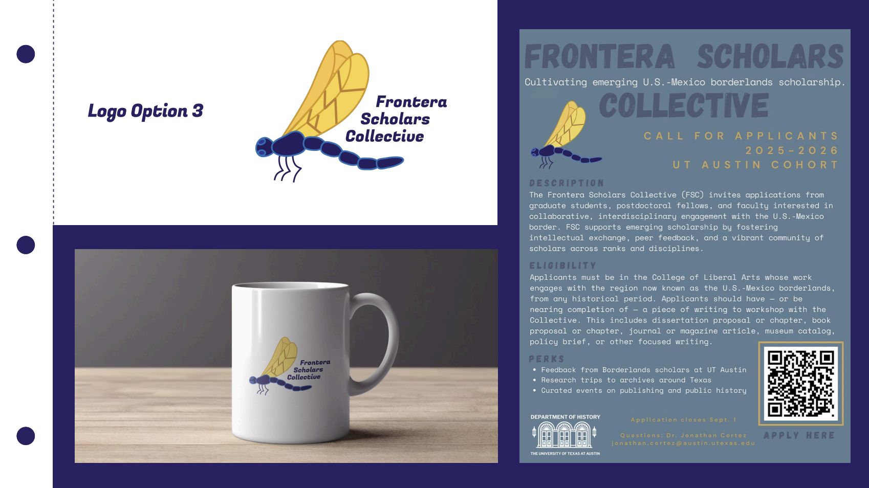
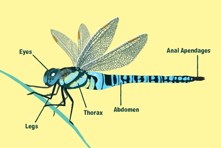
I got a lot of feedback from the client on these three logos. Overall, he wanted the design to be more detailed and realistic. He referenced this photo a lot as a guideline for the orientation and level of detail he wanted. He also gave some suggestions on making the tail shaped like the US-Mexican border and incorporating the name into the wings.
I tried to implement most of the feedback I was given. However, I had to modify some suggestions a little bit because it just wouldn’t look good visually. The tail looked a little strange being so wiggly and the there was no easy way to shade the wings in a way that showcased the words nicely.
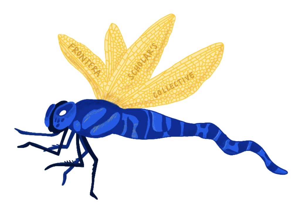
Because I didn’t love how this looked, I made another version with the border inside the pattern of the tail instead. For both versions, I also put the words inside the wings, just not shaded into them.
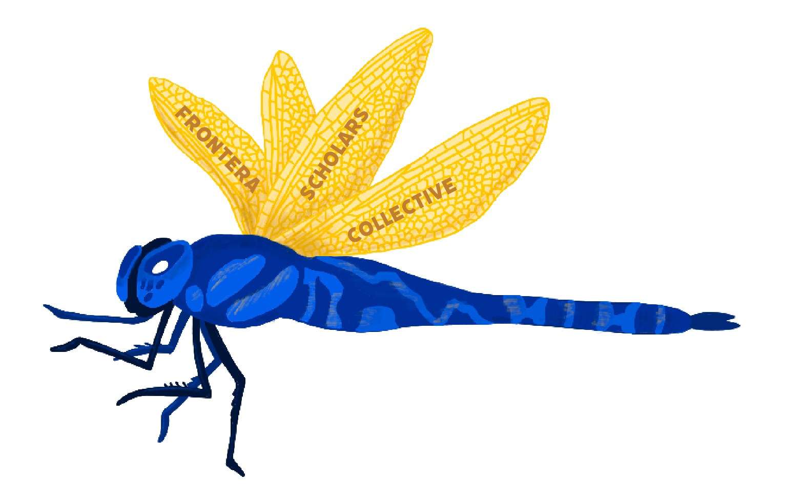
I then had a meeting with the client to discuss these iterations. He ended up liking the second option more, but he wanted me to also add the words “UT Austin” somewhere on the design.
With all this in mind, I made 3 final designs.
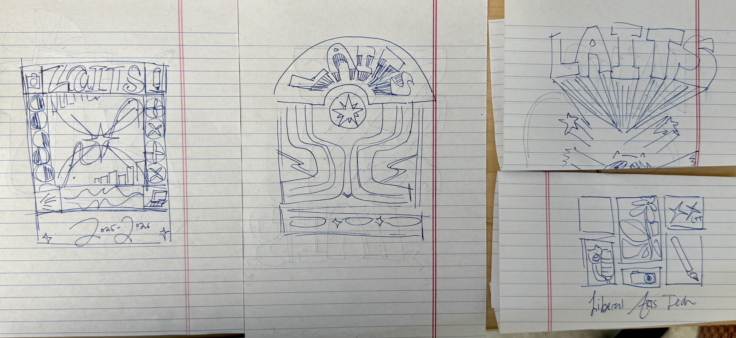
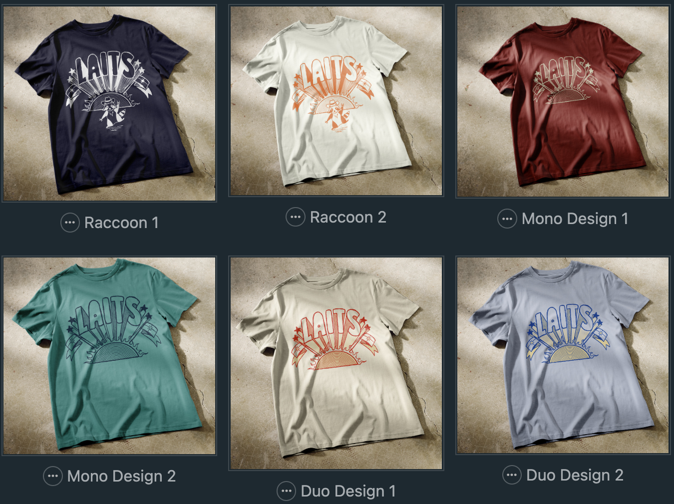
I was tasked with creating two designs for the annual LAITS T-Shirt: one Retro/Y2K inspired design and one Music Festival inspired design!
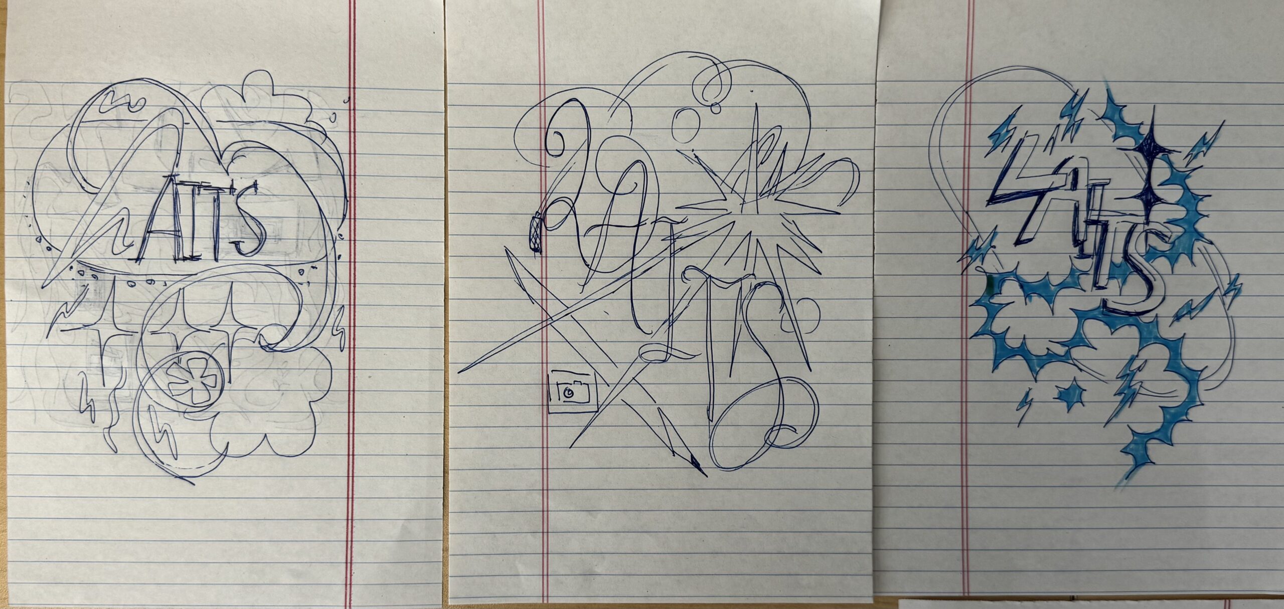
➜ Design Drafts: I started out by creating a Pinterest board of music posters/y2k designs that inspired me, and then ideated a few sketches for each theme. For the y2k designs, I was inspired by abstract shapes and stars, and dynamic lettering. My music fest designs incorporated more chunky lettering, and a more boxy structure. The y2K sketches are on the left, and music fest sketches are on the right:
My first semi-polished draft was for the y2k/retro vibe, and I took heavy inspiration from the abstract forms in the Pinterest inspo photos. I had fun playing around with different effects on Illustrator and Photoshop for this one:
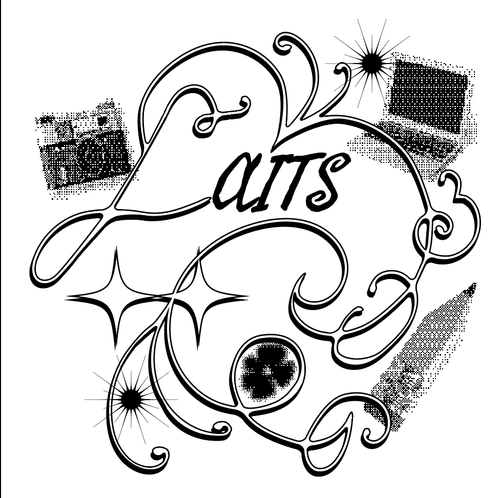
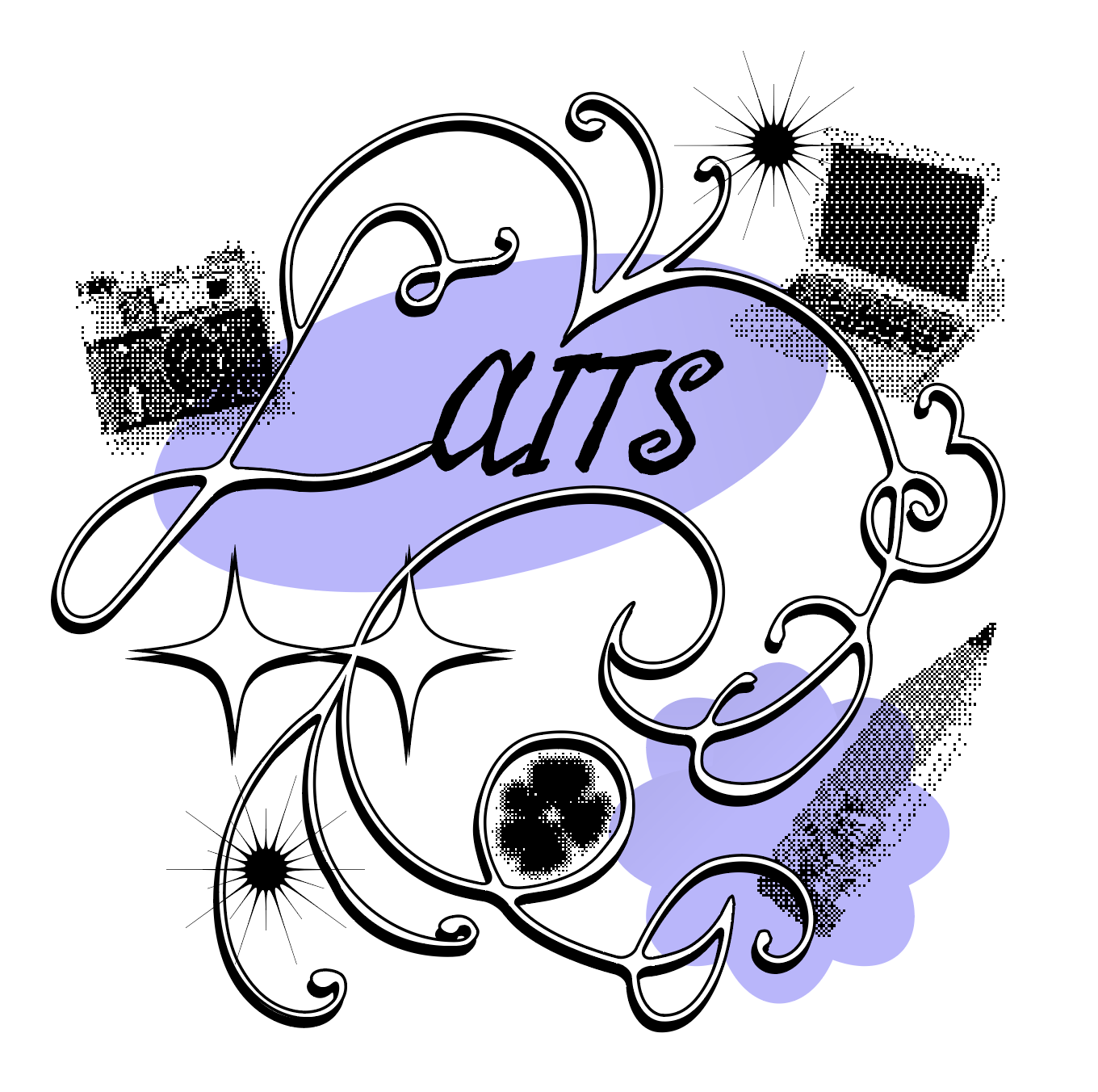
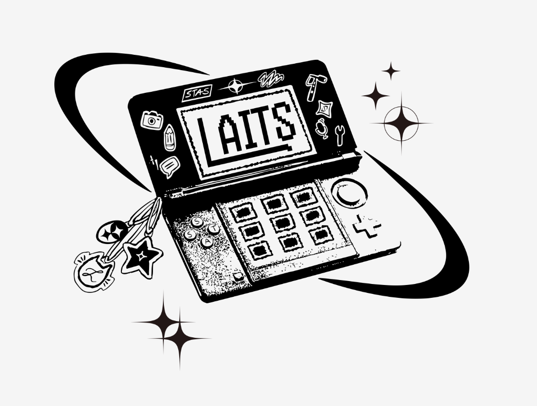
Ultimately, I wasn’t sure the design felt cohesive enough for the T-shirt (especially between the smooth line art and pixelated graphics), and I thought I could convey the retro y2k theme in a stronger way. I then created a second draft for the y2k theme, inspired by a retro DS:
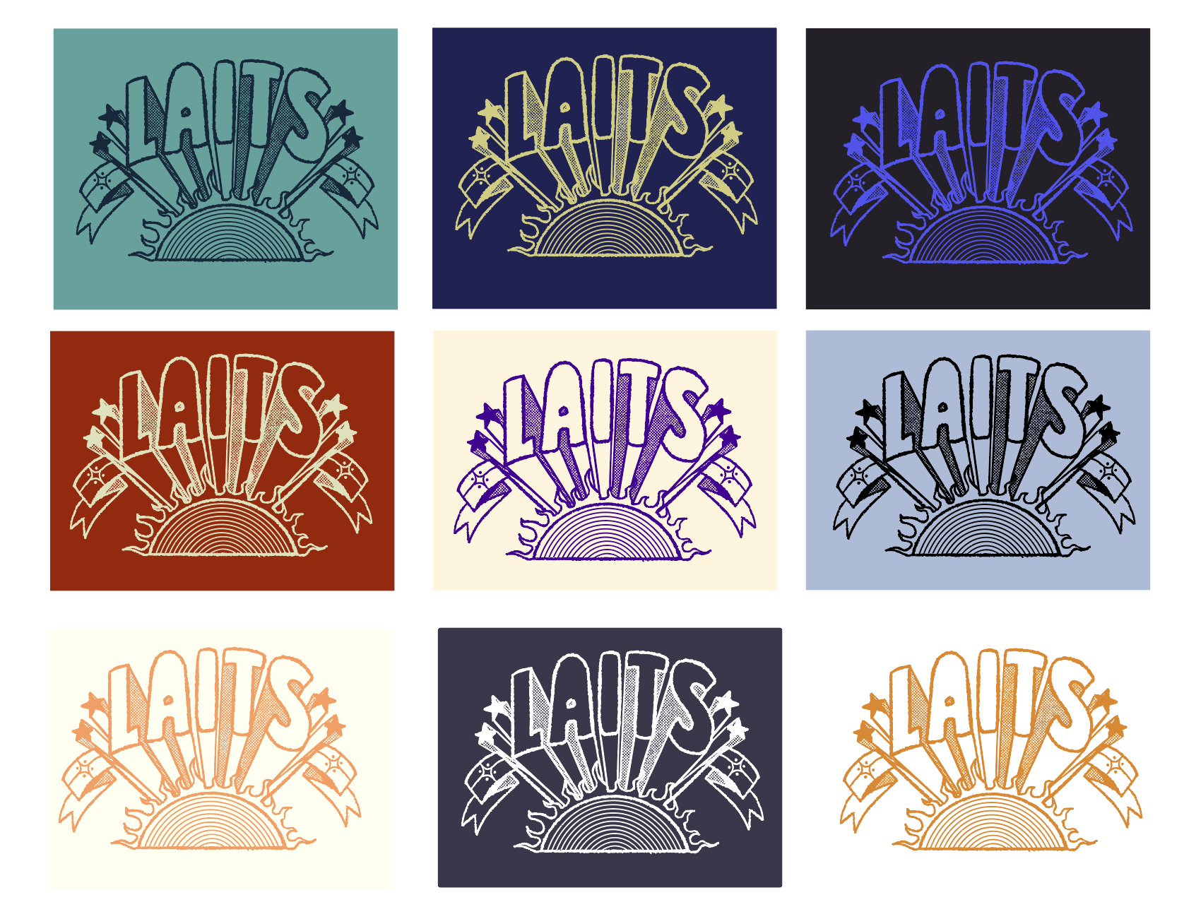
For the music fest theme, I created an illustration inspired by 80’s style 3-D lettering, and I included a sun because typically music festivals happen in the summer (and at ACL Fest, the hot sun is definitely a big factor). I created versions with and without a little music fest turtle, adding halftones for texture and duotone colors for contrast:

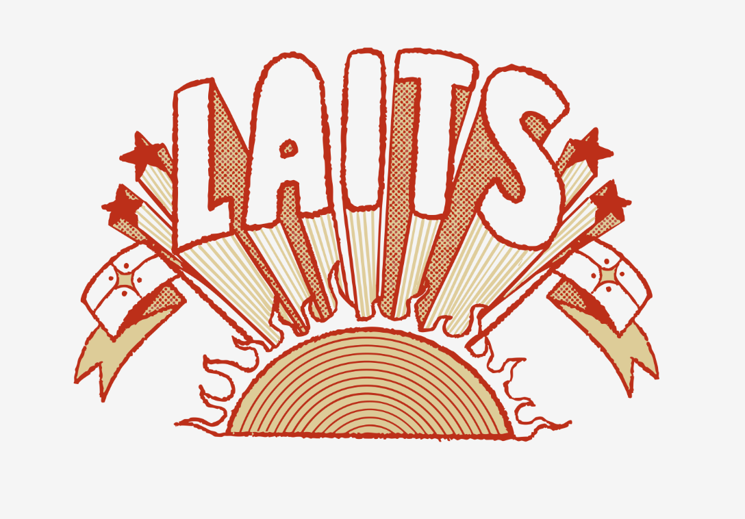
➜ Design Finalization:
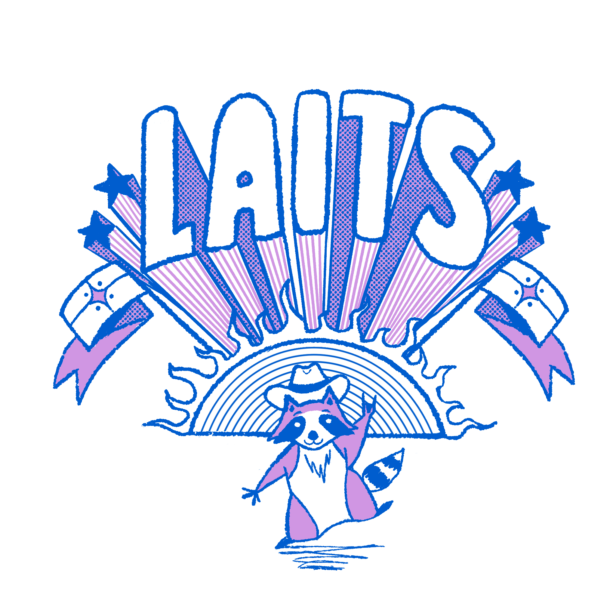
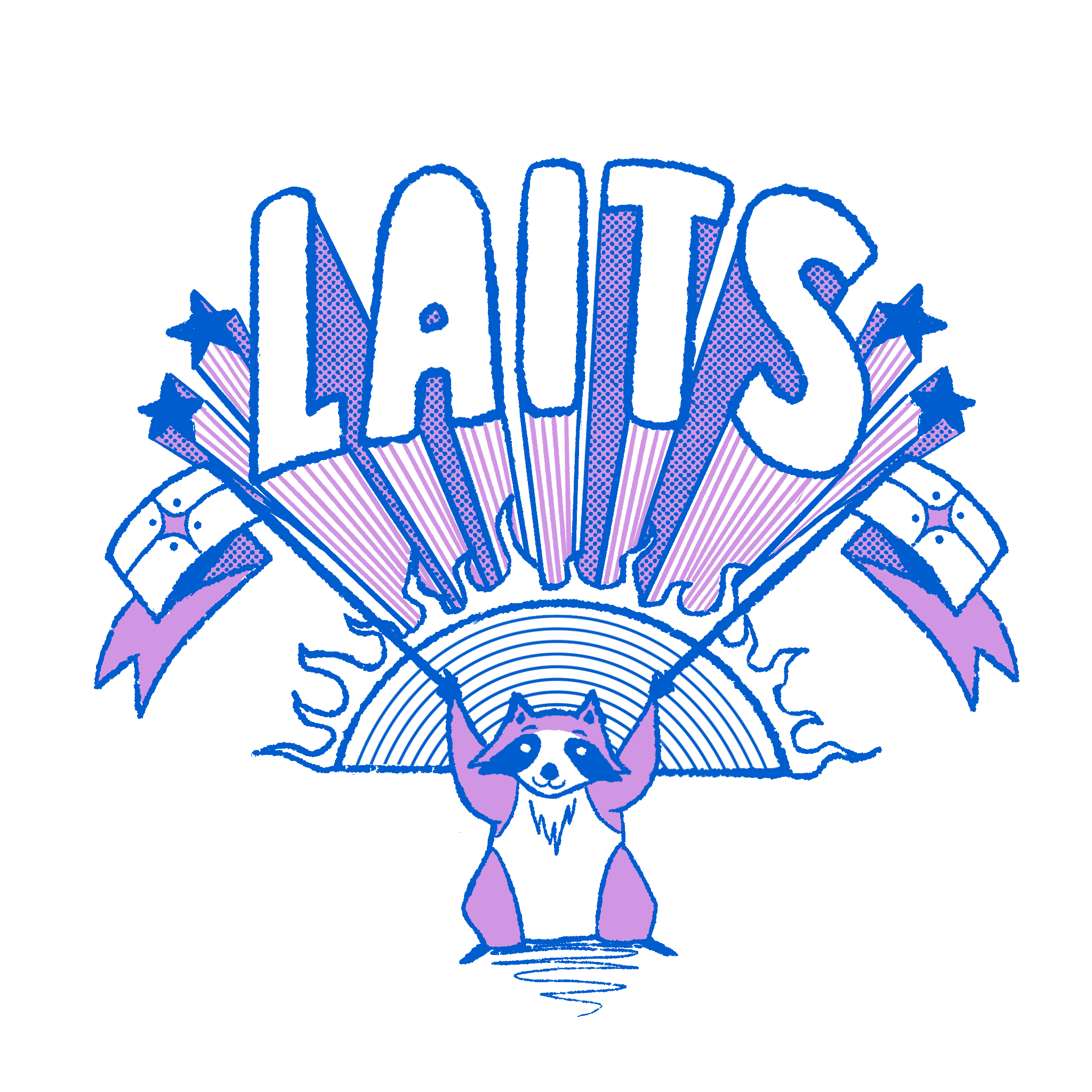
The design that was chosen was the music fest design! I was then asked to create a version with a different animal as a mascot. I made two variations of the original design with a silly racoon:
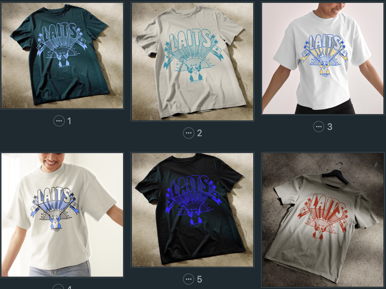
➜ Tee Mockups:
I was then asked to mock up the existing music fest designs on tee shirts. I also was asked to consider different color options (monochrome vs duotone, different color combos, ect). Because of the amount of variables I had in my options (3 design options, monochrome/duotone, shirt color), I ended up making a whole bunch of tee shirt mockups and color combinations:
──────────────────────────────────────────────
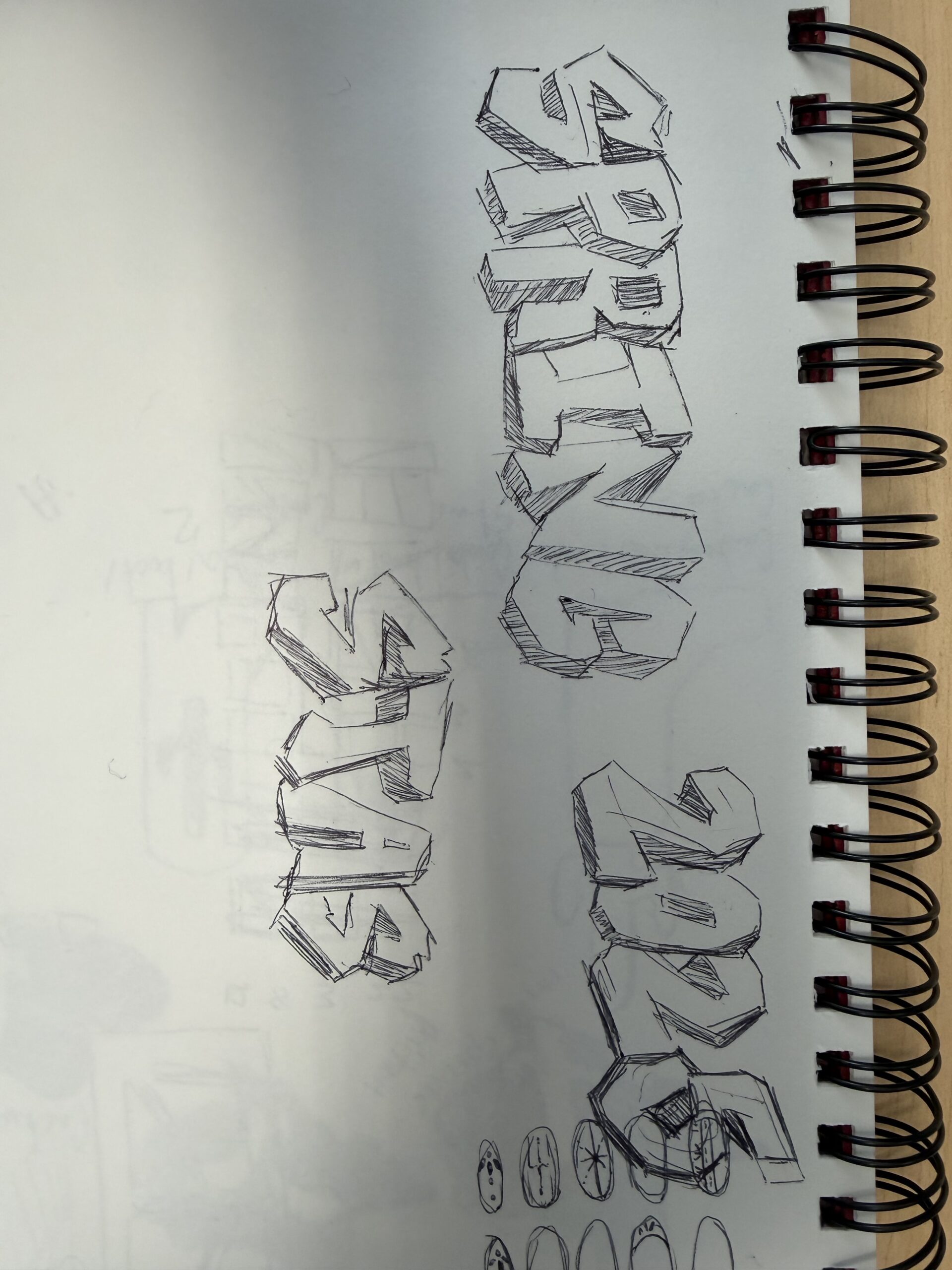
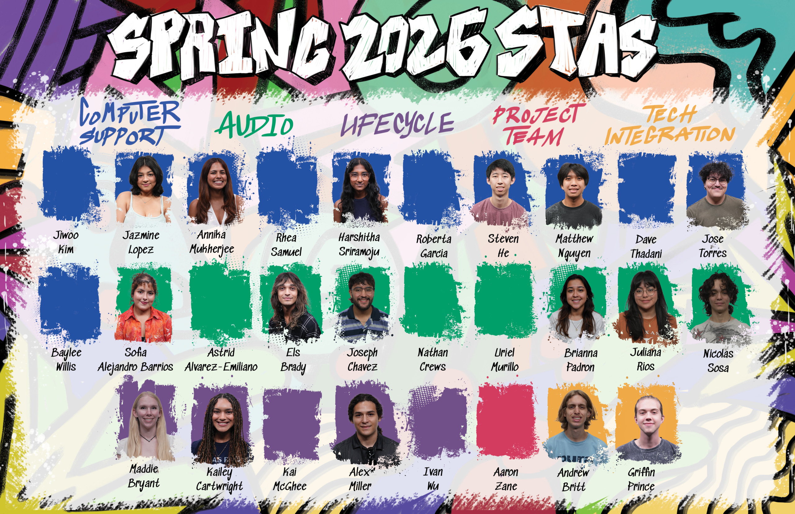
— Spring 2026 STA Roster Poster–
I worked on this assignment in December and the first half of winter break; however, I finished it up during this month and will share my process here!
This poster was very fun! I loved being able to return to Photoshop after spending many weeks in Illustrator. Having the freedom to create fun and expressive doodles was refreshing and I enjoyed myself a lot during the creation of this poster.
Since I was picking up the assignment, I was able to jump right in without having to do much planning. Taking in the previous feedback, references provided, and existing poster, I got right to work!
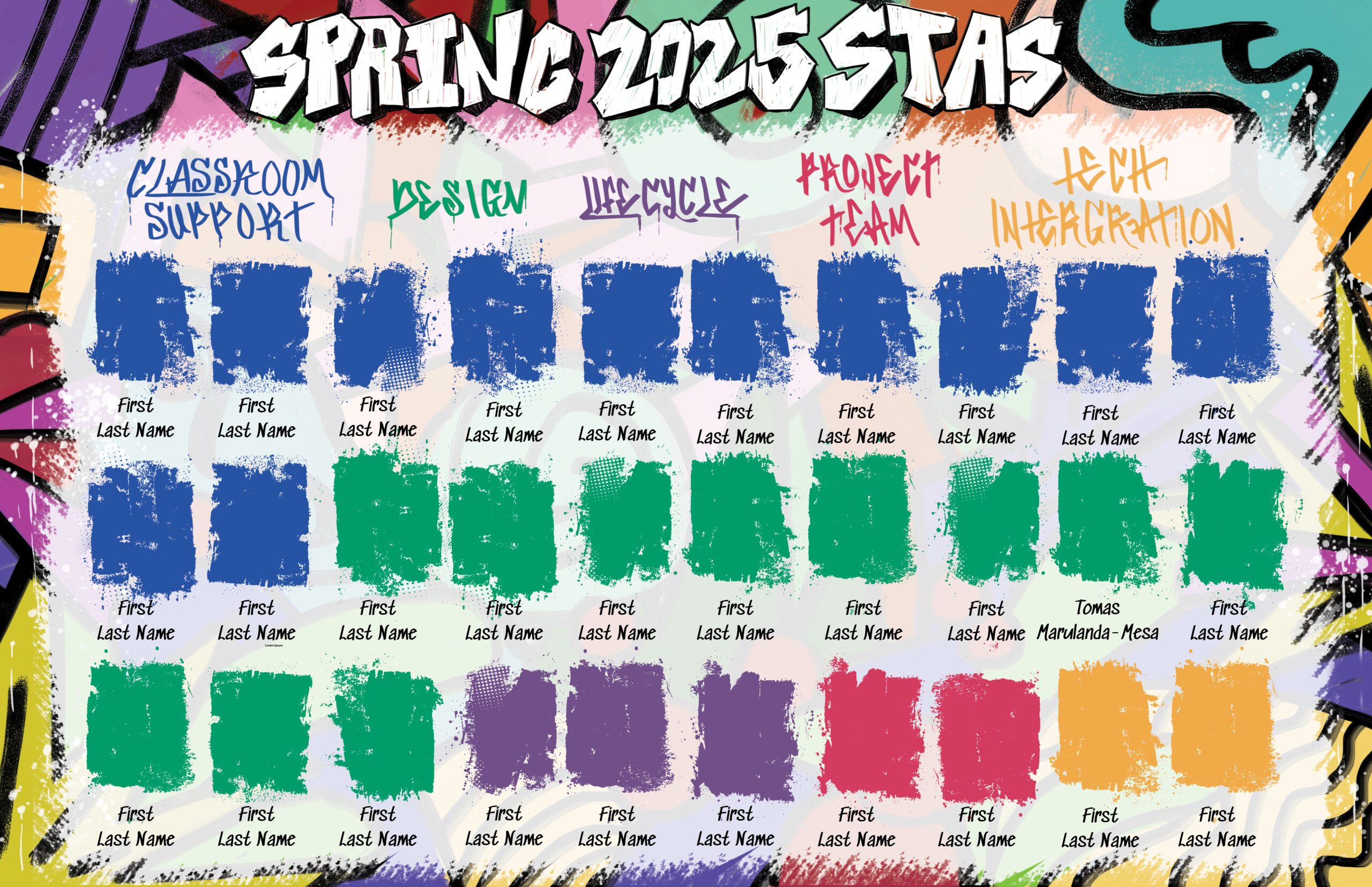

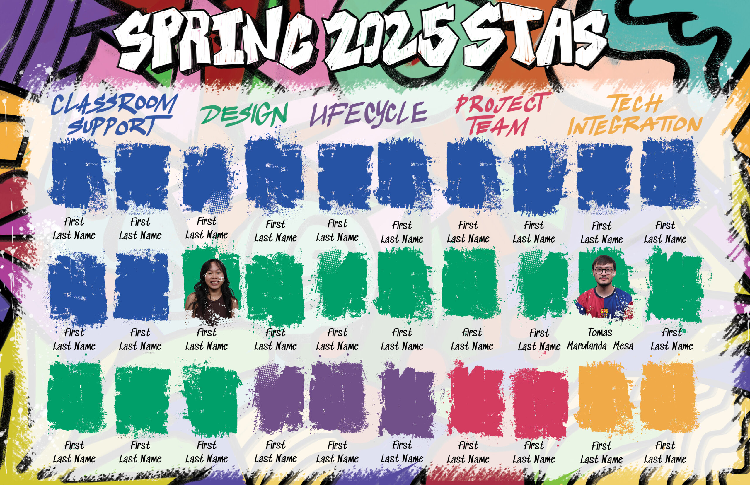
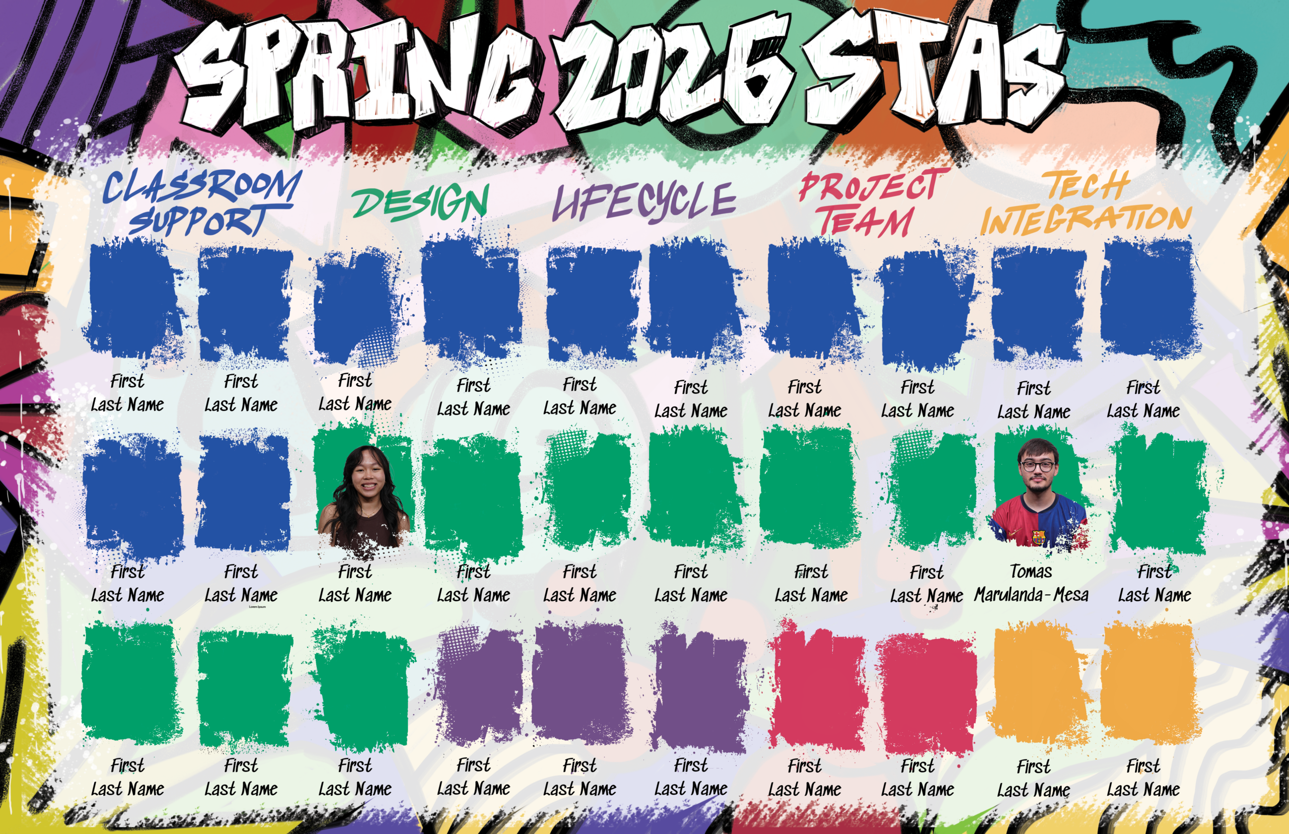
As we got the final list of STAs in, there had to be some adjustments to who was on which Spring Roster Poster. We swapped Classroom Support and Design for Computer Support and Audio from the Minimalist Poster to even out the amount of STAs while keeping a similar layout to the previous draft.
— Summer Marketing Pre-Roll Animation Continued—
After finishing the frame-by-frame animation for the graduation scene, I was tasked with making some edits as feedback came in. One of these was making edits to the pricing scene. I was requested to add more interest to the background of the scene and bring more attention to the text. Lila suggested make it as if they’re coming from fireworks.
Here is the New Pre-Roll draft (as of the end of January):