• We are STAs
    • Asha Rountree
    • Haley Ma
    • Kate Shih
    • Kyra Lee
    • Nicholas Peasley
    • Sasha Kenney
    • Shanda Horm
    • Shriya Atreya
    • Tomas Marulanda-Mesa
  • We were STAs
  • STA Presentation
    • STA Presentation 2017
    • STA Presentation 2016
  • Testimonials
  • Resources
  • Home

STA Blog

Cristina Villarreal Núñez

Cristina Villarreal Núñez

Basic Training: Pixel Art in Illustrator

November 13, 2020 By Cristina Villarreal Núñez

Basic Training: Pixel Art in Illustrator

For this basic training I had to follow a tutorial on how to make pixel art out of a preexisting image. In this case, pixel art was defined as “a style of art that mimics retro computer graphics created with 8-bit or 16-bit processors”. The instructions then suggested that I use a picture I’ve taken myself or a famous painting that doesn’t have a copyright. But I decided to use a free stock photo of a penguin that I got from pexels.com, because somehow penguins have kind of become part of my brand since I became an STA.

After choosing an image, the next step was to sample a color palette including around 10 colors from within the image itself. This is what my project looked like by this point:

Afterward, I was instructed to add a rectangular grid over the image, and to fill out the individual squared with the live painting tool with the colors that correspond in each place. That is how I ended up with my original pixel version. But the activity didn’t stop there. Thereupon I was tasked to make final color changes to the pixelated image, and so I did. I designed three other versions for the pixelated image using the recolor artwork tool. One of them was based on the original version I made, but with some color editing. Another version I made was based on a completely new color palette which I chose from the preset color scheme options. Finally, I made one last version that where I first used the original color palette, then desaturated the whole thing and then added something like a purple color filter to the whole thing to make it into a monochromatic version.
Filed Under: 2020 Summer | 2020 Fall

Basic Training: InDesign Pt.2

November 6, 2020 By Cristina Villarreal Núñez

Basic Training: InDesign Pt.2

For this activity, I was first taught how to do a new array of things on InDesign. The following is a list of them:

  • A new techniques for choosing a coordinated color palette through coolors.com
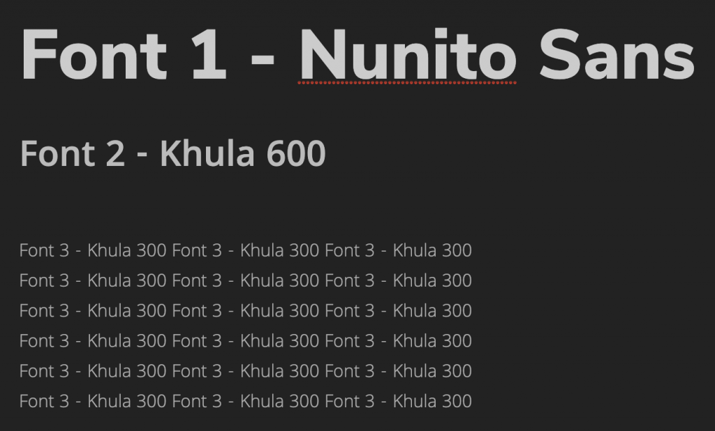
  • A new technique for choosing a short list matching fonts through fontjoy.com
  • A new list of helpful keyboard shortcuts including:
    • Ctrl/Command + click = select object behind another object (ex. Picture behind a text box)
    • Ctrl/Command + D = import an element from your computer. (ex. Select a frame >> Command + D >> import picture)
    • Ctrl/Command + B = Text frame options. (ex. To make a text box ignore text wrap)
    • Ctrl/Command + L = Lock object. (to unlock: Object >> unlock all)
    • Double click on bottom node of text box to get rid of dead space (also works on photos) [screenshot] [screenshot]
    • Ctrl/Command + Shift + . = Make font bigger (3px at a time, so it’s quicker)
    • Ctrl/Command + Shift + , = Make font smaller (again, 3px at a time)
    • Eyedropper: We’ve used the Eyedropper tool for color in Photoshop before, but in InDesign, it works for text styling, too! To quickly transfer over text color, size, font, and other styling, just highlight the text you want changed, click the Eyedropper, then use the Eyedropper on the text that already has the correct styling.
  • Tips on customizing my InDesign toolbar
  • A general overview on using the align tool
  • A way to add placeholder text
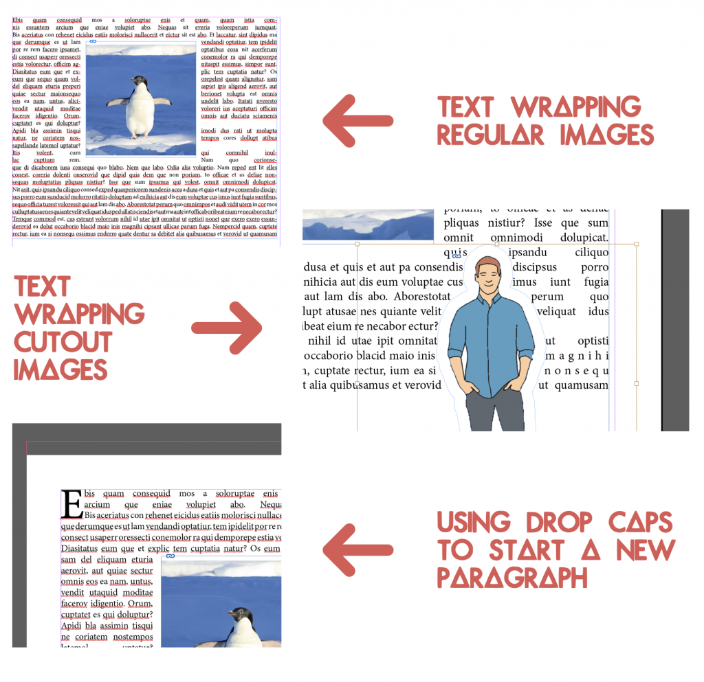
  • Tips on using the text wrapt tool in different ways (for regular images and for cutouts)
  • A reintroduction to drop caps
  • And finally, a general overview on using the arrange tool

After learning all those things, it was time to start working on my own flyer.

First I chose the color palette and fonts I would be using. At first I had a different idea for the color palette than the one shown below, but after getting some much needed feedback on that I designed a new color palette, and that’s as shown below.

Then, I started designing the flyer including the following elements listed on the KB.

  • Professor: Dr. Leonard Moore *with picture*
  • Title of Series: University Lecture Series
  • Title of Event: Conversations on Race and Gender
  • Date/Time/Location: October 7, 8-9 p.m., virtually streamed
  • Description of Event: use placeholder text
  • Department/College Logo: *linked in the KB’s Box folder*

This was my first draft:

But there were some things that looked a little but wonky.

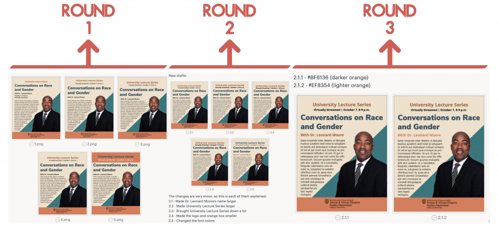
So I made a few edits to this draft but kept in mind the general design of it. In total I made around three different rounds of edits. The first was just to find what I wanted the hierarchy and format to look like. The second round was based on the second version from round one. And, the third round of edits was based on the first version of the second round, and its purpose was just to find the best color to use on Dr. Leonard Moore’s name. When I was done selecting what I wanted my final flyer to look like from those rounds of edits, I just added a drop cap to the text and moved it a little bit closer to Dr. Moore’s image.

The following are the three rounds of edits:

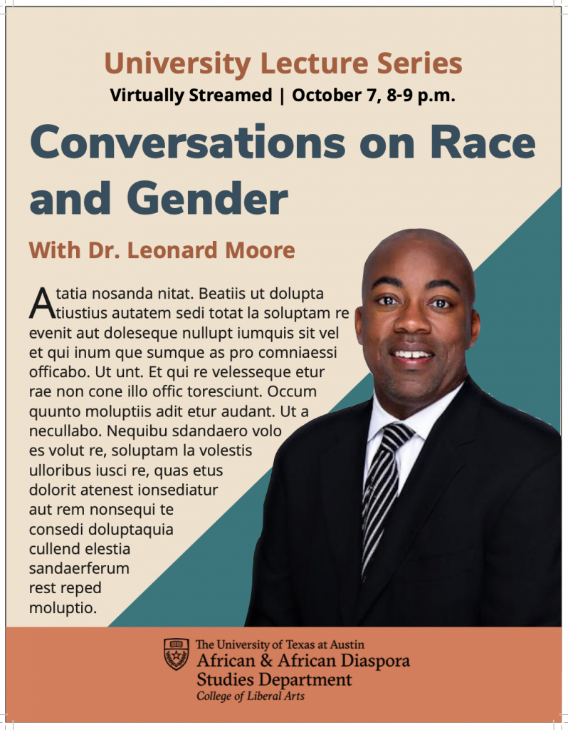
Eventually, this is what the final version of the flyer ended up looking like; hope you like it:

Filed Under: 2020 Summer | 2020 Fall

Basic Training: CLIO Module Training Pt.2

October 29, 2020 By Cristina Villarreal Núñez

Basic Training: CLIO Module Training Pt.2

After finishing this part of the training, so much of my CLIO Module has changed from the last time you saw it. So, the following is a list of the things I changed in the module:

  • I added 3 new  activities. Overall there are now 5 activities and their descriptions are as follows:
    • Activity 1: The Basics – in this activity one can learn a few very easily translatable words and their proper pronunciation.
    • Activity 2: Quiz 1 – in this activity one must answer a short quiz regarding the words they learned in the previous activity. There is also space for feedback.
    • Activity 3: Story Time – in this activity one learns about translation in context through the translation of the classic story of  Humpty Dumpty; available in English and Spanish.
    • Activity 4: Movie Time – in this activity one can learn new words in context through the translation of 5 different movie titles.
    • Activity 5: Quiz 2 – finally, one must answer a short quiz regarding the movie titles they learned in the previous activity.
  • I changed the color of the module’s background twice.
    • First, I changed it from the default setting to a solid color, specifically black.
    • Then, I changed in from black to a background image. That image (which I designed myself) looks something like a black background with a vibrant green grid to add a retro video game/8-bit feel to the module.
  • I formatted some images so that their general format and captions were standardized.
  • I changed the background of the navbar banner from a solid black color to an image. Specifically to an image (I also designed myself) that looks like a black background with pixel-style stars in two colors; green and gray.
    • To that I also added a slight color overlay to make it more cohesive.
  • I changed the card header backgrounds from a solid black color to an image, more specifically to the same image I added to the navbar banner background to maintain the theme consistent.
  • I embedded a Google Font into the navbar title and the card titles.
    • More specifically, the font’s name is Press Start 2P, and I chose it because matched the aesthetic I planned for the module.
  • I worked with HTML to format two text-wrapped image figures. Those can be found in Activity 3.
  • I worked with HTML to format a table in different ways.
    • I added a different background and font color for the first row of the table
    • I added a different background color to all even numbered rows
    • I added a different background color relative to the row that is being hovered by the user’s mouse
  • Last but not least, I added an images carousel in Activity 4 also using HTML.

But, if you are more of a visual learner and/or would like to know what all of these changes actually look like, here’s a demonstration for you.

http://sta.laits.utexas.edu/wp-content/uploads/2020/10/STA12_Clio_Part_2_Evidence.mp4

Filed Under: 2020 Summer | 2020 Fall

Basic Training: CLIO Module Training Pt.1 – Continued

October 22, 2020 By Cristina Villarreal Núñez

Basic Training: CLIO Module Training Pt.1

Continued

I finally finished with part 1 of the CLIO Module Training! Since last time I worked on this, I’ve changed and added quite a few things to this module.

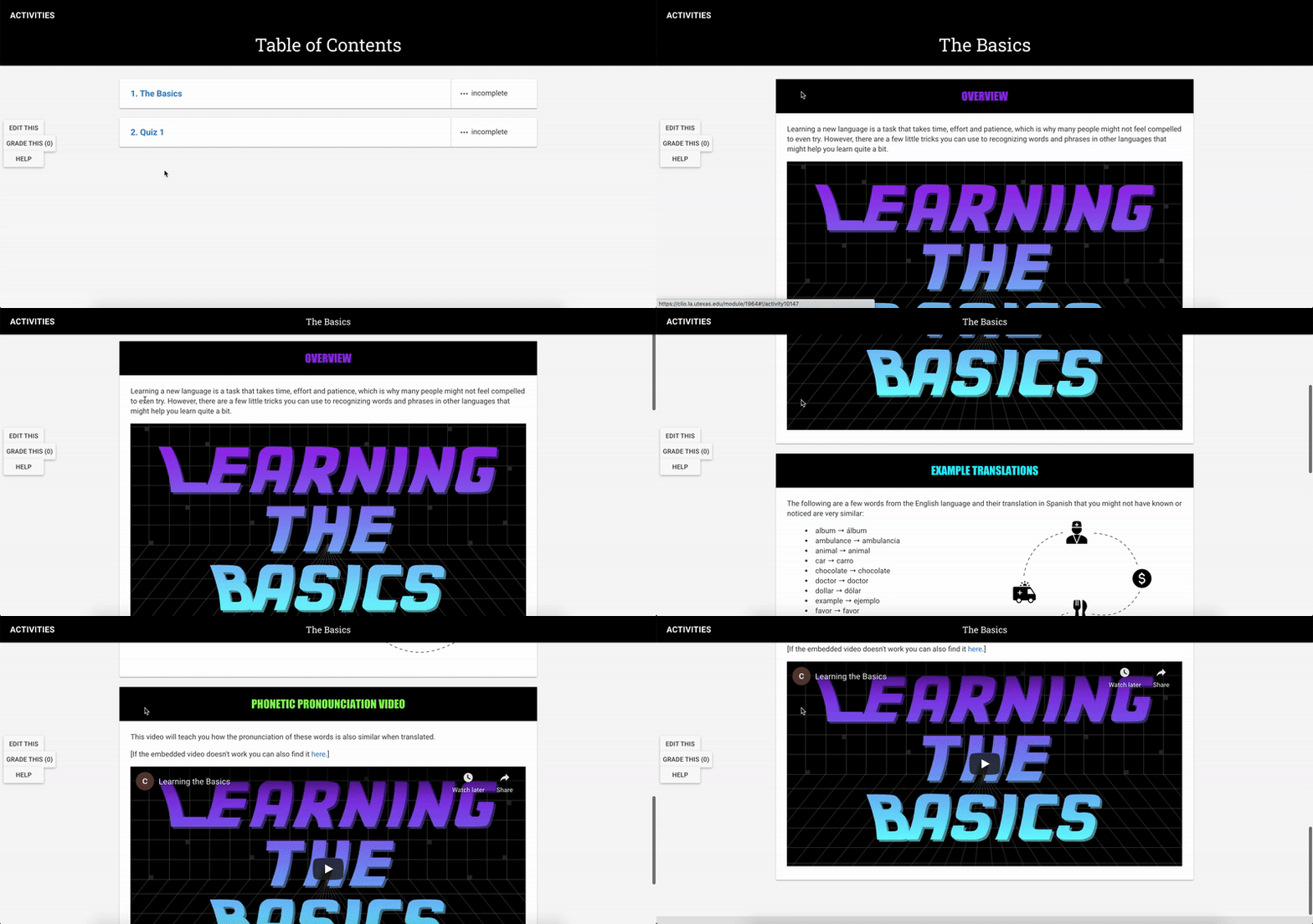
For instance, in the image below you will notice that I changed the color of the navar (the top part) from burnt orange to black. I also added a new activity! I called it Quiz 1 because I am planning on eventually adding a second quiz for people to match a movie’s title (in English) to what they think the correct Spanish translation is, so tune in for that later.


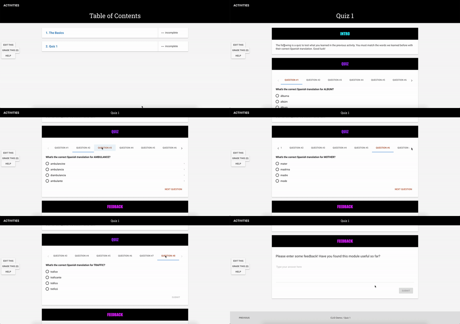
I also made quite a few changes within Activity 1 (The Basics). This is what it looks like now:

Finally, this is what Activity 2 (Quiz 1) looks like:

Hope you liked it!

Now it’s time to move on to CLIO Module Training Pt.2

Filed Under: 2020 Summer | 2020 Fall

KB – Basics of Client Communication

October 20, 2020 By Cristina Villarreal Núñez

KB – Basics of Client Communication

For this project I was tasked to make my own KB help guide on the Basics of Client Communication based on my experience with the GOV Logo and how I managed to communicate with Stuart on that project.

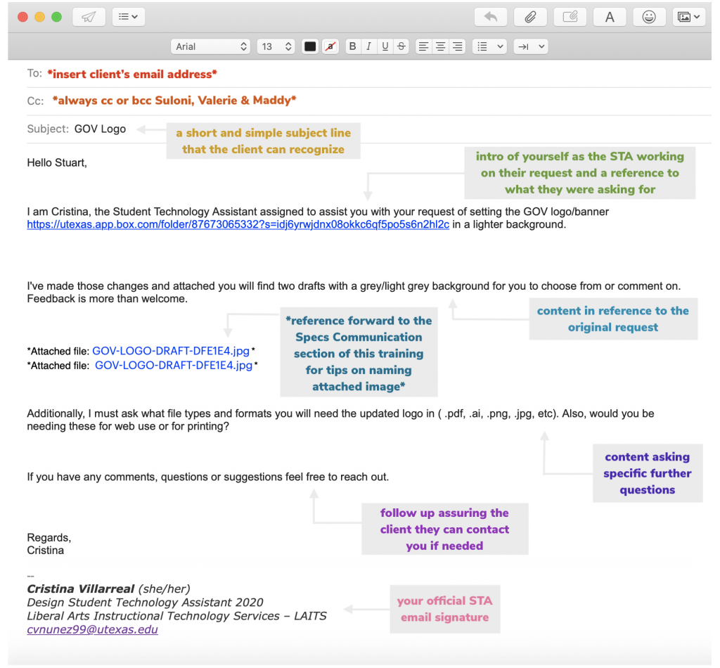
So over the course of a few days I drafted a help guide that explained the three different types of emails you send to a client (initial, specs, and final email), and what must be included within each of those. For instance;

  • I went over what you want to ask the client, and what you should let them know
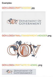
  • I went over the basics of naming conventions and why it is not only important to know then yourself but to also let the client know their meaning
  • I went over the importance of assuring the client they should feel free to contact you or the department when questions/comments arise (because communication is key in any project)

I even added a bunch of images to serve as examples for each of the emails, the naming conventions section and to exemplify what a pdf project guide should look like. These are some of them:


Here is a link to the KB: http://sites.la.utexas.edu/kb/2020/10/19/basics-of-client-communication/ Feel free to check it out! 🙂

Filed Under: 2020 Summer | 2020 Fall

Religiology Logo

October 12, 2020 By Cristina Villarreal Núñez

Religiology Logo

For this project, I was asked to design two different ideas for a new logo that would be used in the website for Religious Studies at UT. To start, I was given a color palette and two sketches to give myself an idea of what to design. These were those sketches:

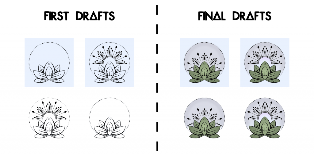
However, the first color palette was way too dark, so in the meantime I designed my first batch of drafts.

I knew I wanted to incorporate at least one of those sketches into my designs because they looked really cool and gave my a sense of what I could work with. So I went with the one on the right and started to work. Eventually when I got the new color palette I adapted my designs to it and created two new versions of them that really ended up liking. What do you think?

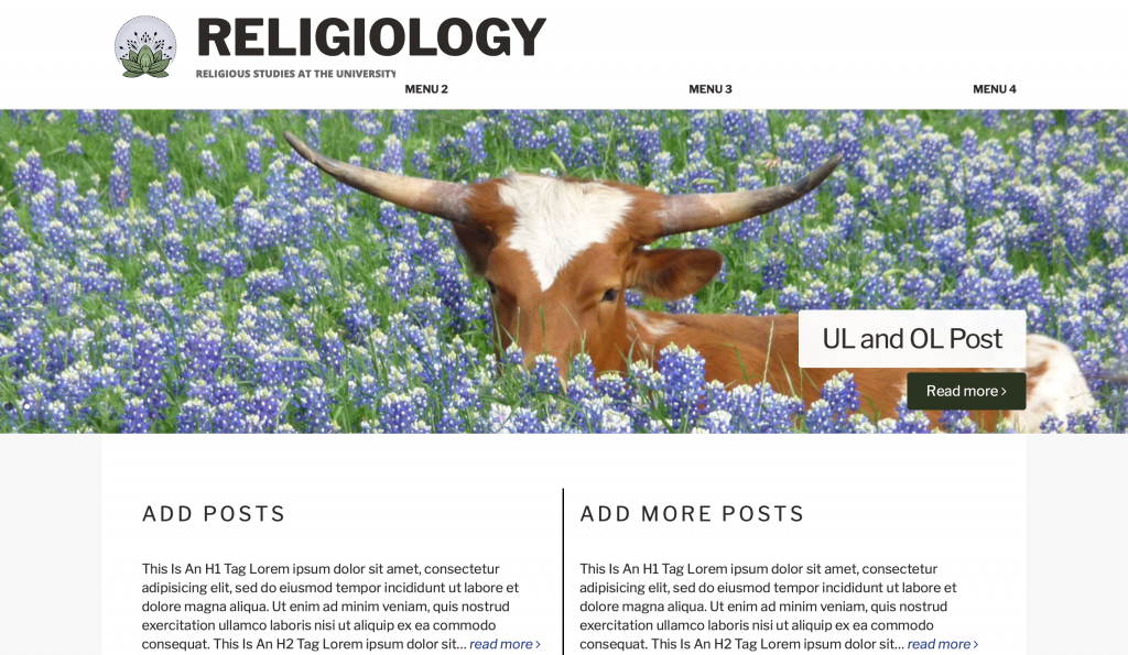
I even made a few mockups of what the logos would look like in context. This is one of them:

Filed Under: 2020 Summer | 2020 Fall

  • « Previous Page
  • 1
  • …
  • 12
  • 13
  • 14
  • 15
  • 16
  • 17
  • Next Page »

link to LAITS home page

Video STA Home

© 2025 Liberal Arts Instructional Technology Services | Production Credits