Basic Training: InDesign Pt.2
For this activity, I was first taught how to do a new array of things on InDesign. The following is a list of them:
- A new techniques for choosing a coordinated color palette through coolors.com
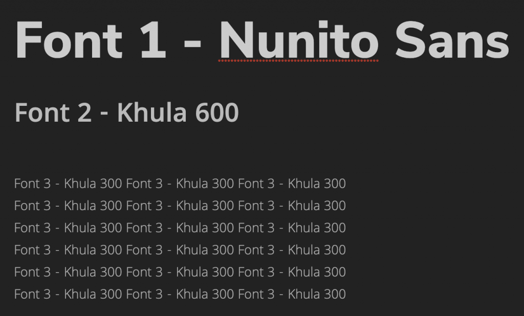
- A new technique for choosing a short list matching fonts through fontjoy.com
- A new list of helpful keyboard shortcuts including:
- Ctrl/Command + click = select object behind another object (ex. Picture behind a text box)
- Ctrl/Command + D = import an element from your computer. (ex. Select a frame >> Command + D >> import picture)
- Ctrl/Command + B = Text frame options. (ex. To make a text box ignore text wrap)
- Ctrl/Command + L = Lock object. (to unlock: Object >> unlock all)
- Double click on bottom node of text box to get rid of dead space (also works on photos) [screenshot] [screenshot]
- Ctrl/Command + Shift + . = Make font bigger (3px at a time, so it’s quicker)
- Ctrl/Command + Shift + , = Make font smaller (again, 3px at a time)
- Eyedropper: We’ve used the Eyedropper tool for color in Photoshop before, but in InDesign, it works for text styling, too! To quickly transfer over text color, size, font, and other styling, just highlight the text you want changed, click the Eyedropper, then use the Eyedropper on the text that already has the correct styling.
- Tips on customizing my InDesign toolbar
- A general overview on using the align tool
- A way to add placeholder text
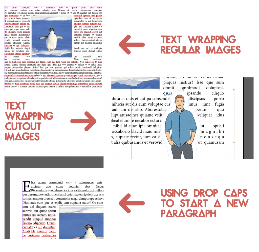
- Tips on using the text wrapt tool in different ways (for regular images and for cutouts)
- A reintroduction to drop caps
- And finally, a general overview on using the arrange tool
 After learning all those things, it was time to start working on my own flyer.
First I chose the color palette and fonts I would be using. At first I had a different idea for the color palette than the one shown below, but after getting some much needed feedback on that I designed a new color palette, and that’s as shown below.
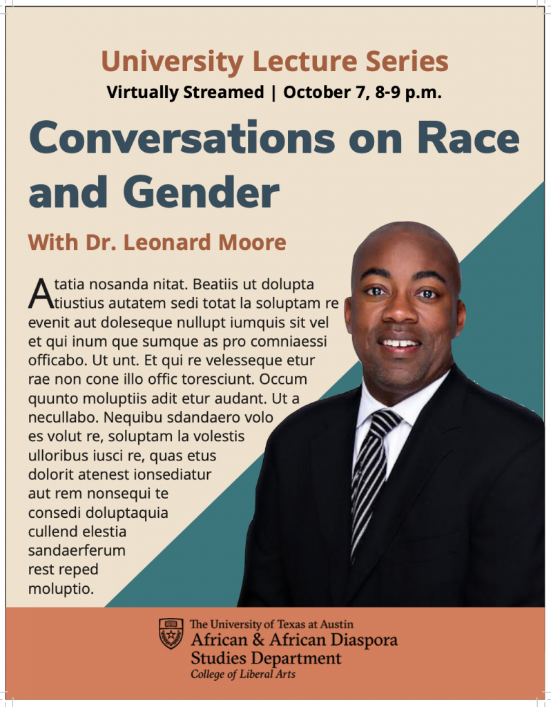
Then, I started designing the flyer including the following elements listed on the KB.
- Professor: Dr. Leonard Moore *with picture*
- Title of Series: University Lecture Series
- Title of Event: Conversations on Race and Gender
- Date/Time/Location: October 7, 8-9 p.m., virtually streamed
- Description of Event: use placeholder text
- Department/College Logo: *linked in the KB’s Box folder*
This was my first draft:
 But there were some things that looked a little but wonky.
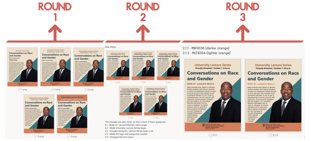
So I made a few edits to this draft but kept in mind the general design of it. In total I made around three different rounds of edits. The first was just to find what I wanted the hierarchy and format to look like. The second round was based on the second version from round one. And, the third round of edits was based on the first version of the second round, and its purpose was just to find the best color to use on Dr. Leonard Moore’s name. When I was done selecting what I wanted my final flyer to look like from those rounds of edits, I just added a drop cap to the text and moved it a little bit closer to Dr. Moore’s image.
The following are the three rounds of edits:
 Eventually, this is what the final version of the flyer ended up looking like; hope you like it:

