• We are STAs
    • Asha Rountree
    • Haley Ma
    • Kate Shih
    • Kyra Lee
    • Nicholas Peasley
    • Sasha Kenney
    • Shanda Horm
    • Shriya Atreya
    • Tomas Marulanda-Mesa
  • We were STAs
  • STA Presentation
    • STA Presentation 2017
    • STA Presentation 2016
  • Testimonials
  • Resources
  • Home

STA Blog

Cristina Villarreal Núñez

Cristina Villarreal Núñez

Basic Training: 8-Bit GIF

February 4, 2021 By Cristina Villarreal Núñez

Basic Training: 8-Bit GIF

Throughout this training I learned how to create my own 8-bit style animated gif. To start off, I had to brainstorm what kind of animation I would like to create. I went with a snowperson, because none of my projects throughout the month of December were holiday themed, and to be honest I’m still not that over the holiday season. So, taking into account that it’s still technically winter, I decided a snowperson would not be that out of season. Anyhow, after deciding the path I would follow through, the next step was to create 5–10 layers of animation for the gif using only black 8 bit style drawings in black over a transparent background. So that’s what I did, and I made the layers into a way that when played frame by frame would make it look like the snowperson was appearing and disappearing. Moving on, all I had to do now that the layers were done was to animate them, which was something I learned from scratch in this tutorial because I didn’t even know that was even a possibility in Photoshop. Finally, I exported it and turned it in on basecamp… here’s what the final product looks like:
Ta Daaa!

Filed Under: 2021 Spring - 2021 Summer

Basic Training: Studio Course Graphics

February 3, 2021 By Cristina Villarreal Núñez

Basic Training: Studio Course Graphics

Howdy, friends! I hope y’all are doing great. Just wanted start this post by saying that I’m pretty sure a few days ago I passed my 100th day of work as an STA… so here’s to that! (ノ^▽^)ノ woohoo!


Anyhow, in today’s installment of this blog I’ll be going over my experience with the Studio Course Graphics training. So here’s the brief: “One of the main services LAITS provides is online course production […] Courses taught in the LAITS Studios require stage set design. Our design team creates a cohesive design package for each course, from the studio set design monitor graphics, to the graphics for the Canvas web interface platform.” Basically, I had to create a cohesive and thoughtful design packet of multiple graphics for a studio based course. For this I had to keep in mind factors like color correction adjustments (because of the nature of the projections in the studio set) and how the graphics must properly reflect the vibe of the course. After understanding this and reviewing a bunch of examples from Maddy and other STAs, I was ready to start working. So, let me explain how things went down.


First things first, I had to chose one of two sample courses predetermined for the purposes of this task. The first option was an environmental class called EAS1030: Earth’s Dynamic Environment II (Atmospheres and Oceans). The second option was called ARTH3800: Twentieth Century Art. I decided to go with the second option because I felt like the professor’s design requests (of considering the Bauhaus style of the 20s-30s) and syllabus (highlighting that the class usually goes on a field-trip to a renowned museum) were going to be easier to work with and make for a more intriguing and complex experience with the training.


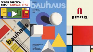
With that in mind, the next step was to brainstorm 2-3 design directions I could take this project on, so I created a small mood-board of style inspiration for each design direction. taking into account the course’s subject, tone, mood and personality. These were my pitches:At this point I had two ideas in mind. If I went with design direction 1 or 3, I was thinking it would be cool to do an illustrative wall monitor. On the other hand, if I went with design direction 2, I was thinking  the puzzle style would look cool. With that in mind, Maddy gave me the go ahead for the illustrative design. So I set my mind to do something along the lines of design direction 3. Once I settled on a direction for the project, I was tasked to continue with the next step of the training.


Step 3 was to start creating my studio assets. My main idea for the wall monitor at this point was to build a scenario that looked like a museum, considering that there’s a museum visit planned in the syllabus. I also decided to make the art in the walls of the museum reflective of twentieth century art specifically from art pieces exhibited at the museum they would visit. To top it all off, I was going to style the whole wall monitor in a cubist-inspired manner.


As follows, you can see the two original art pieces from the museum in the syllabus that I planned to take inspiration from to reflect in the wall art, and also an image of progress from my first draft:


At this point I got feedback for my progress and, though I was going in a good direction, there were some details I needed to figure out before continuing. So, Maddy gave me some tools for that.


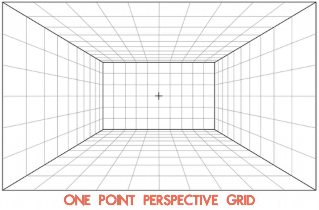
First, she suggested that I use a one-point perspective grid to define the limitations of the background. This way the museum setting could get a more natural perspective than the one I was using.

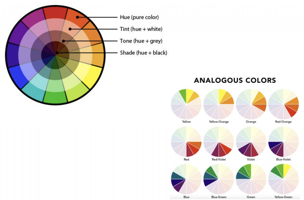
She also gave me these tools on color to better define a color palette, because at this point I was starting to get a bit insecure that the background I was designing would be too distracting for the class.


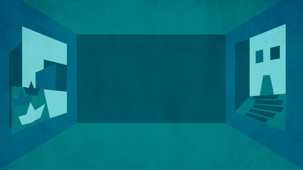
Afterwards, this is the color palette I ended up settling on to limit the amount of distraction for the eye:


Once I had a better grasp of my tools, I got to work on new drafts fixing the perspective and colors for the design and constantly getting feedback throughout this process. I also added texture to the design. Once I was done with the wall monitor, I also got down to working on the desk skirt and the wall monitor.


Step 4 was then to test how my studio assets would look like in real life. For this step I was tasked to insert my designs into different mockup templates to make sure my studio assets would look good and serve their purpose in different scenarios. This is what mine looked like:


Afterwards, I started working on Step 5 – storyboarding an intro. This is how mine turned out (and pardon my very basic stick-person character):


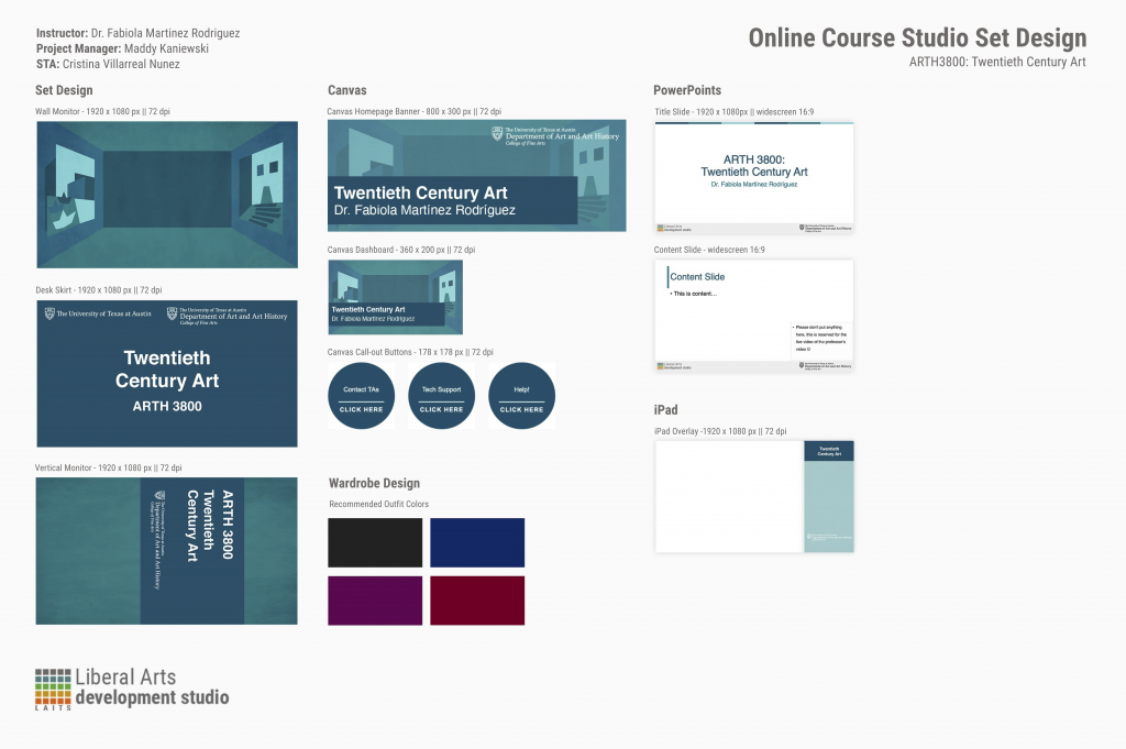
Moving on to Step 6, I began working on the Canvas graphics for this course, including: the dashboard, the homepage banner, the callout buttons and the iPad overlay. I stumbled upon some trouble with the iPad overlay and the homepage banner, if I’m being fully honest. But I got very helpful feedback on these Canvas assets, I was able to come up with some really good designs. (Images for these will be available at the end of this post on the design menu).


Moving on, I started working on Step 7: creating a Powerpoint Template. I took into account the example provided from PSY 352, and based on that I started designing something that was different yet inspired by the example to go with the course I have been working on. (Images for these will be available at the end of this post on the design menu).


Finally, I landed on Step 8 – creating a final Design Menu. So here’s how that looked like:


All in all, this was a very complex project that took me a while to work on (though the time between when I started working on this compared to when I was done was largely influenced by other time sensitive projects that I had to prioritize over this one). Nonetheless, I learned a lot from this experience. I had never before created something like this, so it was very interesting for me to brainstorm, plan and carry-out something like this, and I am so grateful for all the feedback I got. In brief, I would highlight learning how to set a more cohesive color palette to reduce distraction from the focal point and learning a lot about building a perspective; not to mention the overall ‘how to design the graphics for studio courses specific to LAITS’.

Filed Under: 2021 Spring - 2021 Summer

PSY420M: Studio Course Graphics

January 26, 2021 By Cristina Villarreal Núñez

PSY420M: Studio Course Graphics

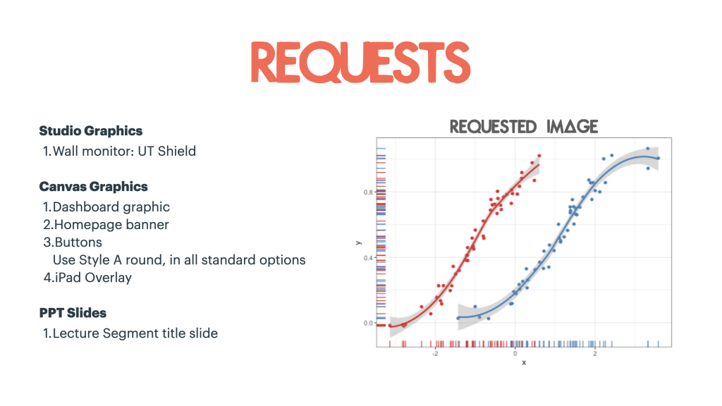
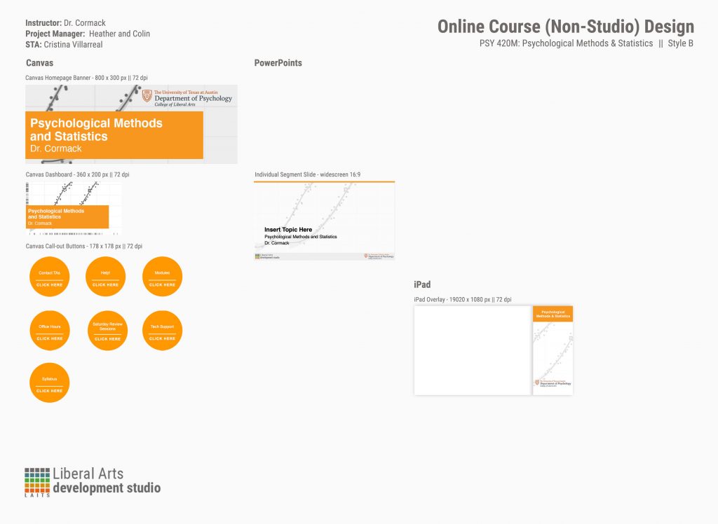
For this project I had to make the course graphics for course called PSY 420M – Psychological Methods and Statistics. The requests for this project were as follows:


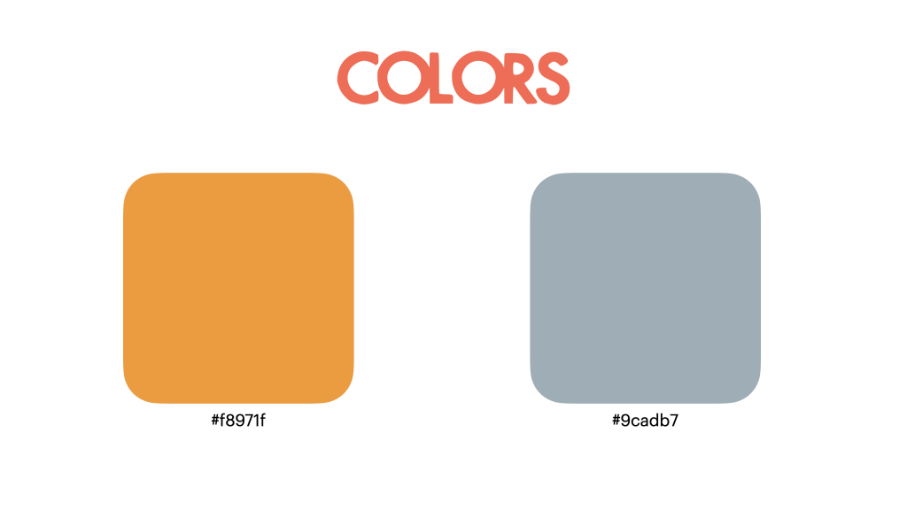
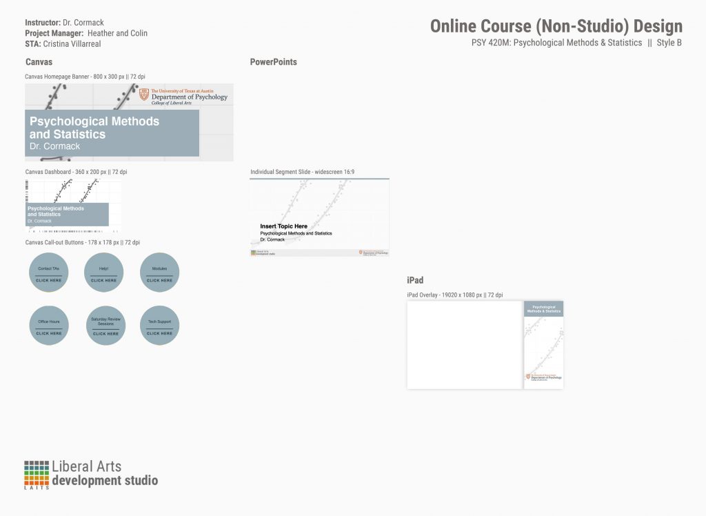
It seemed fairly simple at first, but the process of taking care of these was really extensive. For instance, the client requested that I took care of these requests in two different colors (as you can see in the image above). The reason for this was because we were concerned that the image they requested for the graphics was going to clash with their original color of choice (the #f8971f).


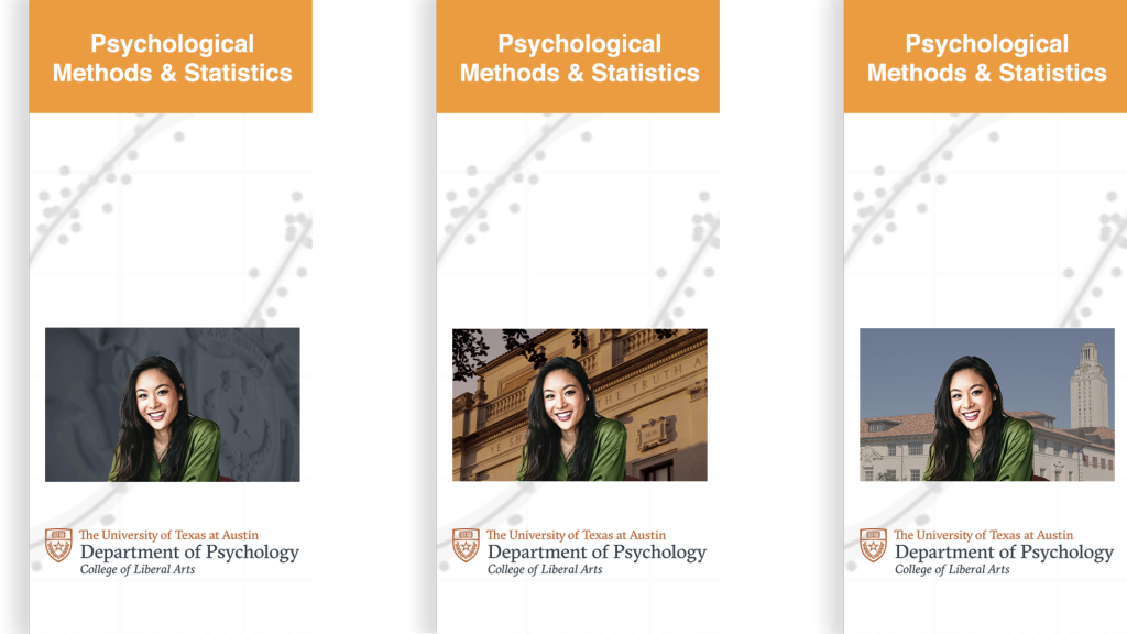
With this in mind, I was now tasked to figure out the optimal look of the requested image for the graphics. So I tried many different versions of presenting this image. I tried displaying it in full color. I tried with a sepia tones (specifically with the orange palette in mind). Then I tried a more faded look. Finally I tried a combination of faded and gray-scaled that seemed to do the trick. Additionally, I made other suggestions for the wall monitor. The client seemed to prefer the orange palette more, but the wall monitor image they had chosen was a bit too dark for that purpose. Therefore I suggested two other images that might fit better with the orange palette and placed them on the iPad overlay as a visual reference.


This is what the state of the project looks like as of right now:


This project is still subject to change, though. But if anything changes I will add an update post, no worries.

Filed Under: Uncategorized

Richmond Website Photoshop Images

January 26, 2021 By Cristina Villarreal Núñez

Richmond Website Photoshop Images

For this assignment I had to take the two images the client provided and create two monochromatic images based on them that match the design of the richmond.la.utexas.edu site. more specifically, the requirements included being similar in size (295 x 365px), color (#4a3d17), and transparency.


So what I did to make this happen was that I took the original images provided by the client, I got rid of the unnecessary background and focused on the shape of the object of the image (for the first one it was a Sor Juana Inés de la Cruz, and for the second one el Charni). Then I reduced the images to a monochromatic palette where the darker shades where represented by a single color (#4a3d17) and the lighter shades became a blank space. After that, I just turned the images in and the client posted them on the page by themselves.


The final products can be seen in the following links…

– Sor Juana Inés de la Cruz: https://richmond.la.utexas.edu/sor-juana-ines-de-la-cruz/

– El Charni: https://richmond.la.utexas.edu/el-charni/

Filed Under: Uncategorized

“Hemispheres” Banner Change

January 25, 2021 By Cristina Villarreal Núñez

“Hemispheres” Banner Change

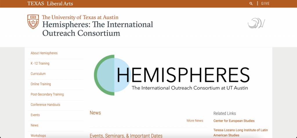
This activity came from a request sent through our LAITS system. A client from the Department of Slavic and Eurasian Studies of the school of Liberal Arts asked for a banner change on their Hemispheres page: https://liberalarts.utexas.edu/hemispheres/. This request was very straight forward. So, when assigned to it  I knew there were only two things I needed to do. First, log into Cascade to change their old banner to the new one the client provided. And second, send an email back to the client (cc’ing Suloni, Valerie and Maddy) letting her know that the banner had been updated. So that is exactly what I did! This is what the updated banner looked like:


However, we noticed that the green box was covering some of the text. So I wrote a new email to the client to offer my services in fixing this issue. But it turned out the client preferred fixing it herself. This is what the banner looks like now:


Filed Under: 2021 Spring - 2021 Summer

HIS315K: Presentation Remake Update

January 25, 2021 By Cristina Villarreal Núñez

HIS315K: Presentation Remake Update

As I have mentioned before, the point of this activity was to remake a presentation made by Dr. Robert Olwell for his HIS 315K course and place it in a new LAITS approved template to unify all of the presentations into a new and optimized format.


Last time I posted on this subject I was working on the first one of these remakes specifically for the presentation titled “Old Spain to New Spain”. Since then, I have worked on many more of these presentations. So here’s a complete list of all the HIS 315K presentations I worked on:


        • Old-New Spain 2016
        • Origins of English Colonization
        • Roanoke
        • Tour of Colonial America
        • Secession
        • Jacksonian Nightmares
        • Making Peace
        • General Jackson’s Democracy
        • American Provincialism

Though at first it seemed simple enough to just transfer the information from the professor’s past format into the new template Maddy prepared, working on these presentations was a great experience because of the following three things:


1. I got to learn more about the visual aspects of layout and animations in a Power Point presentation.

2. I experienced flexibility in project management though the new changes that were introduced mid-project. For instance, the change of template from the first presentation I worked on to the next one. Or when we decided not to follow the professor’s format where some images were blocking text when downloaded as a pdf (due to the lack of image appearing/disappearing animations).

3. This project was very feedback and collaboration-heavy, since we had to go through two different rounds of review before posting the finalized presentations. So what I learned from this was how to take feedback from and give feedback to my peer STAs.


All in all a fun and useful experience 🙂

Filed Under: 2021 Spring - 2021 Summer

  • « Previous Page
  • 1
  • …
  • 10
  • 11
  • 12
  • 13
  • 14
  • …
  • 17
  • Next Page »

link to LAITS home page

Video STA Home

© 2025 Liberal Arts Instructional Technology Services | Production Credits