PSY420M: Studio Course Graphics
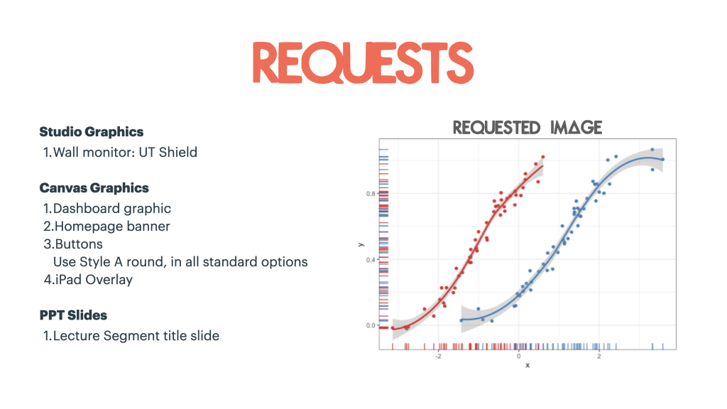
For this project I had to make the course graphics for course called PSY 420M – Psychological Methods and Statistics. The requests for this project were as follows:
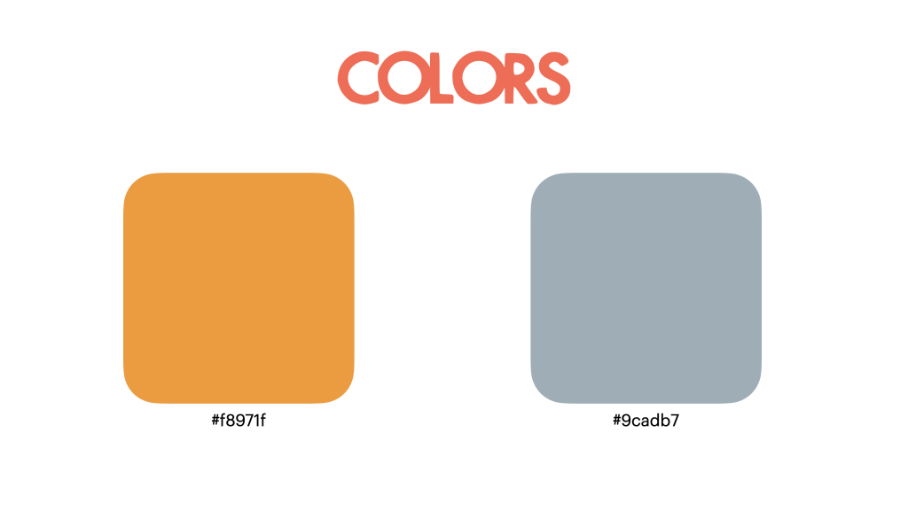
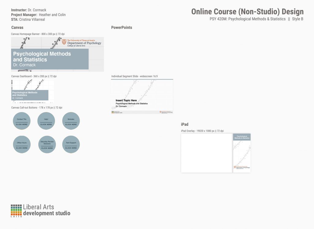
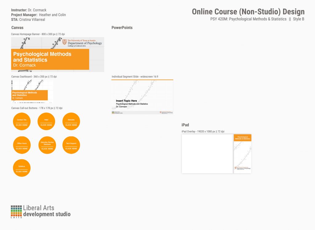
It seemed fairly simple at first, but the process of taking care of these was really extensive. For instance, the client requested that I took care of these requests in two different colors (as you can see in the image above). The reason for this was because we were concerned that the image they requested for the graphics was going to clash with their original color of choice (the #f8971f).
With this in mind, I was now tasked to figure out the optimal look of the requested image for the graphics. So I tried many different versions of presenting this image. I tried displaying it in full color. I tried with a sepia tones (specifically with the orange palette in mind). Then I tried a more faded look. Finally I tried a combination of faded and gray-scaled that seemed to do the trick. Additionally, I made other suggestions for the wall monitor. The client seemed to prefer the orange palette more, but the wall monitor image they had chosen was a bit too dark for that purpose. Therefore I suggested two other images that might fit better with the orange palette and placed them on the iPad overlay as a visual reference.
This is what the state of the project looks like as of right now:
This project is still subject to change, though. But if anything changes I will add an update post, no worries.


