Training Progress
This week I have been focused on making studio graphics. It’s been a bit of a journey, I ended up with a lot of iterations of the Digital Wall Monitor.
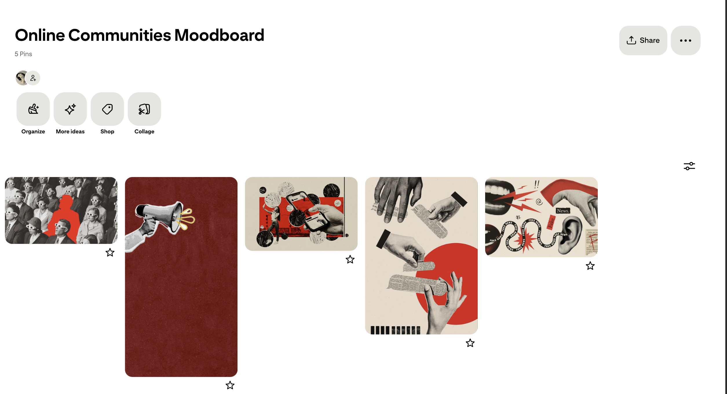
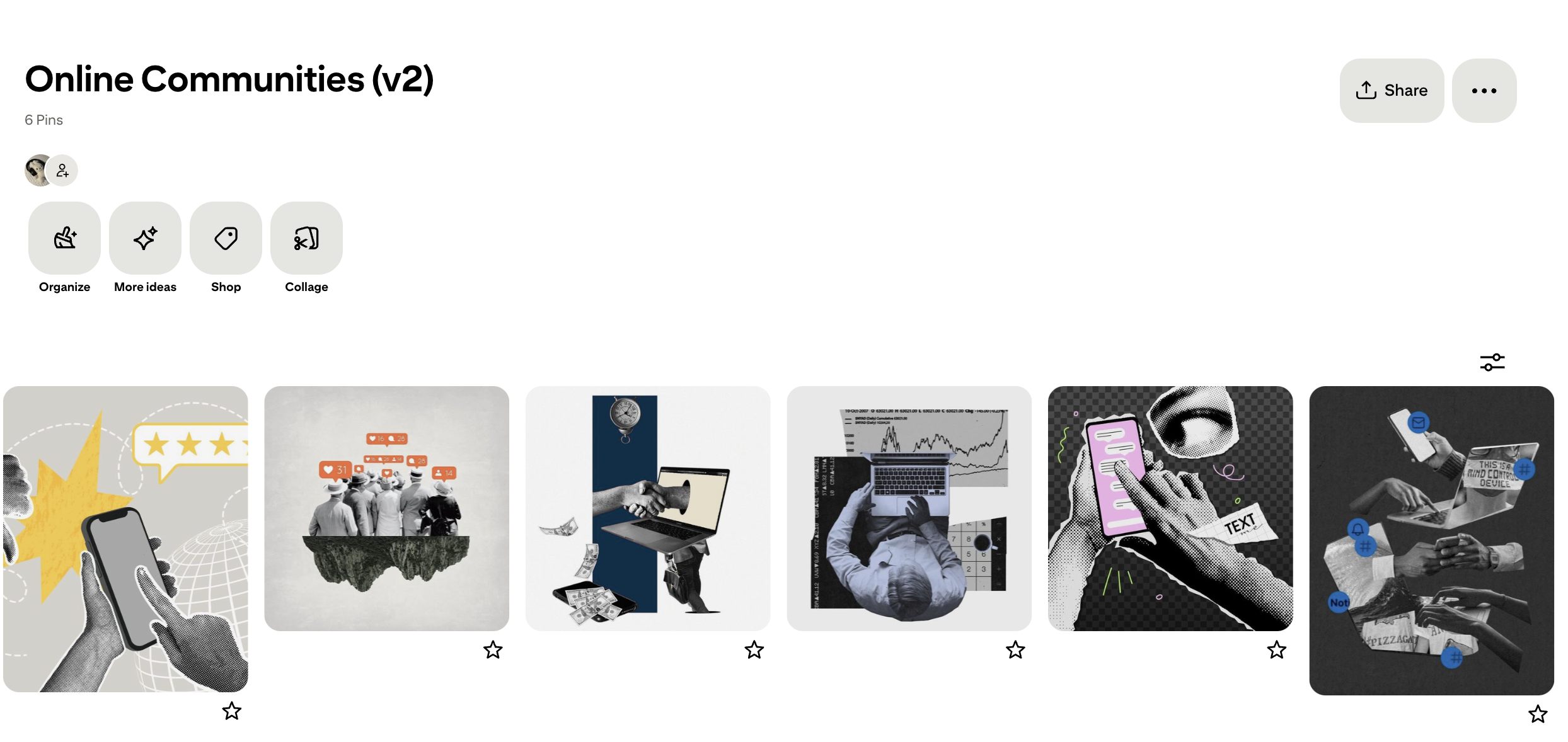
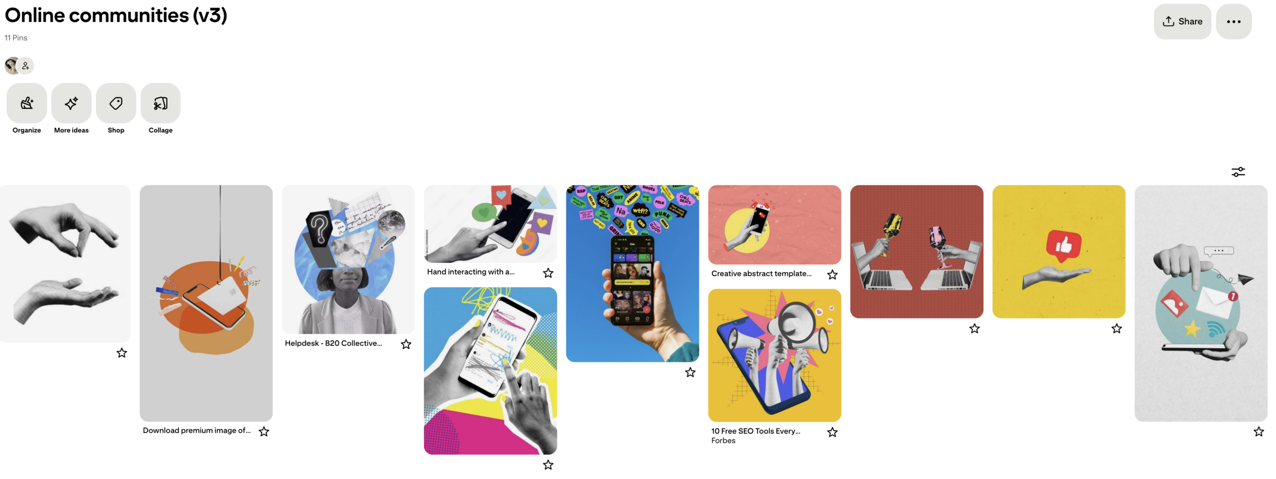
Moodboarding
I started out trying to figure out a direction for the class I selected (I320 U/S: Online Communities)

The direction that was approved was the first one. So thats what I went with going into making the other graphics.
Digital Wall Monitor
I had some trouble trying to keep things simple… given the inspiration I wanted to be maximalist, but a background is meant to be a background! Not the main visual. Especially whenever it comes to an online class, you wouldn’t want the background to be distracting. Here are some of my iterations:
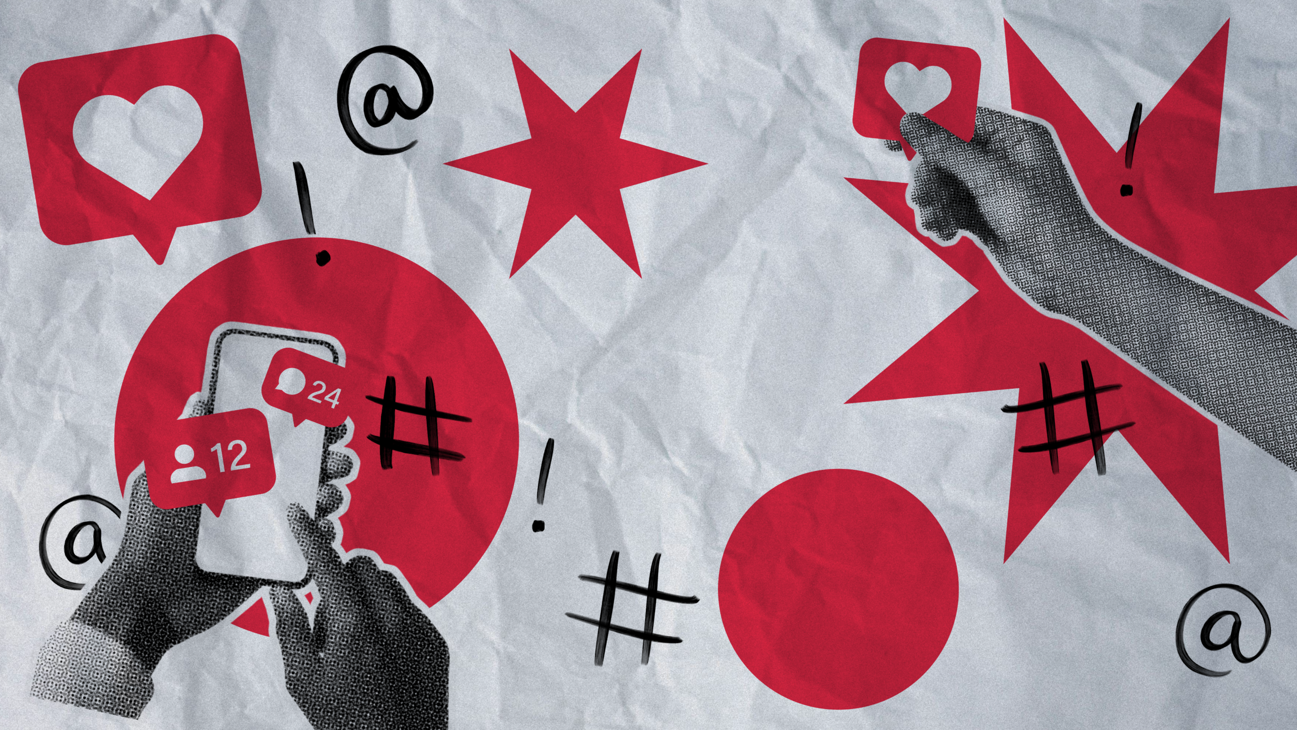
This was my first iteration. I was advised that the bottom left was too attention-grabbing and that I should get rid of the numbers, since your eye darts to read it.
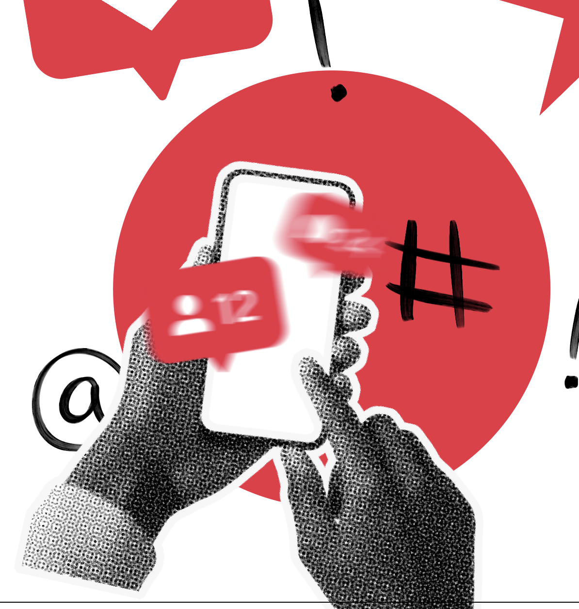
I blurred the numbers out of curiosity with how that could look instead of just getting rid of them entirely, but I eventually ended getting rid of the numbers.

This iteration I really tried making the attention go to the center rather than the bottom left… but it became way too distracting. I needed to tone this down a fair bit.

This iteration was one of my stronger ones and closets to what the final ended up being. It still felt like a little too much was going on… but I focused on adding more dimension by making the center pop out more as if it were stamped atop of everything else.
Final Digital Wall Monitor

Mockup

She shines bright like a diamond
Overall Reflection
Understanding that the background is meant to support the subject was my most important takeaway. Of course designing very intricate details is fun, but it can adversely work against you. I’ll keep this is mind whenever it is time for me to take on a real class. Simple is better!