Dana Center: Strategic Direction Updates – 4/6/22
This past week, I have primarily been working on editing the strategic direction infographics to fit both the client requests as well as keeping in mind design principles.
Graphic 1
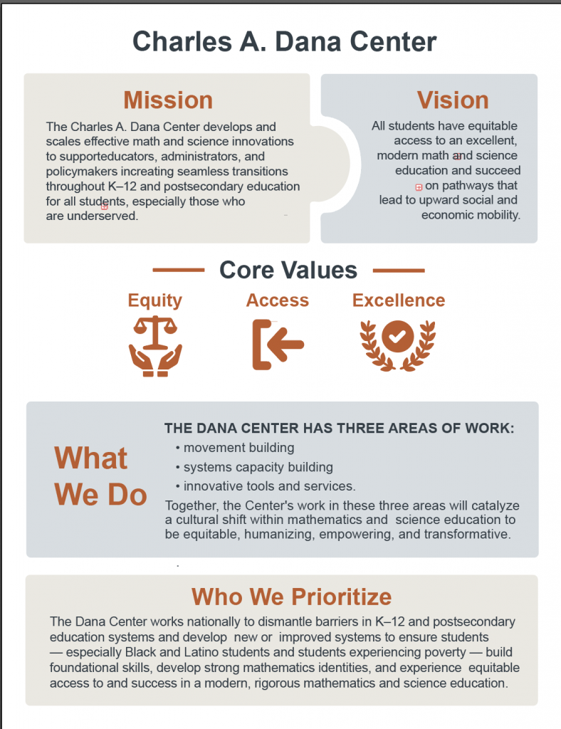
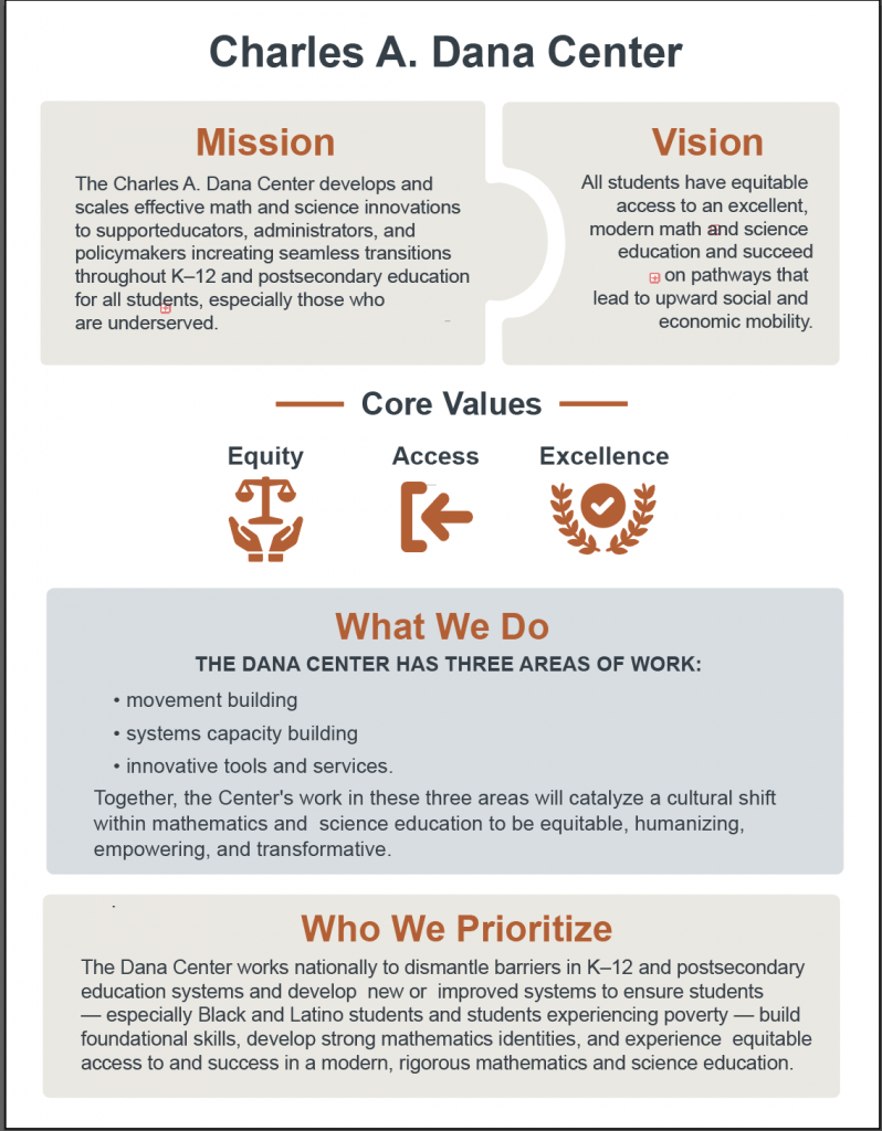
After meeting last week, Suloni and I discussed better ways to convey all the information so that each section is balanced without being too busy. I came up with three versions that experimented with adding another color in it and reorganizing some ideas:
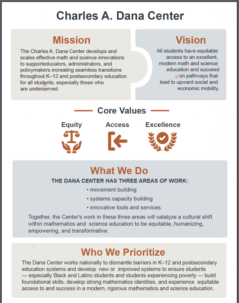
Ultimately, Suloni decided that the third one (where What We Do is on top and not on the side) may work the best. She requested for me to fix the bullet points so that are more center aligned. It ended up looking like this:
We have sent over this current version to the client, and will see what they think about it/what changes they want made.
Graphic 2
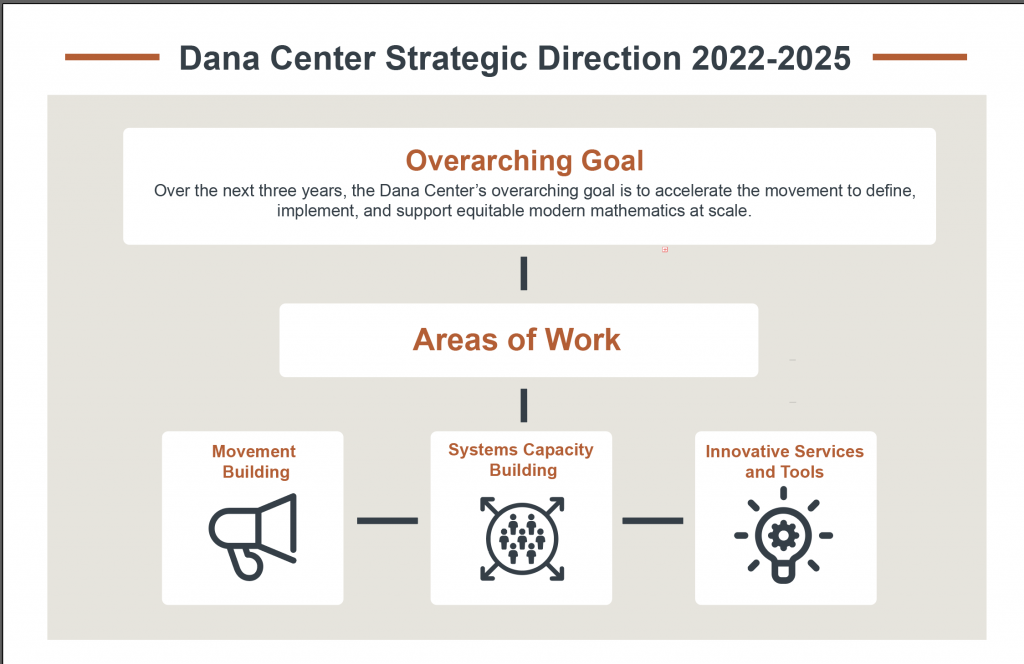
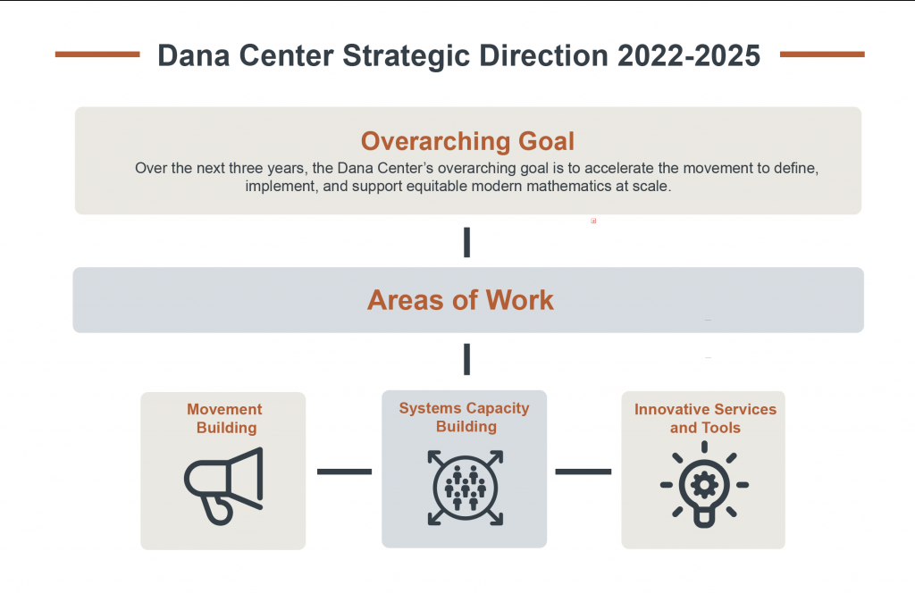
As per last week, the second graphic looked like this:
It didn’t quite match the new version of the the first graphic, so I have revised it to try and match the style better.
I will update this further once I get more feedback on this particular one. Currently I am thinking the “Areas of Work” could potentially be shortened but I am not sure.
Graphic 3
For the third graphic, I began by using image trace to on a previous version of the graphic to get basic silhouettes. I then edited the silhouettes to be more readable.
The original one looked like this:
In my rendition, I ended up redoing quite a bit of the children’s design to better fit the adults. Additionally, I resized them, as the children were initially proportionally too small compared to the adults.
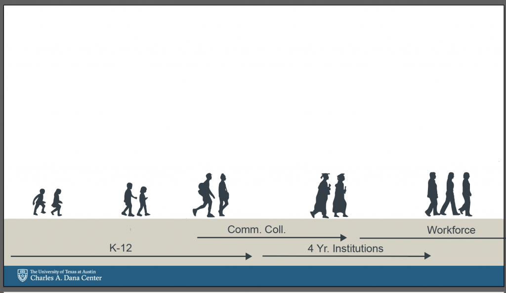
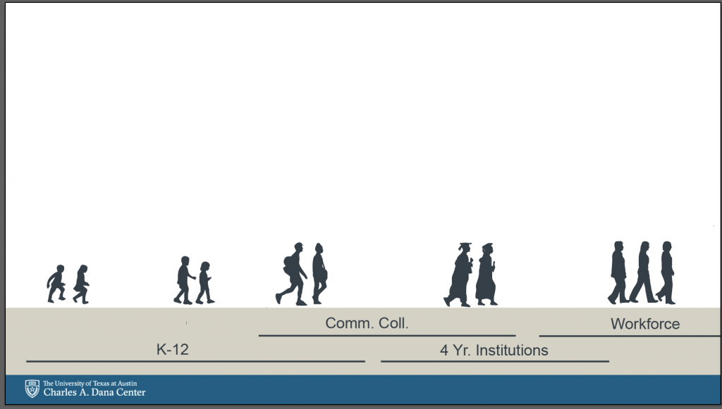
The next step was to add the bottom text in (we have not received the top text yet). I spoke with Suloni about various ways to do this, and ended up deciding on two options:
The main difference between these two is the arrows on the top. Ultimately, we decided on using the arrows for now. My next step is to figure out how to implement color using the UT brand colors. My current draft looks like this:
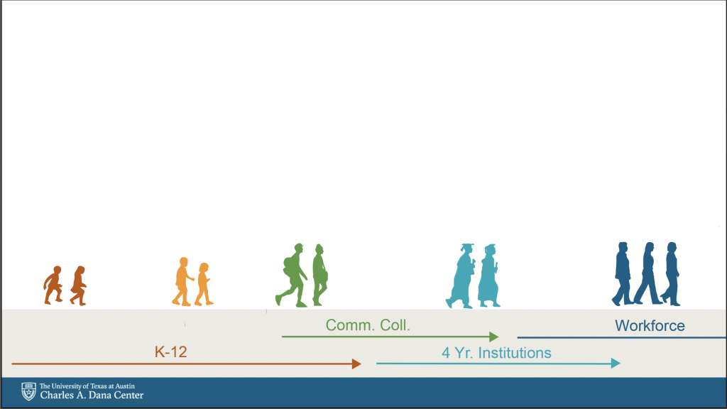
I am not certain if have so much color may clash with the other two graphics. However, I do like how it feels like a colorful, educational piece. I went from red to blue to try and convey a sense of growth and maturity (especially since blue is often used to denote honor and stability). I will see what Suloni thinks and then move on from there!

