Swedish Language Promo Designs
Project: Promo Designs for Swedish Language Course
Client: Smyth Johansson
Completion Status: In progress…
Staff Guidance: Suloni Robertson
STA Team Members: Cristina (yo)
Description/Plans: To create 2 layouts (a minimal and a maximal content approach) designs for the Swedish department to be printed in order to promote their language course.
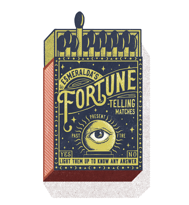
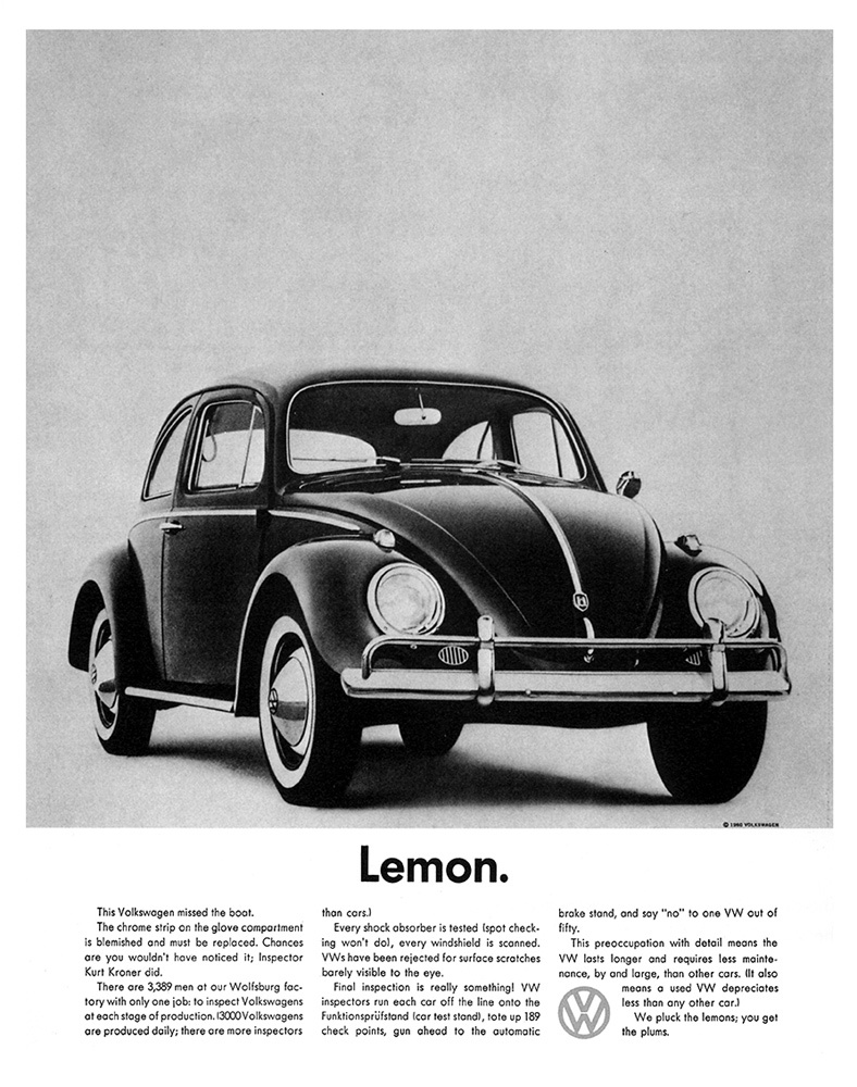
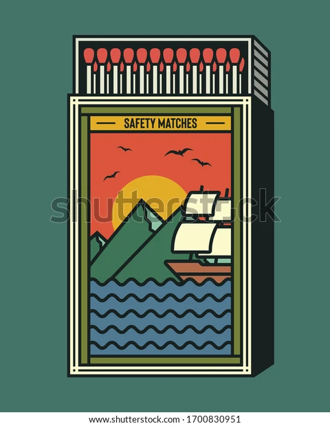
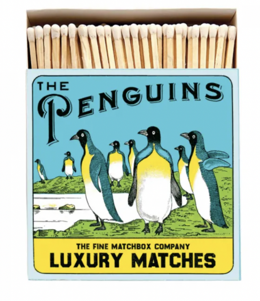
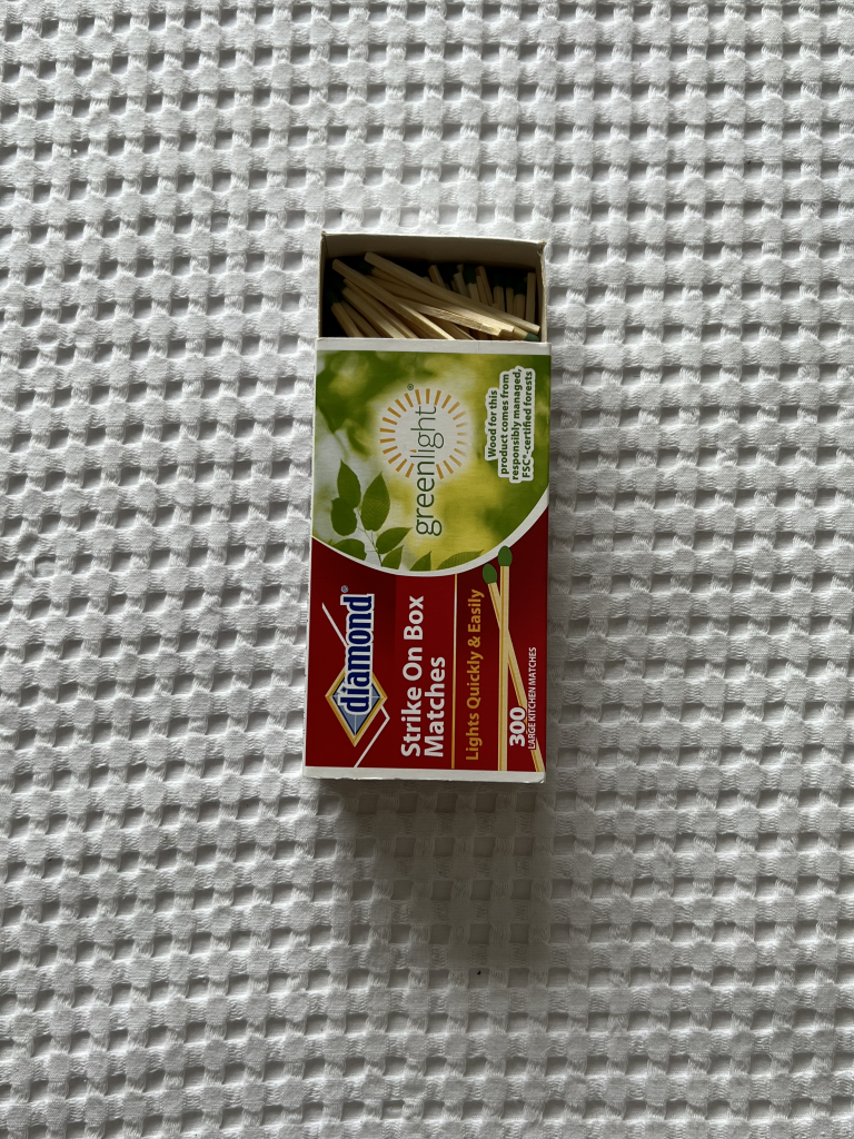
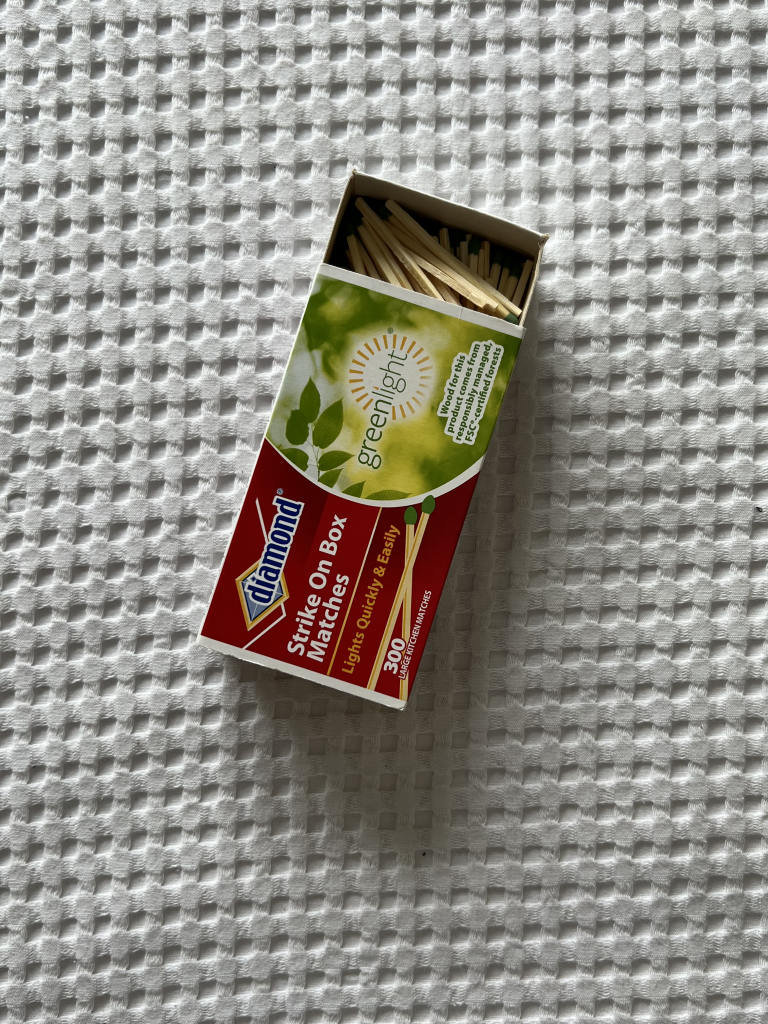
Here are some of the pictures I took for inspiration:
And here is what I started working on:
1. First, a color palette, I chose to use the Swedish flag’s blue and yellow, and complemented those with a nice red and green.
2. Then I created some black and white drafts.
3. Later I started working on a new format inspired by the Lemon ad.
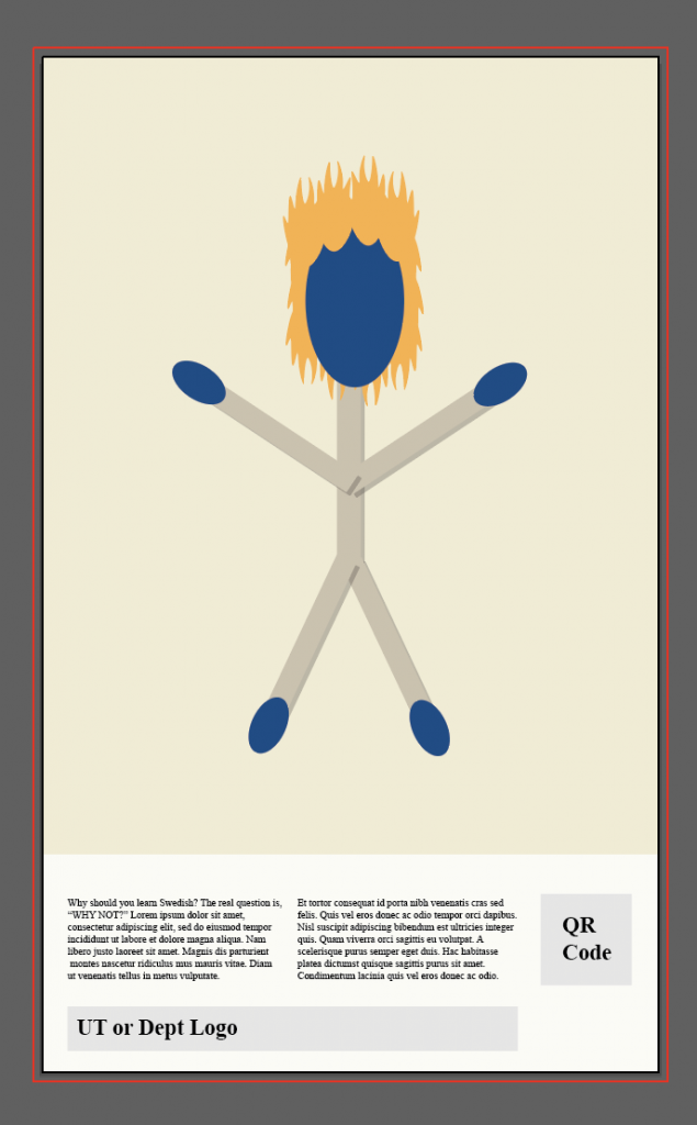
4. Finally I worked on an alternative version where a person would be made out of safety matches… it’s not a refined draft, but just a general idea.
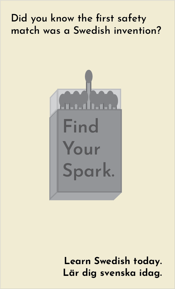
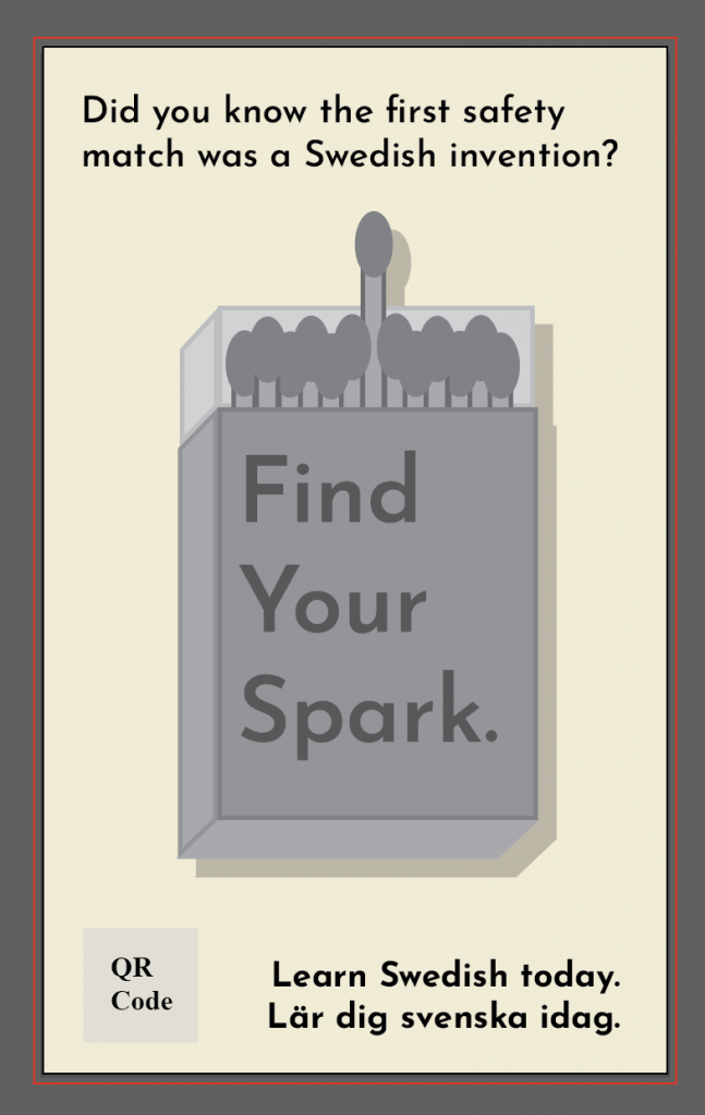
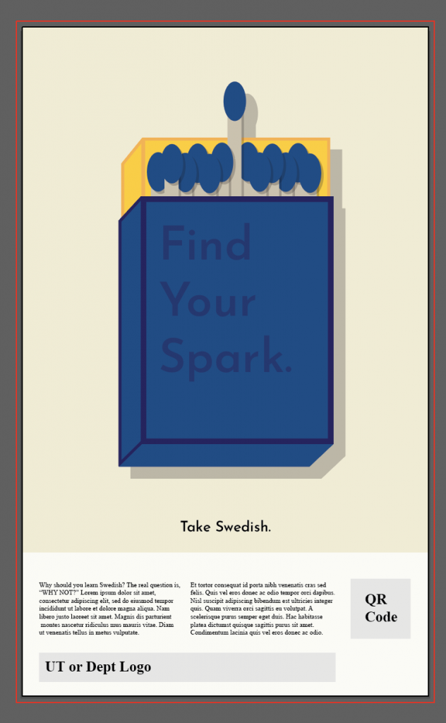
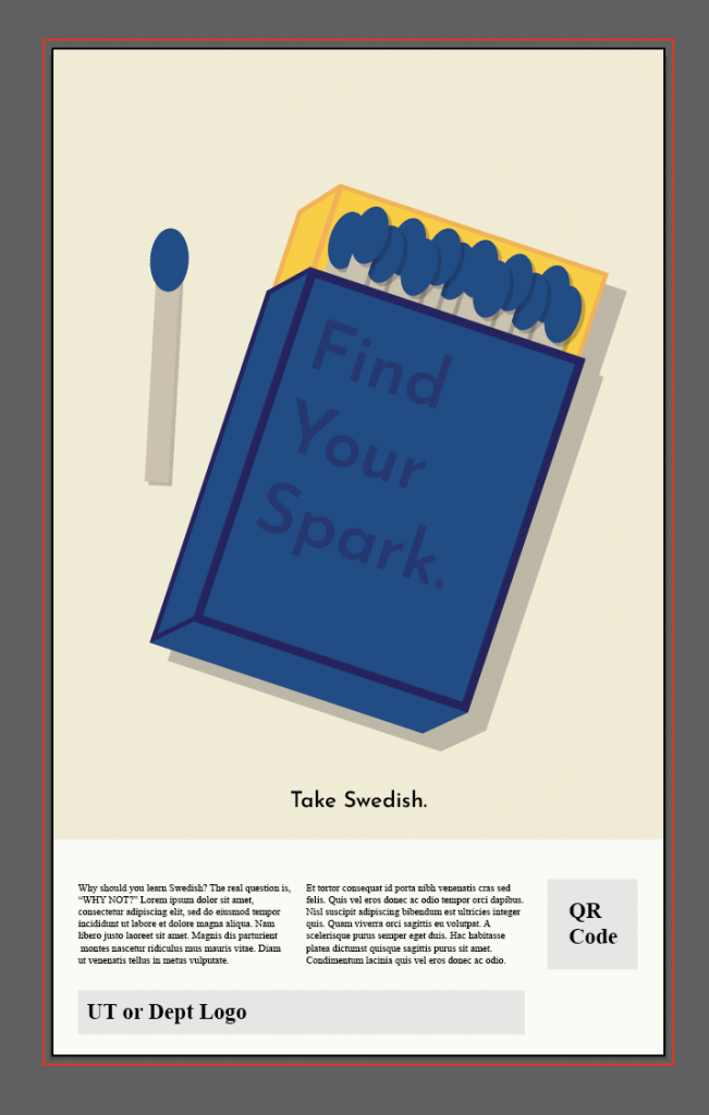
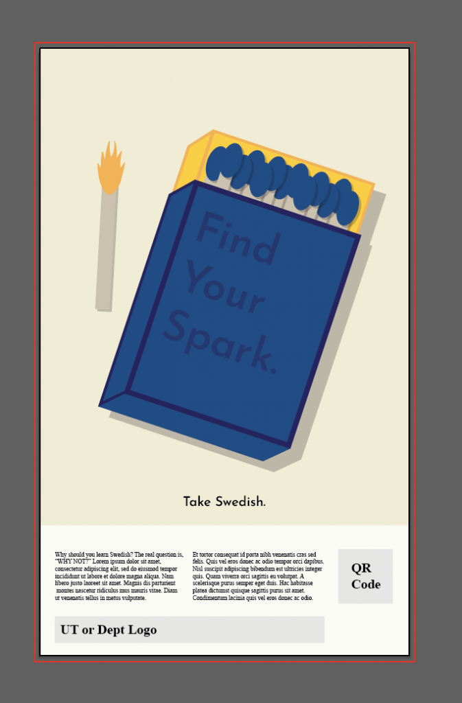
Finally, following Maddy’s advice, I took these two pictures of a match box. This was an exercise to learn how a light source would affect the box’s shadow. But I don’t think I took the pictures with a good enough light source… Nonetheless, here’s my attempt:
Scandinavian/Swedish Design Article: https://www.webpals.com/marketing/scandinavian-graphic-design-guide-tips/
