AI Logo Basic Training
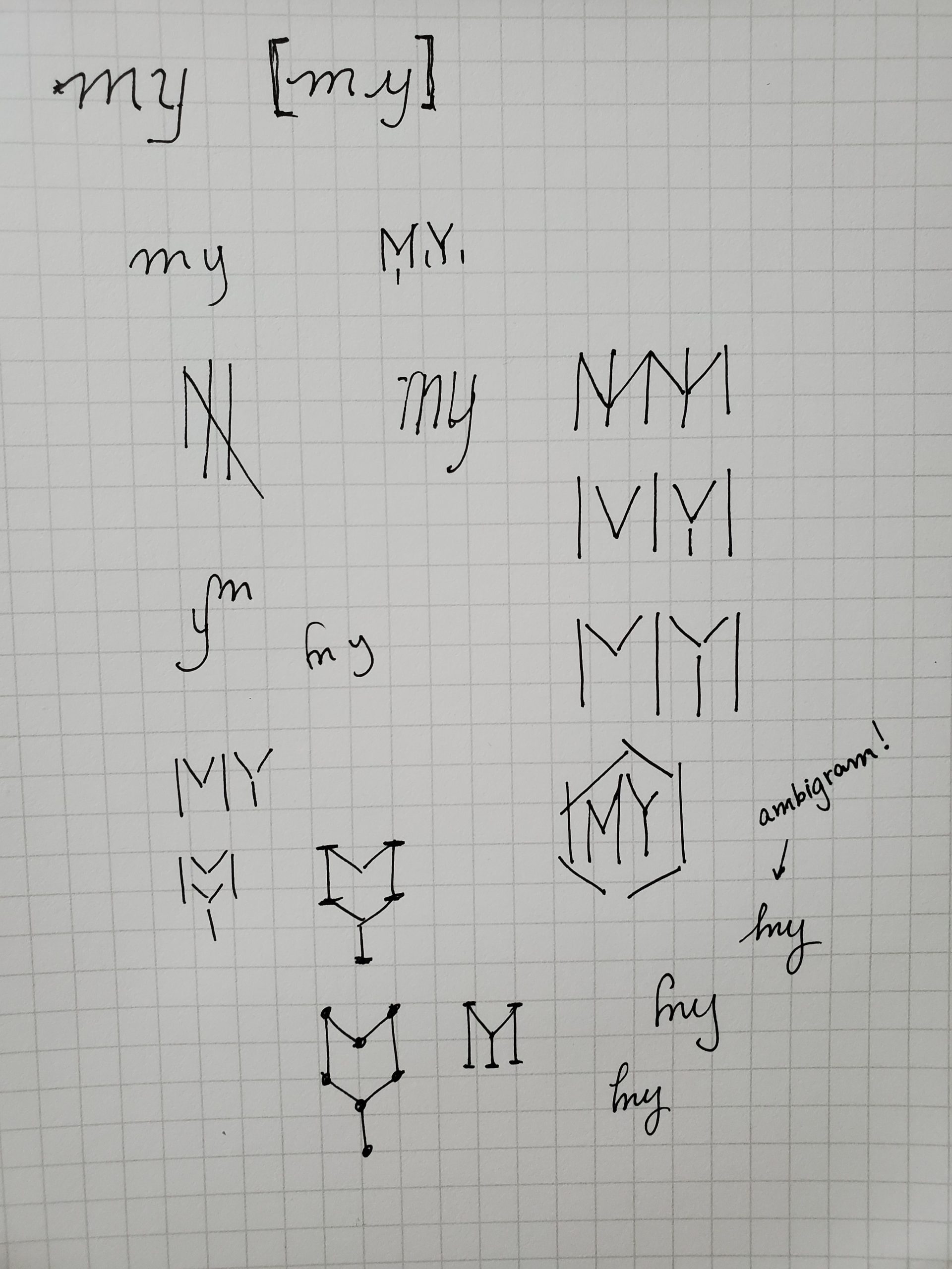
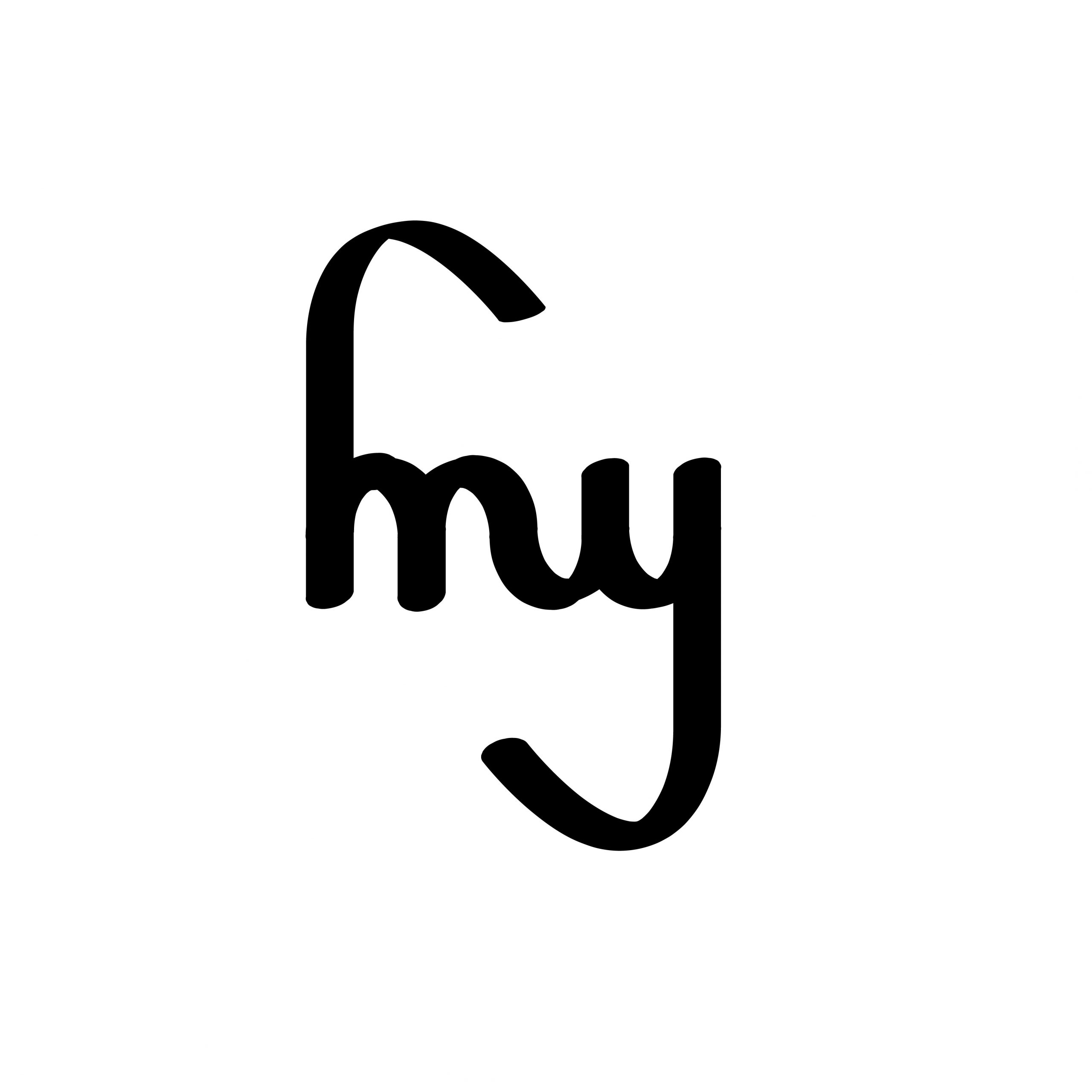
I enjoyed this training very much because I got to play around with designing a logo based on my initials. It was really nice to see how many variations and concepts come up with only two letters. Here’s a couple of iterations I made while looking into my logo:
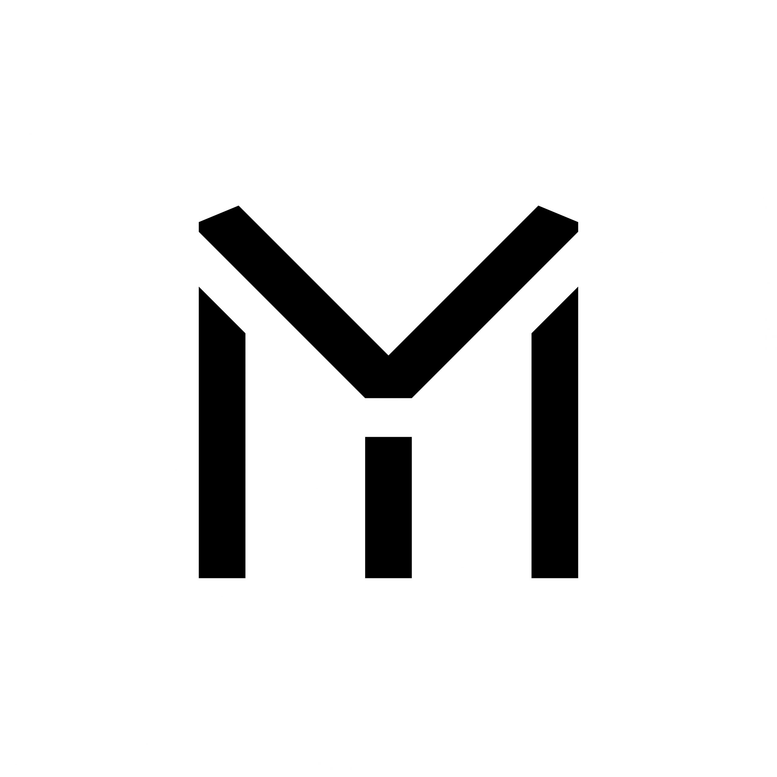
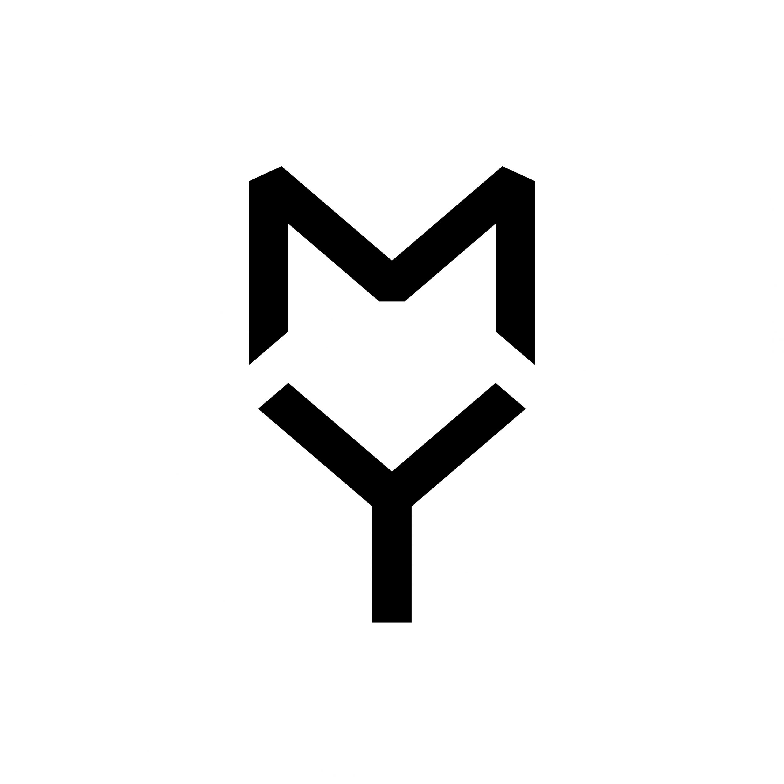
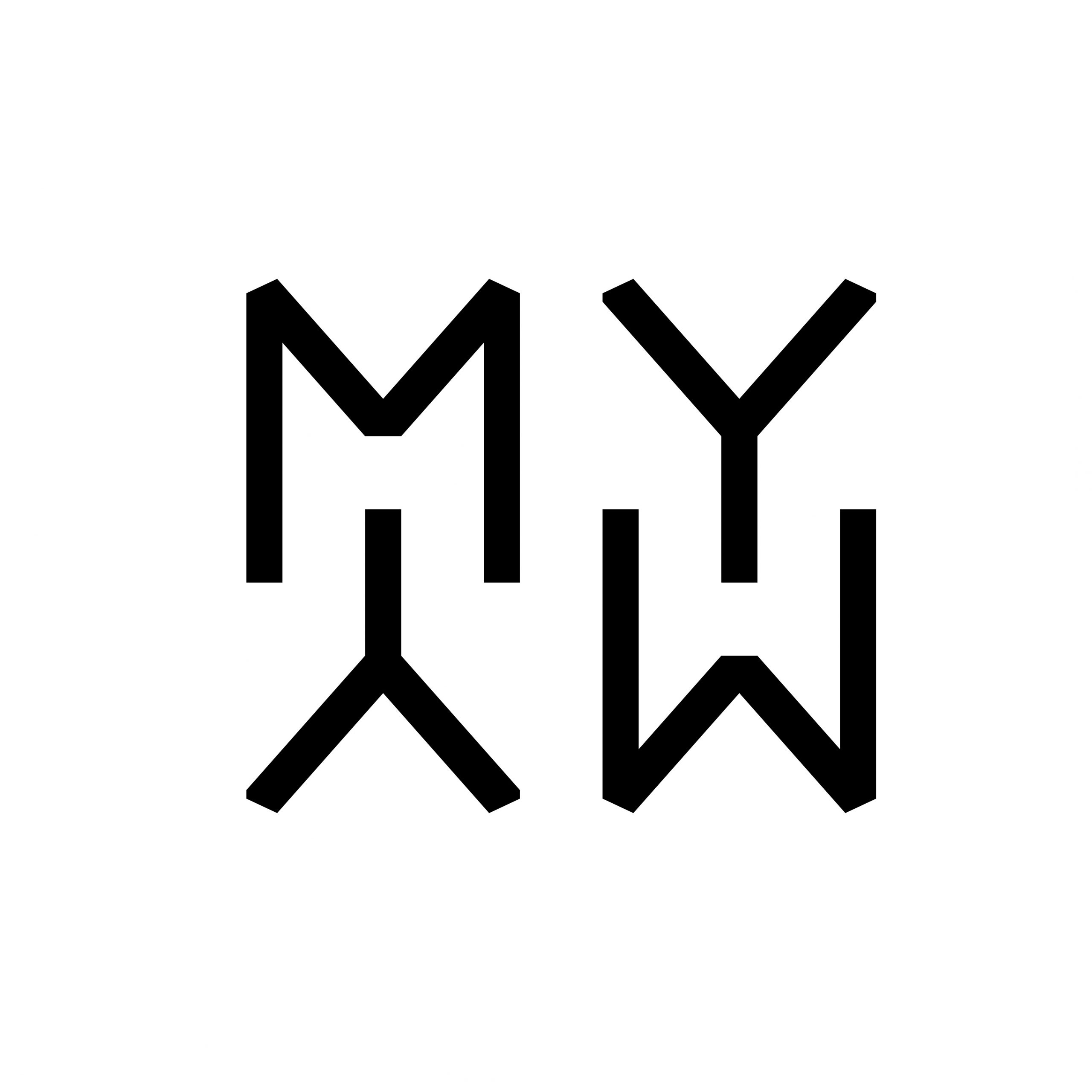
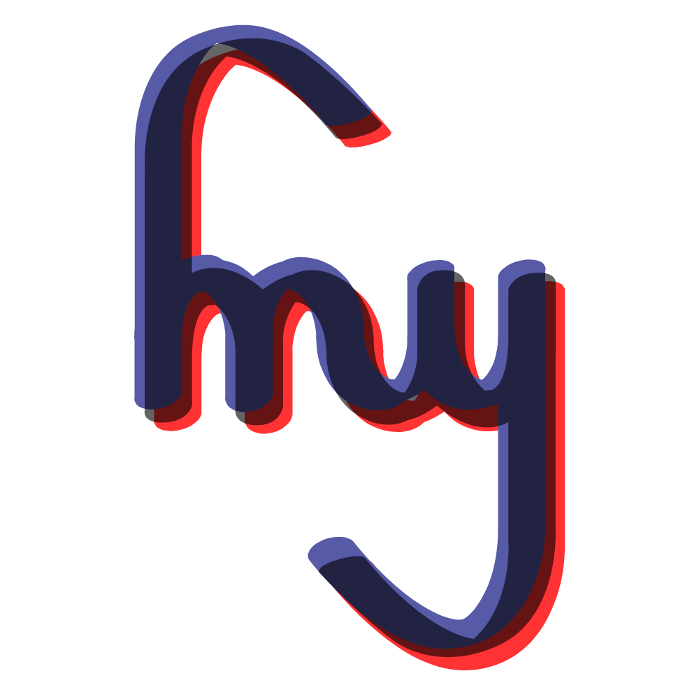
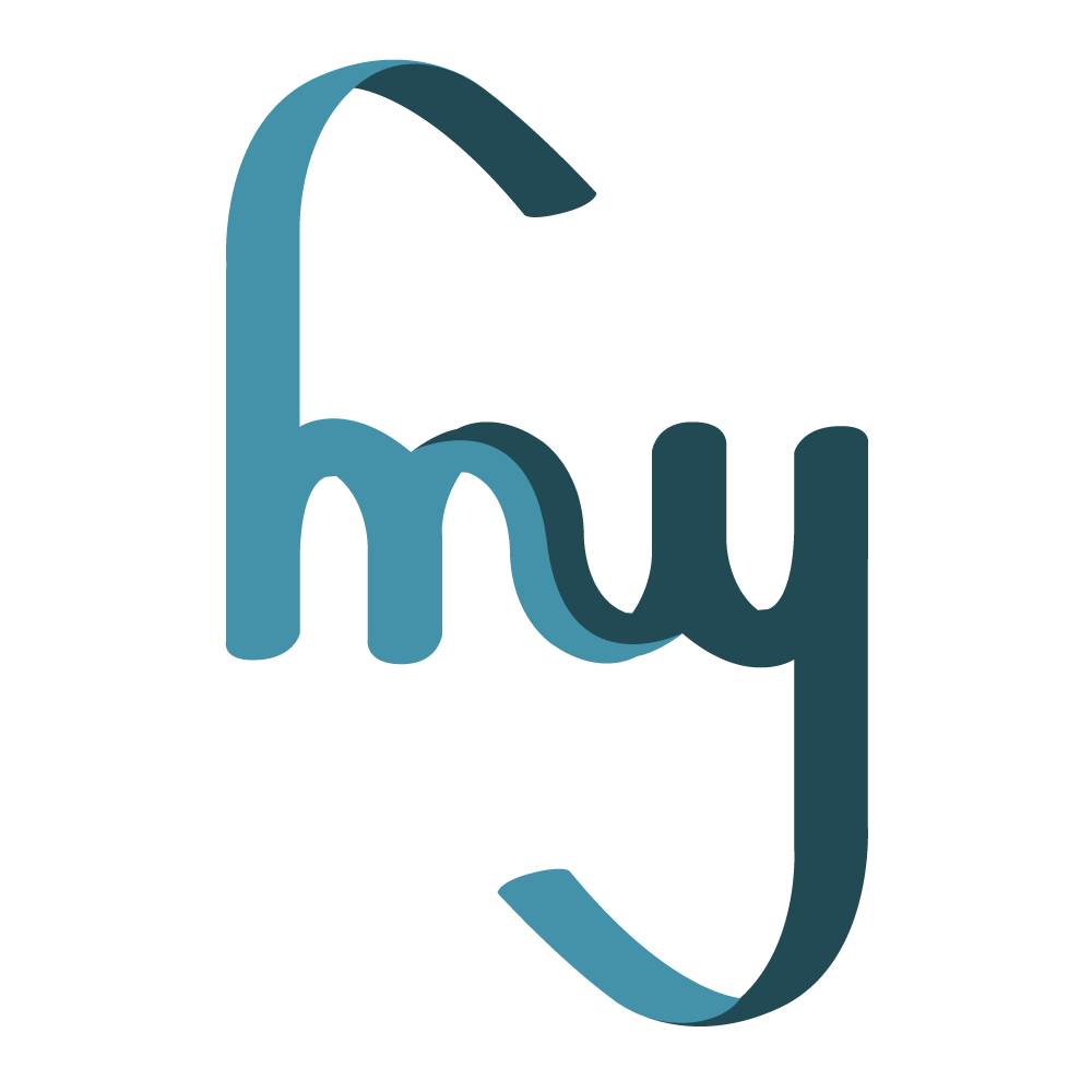
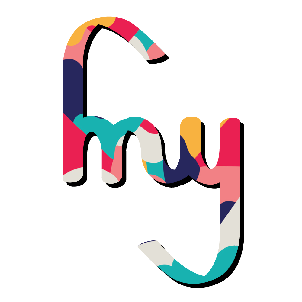
I ended up choosing the fourth design, which is symmetrical and forms an ambigram. Here are are some variations in color based on this logo:
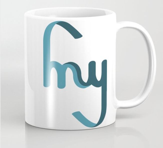
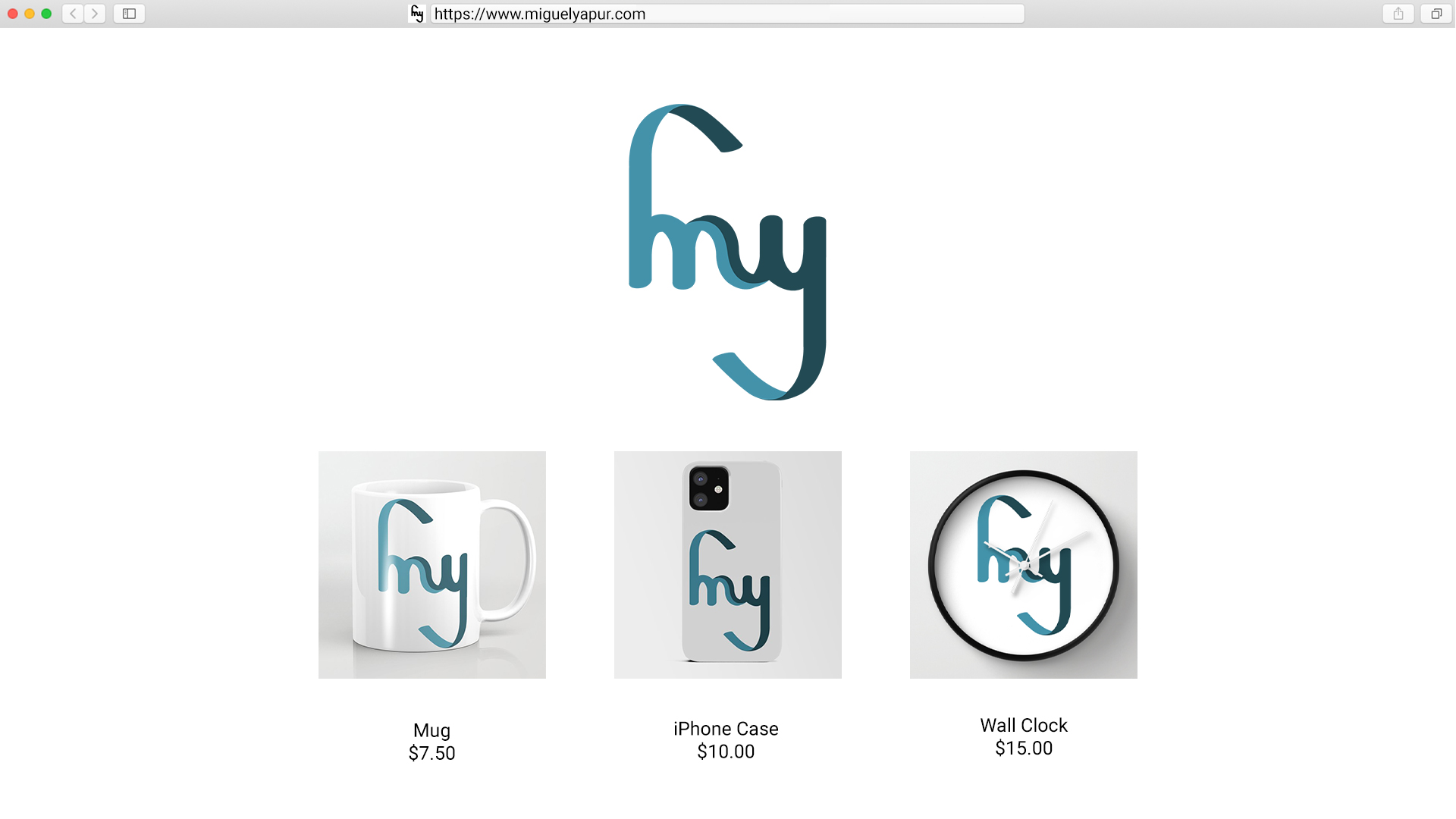
I ended up choosing the duo-toned blue logo since it emphasizes the duality of the orientation of the logo. Here are some mockups of different merch items the logo could be on:
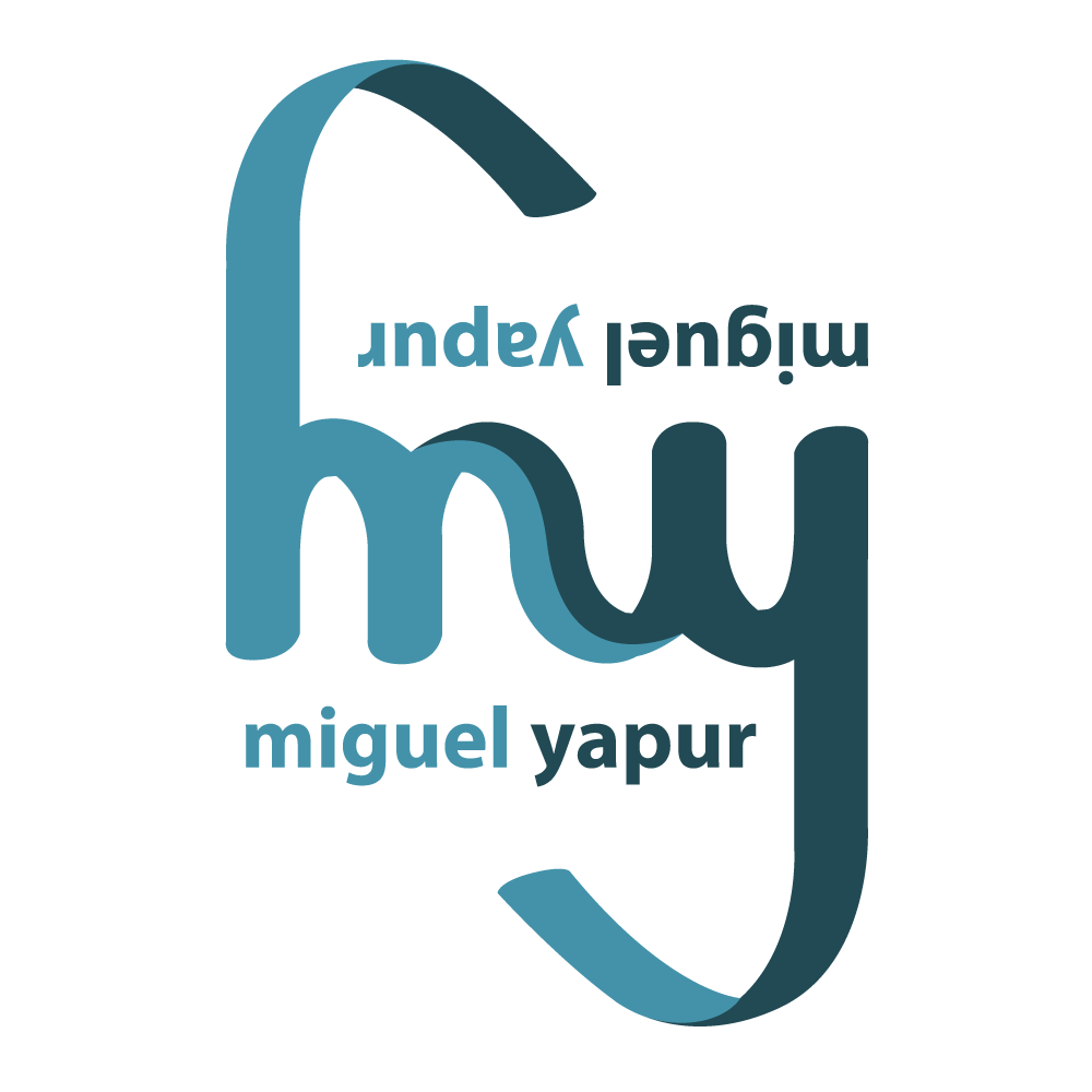
Finally, here’s a version of my logo including my full name:
Color Wheel Basic Training
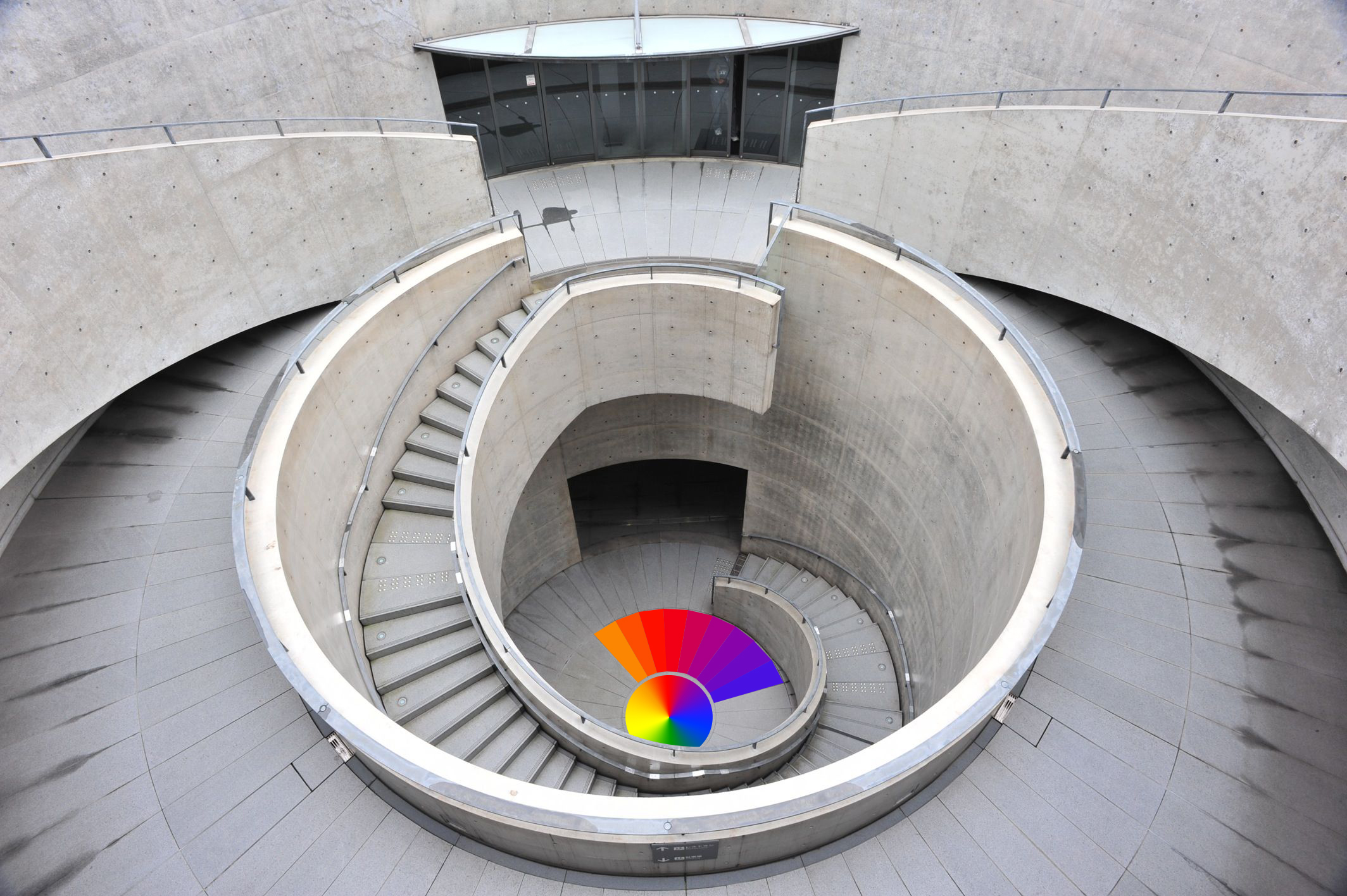
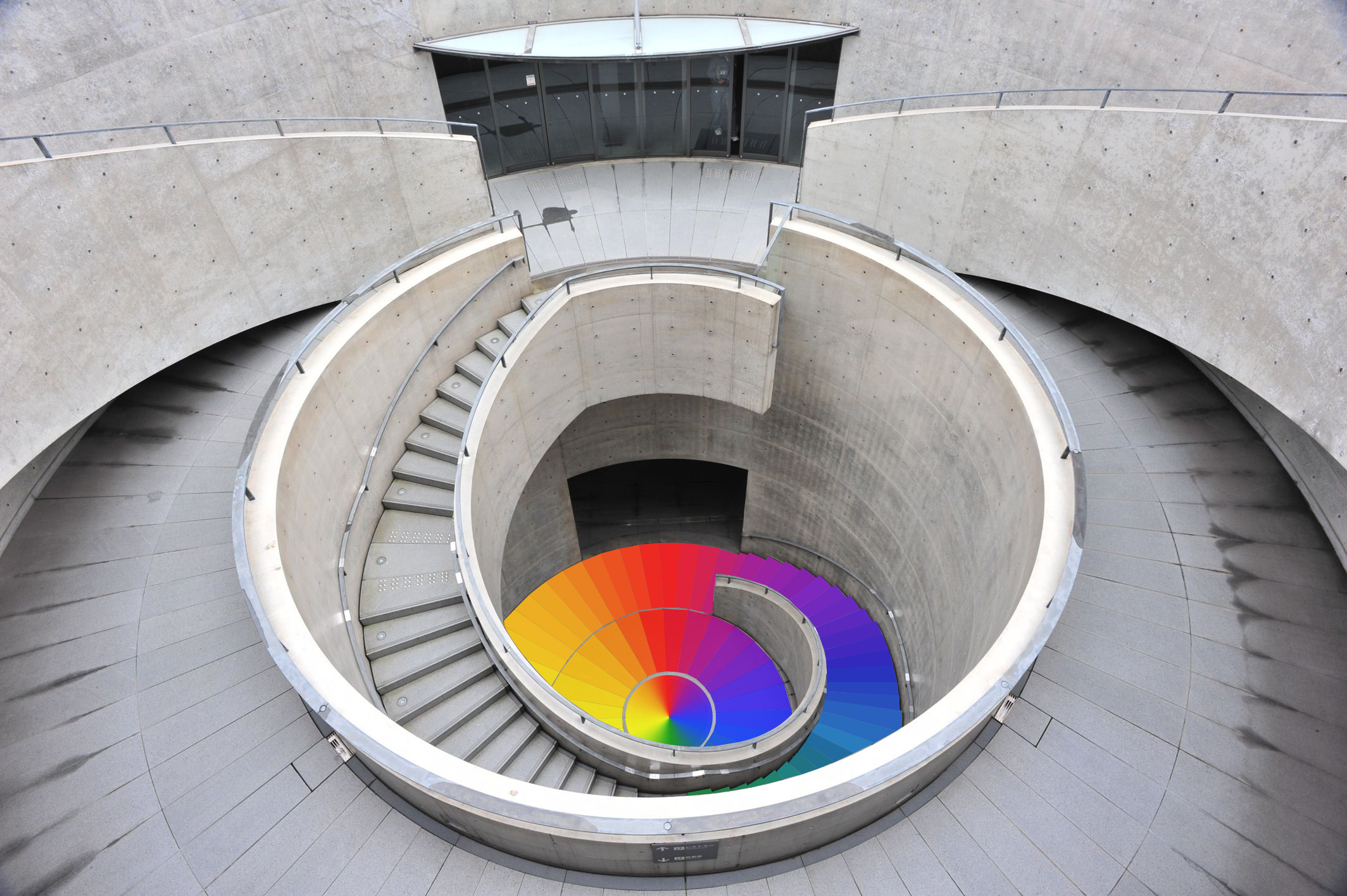
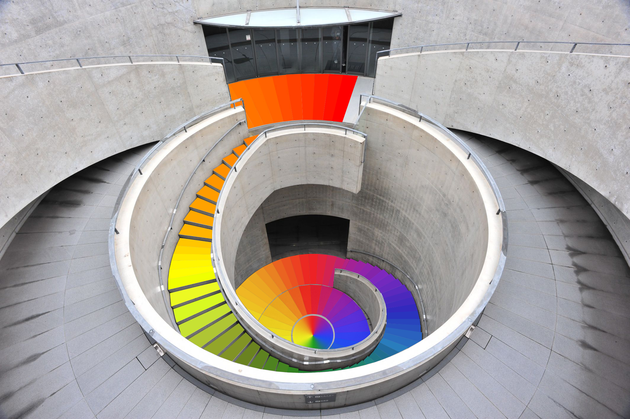
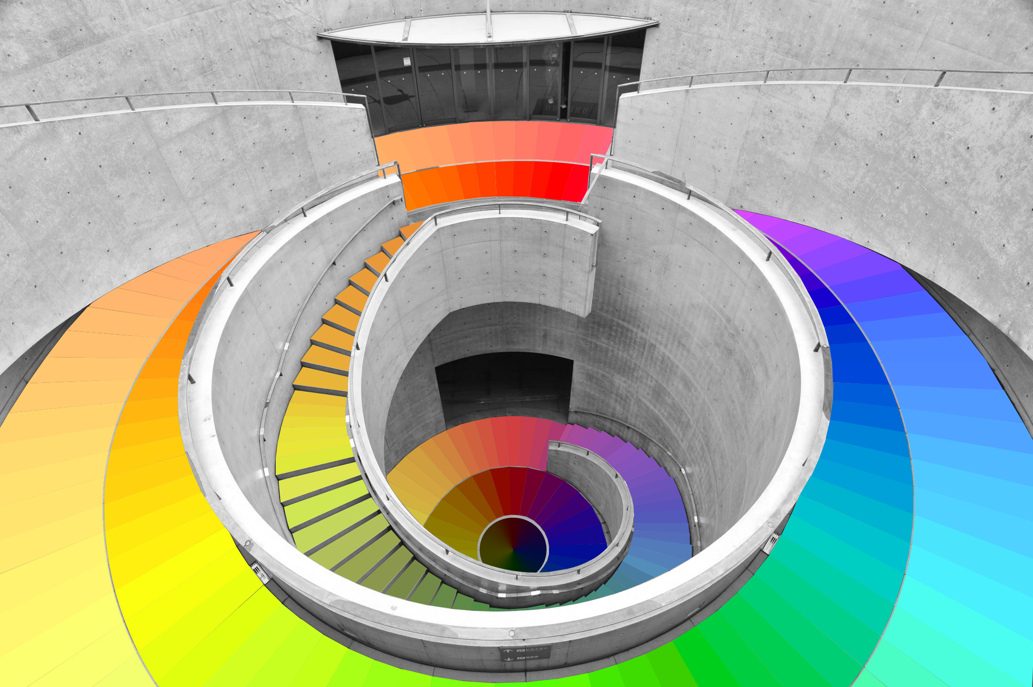
I really enjoyed learning a bit about color theory and the additive/subtractive aspects of color. Here are some progress snapshots of the design I went with for my color wheel:
Course Graphics Basic Training
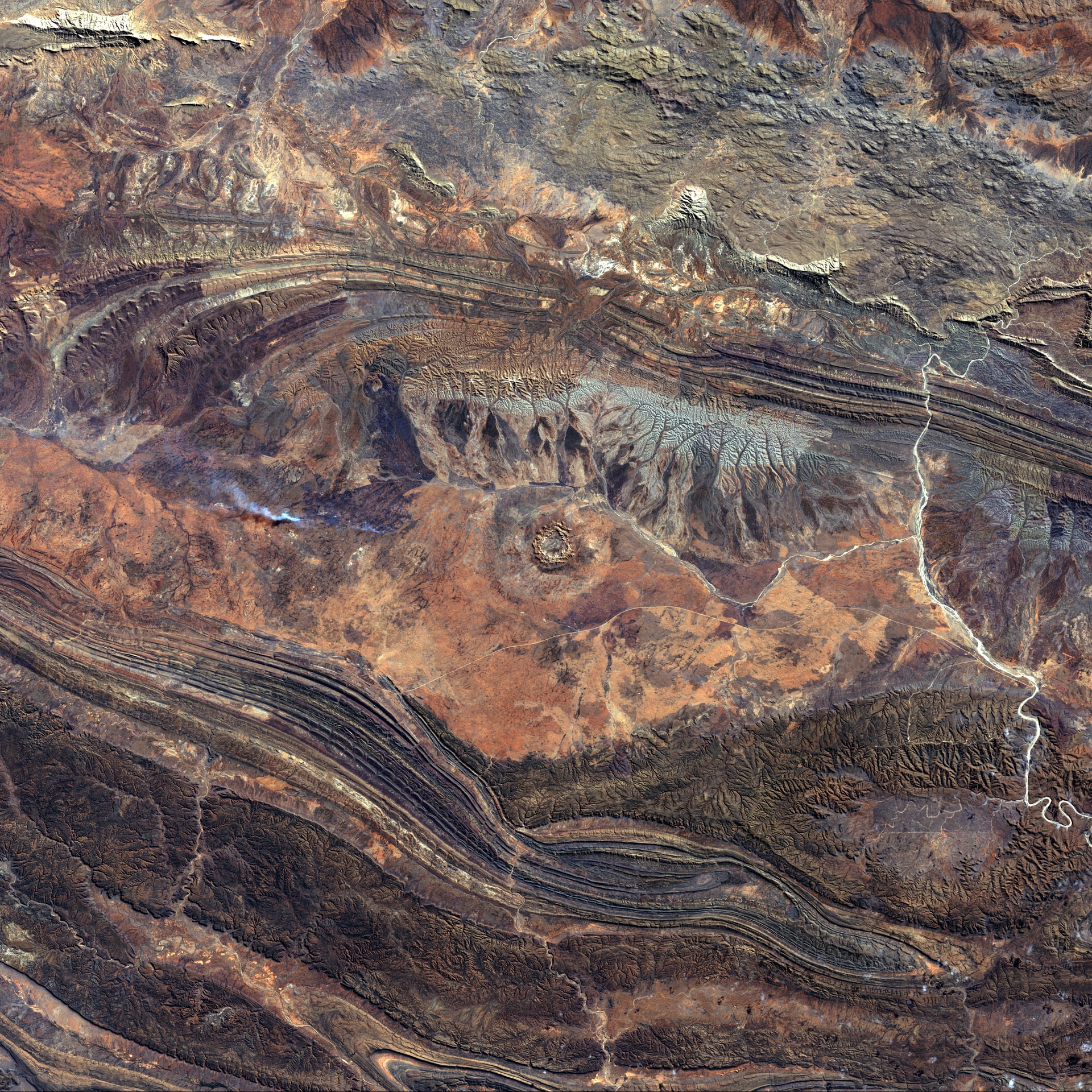
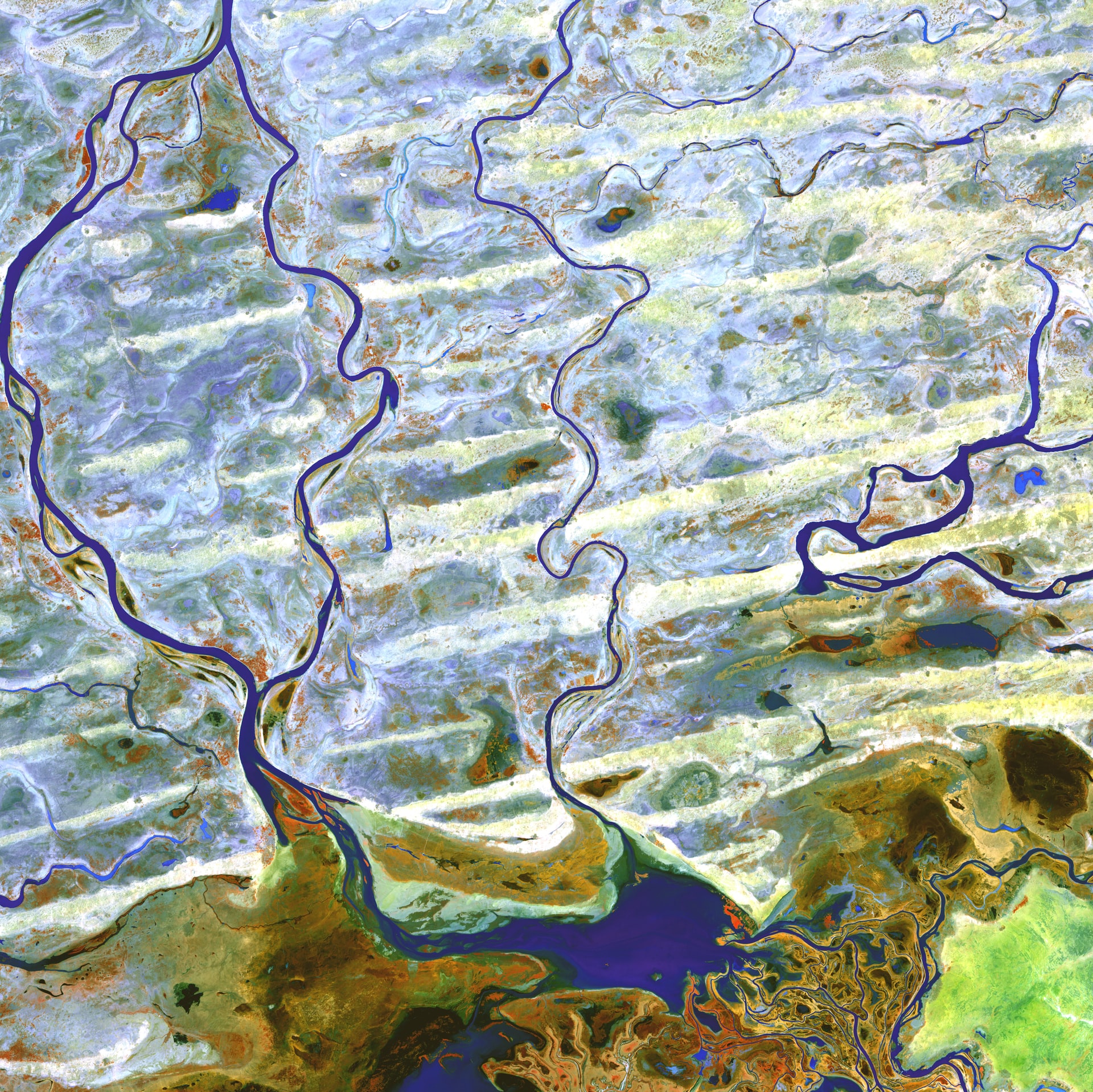
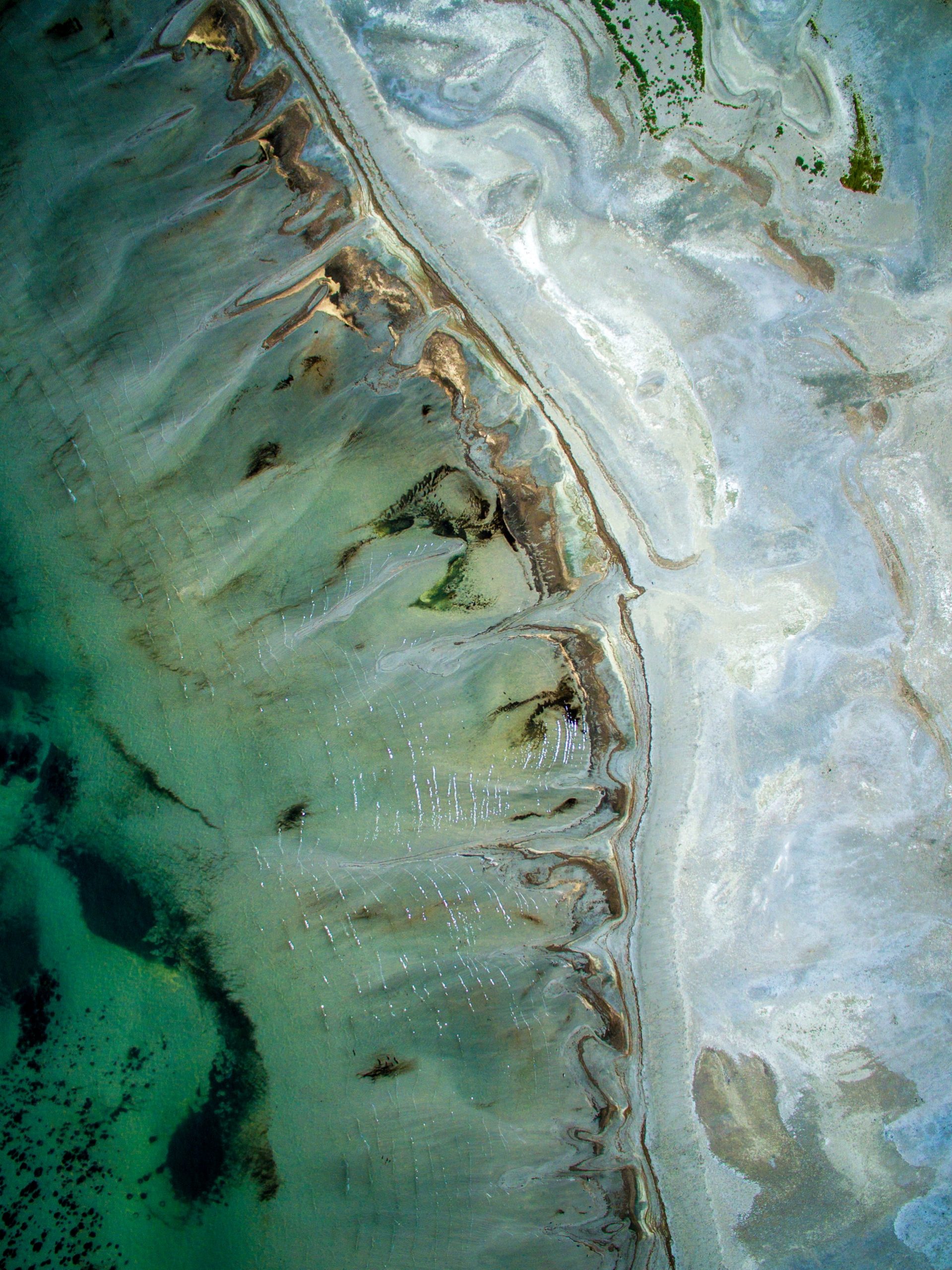
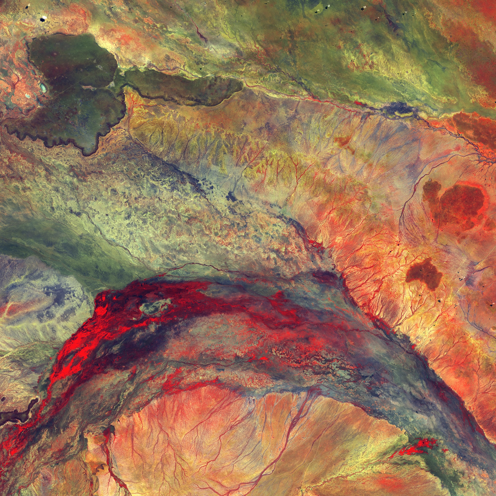
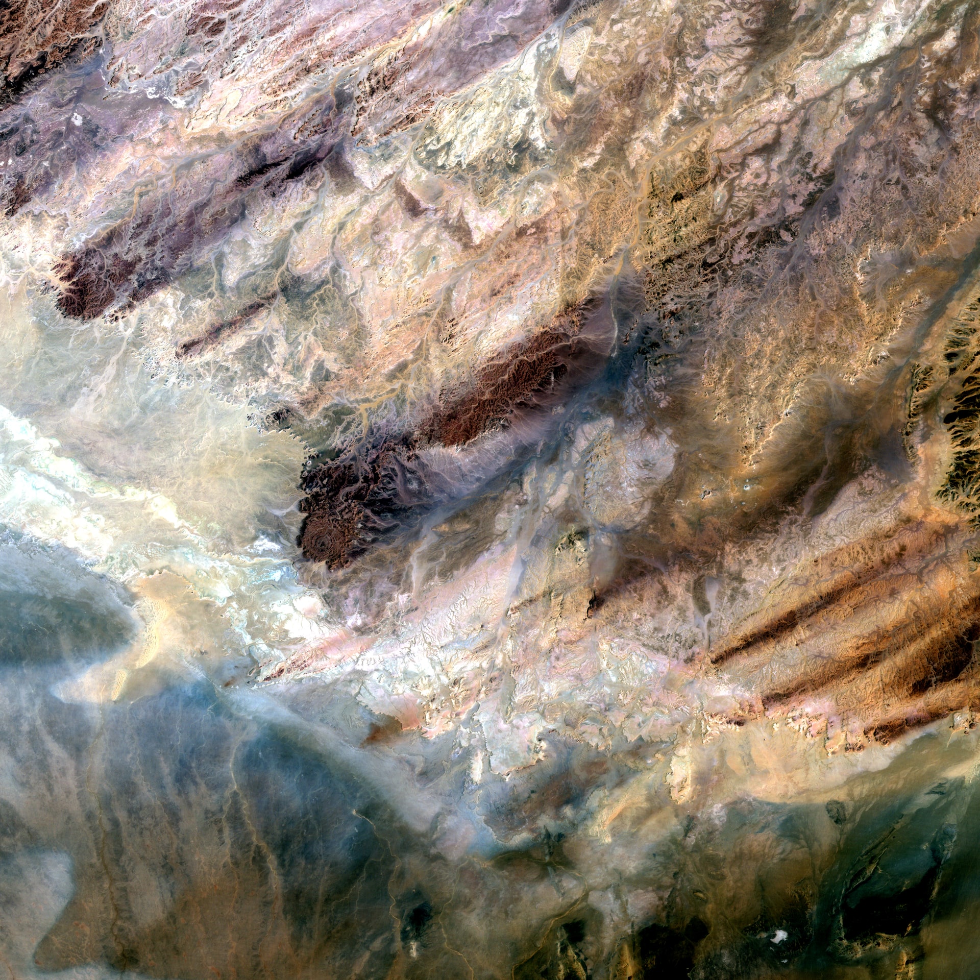
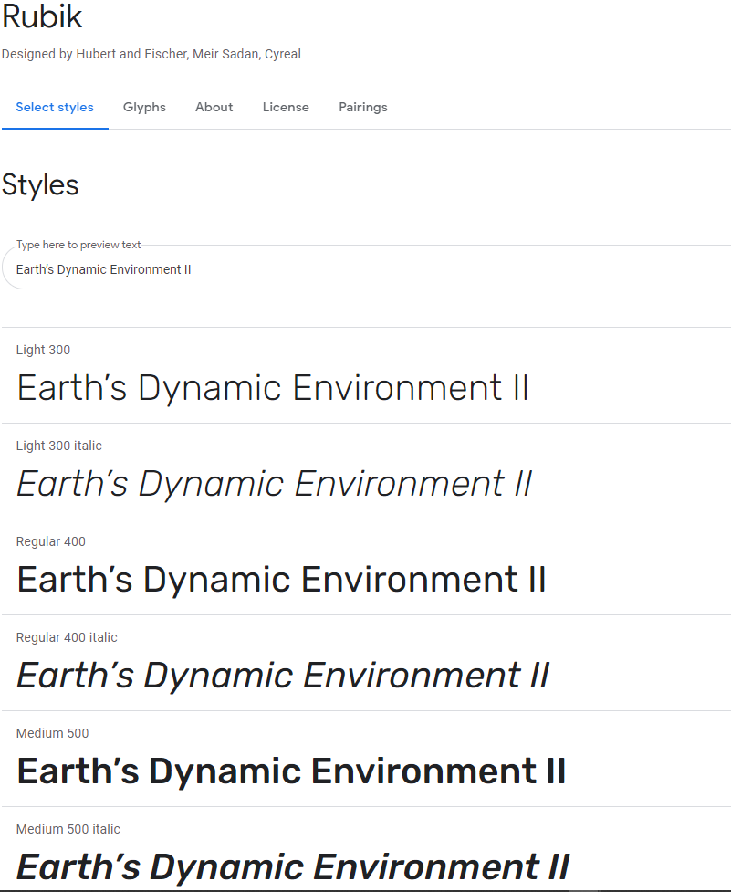
I just started this training. So far, I’ve come up with a few different mood boards for the style of the course: Earth’s Dynamic Environment II.
These are the three mood boards I’ve come up with:
Moodboard 1:
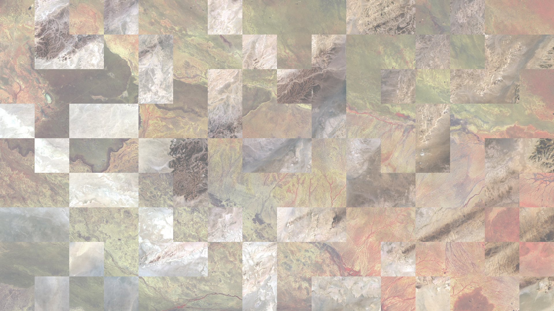
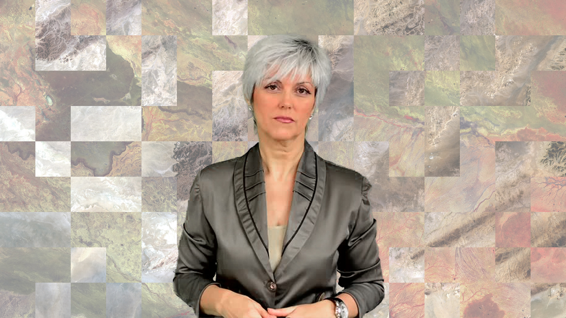
- Earthy tones with satellite images of landscapes
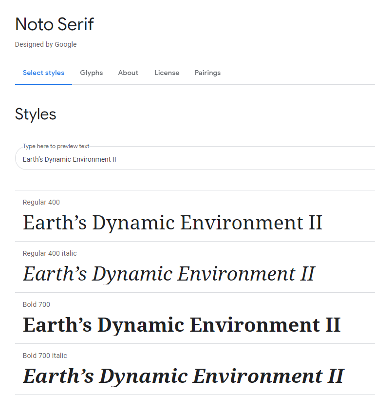
- Font: Noto Serif
Moodboard 2:
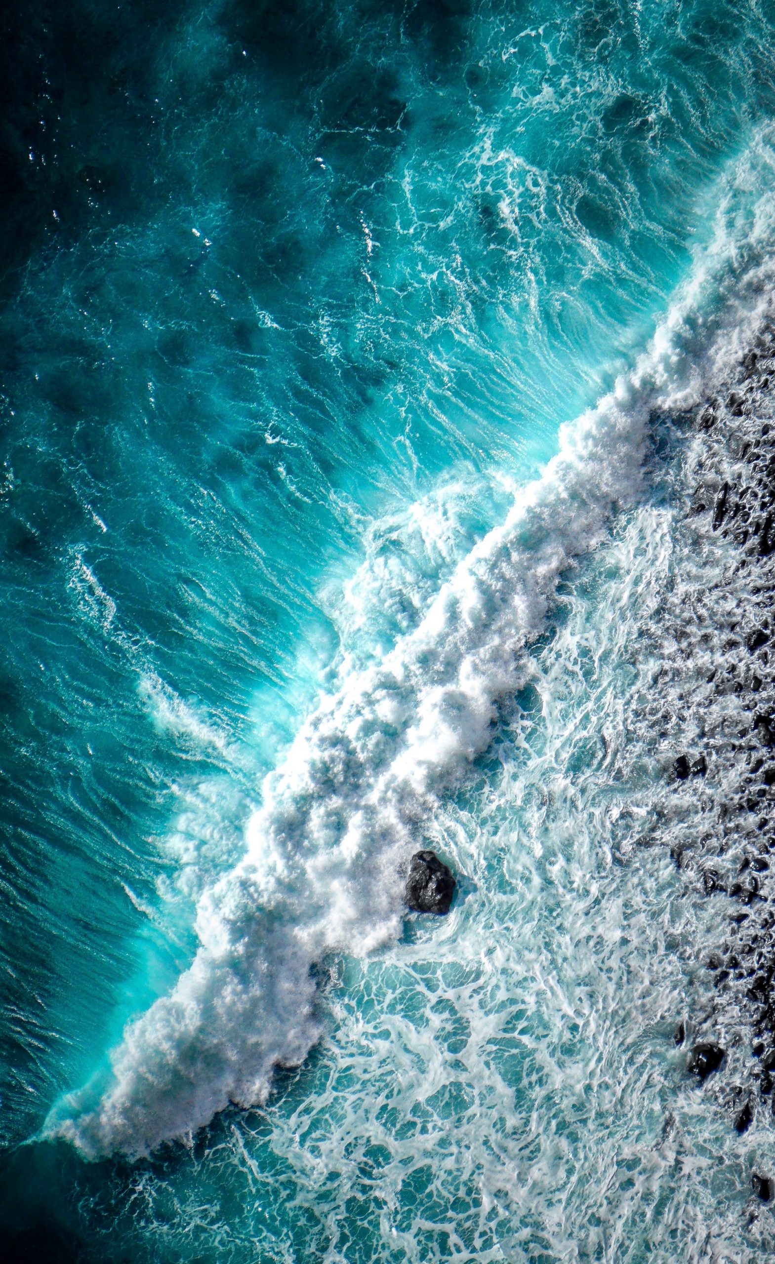
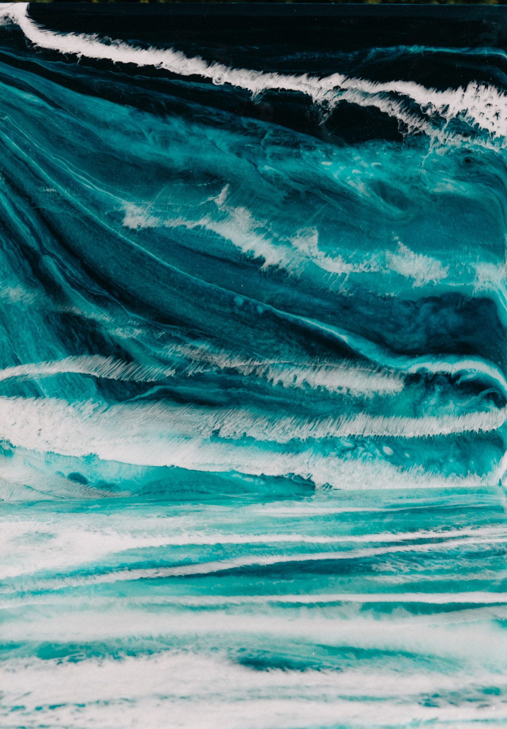
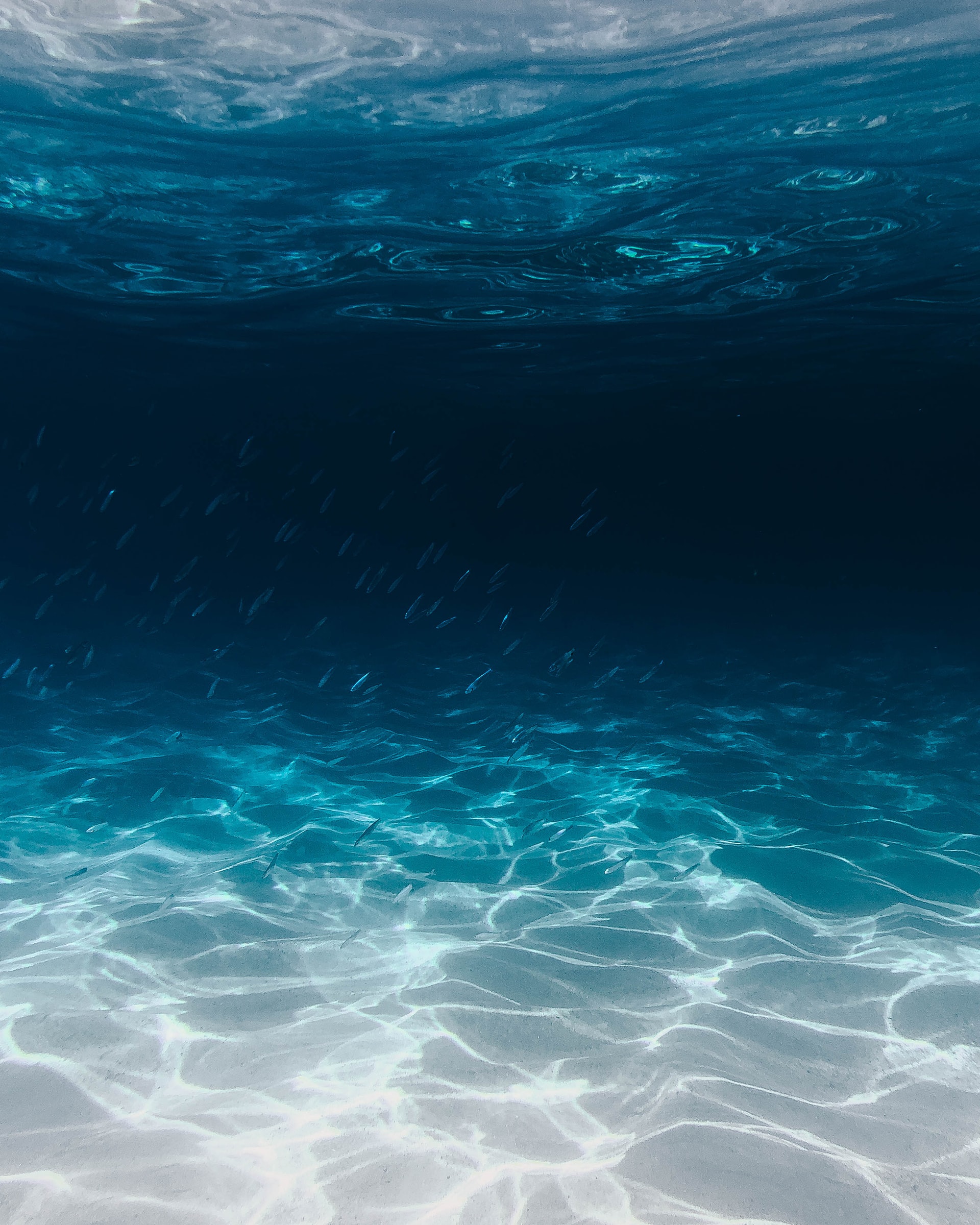
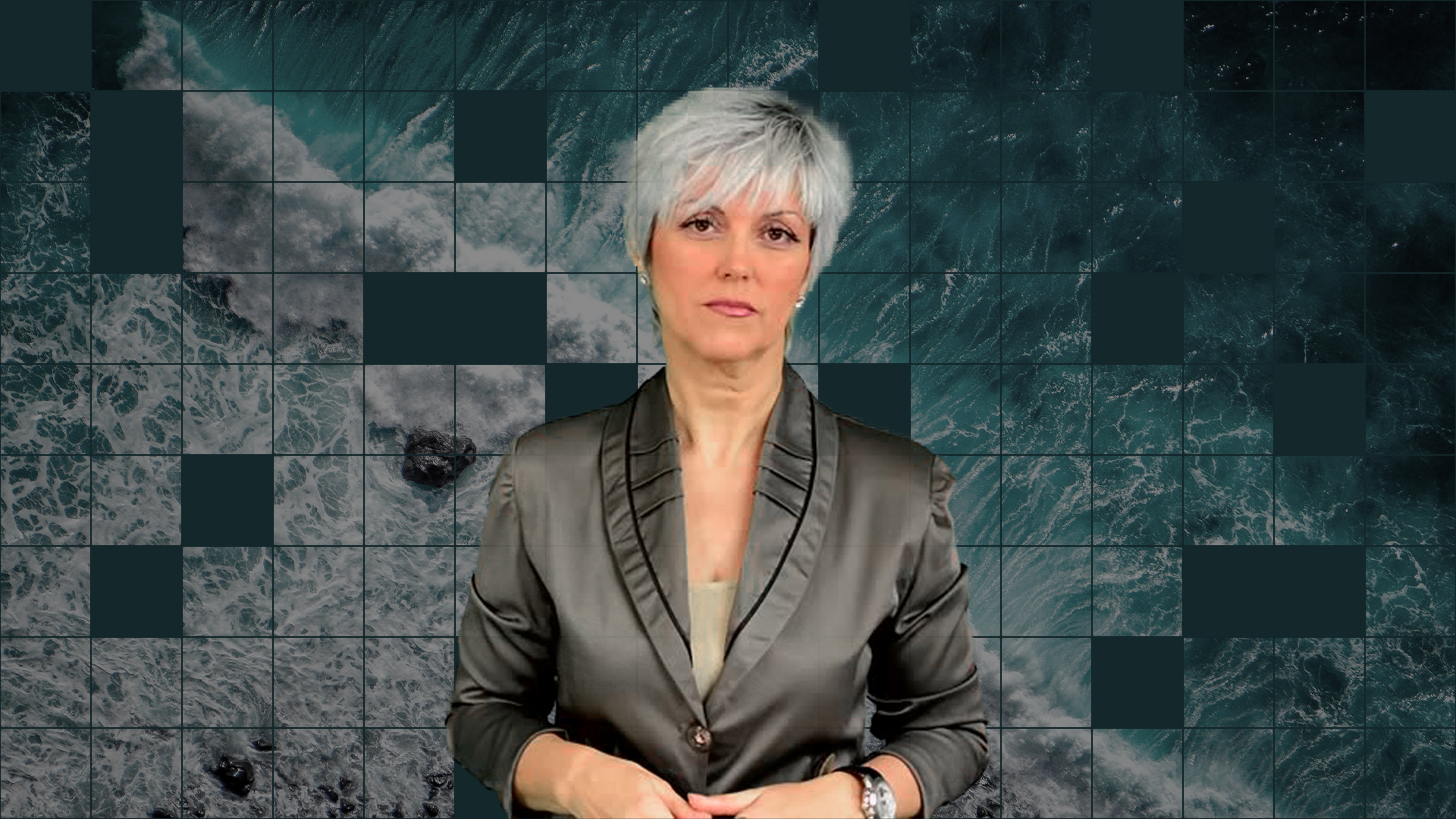
- Cool tones with images of different stages of water
- Font: Rubik
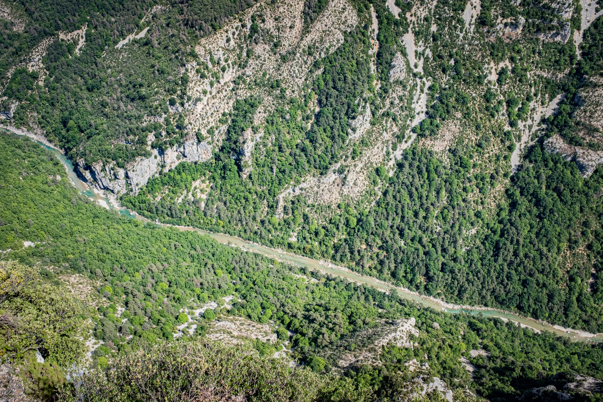
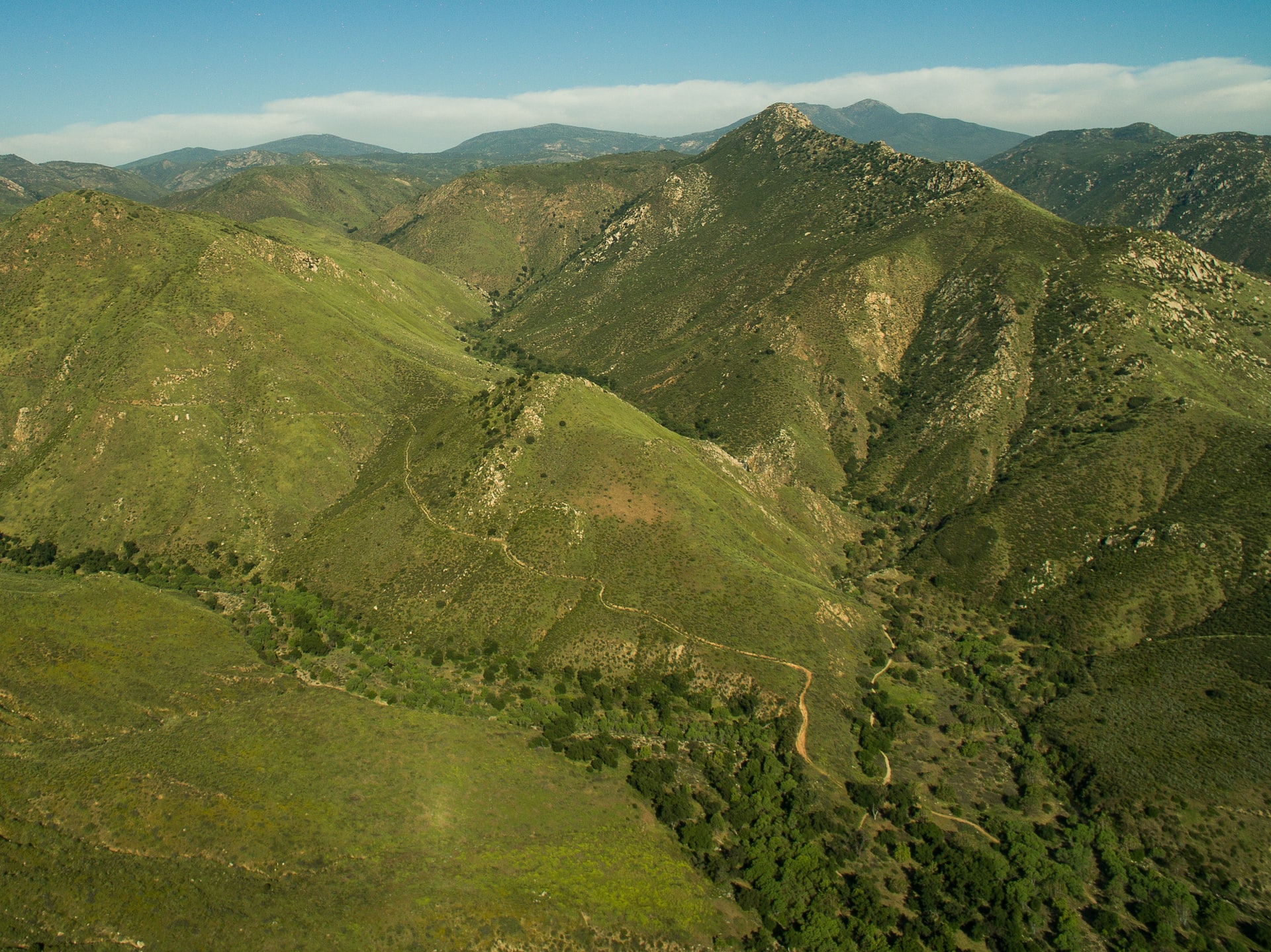
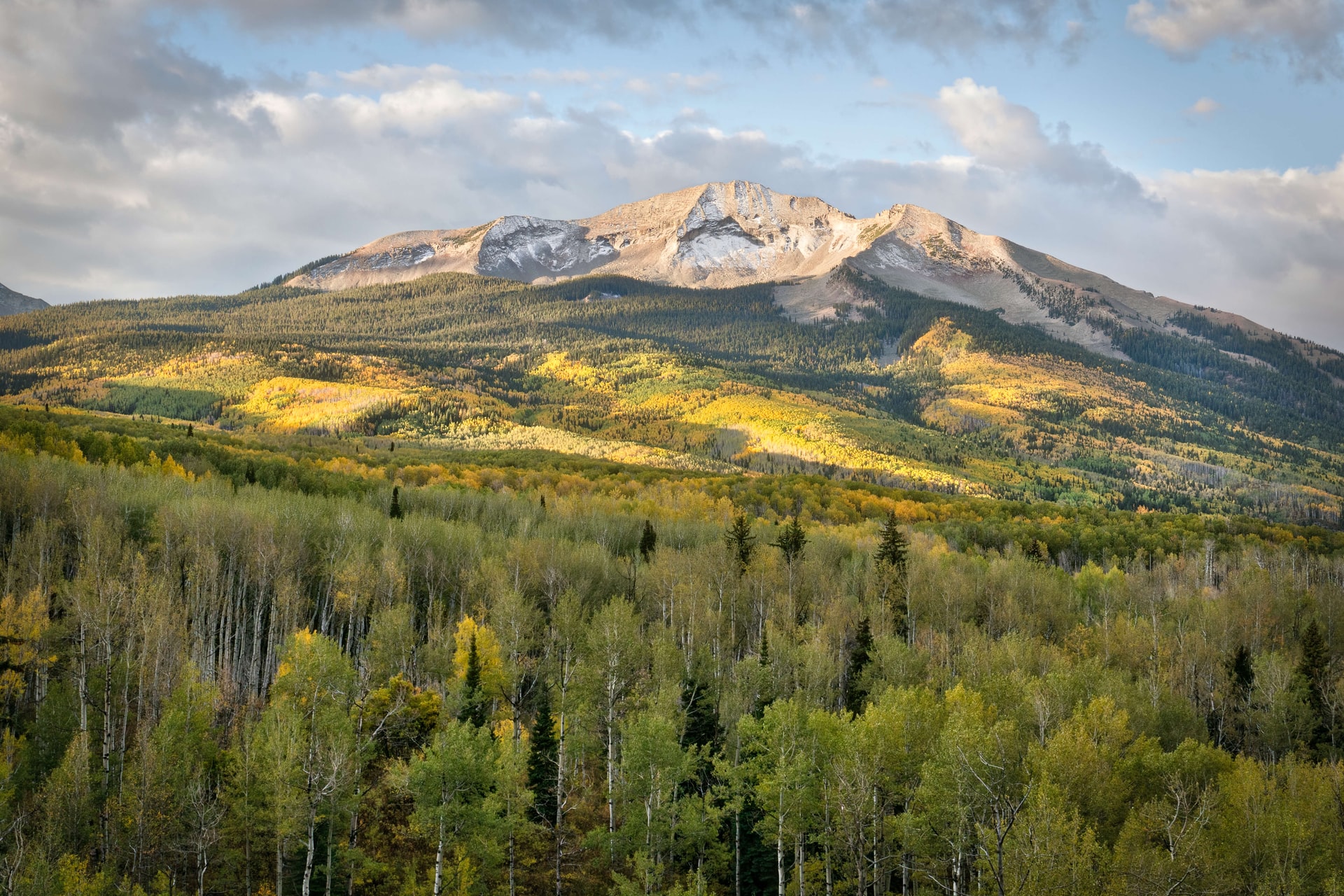
Moodboard 3:
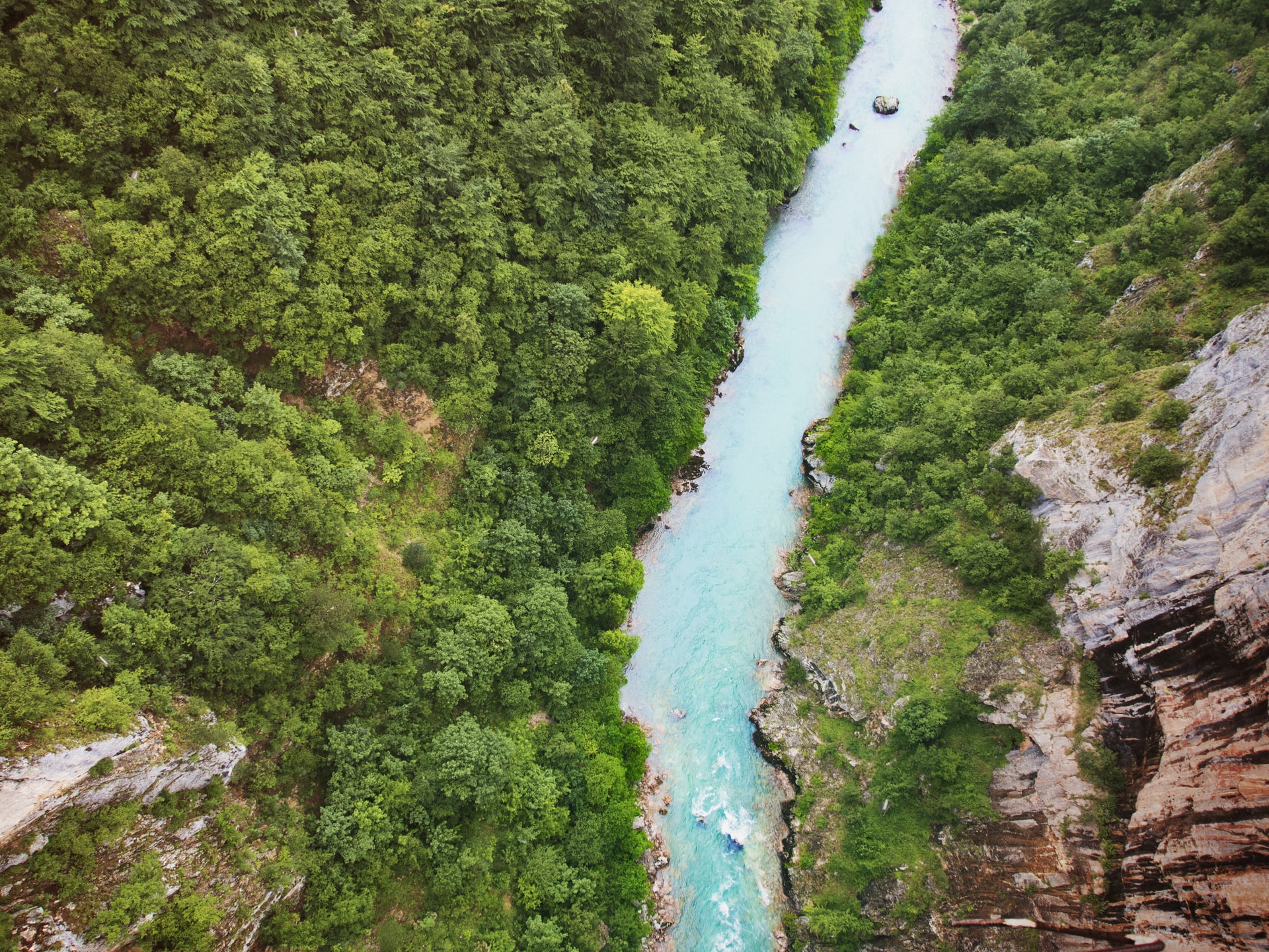
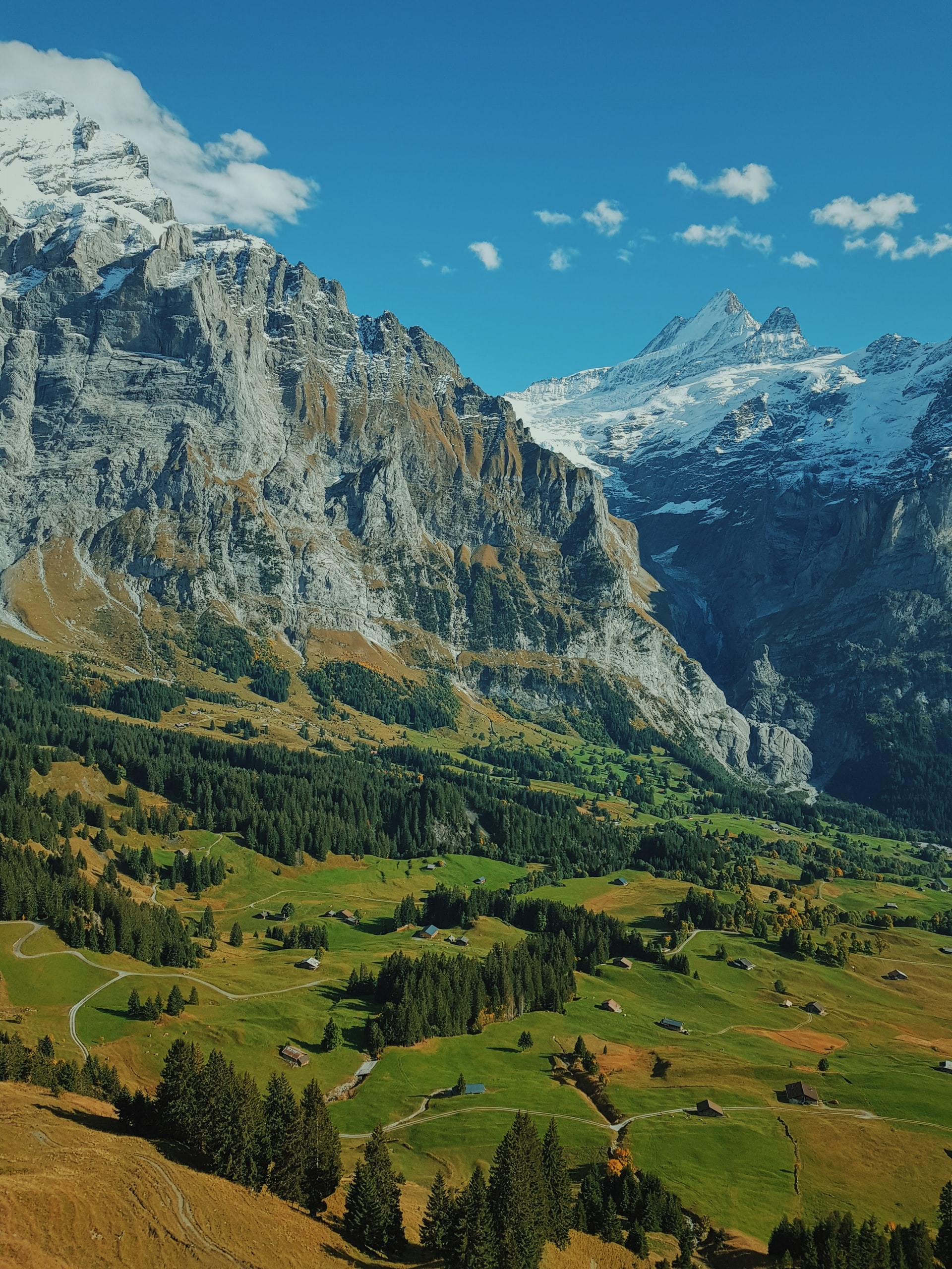
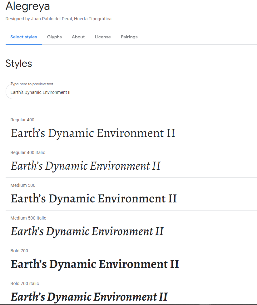
- Green tones with images of green mountainscapes
- Font: Alegreya
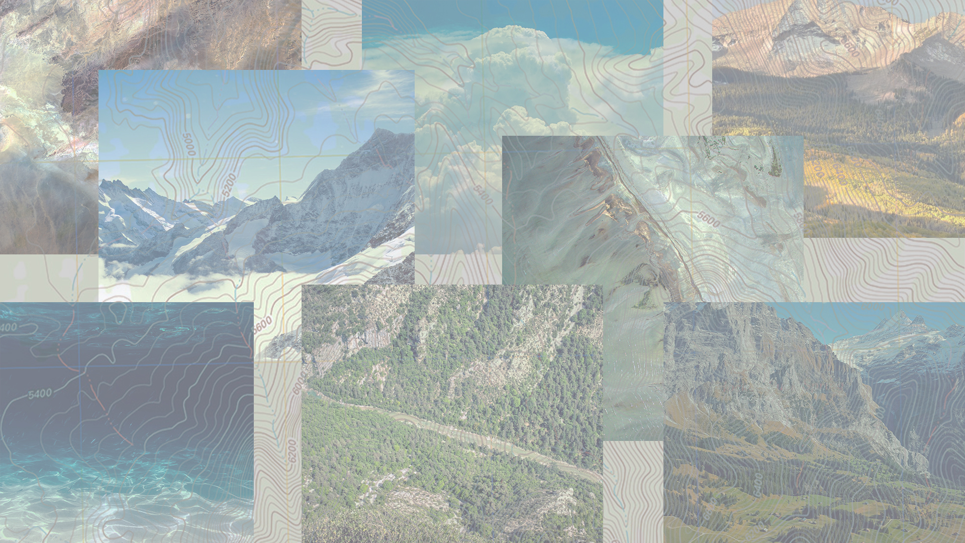
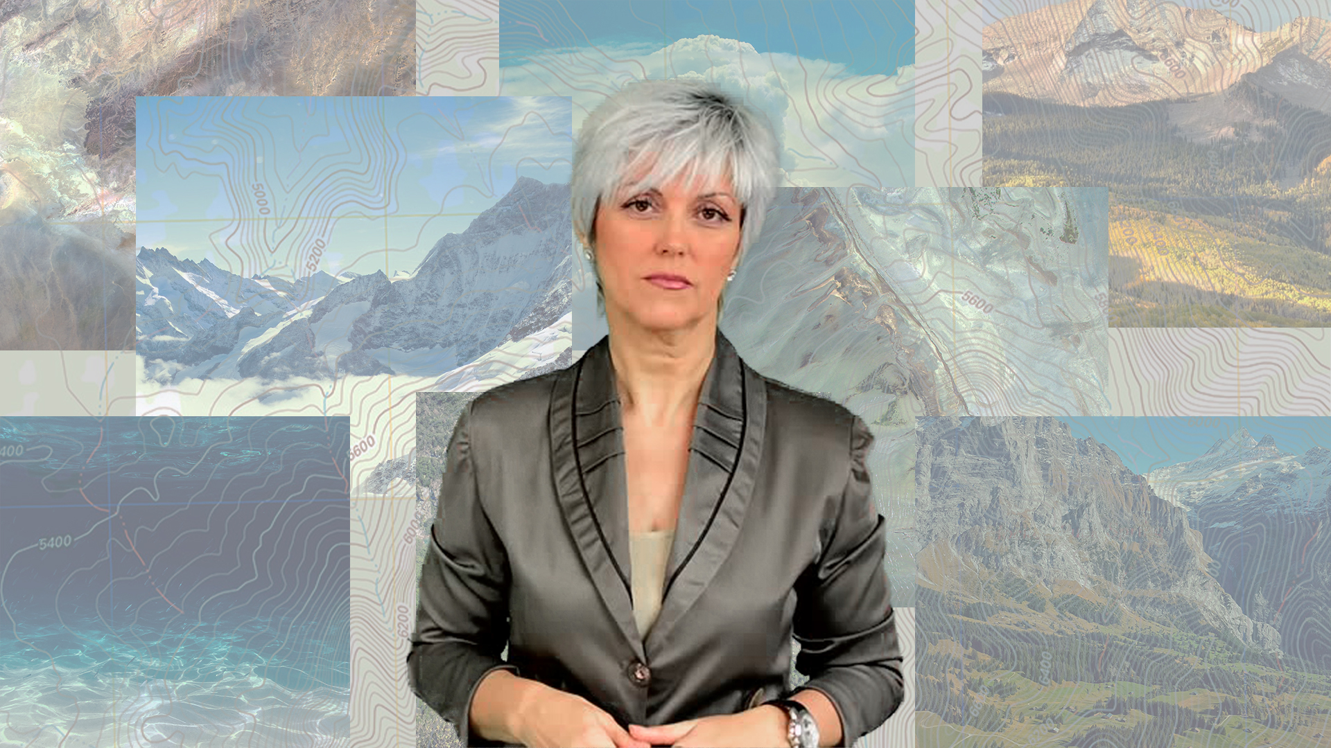
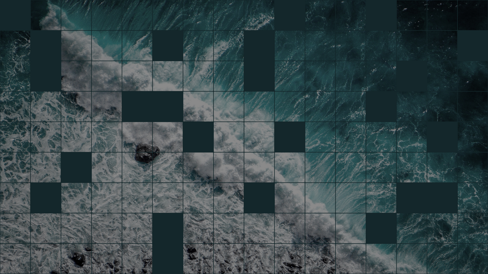
And here are some digital backdrops I’ve come up with based on these mood boards and feedback from Maddy:
