• We are STAs
    • Asha Rountree
    • Haley Ma
    • Kate Shih
    • Kyra Lee
    • Nicholas Peasley
    • Sasha Kenney
    • Shanda Horm
    • Shriya Atreya
    • Tomas Marulanda-Mesa
  • We were STAs
  • STA Presentation
    • STA Presentation 2017
    • STA Presentation 2016
  • Testimonials
  • Resources
  • Home

STA Blog

Orientation

November 6, 2024 By Kate Shih

Orientation

This was my first week as a Design STA! I went over the handbook, customized my blog, and got to meet my fellow STAs.

Using Dropbox

The first thing I did was find a meme and upload it to Dropbox.
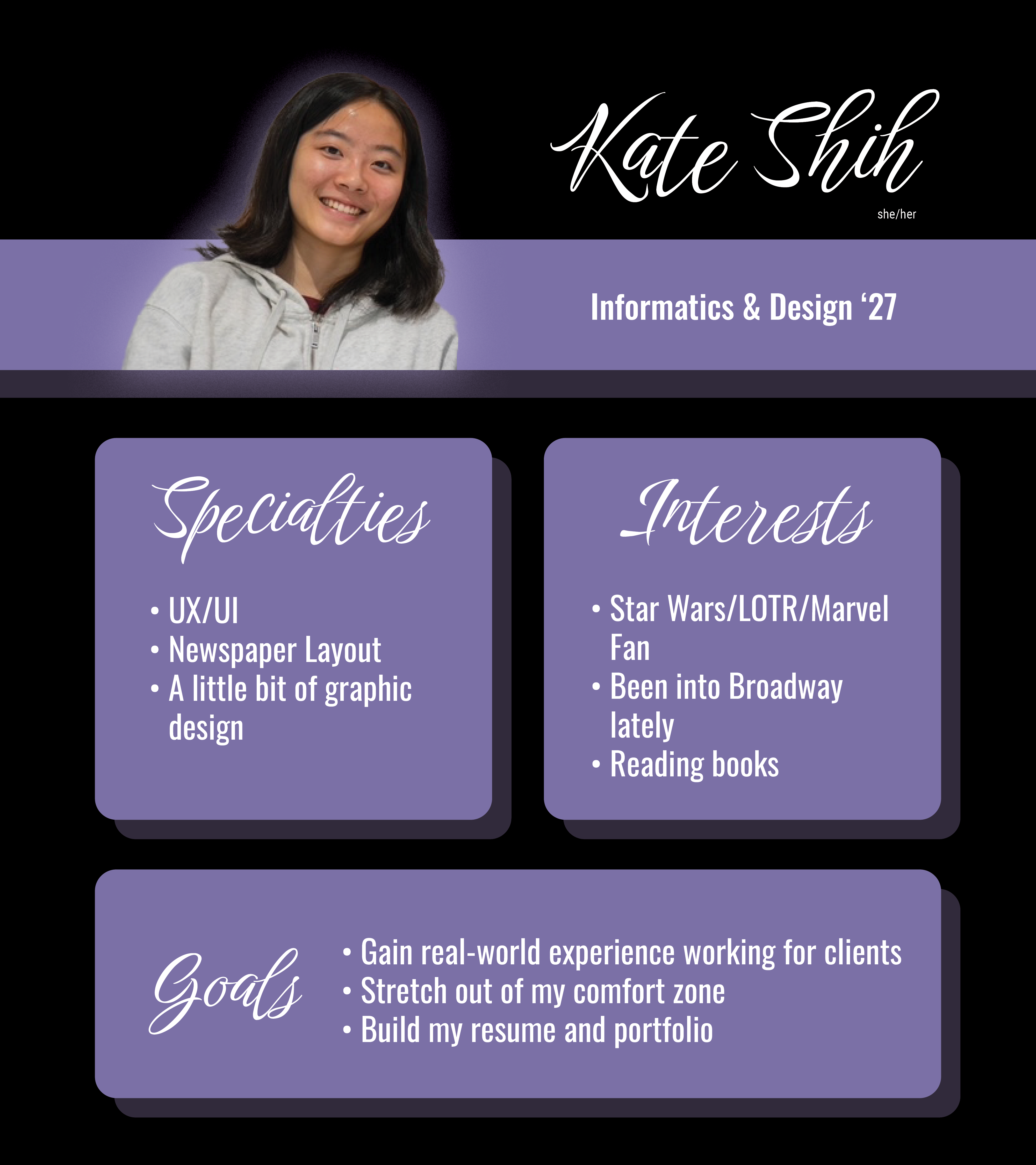
STA Bio

Next, I made my STA bio. I used Photoshop and InDesign. I decided to keep it relatively simple, keeping it at two fonts and two colors.
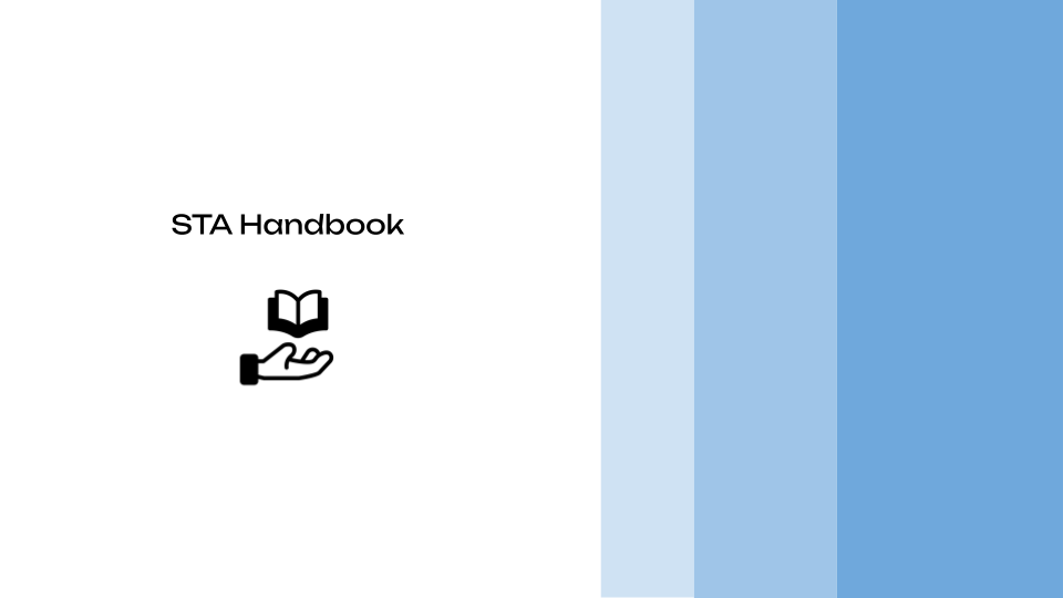
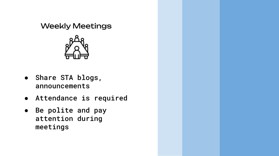
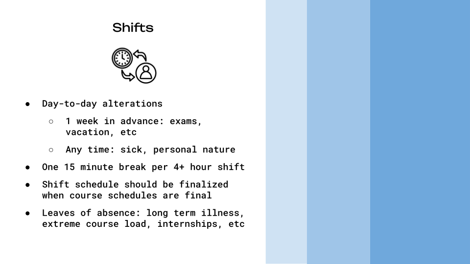
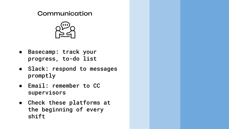
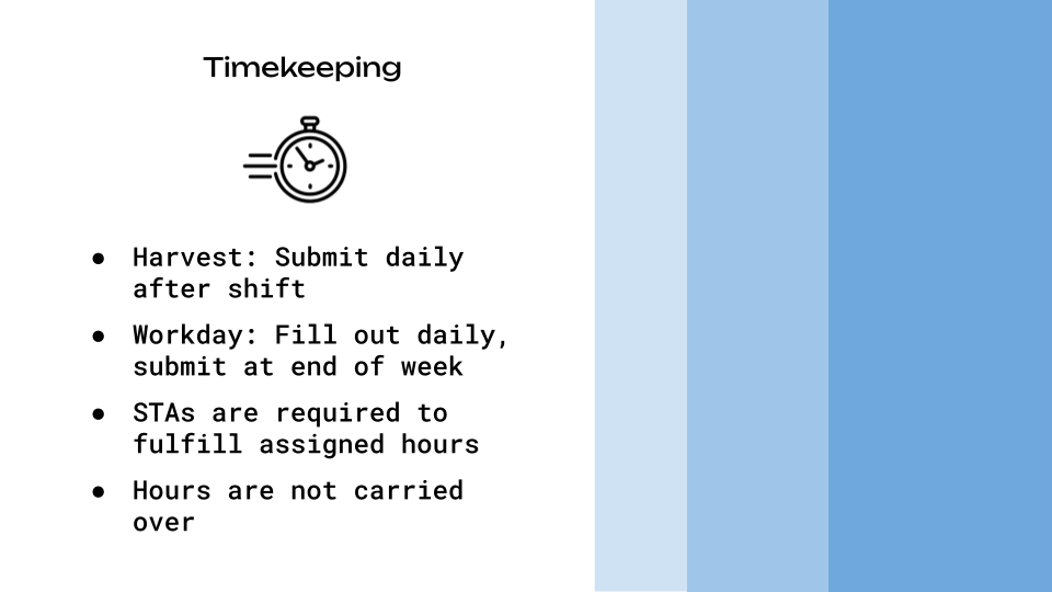
STA Handbook

After that, I made a slideshow recapping the STA Handbook using Google Slides. This was an interesting process for me because usually when I use Google Slides, I use a premade template. It was fun to get to test my design skills somewhere where I don’t usually utilize them.

STA Caricature

Lastly, I made my STA caricature using Illustrator. Graphic design/character design is not my strongest skill, so I was a little daunted by this, but I’m happy with the way it turned out! I think in the future, I’d like to work on making faces slightly more realistic, but for the most part, I’m happy with the style and turnout of this caricature.

Filed Under: Fall 2024 - Spring 2025, We are STAs

October Updates

October 30, 2024 By Lila Mali

Animation Training!

Recently, Shanda and I were told about an upcoming animation project that has an emphasis on character animation, my main speciality! I haven’t been able to get a lot done on this project, but I made a practice rig in Adobe Illustrator to get prepared. It’s pretty simple, but here’s how it looks.

Next, I’ll be working on a female rig with more characteristics such as facial expressions and maybe accessories.

New Logo Design

I was assigned to make a new CSMS logo for their class Distributed Systems.

This was a bit tricky to figure out since there weren’t too many references provided to base a logo off of so I made a few draft designs.

They emphasized distribution amongst computers but we decided that two computers made the logo feel too busy. My supervisor provided me with some better icon references and I started to go off of those.

This project is still in the works, but these new designs worked well with the clients so now we can decide and start animating.

Filed Under: Fall 2024 - Spring 2025, We are STAs

October

October 30, 2024 By Marissa Devivar

10/1 – 10/18

Fall Postcard (Brainstorming)

Initial brainstorming: We wanted to offer the team a first-person and third-person perspective option for the postcard. We took last year’s Alcalde ad and put it on the postcard, as well as stock images of people studying/on a laptop in various locations to illustrate how these classes can be taken *ANYWHERE*

Feedback: The team wanted to continue exploring both options. They liked how the diagonal line draws attention to the $500 sticker, but they also liked how the orange’s curved movement implies a wav– every summer. However, while the image had beautiful colors, the team wasn’t sure how to feel about the trendy clothing (it seemed fashion-ad-like) and how unrealistic it was to bring a laptop on the beach. They wanted something a little more realistic– maybe a student traveling in the city (but not Austin).

The team did appreciate all of the options still feeling very UT in their appearance (burnt orange and institutional).

first drafts:

drafts after feedback and meetings:

  • The font was tweaked to be more legible
  • gradient was utilized in the third person pov’s because it opened up more space for imagery
  • a sticky note holding the QR code to our website
  • still finding ways to incorporate the ” select $500 courses” into the scene
  • there was a suggestion to see if we could put an image of UT in the laptop, so an image of t he tower can be faintly seen. This prompted a change in the background since the blue skies in the background and foreground were blending together.
    • shifted to more greenery in the background
  • Changes (first person POV):
    • Cleaned up the font for legibility
    • Moved all the main text to the laptop screen (central)
    • Option with and without a $500 sticker ($500 is also mentioned on the back of the postcard)
    • QR code on a sticky note
    • Moved up laptop to reduce negative space

Filed Under: Fall 2024 - Spring 2025, We are STAs

October

October 29, 2024 By Shanda Horm

October

After being out for the first week of October due to being sick, I was left with one less week to work on the Early Voting animations and the rest of the animations. While I was able to get the Early Voting animations in on time, I feel the animations could be better if I had more time for a couple more rounds of feedback.

It was then time to move on to the last two animations: “Tomorrow is Election Day” and “Today is Election Day.” I was able to complete these rather quickly because I was able to use assets and animations from the previous animations. A few adjustments later- I officially completed all of the Voting PSA animations!

Here are the final icons used (Credits to De’sha for the vote early icon!):

And here are the final two animations:

Overall, I felt like this project allowed me to really get comfortable in After Effects! I had fun experimenting with different animations and learning the best workflow for me.

Filed Under: Fall 2024 - Spring 2025, We are STAs

Christmas At Winedale

October 29, 2024 By Shriya Atreya

Christmas at Winedale

Project: 2024 Christmas at Winedale Poster

Client: LAITS Service Center

Staff Guidance: Leilani

Tools Used: Adobe Illustrator & Photoshop

Started: Oct 9, 2024

Completed: Oct 22, 2024

The Task

This year I was tasked with making the annual Christmas at Winedale flyer for the LAITS service center. I was super excited to take on a project like this because I love creating holiday themed designs! For this project the requested deliverables I had to create were a 5×7 postcard along with a 11×17 flyer that included all the information about the event and had a Christmas theme.

Starting Out

After reading thru the prompt I started my first draft. They wanted a Christmas theme color scheme and wood and garland embellishments, along with some necessary information.

So I created the poster below as my first draft.

On this first draft I got some great key feedback points to change.

  1. The audience is an older generation so this modern like design doesnt really fit their aesthetic.
  2. Three photos should be included so that people get to see more of the event
  3. Christmas should be cursive and Winedale should be in the font of their logo.
  4. Add more rustic Christmas elements

Making Changes

From here I created a new layout that more aligned with what the client wanted.

On this draft I got some great feedback to edit:

  1. Find a more holiday cursive
  2. Pick images that holistically represent the vent (one inside, one outside, & one of the venue)
  3. Make the images take up more space

The Final Design

After a couple more small tweaks and applying the previous edits I was able to get to the final!

Challenges & Takeaways

Overall this project was super fun to work on and allowed me to build my layout design skills. Some challenges I faced along the way of this project were:

  • The Timeline :One request as a part of this project was a specific amount of hours I worked on it, such as only one hour to make edits due to cost reasons. This was definitely a different way of working I had to approach which taught me how to work efficiently and design quicker with still good results.
  • The Audience: As a younger designer I naturally lean toward more modern designs so it was definitely a challenge to cater to the audience I was designing for. This was a great opportunity to work on this challenge and make sure audience is a key factor I am considering when designing.

Filed Under: Fall 2024 - Spring 2025 Tagged With: Shriya Atreya, STA

October!

October 29, 2024 By Raaga Srimadh

My October!

Over the last couple of weeks, I’ve been working on web development projects for the UT Lifespan Lab and our Alumni network site.

UT Lifespan Lab

I was tasked with redesigning the website shown down below, to be more user-friendly and visual dynamic while keeping a lot of the same elements (like the header).

I was coming back to WordPress after a very long time, so there was an initial learning curve, but I was able to come up with the layout below after some trial and error:

The header was the most difficult to work on– being able to preserve the original design while somehow finding a way to avoid a clash with the newer layout was a challenge.

I went through multiple iterations before deciding that a gradient could help preserve what the client still wanted to showcase while allowing for a softer approach.

This was the final header:


Other Pages

About Page

Original
New

People Page

Original
New

Directions Page

Original
New

STA Alumni Network Site

The most recent project I’m currently working on is the new STA Alumni Network site. The site houses resources for alumni, chances to connect, and recent news regarding STA alumni. SInce this project started very recently, my current progress is limited to the Home page.

I was tasked with adding the following elements to the layout:

  1. Header
  2. Hero Section
  3. Highlight/Mission Section
  4. Carousel Section
  5. Featured Alumni Section
  6. Check Us Out/Latest News

Next Steps

  • About
  • Alumni Showcase
  • Events
  • Job Board
  • Register as an Alum/Log In

Filed Under: Fall 2024 - Spring 2025, We are STAs

  • « Previous Page
  • 1
  • …
  • 8
  • 9
  • 10
  • 11
  • Next Page »

link to LAITS home page

Video STA Home

© 2025 Liberal Arts Instructional Technology Services | Production Credits