• We are STAs
    • Asha Rountree
    • Haley Ma
    • Kate Shih
    • Kyra Lee
    • Nicholas Peasley
    • Sasha Kenney
    • Shanda Horm
    • Shriya Atreya
    • Tomas Marulanda-Mesa
  • We were STAs
  • STA Presentation
    • STA Presentation 2017
    • STA Presentation 2016
  • Testimonials
  • Resources
  • Home

STA Blog

Week X

November 1, 2021 By Adrian McKee

Week X

This week, the Refresh Project is at a bit of an impasse while we wrap up Phase II. One thing I worked on was a new batch of instructional pages adapted from a slideshow, which went through several incarnations because of formatting concerns.

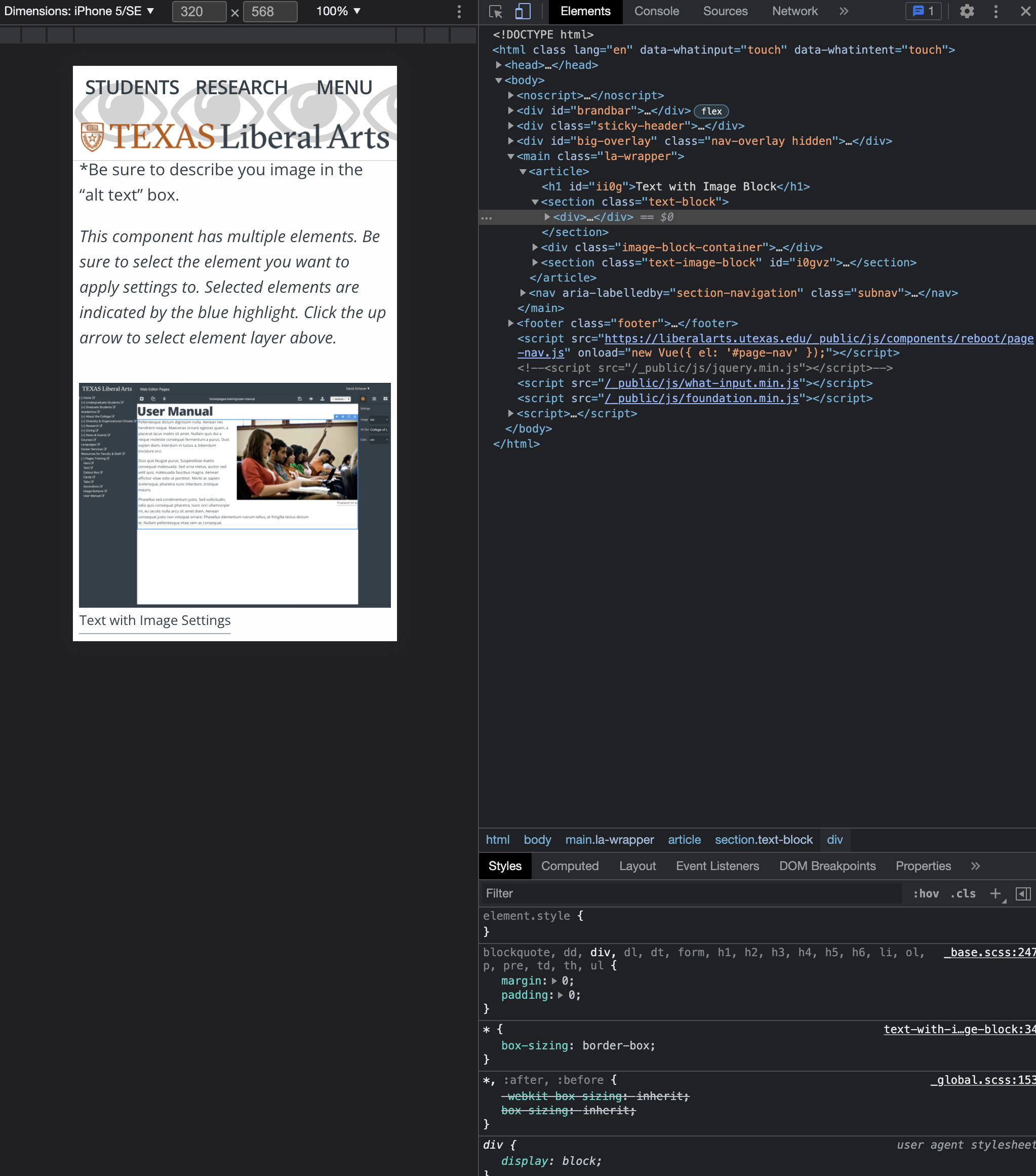
Chris told me how to use inspect element to test mobile formatting, which was causing issues with the “image+text” block. These have since been resolved, but not before I edited multiple layouts for every page. How to prioritize mobile accessibility versus desktop layout will be a recurring question as we migrate more content.

I also started several trainings this week, but I did not finish 3/4 of them because each was a multi-step process requiring approval between stages. The one that I did finish was the Custom Wordmarks and Bezier Curves training. I was happy to do another technical training and learn more about Illustrator; the KB post was very informative, and if anything I would have preferred a more complex exercise. The assignment part of the training involved tweaking the anchors on a letter, then crafting it into a logo. Mine was “K,” and I didn’t know what to do with it except for…

A new flag for the state of Kentucky? Or maybe it stands for pep

Filed Under: Fall 2021 - Spring 2022

Moving on to Blog Posts

November 1, 2021 By Marianne Lê

Last week we finished the exhibitions pages and have now moved on to adding alt text to images and formatting the blog posts.


Over the weekend, I participated in HackTX 2021.

I created a newspaper webapp where the user can change the font to OpenDyslexic and change the color theme from light to dark.

app in default modes

app in dark mode

app with OpenDyslexic font

app with OpenDyslexic font and in dark mode

Newspaper (nohtakcah-newspaper.netlify.app)

Filed Under: Fall 2021 - Spring 2022

Pages, Continued

October 29, 2021 By Ingrid Alberding

Pages (COLA Web Refresh)

We’re about done with Phase II of the COLA Web Refresher Project, meaning the Dean’s COLA sites will soon be frozen and online soon. Most of the bare bones content migration was done, so I and the other CMSTAs spent a good amount of time QAing the various pages (checking for broken links, formatting or content areas, adding/editing alt text, low res graphics). I made some rather last minute edits to the College Leadership page, making sure at least the photos were there even if the specs weren’t perfect.

I can’t wait for the next phase of this project and am so happy to be part of such an efficient and capable team. The team will also burgeon — the last candidate for a CMSTA position is being interviewed next week, and after that decisions and on-boarding should begin.


HIS 314K

I did another powerpoint.


Photo IDs

More photo IDs! Responded to a request from Sarah regarding some IDs submitted a while back that got buried.


Web and Image Training for CMSTAs

In between more time sensitive tasks, I’ve been slowly but surely developing the web and image STA training (for Pages specifically). A lot of this is about photo cropping, exporting, etc. etc. that is crucial for the Pages CMS. I also want to see if we can find a user-friendly alternative to Photoshop for the end users who don’t have / don’t know how to use this program, so we’re not flooded with image resizing requests (Canva?). Anyway, I presented it to the LAITS and PR teams and plan on adding a section on file sizes and exporting.


Pirate

I got a new rug, with two rather abstract cat illustrations on it. Pirate and her brother were initially terrified by it, but it’s now one of her most favorite spots!

Filed Under: Fall 2021 - Spring 2022, We are STAs

AFR Graphs

October 28, 2021 By Abriella Corker

AFR GRAPHS

Below are 3 graphs I have worked on this week. Some of what is presented here has undergone slight detail edits already but this are closest to the final versions. The last one I made in 30 mins before my shift ended because there needed to be a quick turn around. I enjoy recreating these in our style guides.

Filed Under: Fall 2021 - Spring 2022

Infographic training

October 27, 2021 By Sheryl Long

Project: Infographic training
completion status: completed
staff guidance/team: Valerie, Angie, Megan
description/plans: Designing an infographic

Layout draft:

Colored draft with statistics:

Megan pointed out that the darker green text might not have enough contrast, so I switched to a lighter background and fixed alignment and spacing

Final:

Filed Under: Fall 2021 - Spring 2022

AFR 303 Work Process

October 26, 2021 By Rachel Sacks

AFR 303 Work Process

As I continue working on AFR 303, I want to document the typical work process I go through in order to create a graphic or graphic de-design. In this case, I was creating a graphic based off of a slide.

This is the initial slide. It was particularly difficult because there are 3 sets of data that do not correlate in terms of metrics. Unlike the slide about gender and college, I wasn’t able to simply convert the populations into a percentage and combine the graphics. We’re dealing with three distinct units of measurement:
  • Proportion of men in the static year of 2000 in jail vs. college
  • The proportion of men as a dynamic between 1980 to 2000 in prison system vs. college
  • The percentage of men who are ex-offenders 16-34 years old (young men are much more likely to go to jail.)

Attempt 1
My first attempt at tackling all of this different info was to try and dump it on one slide with three separate unrelated graphs. I could sense going in that this would likely not work, but I was also hopeful that it could work if I tweaked it enough.


While it didn’t come out awful, it is a large load of information and there isn’t enough of a story going on in between each graph. You really want your graphs to tell a dynamic story as you follow along, especially when you have a collection of graphs like this.

Attempt 2

Maddy assisted me in re-thinking these graphs and creating more of a cohesive story with them. Considering how the first two both tell similar information, and the range goes 1980-2000, we were able to come up with a story that tells “between 1980 and 2000” and then “by 2000.” The last one still wasn’t super related, but it works as a side-note at the end.

The problem here was the text. The text itself was quite small on this version, and would be hard to read for a professor looking at the powerpoint some distance away. To combat this, we decided to keep all three graphics on separate slides:

These are simple, but each graph can be seen clearly and is large enough to read. Additionally, the separation of each slide makes the last statistic less like a non-sequitur.

    What I Learned:

  • Try to avoid shoving tons of different graphics into one slide
  • Try to combine graphics into one narrative or metric if possible
  • Always try and tell a story with the graphics
  • Don’t be afraid to use multiple slides if it will ultimately work better

Other Graphics Made Recently

Here are some other graphics I created recently for AFR:

Stay tuned for more processes!

Filed Under: Fall 2021 - Spring 2022

  • « Previous Page
  • 1
  • …
  • 37
  • 38
  • 39
  • 40
  • 41
  • …
  • 63
  • Next Page »

link to LAITS home page

Video STA Home

© 2025 Liberal Arts Instructional Technology Services | Production Credits