• We are STAs
    • Asha Rountree
    • Haley Ma
    • Kate Shih
    • Kyra Lee
    • Nicholas Peasley
    • Sasha Kenney
    • Shanda Horm
    • Shriya Atreya
    • Tomas Marulanda-Mesa
  • We were STAs
  • STA Presentation
    • STA Presentation 2017
    • STA Presentation 2016
  • Testimonials
  • Resources
  • Home

STA Blog

November 4, 2021 By Abriella Corker

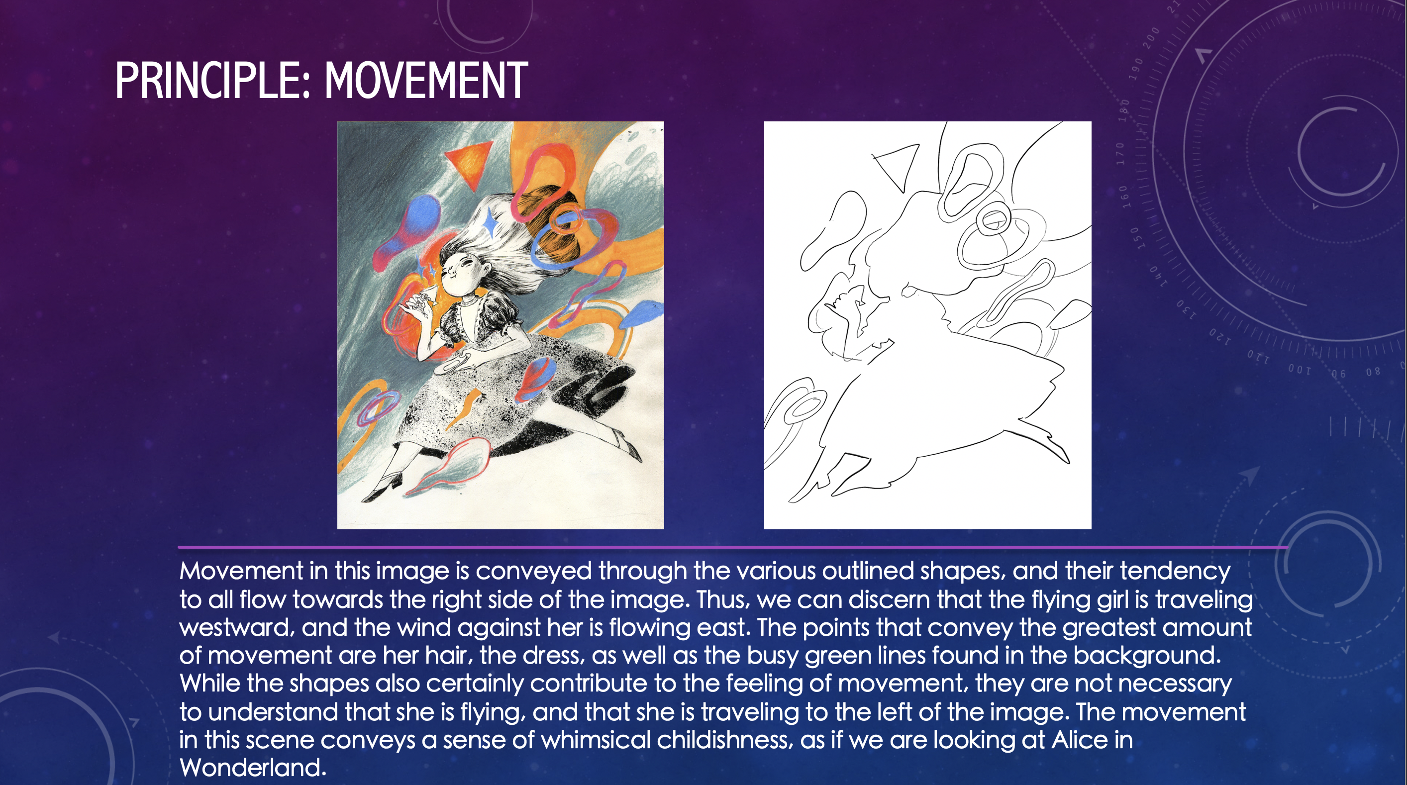
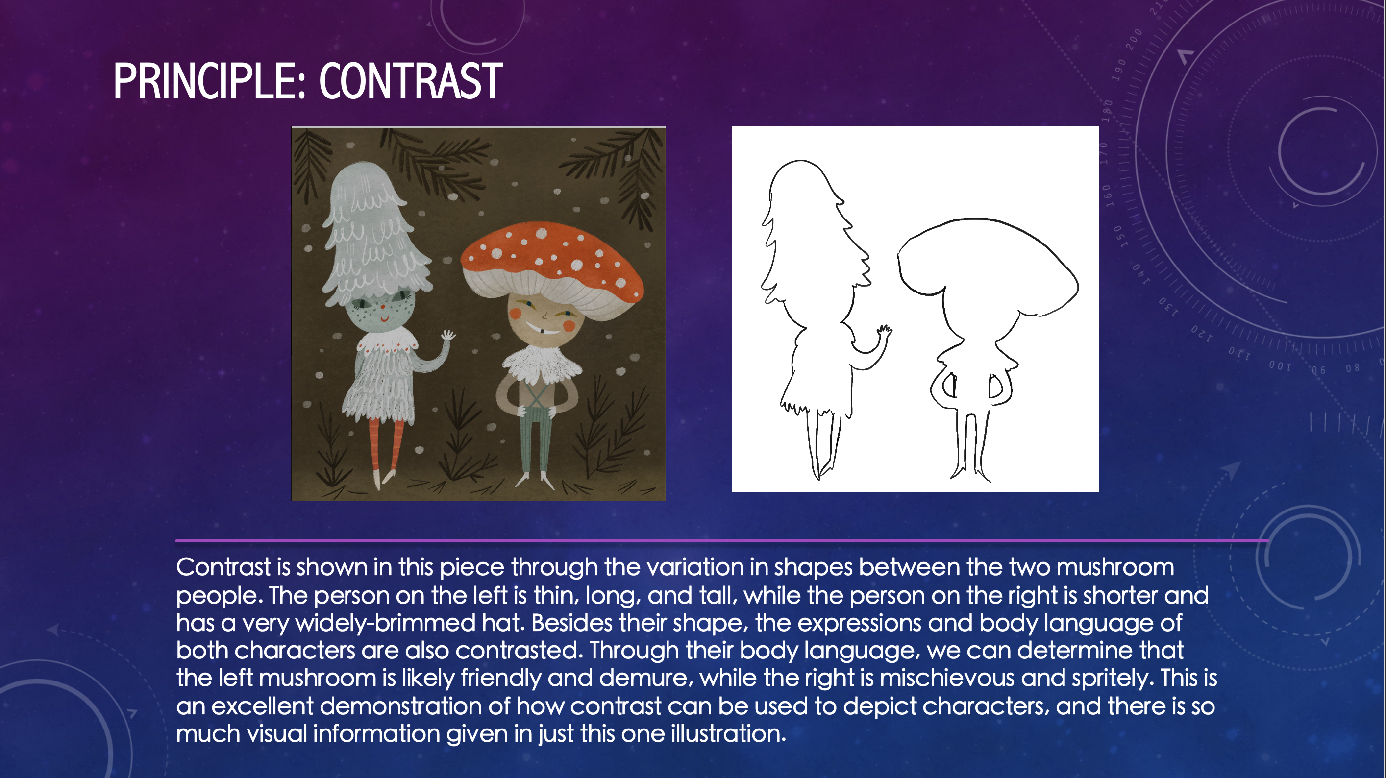
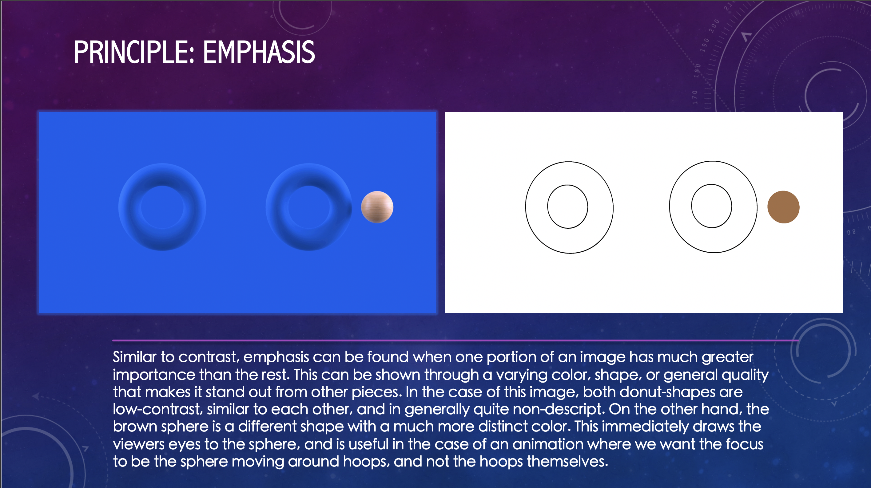
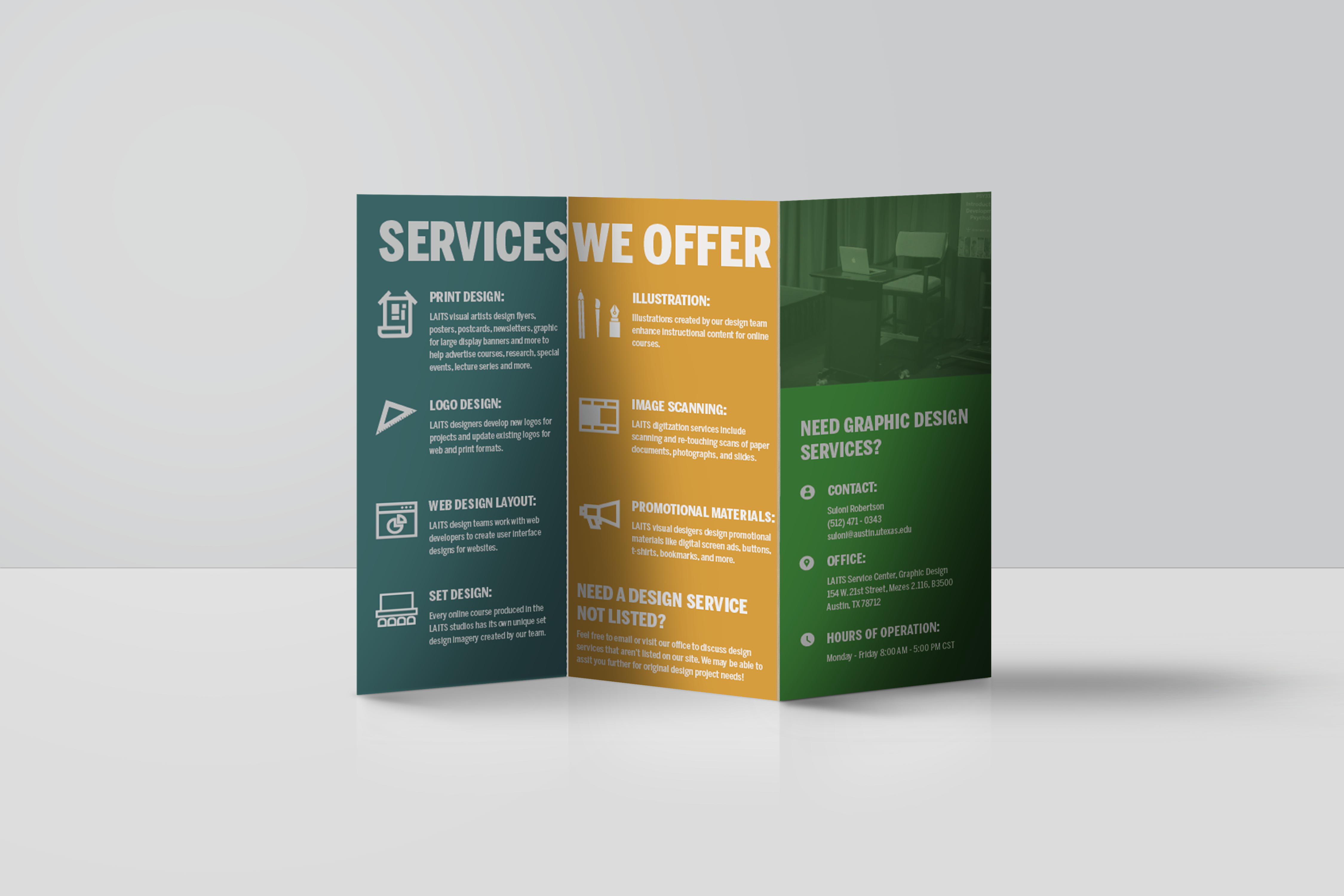
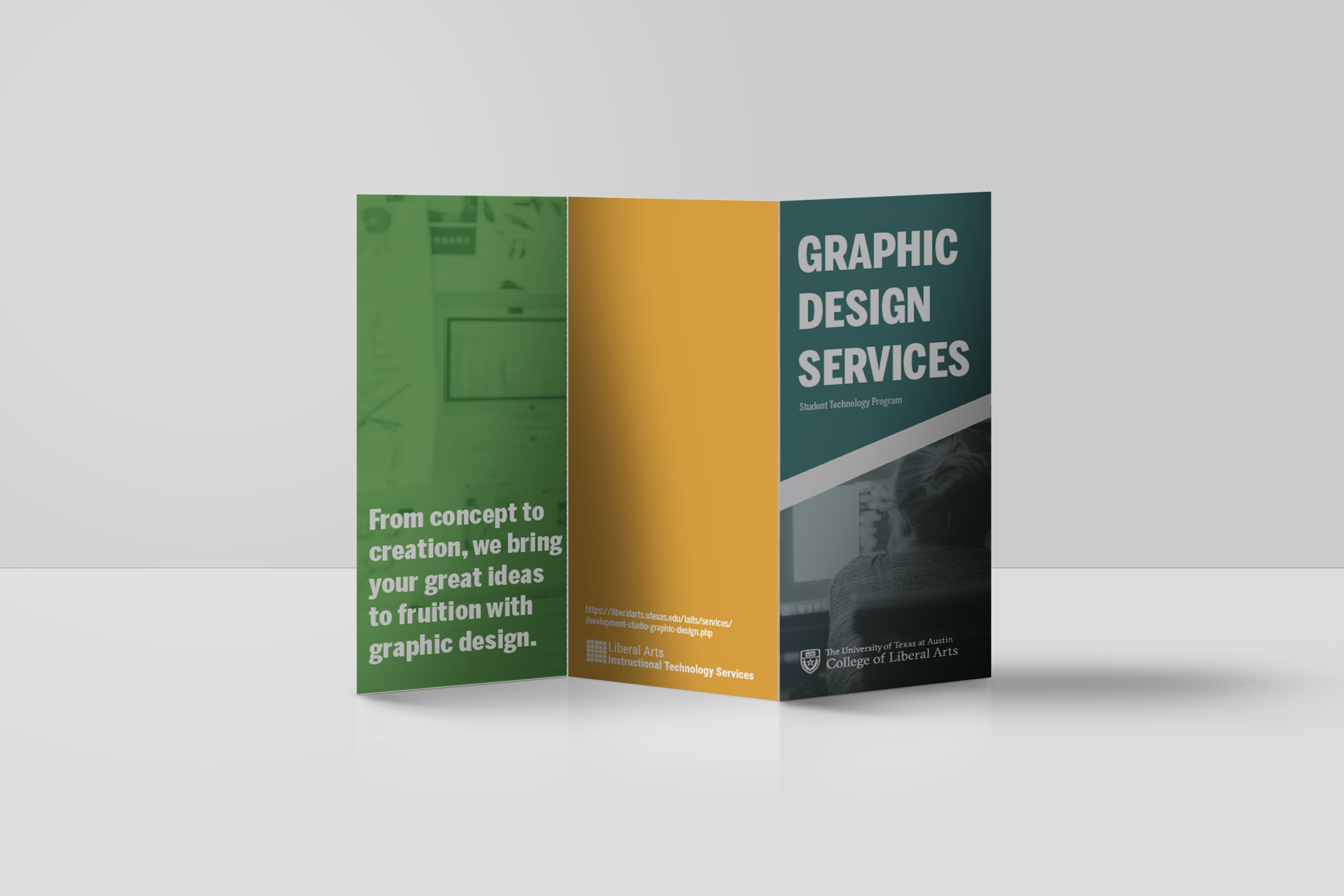
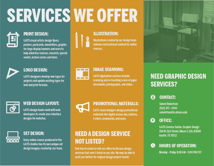
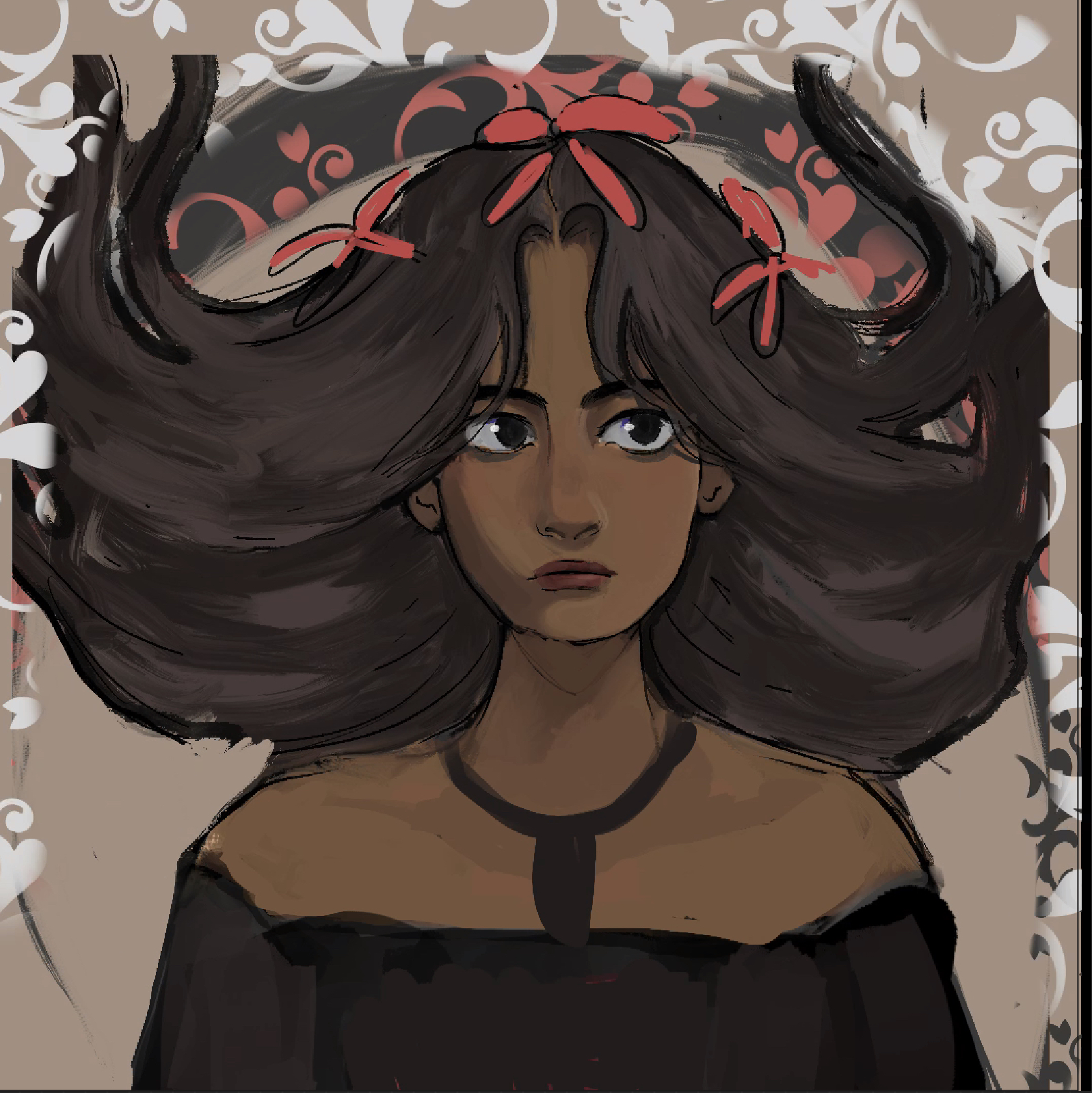
Brochure Template Assets

I created the brochures template guidelines for different services we offer here at LAITS. These are “prompts” for the training on publication design – brochures. My post before shows the first one I made. Before it did not have a theme or assets to use so I made my own and then updated the training to have different options.

https://sta.laits.utexas.edu/blog/2021/11/04/42247-2/

Filed Under: Fall 2021 - Spring 2022

Training: Principles and Elements of Design

November 4, 2021 By Rachel Sacks

Training: Principles and Elements of Design

Goal of training: to understand the basic elements and principles that make up visual art and design

Elements: line, shape, form, size, space, color, value, texture

Principles: Repetition, rhythm, movement, balance, proportion, negative space, contrast, emphasis, variety, unity, hierarchy

Step 1: Finding Images

My first step in this process was to find images that suited each principle. I primarily found images on https://www.behance.net/, although I also found some on https://eyeondesign.aiga.org/. I recall that the first concept I found was for the principle of movement. I was looking through Behance and saw this image:

I was immediately struck by the movement of this image, and how everything in the image gives the illusion of flying through the wind. The girl herself’s hair and dress flow to the side, and the background and shapes only add to this. In fact, as an animator, finding an image for movement was probably one of the easier ones to do. In terms of the most difficult, I found the more abstract concepts such as size and space to take the longest. It’s hard to find a representation of such vague terms unless one is looking at quite abstract art. Fortunately, I was able to find examples that fit, although most images I came across were comprised of several different concepts, and I had to focus on the one that seemed the most prominent.

Size was tricky for me, because almost everything has some sort of size. I picked this particular image because of the variety of different sizes that are found in each type of bottle shape. This could also work for variety, but the variations are primarily in size and width, so I felt another example would be more fitting for variety.

Step 2: Outlining

The second step was to outline each drawing. I did this in Procreate and focused on outlining the features that were most important to each concept.

For movement, I outline every shape to convey the basic form and their tendency towards shifting to the right.

For value, I did the opposite. Instead of outlining the form, I shaded out the basic values used to illustrate this portrait.

For color, I outlined the colors used and how they shifted into other colors going from cool to warm to cool again.

Step 3: Powerpoint

For my final step, I created a powerpoint with slides that analyzed why I chose each image and their relationship to the principle or element I used them to exemplify. Below are a few of the slides that I created:

The rest of the slides can be found on:

https://utexas.box.com/s/eb1ti43rnx56q89n1ip8ou0a7ylvjlis

After doing this, I had the powerpoint reviewed by Abriella, and then the training was complete!

What I learned:

  • Different concepts require different styles of outlining in order to convey the most important features
  • Almost every image combines at least 2-3 of the principles and elements. The less abstract the art, the more principles and elements they employ.
  • Space and negative space are not always the same concept. Size and Hierarchy are related, but are not the same and may be used for different reasons.
  • Contrast is most commonly shown with color variation, although size and shape are also used.


Filed Under: Fall 2021 - Spring 2022

KS PSD Flashcard Training

November 3, 2021 By Adrian McKee

KS PSD Flashcard Training

Dragonfly Logo:

Matt Hawdon from the Noun Project
Ahmad Arzaha from the Noun Project
Lima Studio from the Noun Project

Mantis Logo:
parkjisun from the Noun Project
Eucalyp from the Noun Project
Jino from the Noun Project

Termite Logo:
Termite by Maxicons from the Noun Project
Termite by parkjisun from the Noun Project
Termite by ProSymbols from the Noun Project

Wasp Logo:
parkjisun from the Noun Project
wasp by Georgiana Ionescu from the Noun Project
wasp by Pham Duy Phuong Hung from the Noun Project

Mosquito Logo:
Marco Livolsi from the Noun Project
Jino from the Noun Project
jokokerto from the Noun Project

Filed Under: Fall 2021 - Spring 2022

Intermediate Training: Brochures

November 2, 2021 By Abriella Corker

Intermediate Training: Brochures

For this training we learn how to make a brochure as part of the promotional material we create for departments and professors. This training didn’t have any specific assets to use for the STA so I decided we could create different brochures for advertising different LAITS departments. I made one for the design team and I am going to update the KB with different folders for each team as well as a 3D mockup template. Here is how they turned out:


Filed Under: Fall 2021 - Spring 2022

Week 10

November 2, 2021 By Rahul Palla

Project: COLA Website Refresher
Client /Prof: N/A (College of Liberal Arts)
Completion Status: Started August 25, 2021
Staff guidance: Michelle Vanhoose, Chris Rankin
STA team members: Ingrid, Adrian
description/plans: Continue migrating data from the old CMS to the new CMS
To be completed: TBD (long-term)

This past week has been a lot of finalizing COLA pages and double checking as well as fixing. The site is set to go live soon so there hasn’t been too many new pages to migrate. It is exciting that they demoed the site to the COLA senior staff already and is in its final stages before it goes live.


Project: Blanton Website Migration
Client /Prof: Blanton Museum
Completion Status: Started August 23, 2021
Staff guidance: Ruben Garza
STA team members: Asmita, Marianne, Angie, Abriella
description/plans: Work on migrating the current Blanton museum website pages to the WordPress site
To be completed: TBD (long-term)


For Blanton, I believe the exhibition pages are finished and I am working on finding alternate text for images for the site, which is another extensive task.

Filed Under: Fall 2021 - Spring 2022, We are STAs

History of Design

November 2, 2021 By Rachel Sacks

Training: History of Design

Assignment: Replicate a famous art style from the past

Chosen Art Style: Art Nouveau

For this assignment, I was tasked with creating an image that replicates the famous Art Nouveau art style. I decided to create a digital painting that mimics this style with a bit of a flare of my own art style as well. As it turns out, there is much more to the Art Nouveau style than meets the eye, per se.

Step-By-Step:

1.) Sketch

This was certainly the easiest step. I wasn’t entirely sure where to go with this drawing, so I looked at a bunch of Alphonse Mucha drawings and tried to get a feel for the style of work he did. I decided to draw a woman with elaborate hair, because that is always a good idea. As you can potentially tell with the background strokes, I wanted to have an ornate background, but wasn’t certain where I was going to go with it yet. I often leave painting sketches vague and then implement more details with lines later on.

2.) Colors and Basic Rendering

Here are the base colors with some shading on her face. I altered her eyes quite a bit during this section of the process, and also made her face more of the centerpiece of the image as well. I decided to go with something different with her hair about halfway through, which will be shown in the next image.

As I worked on rendering her face, I realized that I didn’t like her hair being quite as gigantic as I had initially drawn it. This is a common issue of mine: as an animator, I tend to draw very exaggerated and flowy shapes that don’t work quite as well when rendering things in a painting form. From this painting, I’ve realized that I may need to consider how realistic things are if I want to render it in a more realistic, painterly style.

3.) More Rendering

After about an hour of rendering, I ended up with something like this:

At this point the face and hair were mostly done, but I was struggling with maintaining an art nouveau style in the drawing. I had decided to add more dark lines around everything to imitate it better, but I was a bit lost on the background. Hence: the random paisley brush thrown aghast everywhere. I was successful in deciding to add flowers to her hair, though. Fortunately, Valerie was extremely helpful in giving me advice regarding making it more “nouveau-esque.” Valerie also suggested giving the woman a more whimsical or pleased expression to fit with the style of woman portrayed in nouveau.

Step 4: Background, even more rendering on the clothes and face

Here is a more complete version of the drawing, although it is not entirely done.

Things I did between steps 3 and 4:

  • Changed the facial expression to be more whimsical
  • Went for a more peach, warm-toned vintage color
  • Rendered out vines and more of a background
  • Rendered out flowers and a shirt
  • Flattened the shading on some areas to fit with the more flat art style of Mucha

Step 5: Further fixes

In this final rendering, I edited her facial features to push a more realistic art-nouveau look. Art-nouveau women tend to have quite goddess-like, strong proportions, so I wanted to mimic that more with this drawing. I also changed the background to have more patterns, and outlined the patterning to match the paisley look. Furthermore, I added some warmer color tones to appear more vintage. After this, I was done with the piece!


To give a brief summary of what I have learned during this assignment:

– Art nouveau is highly patterned and busy, but also relies partially on the negative space achieved by these patterns. It’s good to include lots of details, but not so much as to make it hard to read.
– Use light colors that appear vintage and dated, specifically use jewel tones
– Art nouveau has more realistic/hyper-realistic proportions (I’ll need to work on this more in the future). Specifically, larger jaws and necks seem to be a common trait.
-Facial expressions are more whimsical and dreamy, not too serious but not so happy that they seem too grounded. Basically, the women generally look like they’re zoned out in a happy place.
– Use black/very dark lines that are on the thicker side to outline pretty much everything except certain internal structures
– Most items, except maybe the face and hair, should be very lightly shaded or not shaded at all, with just a gradient and nothing else

Filed Under: Fall 2021 - Spring 2022

  • « Previous Page
  • 1
  • …
  • 35
  • 36
  • 37
  • 38
  • 39
  • …
  • 63
  • Next Page »

link to LAITS home page

Video STA Home

© 2025 Liberal Arts Instructional Technology Services | Production Credits