I made some progress with figma.


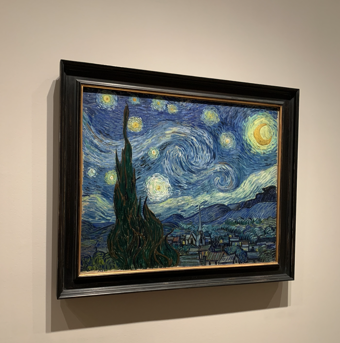
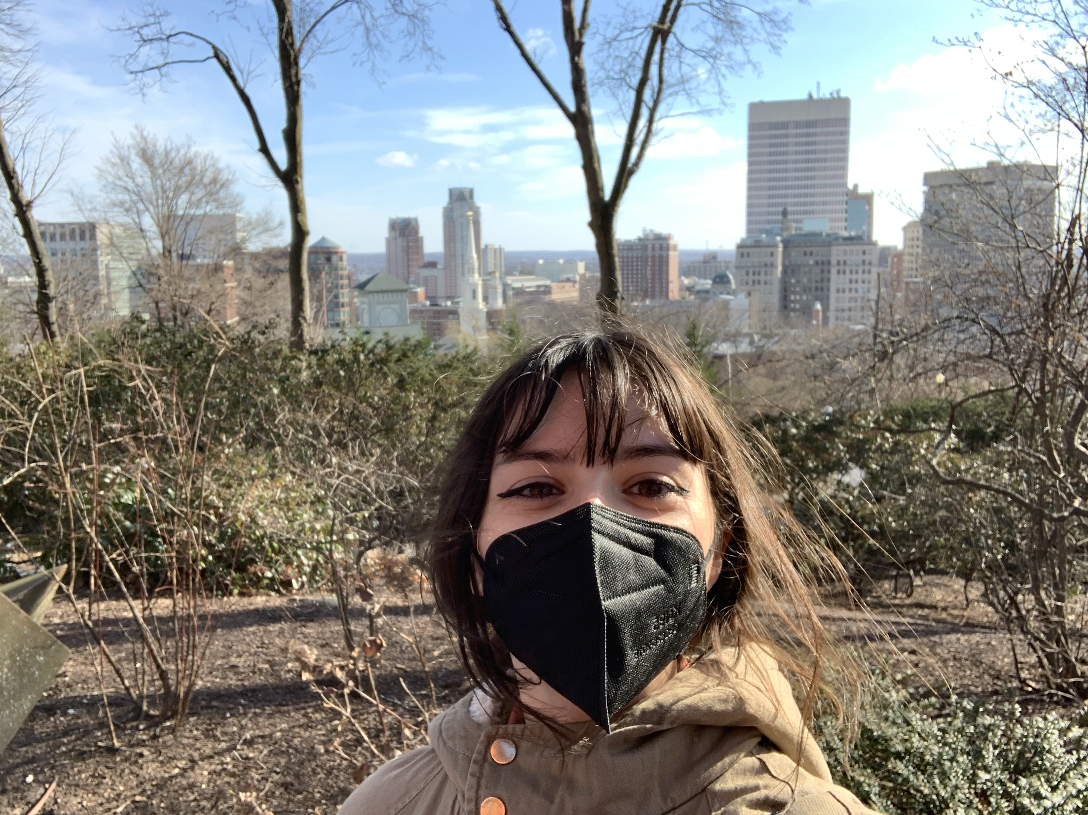
This winter vacation I went to check out three states along the east coast. Providence, Rhode Island – New Haven, Connecticut – New York City, New York. I saw RISD, BROWN, and YALE. I went to the MET, MoMA, Guggenheim, The Natural History Museum, Central Park Zoo, etc. I was up and out from sunrise to sunset. It was my first time visiting that area of the United States! I had a great time, I don’t have all the photos I took readily available on my phone or laptop to upload but here are some good ones.


Project: Texas Beyond History site search mockup
staff guidance: Ruben, Suloni, Estella
description/plans: Create a mockup for the Texas Beyond History site search
Intro to Typography:
font parings:
Merriweather and Verano Sans
Josefin and Verano Sans
I chose Merriweather with Verano Sans because I think the bold serifs od Merriweather pairs well with the humanist sans-serif Verano Sans. Bolded Josefin has a lot of personality and attention catching while Verano Sans is clean and easy to read.
My favorite serif font is Merriweather. I like wedged serifs more than bracketed serifs. It has a bit of a bold vibe because of the thick serifs.

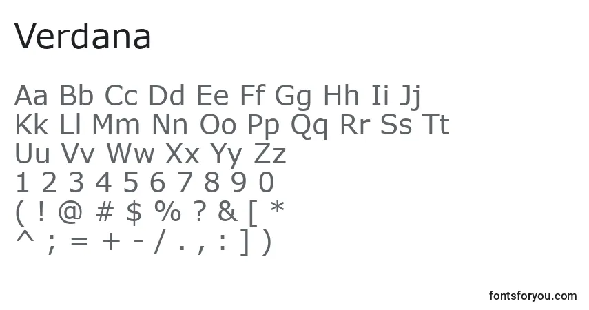
My favorite sans-serif font is Verdana because it has a cross-barred capital I (eye) and differentiates from the lowercase l (ell). I love sans-serif fonts, but most sans-serif fonts don’t differentiate between the capital I and lowercase l.
Script fonts should be used for short phrases to catch attention. My chosen script font is Adine Kirnberg becaue the cursive is readable and fancy.
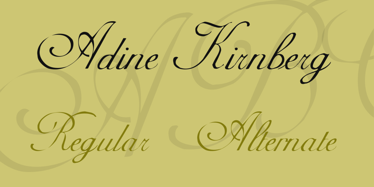
Adine Kirnberg Font Family · 1001 Fonts
I see monospace a lot because I do a lot of coding. My favorite font to use when coding is Fira Code because it has a lot of ligatures.
tonsky/FiraCode: Free monospaced font with programming ligatures (github.com)
My favorite display font is NICESOUR because it has color and strawberries.
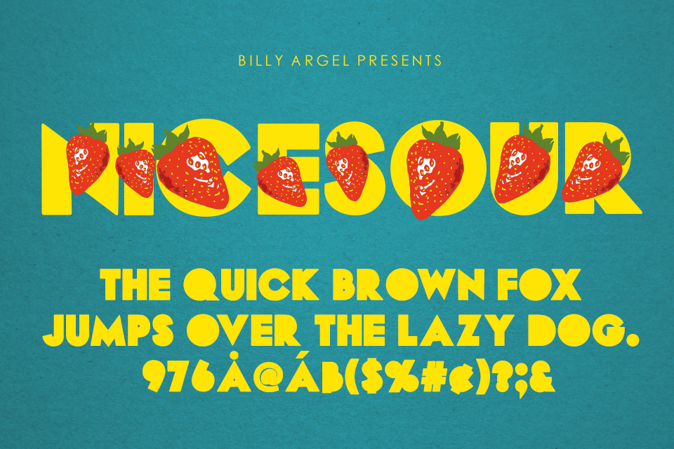
NICESOUR Font | Billy Argel | FontSpace
I like to choose fonts that are clean and readable and have an approachable vibe to them.
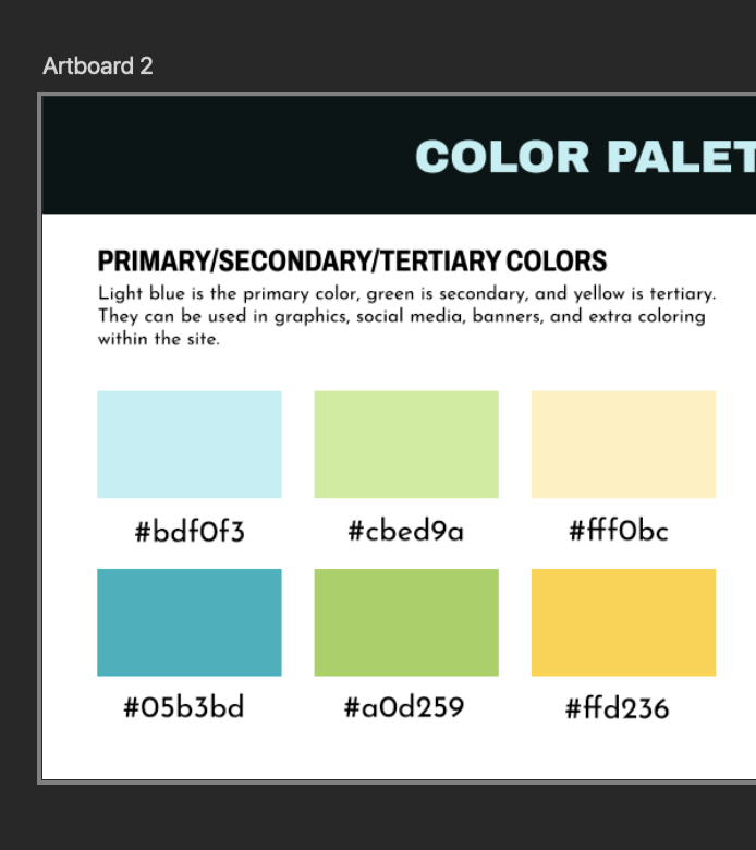
I’m still in the process of trying to figure out how to properly change the color of the capital logo for TxPEP. I was finally able to use the image trace on illustrator to make the PNG into a vector image so that the color could change, but there was still some error with how the logo looked. The lines are no longer clean.
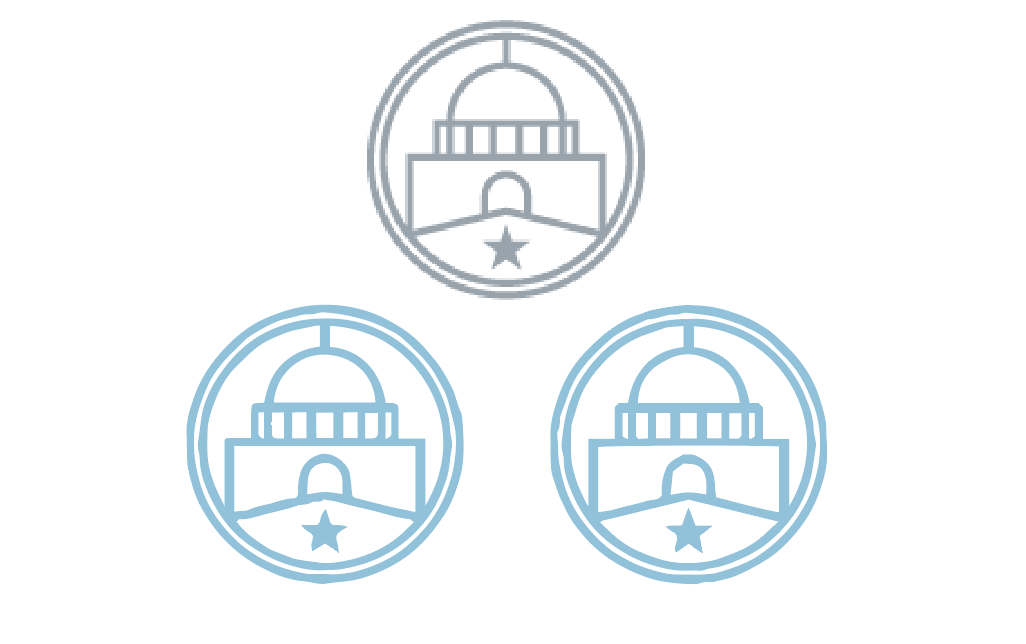
So far, I have continued adding in different versions of the TxPEP logo design. These iterations include the capital logo design.
For these first iterations, I was having trouble changing the color of the capital logo to match the new branding colors that were selected. As a result, I ended up recreating the logo in the accurate color to create the other iterations.
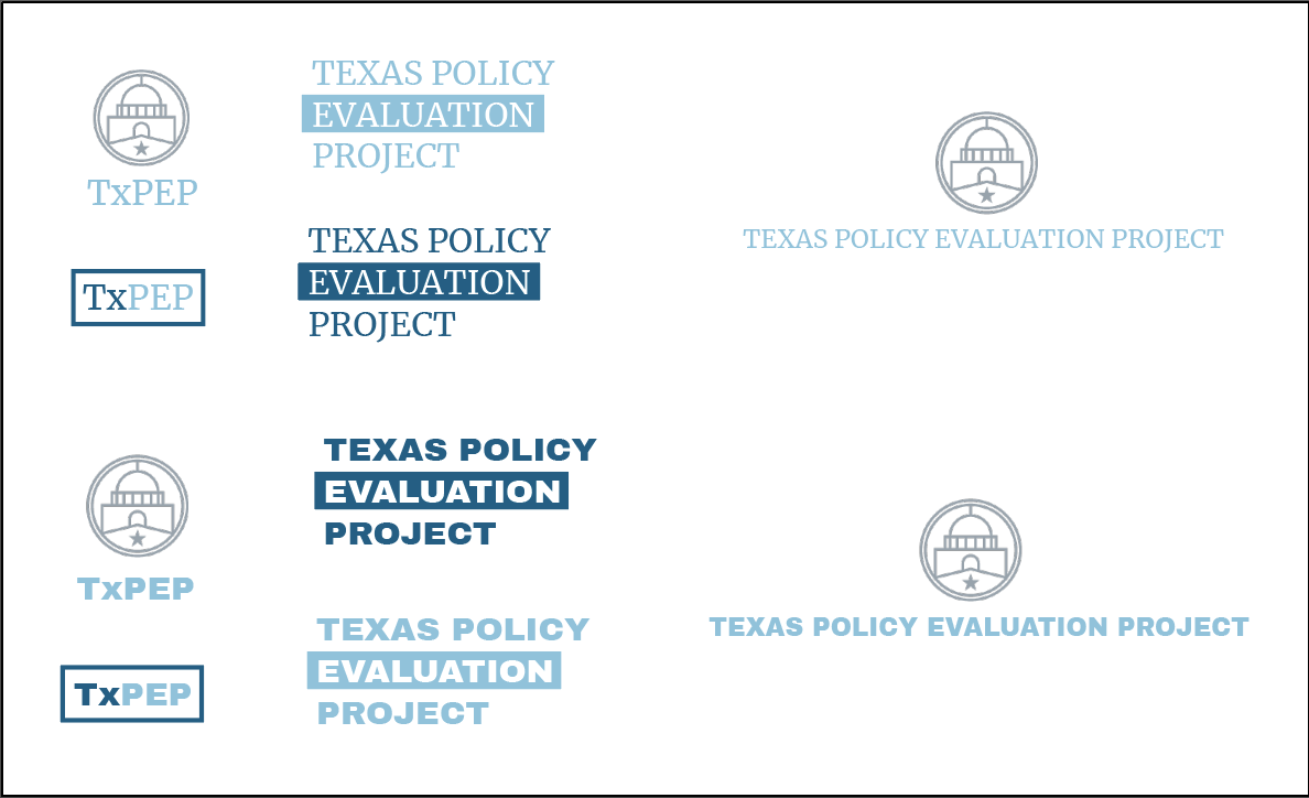
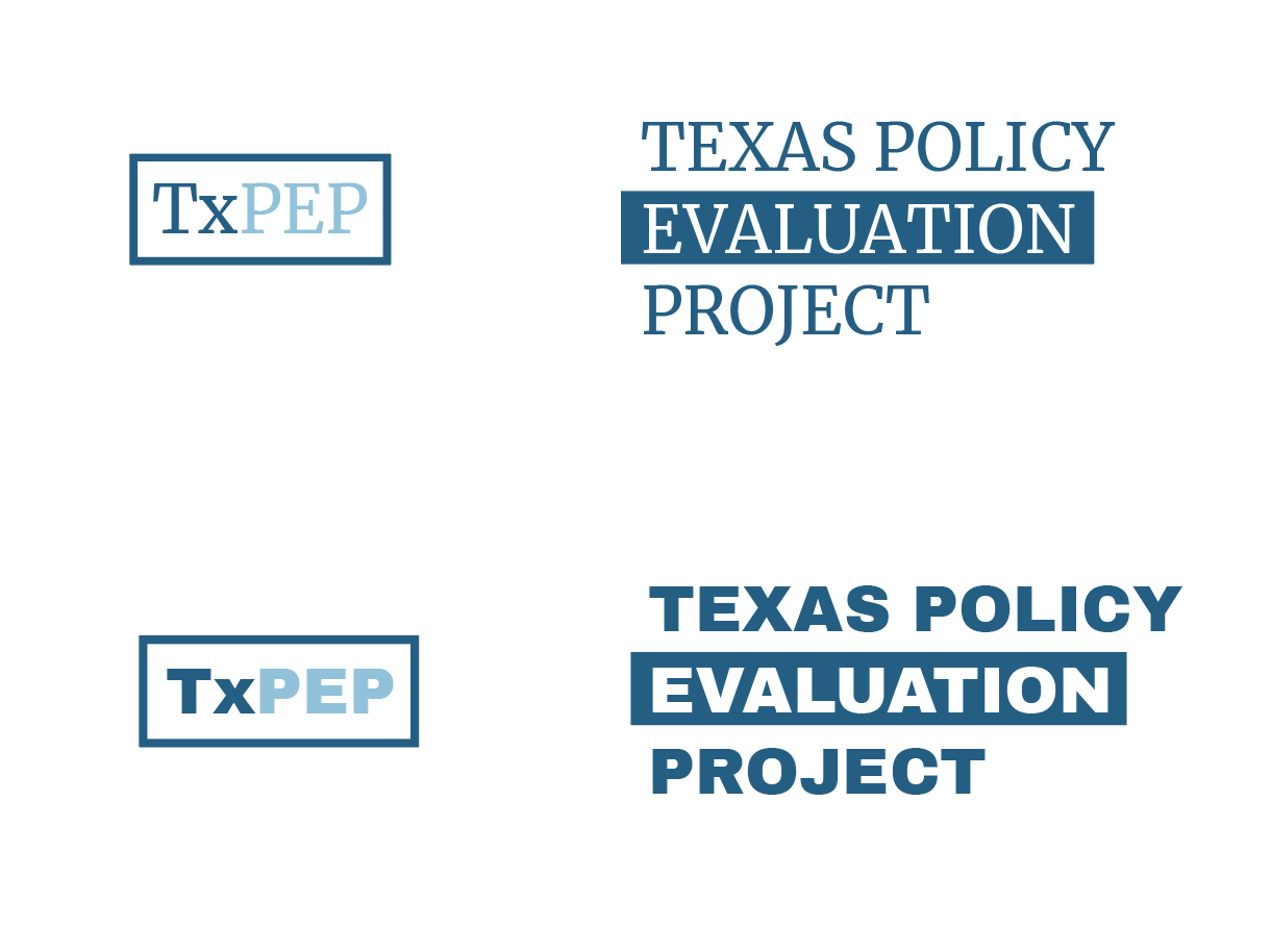
This passed Tuesday, I was assigned to create the word logos for the TxPEP project. With that I’m supposed to:
So far I was able to create the options with the TxPEP current style. Here are the original drafts.
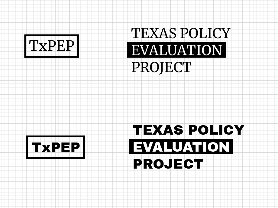

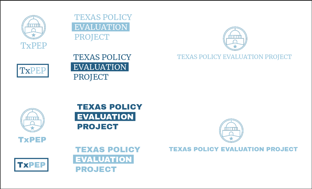
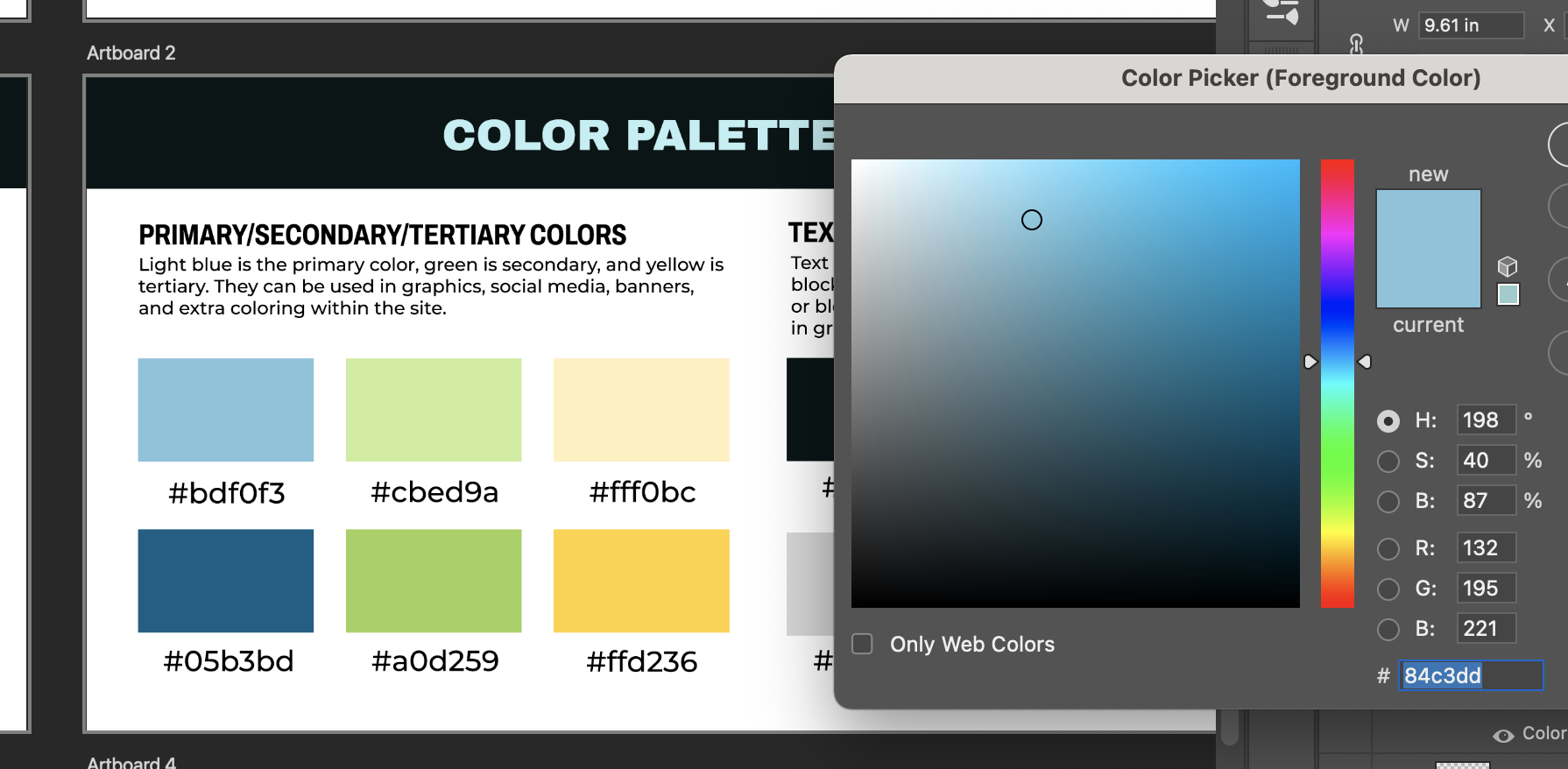
Today I noticed the the HEX codes on the branding guide where slightly different than the intended color scheme,
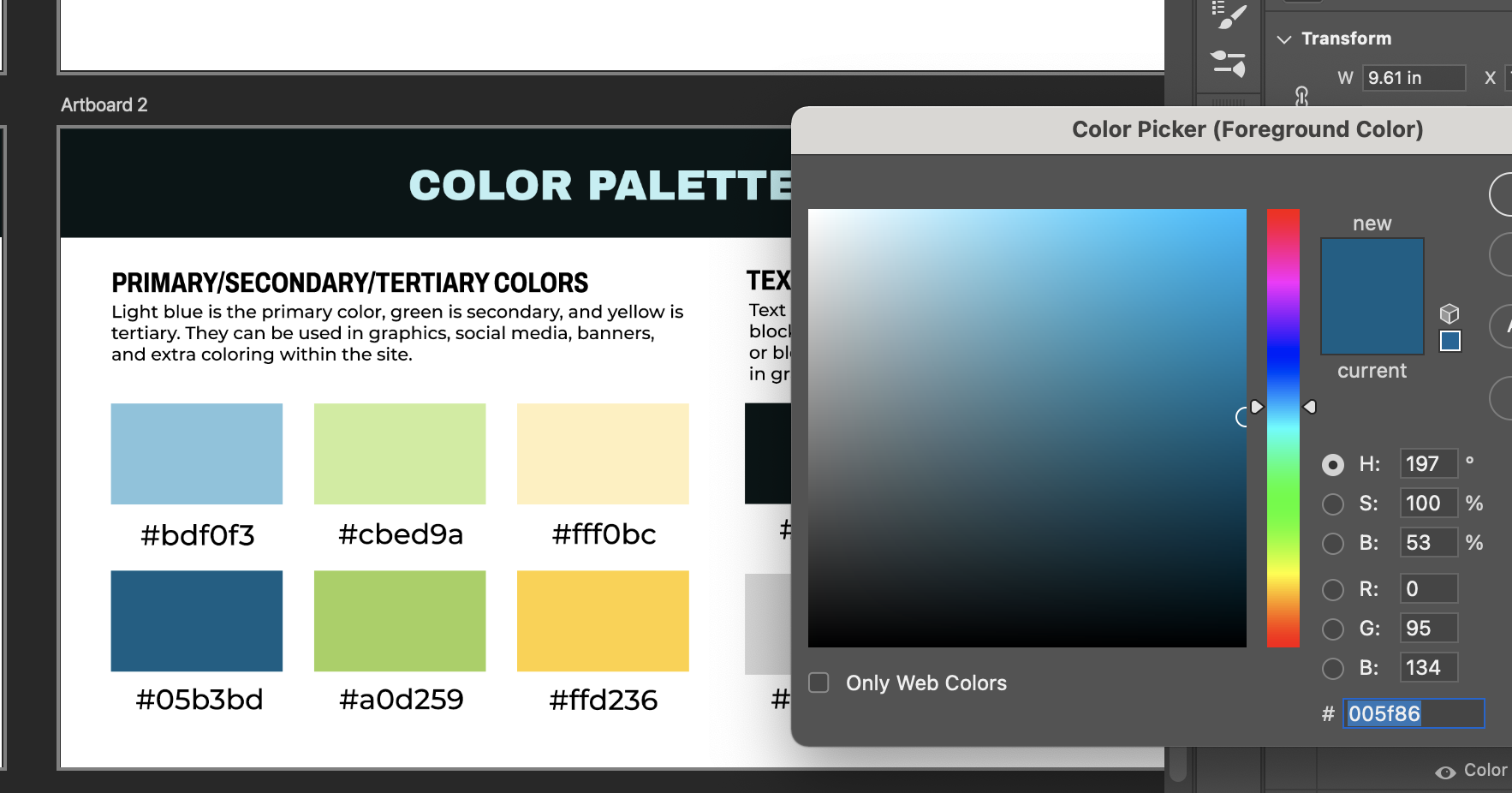
so here are the designs with the correct colors.
Next, I will be working on creating the wild card design for the word logos.
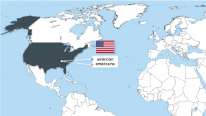
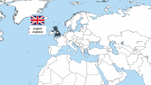
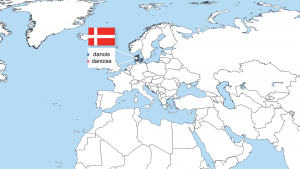
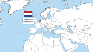
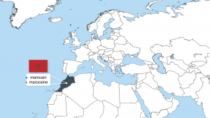
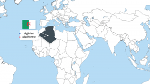
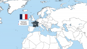
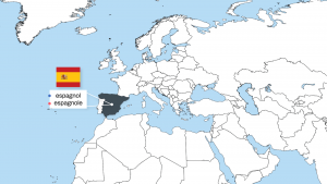
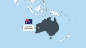
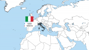
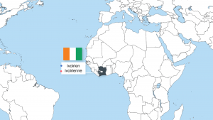
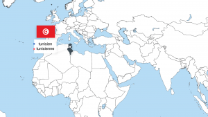
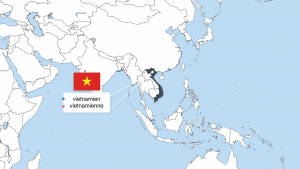
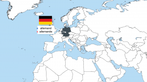
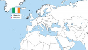
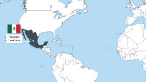
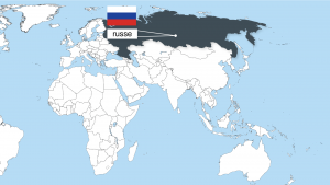
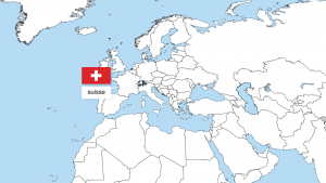
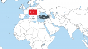
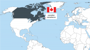
Below is the map I made for the Spring 2022 French course. They needed a green screen map that the professor could stand in front of to go over the different names of countries in french with a visual aid. I added a bit of animation to the slides and text boxes so that the PowerPoint is a little more dynamic.