• We are STAs
    • Asha Rountree
    • Haley Ma
    • Kate Shih
    • Kyra Lee
    • Nicholas Peasley
    • Sasha Kenney
    • Shanda Horm
    • Shriya Atreya
    • Tomas Marulanda-Mesa
  • We were STAs
  • STA Presentation
    • STA Presentation 2017
    • STA Presentation 2016
  • Testimonials
  • Resources
  • Home

STA Blog

Warfield Faculty Book Page

April 17, 2020 By Mounika Tadanki

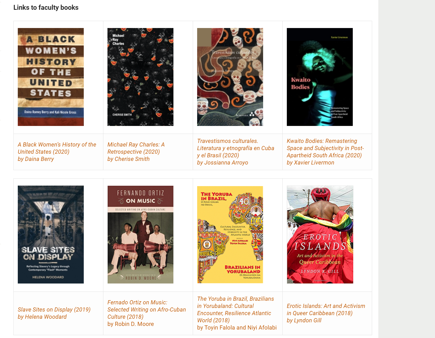
I worked on the Warfield faculty book page to update the books table with 5 new books.

Along with a document with detailed instructions on how to manage tables in Cascade, I also shared a screen recording with the client to help them learn how to edit the books table.


Filed Under: 2019 Fall-Winter | Spring-Summer 2020, We are STAs

Revised Icon Practice

April 14, 2020 By Abriella Corker

Revised Icon: Good Practice

Step 1

Add a grid and margins to your photoshop file. It is a 400 x 400 px template. The grid is 16 px squares. Add padding of 2 squares to all edges. This is the breathing room. No icon material should be placed in this. Add and inner +2 squares from that padding guide edge. This is room to go out of bounds for your icon design if necessary. The main space to work is the center of this board.


Step 2

Place the basic shapes for your icon that will inform the form and keep scale consistent. I made mine blue with 40% opacity to see how they layer and overlap. Make sure shapes snap to the grid squares.


Step 3

Start drawing your outline for your icon in another layer over the shapes you laid out. The line is black with a thickness of 4 px. Try to make all angles at 45 degrees. This is to keep the pixel edge consistence. Mine had a more titled perspective so the angle is not 45 degrees. If you need to step away from that go down in halves such as 22.5, 11.25, or in multiples of 15.


Step 4

Duplicate your outline folder in photoshop and merge and rasterize the shapes of your icon. Mine was merged in two shapes: top of the hat and the bottom. Then use the paint bucket tool to fill in your shapes.


Step 5

Now add 4 x 4 px circles to the corners of your icon to them a consistent rounded edge. I ended up adding one to the inner corner of the tassel as well.


Step 6

Preview your image without the grid and guides and see what adjustments need to be made. Redo the process to fix mistakes. For mine, I had the re-angle the lines at the top of the bottom cap so the spacing was even of 2 squared from the bottom edge of the top hat. Then adding a 4 x 4 px circle to inner corners as well.


Filed Under: 2019 Fall-Winter | Spring-Summer 2020

PRLGBTQ Logo

April 13, 2020 By Thuy H Nguyen

PRLGBTQ Logo

I started working on the Puerto Rico LGBTQ Logo Design. The logo will be presented on PRLGBTQ website as well as their Twitter profile picture. Here’s my initial hand sketches.

For now, I don’t know yet whether the client wants the logo with the text or not, so my sketches presented both versions. I’m waiting to hear back from the client on this!

And here are my first two attempts.

I like the first version better because I think it has more of a ‘movement’ and isn’t as stiff as the second one, but I thought it was worth playing with the brush strokes on the second one anyway! For some ‘technical’ details, I was using Illustrator for creating the logo skeleton (also my first time actually understanding how the pen tool works!), and then I transferred the Ai file into Ps for some manipulations (added textures, brush strokes, etc.)

I’m super excited for this project, because I haven’t gotten to work on some graphics for a while now!

Filed Under: 2019 Fall-Winter | Spring-Summer 2020

4-13-20

April 13, 2020 By Bridget

LACS Career Guides

It’s been awhile since I updated my blog, so I’ll try to summarize what I’ve been working on for the past month. The #1 project has been updating some of the pages on the Liberal Arts Career Services (LACS) site by converting some of the plain text into graphics.

I’ve been leading the project to create infographics for at least 12 of the LACS career guides, which are aimed at humanities grad students preparing for a career outside of school. I’ve been working with the client, Amy Vidor, to come up with a consistent style for all the infographics. We needed it to be monochromatic, and Suloni suggested rounding the corners on each of the blocks. I took the blue from the official UT color palette and reduced it to 40% and 15% opacity to get the lighter shades. This is what we settled on:


All of the subsequent infographics will have the same general layout (i.e., a section for background, pathways, and desired skills/experience). The only parts that need to be changed out will be the text and icons, which need to be original. From the advocacy infographic, I created a template for all the LACS infographics that includes the color palette, specs (padding, font size, etc.), and other useful information.

Here’s where the template’s located, and here’s what it looks like:


Several STAs have already starting working on more infographics, and I’ve been trying to give feedback on their progress. We have a lot of original icons to make, so to make the process easier I made a spreadsheet to track all the icons that need to be made. This will hopefully keep us from making duplicate icons and make it easier to see which icons are being reused:

https://docs.google.com/spreadsheets/d/1rn05Y2paiIqVuF2tCvWbTOAiV9DEyUMy8ZSkHVmRgY8/edit#gid=0


Filed Under: 2019 Fall-Winter | Spring-Summer 2020

LACS Infographic

April 10, 2020 By Abriella Corker

Project: LACS Infographic

Client /Prof: Amy Vidor

Completion status: Started March 28, 2020

Staff guidance: Valerie Tran & Suloni Roberston

STA team members: Abriella Corker, Bridger Kessler, Maddy Kaniewski, Sheryl Long, and Thuy Hai Nguyen

Description/plans: Create icons and layouts for information on the Career Services page.

To be completed: Feb 25, 2020

Filed Under: 2019 Fall-Winter | Spring-Summer 2020

COM301E Intro

April 10, 2020 By Maddy Kaniewski

COM 301E: Communications Foundations Online

LAITS is producing a foundations course for Moody College, COM 301E. I’ve been put in charge of art direction for the class, including the 20-30 second intro animation.


This project is a good learning experience for three reasons:
1) I have little experience in animation and while I’m not the animator, I am planning out the animation and keyframes,
2) I have never been an art director for other STAs like this before, and
3) as a team we will have to be extra considerate about communicating and collaborating during this new work from home COVID-19 situation.


The course is an overview of each of the Moody departments, from Speech Pathology to Journalism to Comm and Leadership. I want the intro animation to follow the class outline by featuring a single person processing ideas, to them sharing with a friend, to a group, and eventually communicating through mass media.


The style will be inspired by this GIF below. The fun colors, cute faces, and organic shapes feel energetic and current, which I know is an important part of Moody’s brand and the communications field in general.


Project: COM 301E
Client/Prof: Dr. Madeleine Redlick
Completion status: Planning intro
Staff guidance: Suloni Robertson, Valerie Tran, Quinn Hoinoski
STA team members: Me, TBD
Description/plans: Course development for COM 301E — creation of graphic assets: intro animation and title cards
To be completed: End of summer

Filed Under: 2019 Fall-Winter | Spring-Summer 2020, We are STAs

  • « Previous Page
  • 1
  • …
  • 45
  • 46
  • 47
  • 48
  • 49
  • …
  • 80
  • Next Page »

link to LAITS home page

Video STA Home

© 2025 Liberal Arts Instructional Technology Services | Production Credits