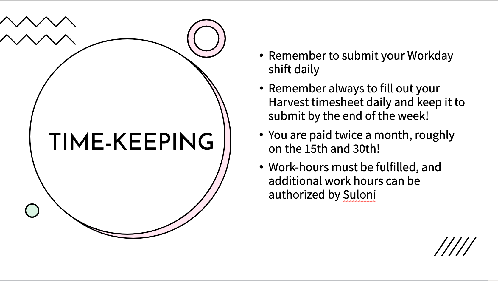
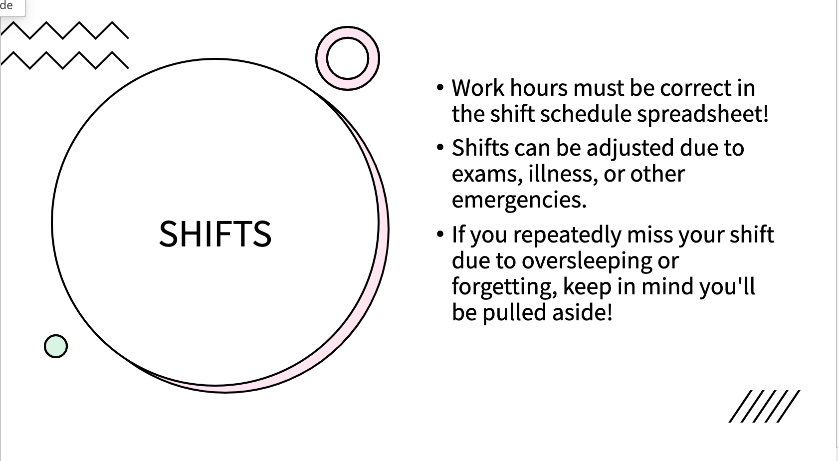
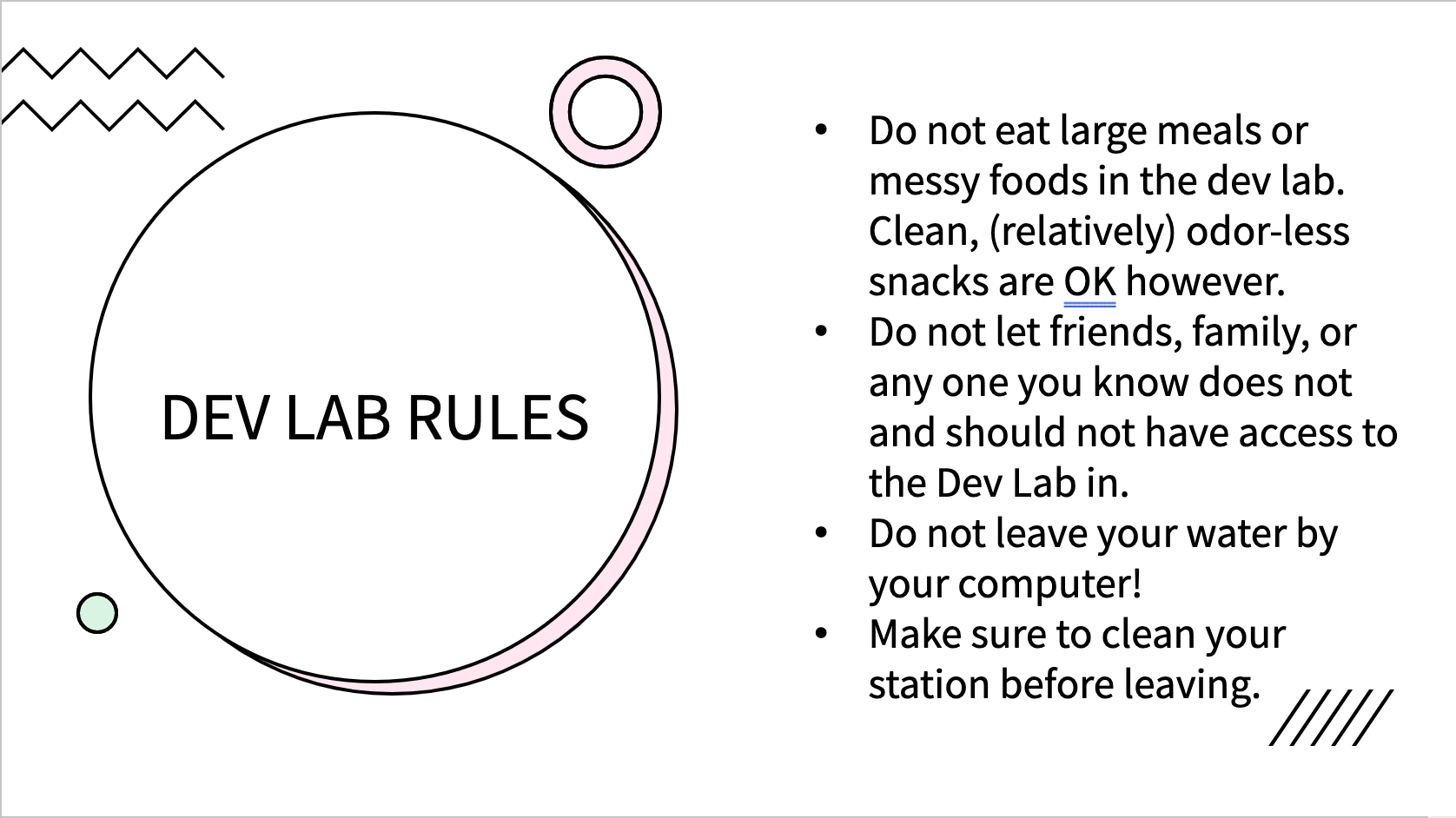
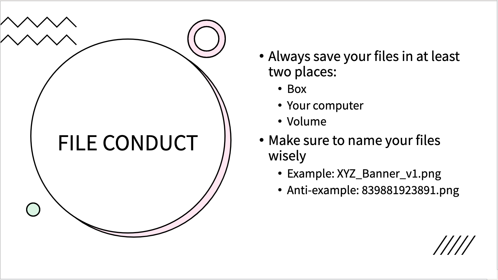
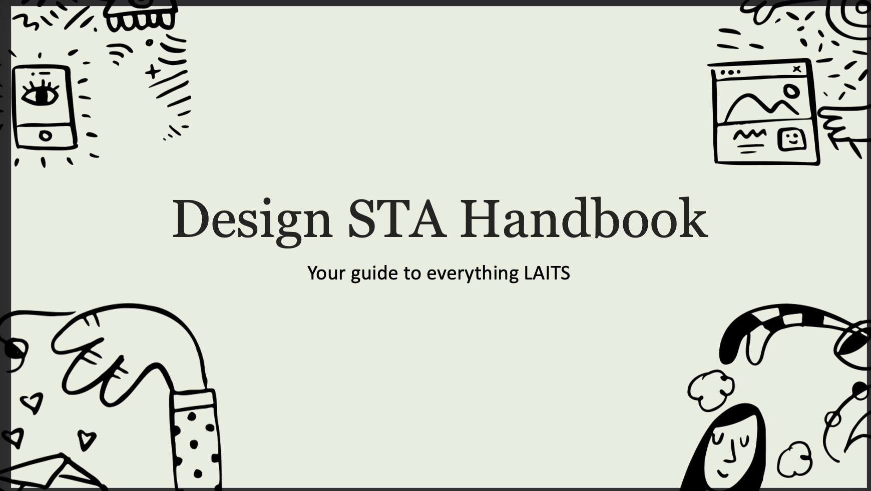
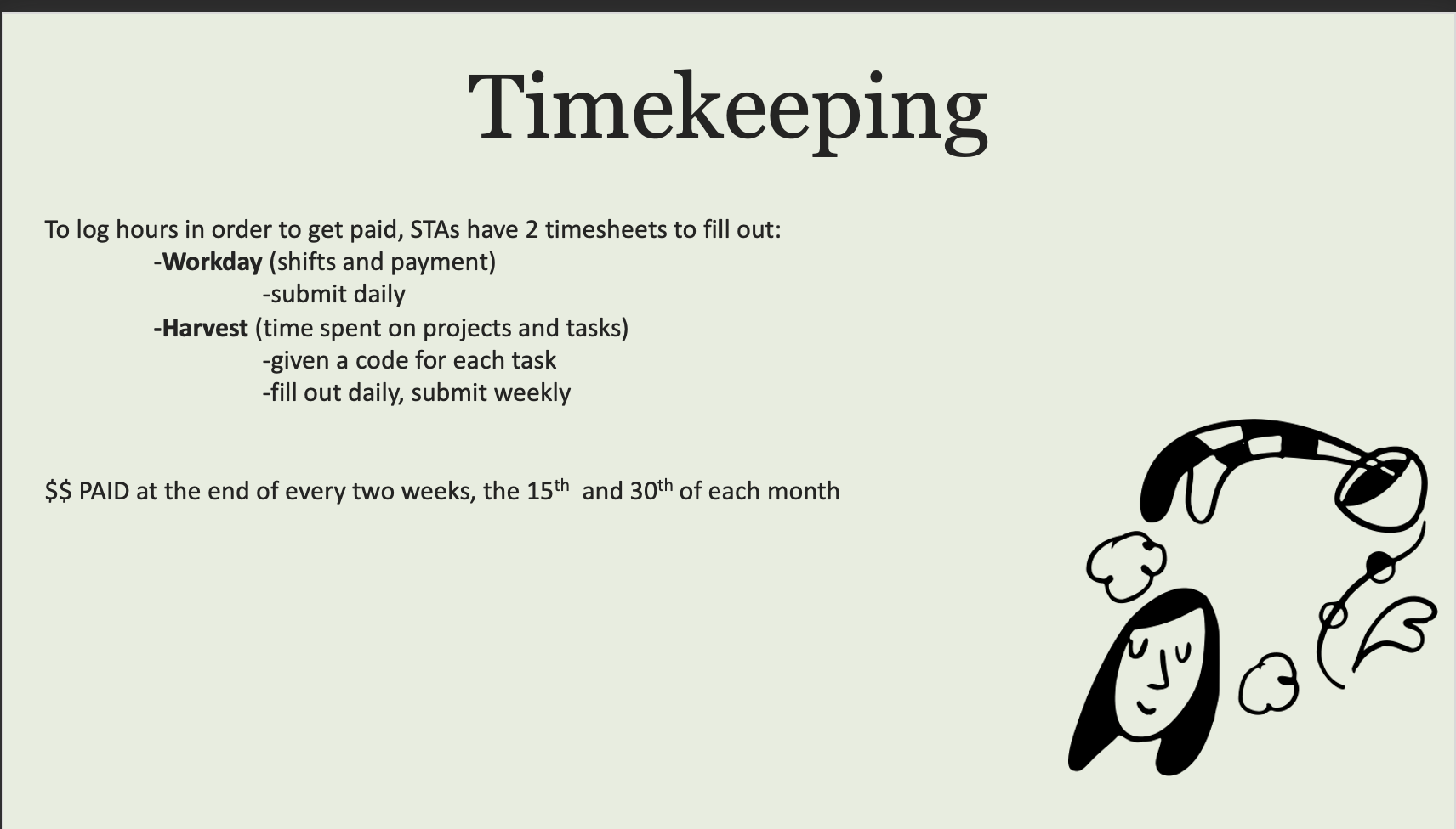
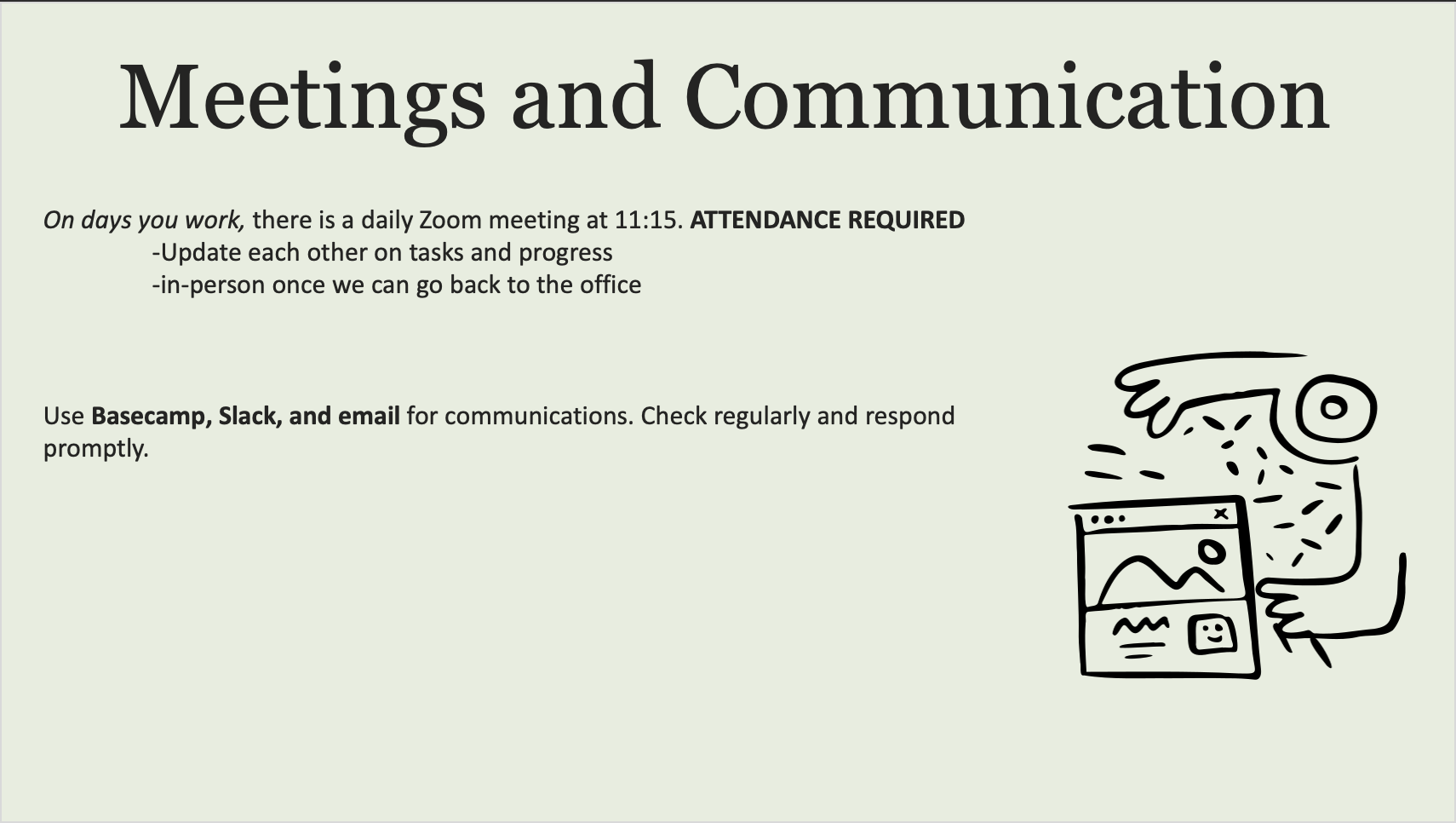
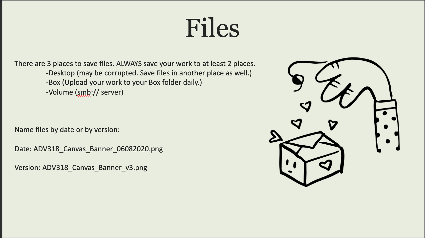
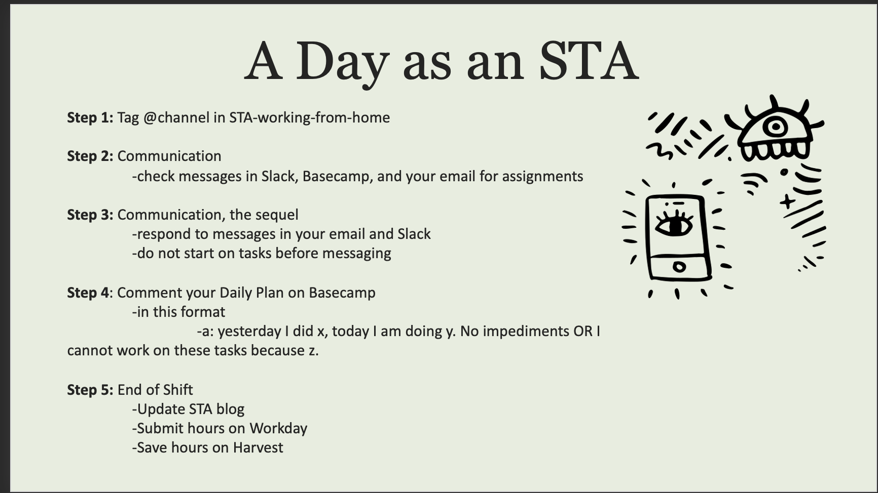
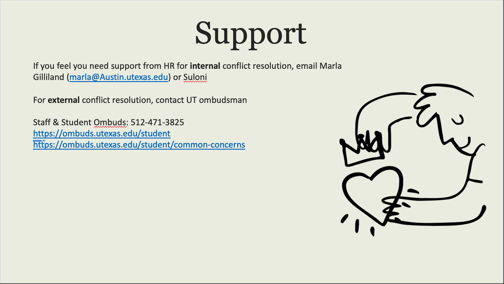
Today I and the other new STAs began the first day of orientation. The main thing I accomplished was creating a powerpoint based off our student handbook! Although it’s fairly simple (used a template and only adjusted colors and design a bit), I was pretty happy with how it turned out.
Orientation
Today was my first day with LAITS! It was super cool to meet all my new coworkers (even though we’re all working from home). We each created a PowerPoint with information from our work handbook and here are my (badly cropped) screenshots:
If you’re wondering, I got the color scheme from this generator and the cute doodles from this open-source site. I didn’t use a template, so this is just the default PowerPoint layouts with my embellishments added.
photo ids
PHOTO IDS
I was working on Photo IDs. All three of them required some photo editings like adjusting the brightness so the face shows better, making the lighting more natural and less warm or removing yellow tints.
Updating Podcasts
Death and Numbers Podcast
I have updated the speakers and transcriptions for this podcast. The three speakers rotate for different podcasts so I included the three of them here instead of as a host which I wasn’t shown or instructed to add yet. One of the speakers I could not find an image for on a public platform so they do not have one.
7-2-20
Retractable Banners
All the design STAs were asked to submit banner designs that could potentially be used as a backdrop for online classes this fall. We used official UT photography and branding/colors in our designs.
The first ones I submitted on Monday were a bit too saturated and distracting, plus the photo of the UT tower that I used was not placed that well–it would’ve been covered up by the professor standing in the middle of the frame most of the time. So I made some edits and tried out some different layouts based on the feedback I got from Suloni and Valerie, and I think they came out much better! Suloni liked the neutral/off-white version because it’s less distracting and doesn’t compete with anything
1st Round of Drafts:
2nd Round of Drafts:
For these I just took the opacity down slightly on the orange/off-white/blue overlays (about 90%) and I added an adjustment layer on top to desaturate them a bit more. The photos are also at about 40% opacity so they fade into the background more.
This is roughly what the banner will look like while the professor is teaching:

ARH303 Canvas Homepage Banner
Dr. Ann Johns requested a new homepage banner to use when she teaches ARH303 online this summer (I think it’s starting in a few weeks).
She has an existing banner that she uses for ARH301, and she just wanted a few images swapped out to use in the 303 class. She sent me links to the images she uses on her tests, and I mocked up a few different options for her to pick from:


Photo IDs


Retractable Banners
RETRACTABLE BANNERS
Most of us design STAs have been assigned with the task of drafting out some retractable banners that could be used for courses being recording for fall 202o. These are the two drafts I made below. Originally, the tower had a very orange overlay on it and Valerie suggested I lower that to be less intense which would allow the natural colors of the photo to show through. Then the statue image was made to have a bit of blur to it so it is not so in focus behind the professor.
- « Previous Page
- 1
- …
- 19
- 20
- 21
- 22
- 23
- …
- 80
- Next Page »


