Round 2
Flyer:
Imagery for screens in the SAC
Round 1
Flyer:
Marquee image (the dimensions given for the larger marquee home image were the same as the event marquee)
Imagery for the screens in the SAC
LAITS Student Technology Assistants collaborate with the College of Liberal Arts faculty and administration by re-imagining their instructional and promotional projects with a creative use of video, audio, web and graphic design. STAs learn technical skills on the job with LAITS development studio staff. They build presentations, produce audio/visual works, scan text documents & perform image correction. STAs are instrumental in helping COLA faculty realize their vision for instructional technology projects used to enhance the teaching and learning experience.
By Ann Yue
By Ann Yue
I was given a set of IDs to process and in that set, this picture came up.

The background needed a bit of cleaning to make the image look more professional overall. I mainly used refine edge to select just the person, and then inverted it to select the background. I filled the background with a color that was in the original image. I also had to go in with a tiny eraser to make sure there weren’t leftover parts that were missed.

By Ann Yue
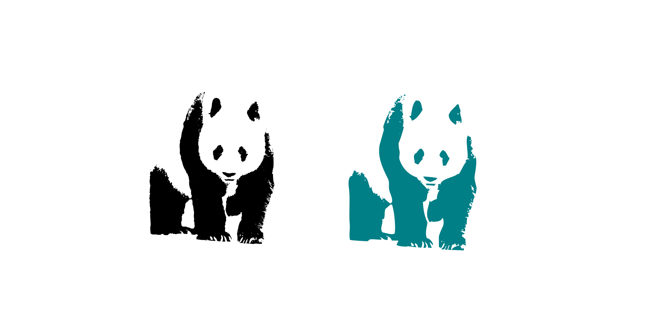
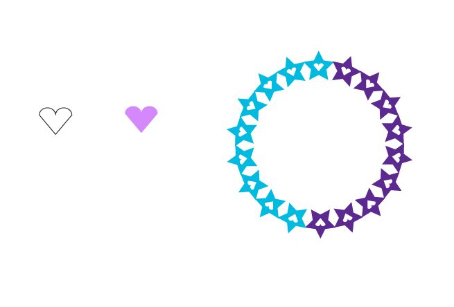
As part of the STA training, I made a live trace of a panda as well as a series of shapes to learn more about shape manipulation. The panda live trace turned out okay, but it didn’t have as many details as the example simply because fur has less details than feathers.
After doing the shape manipulation, I realized that I want to learn more about the pathfinder function in Illustrator since it seems like it could be very powerful depending on how skilled the user is. It’ll also keep me from doing sketchy methods to try to fix a shape.


By Ann Yue
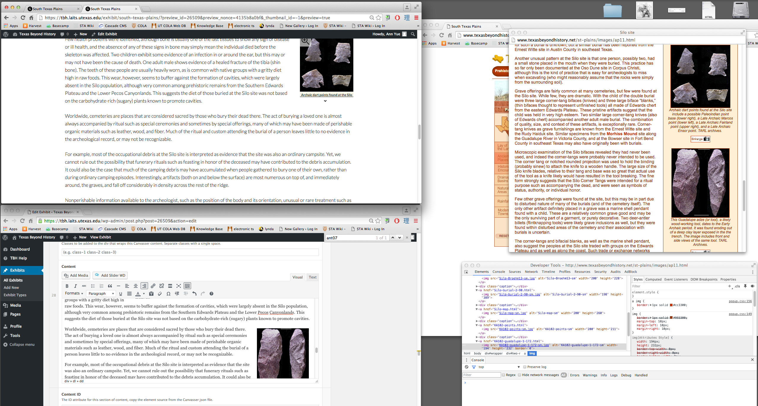
After a bit of confusion, I was put on the task of transferring all the text and images from the old TBH site that opened when a triangle was clicked on the map for South Texas Plains to the new site. I had to insert every image individually which got a bit tedious. Also, since WordPress doesn’t show the correct formatting/spacing in the editor, every time I inserted a picture, I had to preview the update to be able to determine where to insert the next picture so that the spacing wouldn’t get messed up. From this, I mostly learned about the ‘inspect’ function.

For TBH, I have been continuing to work on redesigning the graphical elements of what used to be flash interactives. Last week, I finished creating all the visual assets for the Life of the Caddo Kids interactive page, which uses a colorful, circular UI navigational tool. Here are a few examples of what these elements look like.
First two rough mockups of the BA Sustainability Studies video monitor graphic with focus on general layout.
A third mockup with client feedback.
Two options for the video screen ad. The trees are fading outwards, the globe’s mockup is cleaner, and “Information Sessions” carries more weight.
Tried a drop shadow for the arrow around the globe.
Changed the globe logo to a white arrow, two options for color to see which best represents both Earth and Sustainability.
6 final mockups, each with a different combination of globe logo and image.
The client decided on the blue and green globe logo and boat photo. After a few minor changes–“COLA” in all caps, remove “major” from header text–the ad is finished.
Shown with guides.