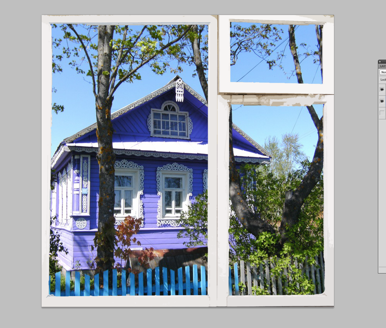
Made mock ups for the new Russian course offered in the Fall.
First I deleted the original background from the window
Then I layered different backgrounds with specific filters to have a cohesive style

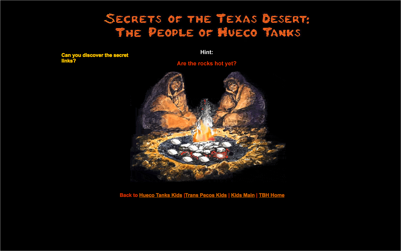
LAITS Student Technology Assistants collaborate with the College of Liberal Arts faculty and administration by re-imagining their instructional and promotional projects with a creative use of video, audio, web and graphic design. STAs learn technical skills on the job with LAITS development studio staff. They build presentations, produce audio/visual works, scan text documents & perform image correction. STAs are instrumental in helping COLA faculty realize their vision for instructional technology projects used to enhance the teaching and learning experience.
Made mock ups for the new Russian course offered in the Fall.
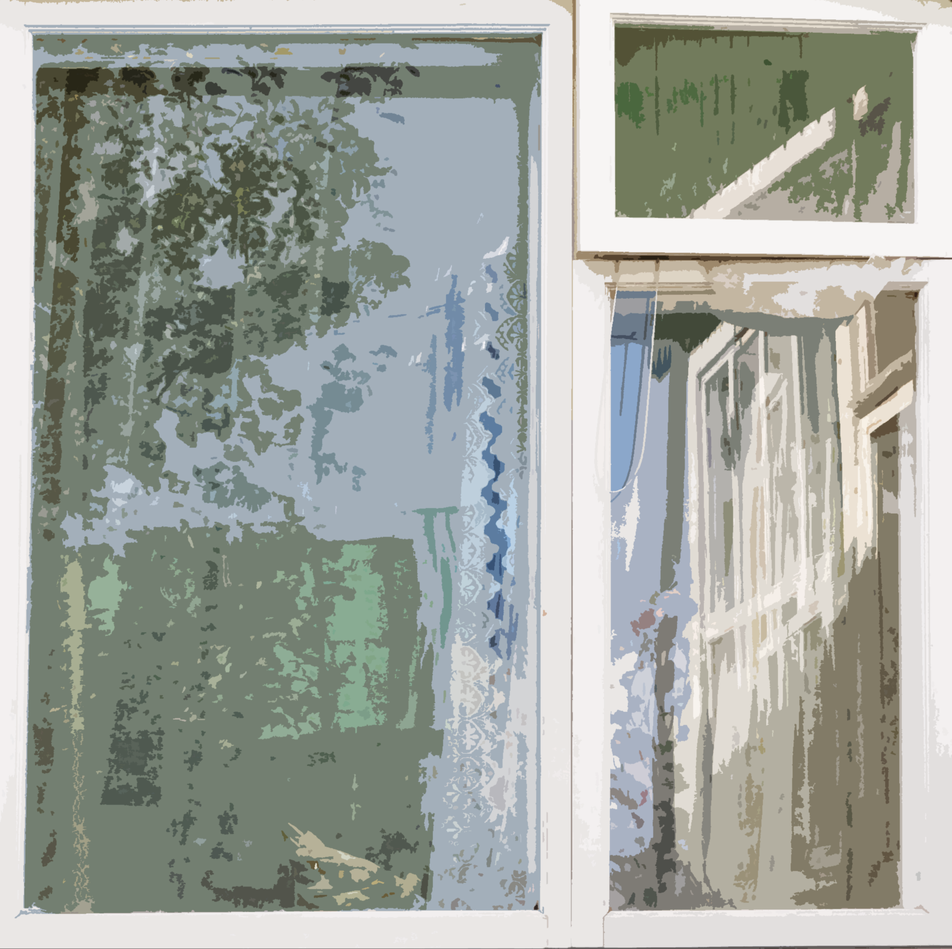
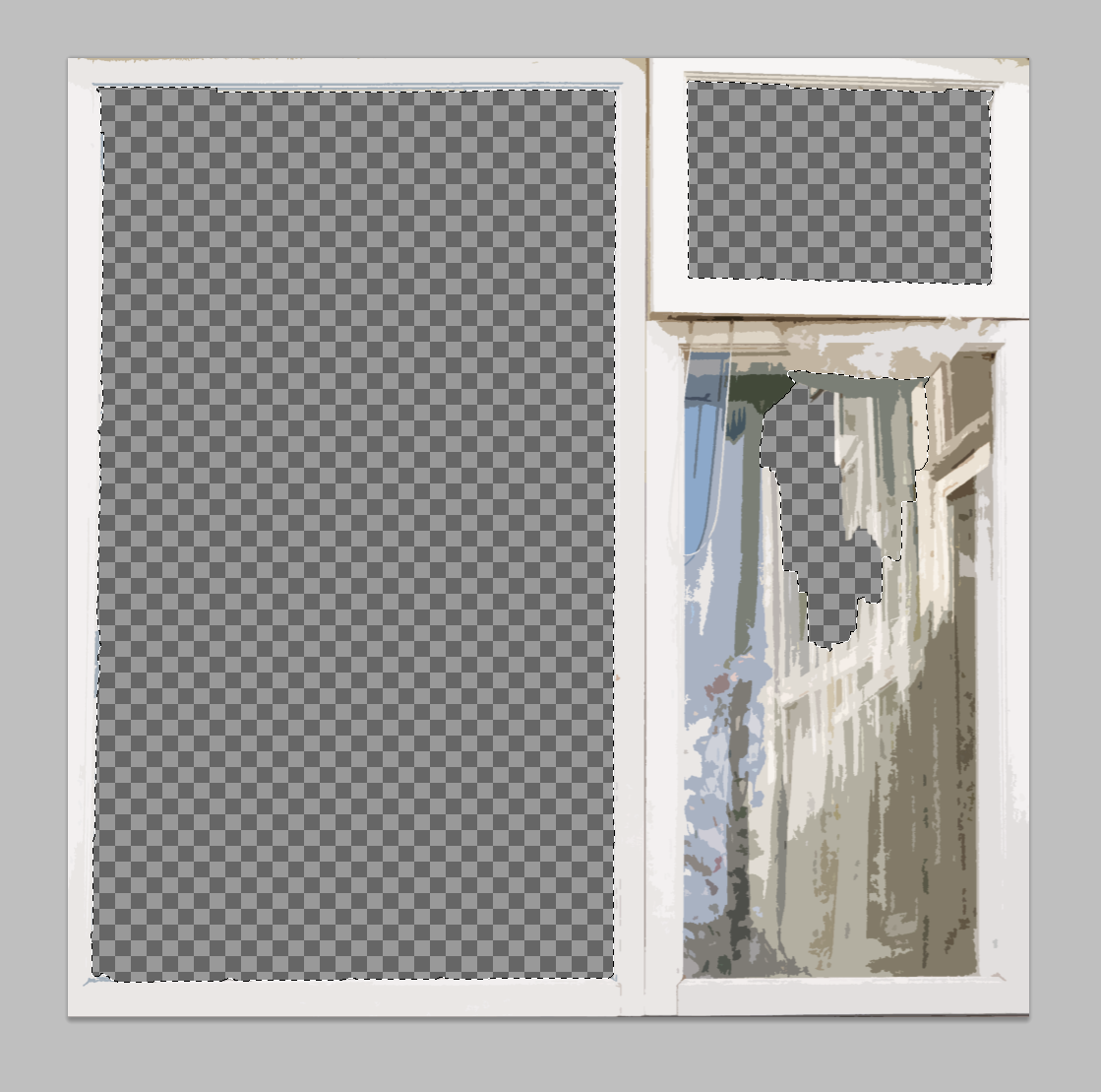
First I deleted the original background from the window
Then I layered different backgrounds with specific filters to have a cohesive style
Finally the banner is finished!
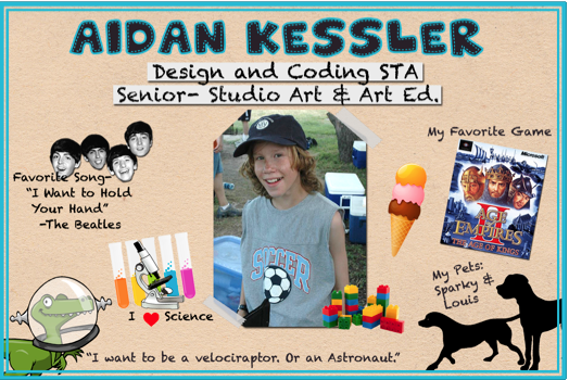
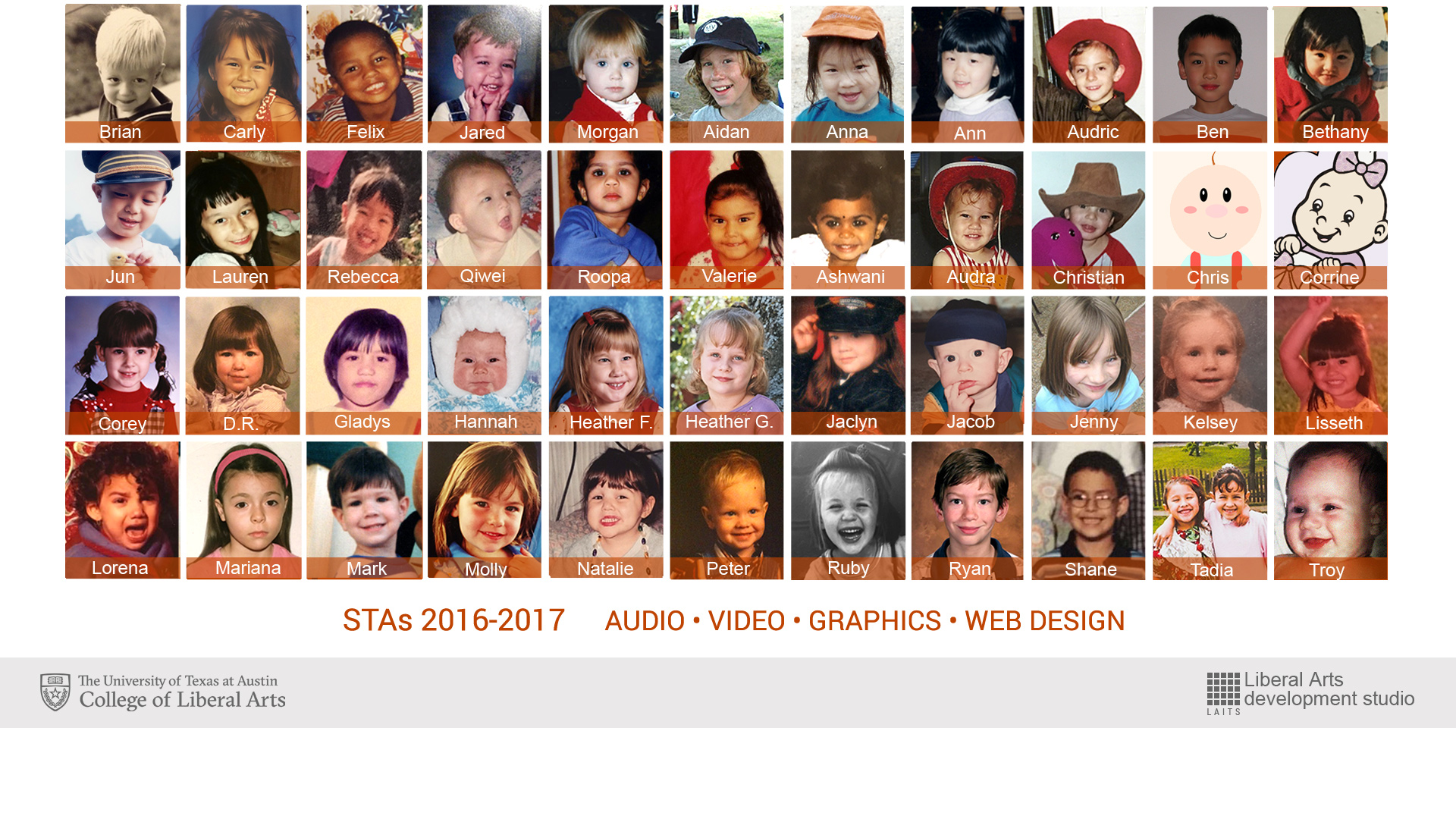
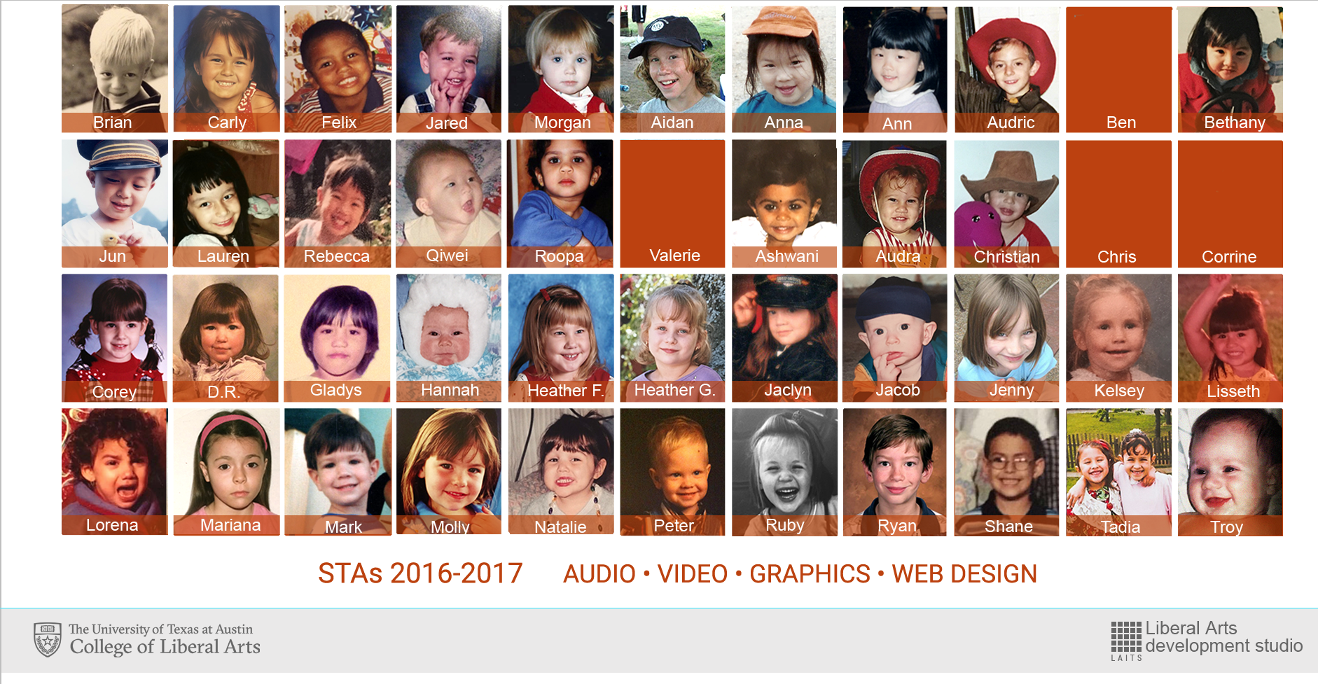
This is for the STA Presentations. I’m making a slide per presenter using clipart and pictures for each STA which includes their favorite things from childhood. Here’s Aidan’s, and I’m working on the others now.
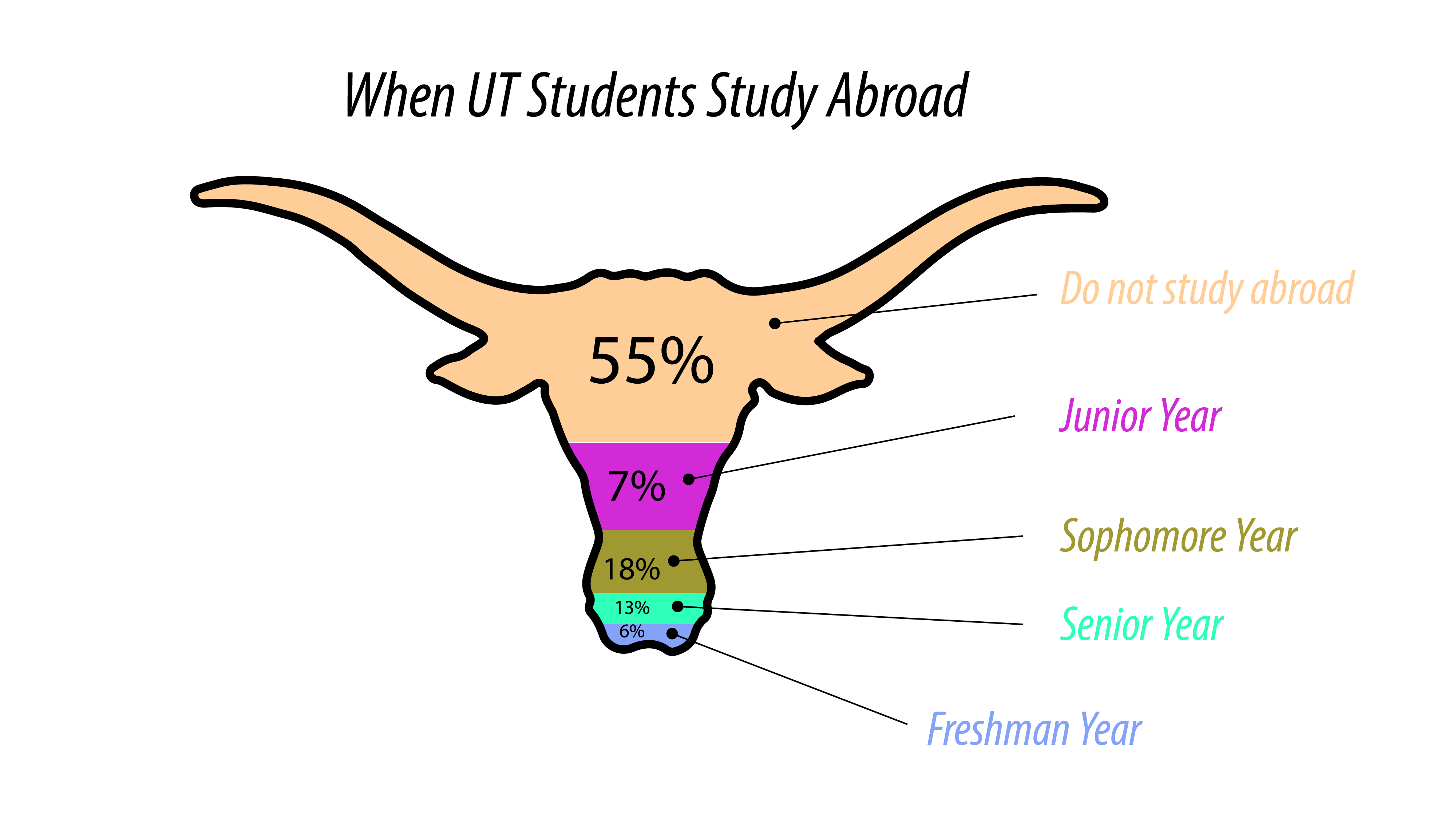
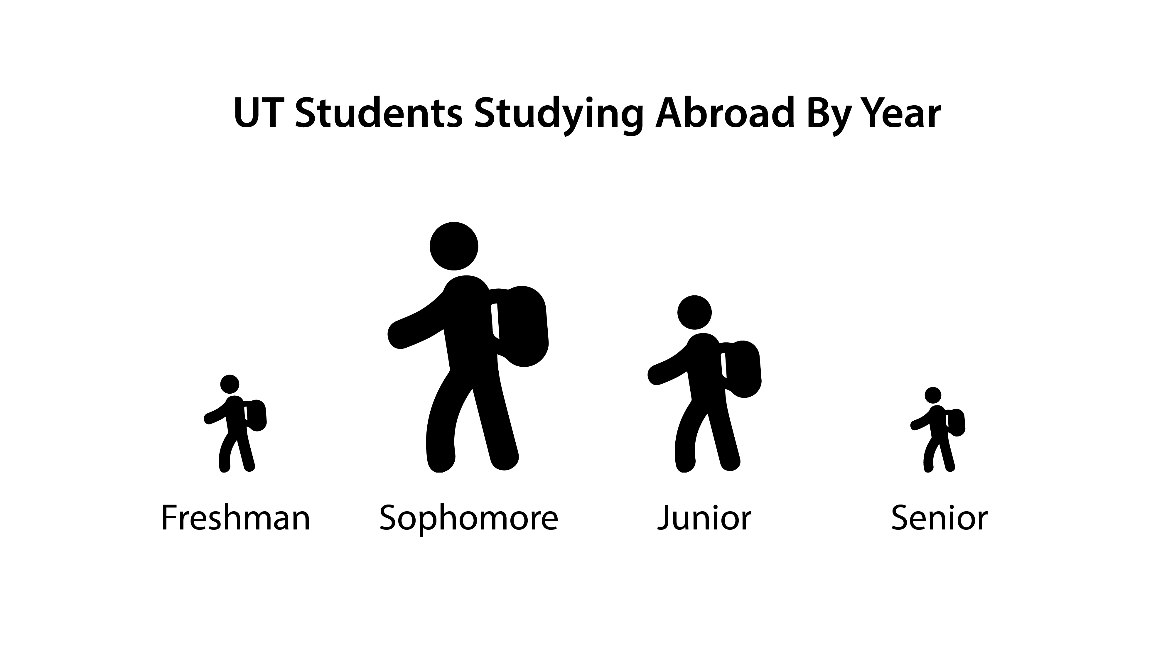
This is what I have so far based on the instructions given. I’m wondering if I should include percentages in the good example? As it stands, you can make some relative observations about the data presented, e.g. more students study abroad as sophomores than seniors so the good example doesn’t need percentages…but it might confuse students if they’re presented with these two graphs that are based on different data sets that look like they express the same message.
Another solution might be to use the same data set for both examples, so students can see how the same info can be represented in hugely different ways.
Here is the almost complete STA blog banner! I like the way it looks, and will like it even more when I get the rest of the pictures in!
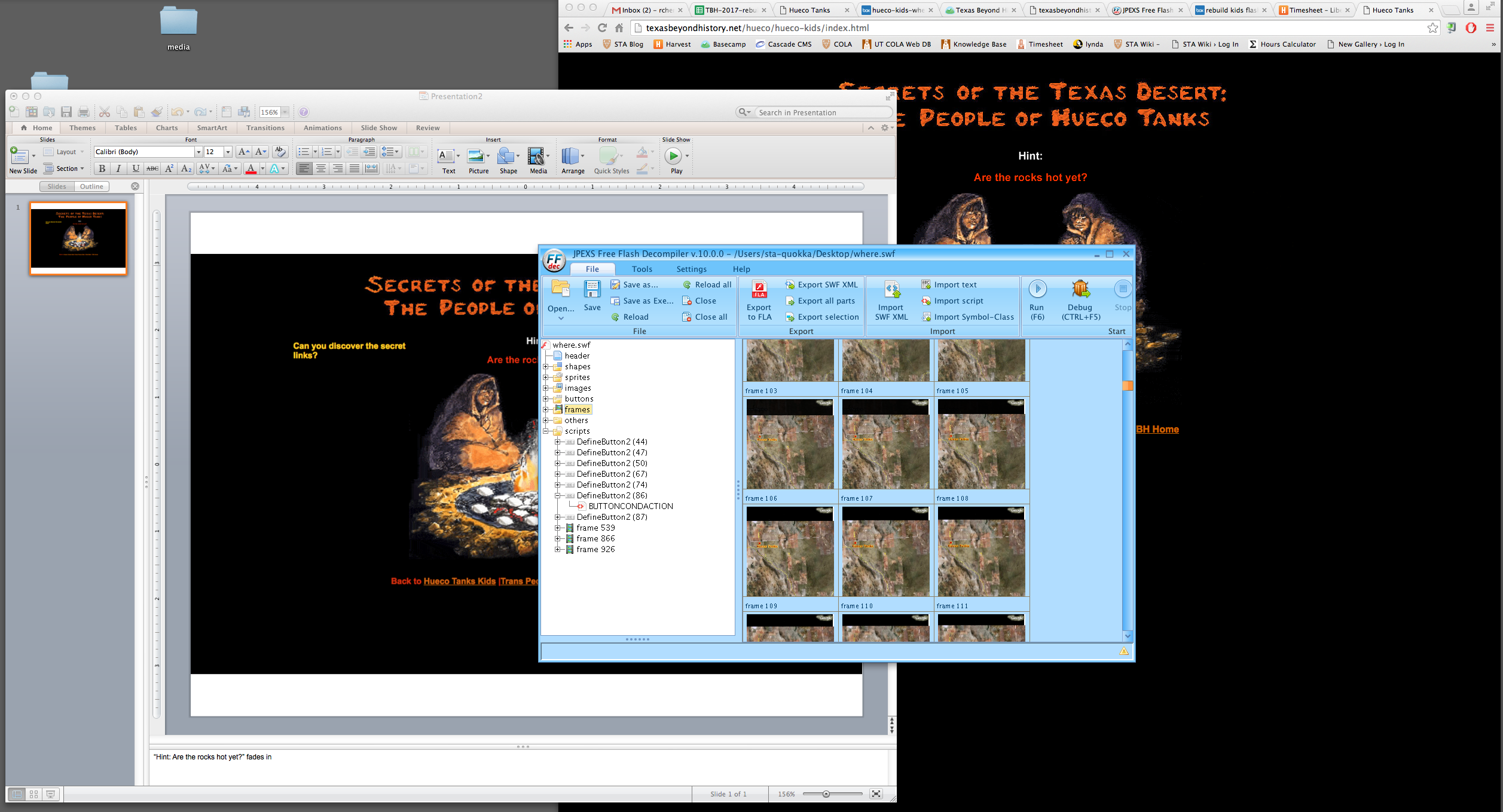
Decompiling flash programs, and drawing up mock ups for potential interface for tablet use.
Searched the elements on the web page to find a swf file.
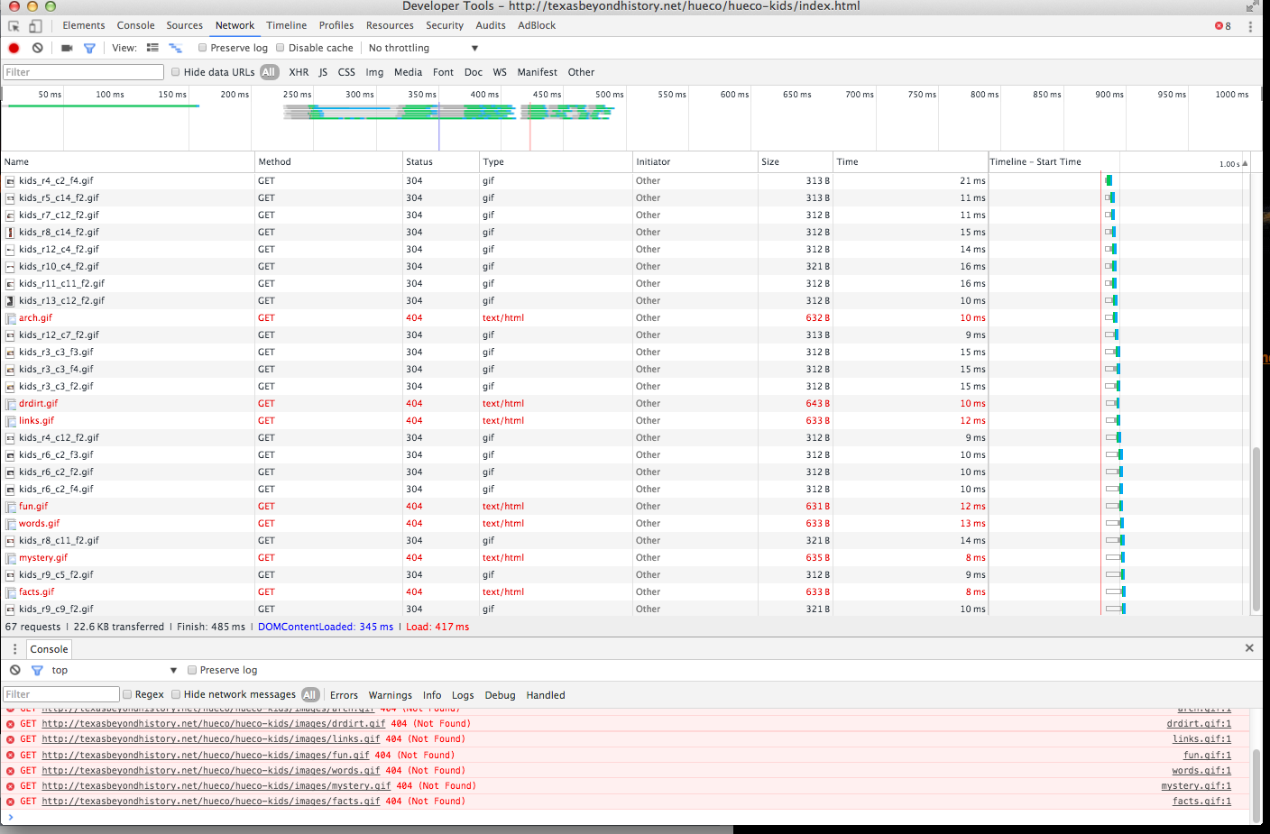
Decompiled the swf file in JPEX to see if there were any missing images
Changed the original interface of the index page to compensate for no hover
Original:
Mock Up