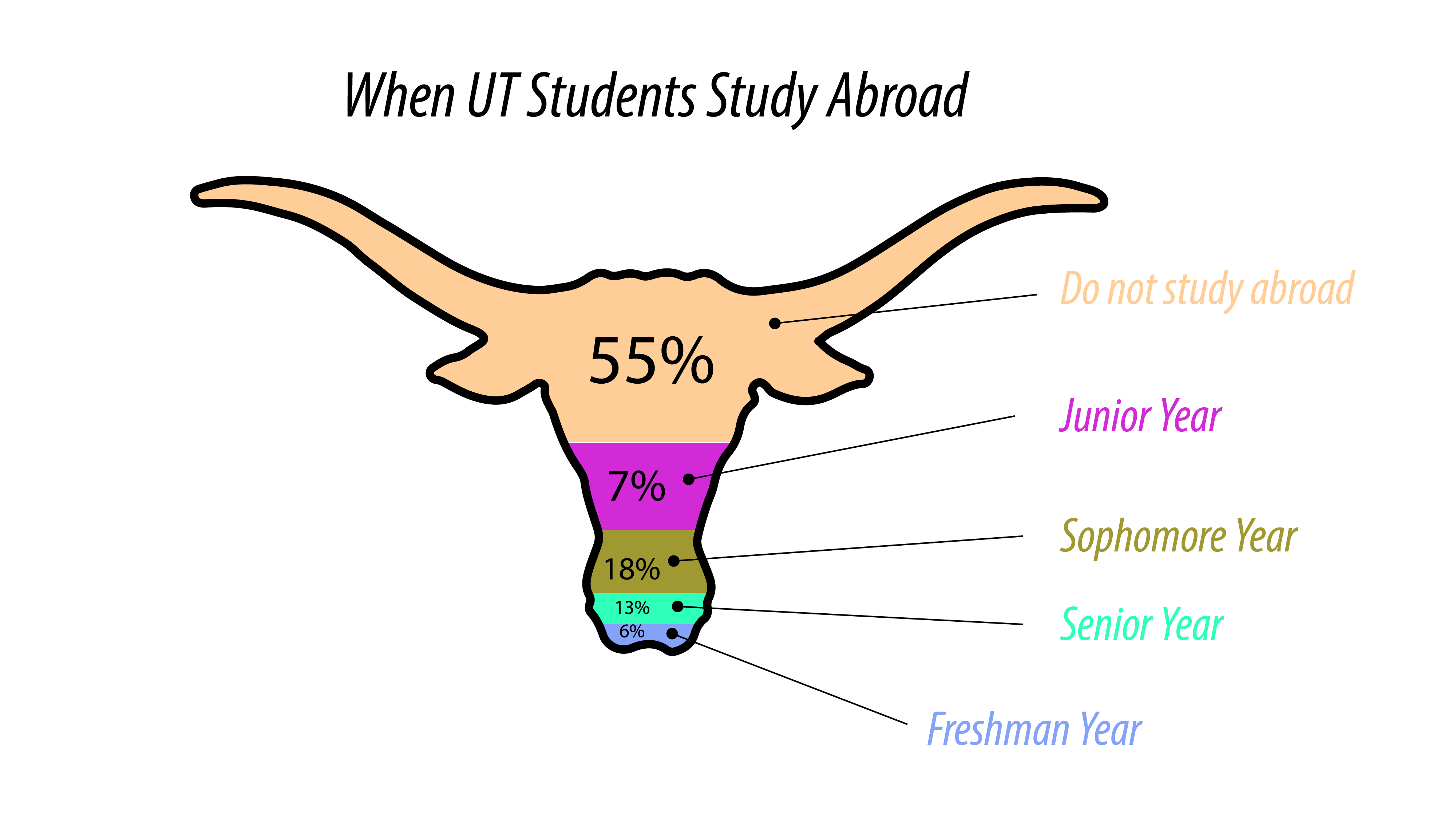
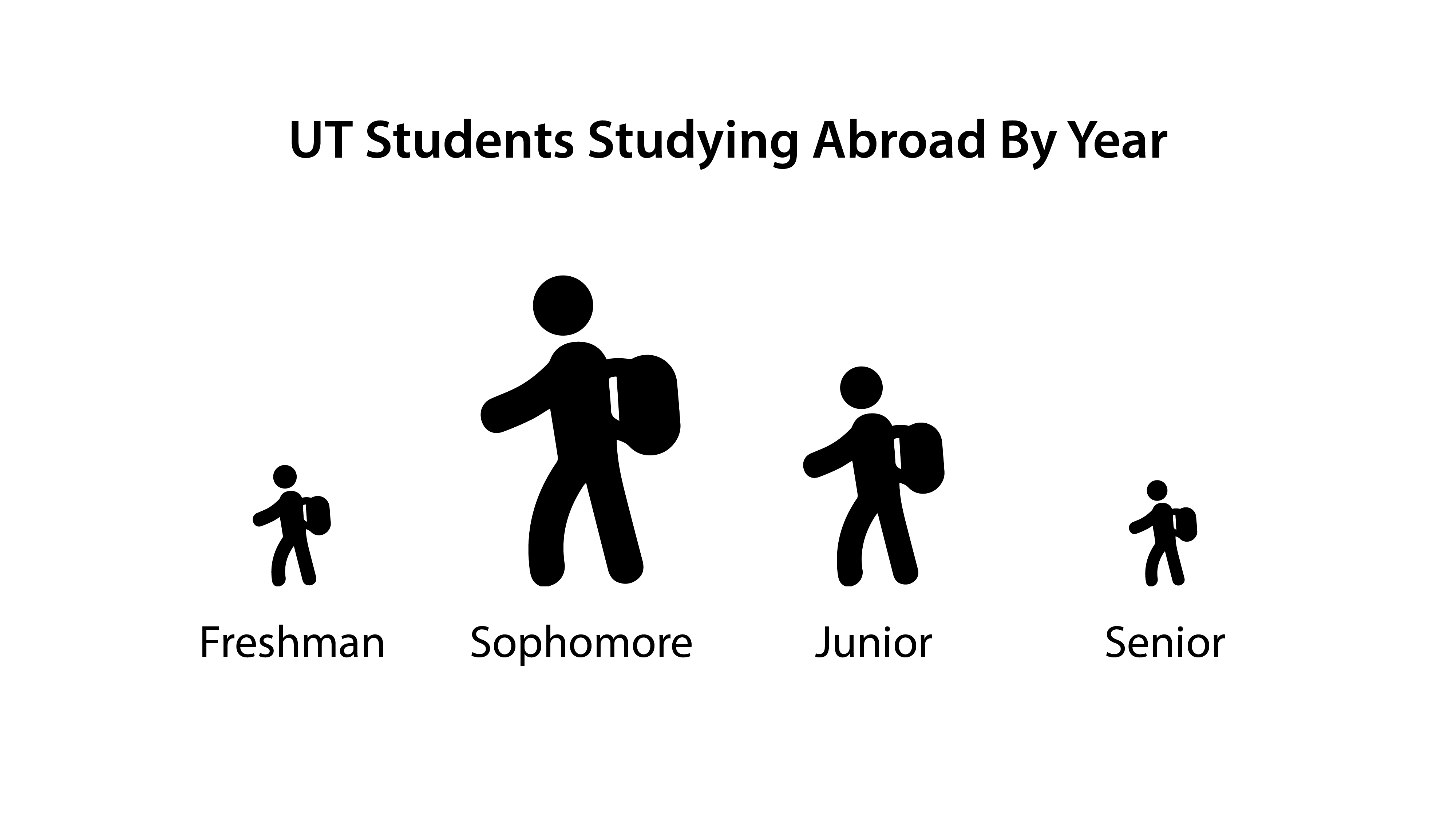
This is what I have so far based on the instructions given. I’m wondering if I should include percentages in the good example? As it stands, you can make some relative observations about the data presented, e.g. more students study abroad as sophomores than seniors so the good example doesn’t need percentages…but it might confuse students if they’re presented with these two graphs that are based on different data sets that look like they express the same message.
Another solution might be to use the same data set for both examples, so students can see how the same info can be represented in hugely different ways.