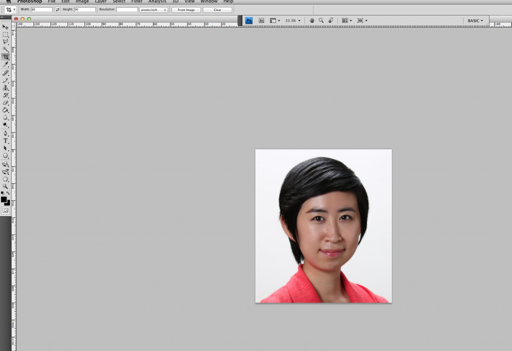
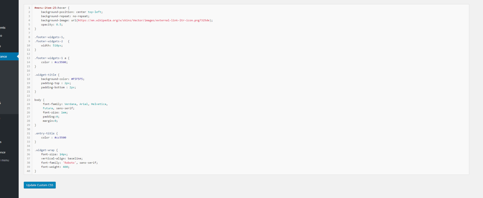
Today I worked on updating a few more COLA ID pictures, including cropping, resizing, and a bit of color correction. I learned a little on how to use the shadow/highlight adjusters in photoshop and will probably get to use those more in the future!
First Project
TBH Population Puzzler Redesign
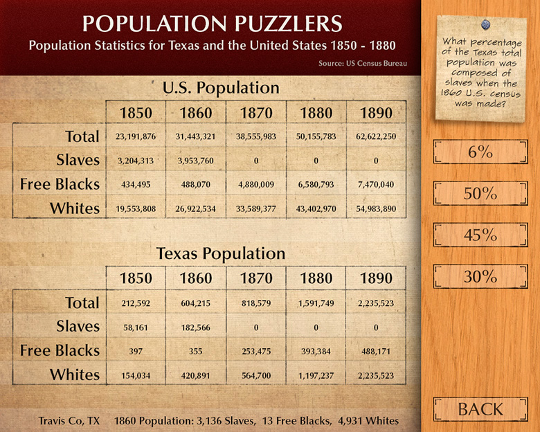
Earlier in the summer I began the process of redesigning several important kids interactives on the Texas Beyond History site. The first of these was the Population Puzzlers interactive. Today I spent some time making minor adjustments to some visual assets, as well as going through and making the relevant buttons and graphics for each possible question and answer choice.
Introducing German Project
I’ve been editing files in the intro German site. I have completed about 3 hours of work, and 3 more hours remain until I can complete my part. My work is mainly reformatting the forum files to be uploaded again for the website. The forum is written in both English and German and includes lesson plans and teaching reflections.
Completion of Orientation
Today, I completed orientation activities including banner design.
PRC Brown Bag Flyer
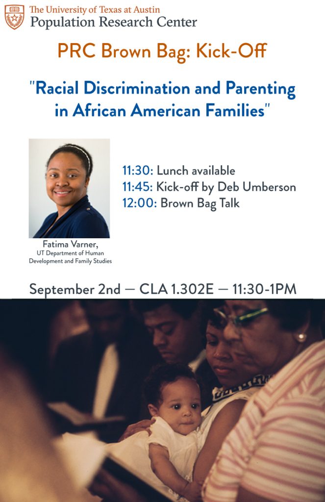
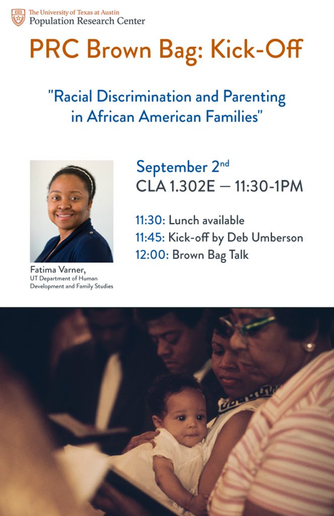
Mock-up 1 for the PRC Brown Bag flyers, which displayed the relevant picture I was using, the basic layout and text.
The client then narrowed down the choices and wanted to continue work with the third.
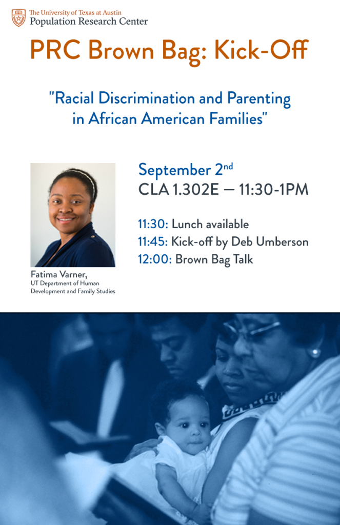
Photo is color corrected, introducing more cyan and blue to offset the orange.
Finalizing the layout with two options for warmth/tone of the flyer. The blue also corresponded with the PRC’s main color scheme, so the client ultimately printed the blue.
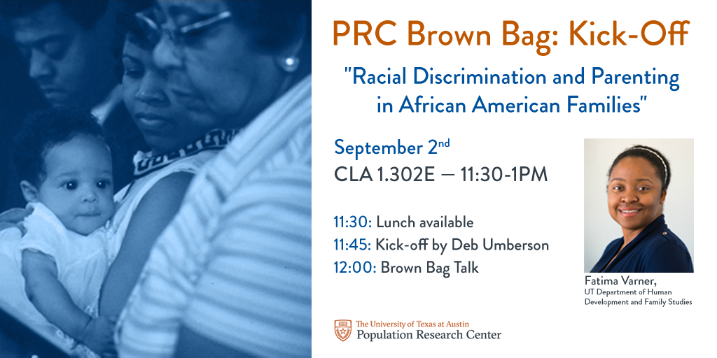
An unused graphic mockup relaying the same information.
An edited version of the layout with less information for a second PRC talk. This layout template will be used for future events.
- « Previous Page
- 1
- …
- 77
- 78
- 79
- 80
- 81
- …
- 92
- Next Page »
