https://cms.la.utexas.edu/entity/open.act?id=aa2ff206ac1148aa6d2e151b16cba224&type=page
By Bridget
Each STA was assigned the task to create a personal cascade site with a theme. This past week I completed my own site and the necessary cascade tutorials. My site is themed after my dog Leo because my family and I think he’d make a great cartoon superhero. We were tasked to create three news articles and two events for our page as well as create a banner, embed links, videos and include faculty and contact information pages on our site. This assignment really helped me learn the process of building out a cascade site for clients and it was fun to put my own spin on the project.
My recent work on V-labs focuses on “last looks” of the site and interactives. This includes following a checklist to insure HTML content, grammer, and interactives are correct and match up with the Flash site. As I begin working on a new section, I open both the Grav site and the Flash site to compare while keeping in mind the style guides created for our Canvasser interactives.
Checklist –
As you perform your LAST LOOKS, assignments, COMPARE the FLASH pages with the GRAV pages, while using the checklist below.
1. For content accuracy: -We want to ensure that the Anthropology students have all that they need per lab, per-section, so that they can study and learn the complete and accurate information they need to pass their exams.
2. Interactives though the lens of pedagogy (SORT OF!)
“how knowledge and skills are imparted in an educational context, and it considers the interactions that take place during learning”
*** Make sure that the redesigned interactives have enough content to be able to stand stand alone, and deliver the lesson the students need to learn. Interactives should not to depend on the html page text content to make sense.
3. For consistent visual style: We want to ensure that Anthropology students have a consistent experience as far a visual and conventions go, from page to page, from interactive to interactive.
…………………………………………..
LAST LOOKS CHECK LIST
CONTENT CHECK – IS IT ALL THERE?
1. All of the Content needs to be in the section HTML TEXT VIDEOS INTERACTIVES
HTML TEXT – COPY EDITOR
2. all of the HTML text has to be correct – ex: words like “Click Here” need to be edited out of the HTML – spelling needs to be corrected -if words runtogetherw/ospacing , correct the spacing -if words need to be bolded, bold them
CONTENT FLOW
3. All of the content needs to flow and be laid out as best as possible – “group” text & other content from separate cards into one card if it helps content flow better
& indent sub headings as needed to show sub-content in the flow of one card. – Center video as needed, or if it’s a list of videos right align?
DOES IT ALL MAKE SENSE?
INTERACTIVES & HTML
3a. All of the Interactives need to be sensibly laid out and pair sensibly with the HTML text, but not depend on the html text.
3b. This step is mostly necessary for the older Interactives & the ones that are not “teal”: Is there enough context (text and images) in the interactive for the interactive to make sense? if the text was edited & re-worded does the resulting text support the content of the interactive? ** It is ok if there is some redundancy btwn the interactive ontent & HTML content.
3c. When you see that visual conventions are not following the style guide for Interactives make a note on basecamp and on the spread sheet. ***ALSO let us know that this needs to be re-worked for the content in the interactive to make sense for the student trying to learn the points. – ____________________________________________
(TEAL DEAL)
4. Valerie will keep track of the teal replacement Interactives on the spread sheet and will make corresponding new to-dos on bc for these.
A part from checking that all content is present, the flow of the page must read well and display a consistent layout to other pages of the site. Content flow has been my biggest challenge during last looks as we are deciding the “standards” for these pages as we go. Most of my work involved repositioning and formatting the HTML content and images in the Grav site in order to improve page layout. I also spend a decent amount of time labeling images!
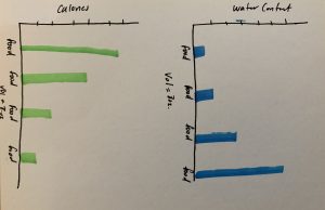
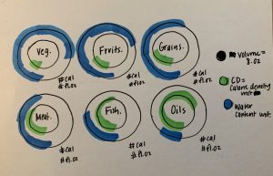
Yesterday and today I have been working on fixing 4 different PSD files that were duplicates. Maddy had done 1 of them and it had 3 different popups within in. Mine was one interactive with 1 popup and 2 popups separated out into still images. I forgot to take before pictures (darn!) but here is what I came up with. I tried my best to edit within what Maddy and had put together and what I had. New elements are keys in the still images, recoloring of the bars, lightening up of the graph lines, reformatting text style, and redoing the popups to fit within the style guide. Currently the STAs are waiting on some confirmation for uniformed styling on the Hypothesis and Quizzes, but hopefully I get to help out more in fixing duplicates.
Well, this is not quite related to my work as an STA, but I got the opportunity to check out the Dior: From Paris to the World exhibit in Dallas last week at the Dallas Museum of Art and I felt like sharing!
https://www.dma.org/dior#field_programs
I was too in awe to take very many pictures but I snapped a couple quick ones with my phone to give an idea of the grandeur of this exhibit.
Upon entry, I saw a wall of cotton muslin prototypes used to test designs of famous Dior pieces. None are meant for sale but a really beautiful representation of the prototyping process. The opposing wall featured original sketches of these featured designs.
Another room showcased memorable pieces from each Design lead at Dior. I was especially drawn to Yves Saint Laurent’s sketches and design boards. It was fascinating to view the style transitions of different decades and designers.
Another room featured all floral designs highlighting the intricate embroidery work in Dior designs. I loved the Exhibit space and ambiance of this section, wish I had captured better pictures of it!
The final room featured Dior’s international designs, taking inspiration from each location of his headquarters. It also featured a Hollywood wall with gowns worn by the rich and famous. Gowns like Jennifer Lawrences white Oscar dress and Marilyn Monroe’s low-backed black number were featured.
The past few weeks I was given the opportunity to take a break from Vlabs and learn something new! I worked with Chris Pittman to learn Vue.js and create a Vue component for UT Instapoll grading options… with a lot of help from Chris.
Vue is a progressive framework of javascript built for creating user interfaces, or as Chris called it, the “hipster” competitor of React.js. Vue allows programmers to create “components” (in our case, forms) which can be dropped anywhere into the site instead of recoding the component each time it’s needed.
To gain a better understanding of Vue.js check out the “Learn” section on their site: https://vuejs.org/v2/guide/index.html
Here are some screen shots of my less than successful attempt to create this component. Thankfully Chris and I ended up walking through the full process together to accomplish this task. Still these shots provide an example of our final component’s appearance and function.
It was difficult for me to dive back into javascript after not writing in it for a year or so, but I really enjoyed the experience and am excited to dive into more coding and UX projects with Chris this fall!
This week every STA was assigned the task of creating an 8-bit GIF sized 80X80 pixels. This was my first time making a GIF and it was a lot harder than I anticipated. Working pixel by pixel is something I’m used to with CSS but not when creating my own artwork. I’m inspired to create more GIFs in the future and now consider going back to this original attempt and cleaning it up a bit!
Oh, this is a dog because I love them. They’re better than humans sometimes.. most of the time
By Bridget
Not much is new, except I’m still working on the Knowledge Base table of contents, vlabs, and also a new project updating some pages for the LAITS site (they aren’t published yet so I can’t post anything for that yet). Some other STAs have been making suggestions for things to add to the KB, so Ive been adding those, plus my own pages. I also did this assignment where I made a little 80 x 80 gif, which was really fun (I’ve never made one before). Here’s what I made:
And here’s an interactive I made recently with a fade animation:
More interactives…