I was placed on a project with my co-worker, Chloe, that required the two of us to work together to reformat the content of the online French 317C course for Professor Kyle’s Carnegie Mellon presentation. We were tasked to go into the CSS/HTML to change the way the specific CLIO pages looked and how it was organized. This included making the text wrap around art and photos, going into the HTML to organize the grammar/word rows and columns, making full color headers for page headings, and using header style text for the card or page headings.
We were first told to go into the course and scroll down to:
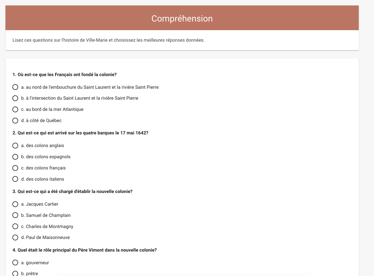
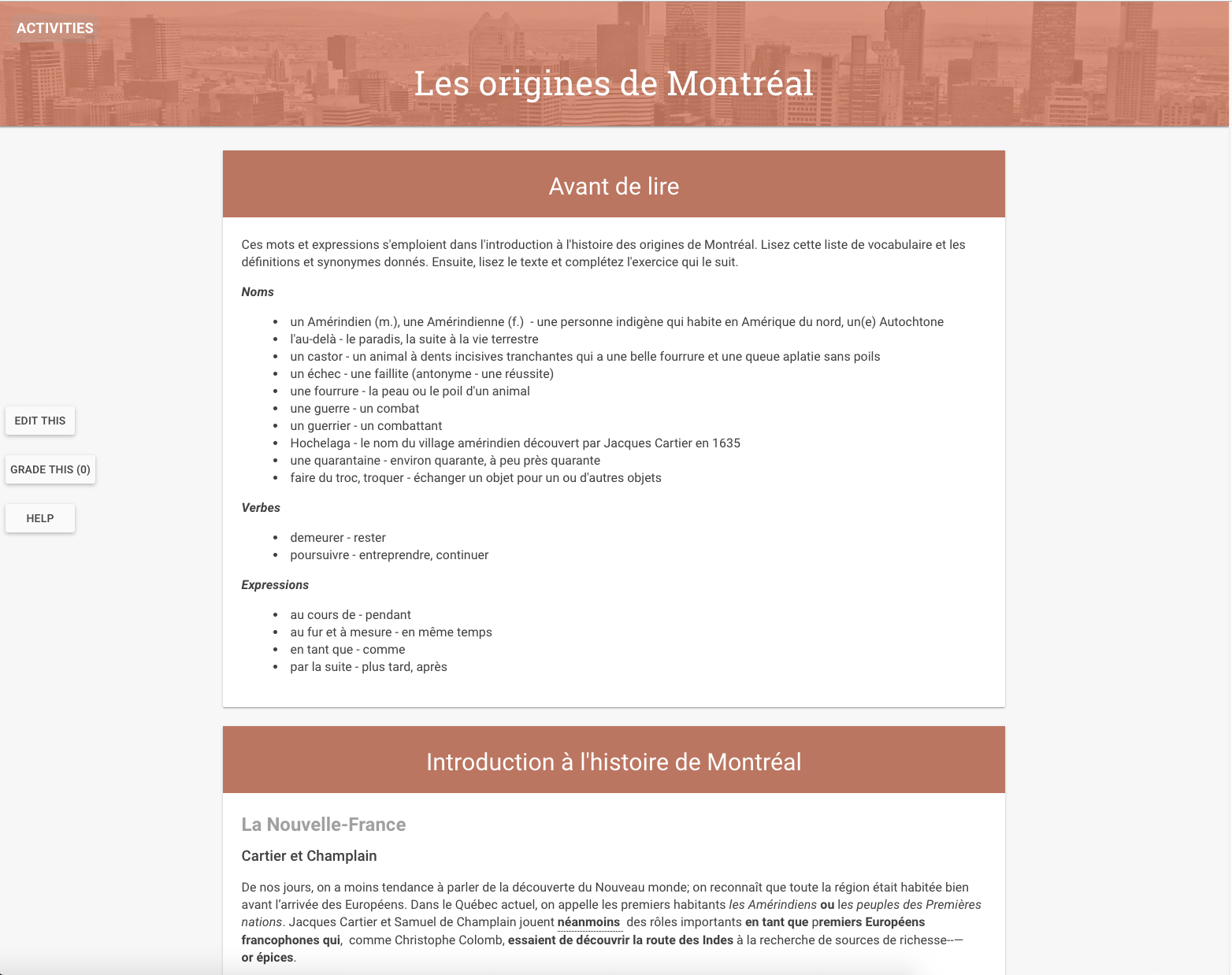
“Sujet 3.1.A Les origines de Montréal à Initiation à l’histoire de Montréal à the texts are on Clio pages entitled Les origines de Montréal and De Français à Canadiens.”
and
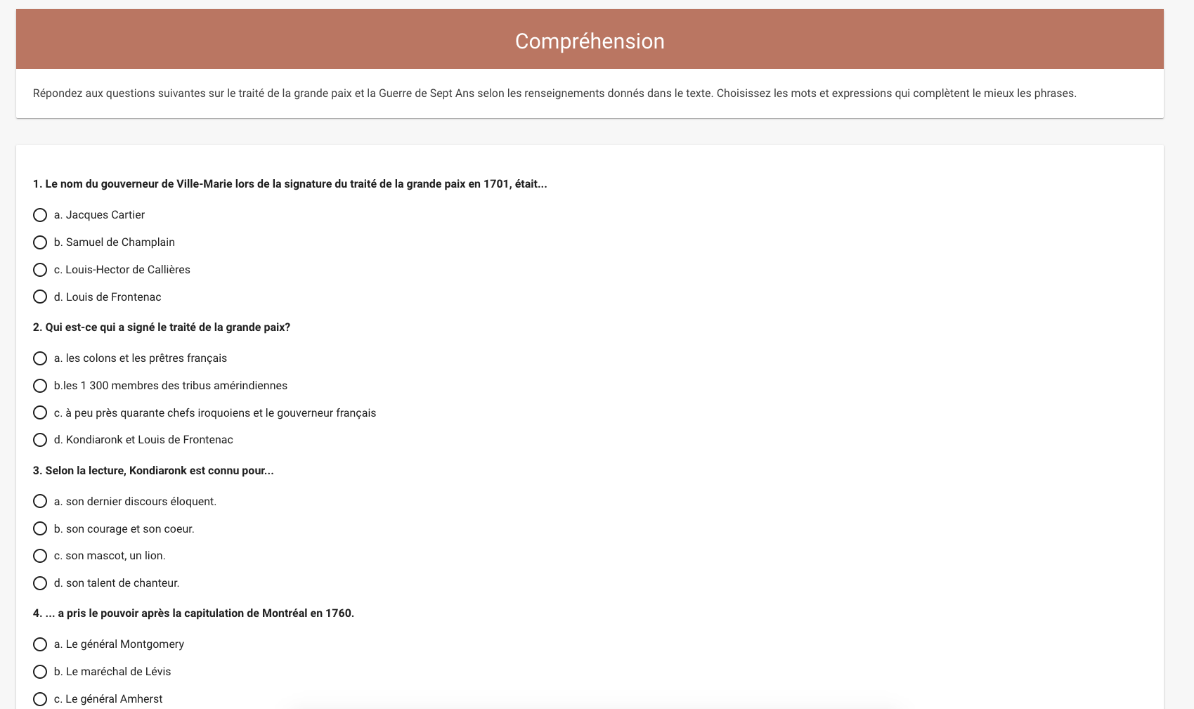
“Sujet 3.1.A Les origines de Montréal à Exploration culturelle à Voix des ancêtres à Les historiens nous parlent à the texts are on Clio pages entitled Lecture: Colonisation and Lecture: Grande Paix et grande guerre.”
Chloe and I split up the work to better streamline the process. Chloe took on the “Sujet 3.1.A Les origines de Montréal à Initiation à l’histoire de Montréal à the texts are on Clio pages entitled Les origines de Montréal and De Français à Canadiens.” section and I took on the “Sujet 3.1.A Les origines de Montréal à Exploration culturelle à Voix des ancêtres à Les historiens nous parlent à the texts are on Clio pages entitled Lecture: Colonisation and Lecture: Grande Paix et grande guerre“.
Below are screenshots of Chloe’s edits:
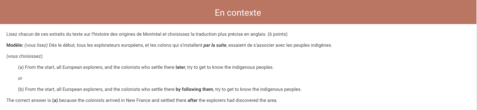
Chloe’s edits in her section included:
- Middle aligning the images & integrating the slide show photo tab
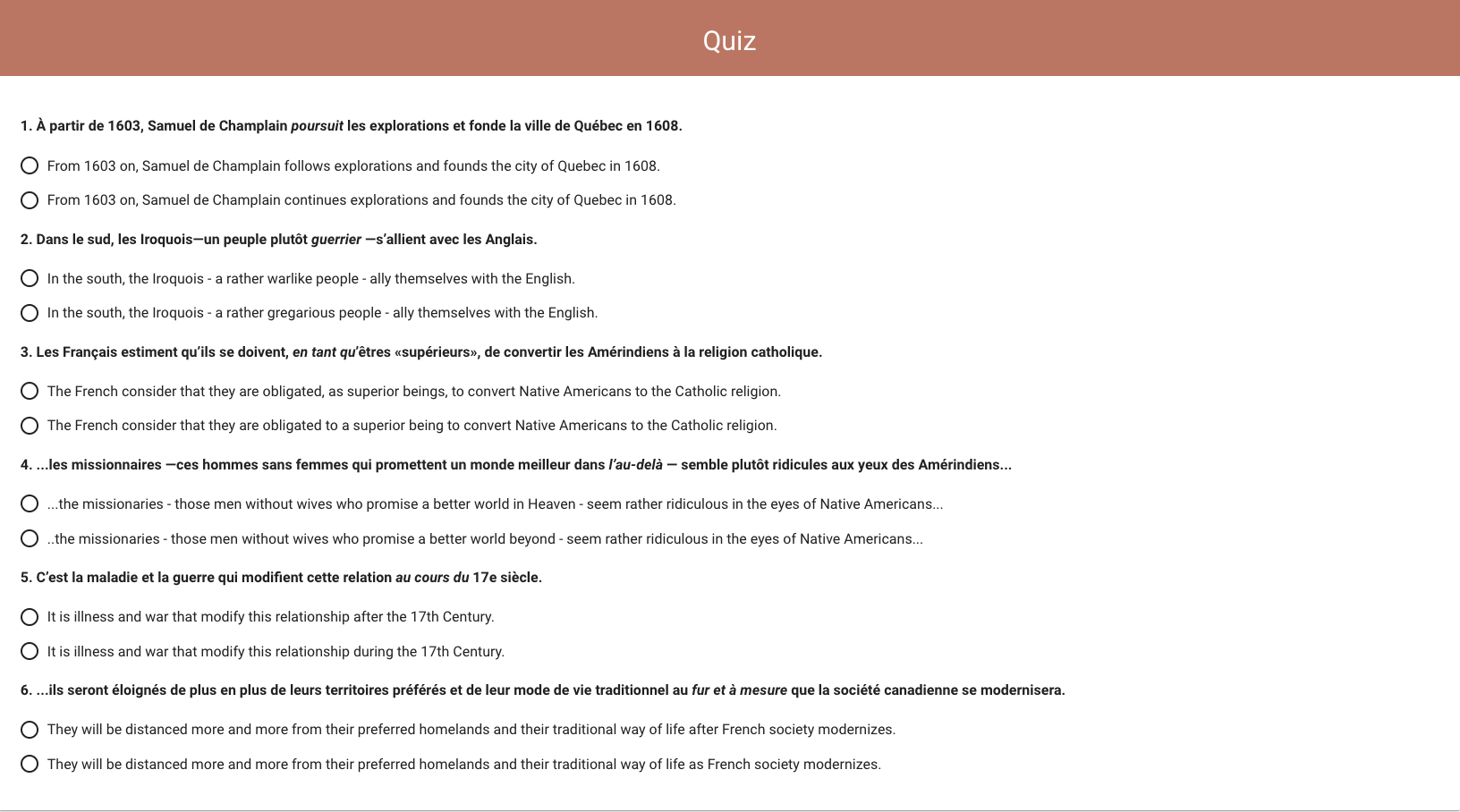
- Adding a header for both “En Contexte” and added a brand new tab called “Quiz” at the very end.
- Indented the options (a) and (b) in the section “En contexte” for better readability
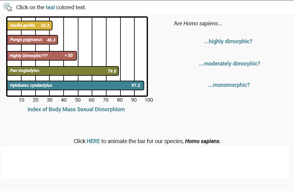
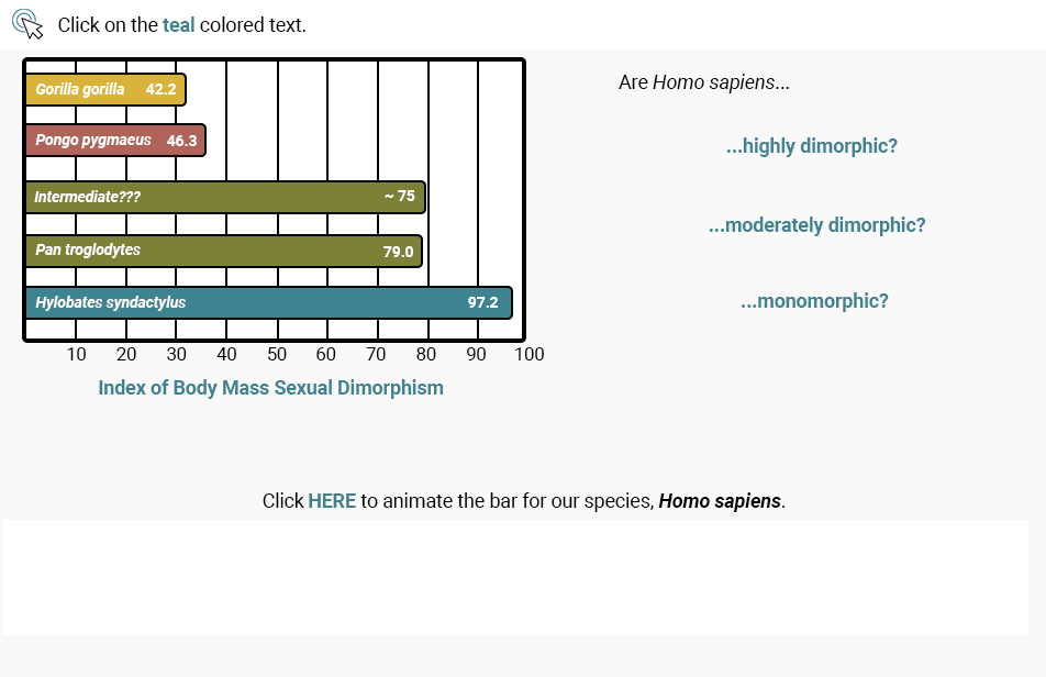
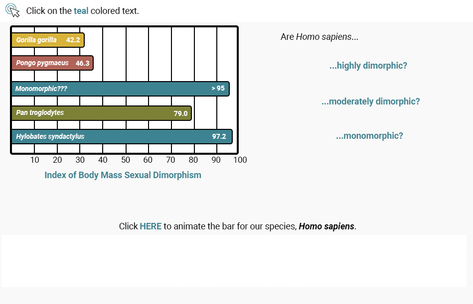
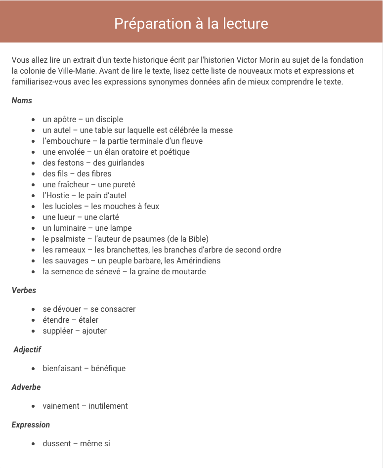
Below are screenshots of my edits:

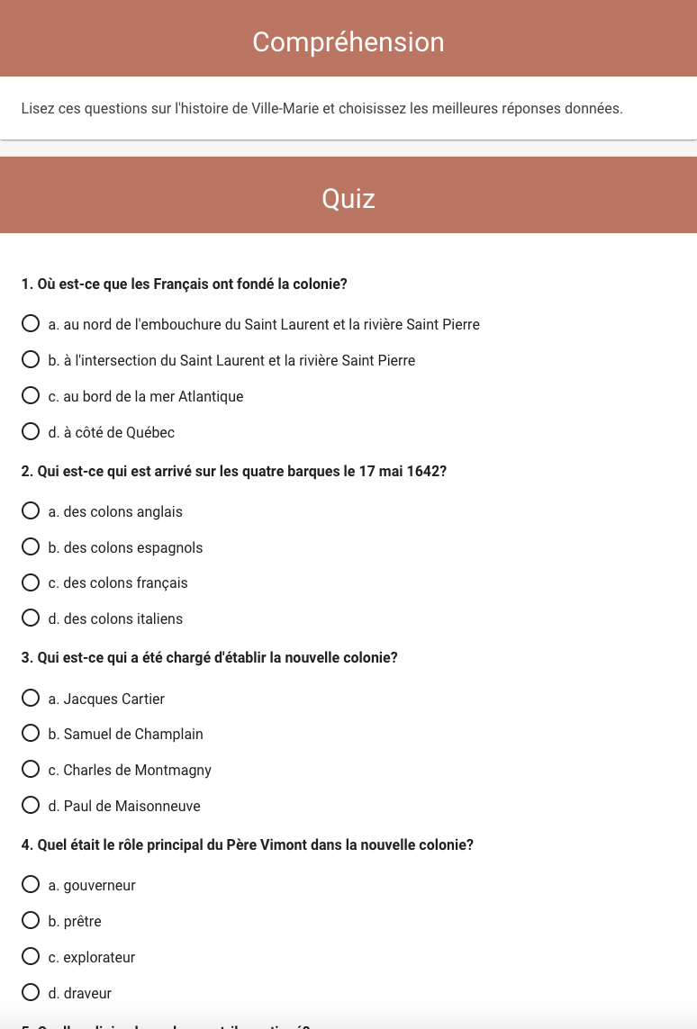
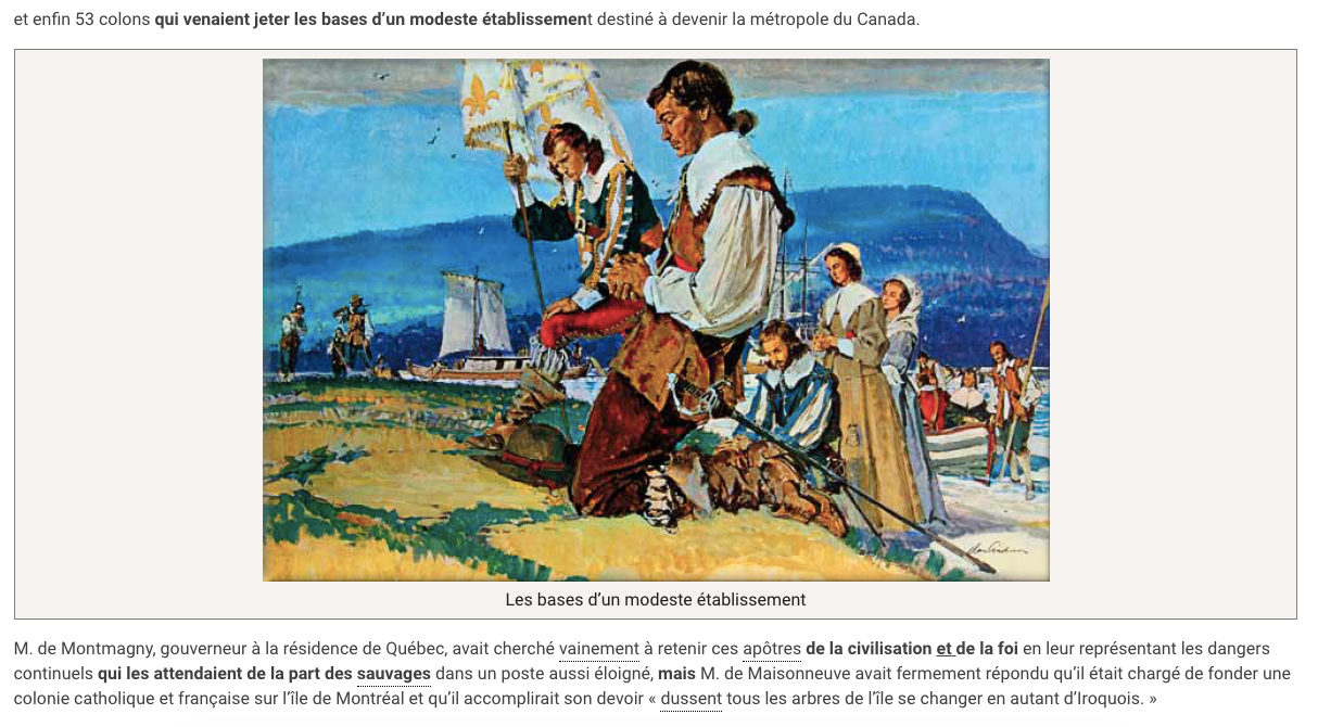
There was feedback given to us by Heather which included adding a caption to an image that didn’t have one, editing and omitting some headers, and, added in more slideshows.
Below are screenshots of the final edits!
Here are some screenshots of the banner and header edits!
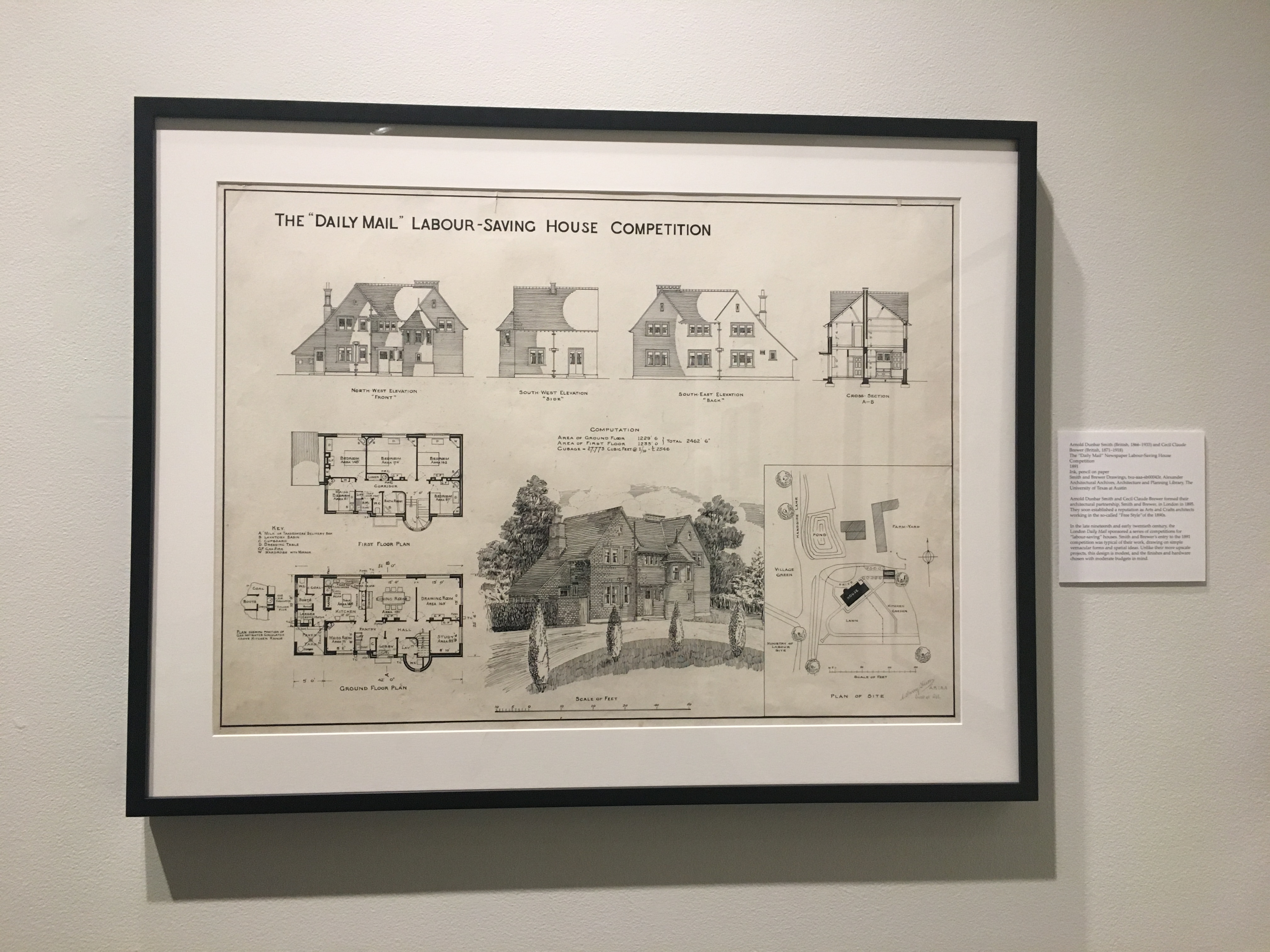
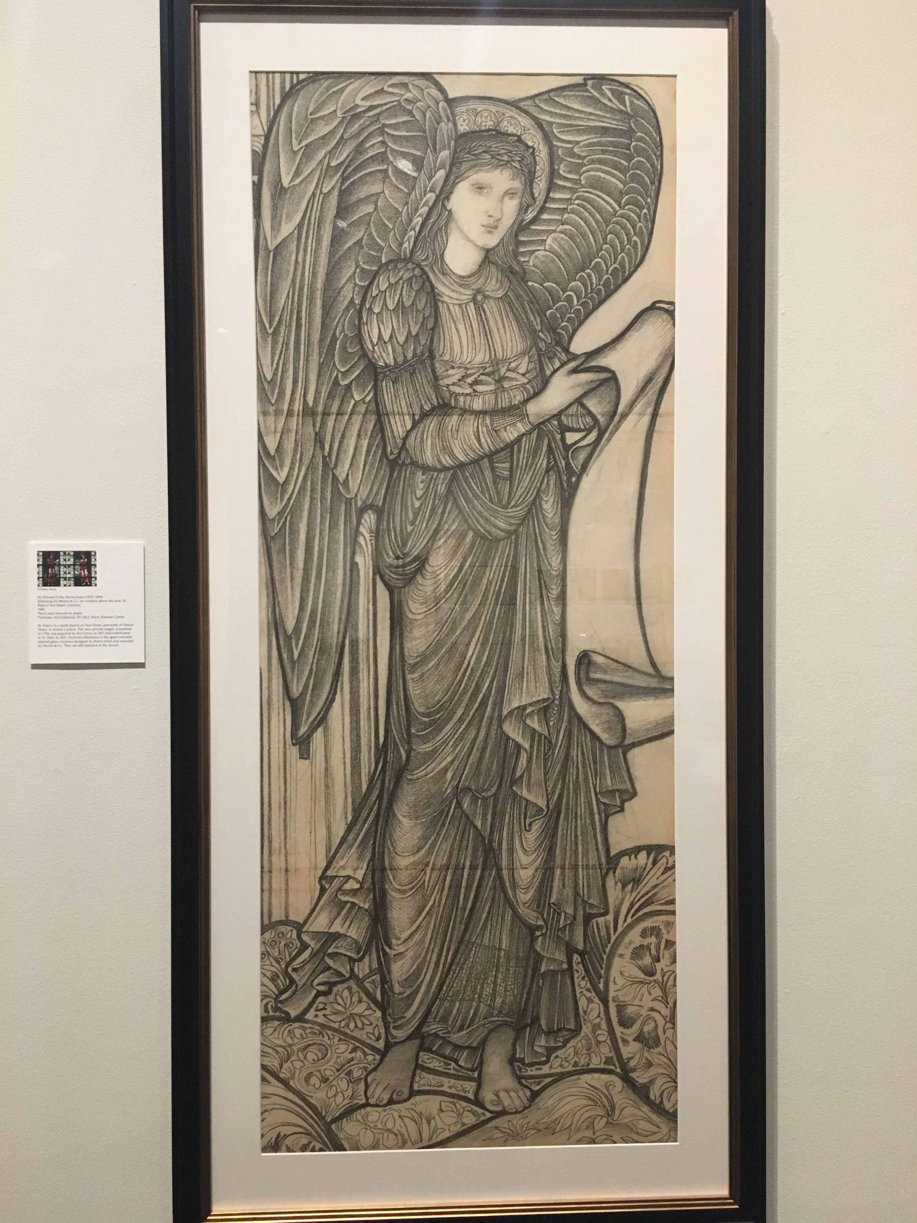
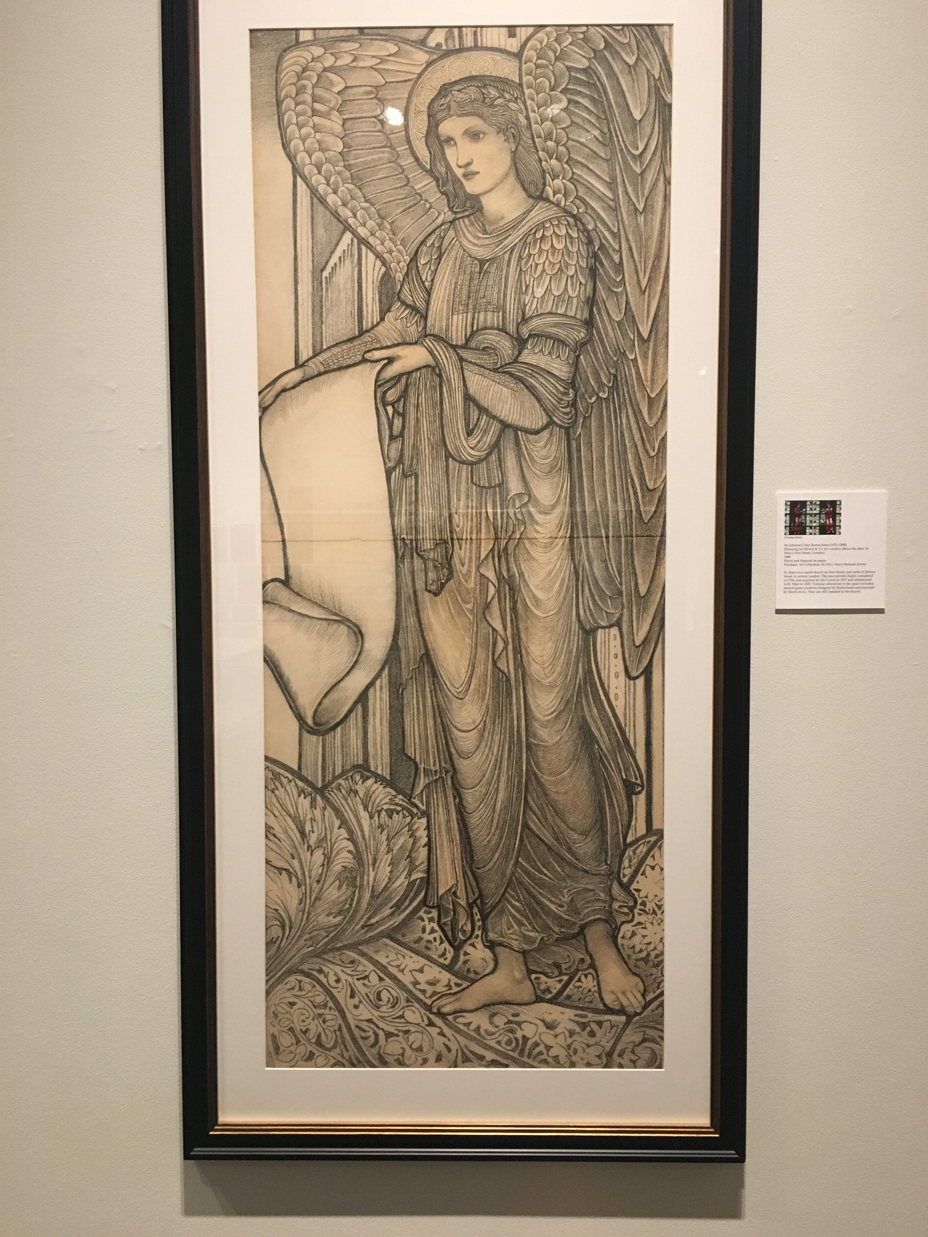
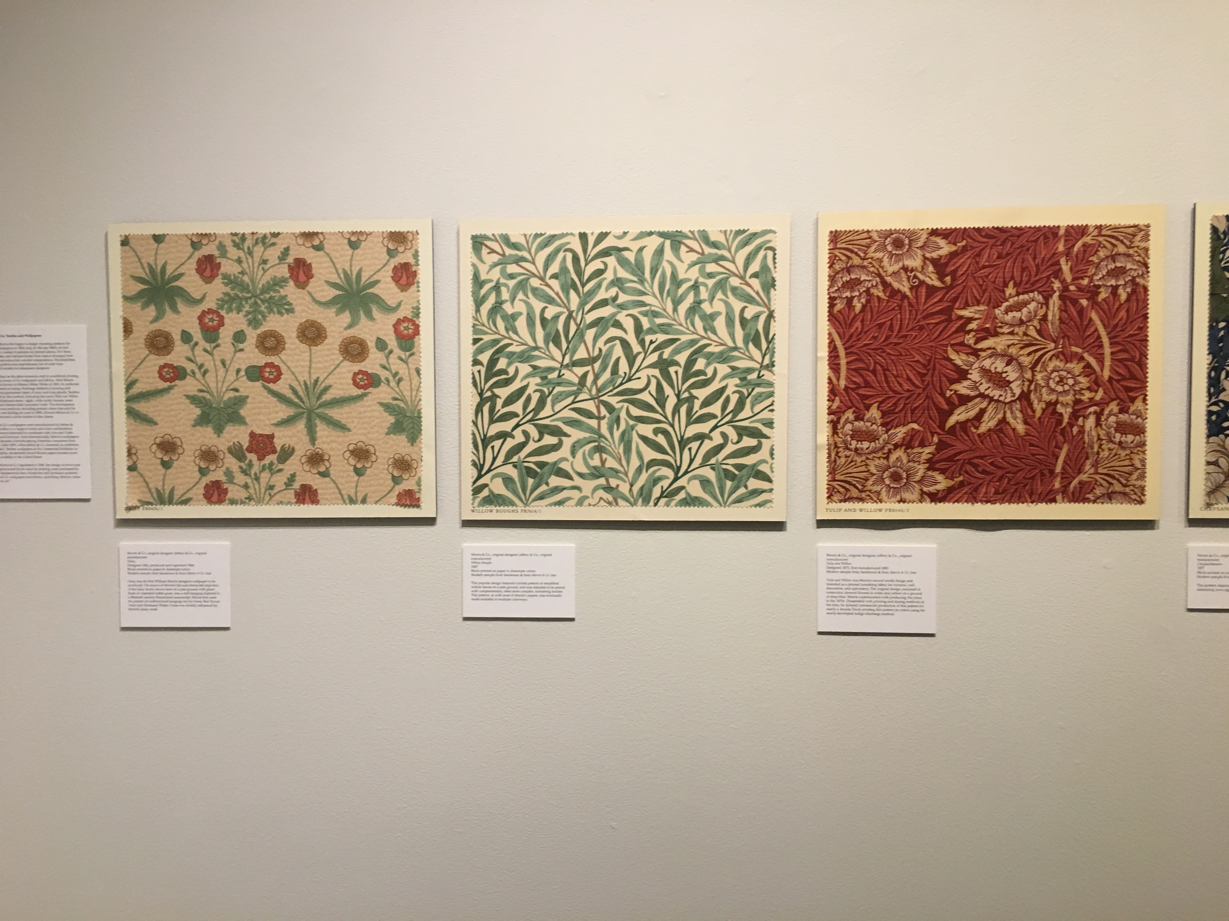
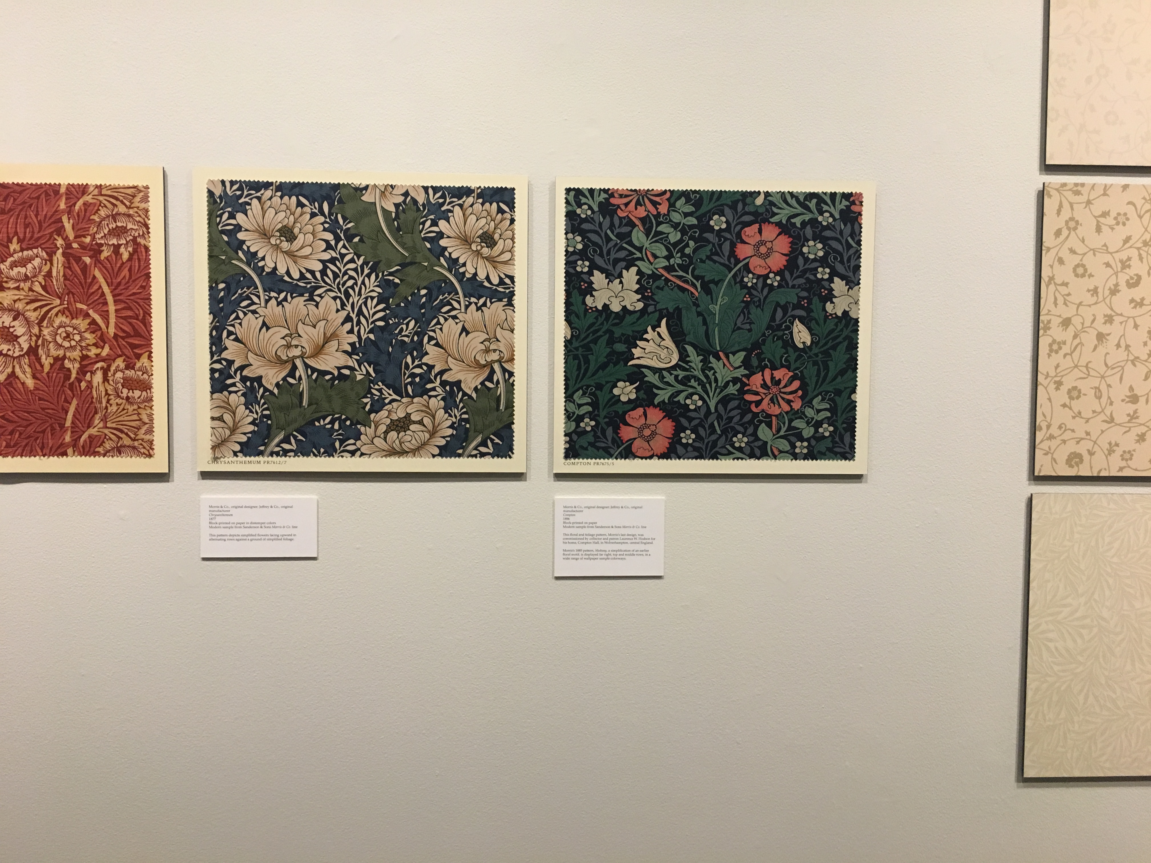
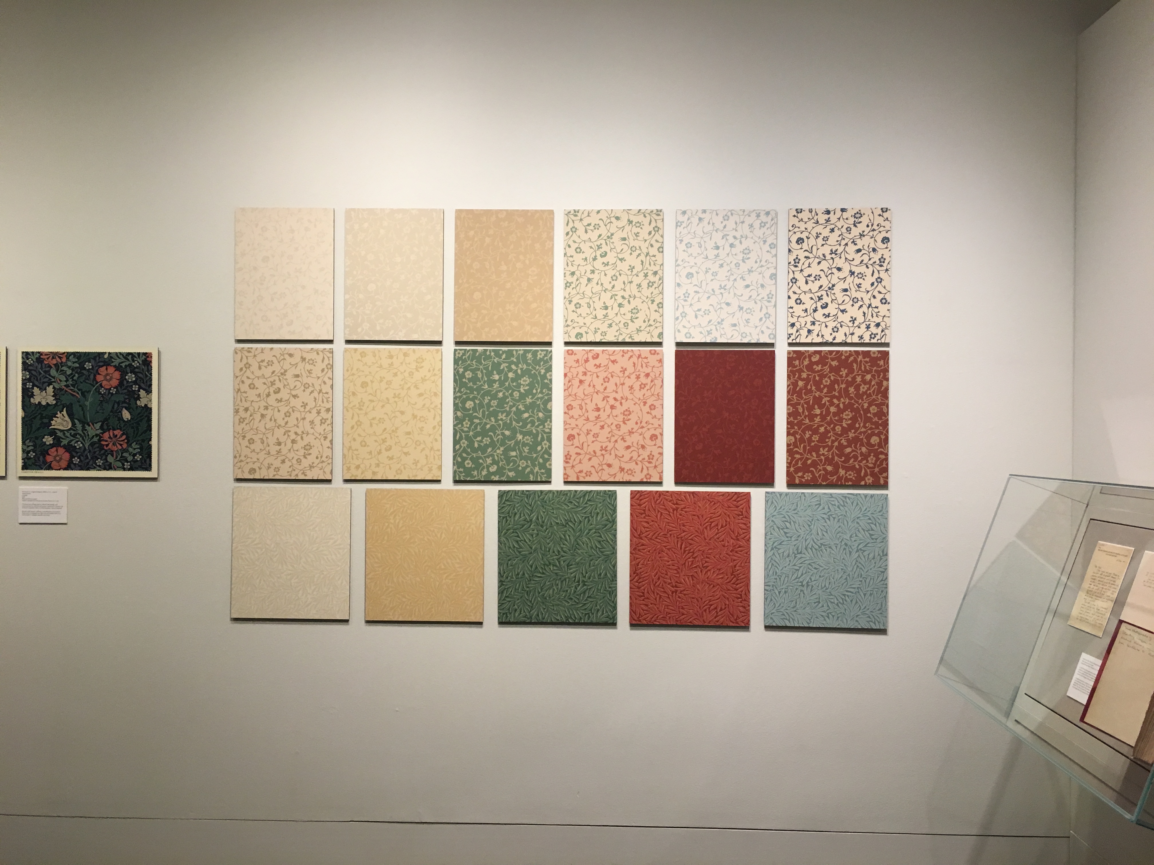
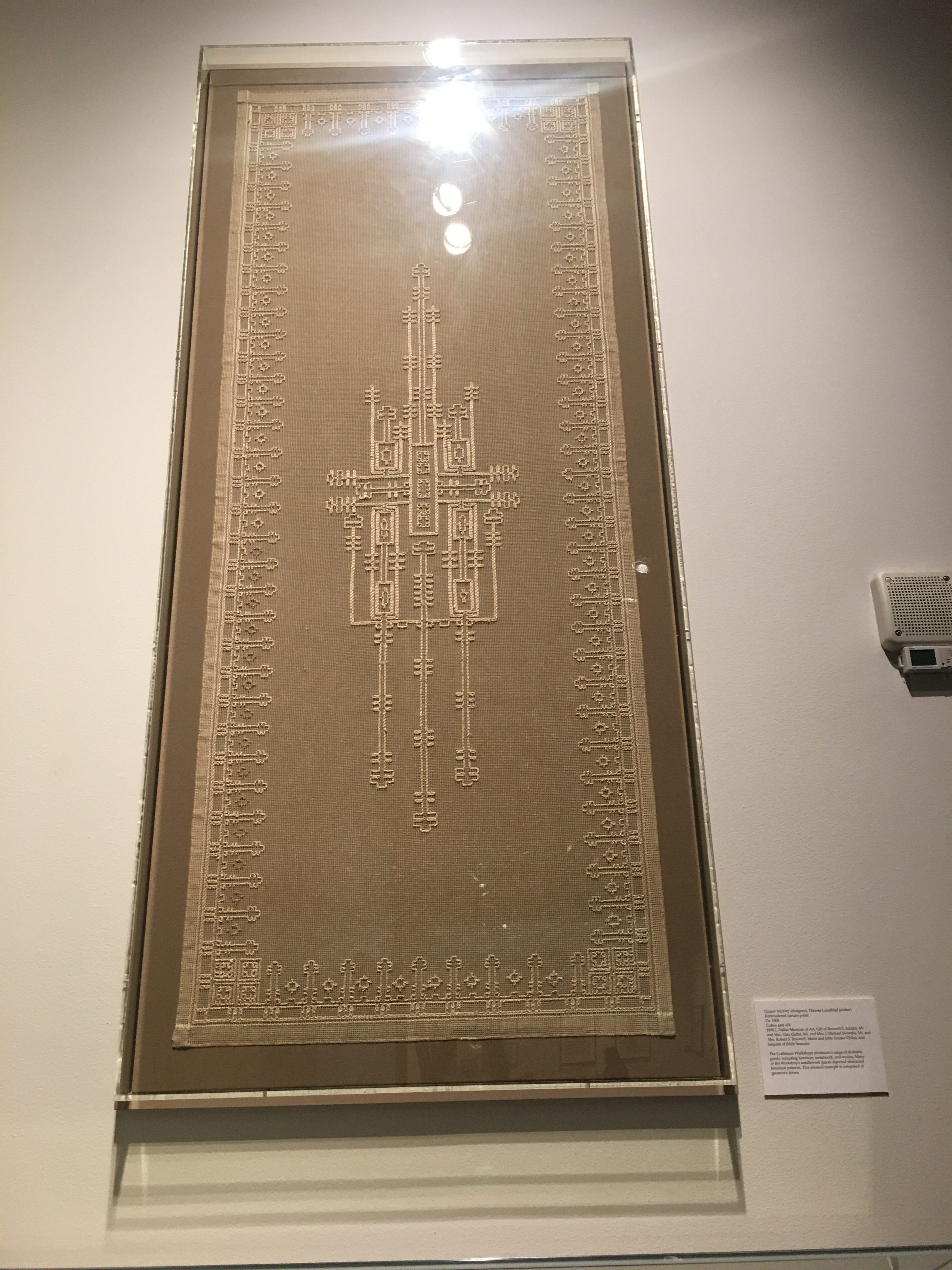 The next piece that caught my attention was this embroidered curtain panel by Gustav Stickley. The background behind this curtain panel was intriguing. His design exudes the aesthetic of traditionally made embroidery and craft. It seemed that this was something he valued in the works he created. However, this piece also provides a window into the popularity and necessity for mass production. I like to think that he and other designers during this time period, were creating a balancing act of authenticity and supplying increasing demands. This is something that has led to the way consumerism works in today’s society. Consumers want something that is pleasing to the eye that is traditionally done without machines, but the demand necessitates mass production. It’s an interesting parallel that has persisted through many, many years.
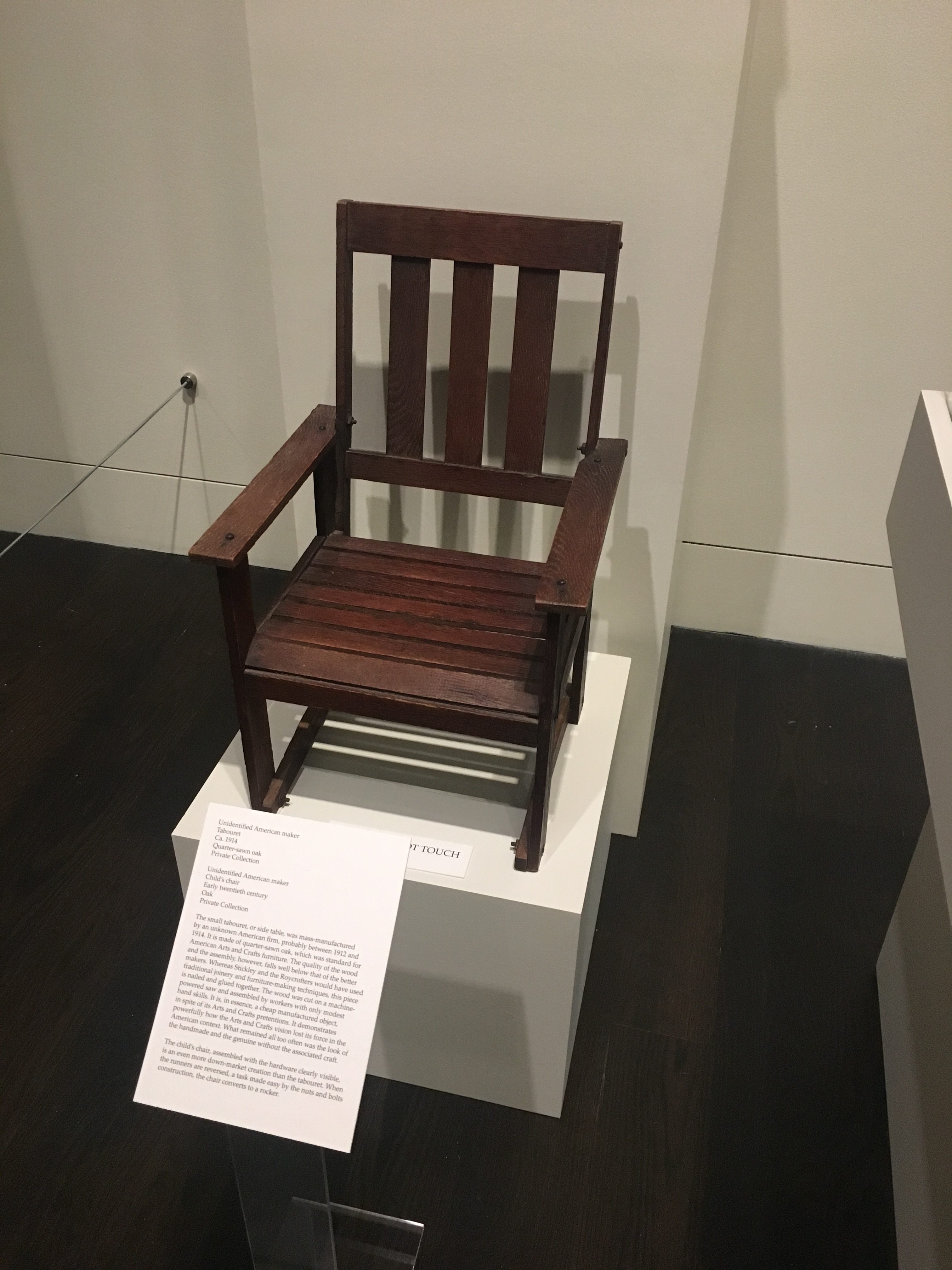 This chair also mimicked hand-crafts but was produced on a large scale. I think these pieces are very telling of what Americans valued. It reminds me of how certain luxuries were only accessible by the rich and privileged, and how over the course of time, it became something that the middle class aspired to. They wanted the look of the bourgeoisie without spending bourgeoisie prices.
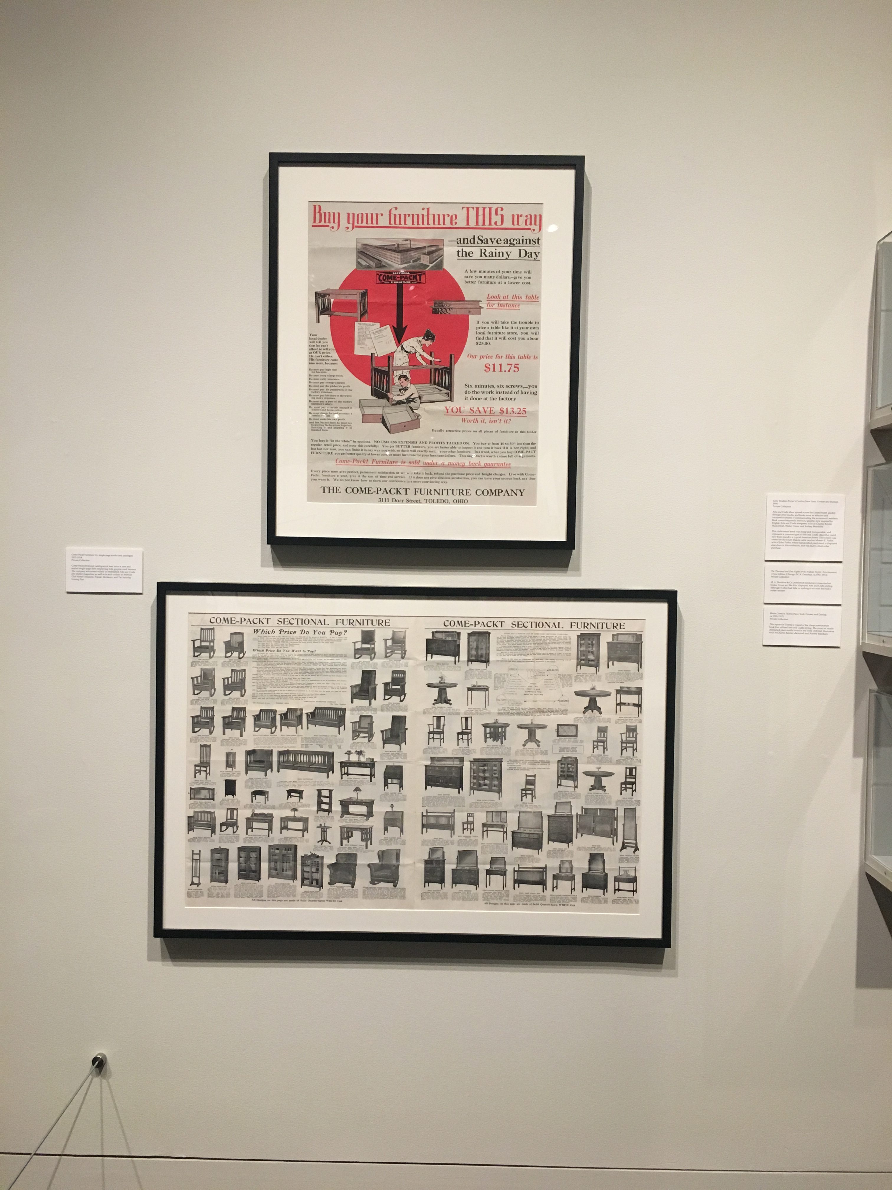 I really enjoyed this piece because it just reminds me of IKEA. I think that this is really indicative of the changing times. Furniture stores are learning to accommodate and adapt to the growing middle class and learning about what consumers want.