
BASS print brochure mockup without Information Sessions text. Photos are enlarged and rearranged on the ‘front’ of the flyer to fill space.
BASS print brochure mockup without Information Sessions text. Photos are enlarged and rearranged on the ‘front’ of the flyer to fill space.
A series of 7 videos about Effective Thinking by Dr. Starbird that require background graphics. I watched the videos for their general main ideas and found generic stock backgrounds to define what graphic needs to be illustrated for the final product.
I proposed the idea of using the entire pentagon for every video, with the relevant triangle highlighted.

About the depth of the mind and mindful thinking.
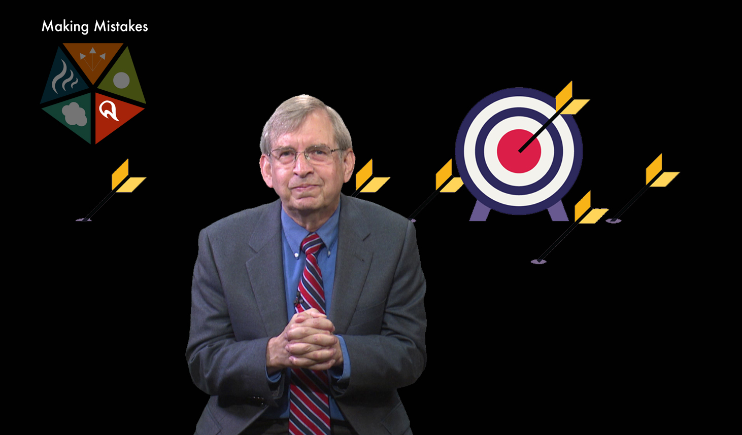
About mistakes being an integral process of success.
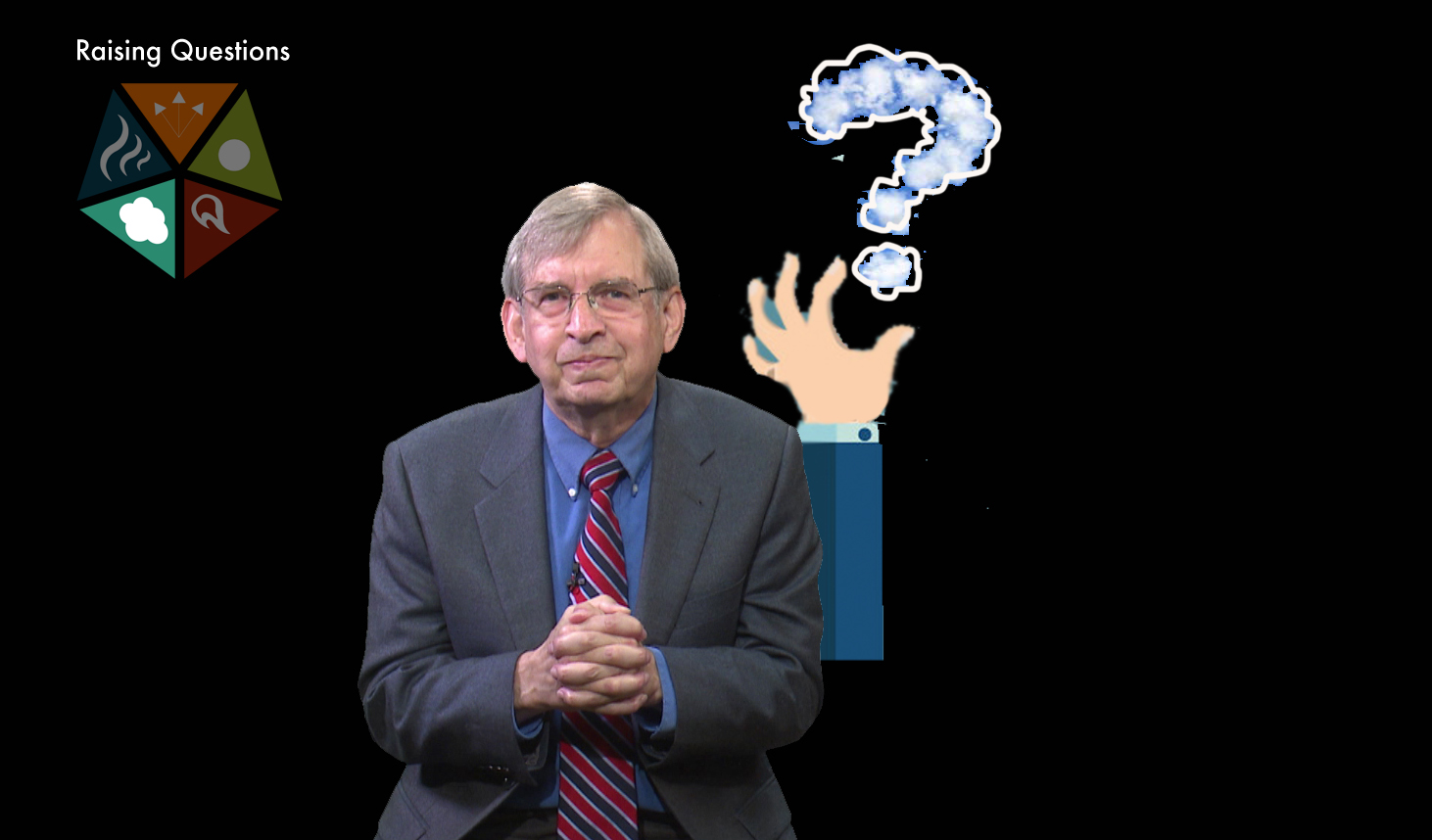
About crafting your own questions.

About constructing a mindset to see where ideas are coming from and going to.
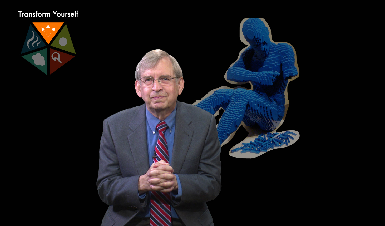
About transforming yourself to actively use the previous four elements of thinking.
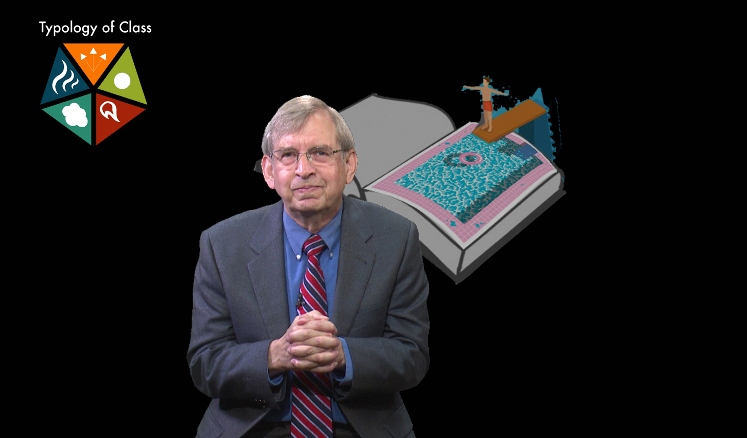
About a class that required jumping into interactive work, not just being taught.
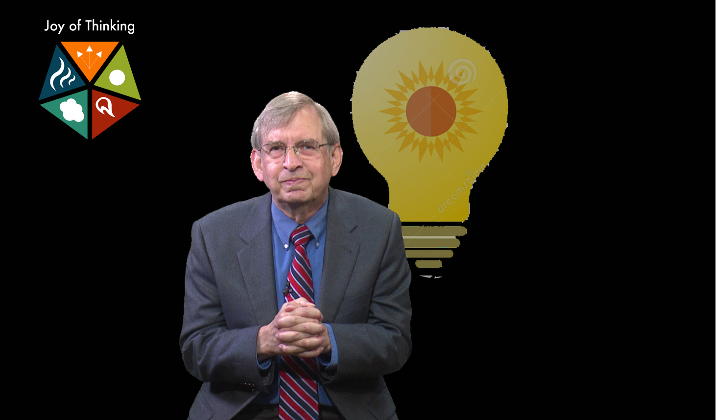
About how wonderful it is to think.
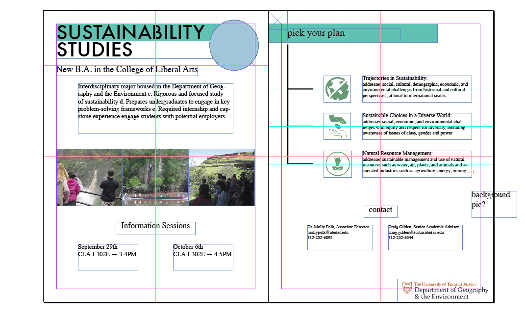
First rough mockup of the print flyer, focusing on layout. Text and some images are set in place.

Second mockup, focusing on fixing typography. More general ideas for layout, such as for the contact section.

Close to final mockup, front and back spread shown: background color is switched from white to match the general orange/brown from the ‘Terrace field’ picture. “Contact” is lowercase to match “Information Sessions”. The three tracks fill the space on their page. The globe logo has been placed. “Pick Your Track”, branch base and ‘Contact’ section all aligned.
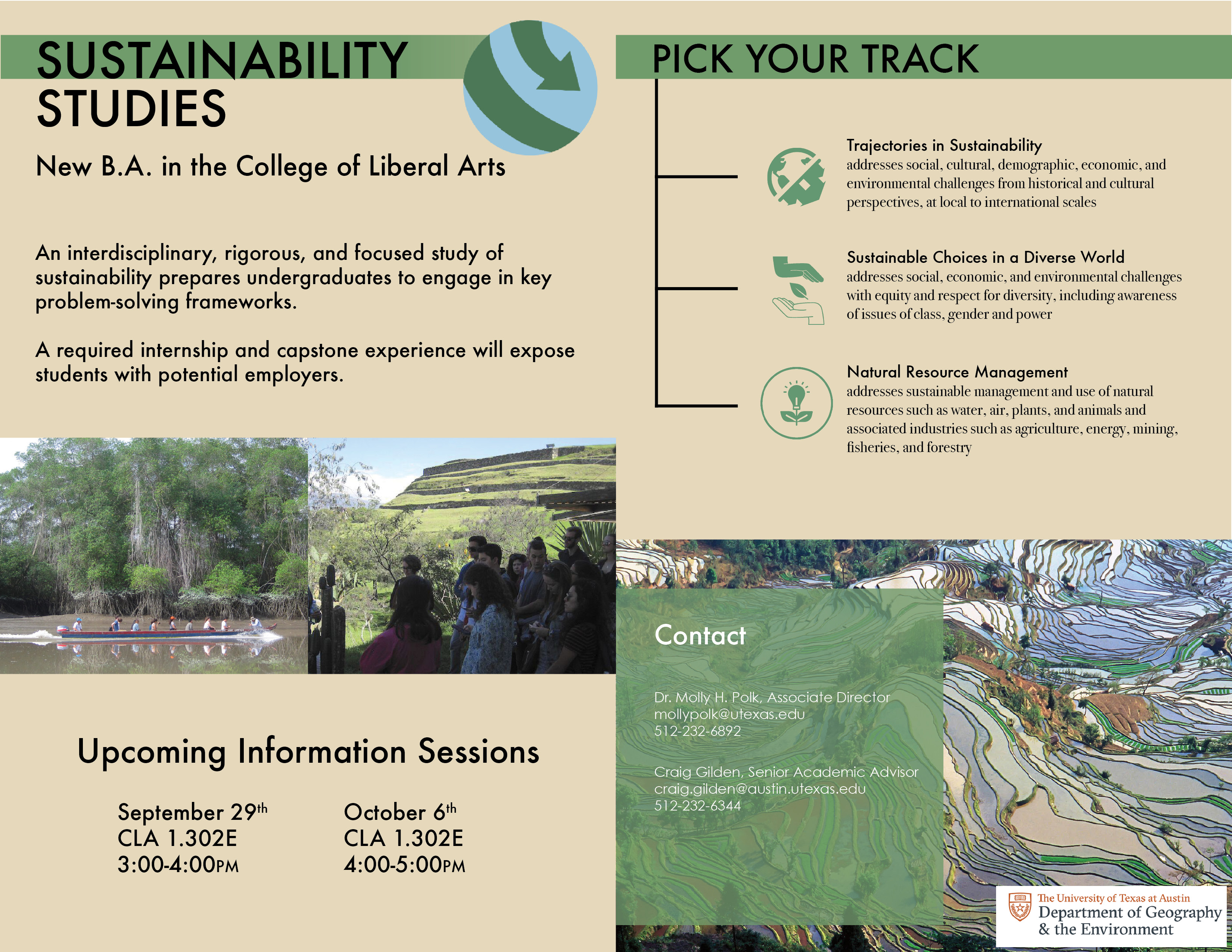
Finished front/back brochure. Two photo strand instead of three to fill white space better, spacing is improved, text enlarged, and the Contact section is more readable.
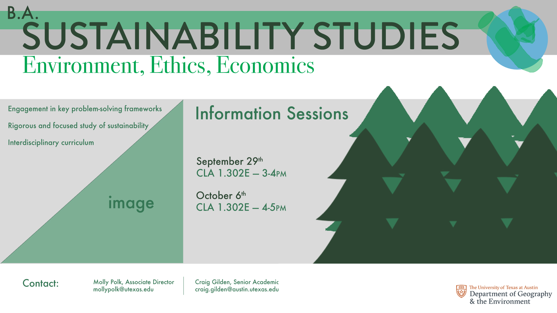
First two rough mockups of the BA Sustainability Studies video monitor graphic with focus on general layout.

A third mockup with client feedback.
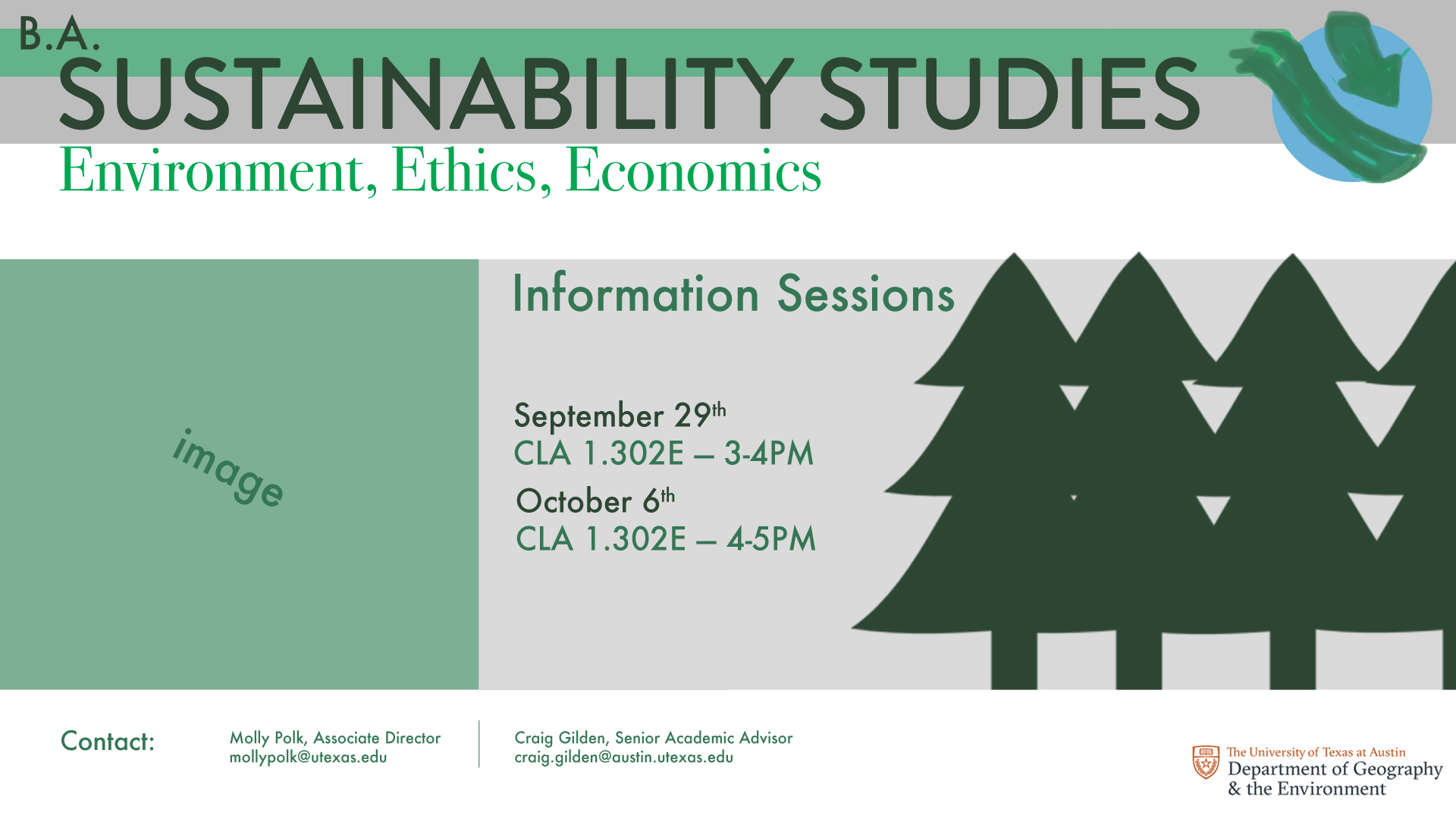
Two options for the video screen ad. The trees are fading outwards, the globe’s mockup is cleaner, and “Information Sessions” carries more weight.
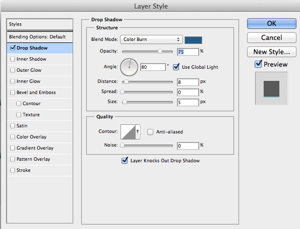


Tried a drop shadow for the arrow around the globe.

Changed the globe logo to a white arrow, two options for color to see which best represents both Earth and Sustainability.
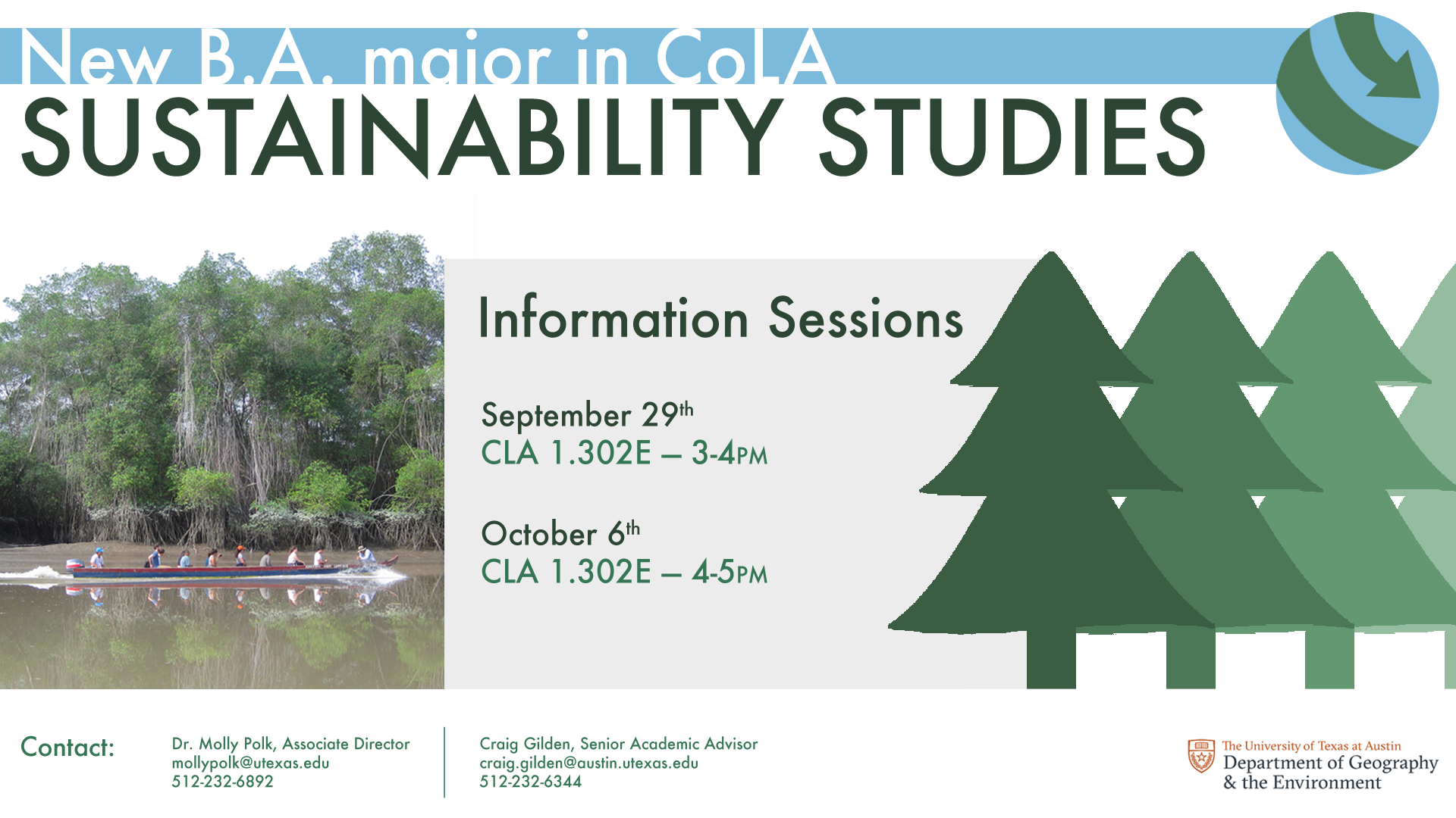

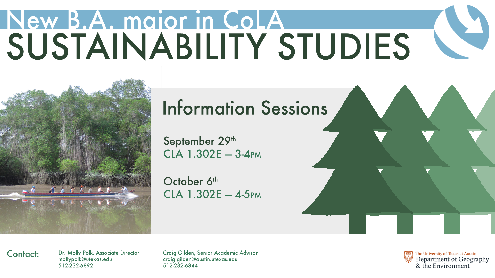
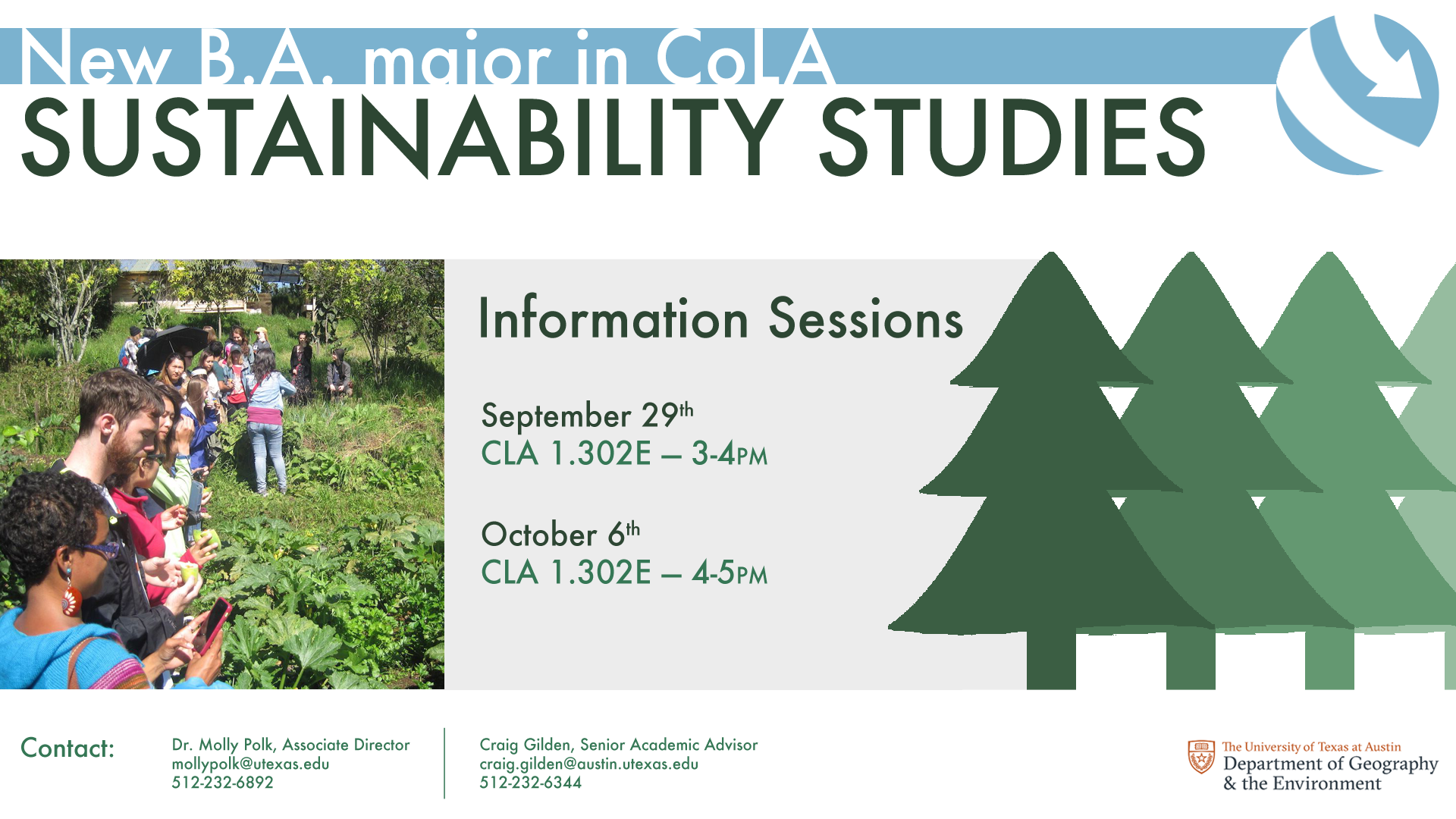
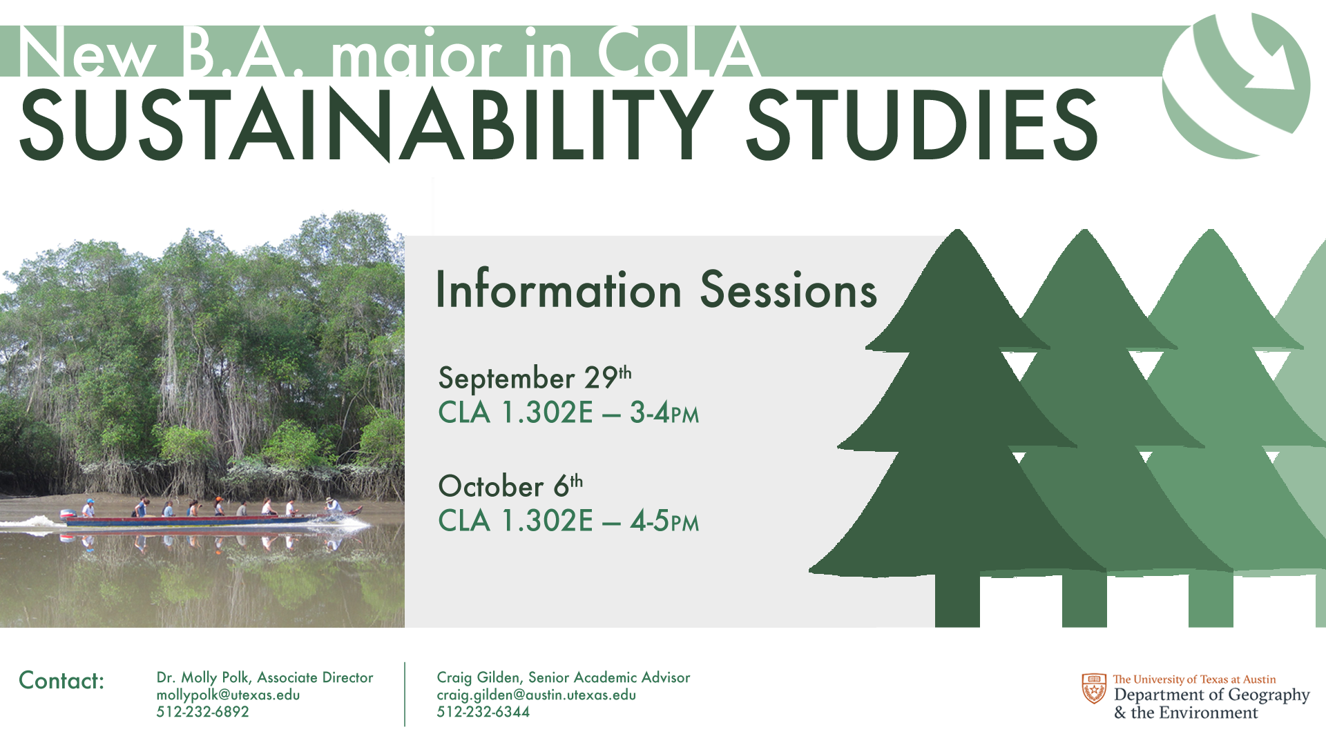
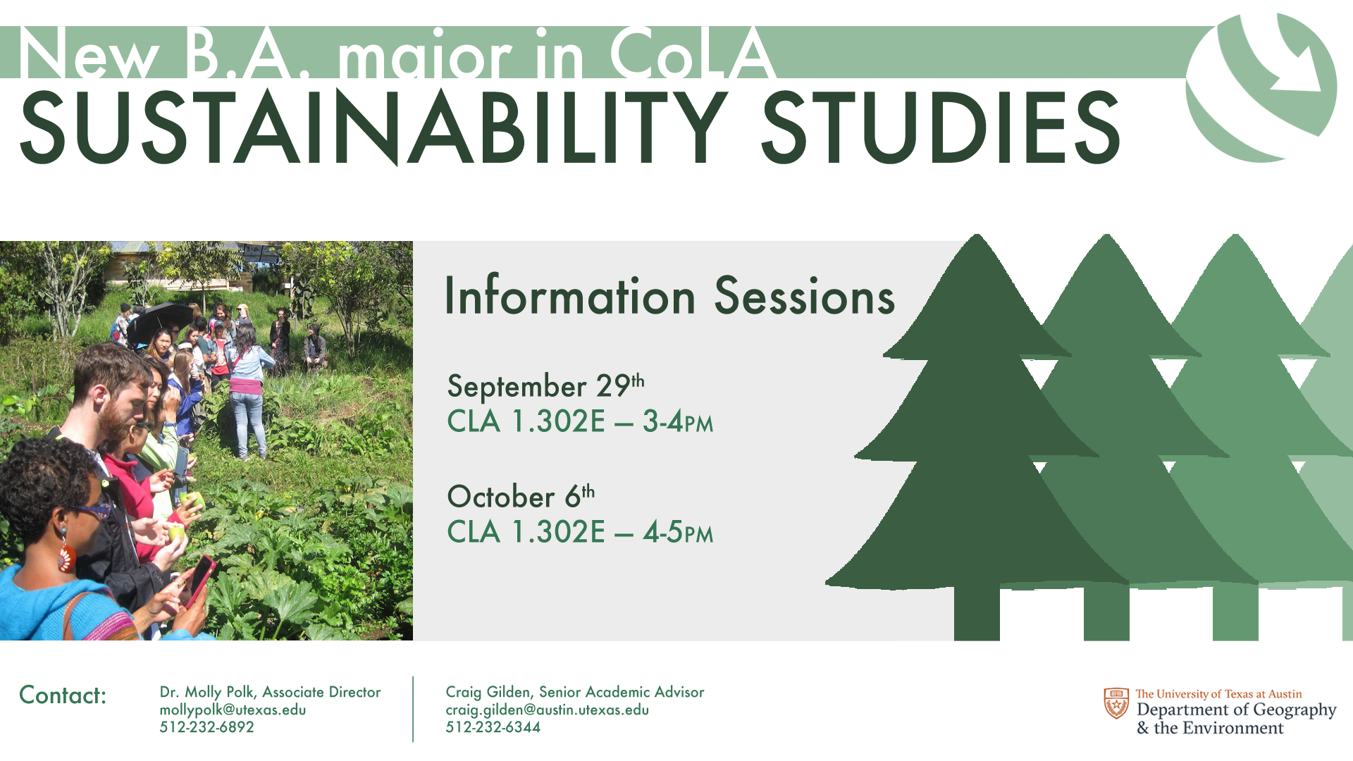
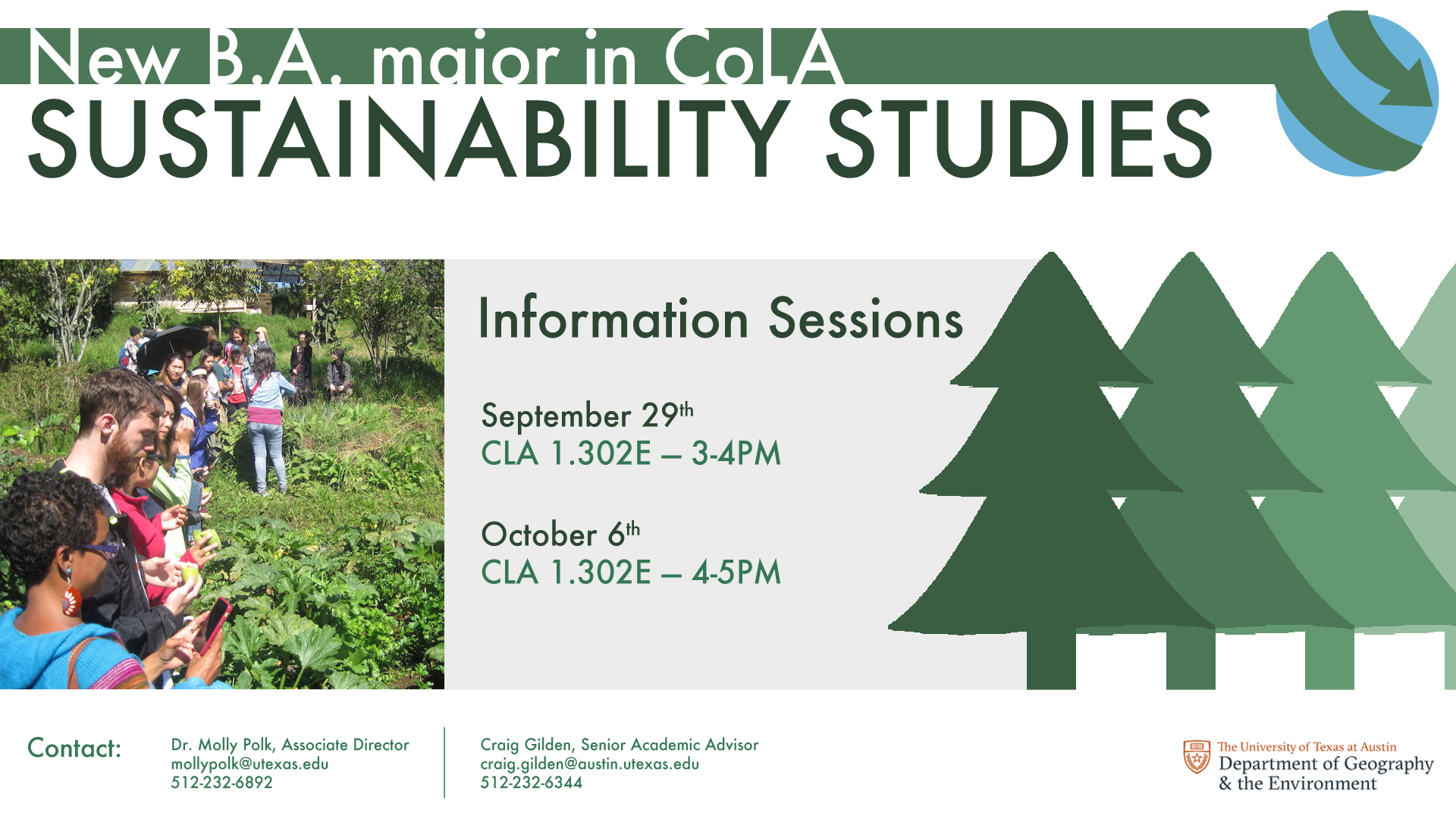
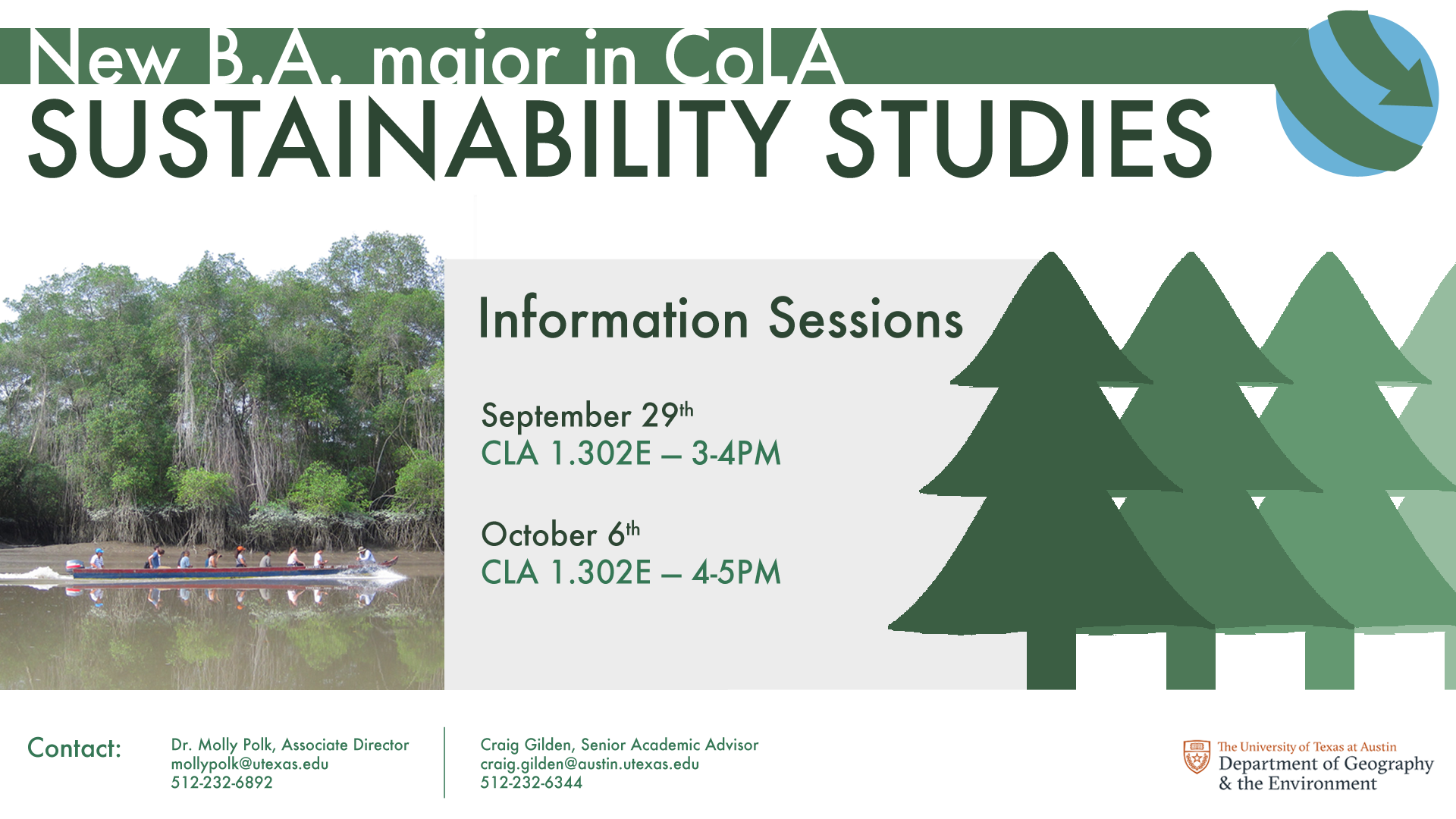
6 final mockups, each with a different combination of globe logo and image.
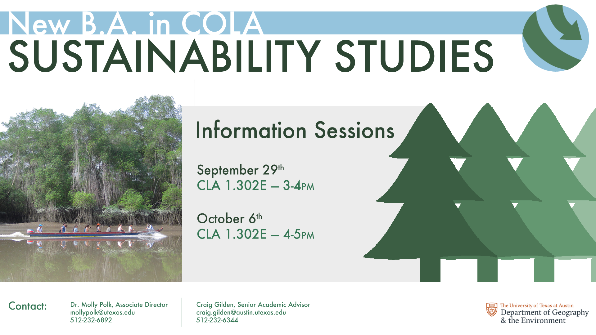
The client decided on the blue and green globe logo and boat photo. After a few minor changes–“COLA” in all caps, remove “major” from header text–the ad is finished.
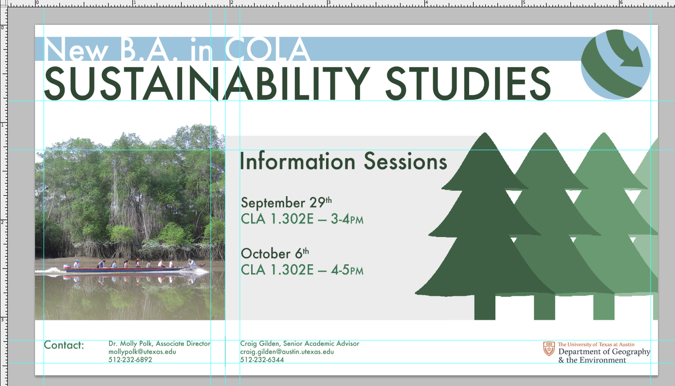
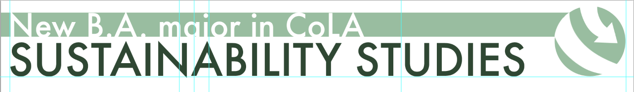
Shown with guides.
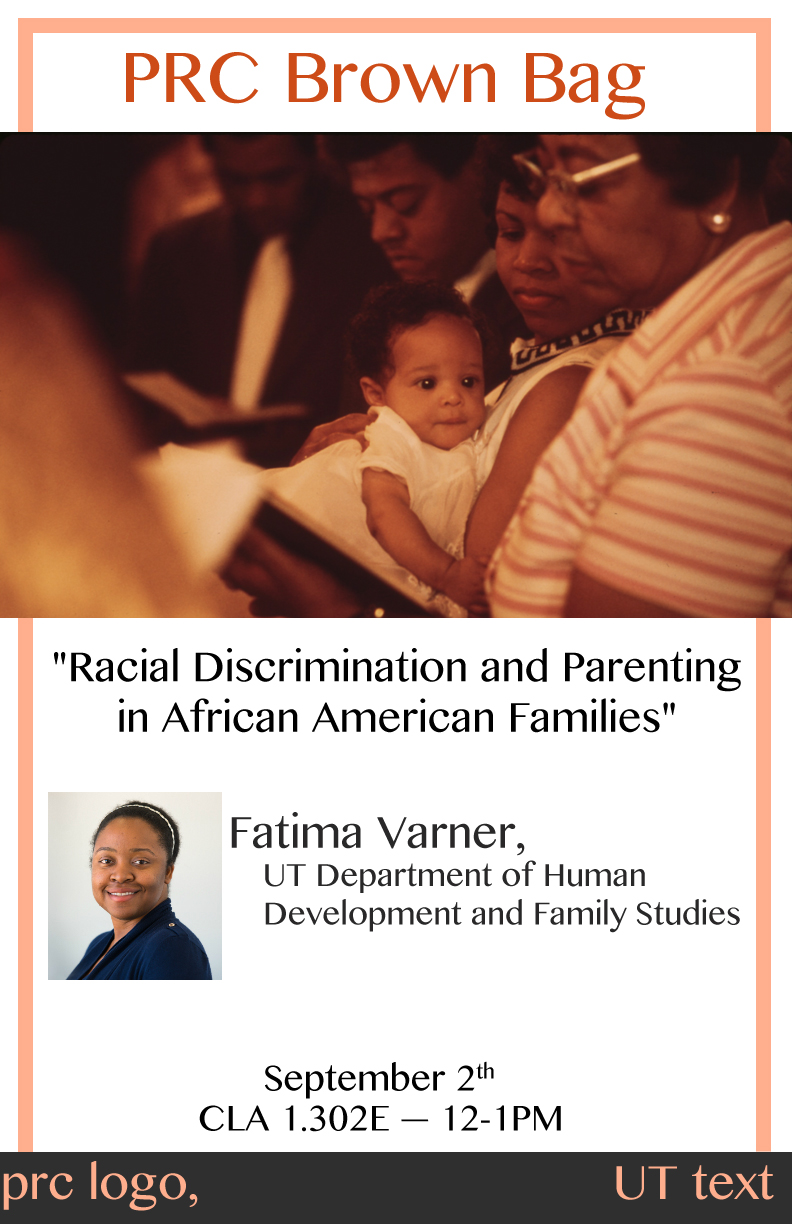
Mock-up 1 for the PRC Brown Bag flyers, which displayed the relevant picture I was using, the basic layout and text.

The client then narrowed down the choices and wanted to continue work with the third.
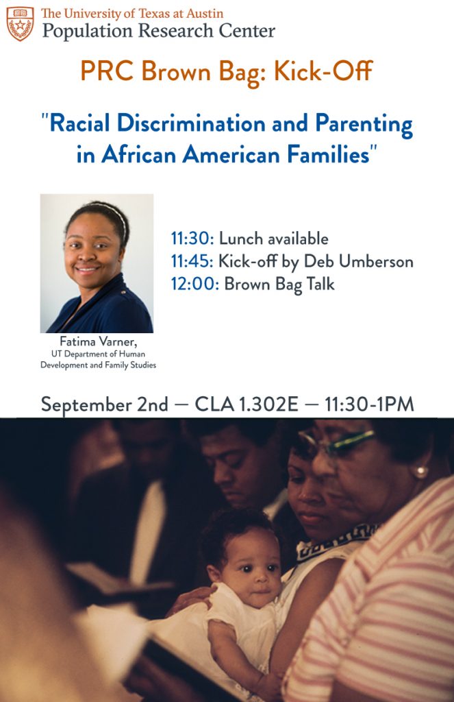
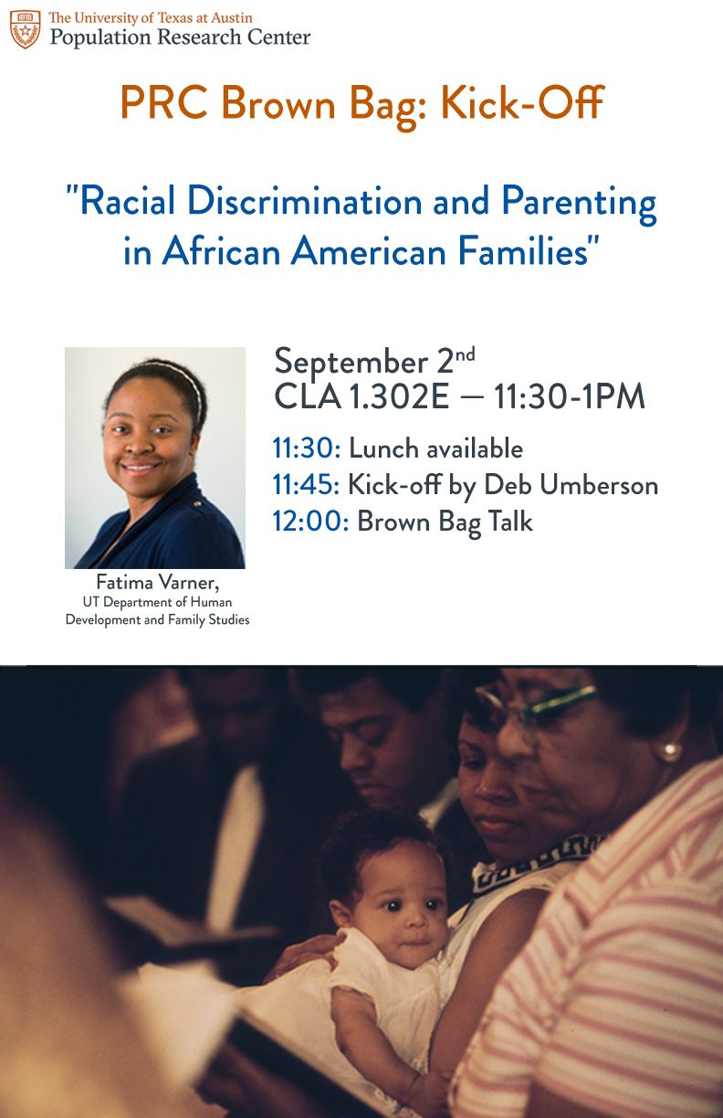
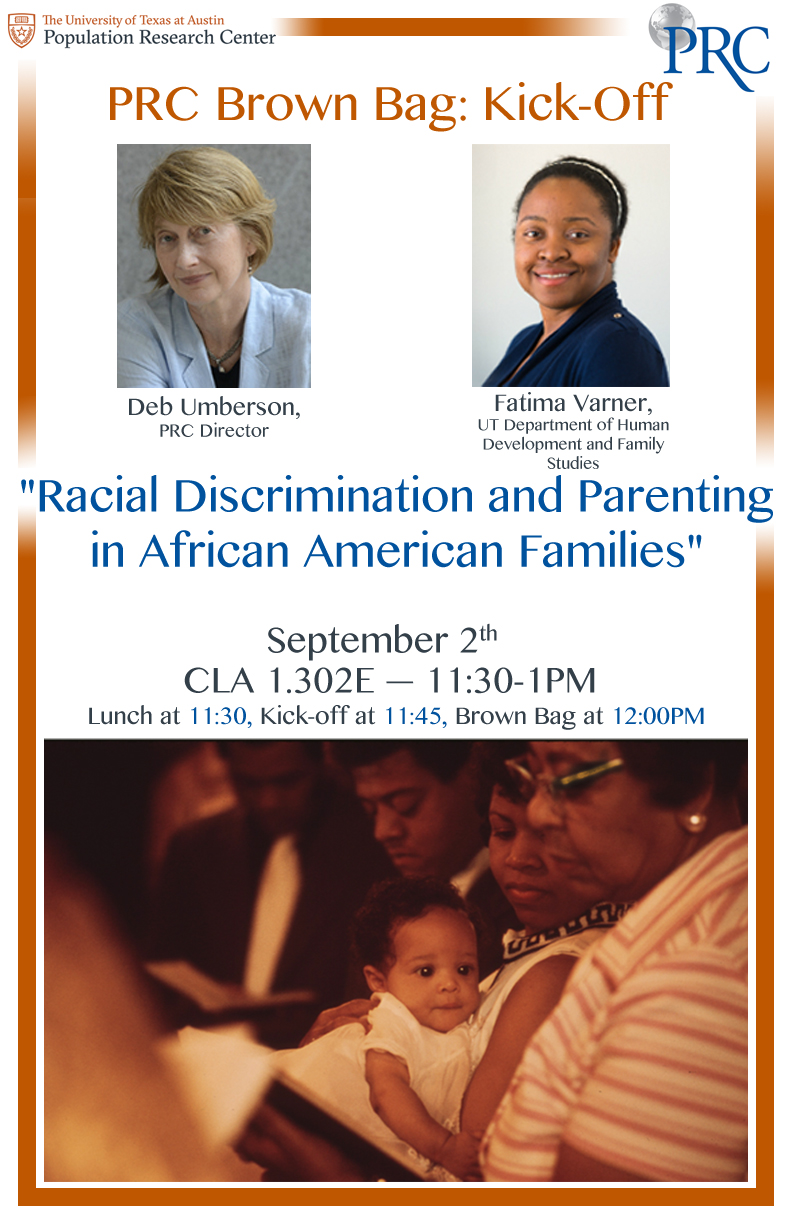
Photo is color corrected, introducing more cyan and blue to offset the orange.
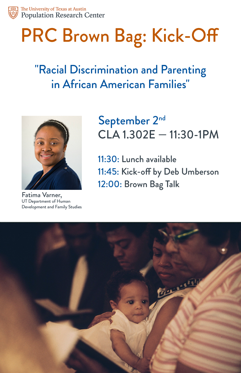
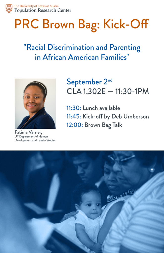
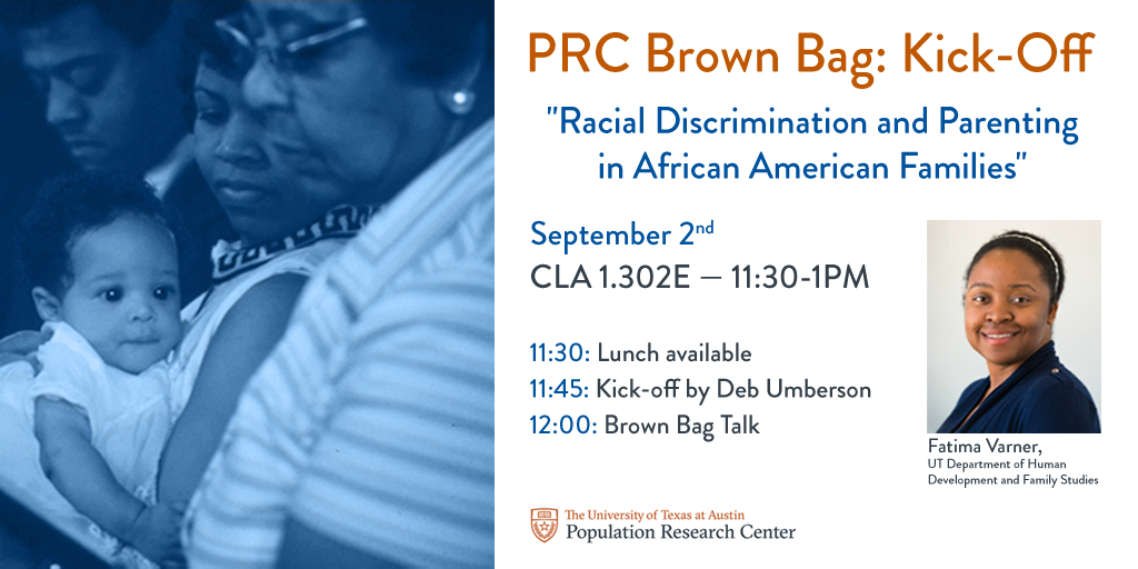
Finalizing the layout with two options for warmth/tone of the flyer. The blue also corresponded with the PRC’s main color scheme, so the client ultimately printed the blue.
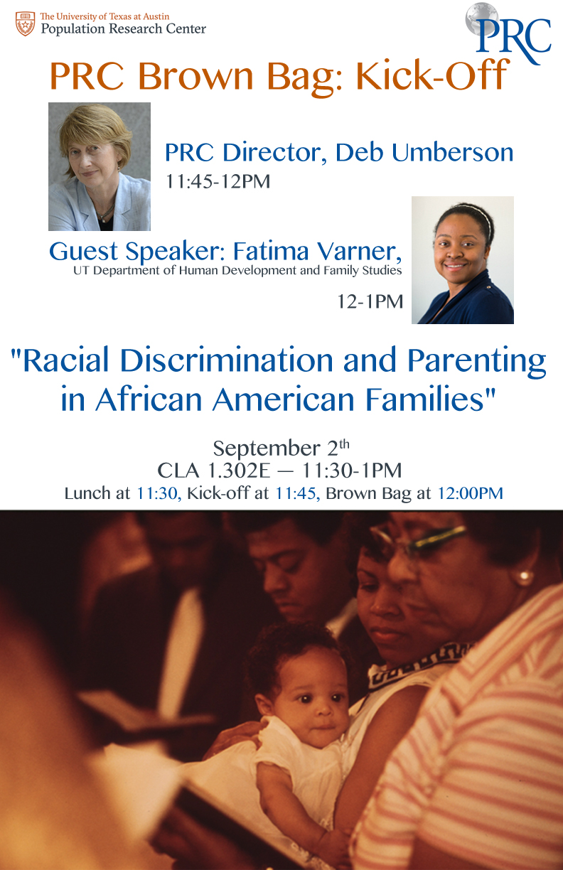
An unused graphic mockup relaying the same information.
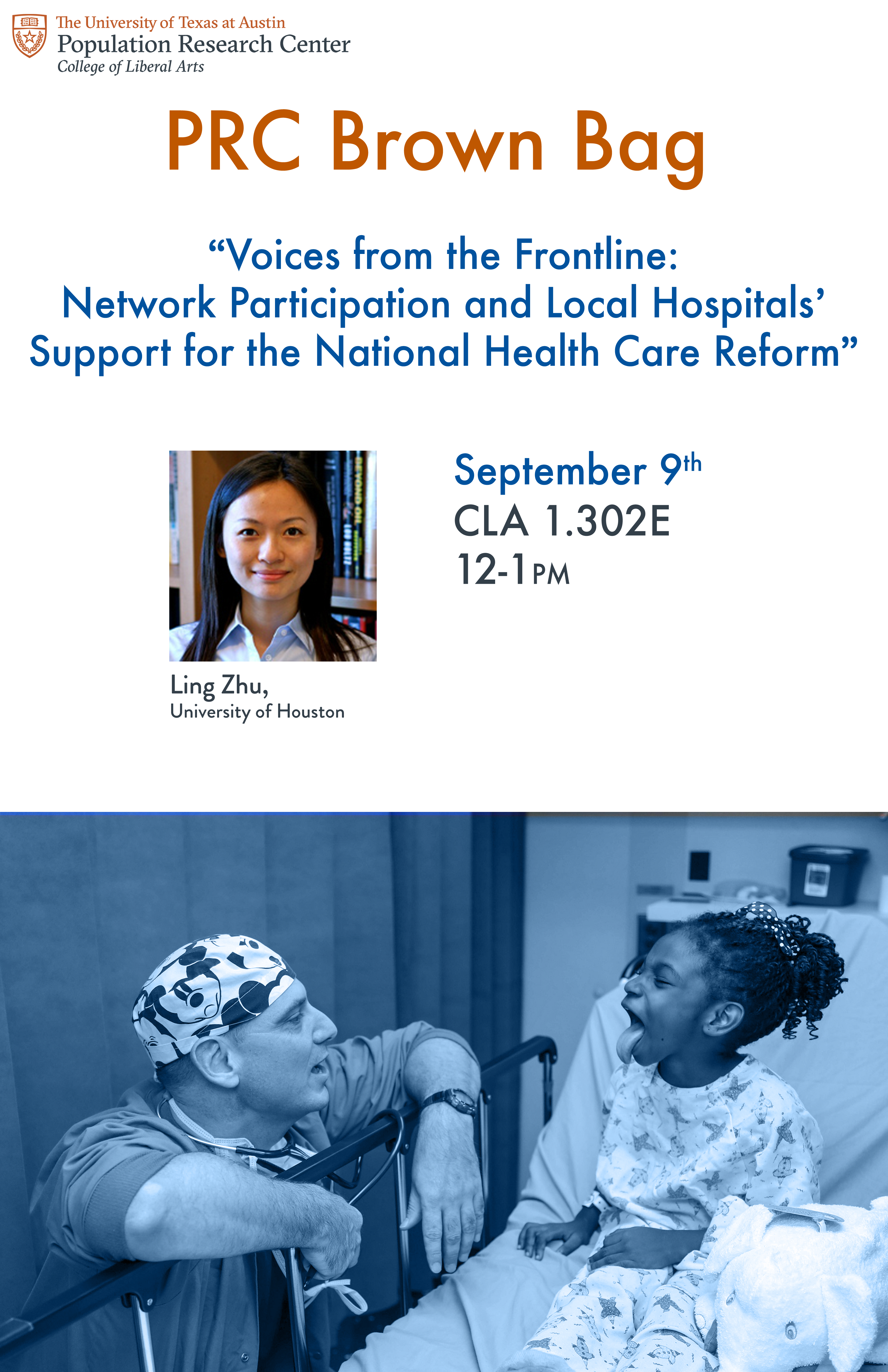
An edited version of the layout with less information for a second PRC talk. This layout template will be used for future events.

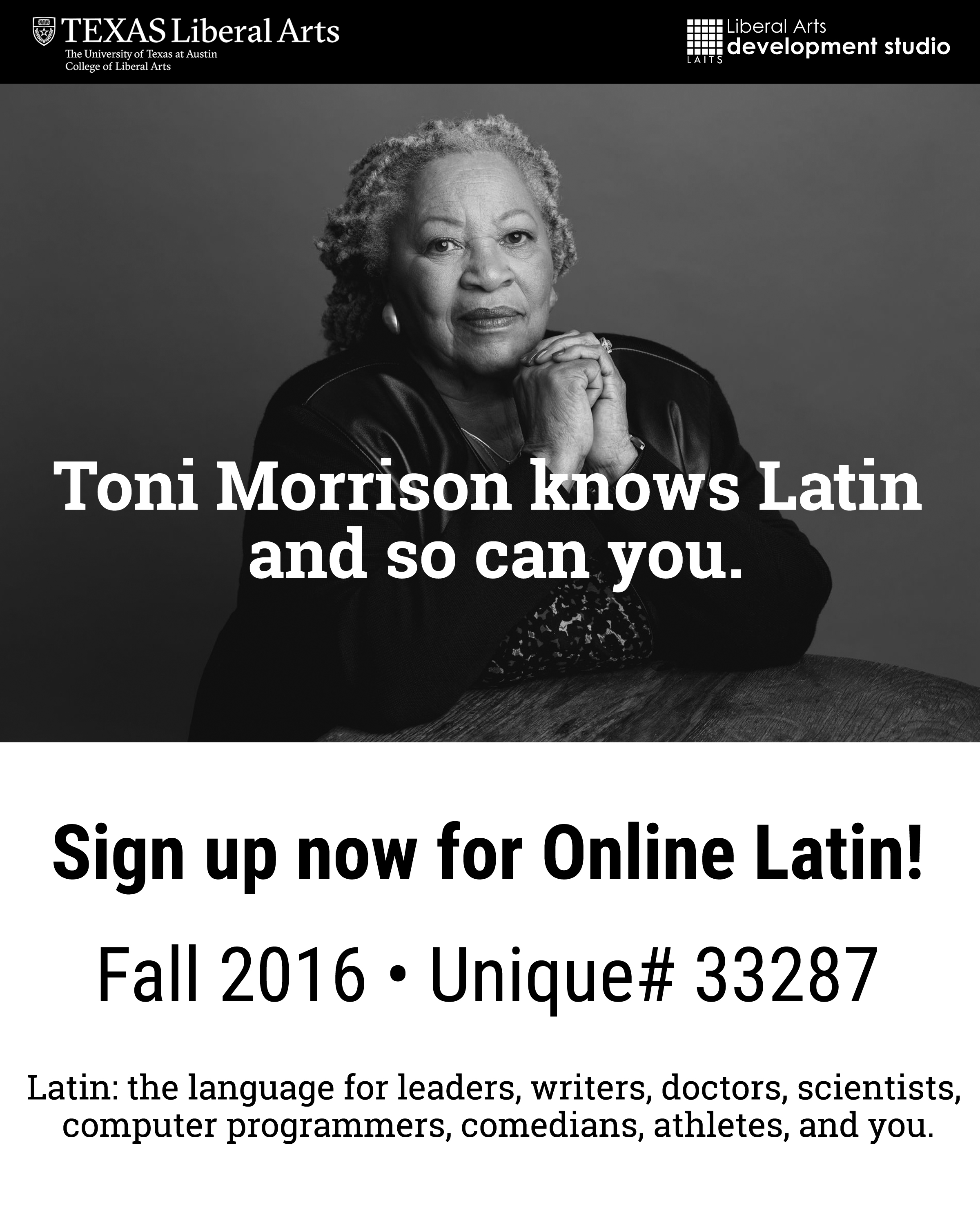
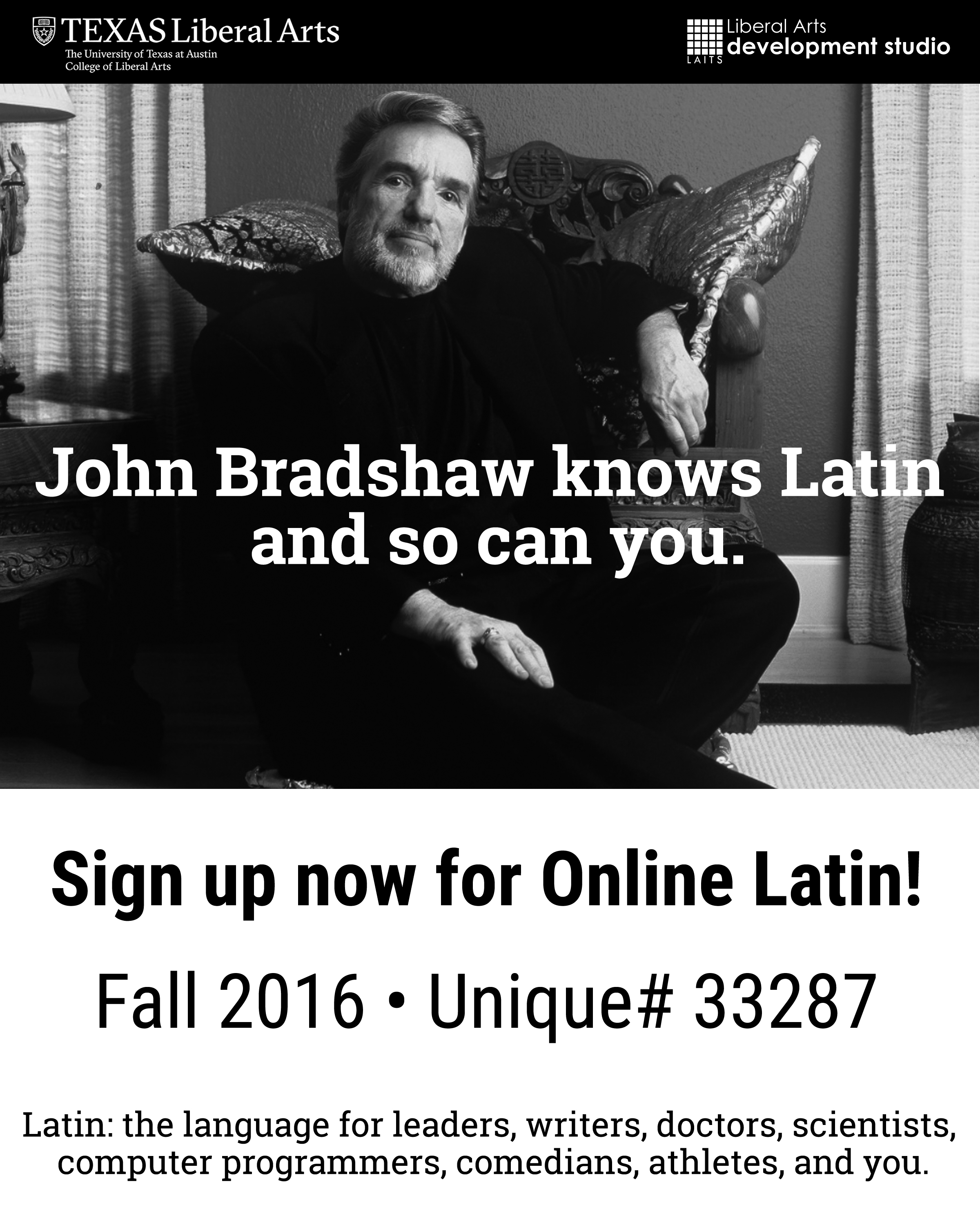
Made flyers promoting Online Latin using pictures of celebrity figures who know Latin themselves.