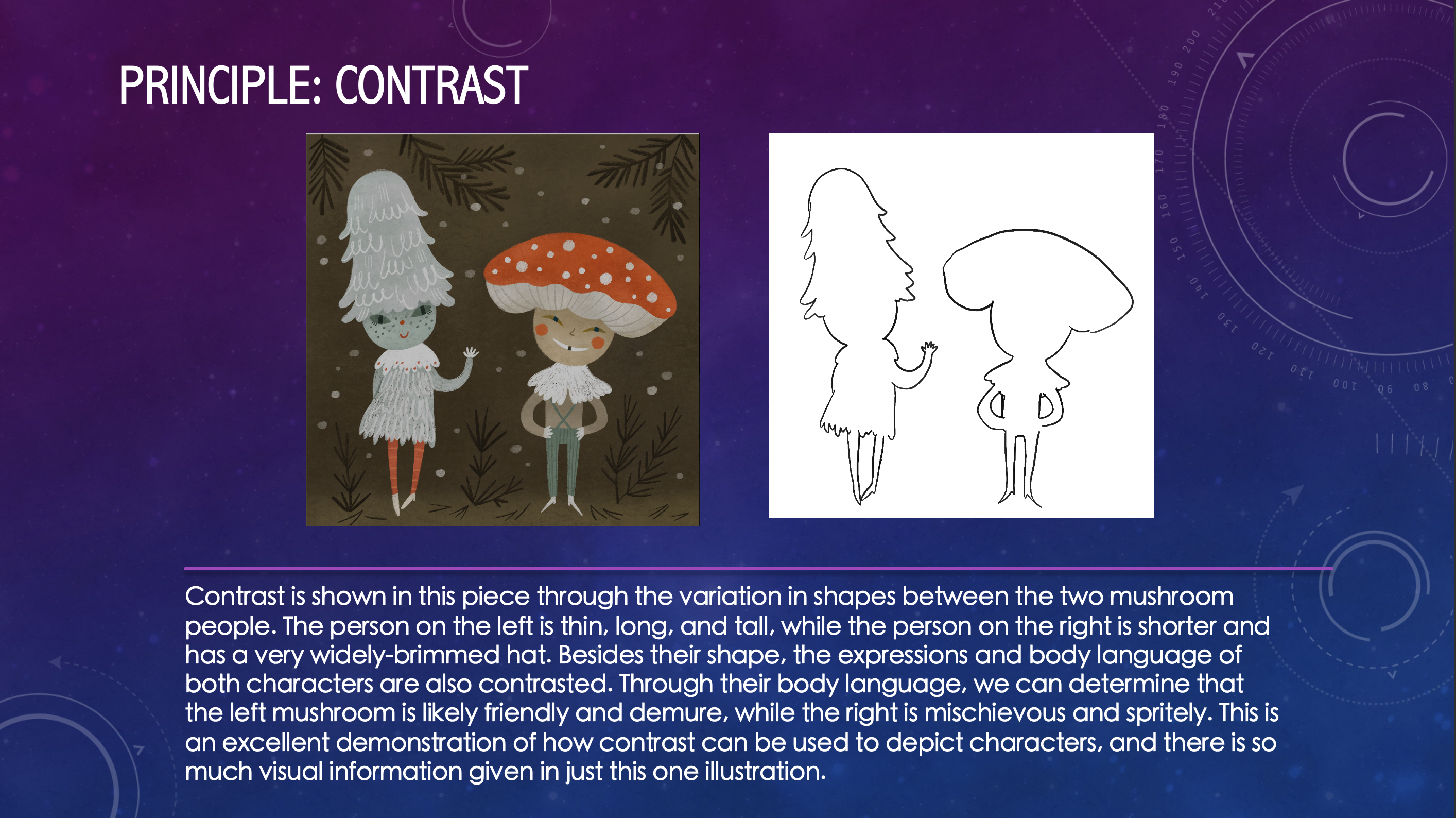
Training: Principles and Elements of Design
Goal of training: to understand the basic elements and principles that make up visual art and design
Elements: line, shape, form, size, space, color, value, texture
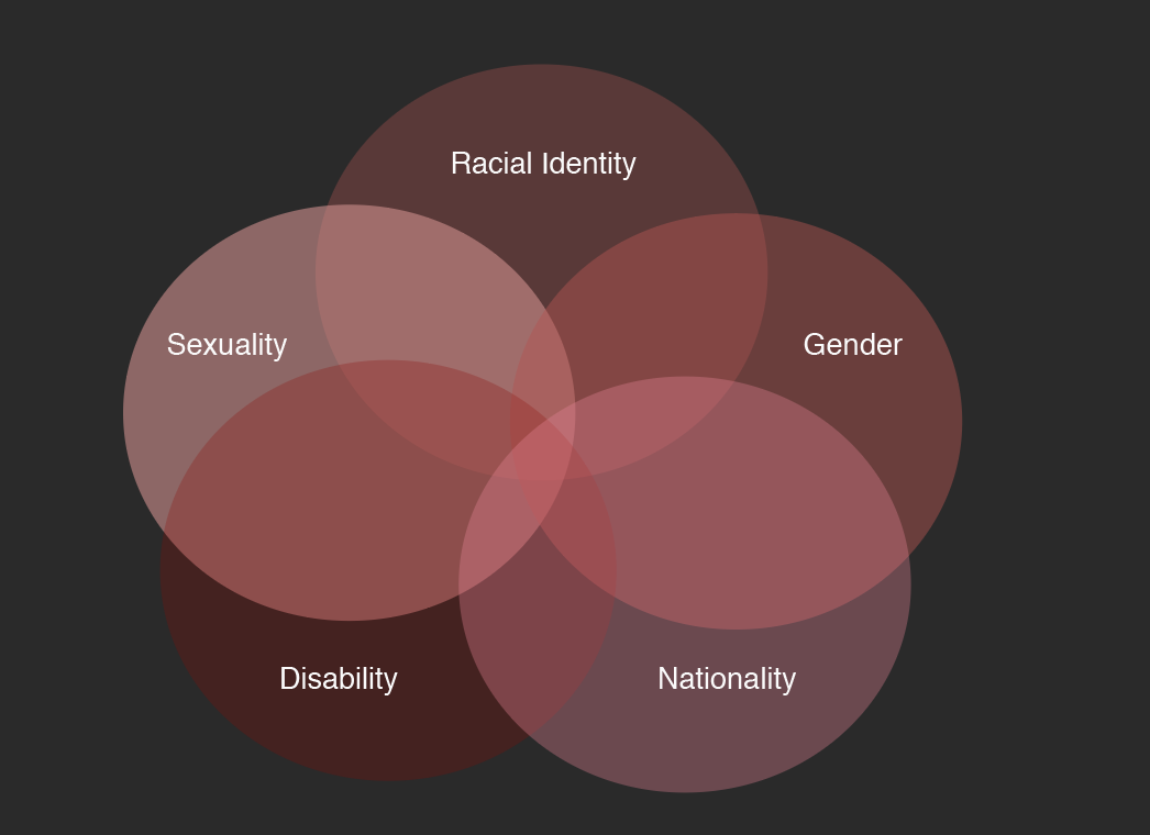
Principles: Repetition, rhythm, movement, balance, proportion, negative space, contrast, emphasis, variety, unity, hierarchy
Step 1: Finding Images
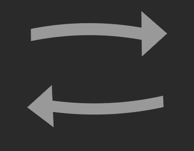
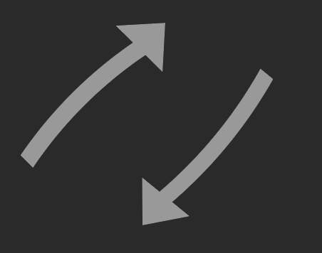
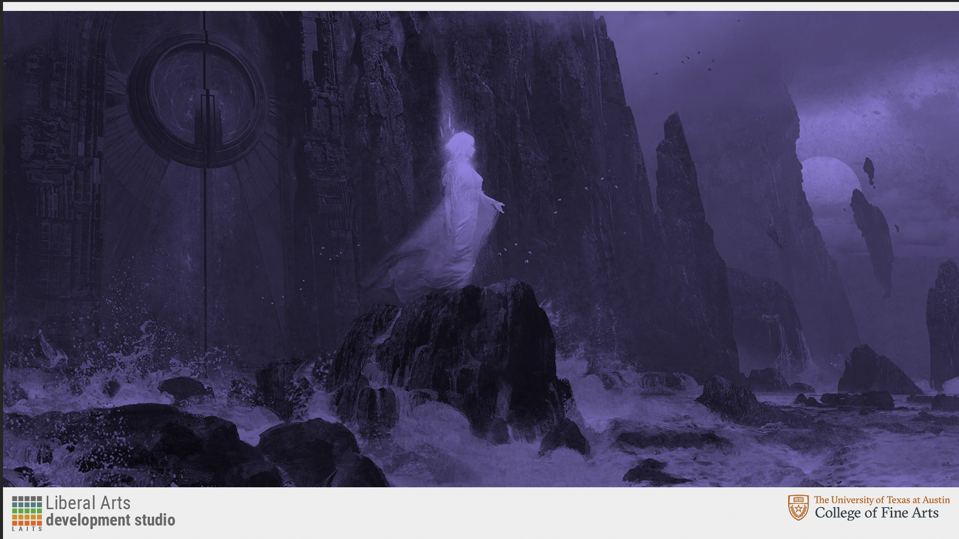
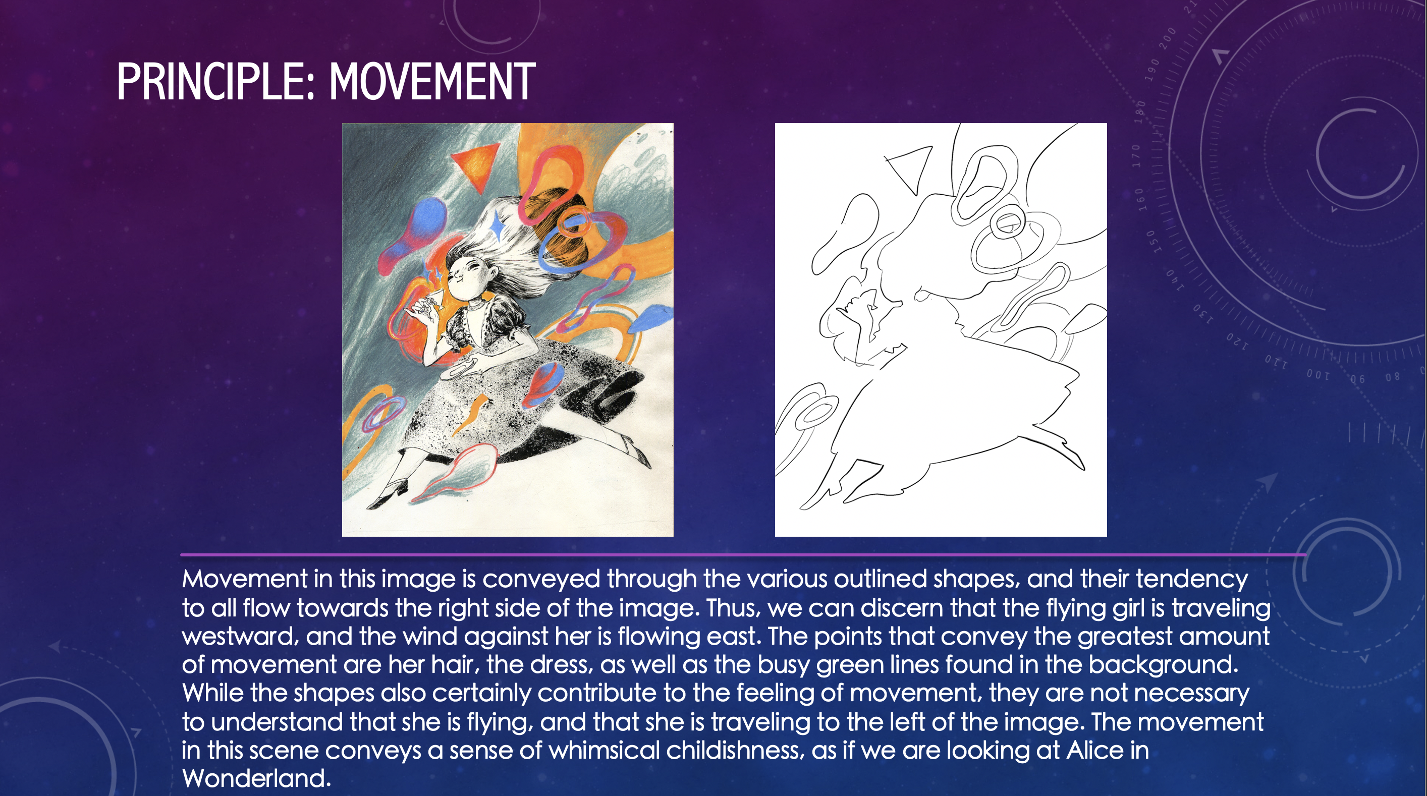
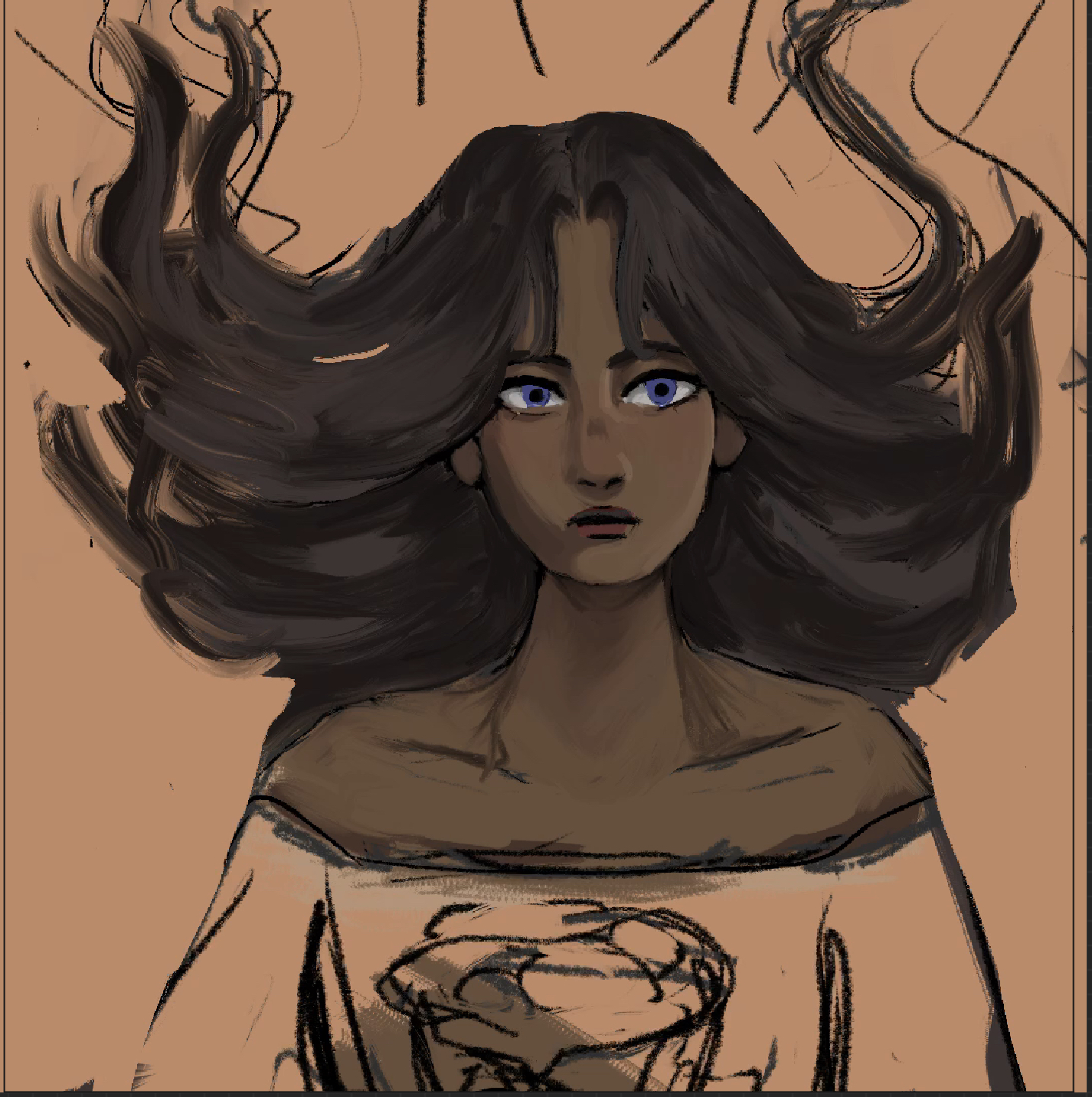
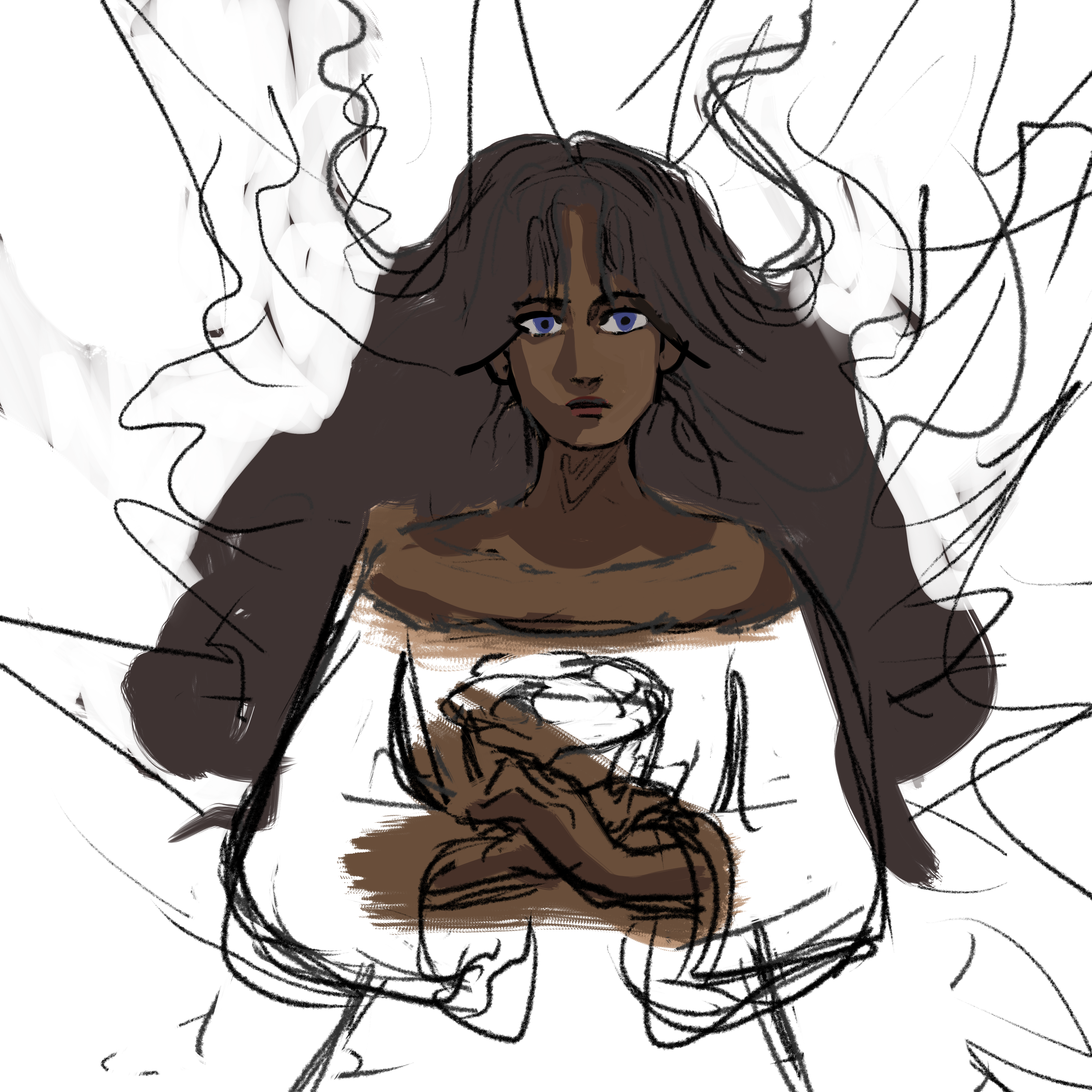
My first step in this process was to find images that suited each principle. I primarily found images on https://www.behance.net/, although I also found some on https://eyeondesign.aiga.org/. I recall that the first concept I found was for the principle of movement. I was looking through Behance and saw this image:
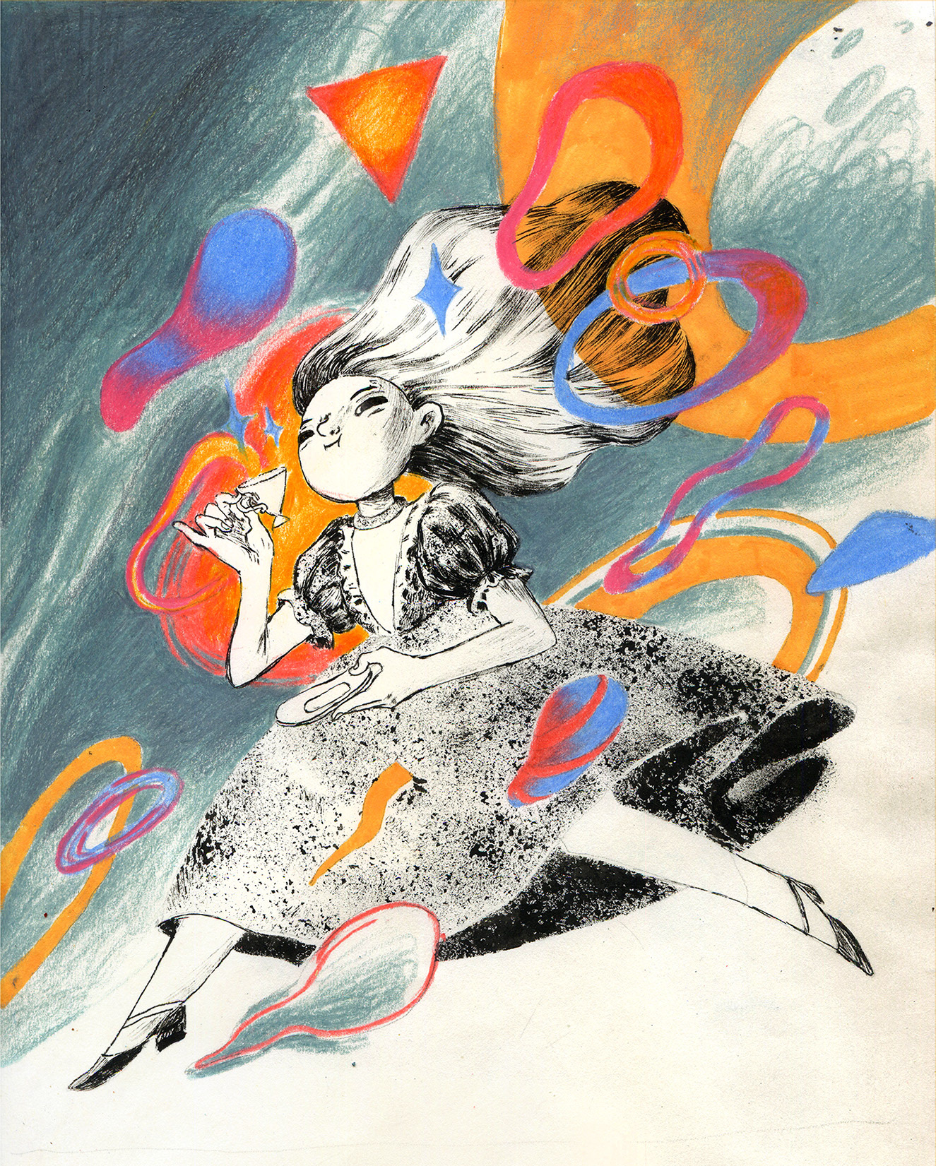
I was immediately struck by the movement of this image, and how everything in the image gives the illusion of flying through the wind. The girl herself’s hair and dress flow to the side, and the background and shapes only add to this. In fact, as an animator, finding an image for movement was probably one of the easier ones to do. In terms of the most difficult, I found the more abstract concepts such as size and space to take the longest. It’s hard to find a representation of such vague terms unless one is looking at quite abstract art. Fortunately, I was able to find examples that fit, although most images I came across were comprised of several different concepts, and I had to focus on the one that seemed the most prominent.

Size was tricky for me, because almost everything has some sort of size. I picked this particular image because of the variety of different sizes that are found in each type of bottle shape. This could also work for variety, but the variations are primarily in size and width, so I felt another example would be more fitting for variety.
Step 2: Outlining
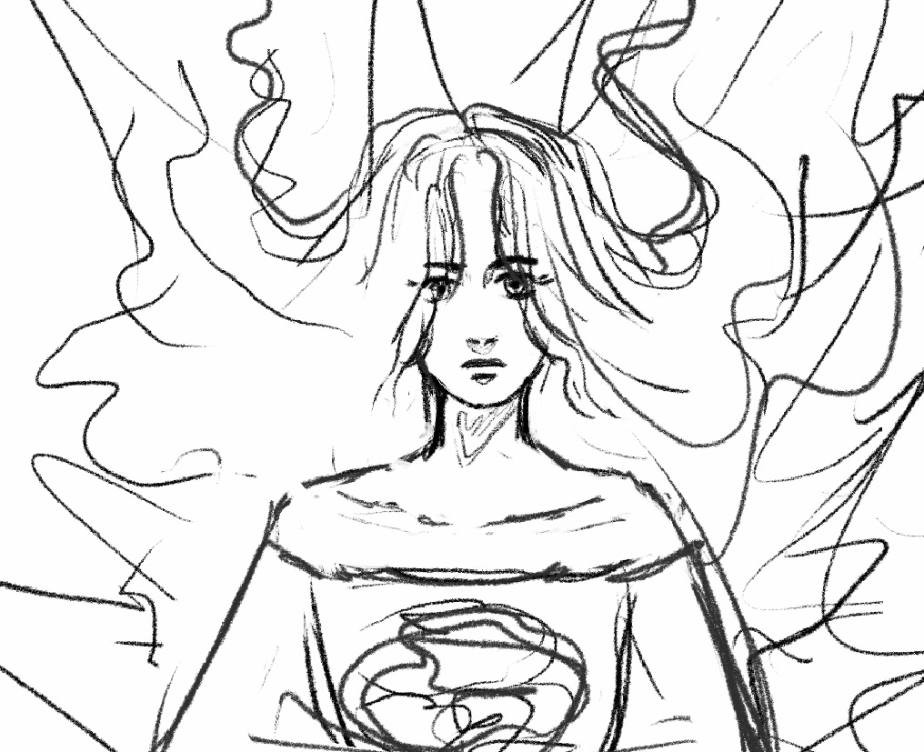
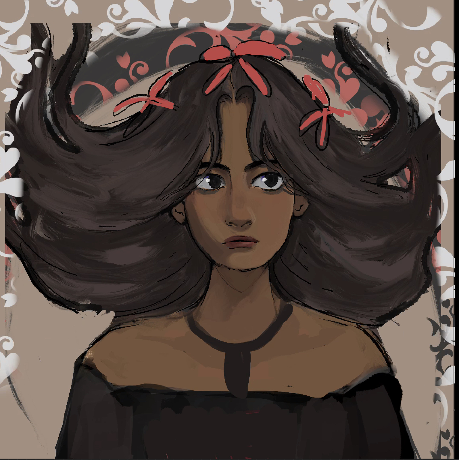
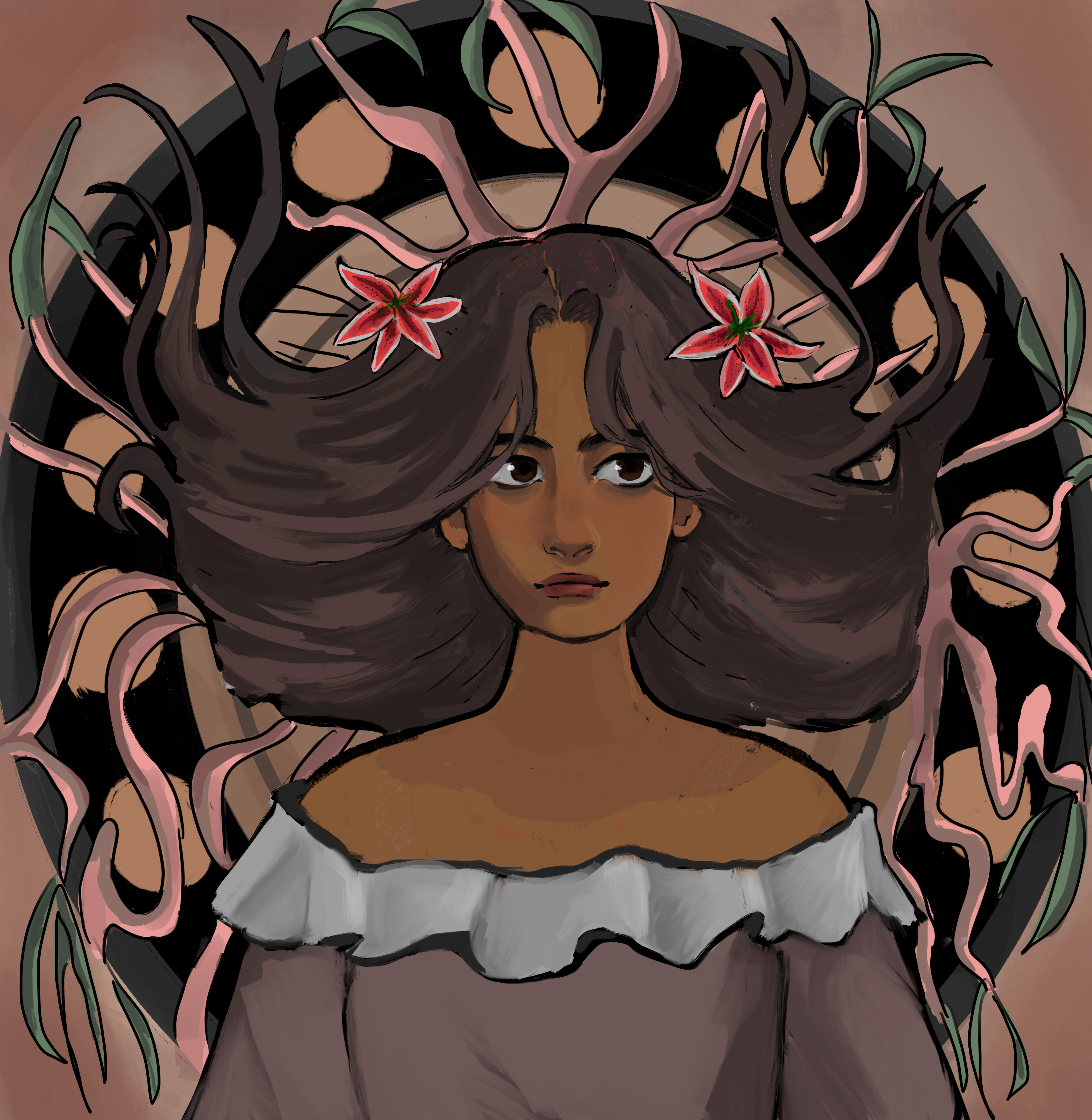
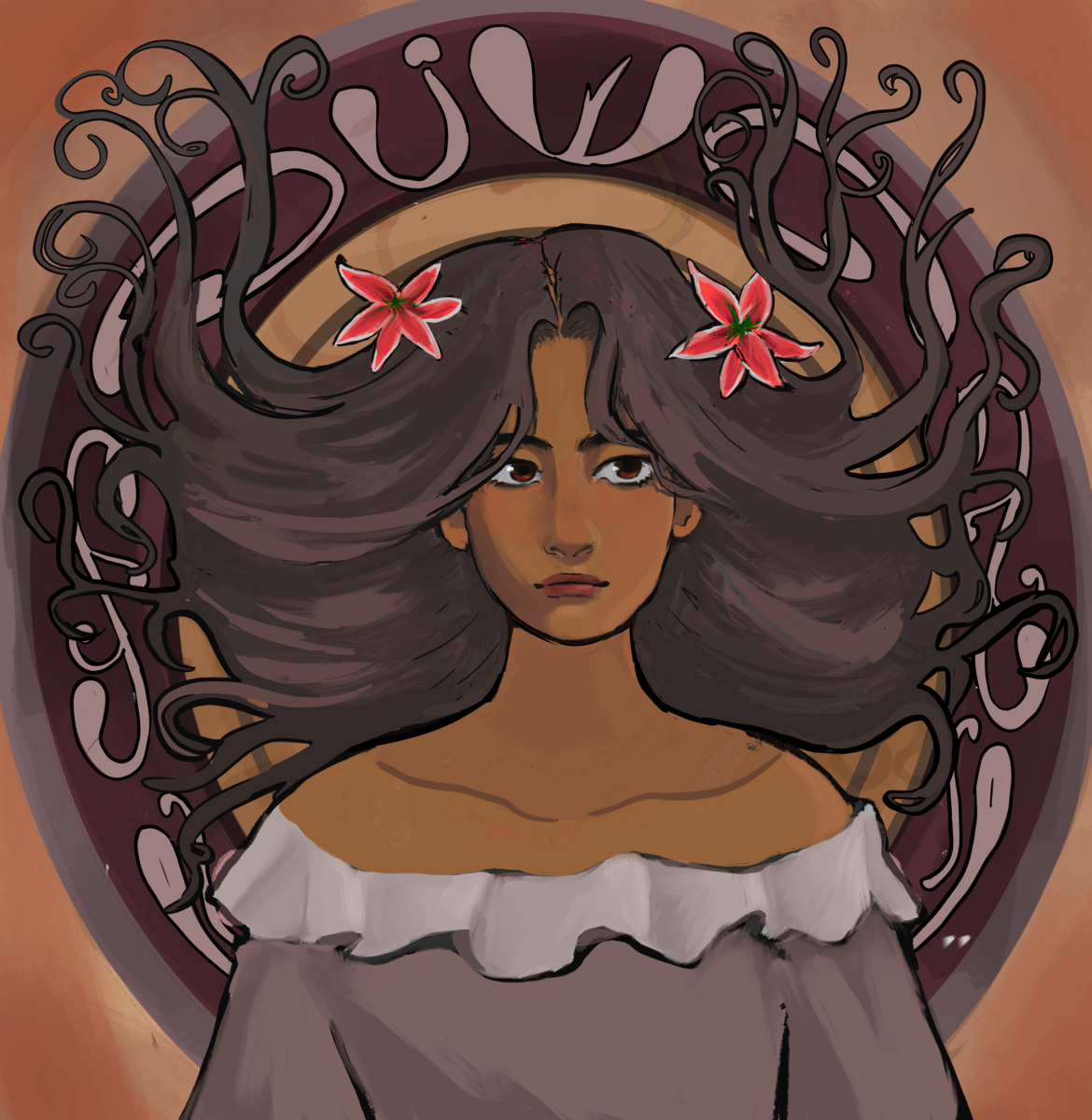
The second step was to outline each drawing. I did this in Procreate and focused on outlining the features that were most important to each concept.
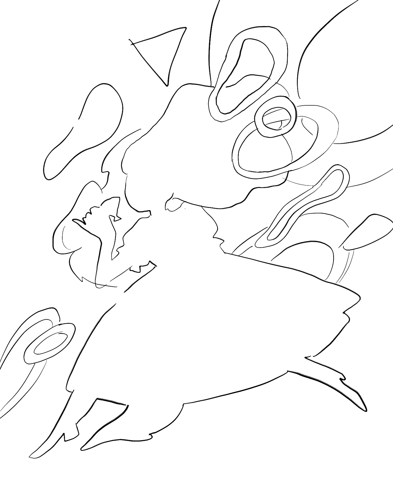
For movement, I outline every shape to convey the basic form and their tendency towards shifting to the right.

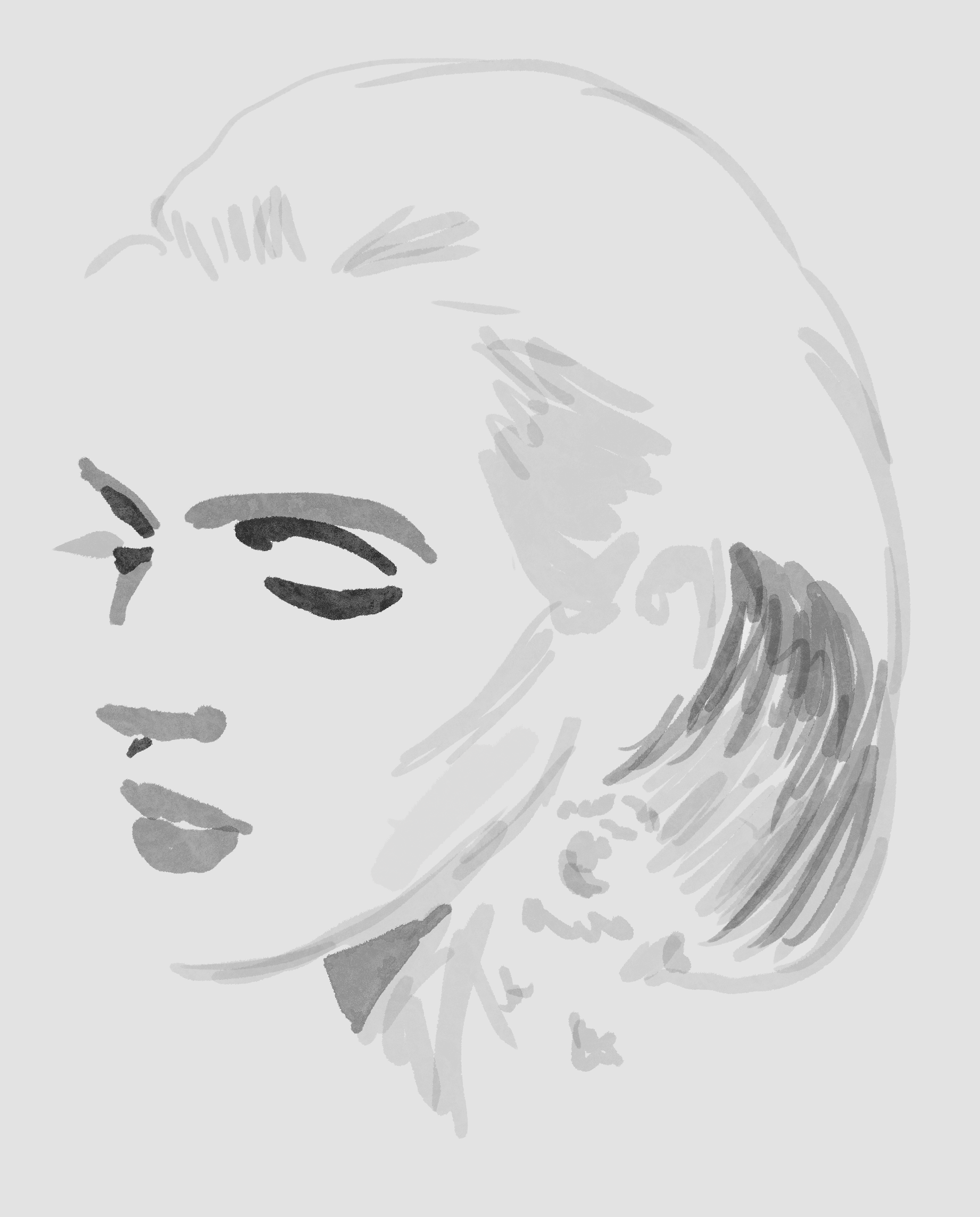
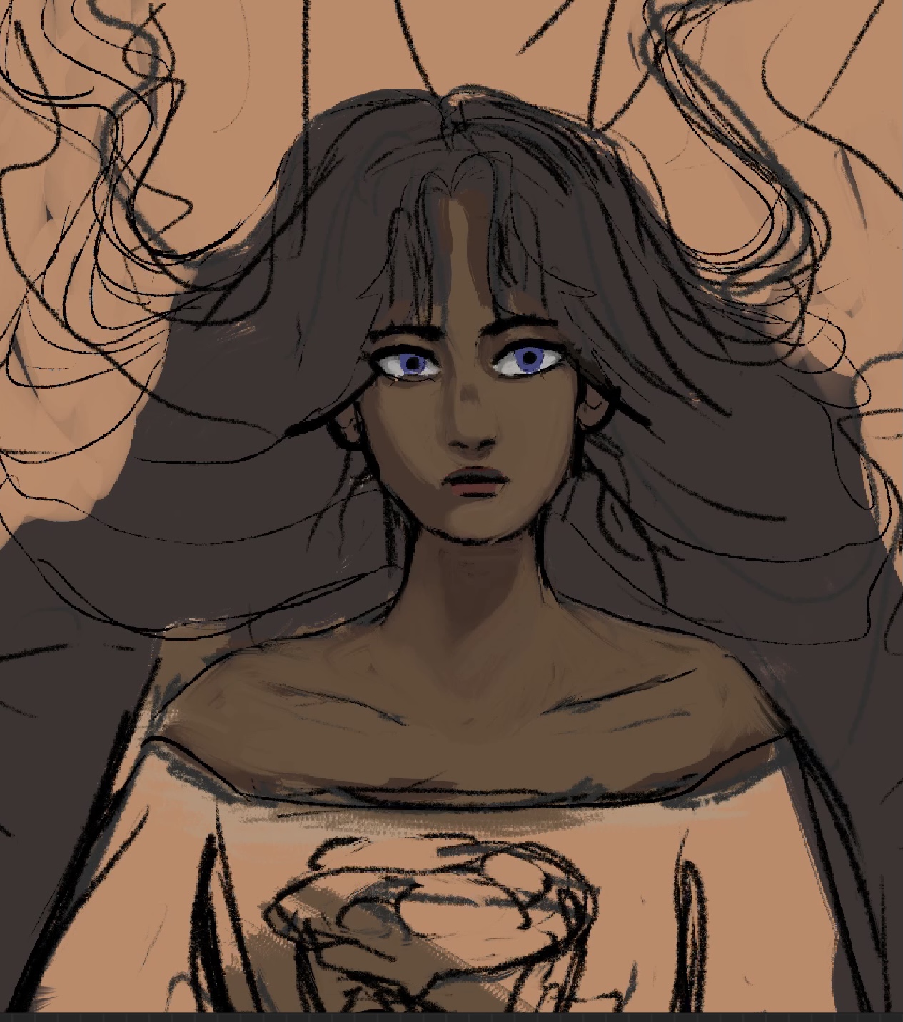
For value, I did the opposite. Instead of outlining the form, I shaded out the basic values used to illustrate this portrait.

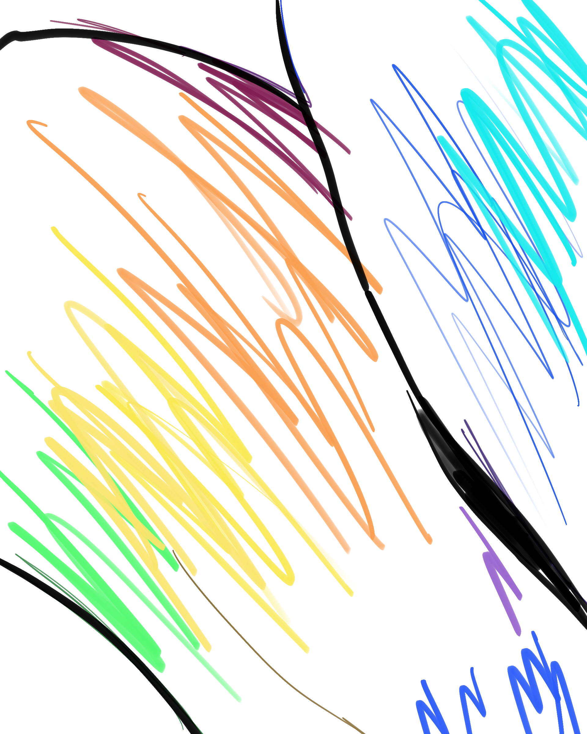
For color, I outlined the colors used and how they shifted into other colors going from cool to warm to cool again.
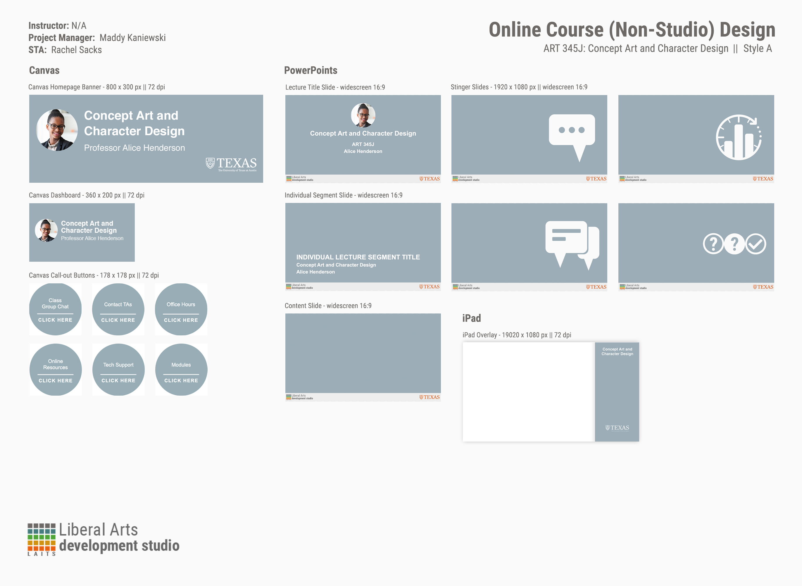
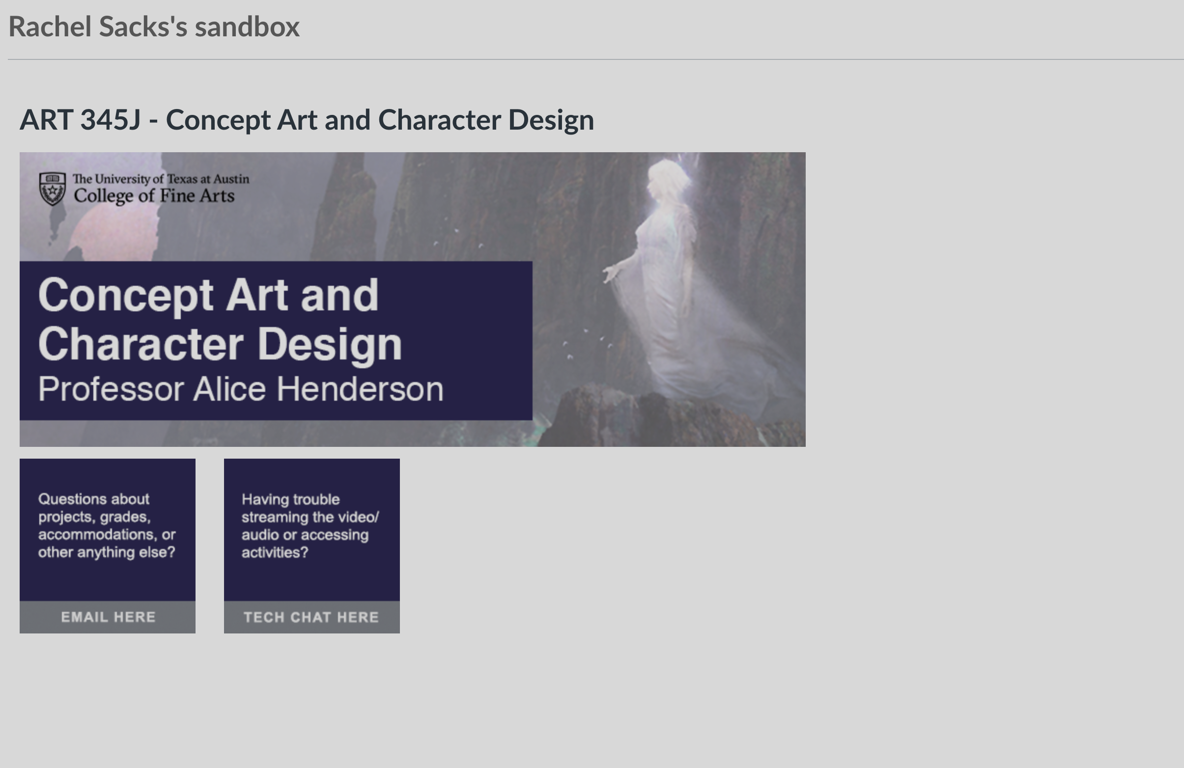
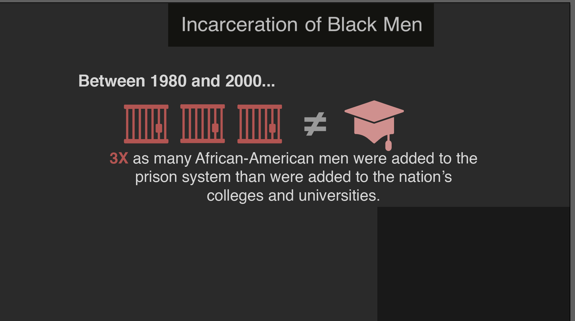
Step 3: Powerpoint
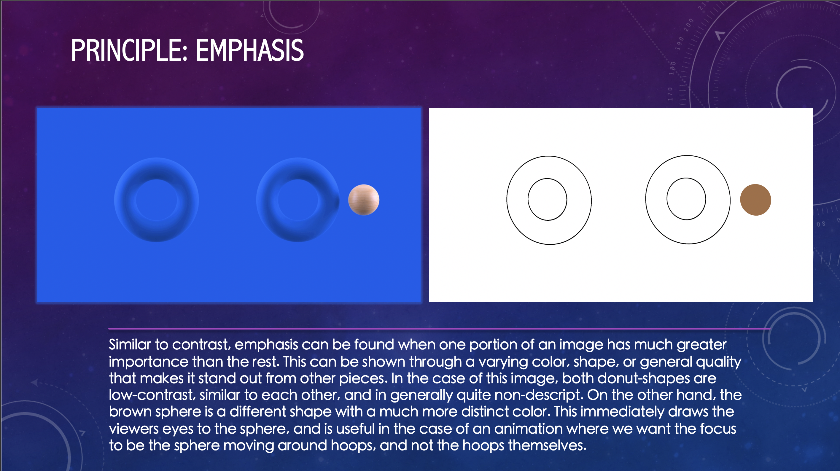
For my final step, I created a powerpoint with slides that analyzed why I chose each image and their relationship to the principle or element I used them to exemplify. Below are a few of the slides that I created:

The rest of the slides can be found on:
https://utexas.box.com/s/eb1ti43rnx56q89n1ip8ou0a7ylvjlis
After doing this, I had the powerpoint reviewed by Abriella, and then the training was complete!
What I learned:
- Different concepts require different styles of outlining in order to convey the most important features
- Almost every image combines at least 2-3 of the principles and elements. The less abstract the art, the more principles and elements they employ.
- Space and negative space are not always the same concept. Size and Hierarchy are related, but are not the same and may be used for different reasons.
- Contrast is most commonly shown with color variation, although size and shape are also used.


 `
`