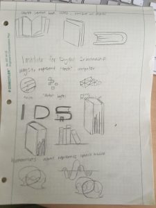
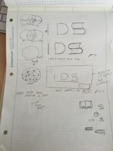
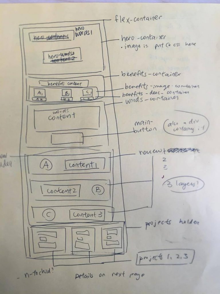
I was asked to work with the department for digital humanities to create a logo and banner for the website. After meeting with the client, I understood that they wanted a combination of digital/techy, and literature. My first sketches looked like this:
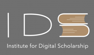
I created drafts of a logo that combined a book, the sides of the book creating the “S” in IDS (Institute for Digital Scholarship). This is the mockup from photoshop:
However, it didn’t have the “modern” feel to it, and the client was particular fond of pixelated effects to convey the digital aspect of their work. I took a break from the logo and went to work on the banner instead.
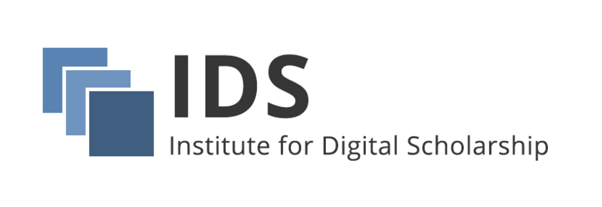
This banner was quickly accepted by the client; they loved it! From there, I got a better idea of what I should create for the logo. Knowing their color choices, I created three different iterations of the similar simple design:
The favorite turned out to be the second, which was my personal favorite as well. The three overlapping squares represent books, while the flat design lends modernity.
Final design:
This was a very fun project to work on, and was my first time working on a solo design project with a client. One valuable thing I have learned is the importance of timely communication when working with clients. I always love to get quick feedbacks, so they must appreciate it as well when I place high priority on their projects. I want to thank Suloni and Andre and Ruben for working closely with me this year on several of our projects, as well as the other wonderful STAs. I will see you guys after summer!
