Summer Marketing
Feb Post #2: Animated Instagram Reel listing the “Top 3 Reasons” to take UT summer online courses.

Spring Postcard: Finding our graduate to feature on the postcard :0


Feb Post #2: Animated Instagram Reel listing the “Top 3 Reasons” to take UT summer online courses.
Spring Postcard: Finding our graduate to feature on the postcard :0
February Reel #2
Top 3 Reasons to Take Summer UT Courses (in the style of the animated pre-roll)

IPE PPT QA
Project: Banner Design & WP content uploading for Prof. Xs, Instructional African Languages website
Client /Prof: Dell – Aguirre & Kwak
Staff guidance: De’sha
STA team members: Kate, Kyra, Lila, Shanda, Shriya
Description/plans: 9 PPT Modules to be reviewed and reformatted–make slides visually cohesive and match existing style guidelines (provided by De’sha in a standardized PPT example)
Nursing Module 2: recreate an animated graphic based on the client’s mockup. Also correct font sizes, spacing, etc.
Client Mockup
Recreated Graphic


Slide Animation
Summer Marketing


PSY339: Behavior Problems of Children
Project: Course Graphics
Client /Prof: Dr. Sara Villanueva
Description/Plans: Updating/creating new course graphics and imagery for PSY339 Spring 2025
Pre-roll Animation
PPT Content Slides


TA Monitor

Summer Marketing
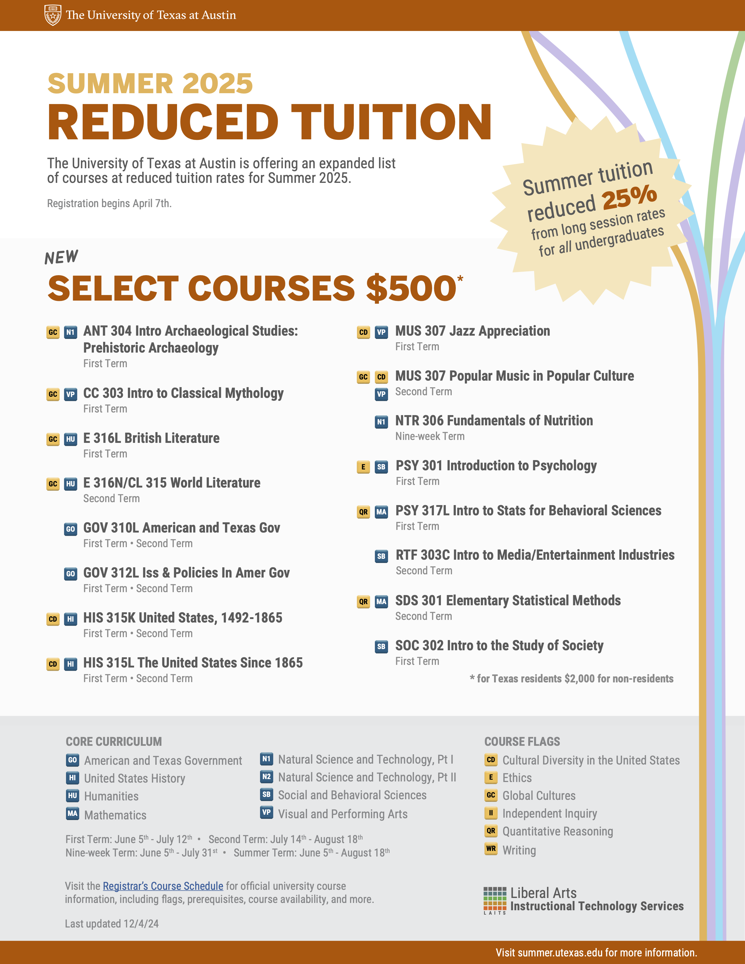
Tuition Guide
Added estimated semesters offered
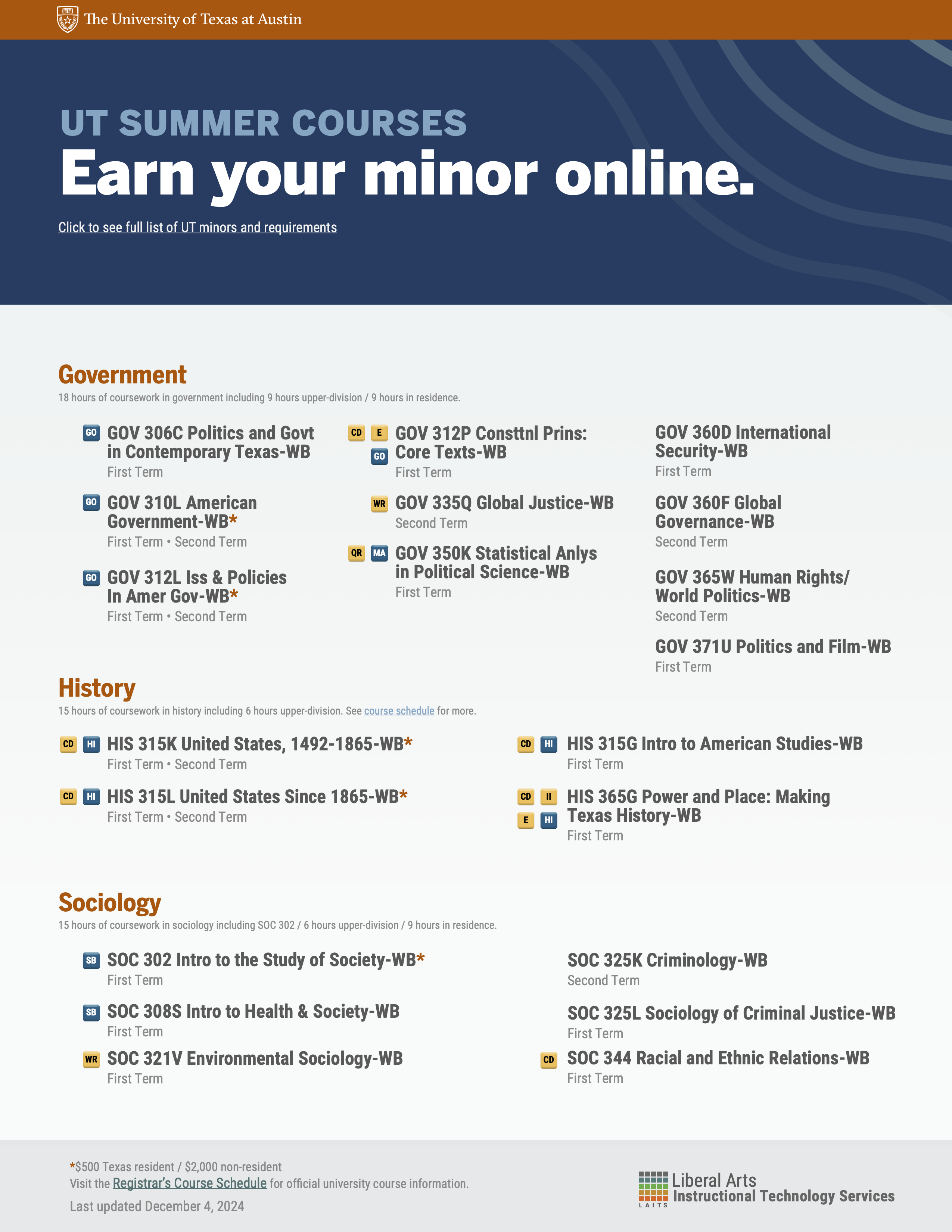
Minors Guide
Updated classes and spacing
Tuition Guide

Finalized Fall Postcard


Finalized Digital Display

Finalized GPC Screensaver
10/1 – 10/18
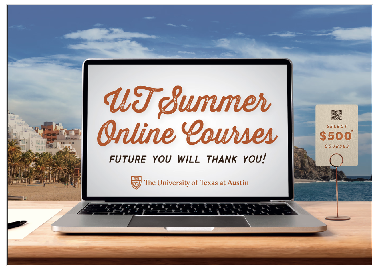
Initial brainstorming: We wanted to offer the team a first-person and third-person perspective option for the postcard. We took last year’s Alcalde ad and put it on the postcard, as well as stock images of people studying/on a laptop in various locations to illustrate how these classes can be taken *ANYWHERE*
Feedback: The team wanted to continue exploring both options. They liked how the diagonal line draws attention to the $500 sticker, but they also liked how the orange’s curved movement implies a wav– every summer. However, while the image had beautiful colors, the team wasn’t sure how to feel about the trendy clothing (it seemed fashion-ad-like) and how unrealistic it was to bring a laptop on the beach. They wanted something a little more realistic– maybe a student traveling in the city (but not Austin).
The team did appreciate all of the options still feeling very UT in their appearance (burnt orange and institutional).
first drafts:


drafts after feedback and meetings: