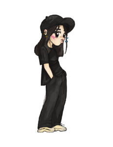
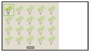
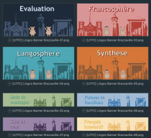
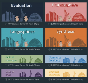
Hello! For this week, I mainly focused on one project but here’s my avatar for the STA Banner that I had forgotten to previously showcase! mini me!!
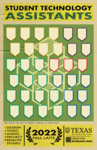
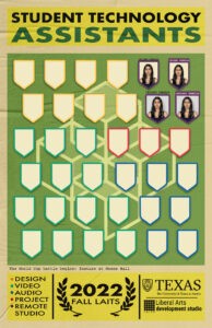
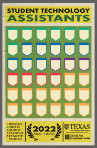
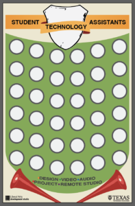
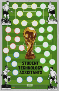
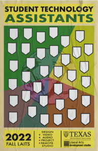
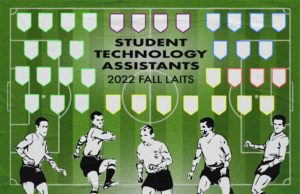
Apart from that, I have been continuously working on the STA team poster that I started last week.
- Is the yellow for the rectangles too yellow?
- I wanted to add a small text in-between the green and yellow rectangles as shown above mentioning something about Mezes hall but I’m unsure how to rephrase it. Or should I completely omit the sentence?
- Should I make the leaf crests green or leave them as is to not draw too much attention?
- Is the texture opacity OK?
- Should I go with the original size shield (top row) or a wider shield (bottom row)?
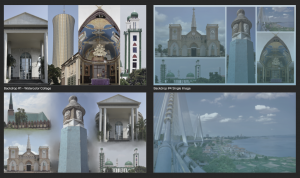
- Should I cut everyone out of the original backdrop (top row) or keep the original backdrop (bottom row)?
- Do the names look better on the outside or within a border? Any better ideas on displaying the names?
- Should the drop shadow for the shields be darker?
- Is the color scheme for the shields ok?
Thankfully I had a handful of help from De’sha and Maddy as in specifics for the poster. After a little bit of correspondence between them and Mike Heidenreich’s new feedback, I was able to get to this point.
