• We are STAs
    • Asha Rountree
    • Haley Ma
    • Kate Shih
    • Kyra Lee
    • Nicholas Peasley
    • Sasha Kenney
    • Shanda Horm
    • Shriya Atreya
    • Tomas Marulanda-Mesa
  • We were STAs
  • STA Presentation
    • STA Presentation 2017
    • STA Presentation 2016
  • Testimonials
  • Resources
  • Home

STA Blog

Jaclyn Alford

Jaclyn Alford

This Is Democracy Cover Art Design

June 26, 2018 By Jaclyn Alford

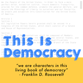
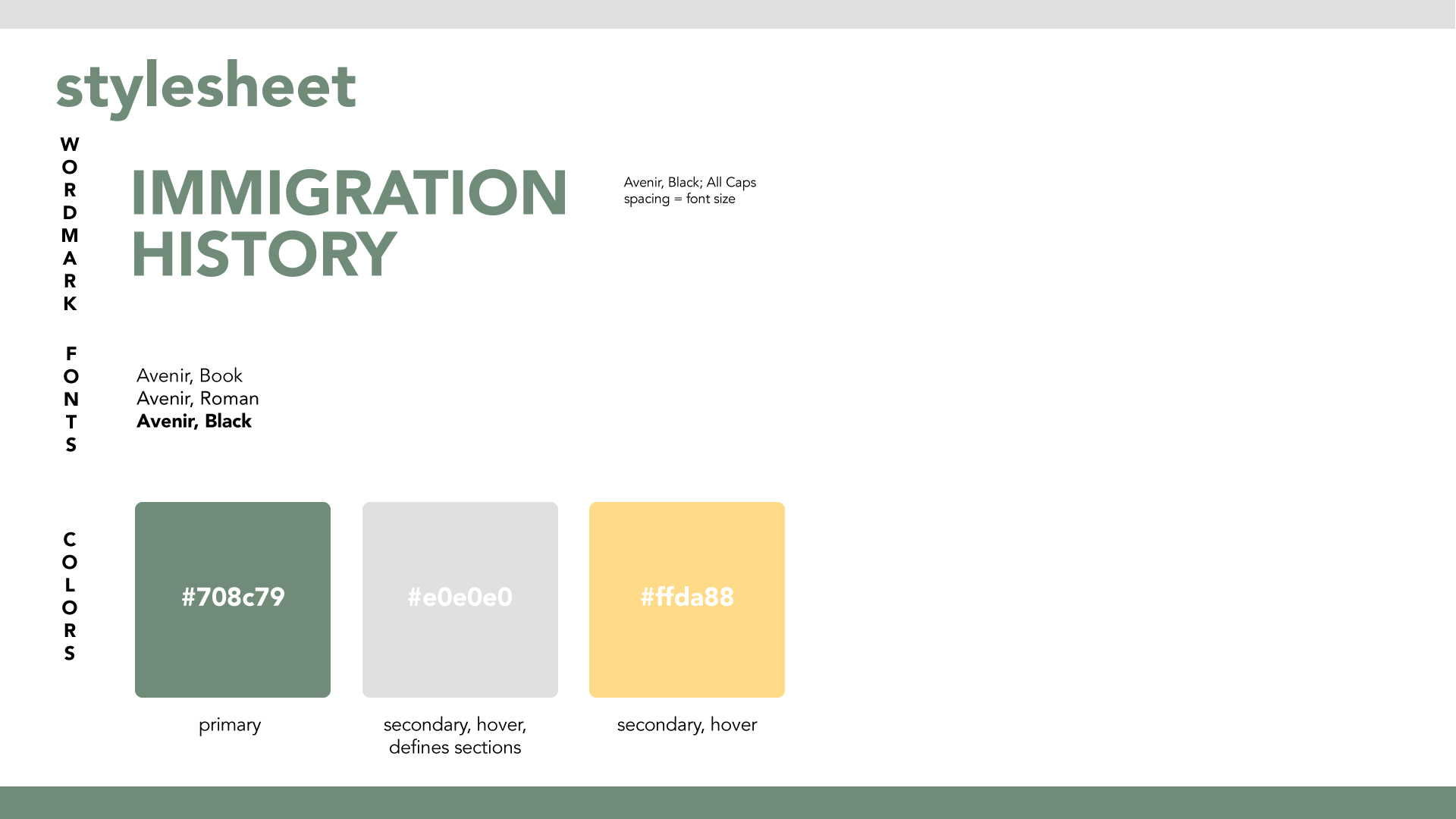
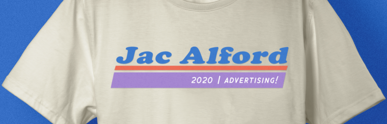
I chose this text-based design because I think the target audience (i.e. “young people in their teens & 20’s” / aka ME) will respond well to something clean and bright.

Note: When the cover art is sized down, it will be difficult to read the tagline. I believe that a more appealing design would leave out the tag.

Filed Under: 2017-2018

Nation of Immigrants UI Design

June 19, 2018 By Jaclyn Alford

Wowee another UI design project! Keep ’em coming, Suloni. I’m having fun with these.

Nation of Immigrants is a WordPress site that Kathy and I will be designing the layout and feel of. The site houses an archive of info and documents about the immigration history of the United States. Once again, this is a really cool and important project because the design of the website is going to be able to make this information all the more accessible!


Here is the first round of mockups:


Filed Under: Uncategorized

Racial Geography Tour UI Design

June 12, 2018 By Jaclyn Alford

For this new, incredibly cool (and culturally relevant!) project, I am helping Suloni as a co-art director and UI design lead.

Racial Geography Tour was an in-person tour organized by Dr. Gordon in which he shares the history of certain buildings and landmarks on UT’s campus that have cultural significance.

On the tour’s current webpage it further explains, “Learn about these and other intriguing historical facts by scheduling a Racial Geography Tour of campus with Dr. Edmund T. Gordon, Chair of the Department of African and African Diaspora Studies.  Taking up the challenge means engaging in a veritable archeological excursion! Explore how anti-black racism, patriarchy, and militarist nationalism of the New South are sedimented in the architecture, landscape, layout, and building names of our campus. Examine the historic origins of the buildings, landmarks, and spaces to come to grips with the historical and present realities of The University of Texas and Austin.”

https://liberalarts.utexas.edu/aads/racial-geography-tour-.php


Now, LAITS’ video and design team is helping Dr. Gordon make this incredible experience accessible to everyone with a device. It is in the process of being converted into a virtual tour website; most of the 360 videos are already recorded and edited.


I first sat down with Suloni, Stacy–the lead programmer, Kelly–the video manager, a video STA, and Melissa–who will be helping with design deliverables–to discuss this project and my roles.

For the first round of tasks, I am creating:

  • mockups of the site that includes its extent of controls and functionality
  • a style guide for the site
  • intro graphic options

Additionally, I am working with Suloni to examine branding options and practices–including potentially altering the title/adding a tagline for clarity.


I am genuinely ecstatic about this project and its message, and I am so thankful to help make this invaluable information available to UT students, alumni, prospective students, and individuals outside of the university system.


Below are the initial mockups of the main window: the collapsed view, an “about” popup, and sidebar views


And here is an option for the intro graphic (it splices together two images of the Jefferson statue–one in 1933, the other in 2017)


Page updates:

And I created a click-through prototype to really bring the project to life! https://marvelapp.com/31bc893

This was my first time Really Utilizing Marvel, and it’s incredible how these pngs can act like a coded site. Pretty neat stuff!


Went ahead and added a dropdown menu in the main nav to ease navigation (plus it looks prettier than a table of contents).

Also, there is at least one supplementary (non-360) video that goes along with one of the stops, so we needed to think about where it would live.

Oh and just in case folks wanted to provide feedback or had any lingering questions, we added a contact form too (which WordPress does a great job of supporting).

Filed Under: 2017-2018

Dev Lab Door Graphics

May 11, 2018 By Jaclyn Alford

Currently, I am re-doing the graphics and copy that will be used on the door of the Dev. Lab as an advertisement of sorts for the STA program. I switched out some of the iconography for a more cohesive look, altered the font for increased legibility, and highlighted the action/activity portion of the copy.

Initial design:

Updates:

Next version of edits:

The title was moved to the top and description to the bottom to make the eye line/flow more smoothly. Additionally, a horizontal break/bar was included to keep the graphics and type tidy.

Additionally, I created a title card for this collection of cards.


Here is a mockup of how the graphics might look on the Dev. Lab door:

Filed Under: 2017-2018

Homepage Feature Images

May 11, 2018 By Jaclyn Alford

Recently, I have been tasked with creating feature images for the LAITS home page. Feature images are one of the main factors that draw in readers. Audiences will judge a book by its cover, so that cover needs to be visually appealing. Additionally, these feature images need to adhere to the overall look and feel of the LAITS homepage–i.e. it shouldn’t clash with any other elements.

Starting out, I had a few images to choose from for each article. First the image needed to be resized, and then I created many options featuring logos, color overlays, and decorative elements.

Here is the current homepage with the TEDx feature image I made.

And here are a few renditions of the British Studies feature image:


Filed Under: 2017-2018

Fall Online Courses Flyer and Screen Ad

May 11, 2018 By Jaclyn Alford

For the flyer, I was tasked with updating the information in a preexisting template and create a fall-themed graphical element.

Suloni and I agreed that using the “albino” squirrel here could be cute, so I ran with it. Like previous online course promotional materials, this graphic adheres to a paper collage style.

Note: The photo used for the squirrel was actually brown, but that’s nothing a clipping mask and overlay can’t fix!


Using the same graphic, I created a screen ad as well. The layout and style follows the previous screen ad for summer online courses.

Filed Under: 2017-2018

  • « Previous Page
  • 1
  • …
  • 4
  • 5
  • 6
  • 7
  • 8
  • …
  • 11
  • Next Page »

link to LAITS home page

Video STA Home

© 2025 Liberal Arts Instructional Technology Services | Production Credits