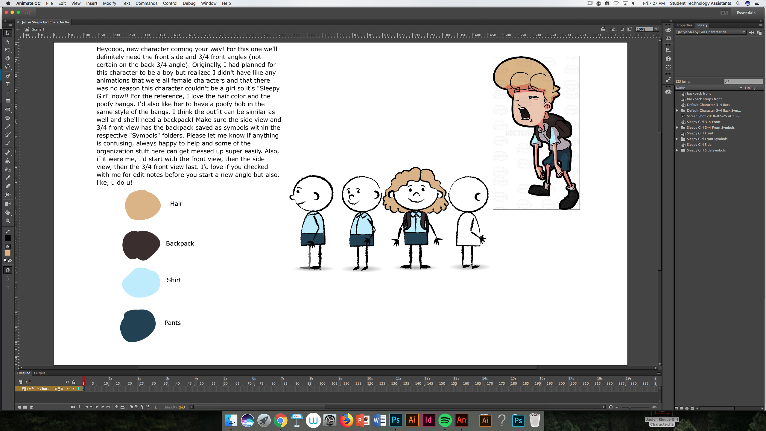
For RUS 412, I am continuing to work on assets for the short animations. For my current assignment, I am creating a sleepy girl character.
Here was my shot at the front view + the refs and description.
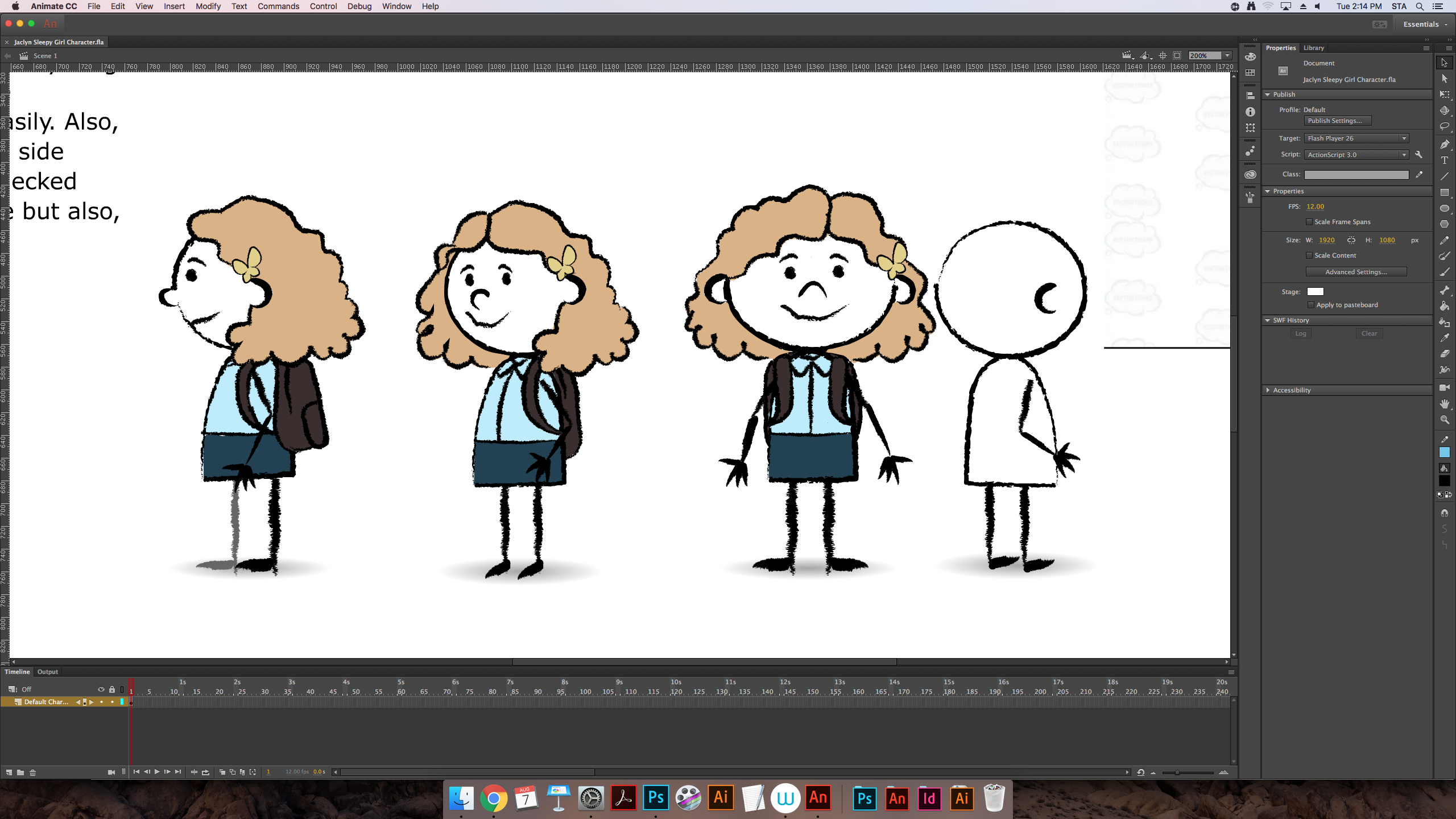
annnnnnnnd an update on the different views!
For RUS 412, I am continuing to work on assets for the short animations. For my current assignment, I am creating a sleepy girl character.
Here was my shot at the front view + the refs and description.
annnnnnnnd an update on the different views!
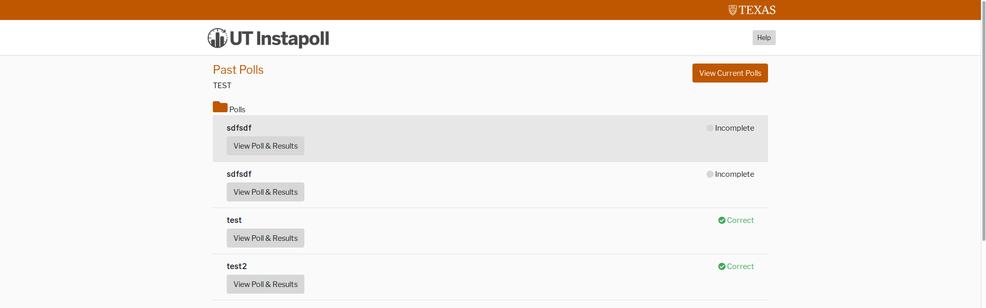
ANNNNOTHER UI PROJECT WOOOOO.
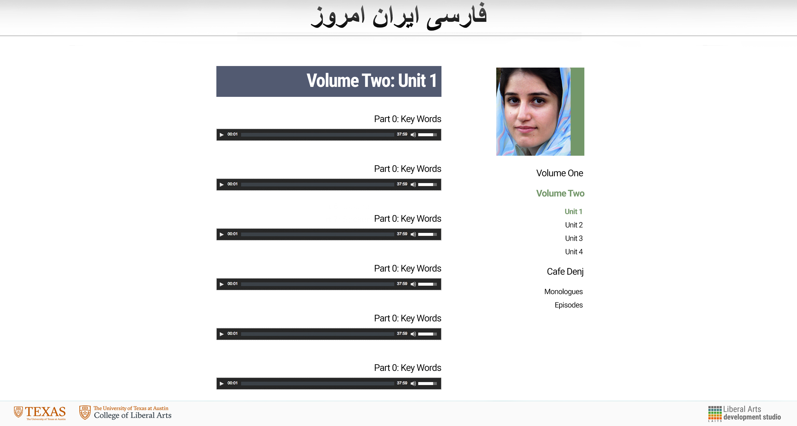
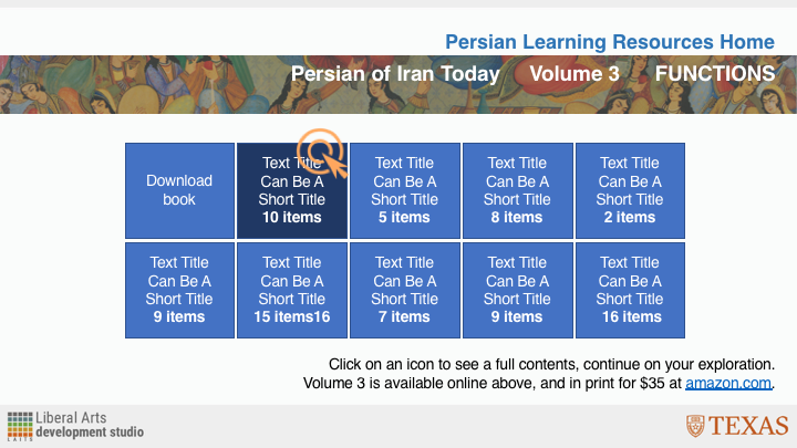
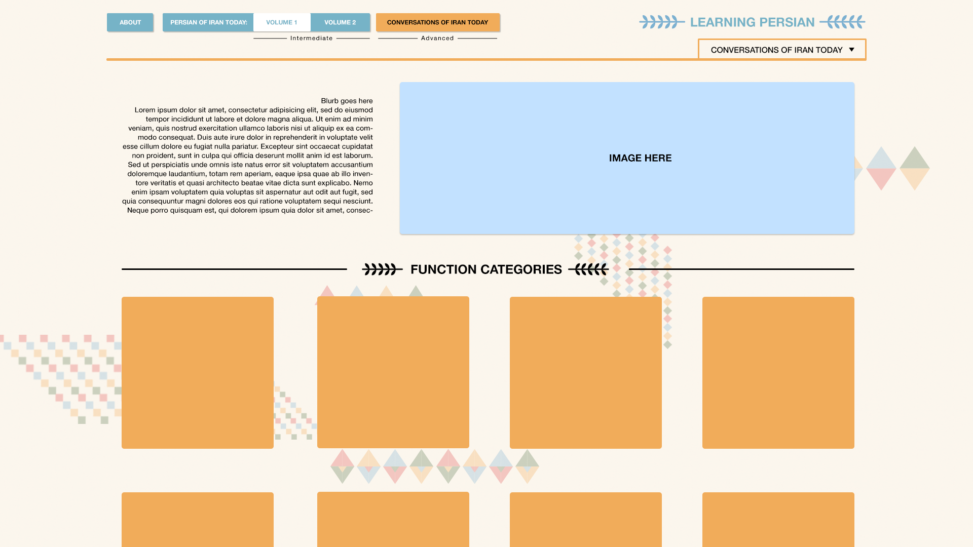
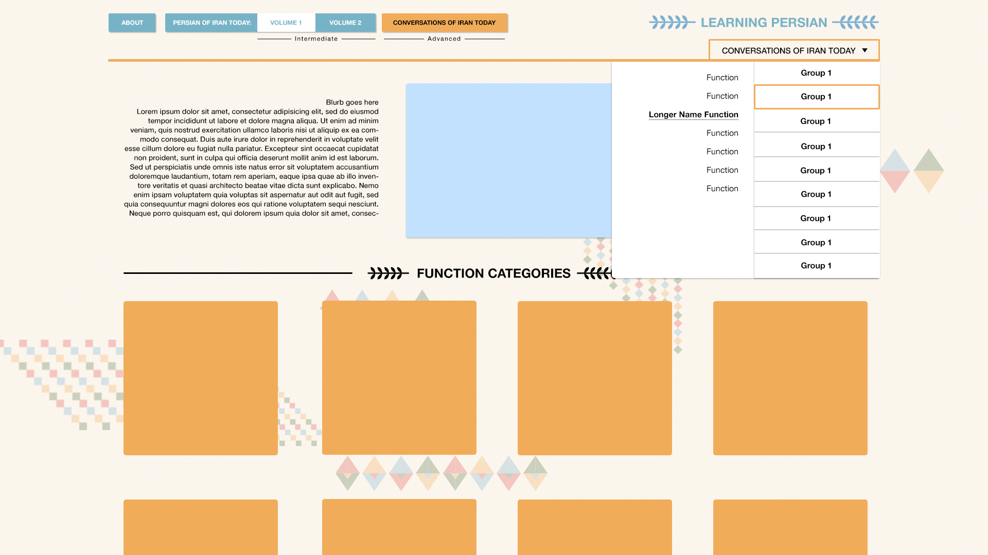
I’ve genuinely been enjoying myself with these UI projects! I am working again with Kathy to update the interface for the Persian Learning Resources site. I have attached reference images below!
Current:

Rough:
New refs from Suloni:

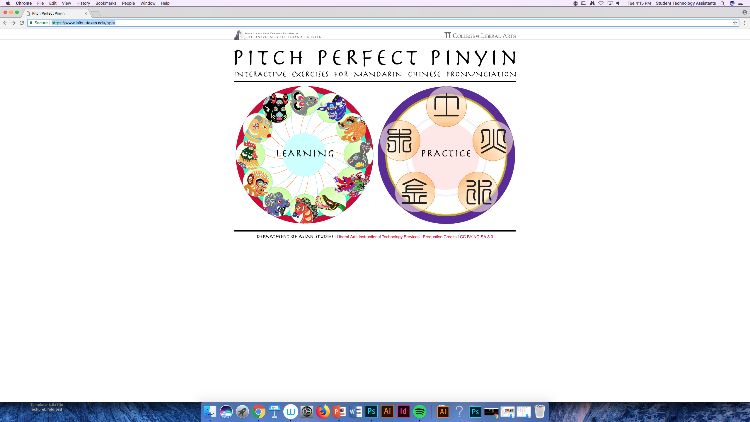
https://www.laits.utexas.edu/ppp/learning.php

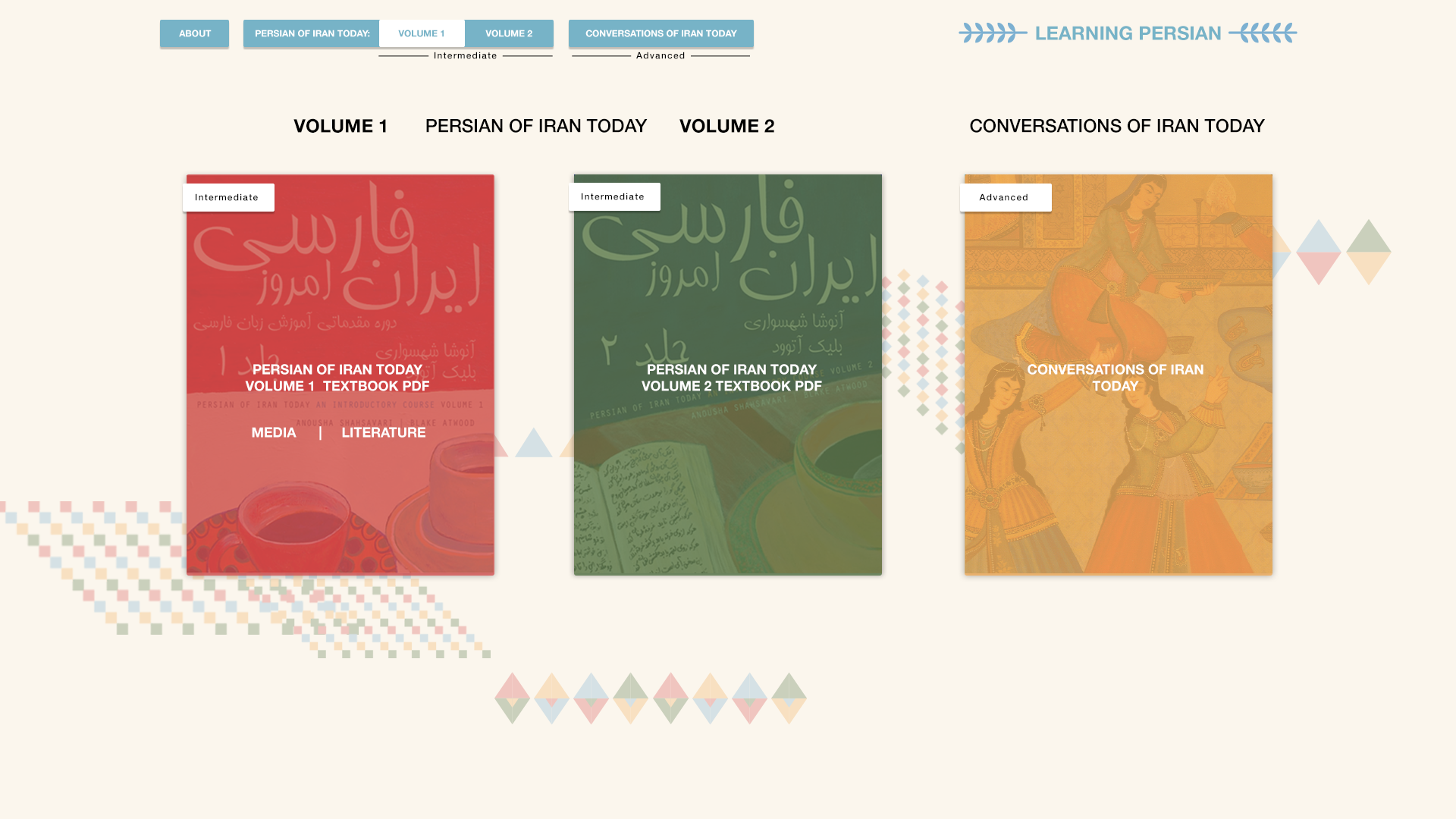
And an update on the portal page and Conversations of Iran Today page!
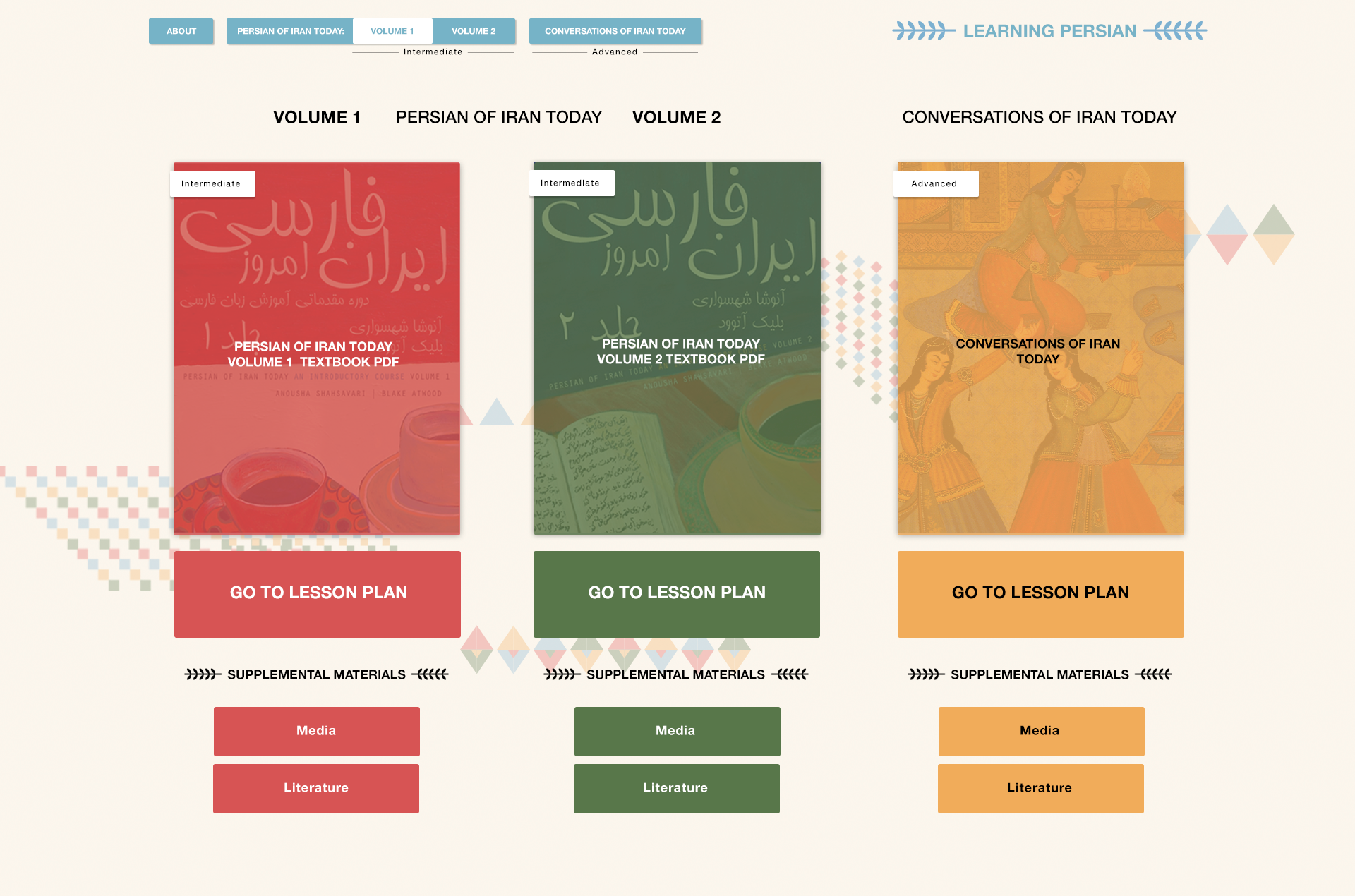
and with added buttons:
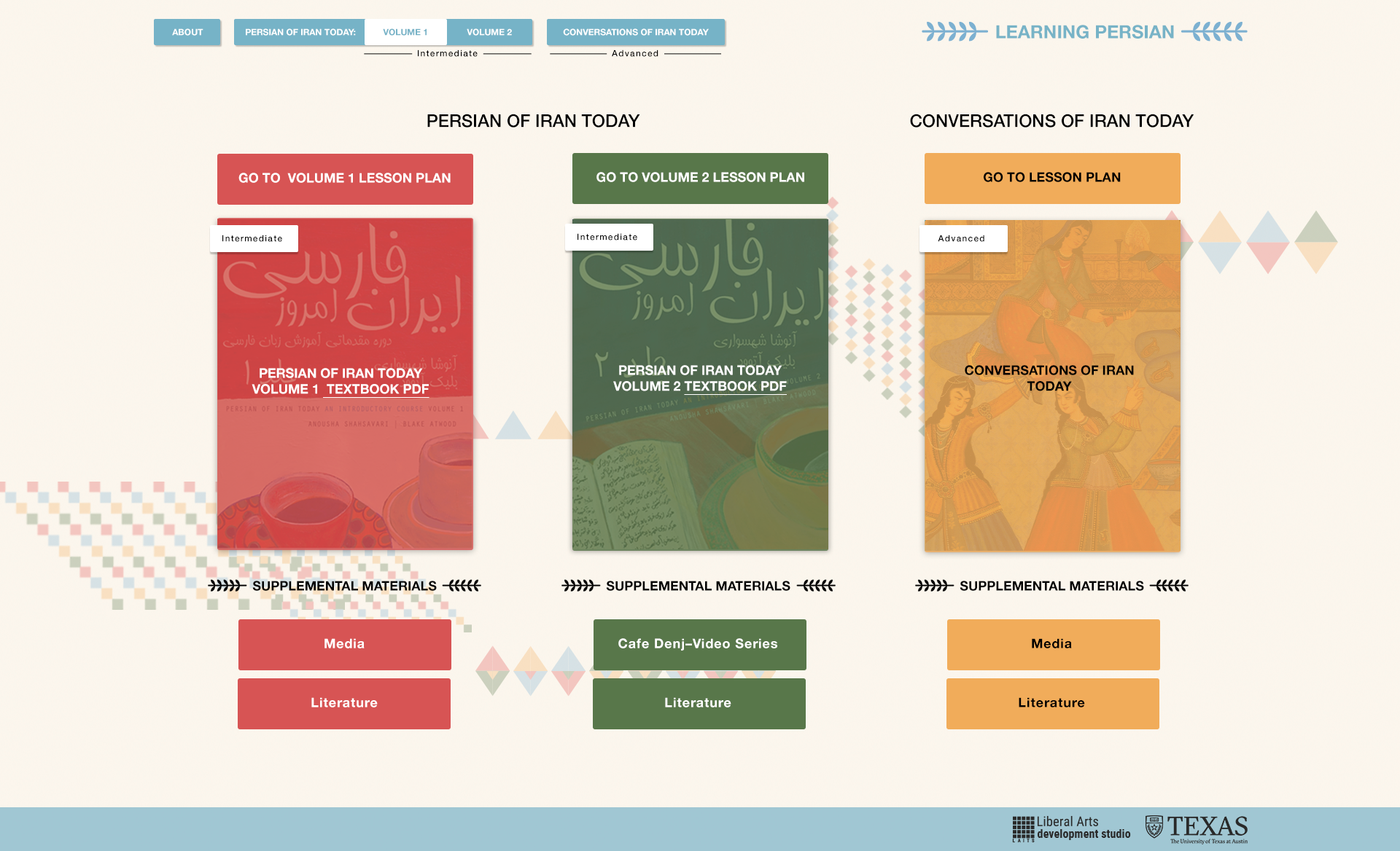
COIT home + Dropdown menu
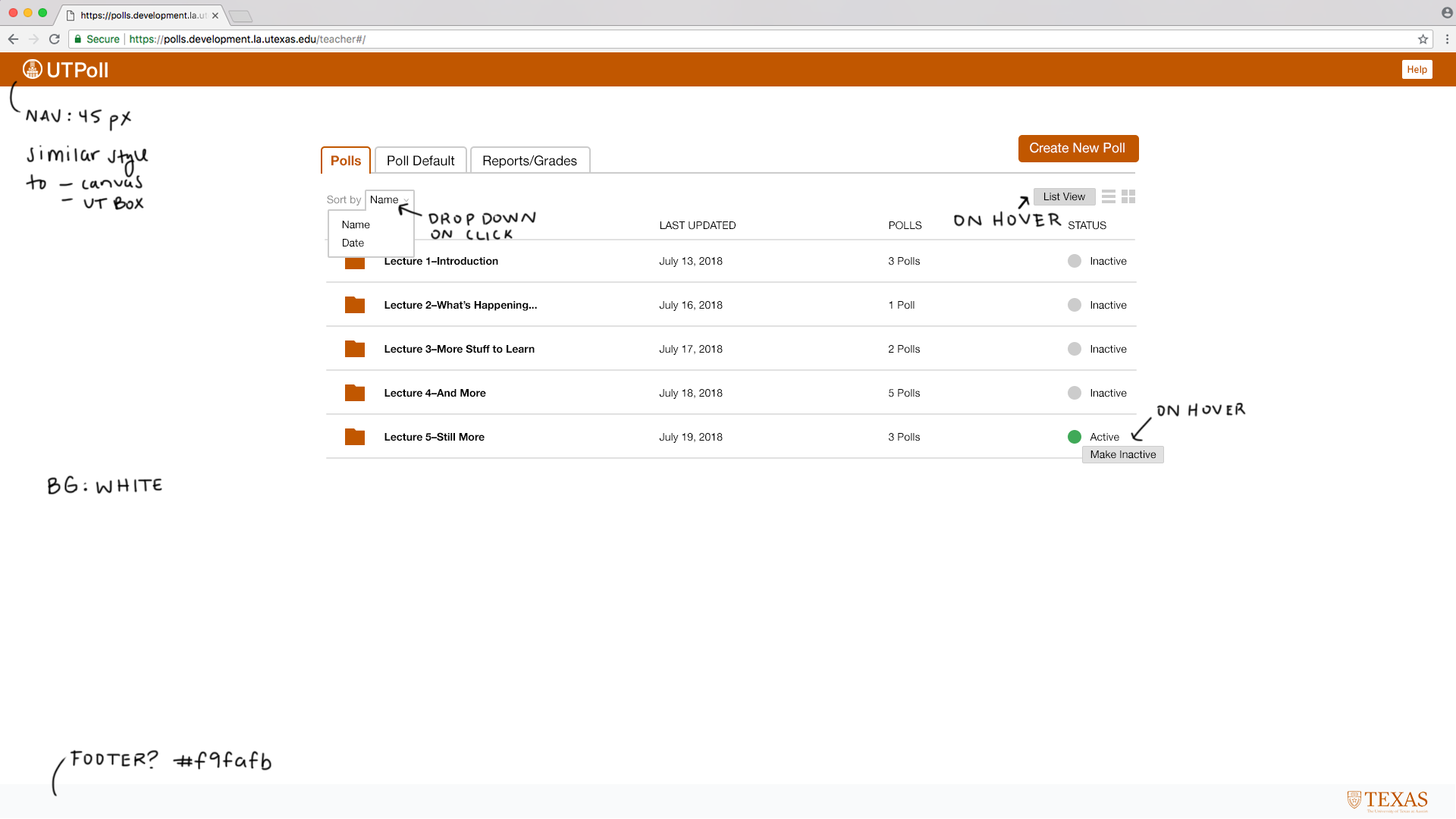
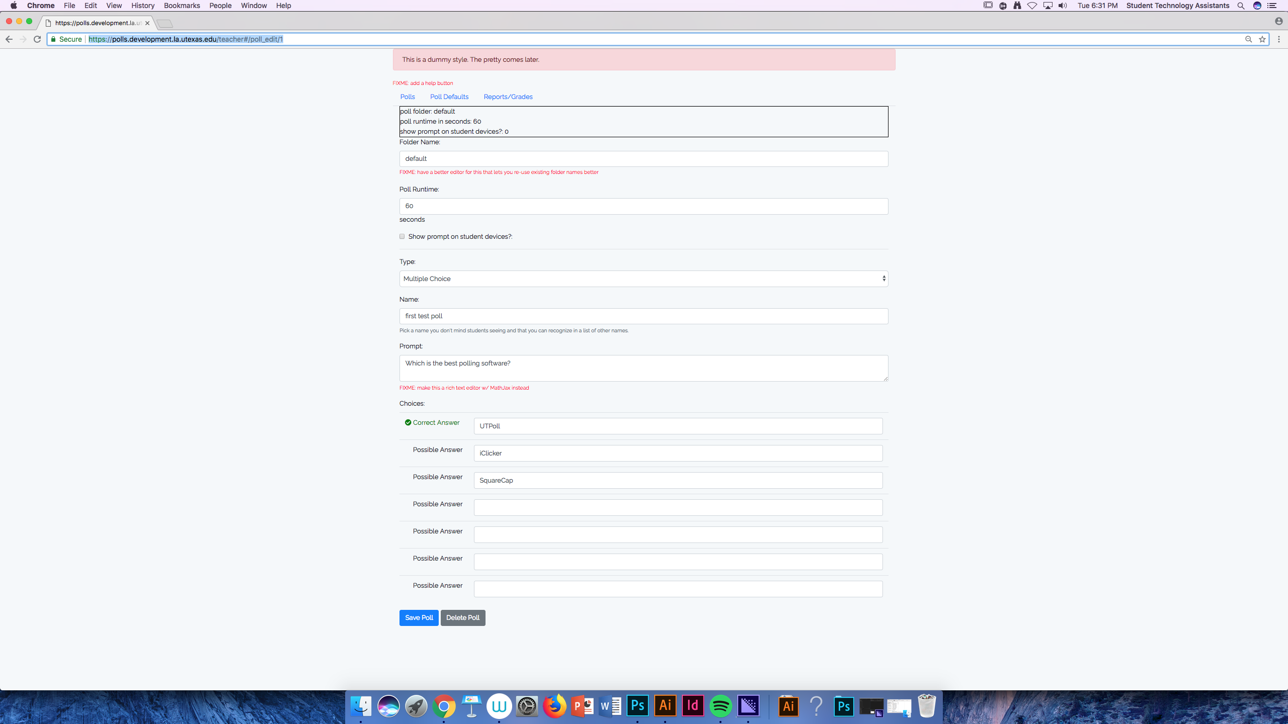
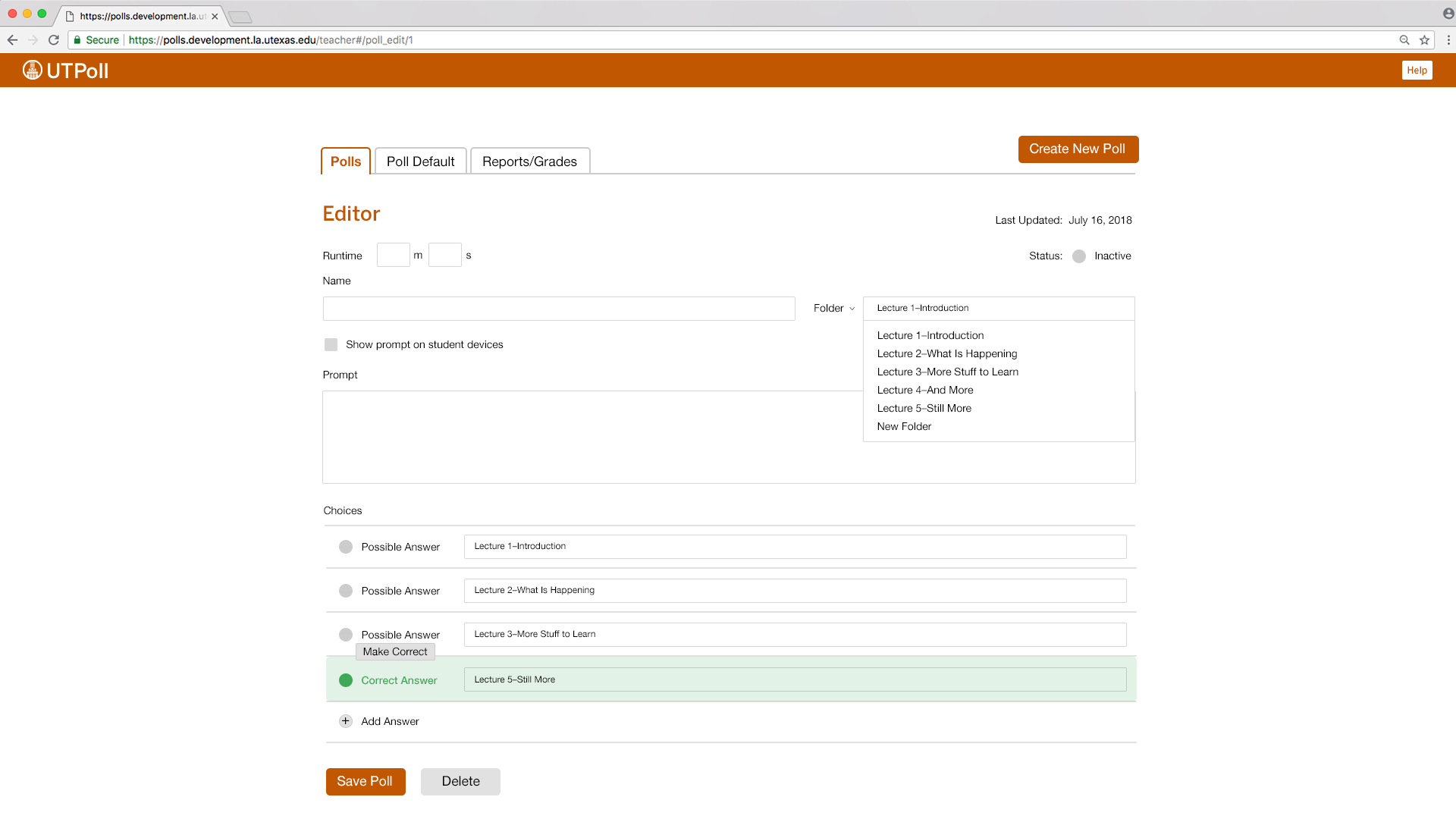
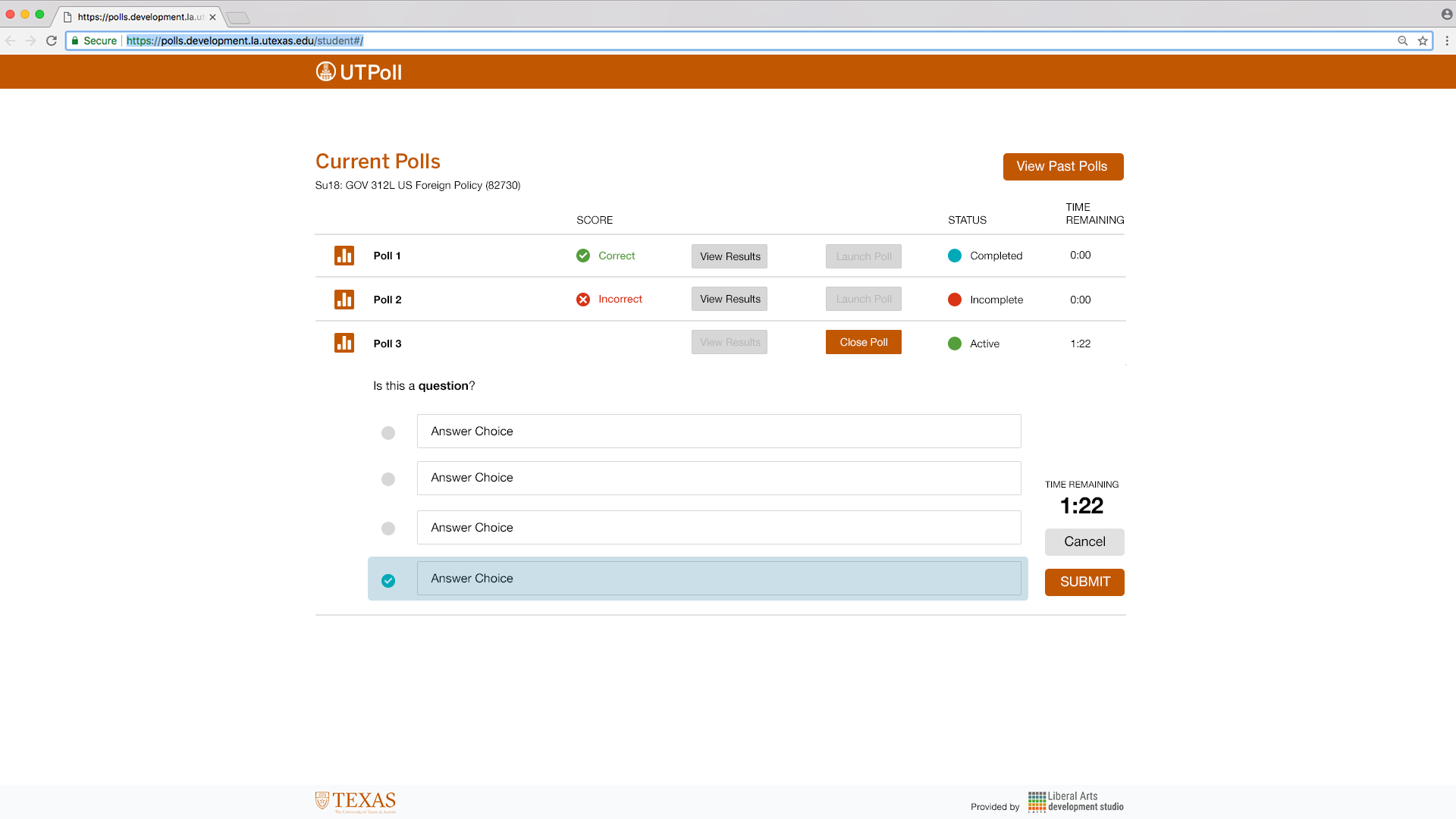
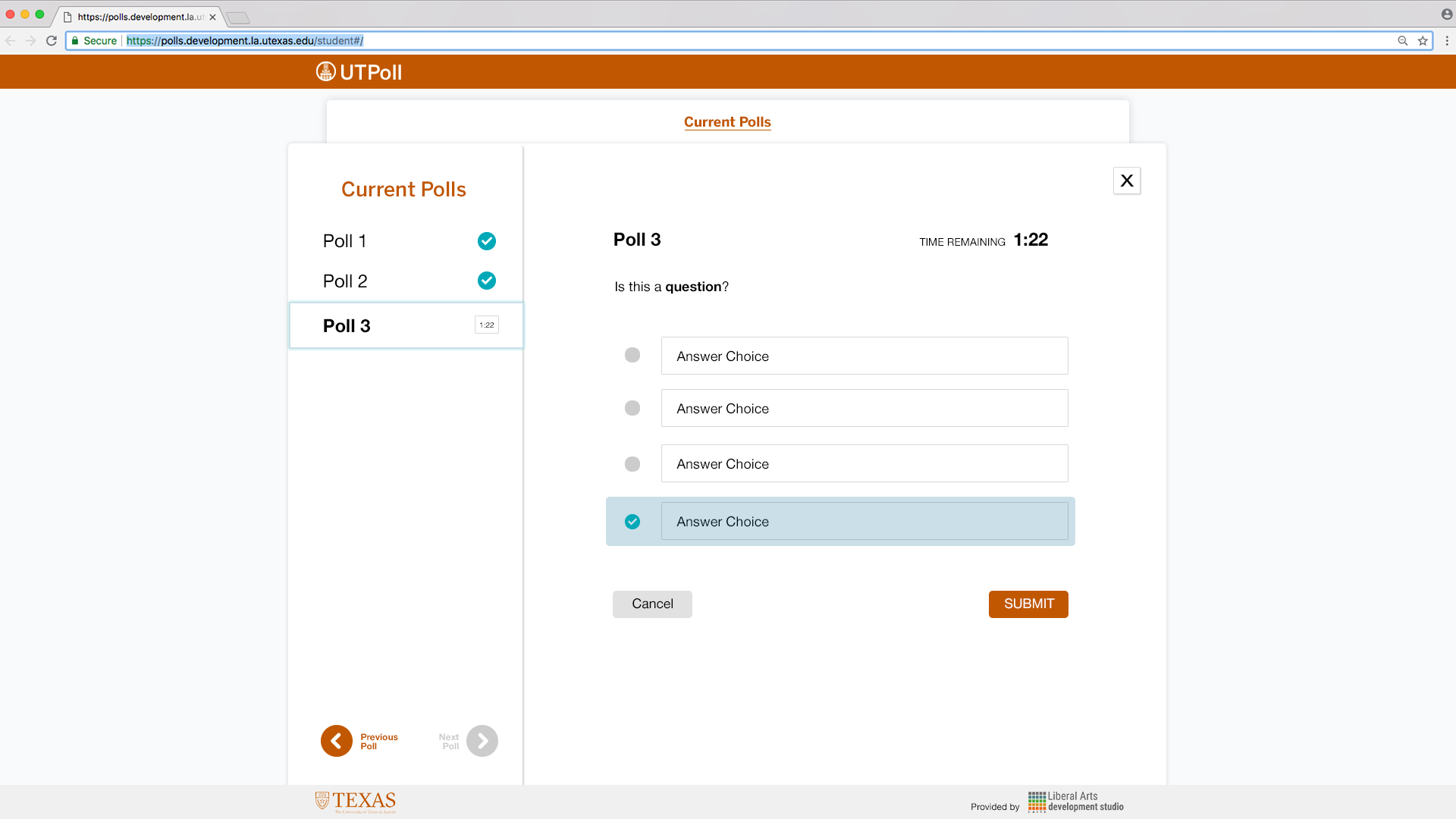
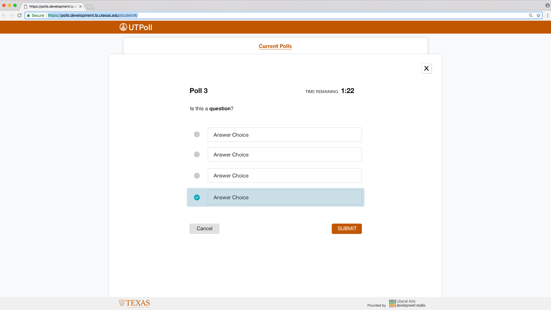
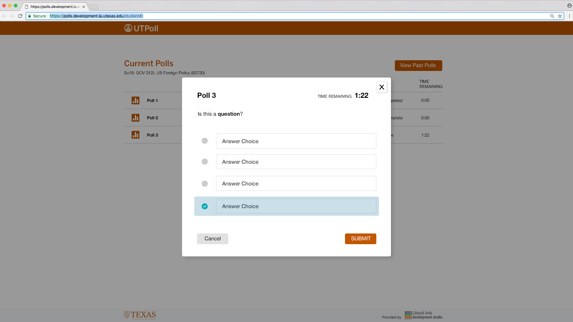
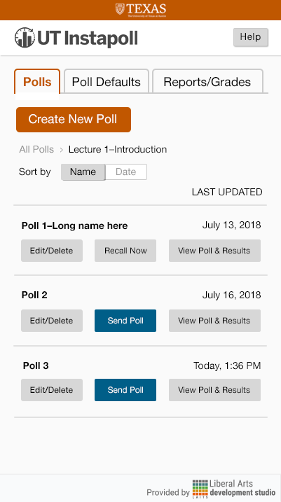
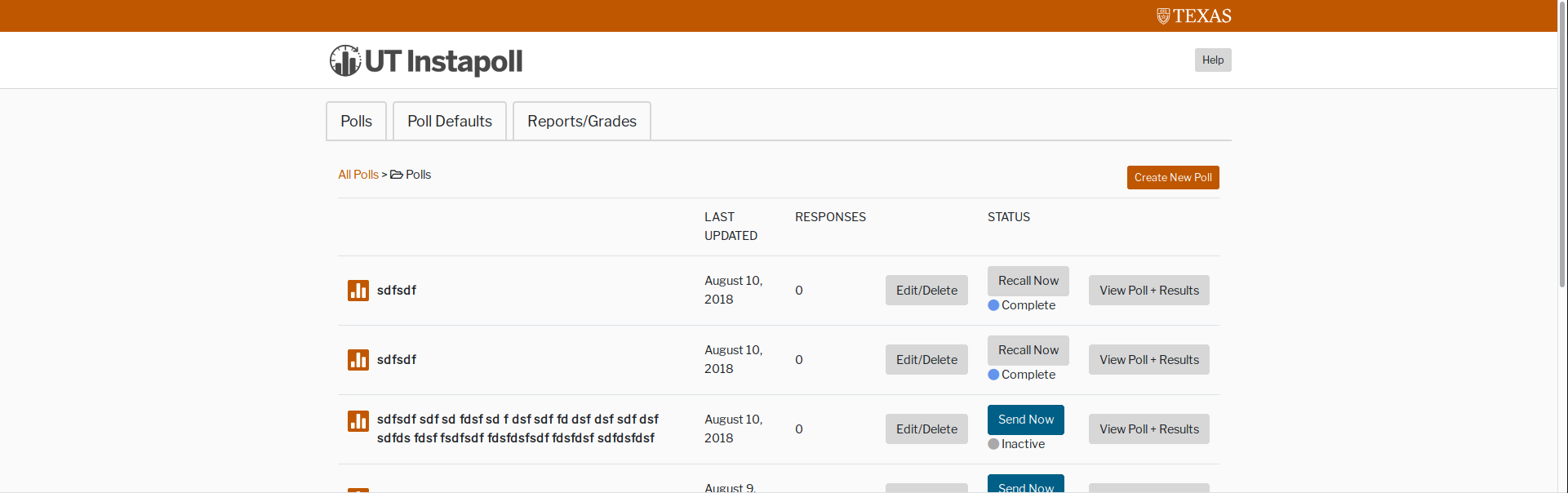
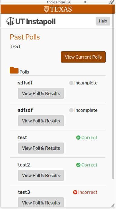
Suloni asked me to help out with the UI design for a new (free!) clicker system for UT classes. Having used a few clicker systems myself, I am excited to help out with this project and hope this tool will be standardized/help drop the cost of courses for students!
Here are the first few mockups of the “teacher” view home page (+ versions with my notes). I tied in elements of UT Box, Canvas, and the UT branding guidelines webpages. Hover effects are included considering instructors will likely be using the desktop version of this most of the time (unlike students who are just as likely to use the mobile version as the desktop).
The original tabs are really effective here for the menu!
Refs:
Squarecap
UT Branding + Canvas

Unstyled:
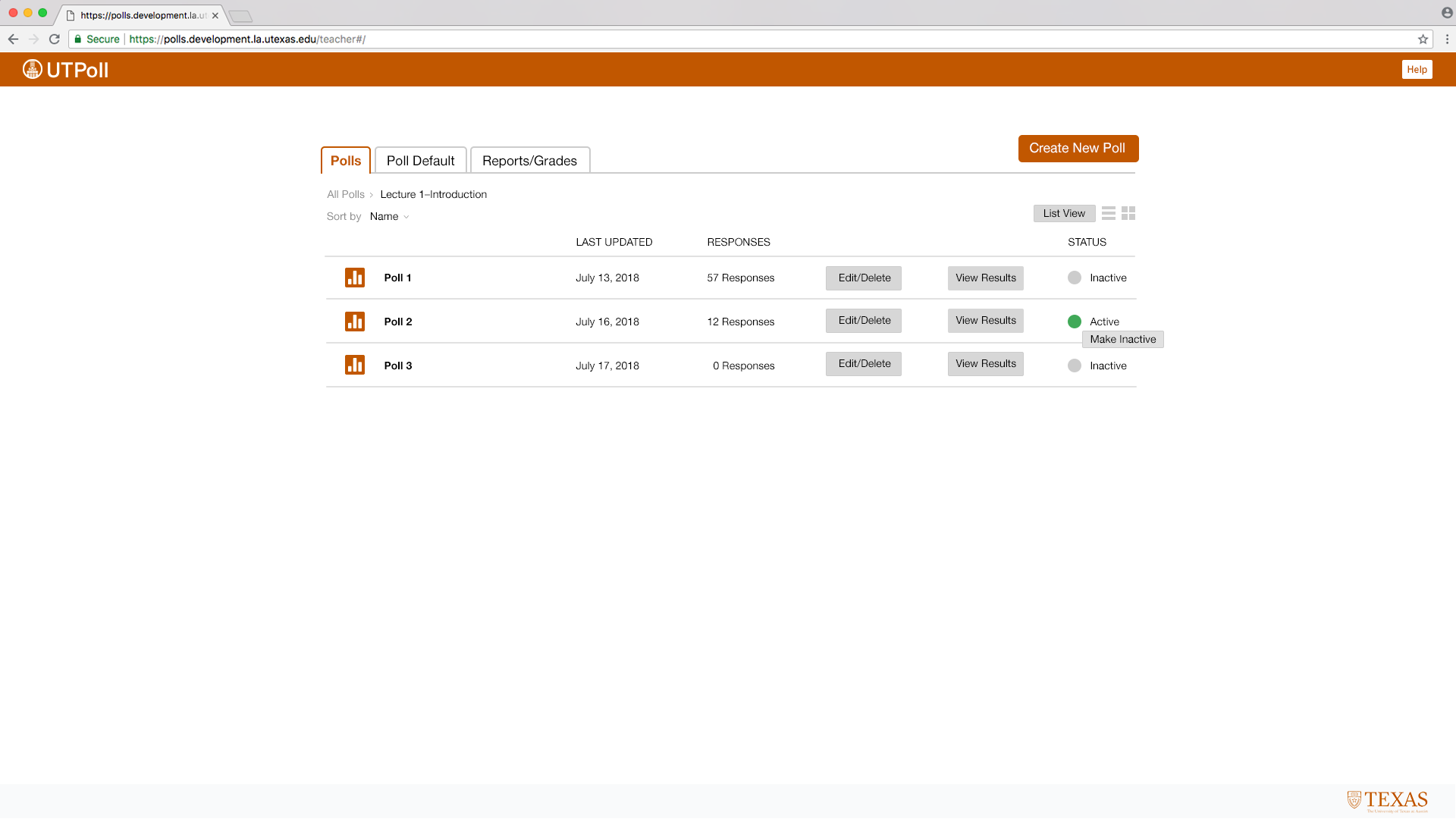
Teacher-View Folder Mockups with Notes:

Unstylized:
Teacher-View Editor Mockup
Some notes on Branding:
I had some concerns about the chosen logo; I provided an image for reference below. As you can see, the wonderful coloring and imagery is lost when the logo is scaled down. Also, the Tower imagery has already been used for 2 other UT applications and, thus, will not be distinguishable from these other apps (if you just use the symbol without “UTPoll”). The imagery only hints at its UT ownership but leaves out the polling aspect of the app.
![]()
Additionally, there is a possibility of the application being named “UT Instapoll.” I found that CALI (Center for Computer Assisted Legal Instruction), a law school organization, already has a tool called InstaPoll that seems to do the same thing as our poll application: https://www.cali.org/content/cali-instapoll. Users (instructors as well as students) would likely drop the “UT” in “UT Instapoll” when referring to the app for the purpose of brevity. I believe that “UTPoll” is concise and fits the tool well!
Updates:
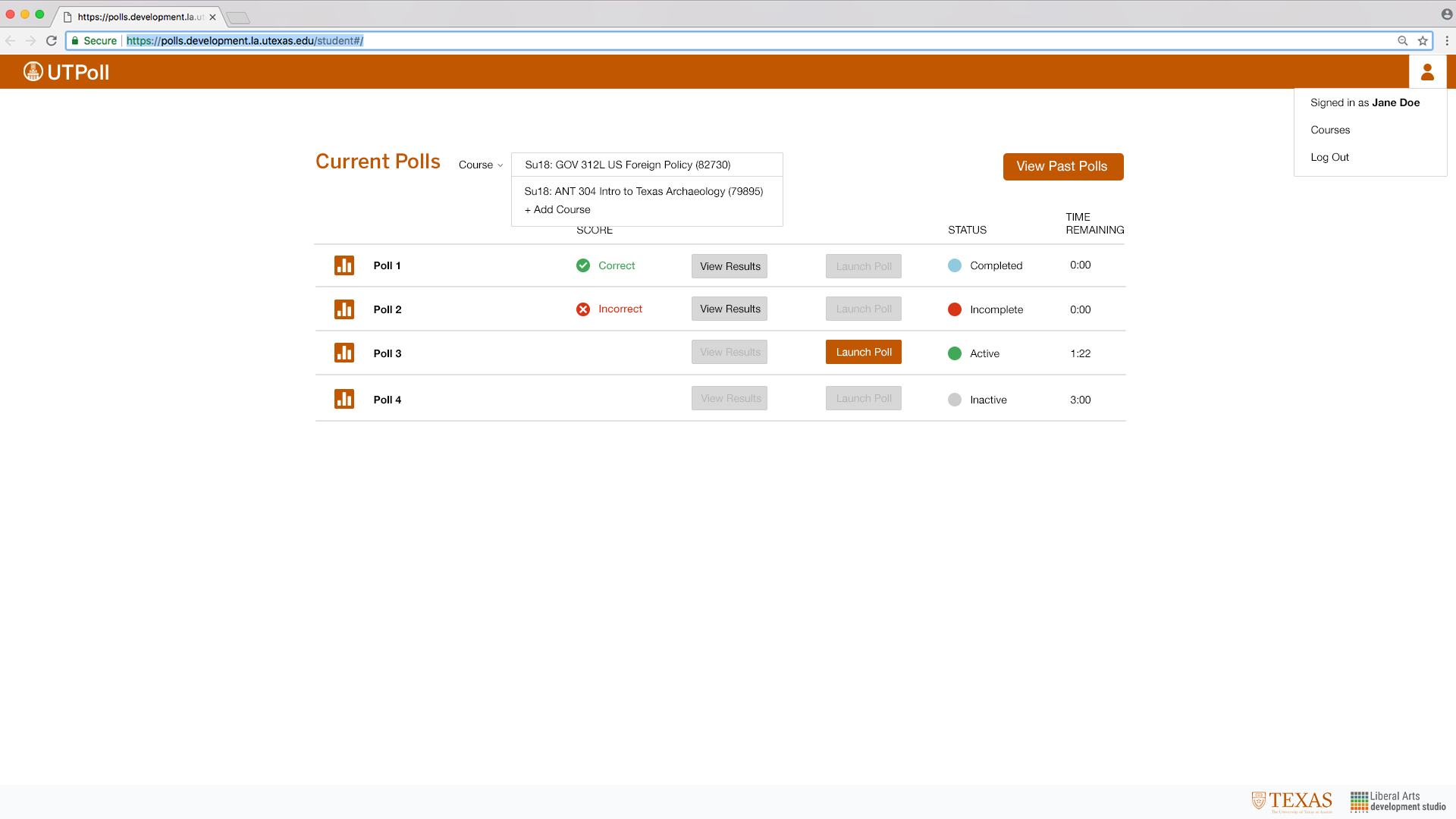
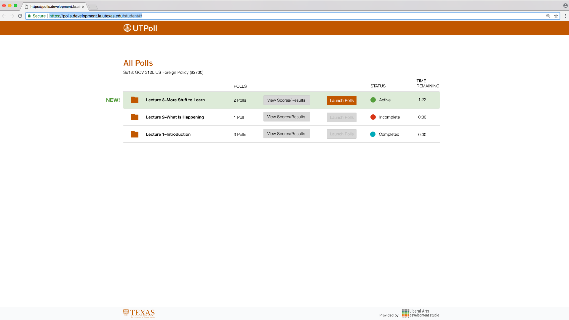
Student view:
Yesterday I met with Suloni to discuss the designs, so I am currently working on those updates! Additionally, I will be meeting with the project managers to discuss the project today!
Accordion Style
Card Style
Popup Style

Teacher: 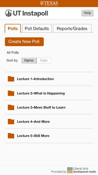
 Student:
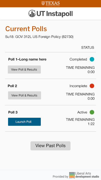
Teacher View:

Student View:

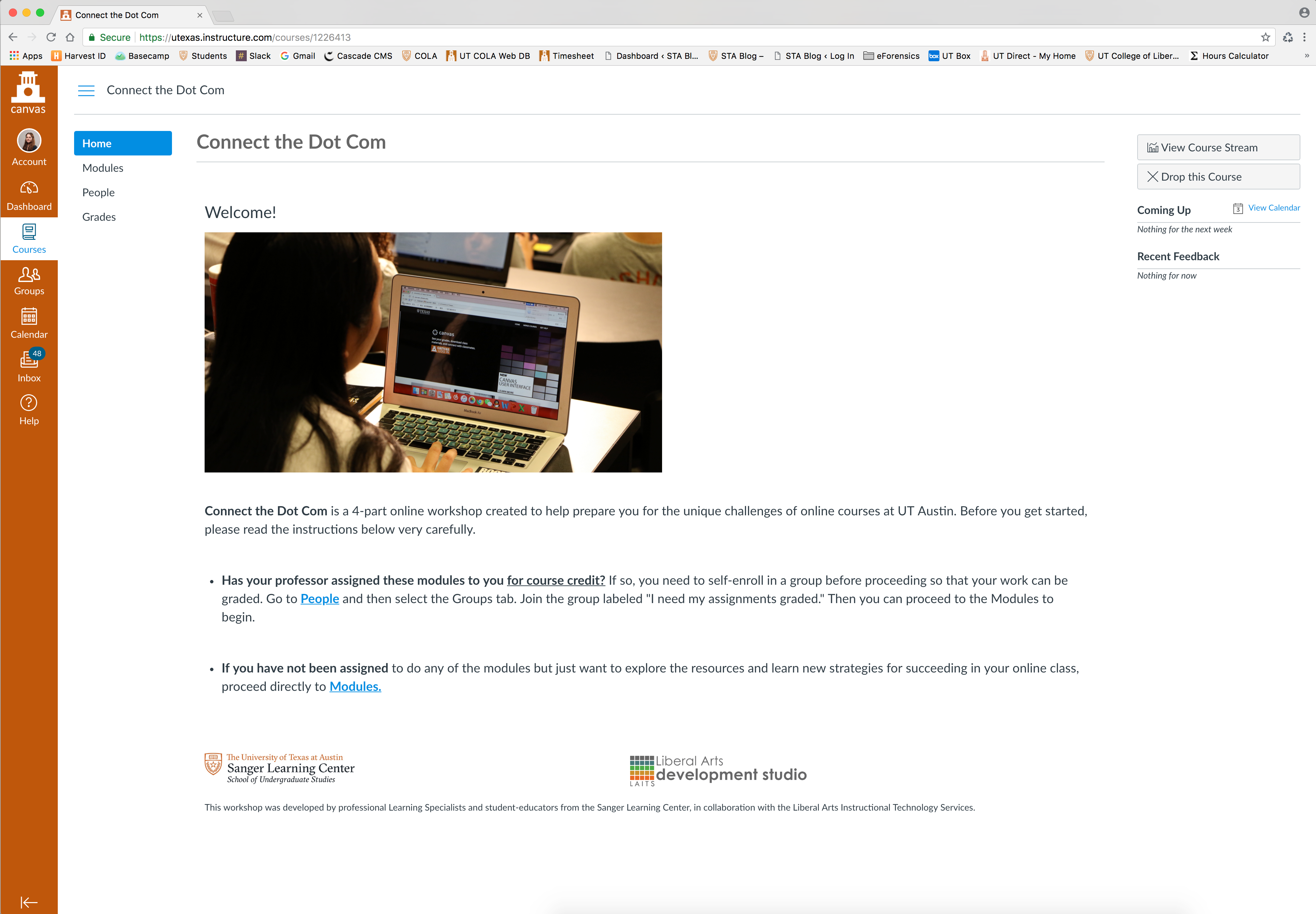
Suloni asked myself and a few other STA’s to review a new course designed to help freshman become acquired to UT online courses. I enjoyed this opportunity to provide feedback for this new tool as it allowed me practice on thinking critically about user-experience and bring back my knowledge on effective presentations/speaking.
I believe the tutorial has the power to be very helpful for students, however, I expressed concern about the delivery of the information and the service name itself (Connect the Dot Com). The name is not at all descriptive or relevant, and I was worried that students who would like help becoming familiar with online courses will not access this tutorial solely because the name does not give any hint or reference to its content. Hopefully, the team responsible for this project will utilize mine and other STA’s feedback to refine this tool; it has such potential!
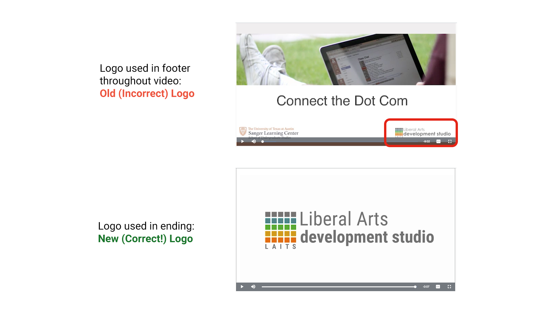
Additionally, I noticed that the course home page and the video footer uses an outdated version of the LAITS Development Studio logo. Oops!

Along with doing the UI design for the Racial Geography Tour website, I was also asked to put together a style guide that encompasses the styles of both the 360 video and website. This style guide not only organizes the art direction of the project, but serves as a tool for the professor to see the cohesiveness of the two mediums as well.
Here is the style guide that lays out typography, color, video imagery and symbols, and website imagery:
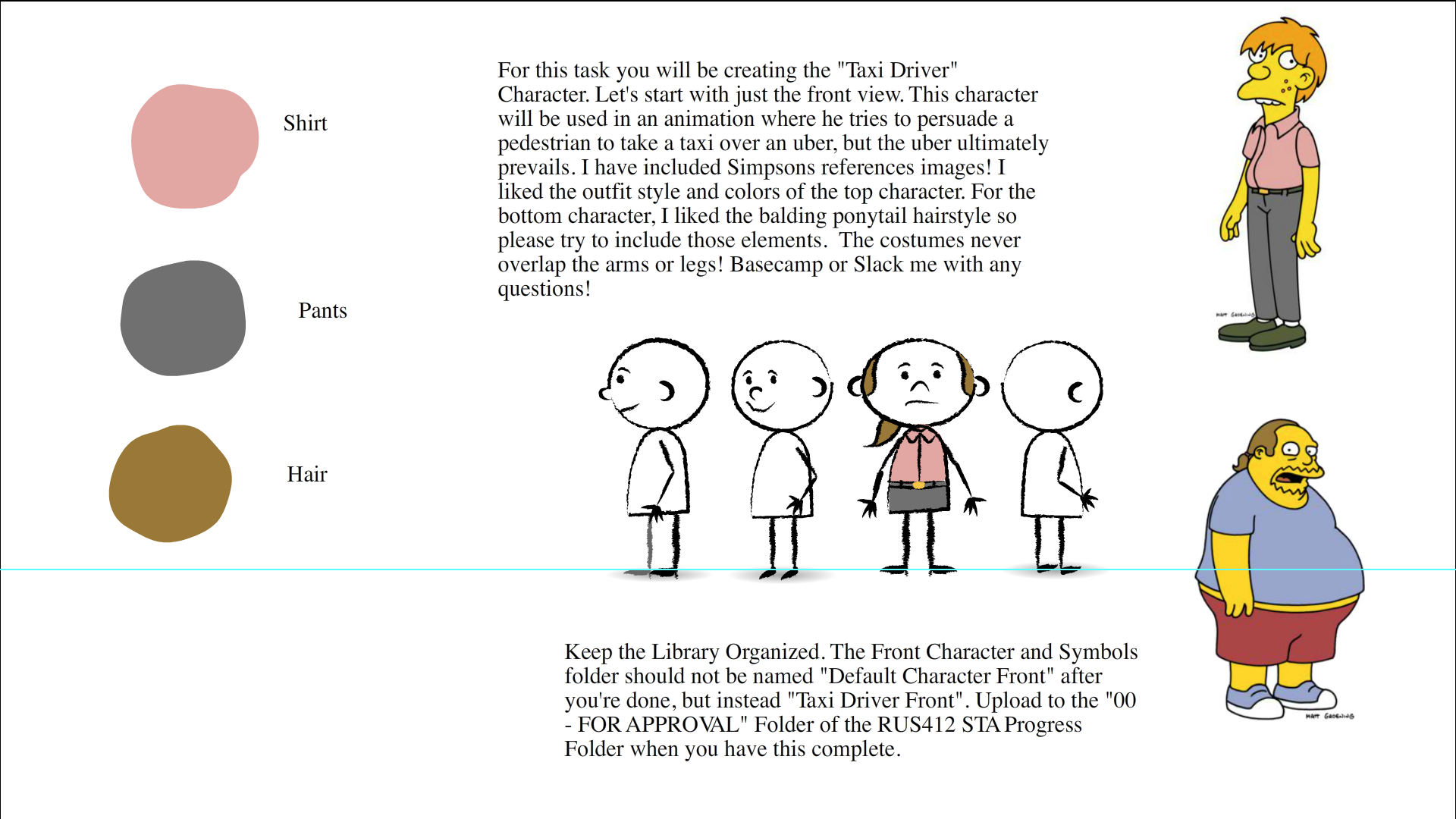
For RUS 412, I will be working on assets for the short animations. For my first project, I created a taxi driver using reference images from–low and behold–the Simpsons!
Here was my shot at the front view + the refs and description.
and Tate’s lil edit to the hair which makes this dude considerably better:

annnnnnnnd the 3/4 view: