COLA Web Editor mockup:
https://xd.adobe.com/view/03273fc8-f2cb-4cf9-4bfb-c13540336ac9-7516/
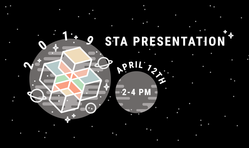
STA Presentation “Save the Date”
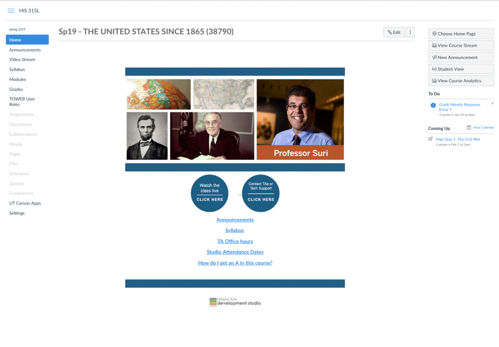
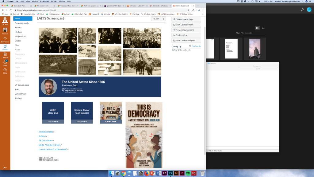
Draft and updated look/feel for Canvas Home Page: HIS315L (Spring 2019/Suri)

https://xd.adobe.com/view/03273fc8-f2cb-4cf9-4bfb-c13540336ac9-7516/


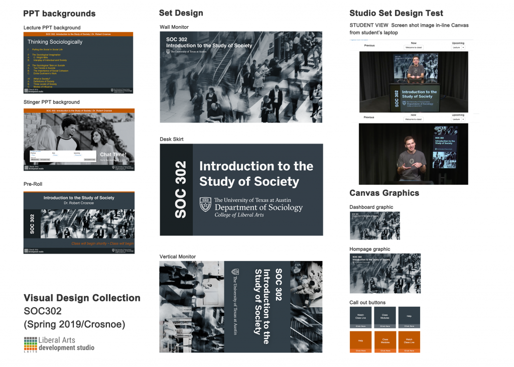
project: SOC 302–Visual Design Collection
Client /Prof: Crosnoe
completion status: Started Jan 4, 2019
staff guidance: Suloni, Bridget
STA team members: n/a
description/plans: create visual materials for the online course that are cohesive and follow online course standards while maintaining established color scheme
To be completed: Jan 15th, 2019
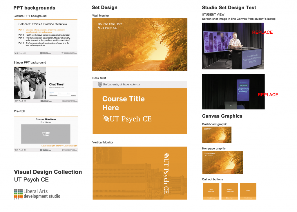
project: Psych CE–Visual Design Collection
Client /Prof:
completion status: Started Jan 8, 2019
staff guidance: Suloni, Marla, Patricia
STA team members: n/a
description/plans: create visual materials for the online courses that are cohesive and follow online course standards while maintaining established color scheme
To be completed: Jan 9, 2019
project: Kiowa Timeline UI Design
Client /Prof: Native American Museum in Oklahoma
completion status: Started Dec. 13th, 2018
staff guidance: Stacy
STA team members: n/a
description/plans: create page mockups for Kiowa Timeline, a database for images that are used as a calendar and historical system to be shown on a display in the museum
To be completed: Dec 15th, 2018 (first draft)
https://kiowatimeline.herokuapp.com/
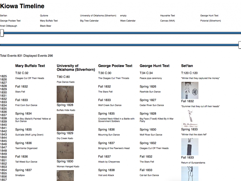
Mockups:
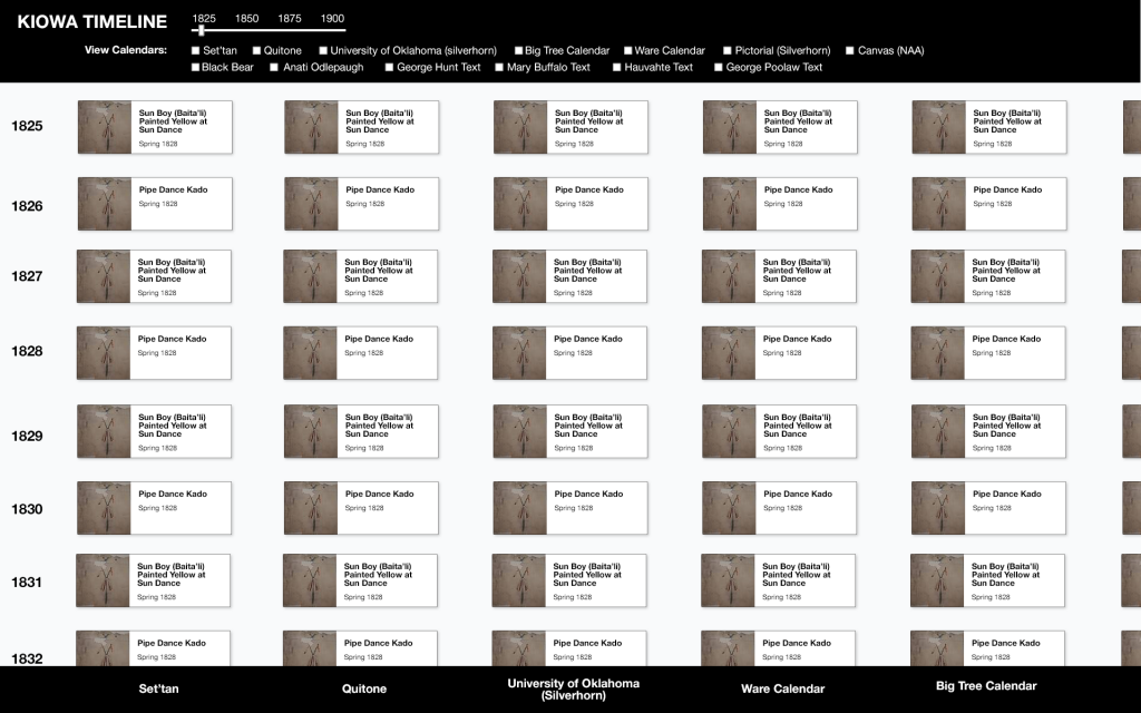
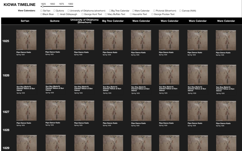
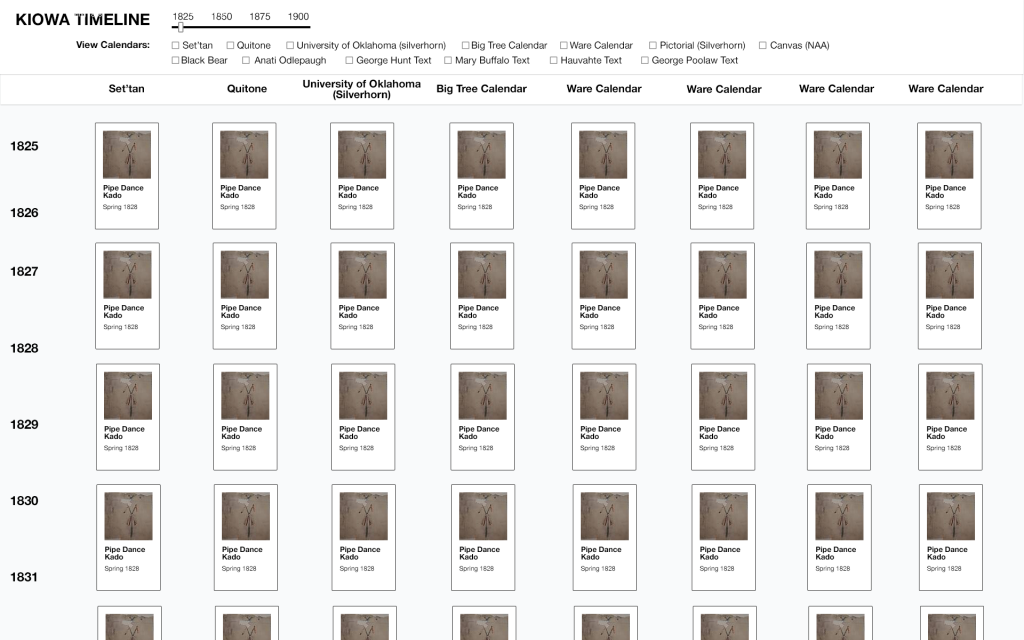
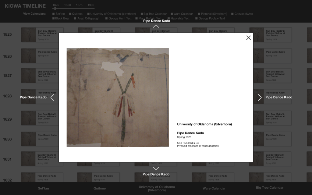
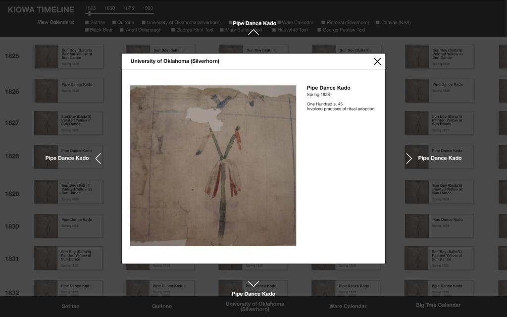
Module options styled like art descriptor cards (that you see on the wall beside art pieces in museums), since this will be displayed in a museum.
Tiles needed to be optimized to ease comparison between different calendars.
project: Arts Portal UI Design
Client /Prof: Allison Welch and Robert Abzug
completion status: Started Nov 29th, 2018
staff guidance: Stacy
STA team members: n/a
description/plans: create page mockups for Arts Portal, an arts events database for use by professors (primary user).
To be completed: Dec 7th, 2018 (first draft)
For this project I first met with Stacy and was briefed about the site, the needed functionality, and the target user. Here are my notes!
Arts Portal https://artsportal.la.utexas.edu/
Mockups needed:
Home/cards
Event page (top priority)
Nav
Reference:
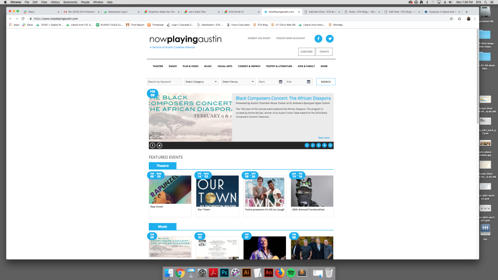
https://www.nowplayingaustin.com/
https://www.eventbrite.com/
Stacy’s initial site design utilized the same card style as the NowPlayingAustin site; this is because the clients wanted the site to be modeled after it.
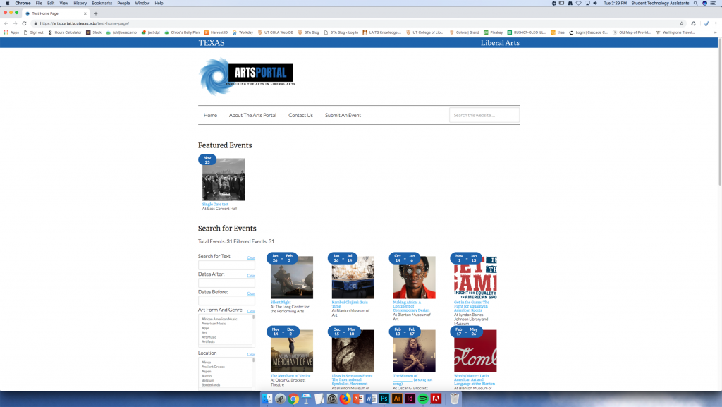
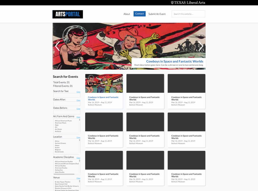
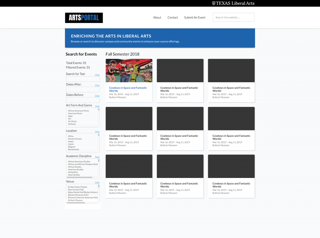

https://xd.adobe.com/view/f7de273a-6969-41da-48ff-635bcb0c2190-81ef/?fullscreen
project: Persian Learning Style Documentation
Client /Prof: Anousha
completion status: Started Nov. 5th, 2018
staff guidance: Suloni
STA team members: Kathy, Nick?, Sanika?
description/plans: writeup documenting all styles and effects of all pages of Persian Learning sites
To be completed: Nov. 25th, 2018
Provided these notes for edits (these have since been addressed!)
1. What font is this?
mockups use Helvetica
If Helvetica can’t be used, a google font alternative is Lato: https://fonts.google.com/specimen/Lato
2. There should be a bottom border on the header:
border-bottom: 1px solid #d7d7d7 (secondary color) is specified in the style doc
3. Page content needs the same negative space/padding as the home page (whatever padding we agreed on when we sat down to look at the home page, I can’t remember the exact pixel value); this is for consistency and also to give the content some breathing room.
Installation Container:
4. container content should have more padding– 25px padding (all sides within container) is specified in the style doc
5. can install dropdown button change to something cleaner/more modern?
Button should also be right-aligned in the container
6. “Your install succeeded!” sounds off, (kind of sounds like “your install seceded”) language should be “Successfully Installed” or “Install Successful”
and text should be bold and #3c763d
Collapsable Group Container
7. Missing a heading for the Instructions section. Instructions Heading should be same style as Installation Heading with bottom padding–20px
8. Collapsable Group container should be same width as installation container
9. Collapsable Group title text should be black and bolded.
10. Collapsable Group content text should have more padding– 25px padding (all sides within container).