SJCS Logo Update
project: SJCS Logo Update
Client /Prof:
Initial Task:
Associate Professor, Department of History
Dear Suloni,
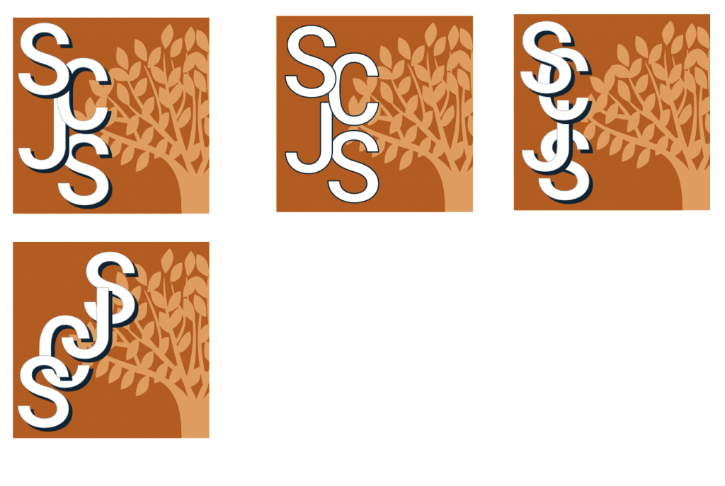
I hope you are doing well and have had a good start to the new semester. I am hoping you can help me (or know someone who can) with a draft of a revised logo for us. Our current logo is blue and white as seen here: here. (I have also attached it below)In the last few years, we have invested a lot of work branding our events, activities, and publications and we always use the logo as part of the publicity. However, UT’s colors are “Burnt Orange.” Thus, we often find that we have to go an extra few steps to make the connection between the SCJS and UT obvious. The current color scheme doesn’t make that connection for people right away.
I am therefore asking the Schusterman Foundation, our donors who have to give permission for us to change the color scheme, whether they would be willing to consider allowing us to change the blues to shades of burnt orange. They have yes to considering it but would like to see a draft of such a logo. Can you help me with that?
Everything else would stay the same, just the color blue would change to orange for UT identity.
Warm wishes,
Tatjana
Original:
Updates:
Client Feedback:
Dr. Lichtenstein really likes the orange and tan variant you’ve made. They want to make another edit to the logo’s lettering, and would like to see a Roboto font used for “SCJS”.
Client Feedback:
Dear Valerie,
What are your thoughts about the shadows, that was something people though looked outdated, Would it not work to just have the letters now depth?
Tatjana
Texas Polish Logo
project: SJCS Logo Update
Client /Prof: Hans Boas
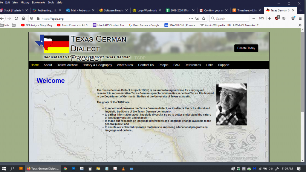
Initial Task: creating a Polish flag logo similar to the German flag logo/word mark on www.tgdp.org
Reference:
FINAL:


