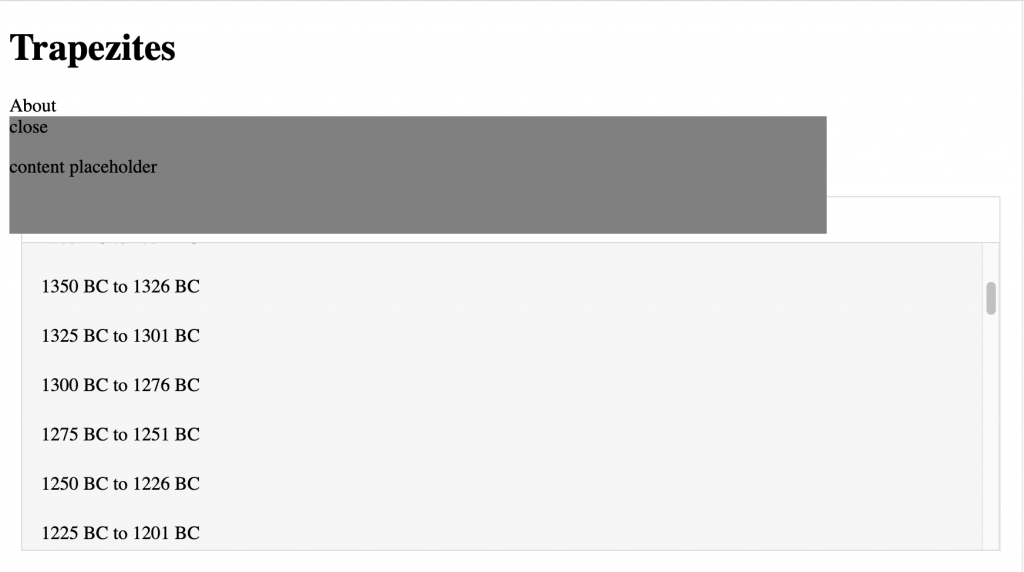
I’ve made quite a few changes since last posting on here (oops!)
Last Friday, I had a client meeting with Giuseppe (client), Lesser (designer) and Stacy. We mainly spent the time answering my questions, and it helped A LOT. I have a pretty clear understanding of where I should be headed with the site now, and I’m spending my time focused on fixing things one at a time.
Some notable updates:
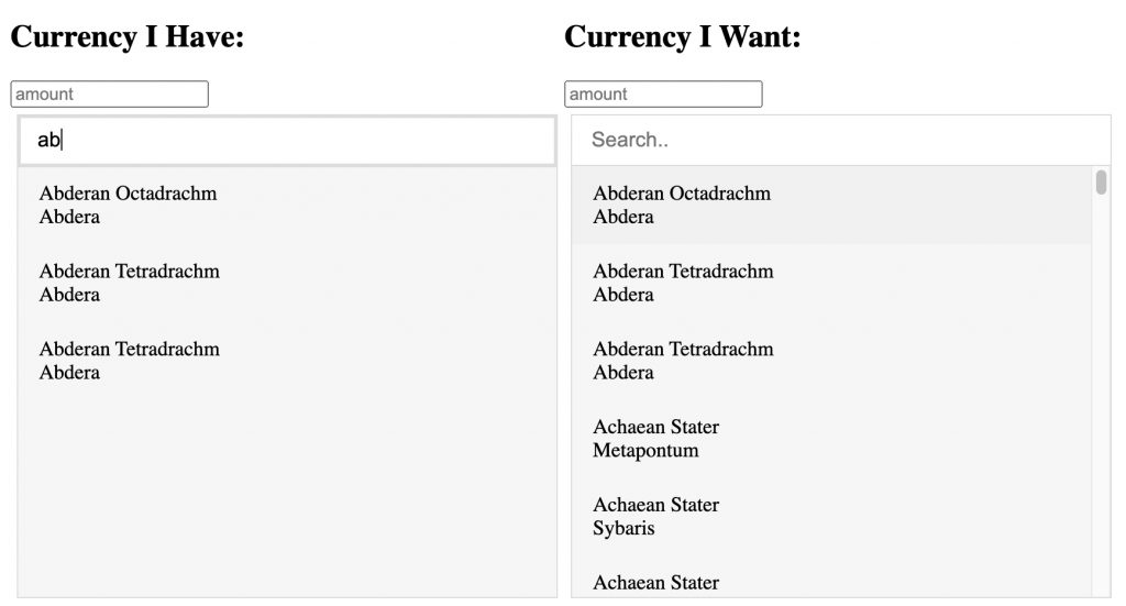
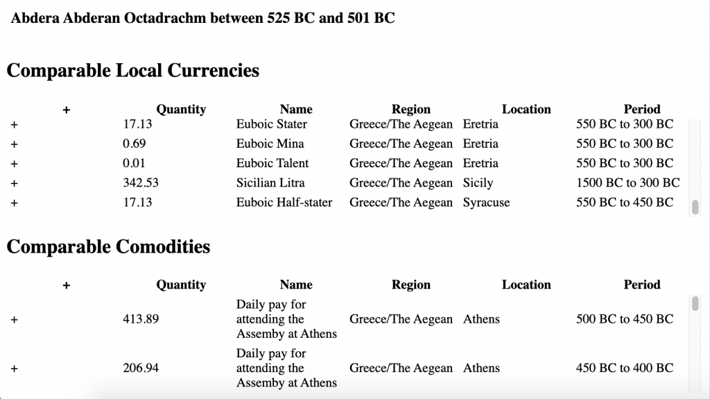
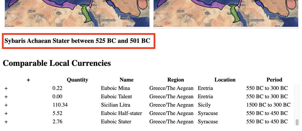
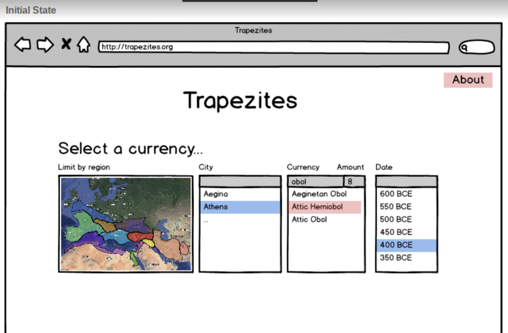
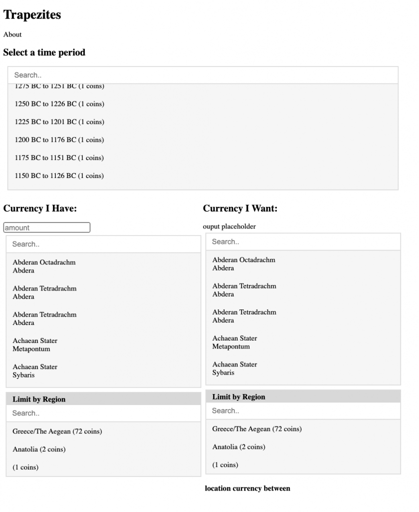
- We’re taking out the map & switching it to a dropdown of regions instead. The map will just be shown for reference when the actual currency conversion occurs.
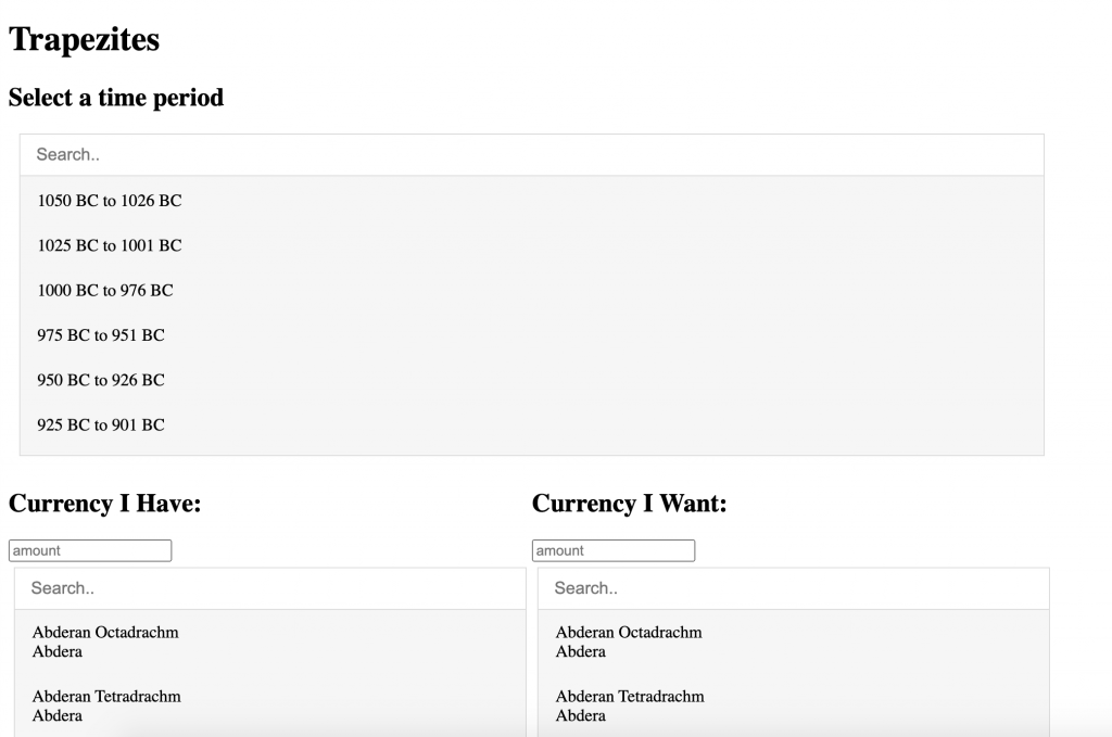
- Took out the second amount input field, so there’s only one place for the user to enter the amount of money they want converted. This simplifies the usability and the coding on my end.
- Lesser should be sending the UI design some time this week! So I’ll be starting on implementing that CSS soon as well
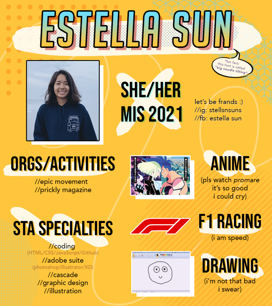
I also made my Bio graphic for new STA Orientation! I had a lot of fun with this assignment 🙂 It’s kind of wild, but I feel like it represents my personality quite well haha
