• We are STAs
    • Asha Rountree
    • Haley Ma
    • Kate Shih
    • Kyra Lee
    • Nicholas Peasley
    • Sasha Kenney
    • Shanda Horm
    • Shriya Atreya
    • Tomas Marulanda-Mesa
  • We were STAs
  • STA Presentation
    • STA Presentation 2017
    • STA Presentation 2016
  • Testimonials
  • Resources
  • Home

STA Blog

Cristina Villarreal Núñez

Cristina Villarreal Núñez

Fall 2021 STA Roster Poster Update

November 10, 2021 By Cristina Villarreal Núñez

Fall 2021 STA Roster Poster Update

Project: Fall 2021 STA Roster Poster
Client: Internal/LAITS STA Program
Completion Status: Done!
Staff Guidance: Mike Heidenreich
STA Team Members: Cristina (me), & Abriella Corker
Description/Plans: Create this semester’s STA Roster Poster according to specifications.


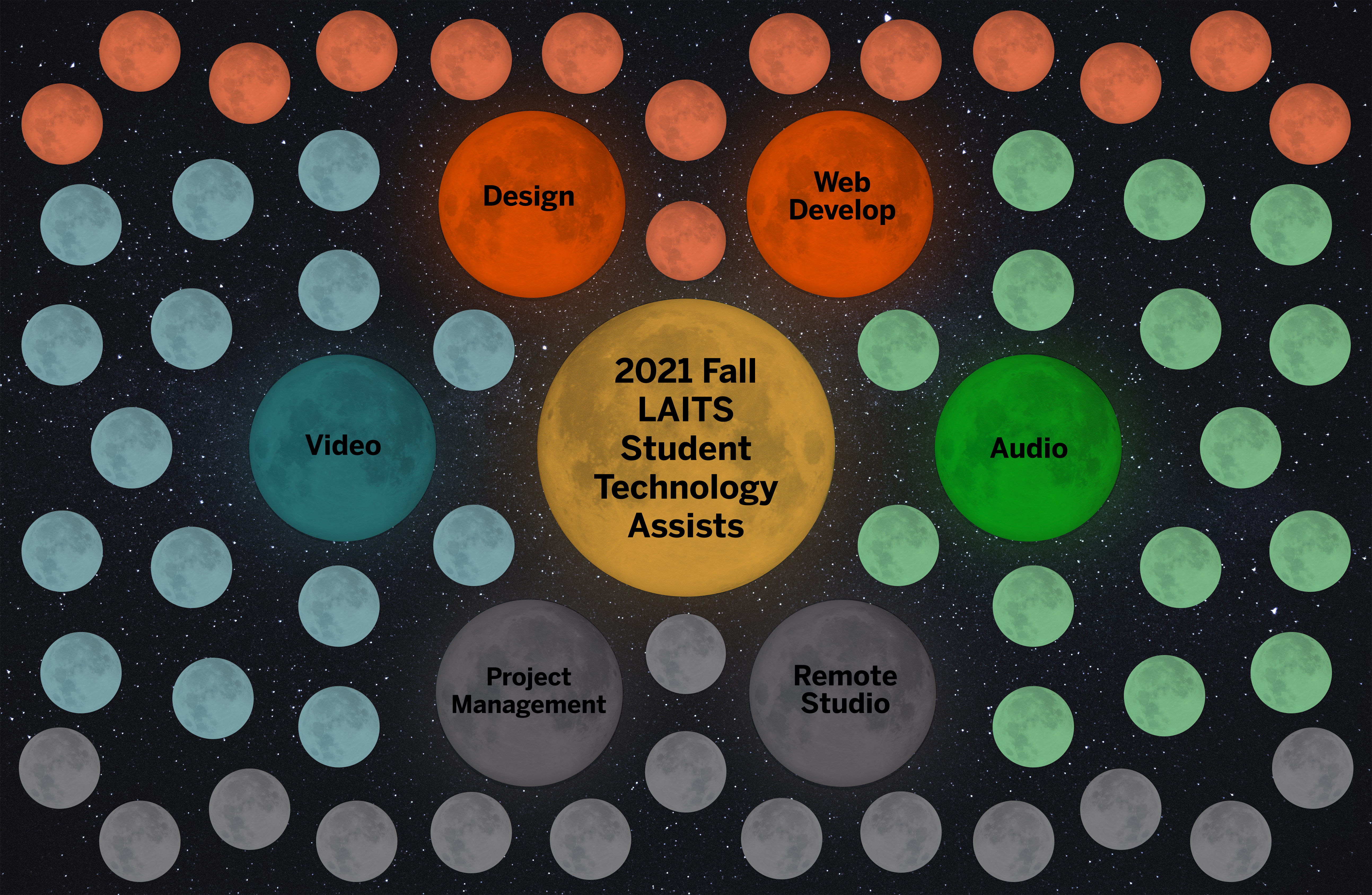
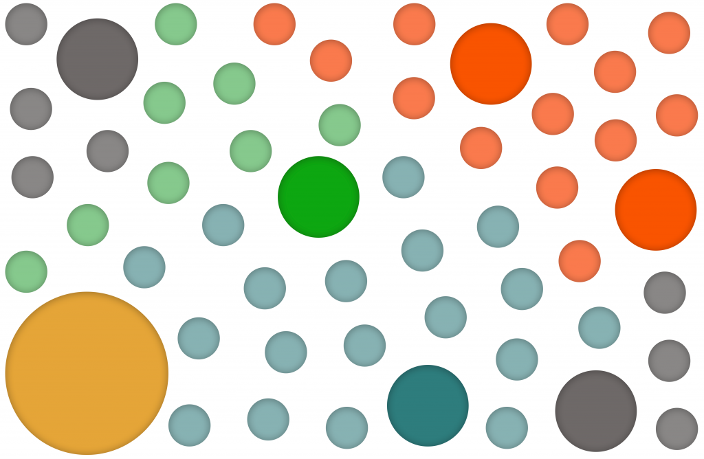
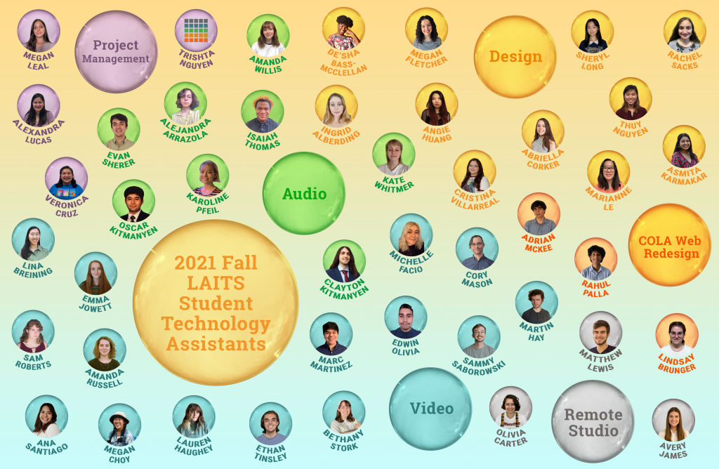
So, last time I updated y’all on this project, I was working on the first version of it. A galaxy iteration, if you recall. However, that version was scrapped because it didn’t really represent the vibe we were going for, so we started working on a new concept: bubbles. Other ideas were thrown at the wall to see what sticked, but bubbles was the real champion here. So, without further ado, here are the drafts that took this version of the poster from nothing, to the most recent (plausibly final version)…


First off, I remade the setup of the bubbles to make it more dynamic and similar to how bubbles float.
Then, following feedback, I moved the big circle (the one designated for the title) more towards the center to avoid the feeling that further away STAs are not as related to the program as the others. I also redefined the color delineation for the different groups.
Afterwards, it was time to add some bubble texture to the mix, to test it out. I also started experimenting with backgrounds. This was idea #1…
… Aaaand this was idea #2. This one was less distracting and still on theme, so we moved on with this gradient background.
Next up, I added the rest of the bubble textures to the STA circles, and added all the images and names, accordingly. This was also my stopping point before I had to go on break…
A fellow (Abriella Corker) STA took over the project on my time away, and she changed the blue background color to a darker tone, in order to make the bubbles pop out better.

Now, we are only waiting for final feedback before the posters get printed, so I’ll keep you posted once that happens…


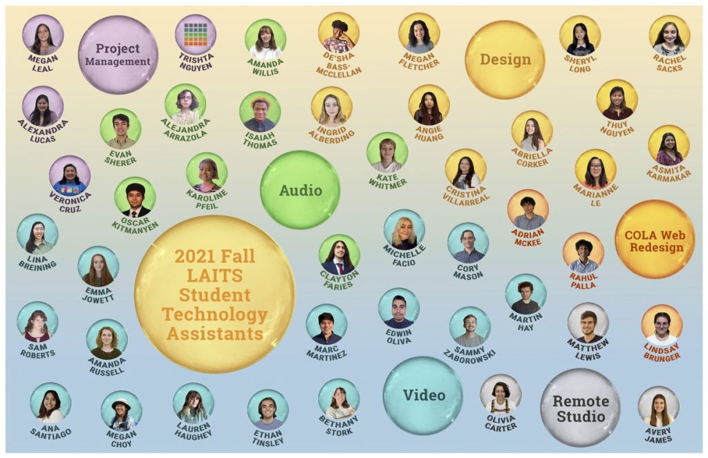
Edit: It happened! We’re done with this project! The final version got approved and you can now find the printed version at various locations of the LAITS offices. Hope y’all liked it 🙂

Filed Under: Fall 2021 - Spring 2022

TBH: Rusk County Map Update Pt.4

November 10, 2021 By Cristina Villarreal Núñez

TBH: Rusk County Map Update Pt.4

Project: Rusk County Map for TBH
Client: Steve Black & Emily McCuistion
Completion Status: Done!
Staff Guidance: Suloni Robertson, Estella Sun, and the WebDev team
STA Team Members: Cristina (c’est moi)
Description/Plans: Develop an interactive image through Canvasser for a new Texas Beyond History page, add it to the TBH server, and create one of the pages linked to the interactive image in question.

And, we’re back. Thank you for tuning in to part 4 of this rollercoaster of an experience, but in today’s news, let me give you a little update on what’s happened with this project since last time I wrote about it…


So, if you don’t remember, the conclusion on the previous update was that we pretty much finished working on both the Landscapes site and the Ware Plantation site with fulfilling all the requests and just needed to wait for feedback… Well, change of plans…


A few days afterwards, we got a response pretty much saying that the Landscapes page looked fine, but that someone accidentally overwrote the Ware Plantation site, and all progress was deleted from it. We didn’t have any backups for that, so my next task was to recreate everything I’ve already worked on and everything the team was able to help me fix that site, pretty much from scrap and following the feedback from the most resent communication round (at the time). So, long story short, I got down to business and did this… [See image to the right]. Like they say, “it ain’t much, but it’s honest work”…


Anyway, it seems like we have more to come on this project, so it’s not over just yet. So, I’ll keep updating y’all on this later…


Edit: Things are a bit ambiguous, but I would say we are done with this specific project! The map and all the external sites have gone live and are up and running to the best of their abilities. (Check them out here: https://texasbeyondhistory.net/rusk/landscape.html) But, we do have a new TBH project going on now, so check out my upcoming posts on that…

Filed Under: Fall 2021 - Spring 2022

TOWER Tools: Course Graphics

October 11, 2021 By Cristina Villarreal Núñez

TOWER Tools: Course Graphics

Hi y’all, happy Monday! I’m usually more of a Friday blogger myself, but this past Friday was the STA Welcome Back Party, and I didn’t have time to do it. But I had a lot of fun at the party though… Anyway, back to work…


Project: Course Graphics for TOWER Tools
Client: Julianne Phillips
Completion Status: Mostly finished; buttons pending.
Staff Guidance: Maddy
STA Team Members: Cristina (the man, the myth, the legend)
Description/Plans: Create some cool new graphics for this Canvas course including: a banner, a dashboard graphic, and some buttons.


In case you don’t know what this course is about, you’re not alone, cause neither did I. But as I worked on it I came to learn that this course is an internally-developed Canvas course designed to train TAs and professors on using our custom-built TOWER tools in their classes. Apparently the course has been running without any graphics at all for a few years now, and I also I didn’t get much direction, so it was nice to have a chill project to work on. The twi requirements I was tasked to fulfill, though, were as follows:

1. Add some form of LAITS branding

2. Make it look professional but not boring


So I got down to business… They didn’t specify a style to work on, so I decided to go with Style B (background image) because I personally think it’s more engaging than Style A (solid background color). So, for the imagery I chose to work with the Spanish Tiles from our generic wall monitor’s library because it has a nice view of the UT Tower, and it just felt fitting for this project.


That being set, I started working on the homepage banner, added this image and played around with different colors from the LAITS color palette, to see which one would look best for the text bar. I started testing out the orange, but the image looked a bit dull in comparison to the text bar. So I added some selective color filters to the background image to make it match the LAITS color palette a bit more. I edited the color of the tiles into a brighter orange, the clock’s to a brighter yellow, and the made the blue sky is a bit more blue-green. But the orange color bar still felt a but too much, so I changed it to blue-green. Then I added the logo, and after a few rounds of feedback with Maddy regarding the size and placement of the text bar, and the ideal tone for the sky, here is the finished product:


Then I incorporated that same image into the dashboard graphic, got some feedback –you know the drill– and finalized that not much later. The only thing pending now is to make the buttons. The course is going through a bit of a redesign itself, so for now I was just asked for two buttons, with the possibility of more to come. But for now, this is what all these three graphics look like:


So, regarding this project, that’s it for now. But I’ll let you know if something else comes up with the buttons… For now, since it’s October and I’ve had this song stuck in my head all day, here’s a spooky season classic just for you:


Filed Under: Fall 2021 - Spring 2022

Fall 2021 STA Roster Poster

October 2, 2021 By Cristina Villarreal Núñez

Fall 2021 STA Roster Poster

Project: Fall 2021 STA Roster Poster
Client: Internal/LAITS STA Program
Completion Status: In progress…
Staff Guidance: Mike Heidenreich
STA Team Members: Cristina (’tis I)
Description/Plans: Create this semester’s STA Roster Poster according to specifications.


∘˚˳° Spooky howdy y’all, and happy start of the most wicked month of the year ⊂(´・◡・⊂ )∘˚˳°


For those of you who might not know, the Roster Poster referred to in this project is the one you’ve probably seen before (taped to our office’s door) that was a picture of all the STAs in our program, not just from Design and WebDev, but from all other teams, too. Here are some pic from past posters, just for reference…


Well, this year’s theme is “Atomic Connecting Circles”… Mike (the project manager) and myself have been working on a few different ideas that might be successful at portraying this theme, so no spoilers there. But, let me show you some progress pics from a version that didn’t make the cut:


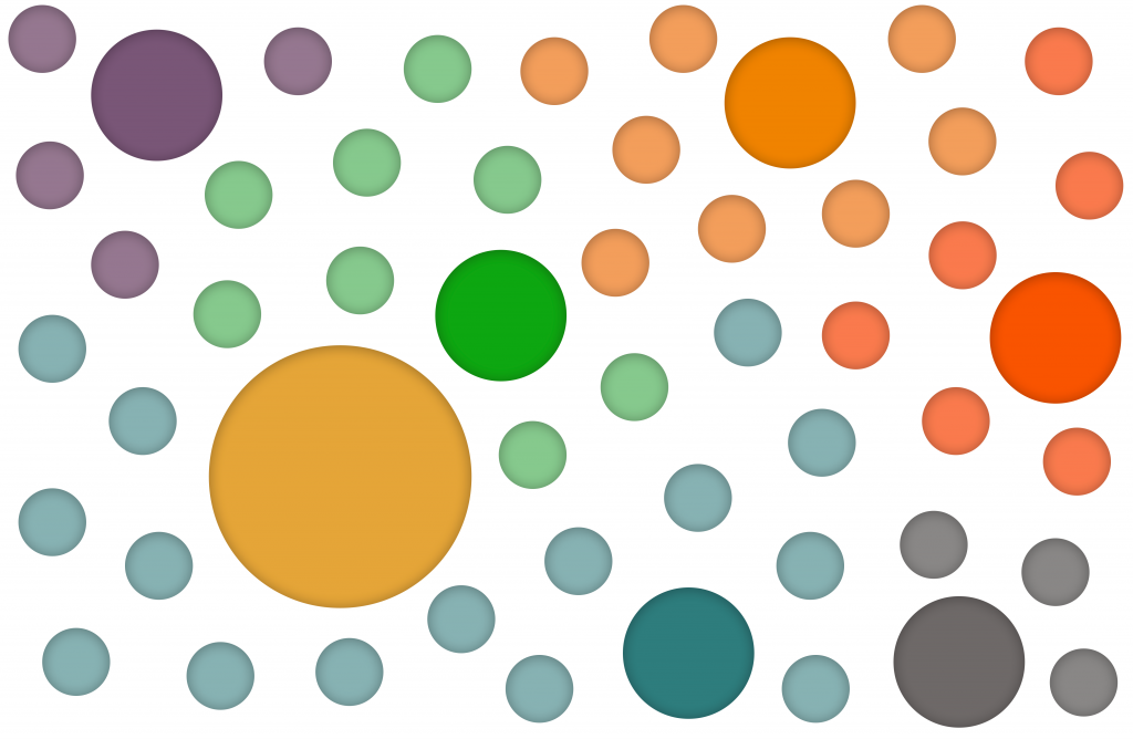
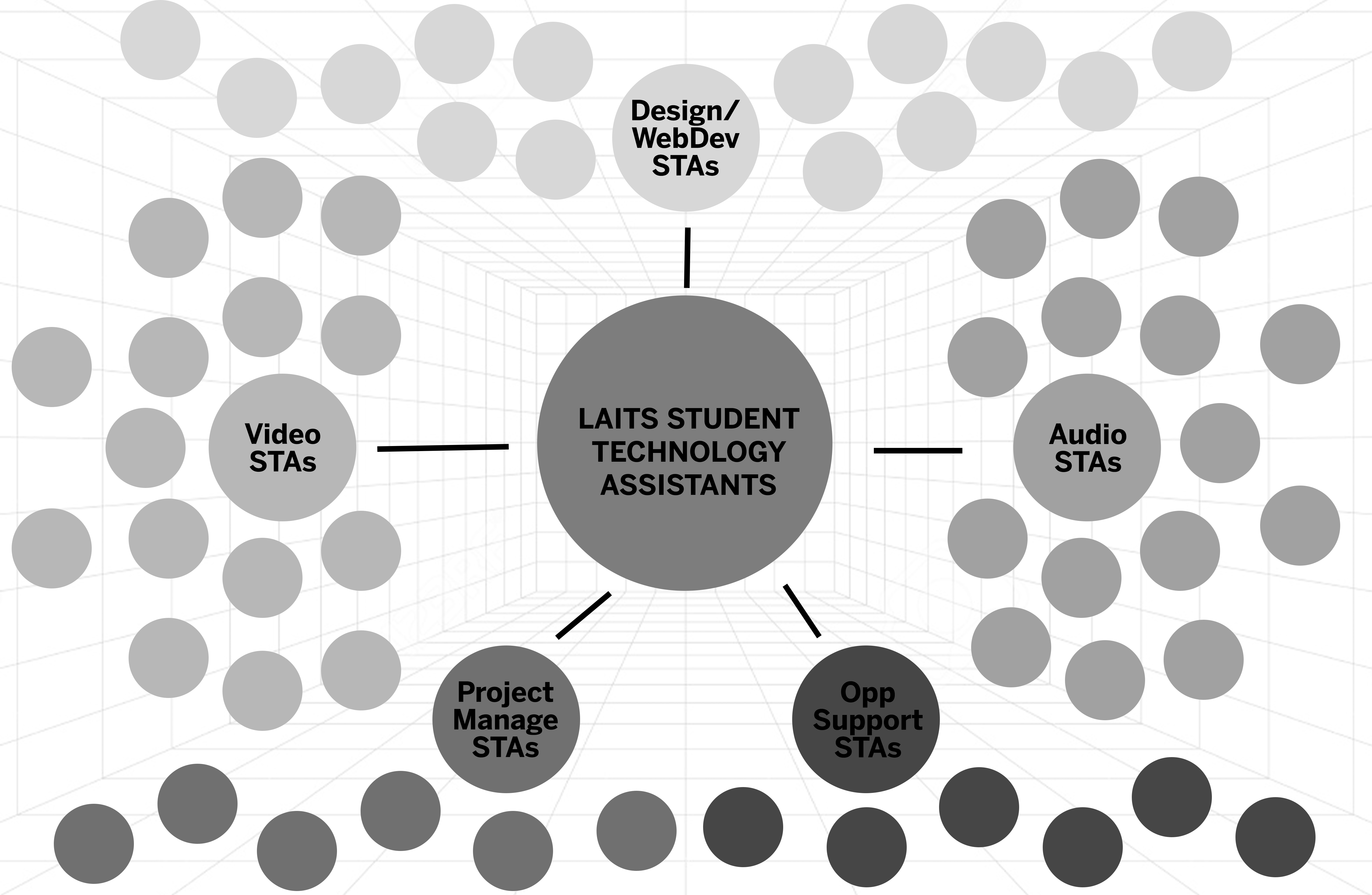
Very basic b&w draft for the general layout of this version, and a perspective grid to add depth through the background.

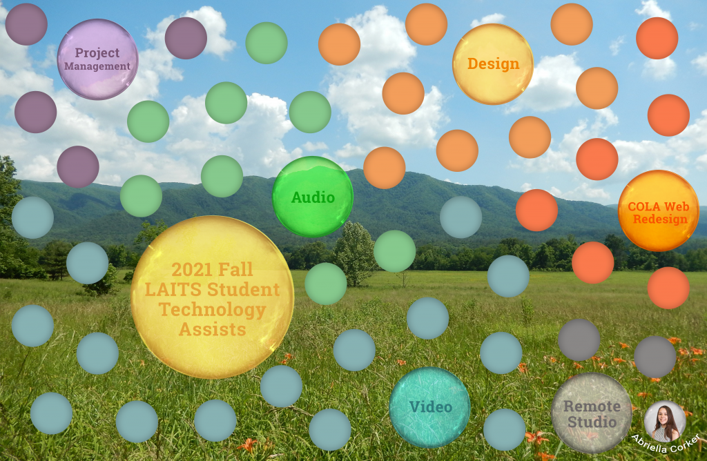
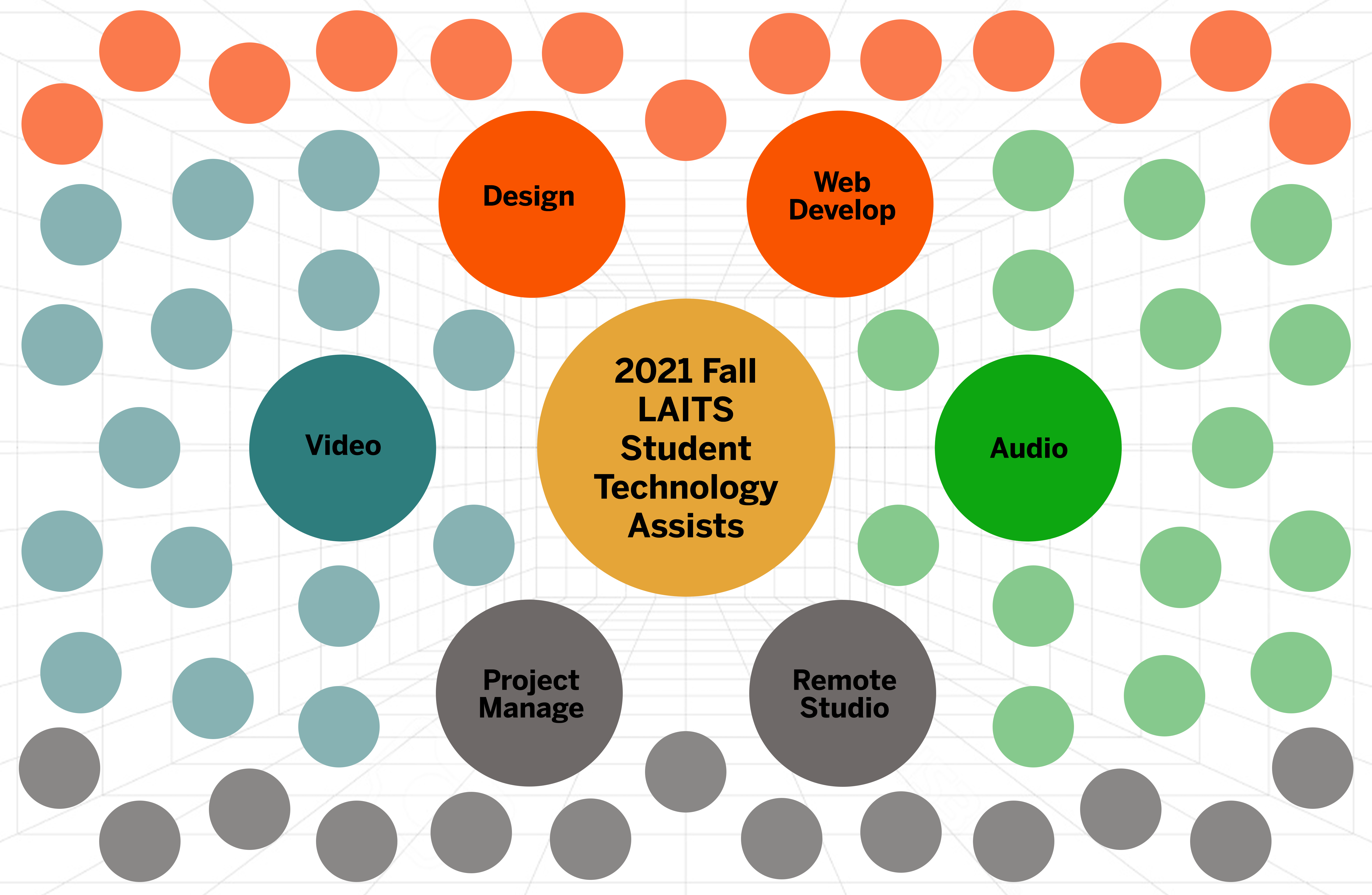
Refined layout draft: now with color!

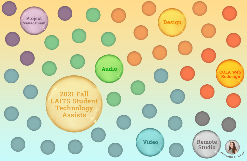
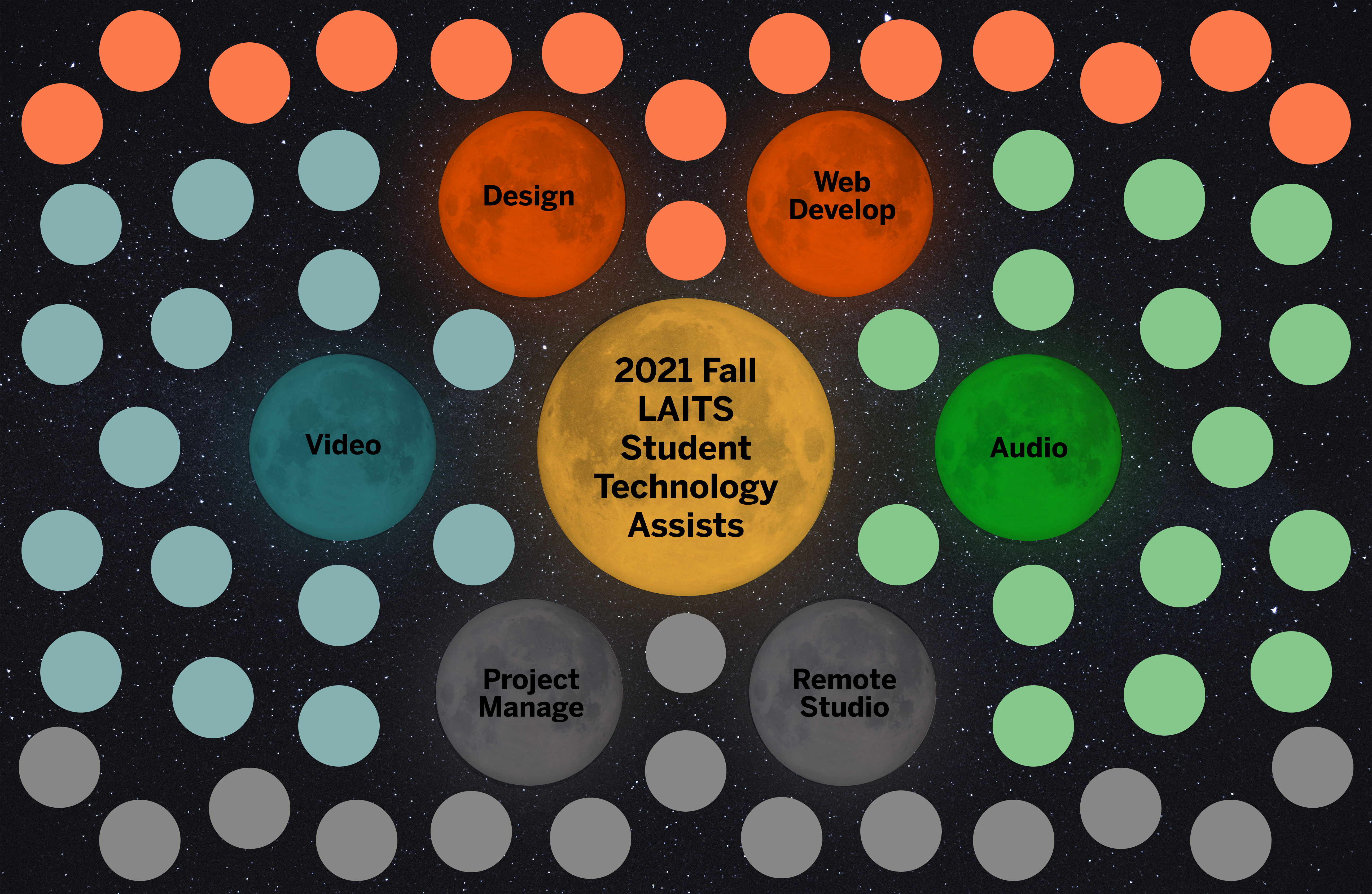
Double-refined layout draft, with color, and a cool new background to which I also added some background lights as if coming out of the central planets.

Star Drafts Episode 4: A New Hope…

Filed Under: Fall 2021 - Spring 2022

TBH: Rusk County Map Update Pt.3

October 2, 2021 By Cristina Villarreal Núñez

TBH: Rusk County Map Update Pt.3

Welcome back to the TBH Recap Show. Today we present to you the Tokyo Drift of our saga: Rusk County Map Update Pt.3. As always, I’m your host Cristina. Let’s get to it…


Project: Rusk County Map for TBH
Client: Steve Black & Emily McCuistion
Completion Status: In progress… soon to be done.
Staff Guidance: Suloni Robertson, Lauren Moore, Ruben Garza, Estella Sun, and the WebDev fam as a whole, to be honest.
STA Team Members: Cristina (at your service)
Description/Plans: Develop an interactive image through Canvasser for a new Texas Beyond History page, add it to the TBH server, and create one of the pages linked to the interactive image in question.


Since the last update on this, a lot has happened. After sending the mockups I talked about on the past TBH post, we got some comments, some feedback, and some new requests. So let’s talk about it in order:


  1. On the first mockup, apparently we had a miscommunication situation going on, since they responded they were confused by that mockup since “the interactive map, of course, will not appear on the main page /rusk/index.html as shown, but on the Cultural Landscape page.” No further requirements there, though.
  2. On the second mockup they stated that they wanted the “map [to be] as large as possible for page width, very minor scrolling on reader’s part shouldn’t be much of an issue.” So the next step there would be embedding the map.
  3. Finally, they had a lot to say about the third pic I send, adding comments arrow by arrow on the annotated mockup, which is good because we wanted very specific input from them. (I won’t bore you with the details, though).


First thing I did after that was to ask for help, since coding on html was not something I was familiar with. So, eventually, Thuy (a fellow STA that’s really versed on these kinds of tasks and is also a CompSci mayor) was able to help me getthe new requests from the third mockup onto the site… However, I noticed that we still had some requests on that pending by the time I logged onto my next shift. Good thing is I had a long shift that day, so I used that time to literally learn how to log onto the TBH development server, and familiarize myself with html coding. So I did what I could to the best of my abilities and commented on BC about what I couldn’t fix: mainly a header on the rusk/images/warep.html site, and the fact that, when you interacted with the map on the rusk/landscape.html site, the map’s linked sites would not just on the same tab (which is what we previously agreed with our clients on doing), but are also confined to the space of the map within the landscape page. This is what I mean:


Afterwards, I got some feedback to lean into that bug, and just make it look neater, so I got down to work on that. Simultaneously, I asked for some more help from the webdev team on fixing the header issue. Few days later, I was done with that and send an email to the client with all the updates Thuy and myself were able to make.


Nonetheless, a few more days later we got a response and more tasks to manage. On the landscape site we got comments about the size of the map (asking for me to fix an overflow issue) and on the functionality, since they really needed for us to have the links from the map’s hot spots to open on a new tab… so the next step would be to ask Ruben if that was even possible, and then how to fix this on the embedding of the map. Moreover, on they also had more requests fixing the warep site’s format. Finally, they had a new request to, if possible, arrange for the “Back to map” button to return to the same place on the page as the viewer left it on the landscape page. Long story short, I was able to address some of these requests, and had to ask the webdev team (and Estella) to help out with the rest, and soon enough, we were able to tackle every single one of those requests.


We are currently waiting for either more feedback, or a final comment from the clients, so fingers crossed it all goes well!

Filed Under: Fall 2021 - Spring 2022

Graphics for Sleep Assessment

September 24, 2021 By Cristina Villarreal Núñez

Graphics for Sleep Assessment

Project: Graphics for Sleep Assessment
Client: School of Nursing
Completion Status: Done
Staff Guidance: Lauren Moore
STA Team Members: Cristina (it me)
Description/Plans: Design new graphics of three traffic lights (lit green, yellow, and red) for their sleep assessment survey project, emulating a specific design style used in their other graphics.


This is the image they provided as an example of said style…

… and these are the traffic lights I ended up designing:


Filed Under: Fall 2021 - Spring 2022

  • « Previous Page
  • 1
  • …
  • 3
  • 4
  • 5
  • 6
  • 7
  • …
  • 17
  • Next Page »

link to LAITS home page

Video STA Home

© 2025 Liberal Arts Instructional Technology Services | Production Credits