Week XXXVII
I have 3 tasks this week, in descending priority from 1-3
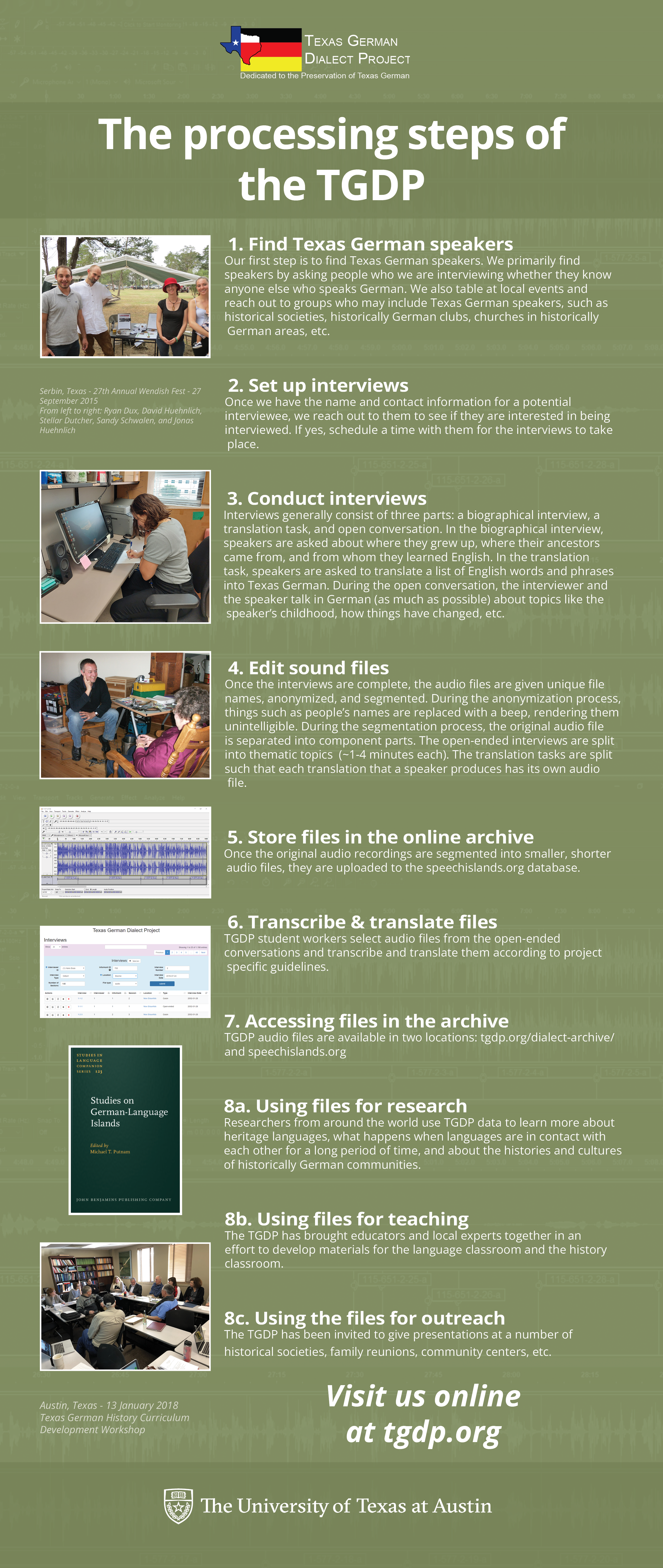
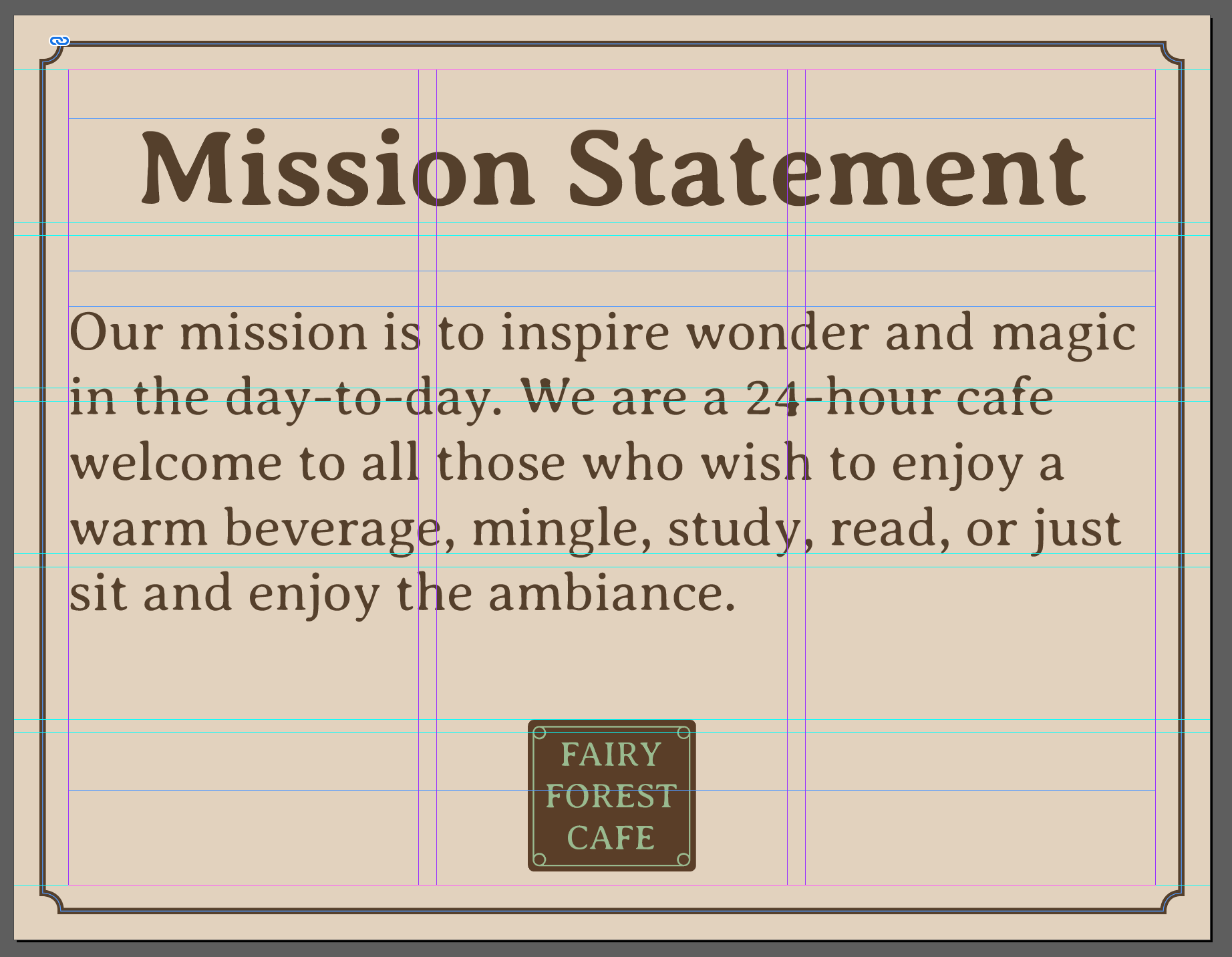
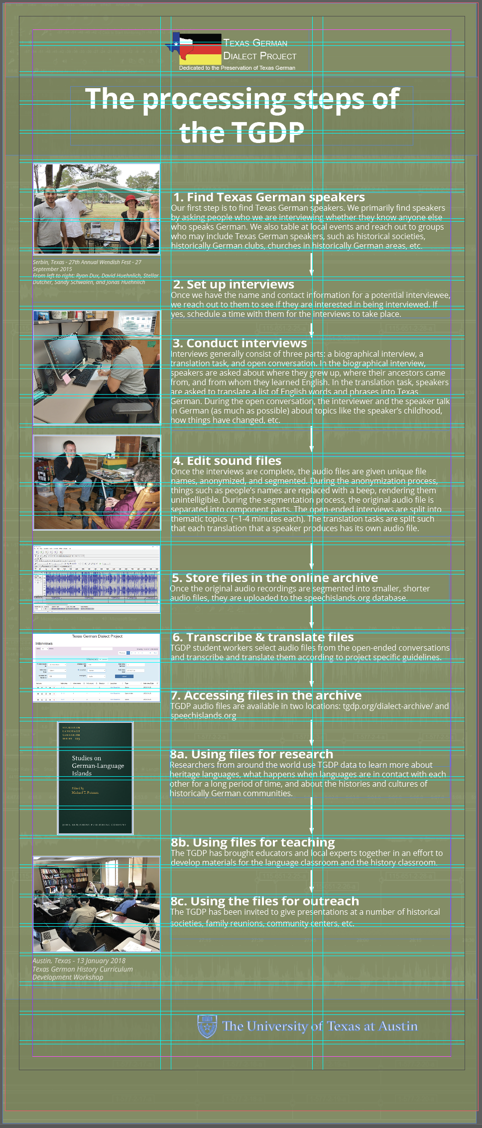
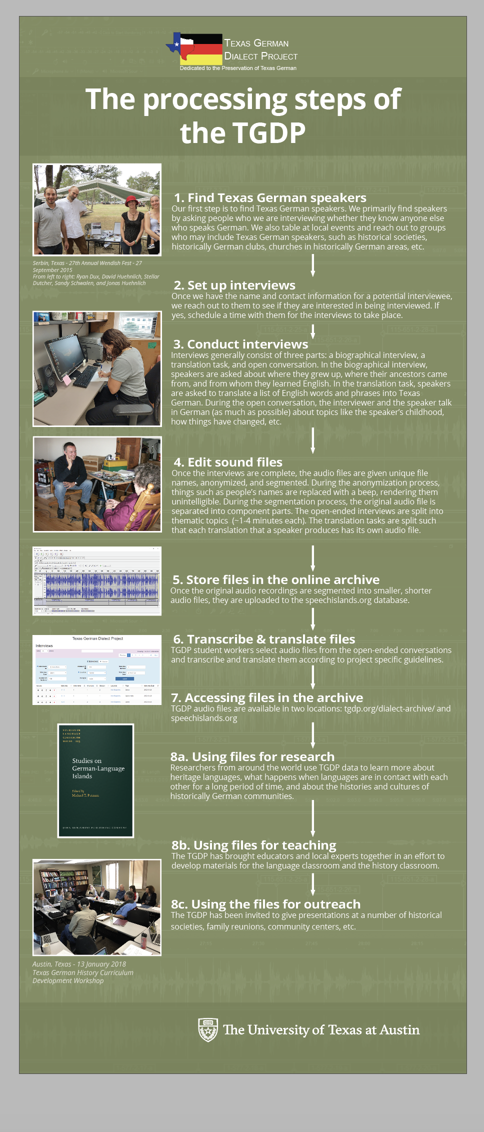
Texas German Dialect Project
Finally got some client feedback, and spent a whole day grappling with the difficulty of sizing and spacing elements consistently in InDesign. My first attempt had all the images at a consistent size that worked for the smallest text boxes, but left a lot of awkward space.
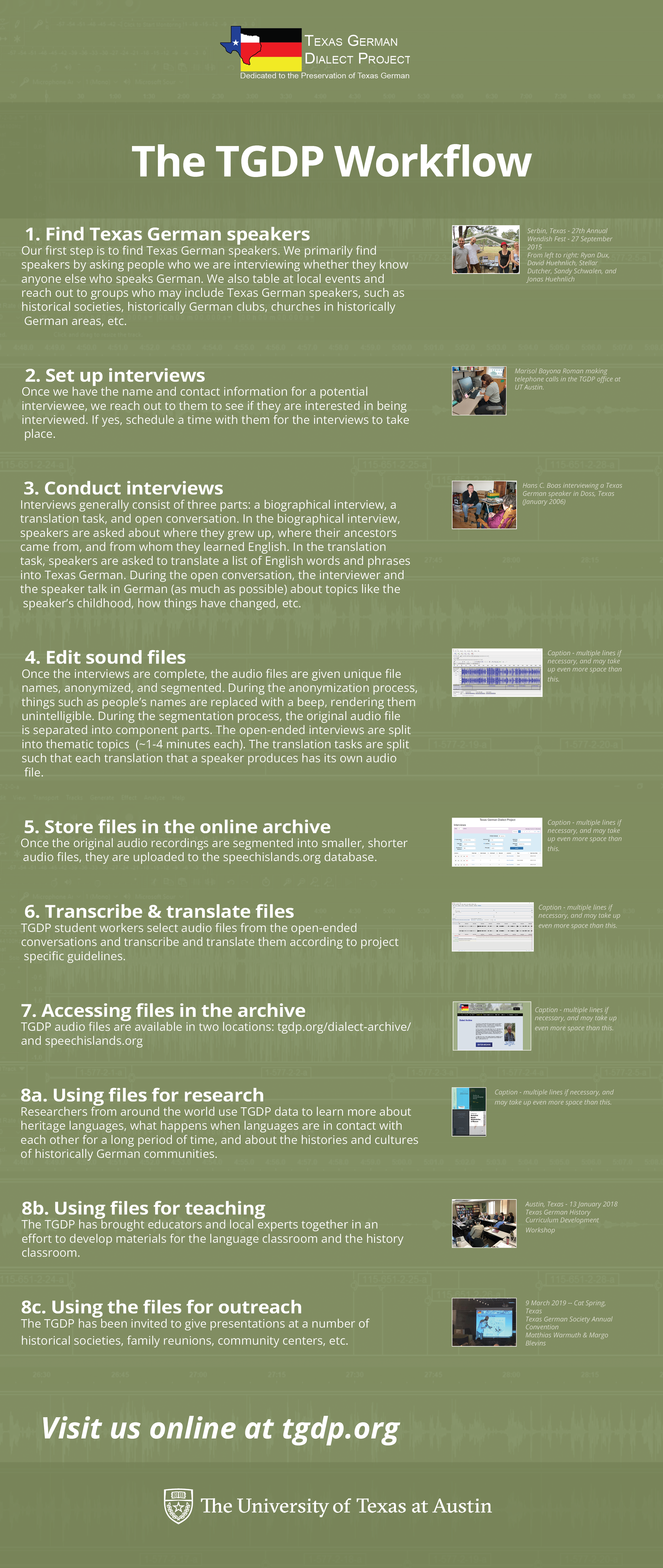
After that, I decided to line image up with the top and bottom of each text box, making them vary with the length of each text (which is still eyeballed, since the box size is adjusted manually, but the spacing between boxes is automated).
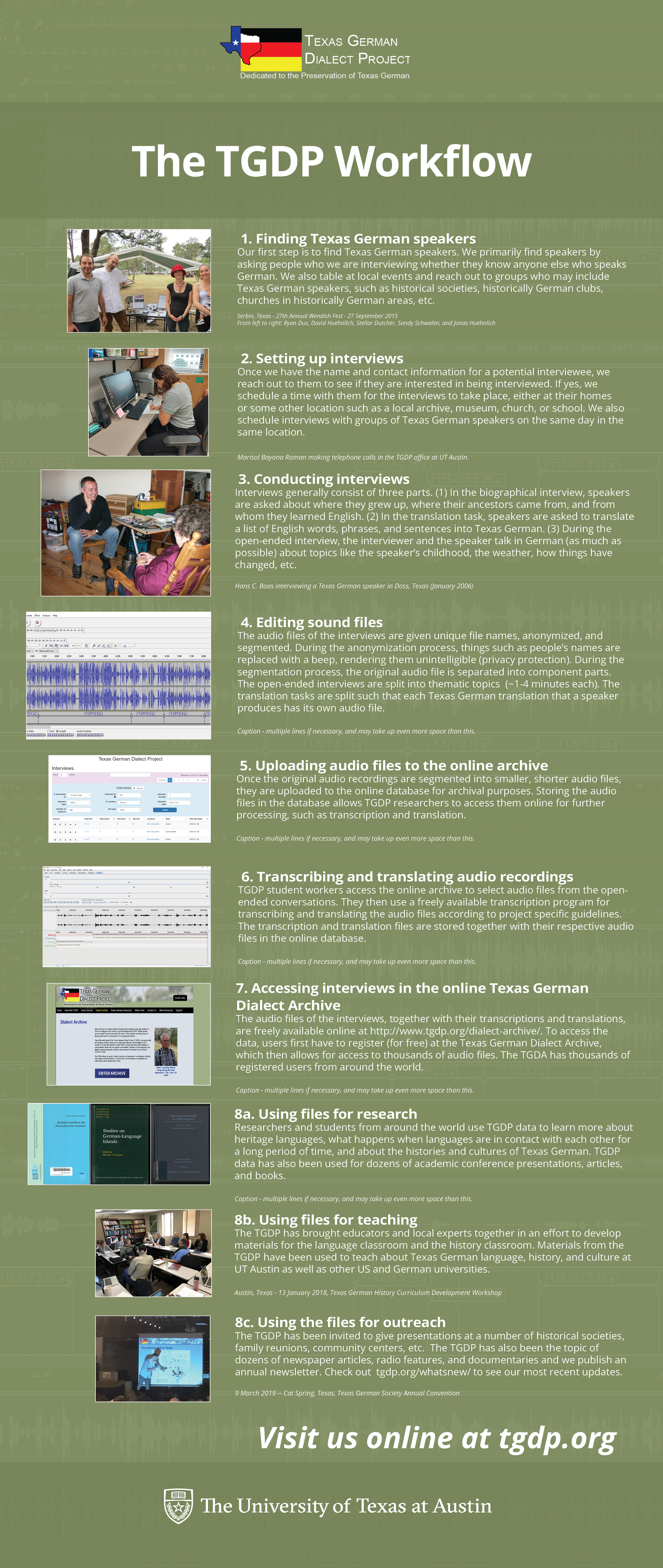
The result is sort of better, except that first thing next week, I need to almost all of it to adjust for a header mistake, and split step 8 into a header and subheaders, as well as maybe making the titles and image captions separate text boxes, so I can readjust the image sizes to the top margins of the header text boxes and the bottom of the caption text boxes, and then reset the image border width to 2 since that changes upon resize, and then fine tune the alignment again since changing the border width alters that. Whew!
Priority level: 1
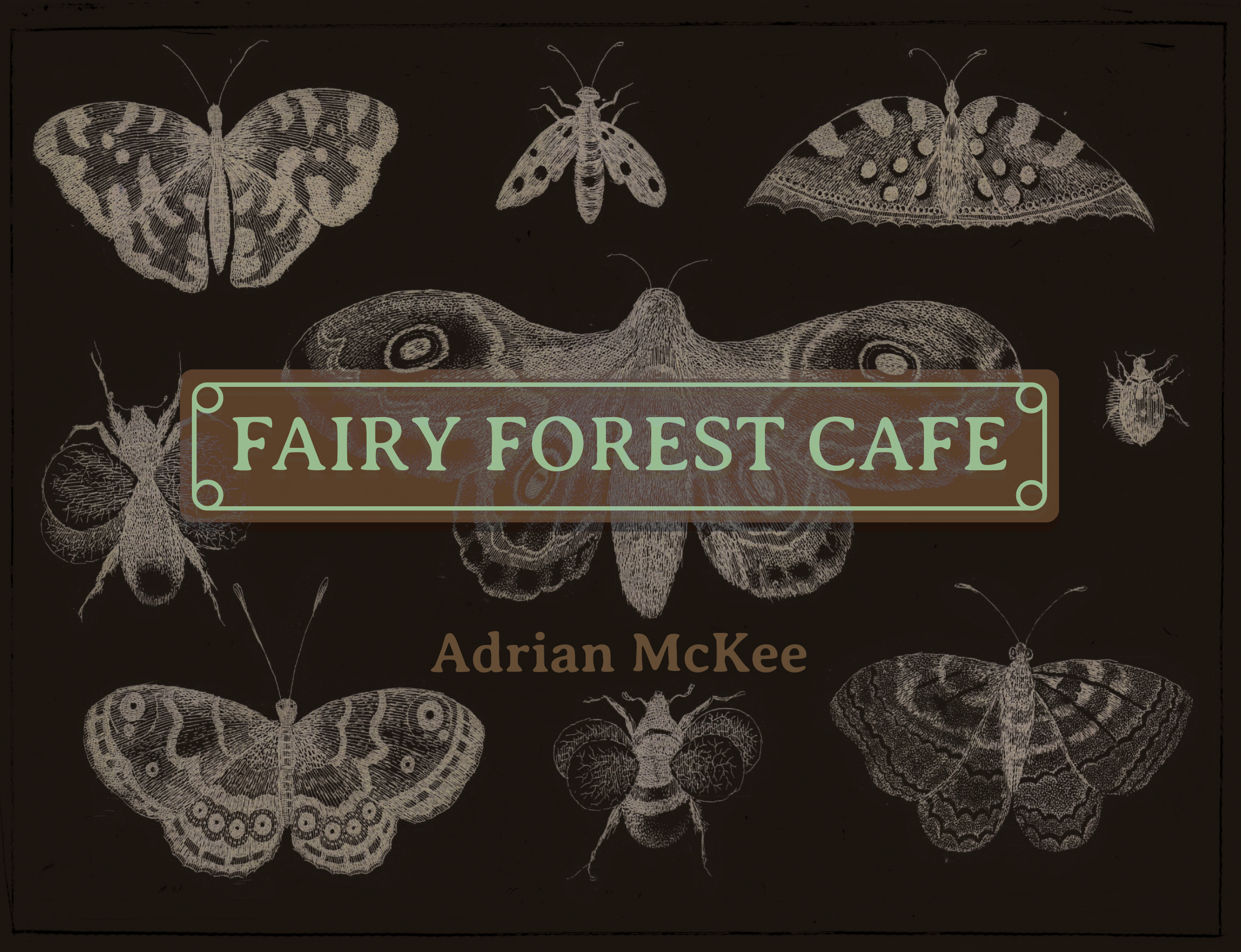
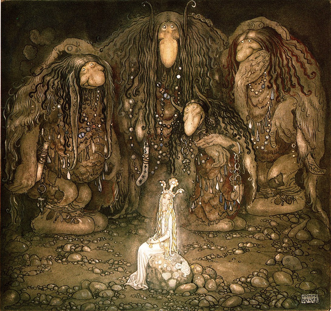
Basic Training: Research for Meaningful Brand System
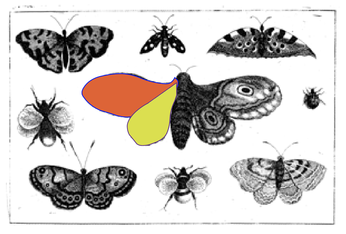
As mentioned, I’ve been taking my time with this, and making the graphics as fancy as possible. The booklet is heavily derived from a 17th century Bohemian woodcut; I used content-aware fill to make a blank version of the paper background for some pages and kept a low-opacity version of the illustration for others.
![]()
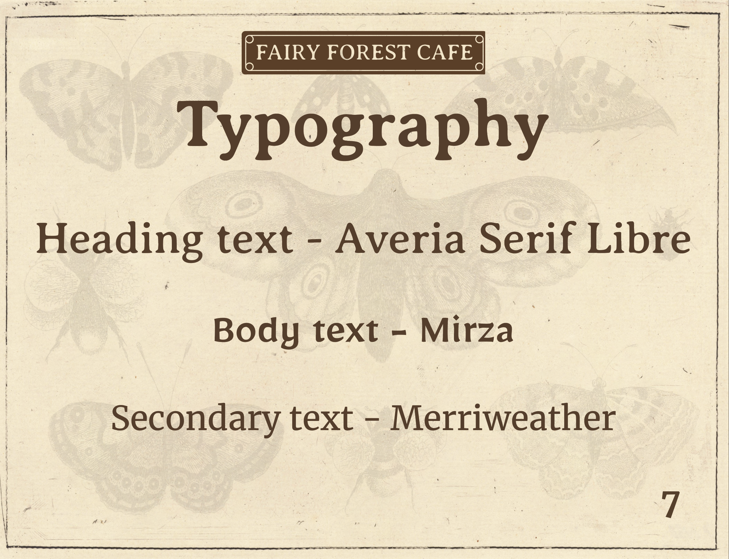
I estimate it’ll be done the next full shift I work on it.
Priority level: 3
CoLA Web Refresh Support Documentation
Another small task I picked up, this took longer than expected, because I am writing the documentation from scratch, and am quite rusty on a lot of Refresh features. I have only written up 1 page so far.
I will be doing more testing/research and writing more next week.
Priority level: 2


