Week XXXVI
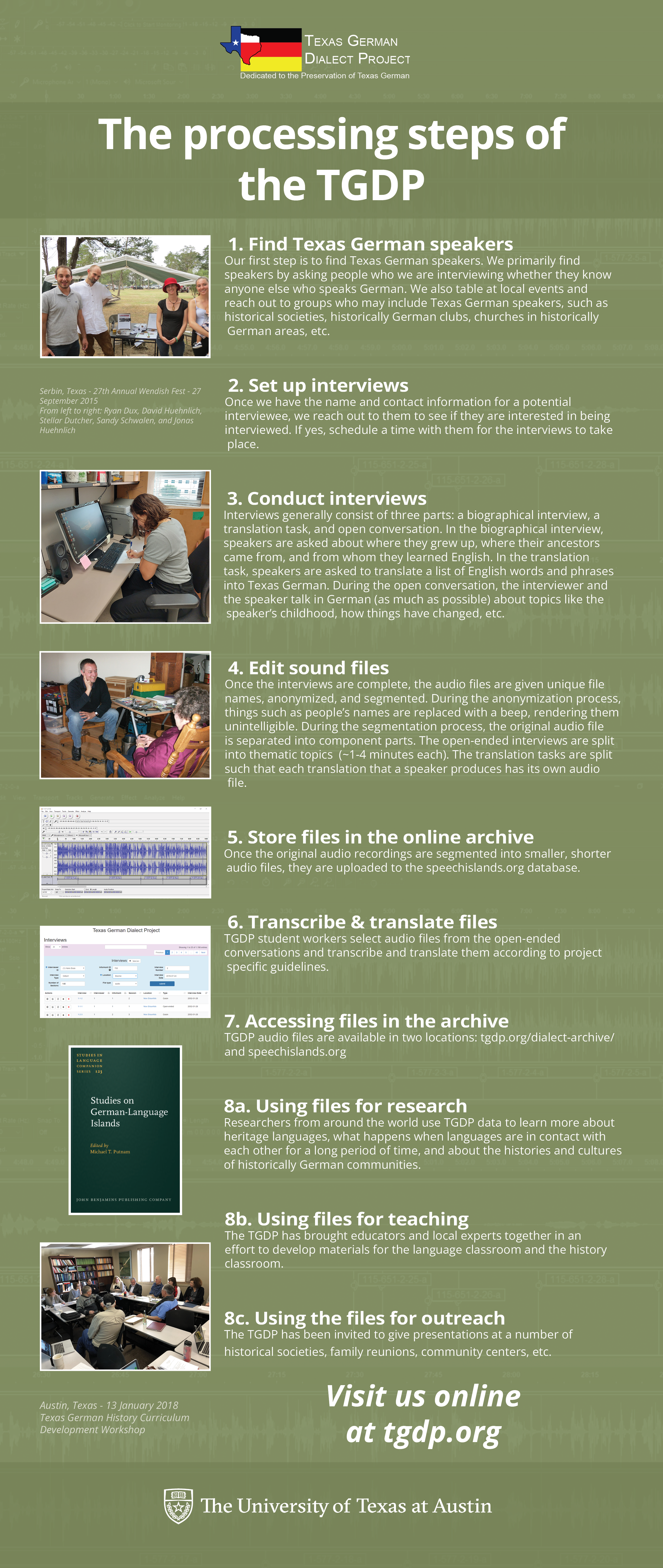
Texas German Dialect Project
My (final) first draft of this scrapped the vertical guides and evenly spaced everything. As of writing, I am still waiting for client feedback.
Basic Training: Research for Meaningful Brand Systems
This is an older training I’d finished the first part of months ago. The second part involves making a brand booklet for a fictional cafe with the following info:
- Name: Fairy Forest Cafe
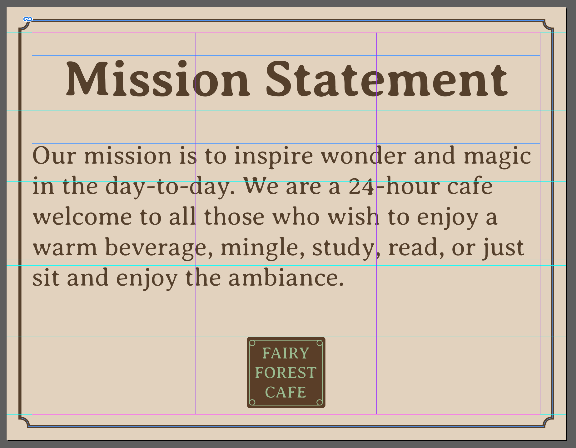
- Mission Statement: Our mission is to inspire wonder and magic in the day-to-day. We are a 24-hour cafe welcome to all those who wish to enjoy a warm beverage, mingle, study, read, or just sit and enjoy the ambiance.
- 3-5 Adjectives: whimsical, natural, cozy, fresh, relaxed
- Messaging: Magical
- Audience: in an urban environment, typically serves students and young twenty/thirty somethings who are looking to get a good read on, do work, and perhaps mingle with fellow coffee goers in a casual manner. These twenty to thirty somethings love organization, “quirky” things, and consuming caffeinated products.
- Type of Restaurant: coffee, desserts, refreshments, and some light food (think sandwiches and soups). Like halfway between Bennu and this cafe (El Bosc de les Fades)
The booklet itself is to include a moodboard, logo, color scheme, typography guide, and merchandise.
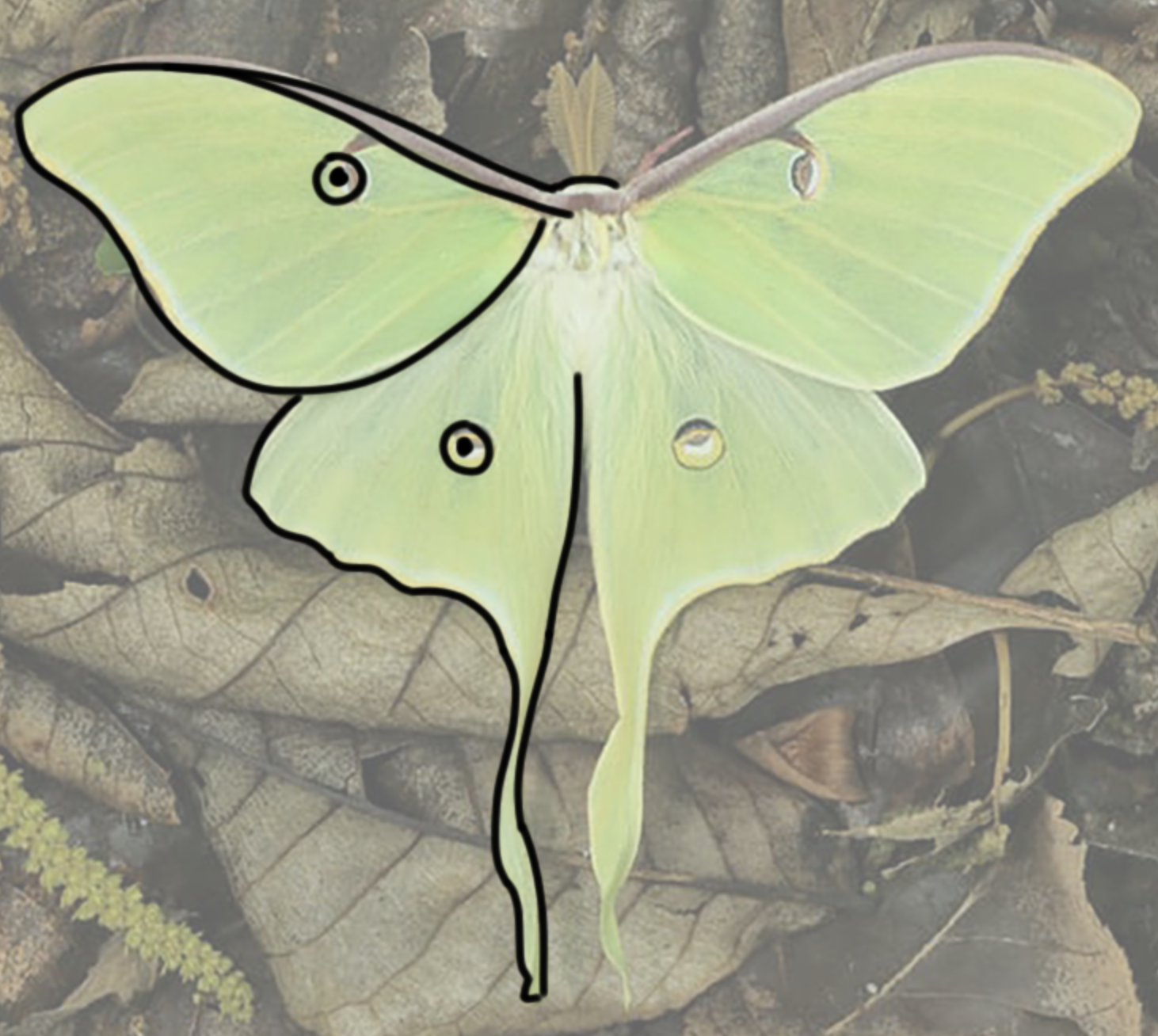
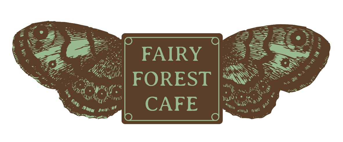
I started with the logo, to work outwards from its colors/design elements. I’ve been taking my time with this training, since it’s been a slow week, and it’s a good opportunity to self-teach Illustrator and Indesign; I need a lot of refreshing for both. I wanted to incorporate moth/butterfly wings into the logo, so my first idea was to try tracing a photo as a raster, then vectorizing it.
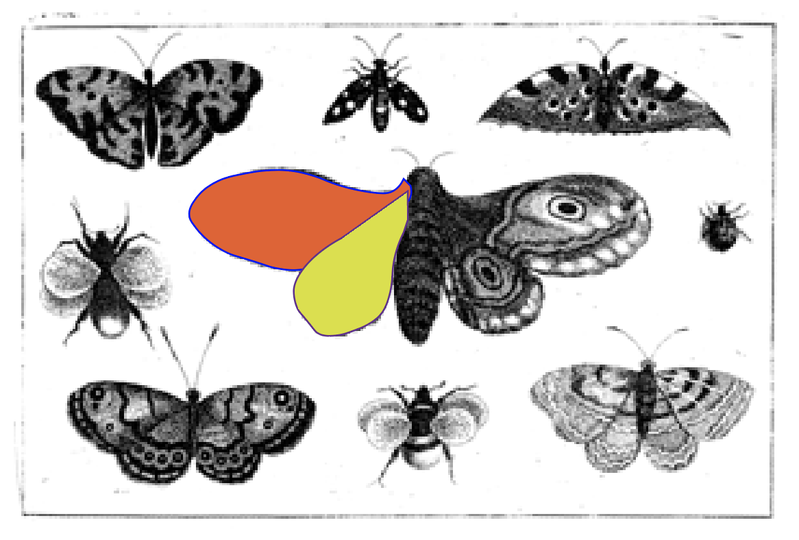
…I wasn’t very satisfied with my mouse drawing, so I tried tracing vector shapes directly over an illustration.
…and was even less satisfied. (The image is a public domain woodcut from Wikimedia). 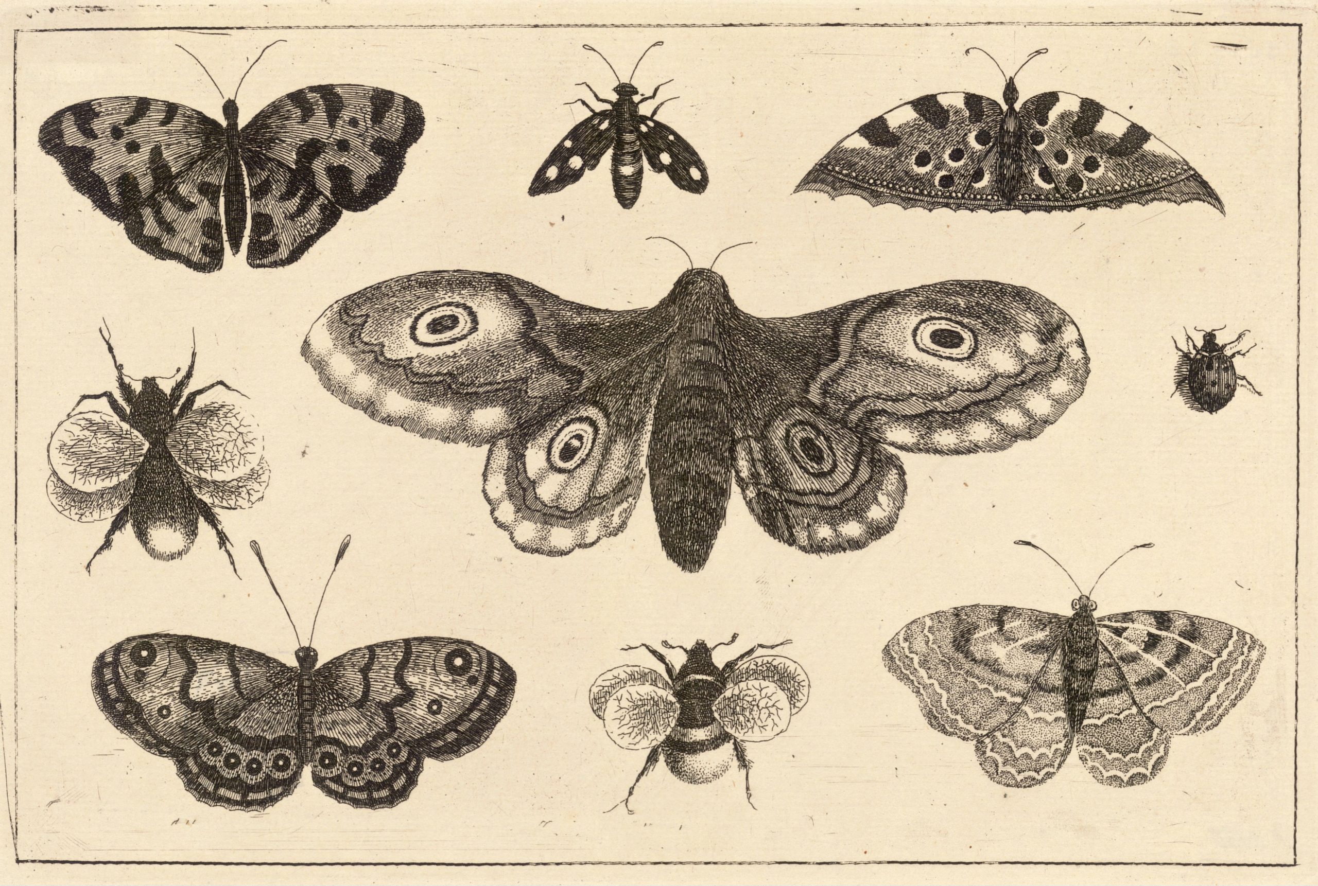
I tried directly vectorizing it next and actually made it work pretty well, so I used that for this logo with a mint-chocolate palette.
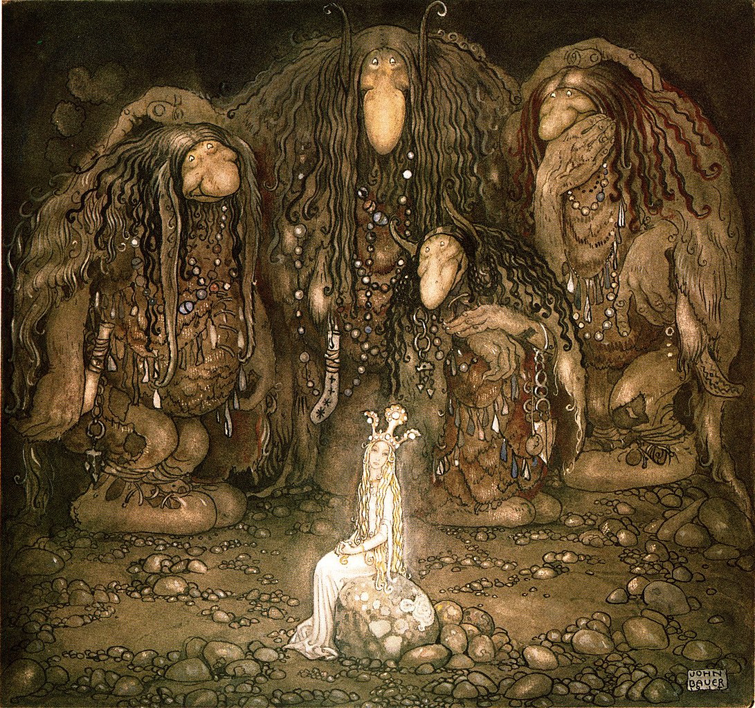
The colors were sampled from some of my moodboard pictures, old growth forest photos and John Bauer paintings. 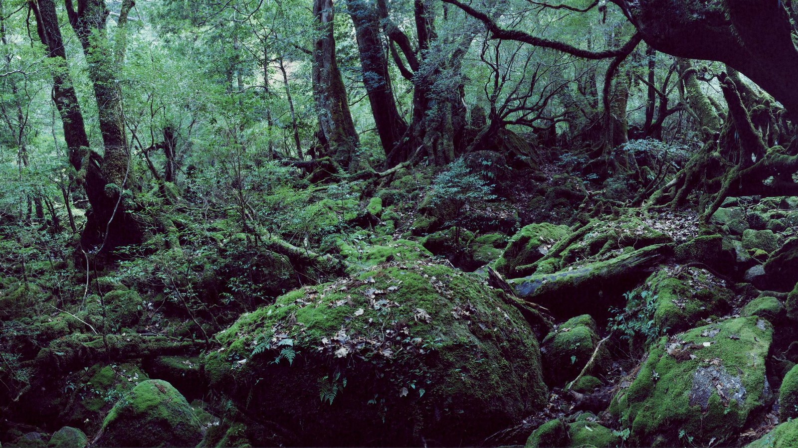
I’ve started drafting the actual stylebook, but it’s pretty plain so far. I plan to look at some references on Behance, and rework some things like the typography and my old InDesign nemesis, guidelines.
Chemistry Readiness Course
This was a quick exercise in independent problem-solving: a somewhat ambiguous design task assigned minutes before the managers left for a 1 hour break, and 1 hour before my shift ended, due by the day’s end. The source photo was low res, so I made several blurred versions blown up to the right proportions for a studio backdrop, and since I couldn’t upload into the requested Volume server, I left the editables in an accessible Box drive.
CE 333T Engineering Communication
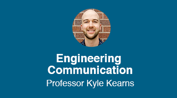
Another quick design task, this one was just updating the professor for 2 Canvas graphics, and it came with its own moral too – always save your editables! After some sleuthing I deduced I would have to remake them from scratch. Thankfully that doesn’t take long for Style A graphics.
