French Textbook Icons for Lingco Platform
The French textbook team wanted to enhance how they organize their content by adding visual aids of icons for every kind of assignment or action the students were going to take as they go through the book. The original online book had icons but they were far more generalized and didn’t clearly indicate the tasks the students needed to take. I worked closely with Pat Kyle and Yazz to come up with the design of each icon and we organized our entire feedback system using excel.
Valerie had initially created the re-design for Tex and Tammy on Procreate. I used her stylistic details such as brush texture and line-weight to influence the design of the icons. Eventually, the team decided on a two-toned color icon with a hand-drawn look similar to that of Tex and Tammy. I used the same procreate software as Valerie and exported all the files as .psds for Box.
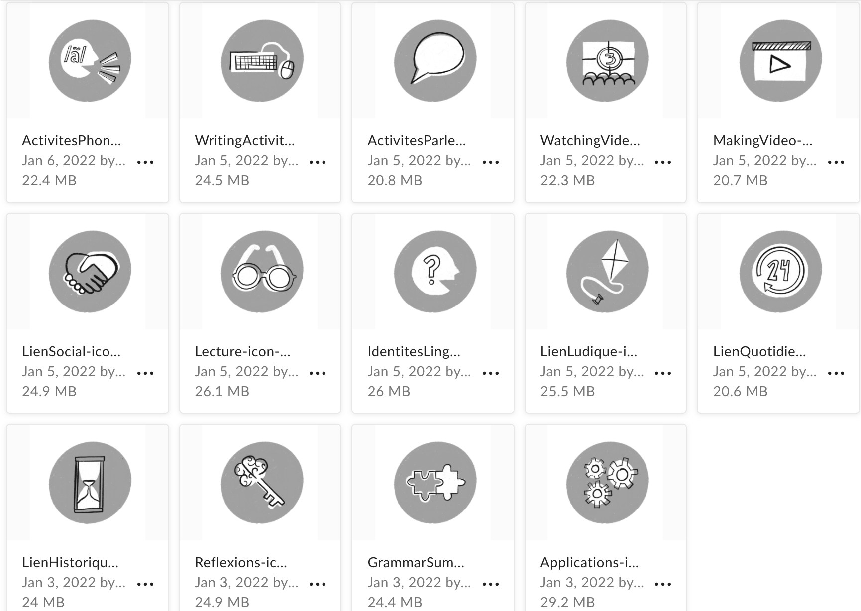
Below is the fully complete and approved grayscale version of all the icons needed to be made:
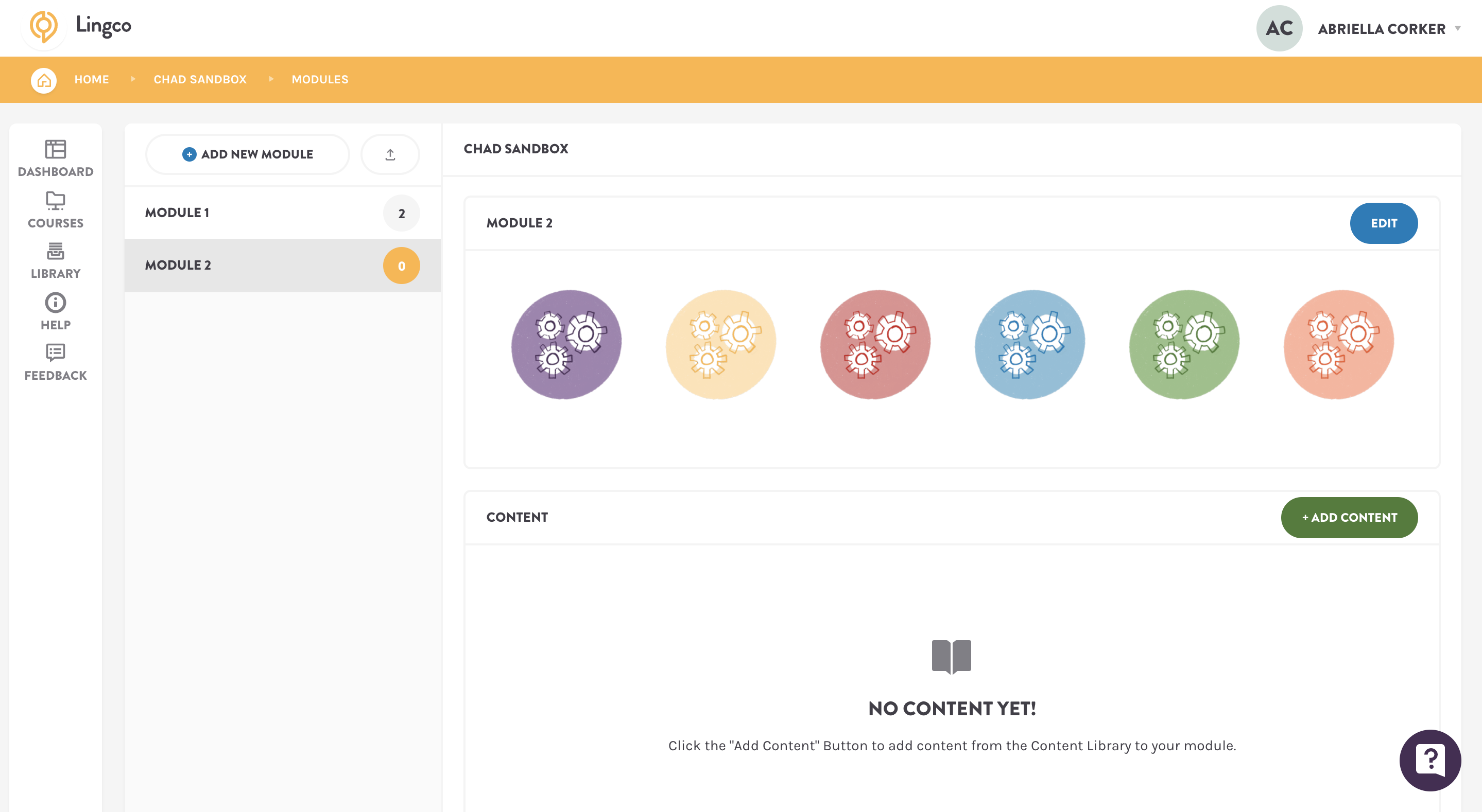
As for coloring, the team was stuck on whether they wanted to go the UT color route or the Lingco site color route. I helped in the decision process by clarifying that the UT color palette was limited to two-tone color options for the number of different colors needed. The university palette only uses blues, orange, yellow, green, and gray. The Lingco color palette had 6 colors that were more saturated and easier to turn into two-toned combinations for the icons. It also made more sense to create iconography that color-matched with the site it was going to be one. In the end, we went with the Lingco color palette below. I also mocked up all color icon versions on an empty Lingco page for the clients viewing.
Once the approved of the way the colors looked on the icons, I spent 3 shifts re-coloring, exporting, and systematically naming all the icons and filing them in Box. It was the most laborious part of the design process but worth the effort because now the clients can easily access the icon color they need under the appropriate name. While doing this exporting process I also cleaned up and organized all the layers within the .psd grayscale drafts to make re-coloring easier and more efficient for any future STA in the case they would want these in other color options.
